
uniapp实现自定义弹窗组件,可以在app全局任意地方使用
此组件可以在app全局使用,因此需要用到vuex。1.首先安装vuex通过此命令安装 npm install vuex --save2.创建initModal.jsimport Vuex from 'vuex'// 自定义弹窗export default function initModal(v) {// 挂在store到全局Vue原型上v.prototype.$modalStore = new
·
此组件可以在app全局使用,因此需要用到vuex。
1.首先安装vuex
通过此命令安装 npm install vuex --save
2.创建initModal.js
import Vuex from 'vuex'
// 自定义弹窗
export default function initModal(v) {
  // 挂在store到全局Vue原型上
  v.prototype.$modalStore = new Vuex.Store({
    state: {
		show:false,
		title:"标题",
		content:'内容',
		showCancel:true,
		cancelText:"取消",
		cancelColor:"#333333",
		cancelBackgroundColor:"rgba(236, 236, 236, 0.39)",
		confirmText:"确定",
		confirmColor:"#333333",
		confirmBackgroundColor:"#FFBB24",
		success:null,
    },
    mutations: {
		hideModal(state) {
			// 小程序导航条页面控制
			// #ifndef H5
			if(state.hideTabBar){
				wx.showTabBar();
			}
			// #endif
			state.show = false
		},
		showModal(state,data) {
			state = Object.assign(state,data)
			console.log(state);
			state.show = true
		},
		success(state,res) {
			let cb = state.success
			let resObj={
				cancel:false,
				confirm:false
			}
			res=="confirm"?resObj.confirm=true:resObj.cancel=true
			cb && cb(resObj)
		}
    }
  })
  v.prototype.$showModal = function (option) {
	if (typeof option === 'object') {
		// #ifndef H5
		if(option.hideTabBar){
			wx.hideTabBar();
		}
		// #endif

		v.prototype.$modalStore.commit('showModal', option)
	}else{
		throw "配置项必须为对象传入的值为:"+typeof option;
	}
  }
}
3.在main.js挂载vuex和showModal

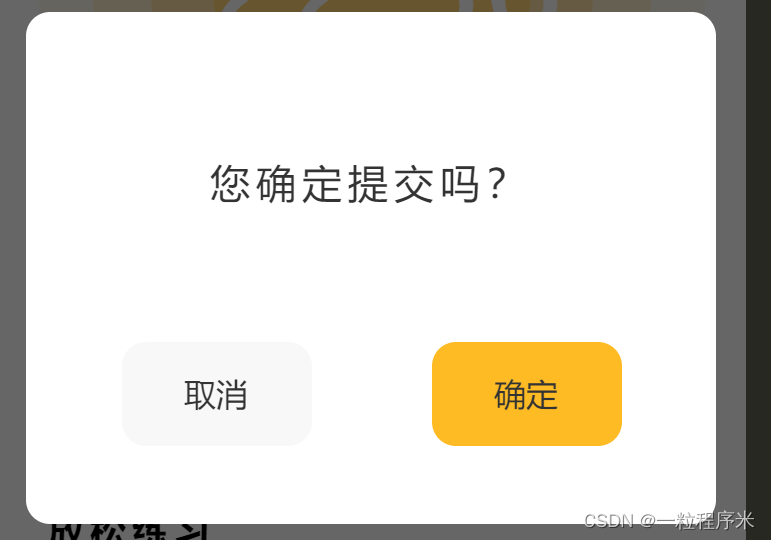
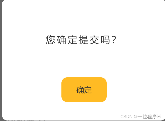
4.showModal组件实现,我做了个判断,如果传入的cancelText是空字符串,则只显示确认键。
<template>
	<!-- 自定义弹窗 -->
	<view class="_showModal" v-show="show">
			<view class="_shade"></view>
			<view class="_modalBox">
				<view class="_modal">
					<slot name="title">
						<view class="title" v-show="title">{{title}}</view>
					</slot>
					<slot name="content">
						<view class="content">{{content}}</view>
					</slot>
					<slot name="btn">
						<view class="btnbox">
							<view v-if="cancelText" class="btn" :style="{color:cancelColor,background:cancelBackgroundColor}" @click.stop="clickBtn('cancel')">{{cancelText}}</view>
							<view class="btn" :style="{color:confirmColor,background:confirmBackgroundColor}" @click.stop="clickBtn('confirm')">{{confirmText}}</view>
						</view>
					</slot>
				</view>
			</view>
	</view>
</template>

<script>
	export default {
		name:"show-modal",
		computed: {
				show(){
					return this.$modalStore.state.show;
				},
				title(){
					return this.$modalStore.state.title;
				},
				content(){
					return this.$modalStore.state.content;
				},
				showCancel(){
					return this.$modalStore.state.showCancel;
				},
				cancelText(){
					return this.$modalStore.state.cancelText;
				},
				cancelColor(){
					return this.$modalStore.state.cancelColor;
				},
				cancelBackgroundColor(){
					return this.$modalStore.state.cancelBackgroundColor;
				},
				confirmText(){
					return this.$modalStore.state.confirmText;
				},
				confirmColor(){
					return this.$modalStore.state.confirmColor;
				},
				confirmBackgroundColor(){
					return this.$modalStore.state.confirmBackgroundColor;
				}
		},
		methods:{
			closeModal(){
				this.$modalStore.commit('hideModal')
			},
			clickBtn(res){
				this.$modalStore.commit('hideModal')
				this.$modalStore.commit('success',res)
			}
		},
		beforeDestroy(){
			this.$modalStore.commit('hideModal')
		},
		data() {
			return {

			};
		}
	}
</script>

<style lang="scss" scoped>
._showModal{
		position: fixed;
		top: 0;
		left:0;
		width: 100%;
		height: 100%;
		z-index:10000;
		._shade{
			width: 100%;
			height: 100%;
			position: absolute;
			top: 0;
			left: 0;
			background: #000;
			opacity: .6;
			z-index:11000;
		}
		._modalBox{
			width: 100%;
			height: 100%;
			position: absolute;
			top: 0;
			left: 0;
			z-index:12000;
			display: flex;
			justify-content: center;
			align-items: center;
			._modal{
				flex: none;
				width:345px;
				min-height:256px;
				background: #fff;
				border-radius: 12px;
				.title{
					text-align: center;
					font-size: 16px;
					font-family: Source Han Sans CN;
					font-weight: bold;
					color: #333333;
					margin-top: 20px;
				}
				.content{
					min-height: 80px;
					width: 284px;
					margin:45px auto;
					font-size: 20px;
					font-family: Source Han Sans CN;
					font-weight: 500;
					color: #333333;
					display: flex;
					justify-content: center;
					align-items: center;
					letter-spacing: 3px;
				}
				.btnbox{
					display: flex;
					justify-content: center;
					// padding-top: 10px;
					flex-direction: row;
					.btn{
						width: 95px;
						height: 52px;
						border-radius: 12px;
						display: flex;
						justify-content: center;
						align-items: center;
						font-family: Source Han Sans CN;
						font-weight: 500;
						font-size: 16px;
						margin:  -5px 30px 30px 30px;
					}
				}
			}
		}

}
</style>
5.使用方式
在app页面使用<show-modal></show-modal>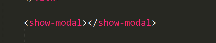
哪里需要弹窗时,加入这句代码:
<show-modal></show-modal>
  this.$showModal({
  	title: '',
  	content: '内容',
  	cancelText:"取消",//传入空值表示只显示确认按钮,此代码不能省略
  	confirmText:"确认",
  	success(res) {
  		if (res.confirm) {
  		  console.log('用户点击确定')
  		} else if (res.cancel) {
  		  console.log('用户点击取消')
  		}
  	}
  })

为开发者提供学习成长、分享交流、生态实践、资源工具等服务,帮助开发者快速成长。
更多推荐


 5
5 0
0- 0


 已为社区贡献24条内容

所有评论(0)