Vue3+Element-Plus 登录组件页面布局完善 八
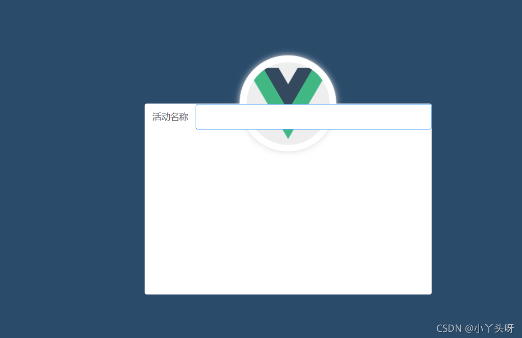
3.3 登录页面的布局1.通过Element-UI 组件实现布局el-formel-form-itemel-inputel-button字体图标①如图,之前也介绍过。最外面是一个el-form 表单,里面的每一行,都是一个form-item项。其中每一个输入框都是一个input组件,下面的两个按钮都属于el-button,包括输入框左则都会用到一些字体图标。② 首先打开Element-UI 官网
1. 登录页面的布局
1.1 通过Element-UI 组件实现布局
- el-form
- el-form-item
- el-input
- el-button
- 字体图标
①如图,之前也介绍过。最外面是一个el-form 表单,里面的每一行,都是一个form-item项。其中每一个输入框都是一个input组件,下面的两个按钮都属于el-button,包括输入框左则都会用到一些字体图标。
② 首先打开Element-UI 官网 组件 | Element,找到Form表单。复制表单,按需复制进行修改。
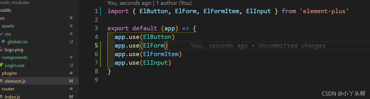
注意事项:因为是按需导入Element组件,当我们需要使用到表单或者是其他组件的时候,需要去到elment.js中把用到的组件,导入进去。导入之后,需要使用Vue.use把相关的组件注册成全局组件。
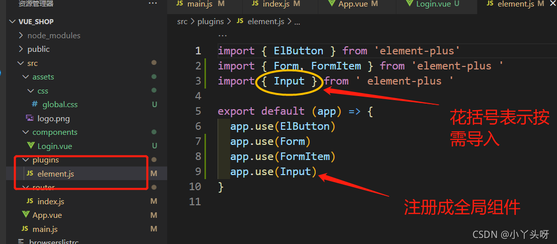
以上只是适用于vue3.0版本以下的。现在是使用vue3.0版本开发,需要配套Element-plus 使用,因为只有Element-plus支持vue3.0版本Button 按钮 | Element Plus (gitee.io)
所以,要修改成这样,前面加El
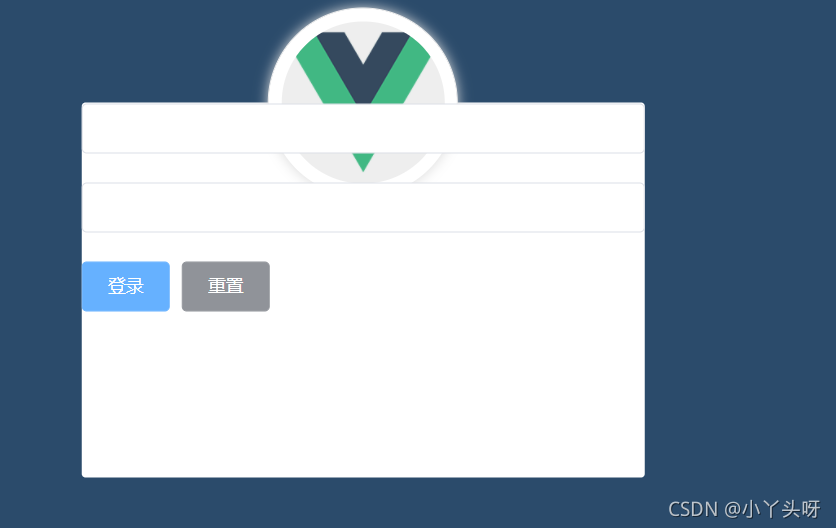
页面代码
然后效果就出来了
③ 接下来,对该页面进行样式调整美化
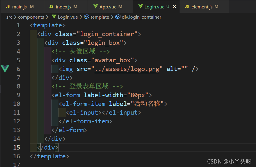
首先,添加完成页面元素。代码
<template>
<div class="login_container">
<div class="login_box">
<!-- 头像区域 -->
<div class="avatar_box">
<img src="../assets/logo.png" alt="" />
</div>
<!-- 登录表单区域 -->
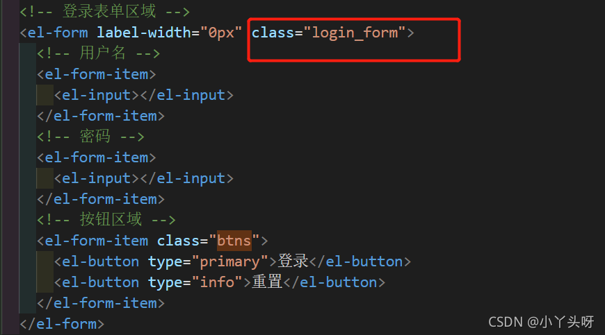
<el-form label-width="0px">
<!-- 用户名 -->
<el-form-item>
<el-input></el-input>
</el-form-item>
<!-- 密码 -->
<el-form-item>
<el-input></el-input>
</el-form-item>
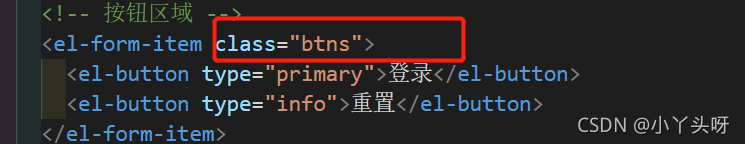
<!-- 按钮区域 -->
<el-form-item>
<el-button type="primary">登录</el-button>
<el-button type="info">重置</el-button>
</el-form-item>
</el-form>
</div>
</div>
</template>效果:
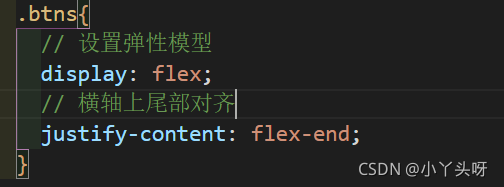
④ 接下来,让按钮向右对齐。先在按钮区域定义一个类
通过类选择器,选中。然后让它变成一个弹性模型,display
效果:
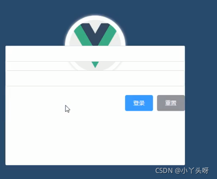
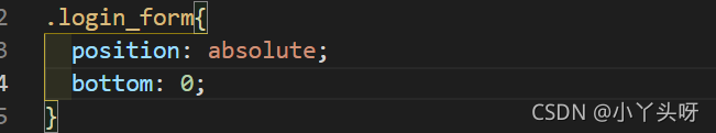
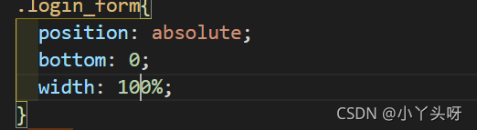
⑤ 还需要把文本框放到页面的低部。如果放低部呢,需要给form加一个定位器
通过类选择器,选中。添加一个定位
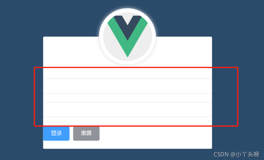
但是页面效果,input并没有占满全屏,
需要加一个宽度
这样就占满全屏了
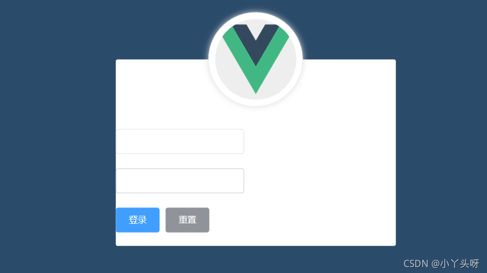
⑥ 接下来,我们要让它距离左右都有边距,可以给它加padding属性
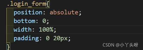
可以明显看到,超出了白色盒子区域
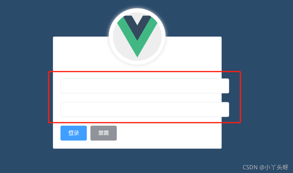
那么就再加一个box-sizing 属性
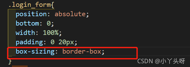
这样就不会超出来了
⑦ 细心的其实可以发现,我的按钮移不过去右边。没有找出来什么原因,导致使用justify-content失效。
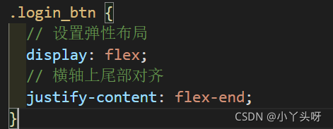
所以就换成了Element-plus 里面的Layout布局。
代码如下:
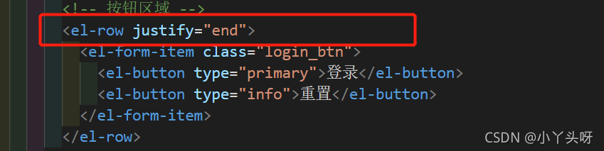
可以把login_btn这个类选择器去掉。
注意事项:要注意引入row组件。
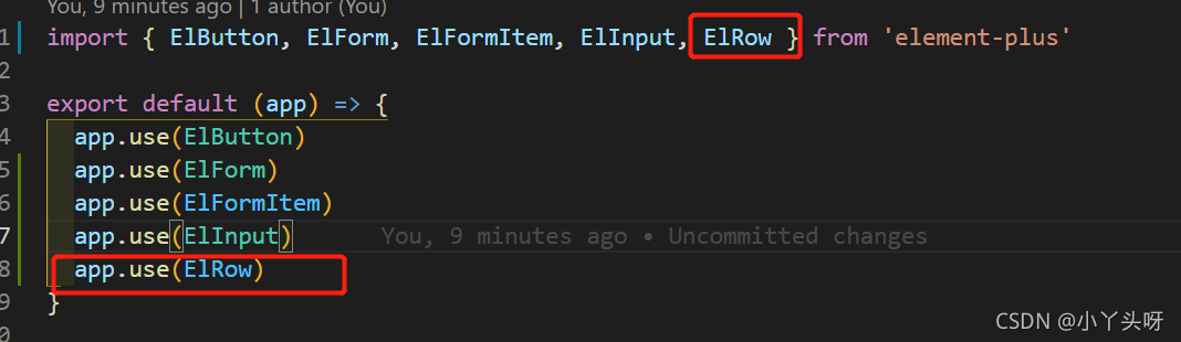
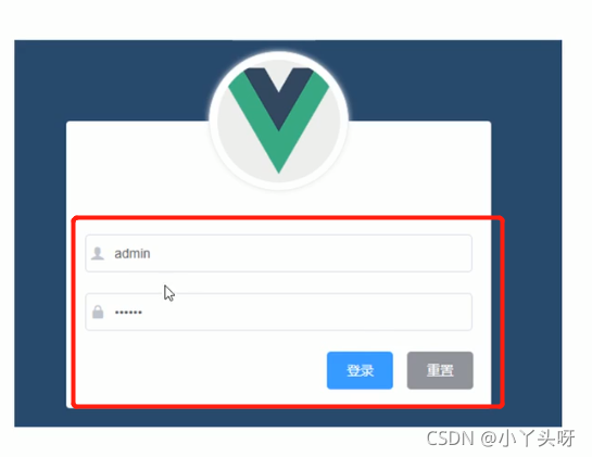
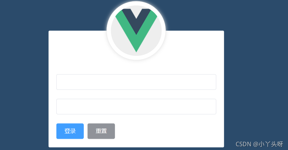
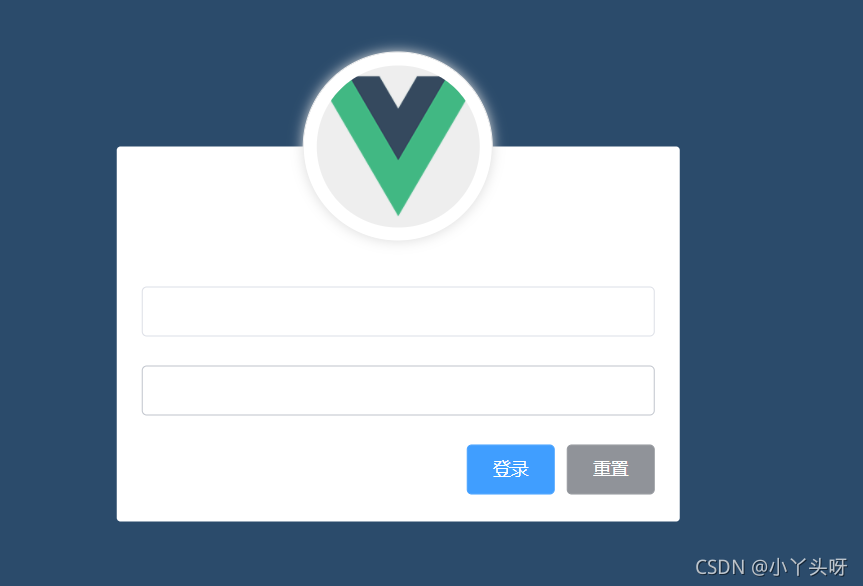
⑧ 最后效果
⑨ 页面全部代码
<template>
  <div class="login_container">
    <div class="login_box">
      <!-- 头像区域 -->
      <div class="avatar_box">
        <img src="../assets/logo.png" alt="" />
      </div>
      <!-- 登录表单区域 -->
      <el-form label-width="0px" class="login_form">
        <!-- 用户名 -->
        <el-form-item>
          <el-input></el-input>
        </el-form-item>
        <!-- 密码 -->
        <el-form-item>
          <el-input></el-input>
        </el-form-item>
        <!-- 按钮区域 -->
        <el-row justify="end">
          <el-form-item class="login_btn">
            <el-button type="primary">登录</el-button>
            <el-button type="info">重置</el-button>
          </el-form-item>
        </el-row>
      </el-form>
    </div>
  </div>
</template>

<script>
</script>

<style lang="less" scoped>
.login_container {
  background-color: #2b4b6b;
  height: 100vh;
}
.login_box {
  // 宽450像素
  width: 450px;
  // 高300像素
  height: 300px;
  // 背景颜色
  background-color: #fff;
  // 圆角边框3像素
  border-radius: 3px;
  // 绝对定位
  position: absolute;
  // 距离左则50%
  left: 50%;
  // 上面距离50%
  top: 50%;
  // 进行位移,并且在横轴上位移-50%,纵轴也位移-50%
  transform: translate(-50%, -50%);
  .avatar_box {
    // 盒子高度130像素
    height: 130px;
    // 宽度130像素
    width: 130px;
    // 边框线1像素 实线
    border: 1px solid #eee;
    // 圆角
    border-radius: 50%;
    // 内padding
    padding: 10px;
    // 添加阴影 向外扩散10像素 颜色ddd
    box-shadow: 0 0 10px #ddd;
    // 绝对定位
    position: absolute;
    // 距离左则
    left: 50%;
    // 位移
    transform: translate(-50%, -50%);
    // 背景
    background-color: #fff;
    img {
      width: 100%;
      height: 100%;
      border-radius: 50%;
      background-color: #eee;
    }
  }
}
.login_form {
  position: absolute;
  bottom: 0;
  width: 100%;
  padding: 0 20px;
  box-sizing: border-box;
}
.login_btn {
  // 设置弹性布局
  display: flex;
  // 横轴上尾部对齐
  justify-content: flex-end;
}
</style>
以上出自于:【黑马程序员】前端开发之Vue项目实战_Element-UI【配套源码+笔记】_哔哩哔哩_bilibili https://www.bilibili.com/video/BV1x64y1S7S7?p=1

Vue社区为您提供最前沿的新闻资讯和知识内容
更多推荐


 5
5 0
0- 0


 已为社区贡献27条内容

所有评论(0)