基于《黑马商城》项目,分析uniapp中首页的实现
在这篇文章中,我们将基于《黑马商城》项目,分析首页的实现。涉及到调用uniapp组件库的轮播图组件,图标自建组件首页效果如下:分为三部分:第一部分是轮播图的实现第二部分是导航区,涉及图标,文字等第三部分是商品列表1、轮播图调用uniapp提供的组件滑块视图容器,代码如下:<swiper indicator-dots circular><swiper-item v-for="ite
在这篇文章中,我们将基于《黑马商城》项目,分析首页的实现。
涉及到调用uniapp组件库的轮播图组件,
图标
自建组件
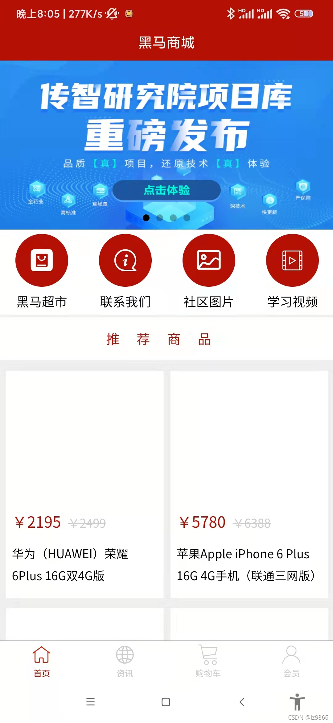
首页效果如下:
分为三部分:第一部分是轮播图的实现
第二部分是导航区,涉及图标,文字等
第三部分是商品列表
1、轮播图

调用uniapp提供的组件滑块视图容器,代码如下:
		<swiper indicator-dots circular>
			<swiper-item v-for="item in swipers" :key="item.id">
				<image :src="item.img"></image>
			</swiper-item>
		</swiper>
属性中,indicator-dots指显示面板指示点,circular指采用衔接滑动,滑动到末尾再往下滑可以回到开头,
没有为属性属性赋值,默认为true,即默认显示面板指示点和衔接滑动
在生命周期函数加载页面onLoad()时,获取轮播图数据
代码如下:
		onLoad() {
			this.getSwipers()
			this.getHotGoods()
		},
		components: {"goods-list":goodsList},
		methods: {
			// 获取轮播图的数据
			async getSwipers () {
				const res = await this.$myRuquest({
					url: '/api/getlunbo'
				})
				this.swipers = res.data.message
			},
使用postman测试接口获取数据如下:

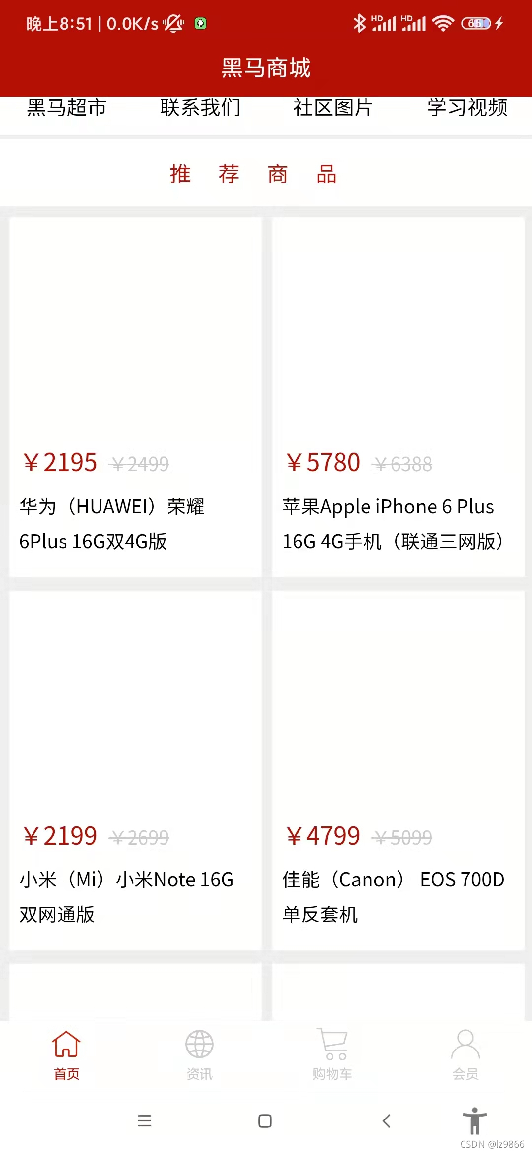
2、导航区域实现
导航区域html代码如下:
		<!-- 导航区域 -->
		<view class="nav">
			<view class="nav_item" v-for="(item,index) in navs" :key="index" @click="navItemClick(item.path)">
				<view :class="item.icon"></view>
				<text>{{item.title}}</text>
			</view>
</view>navs列表的数据在前端代码中存储,如下:
		data() {
			return {
				swipers: [],
				goods: [],
				navs: [
					{
						icon: 'iconfont icon-ziyuan',
						title: '黑马超市',
						path: '/pages/goods/goods'
					},
					{
						icon: 'iconfont icon-guanyuwomen',
						title: '联系我们',
						path: '/pages/contact/contact'
					},
					{
						icon: 'iconfont icon-tupian',
						title: '社区图片',
						path: '/pages/pics/pics'
					},
					{
						icon: 'iconfont icon-shipin',
						title: '学习视频',
						path: '/pages/videos/videos'
					}
				]
			}
		},
对view动态绑定class可以选择图标
绑定事件navItemClick,点击导航,跳转到相应的页面,代码如下:
			// 导航点击的处理函数
			navItemClick (url) {
				uni.navigateTo({
					url
				})
			},
下面我们来分析一下样式,代码如下:
		.nav {
			display: flex;
			.nav_item {
				width: 25%;
				text-align: center;
				view{
					width: 120rpx;
					height: 120rpx;
					background: $shop-color;
					border-radius: 60rpx;
					margin: 10px auto;
					line-height: 120rpx;
					color: #fff;
					font-size: 50rpx;
				}
				.icon-tupian{
					font-size: 45rpx;
				}
				text{
					font-size: 30rpx;
				}
			}
		}
navs采用flex布局(默认在一行显示)
对于每一项nav_item,宽度采用25%,
text-align: center使得图标和字体都居中显示
对于view区域

设置高度、宽度、背景色,
将border-radius设置为宽度的一半,则显示为圆形,
margin为上下10px,左右居中
图标大小为50rpx,
由于第三个图标显示略大,单独设置第三个图标的类icon-tupian,大小为45rpx
3、推荐商品
HTML如下:
		<!-- 推荐商品 -->
		<view class="hot_goods">
			<view class="tit">推荐商品</view>
			<goods-list @goodsItemClick="goGoodsDetail" :goods="goods"></goods-list>
		</view>
先是标题推荐商品,后面是商品列表
样式如下:
		.hot_goods {
			background: #eee;
			overflow: hidden;
			margin-top: 10px;
			.tit{
				height: 50px;
				line-height: 50px;
				color: $shop-color;
				text-align: center;
				letter-spacing: 20px;
				background: #fff;
				margin: 7rpx 0;
			}
}整体背景色为浅灰色,overflow设置为hidden ,清除浮动,参考为什么"overflow:hidden"能清除浮动的影响 - 简书
关于overflow:hidden的作用(溢出隐藏、清除浮动、解决外边距塌陷等等)_Emily-CSDN博客
上边距为10px
标题部分高度为50px,行高(文本内容的高度)为60px,颜色为红色,文字居中,字符间间距为20px,背景色为白色,上下margin设置为7rpx,左右margin为0
下面我们来自建商品列表组件
html代码如下:
		<!-- 推荐商品 -->
		<view class="hot_goods">
			<view class="tit">推荐商品</view>
			<goods-list @goodsItemClick="goGoodsDetail" :goods="goods"></goods-list>
		</view>
引入组件
	import goodsList from '../../components/goods-list/goods-list.vue'
	export default {
        components: {"goods-list":goodsList},
对于goodsList组件,参数为goods,触发父组件事件@goodsItemClick,在父组件中对应goGoodsDetail
goods列表在onLoad()页面加载时获得,代码如下:
		onLoad() {
			this.getSwipers()
			this.getHotGoods()
		},
		methods: {

			// 获取热门商品列表数据
			async getHotGoods () {
				const res = await this.$myRuquest({
					url: '/api/getgoods?pageindex=1'
				})
				this.goods = res.data.message
			},
获取热门商品列表接口,使用postman测试如下:

goGoodsDetail方法代码如下:
			// 导航到商品详情页
			goGoodsDetail (id) {
				uni.navigateTo({
					url: '/pages/goods-detail/goods-detail?id='+id
				})
			}
下面我们来看goodsList组件,
代码如下:
<template>
	<view class="goods_list">
		<view class="goods_item" v-for="item in goods" :key="item.id" @click="navigator(item.id)">
			<image :src="item.img_url"></image>
			<view class="price">
				<text>¥{{item.sell_price}}</text>
				<text>¥{{item.market_price}}</text>
			</view>
			<view class="name">
				{{item.title}}
			</view>
		</view>
	</view>
</template>

<script>
	export default {
		props: ['goods'],
		methods: {
			navigator (id) {
				this.$emit('goodsItemClick',id)
			}
		}
	}
</script>
传入的参数为goods,在navigator事件中触发父组件的事件goodsItemClick,并传入参数id
对于商品列表部分

对于商品列表的每一项,分为图片部分,价格部分,和文本介绍部分
HTML代码如下:
<template>
	<view class="goods_list">
		<view class="goods_item" v-for="item in goods" :key="item.id" @click="navigator(item.id)">
			<image :src="item.img_url"></image>
			<view class="price">
				<text>¥{{item.sell_price}}</text>
				<text>¥{{item.market_price}}</text>
			</view>
			<view class="name">
				{{item.title}}
			</view>
		</view>
	</view>
</template>
下面我们来分析样式:
<style lang="scss">
	.goods_list {
		padding: 0 15rpx;
		display: flex;
		flex-wrap: wrap;
		justify-content: space-between;
		.goods_item {
			background: #fff;
			width: 355rpx;
			margin: 10rpx 0;
			padding: 15rpx;
			box-sizing: border-box;
			image{
				width: 80%;
				height: 150px;
				display: block;
				margin: auto;
			}
			.price{
				color: $shop-color;
				font-size: 36rpx;
				margin: 20rpx 0 5rpx 0;
				text:nth-child(2){
					color: #ccc;
					font-size: 28rpx;
					margin-left: 17rpx;
					text-decoration: line-through;
				}
			}

			.name {
				font-size: 28rpx;
				line-height: 50rpx;
				padding-bottom: 15rpx;
				padding-top: 10rpx;
			}
		}
	}
</style>
goods_list总体,padding上下为0,左右为15rpx,
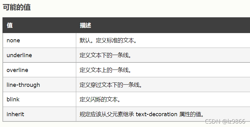
采用flex布局,flex-wrap: wrap;是指在必要的时候拆行,flex-wrap属性如下:

justify-content: space-between是指两端对齐,元素之间的间隔都相等,参考自Flex 布局教程:语法篇 - 阮一峰的网络日志
对于每一项goods_item,box-sizing: border-box;盒子不会被撑大
对于图片来言,display: block;设置成块元素(否则是行内元素),margin: auto;使得图片上下左右居中
对于价格部分
<template>
	<view class="goods_list">
		<view class="goods_item" v-for="item in goods" :key="item.id" @click="navigator(item.id)">
			<image :src="item.img_url"></image>
			<view class="price">
				<text>¥{{item.sell_price}}</text>
				<text>¥{{item.market_price}}</text>
			</view>
			<view class="name">
				{{item.title}}
			</view>
		</view>
	</view>
</template>
.price{
color: $shop-color;
font-size: 36rpx;
margin: 20rpx 0 5rpx 0;
text:nth-child(2){
color: #ccc;
font-size: 28rpx;
margin-left: 17rpx;
text-decoration: line-through;
}
}第二个text标签元素,颜色为灰色,字体大小为28rpx,
text-decoration: line-through 表示穿过文本中间有一条线
对于文字说明部分
<template>
	<view class="goods_list">
		<view class="goods_item" v-for="item in goods" :key="item.id" @click="navigator(item.id)">
			<image :src="item.img_url"></image>
			<view class="price">
				<text>¥{{item.sell_price}}</text>
				<text>¥{{item.market_price}}</text>
			</view>
			<view class="name">
				{{item.title}}
			</view>
		</view>
	</view>
</template>
.name {
font-size: 28rpx;
line-height: 50rpx;
padding-bottom: 15rpx;
padding-top: 10rpx;
}
为开发者提供学习成长、分享交流、生态实践、资源工具等服务,帮助开发者快速成长。
更多推荐


 0
0 0
0- 0


 已为社区贡献2条内容

所有评论(0)