Vue 中echarts的数据参数使用、X轴Y轴、柱状图、饼状图、x轴显示全
·
Echarts 柱状图配置详解 - 龙恩0707 - 博客园
ECharts图表设置x轴和y轴显示数值_King汀的博客-CSDN博客_echarts设置y轴数值
echarts柱状图 渐变色_kylvia的专栏-CSDN博客_echarts 柱子渐变色 eCharts——柱状图中的柱体颜色渐变
Echarts设置背景的网格线为虚线_祈澈菇凉-CSDN博客 Echarts设置背景的网格线为虚线
echarts bar series下的label position的属性值_MistyWood的博客-CSDN博客_echarts label position echarts bar series下的label position的属性值
Echarts 饼状图显示信息,内容,值,百分比都显示的代码 更改图例等问题汇总 - 知乎Echarts 饼状图显示信息,内容,值,百分比都显示的代码 更改图例等问题汇总
稍微总结一下echar 柱状图的参数修改
x 轴文本 如何设置成2行显示
 ↓
↓
xAxis: {
  axisLabel: {
    show: true,
    color: "#c0c3cd",
    fontSize: 14,
    rotate: 45,
    formatter: function(value) {
      if(value.length > 4) {
        return value.substring(0,4) + "\n" + value.substring(4);
      }
      return value;
    }
  }
}
修改x和y轴的文本显示全 宽度
调整图表的整体配置,为Y轴标签留出更多空间↓
grid: {
          left: '25%',
          right: '5%',
          top: '15%',
          bottom: '10%'
        },

xAxis: {
          type: "category",
          data: xdata,
          axisLabel: {
            color: "#222",
            fontSize: 10,
            width: 120,//重点
            overflow: 'break',//重点
            interval: 0//重点
          },
          nameGap: 10,//重点
          nameTextStyle: {
            fontSize: 12,//重点
          }

        },

 yAxis: {
          type: "category",
          data: ["AAAA10有限公司", "AAAA9有限公司", "AAAA8有限公司", "AAAA7有限公司", "AAAA6有限公司", "AAAA5有限公司", "AAAA4有限公司", "AAAA3有限公司", "AAAA2有限公司", "AAAA1有限公司"],
          axisLabel: {
            color: "#222",
            fontSize: 10,
            width: 120,//重点
            overflow: 'break',//重点
            interval: 0//重点
          },
          nameGap: 10,//重点
          nameTextStyle: {
            fontSize: 12,//重点
          }
        },
修改图形整体位置
grid: {
top: 36,
left: "1%",
// right: "1%",
bottom: 0,
containLabel: true,
borderColor: "#282f47",
show: true,
},
修改图顶部小图 找legend :https://blog.csdn.net/m0_66557301/article/details/123421178
legend: {
data: [
{ name: "使用量(次)", itemStyle: { color: "#085574" } },
{
name: "效益(人/每天)",
itemStyle: {
color: "#166047",
},
},
{
name: "使用率(%)",
icon: "path://M63.6 489.6h896.7v44.8H63.6z",
},
],
icon: "circle",
padding: 0,
orient: "vertical", vertical // 垂直显示或者horizontal // 水平显示
top: "center",
x:'right',//left
y:'center',//top
right: 20,
bottom: 0,
itemWidth: 8,
itemHeight: 8,
width: 200, // 设置图例的宽度,根据实际需要调整
height:200, // 设置图例的高度,适应自动换行
formatter: function (name) {
// 自定义图例内容和样式
return name;
},
textStyle: {
color: "#FFF",
fontSize: "12px",
},
},
直接设置width并不会生效,需要设置formatter展示文本才会生效
1.修改x轴找
xAxis: {
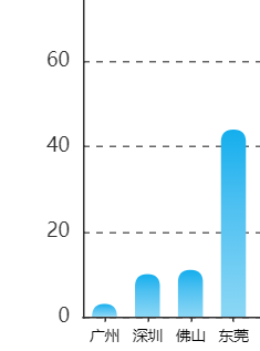
data: ["汕头", "佛山", "珠海", "广州", "深圳"],//值
show:false,//完全隐藏x轴
interval: 25,//x轴数字间距
axisTick: { //轴刻度
show: false,
},
splitLine: { //x轴网格
show: true,
lineStyle: {
color: ["#282f47"],
width: 1,
},
},
axisLine: { //X轴线
show: true,
lineStyle: {
color: "white",//x轴线颜色
},
},
axisLabel: {//X轴文字设置
show:true,//是否显示x轴
interval: 0, //显示x轴所有文字内容 间距
margin: 14,
fontSize: 12, //X轴文字大小-同样生效
textStyle: {
color: "#fff", //X轴文字颜色
fontSize: 14, //X轴文字大小- 推荐这个
},
},
},
2.修改y轴找
yAxis: [
{
type: "value",
gridIndex: 0,
min: 0,
max: 100,
show:false,//完全隐藏y轴 -推荐
interval: 25,//y轴数字间距
axisTick: { //刻度线
show: false,
},
axisLine: { //y轴网格
show: true,
lineStyle: {
color: "rgba(77, 128, 254, 0.2)",
},
},
axisLabel: { //y轴文字
show: true,//是否显示Y轴
margin: 14,
fontSize: 14,
color: "#c0c3cd",//文字颜色
},
},
{
type: "value",
min: 0,
max: 100,
show:false,//完全隐藏y轴 -推荐
interval: 20,
axisLabel: {
show: true, //是否显示Y轴
color: "#c0c3cd",
fontSize: 14,
rotate: 45,//文字倾斜
formatter: function (value) {
if (value.length > 3) {
return `${value.slice(0, 3)}...`;
}
return value;
},
},
splitLine: {
show: false,
lineStyle: {
color: "rgba(211,228,255,0.08)",
},
},
},
],
3.修改提示框找
tooltip: {
trigger: "axis",
show: true,
backgroundColor: "rgba(0, 0, 0, 0.3)",
borderColor: "rgba(224, 224, 224, 0.4)",
borderWidth: 2,
borderRadius: 4,
textStyle: {
color: "#fff",
fontSize: 14,
},
formatter: function (params) {
console.log(params, "params");
return (
"<div>" +
"使用人次:" +
params[0].data +
"人" +
"</div>" +
"<div>" +
"使用量:" +
params[1].data +
"次" +
"</div>" +
"<div>" +
"效益:" +
params[2].data +
"人/天" +
"</div>"
);
},
},
4.修改柱状图背景色,宽度等找
series: [
{
name: "打底",
type: "bar",
barWidth: 20,
yAxisIndex: 0,
animation: false,
showBackground: true,
tooltip: { show: false },
backgroundStyle: {
color: "rgba(23, 230, 255, 0.05)",
borderColor: "rgba(39, 182, 255, 0.15)",
borderWidth: 1,
},
},
{
name: "使用量(次)",
barGap: 0.1, //柱状图不重叠
type: "pictorialBar",
symbol: "rect",
symbolRepeat: true,
barWidth: 15,
symbolMargin: 2,
itemStyle: {
normal: {
label: {
show: true, //是否开启柱子顶部文字显示
position: "top", //在上方显示 文字显示方向
textStyle: {
//数值样式
color: "rgba(250,250,250,0.6)",
fontSize: 16,
},
},
color: "#085372",
},
},
data: [21, 43, 56, 32, 64],
z: 10,
zlevel: 0,
},
{
yAxisIndex: 0,
name: "效益(人/每天)",
type: "pictorialBar",
symbol: "rect",
symbolRepeat: true,
barWidth: 15,
symbolMargin: 2,
itemStyle: {
normal: {
label: {
show: true, //是否开启柱子顶部文字显示
position: "top", //在上方显示 文字显示方向
textStyle: {
//数值样式
color: "rgba(250,250,250,0.6)",
fontSize: 16,
},
},
color: "#1d724e",
},
},
data: [51, 23, 21, 34, 22],
z: 10,
barGap: 0.1, //柱状图不重叠
zlevel: 0,
},
],Echart 赋值
<script>
import * as echarts from "echarts";
const chartOption = {
  tooltip: {
    trigger: "axis",
  },
  grid: {
    top: "50",
    left: "1%",
    right: "1%",
    bottom: 5,
    containLabel: true,
  },
  legend: {
    data: ["当月完成值(亿)", "累计同比增幅(%)"],
    top: 20,
    right: 0,
    textStyle: {
      color: "#FFF",
      fontSize: "12px",
    },
  },
  xAxis: [
    {
      type: "category",
      data: months,
      axisLabel: {
        color: "#A7C6CD",
        fontFamily: "PingFangSC-Medium",
        fontSize: 13,
        fontWeight: 500,
        interval: 0,
      },
    },
  ],
  yAxis: [
    {
      type: "value",
      min: 0,
      max: 1900,
      interval: 200,
      axisLabel: {
        color: "#A7C6CD",
        fontFamily: "PingFangSC-Medium",
        fontSize: 13,
      },
      splitLine: {
        show: true,
        lineStyle: {
          color: "rgba(211,228,255,0.08)",
        },
      },
    },
    {
      type: "value",
      min: 0,
      max: 70,
      interval: 20,
      axisLabel: {
        show: false, //是否显示次Y轴
        color: "#A7C6CD",
        fontFamily: "PingFangSC-Medium",
        fontSize: 13,
        formatter: "{value}%",
      },
      splitLine: {
        show: true,
        lineStyle: {
          color: "rgba(211,228,255,0.08)",
        },
      },
    },
  ],
  series: [
    // 背景
    {
      name: "打底",
      type: "bar",
      barWidth: 20,
      yAxisIndex: 0,
      showBackground: true,
      tooltip: { show: false },
      backgroundStyle: {
        color: "rgba(23, 230, 255, 0.05)",
        borderColor: "rgba(39, 182, 255, 0.15)",
        borderWidth: 1,
      },
      data: (() => {
        const arr = [];
        let max = 12;
        while (max--) {
          arr.push(0);
        }
        return arr;
      })(),
    },
    {
      name: "当月完成值(亿)",
      type: "pictorialBar",
      symbol: "rect",
      barWidth: 16,
      symbolRepeat: true,
      symbolSize: [15, 8],
      symbolMargin: 2,
      yAxisIndex: 0,
      data: (() => {
        const arr = [];
        let max = 12;
        while (max--) {
          arr.push(0);
        }
        return arr;
      })(),
      label: {
        show: true,
        position: "top",
        fontFamily: "MicrosoftYaHei",
        fontSize: 12,
        color: "#FFF",
      },
    },
    {
      name: "累计同比增幅(%)",
      type: "line",
      yAxisIndex: 1,
      lineStyle: {
        shadowColor: "rgba(255,168,0, 0.5)",
        shadowBlur: 10,
        shadowOffsetY: 5,
      },
      label: {
        show: true,
        position: "top",
        fontFamily: "MicrosoftYaHei",
        fontSize: 12,
        color: "white",
        // formatter: function (parms) {
        //   return parms.value + "%";
        // },
      },
    },
  ],
  color: ["rgba(23, 230, 255, 0.05)", "#22D7F0", "#FFE200"],
};
export default {
data() {
    return {
      chart: null,
    }
},
mounted() {
    const myChart = (this.chart = echarts.init(
      document.querySelector(".financialai-container")
    ));
    //第二种:↓
    const getchart = this.$echarts.init(
          document.getElementById("board1EchartLeftBar3")
    );
    if (chartOption) {
      myChart.setOption(chartOption);
      myChart.on("click", param => {
        console.log(param);
        this.$emit("sendAiDialog", param.name);
      });
    }
  },

}

//覆盖options里面的属性
onDataUpdate(data) {
      if (data) {
        this.chart.setOption({
          xAxis: [
            {
              data: null,
            },
          ],
          series: [{}, { data: data.income }, { data: data.increase }],
        });
      }
    },
</script>

.financialai-container {
  height: 250px;
  width: 100%;
}
barGap: "-140%", //两个图像不重叠
series: [
    {
      name: "使用量(次)",
      type: "pictorialBar",
    },
    {
      name: "效益(人/每天)",
      type: "pictorialBar",
      barGap: "-140%", //柱状图不重叠 一般给第二个加  -100%重叠 0 完全分开 -140% 部分重叠
    },
  ],
echarts 初始化两种写法
1.推荐
const chart = this.$refs.chart
if (chart) {
//var myChart = this.$echarts.init(chart); //这种写法打包报错init
var myChart = echarts.init(chart); //推荐
const option = {...}
myChart.setOption(option)
}
2.
this.chartLine = echarts.init(document.getElementById('J_chartLineBox'))
var option = {...}
this.chartLine.setOption(option)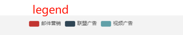
柱形图:圆角 渐变echarts设置图标图例legend多种形状 - lpmou - 博客园
legend: {
    data: [
      { name: "使用量(次)", itemStyle: { color: "#085574" } },
      {
        name: "效益(人/每天)",
        itemStyle: {
          color: "#166047",
        },
      },
      {
        name: "使用率(%)",
        icon: "line",//  字段控制形状  类型包括 circle,rect,line,roundRect,triangle,diamond,pin,arrow,none
        itemStyle: {
          color: "#ffa800",
        },
      },
    ],
    top: "3%",
    x: "center",
    textStyle: {
      color: "#FFF",
      fontSize: "12px",
    },
  },

itemWidth: 10,  // 设置宽度
itemHeight: 10, // 设置高度
itemGap: 40 // 设置间距

itemStyle: {
                normal: {
                  barBorderRadius: [20, 20, 0, 0], //柱形图圆角,初始化效果
                  color: new echarts.graphic.LinearGradient(
                    0,
                    1,
                    0,
                    0,
                    [
                      {
                        offset: 0,
                        color: "#8cd7f5", // 0% 处的颜色
                      },
                      {
                        offset: 0.6,
                        color: "#4dc0f1", // 60% 处的颜色
                      },
                      {
                        offset: 1,
                        color: "#14aeed", // 100% 处的颜色
                      },
                    ],
                    false
                  ),
                },
              },
barBorderRadius:[10, 10, 10, 10] 表示右上,右下,左下,左上的边框弯曲像素值
label position的属性值:
1.
inside(自适应,柱状内部中央),top(柱状外的正上方),bottom(柱状外的正下方),left(柱状外的左边),right(柱状外的右边)

2.
坐标[x,y](以柱状的顶部为原点)

3.
insideTop(柱状内部靠顶部),insideBottom(柱状内部靠下方),insideRight(柱状内部靠右边),insideLeft(柱状内部靠左边)
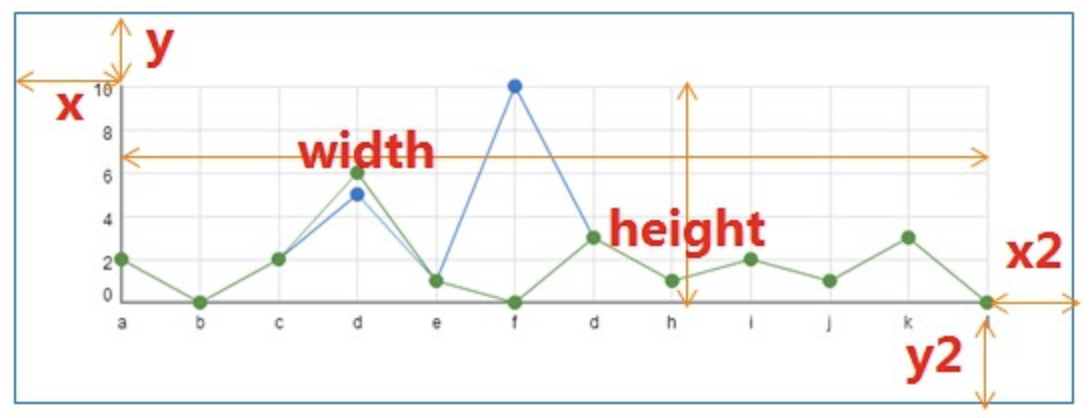
在 Echarts 文档中查找设置图标位置,设置条形图的位置,设置饼状图的位置,找到很艰辛。
- 设置条形图的位置通过
option.grid的x属性设置图形 x 轴方向距左上角的位置 ,x、y、x2、y2的的含义如下图:
getRobotEchartData() {
      const chart = this.$refs.chart1;
      if (chart) {
        var myChart = this.$echarts.init(chart);
        let xdata = [
          "2020-06",
          "2020-07",
          "2020-08",
          "2020-09",
          "2020-10",
          "2020-11",
        ];
        let ydata = [44, 1800, 100, 999, 222, 333];
        const option = {
          trigger: "axis", //坐标轴触发,主要在柱状图,折线图等会使用类目轴的图表中使用。只有设置了这个参数才会出现竖直的线条
          axisPointer: {
            // 坐标轴指示器,坐标轴触发有效
            type: "bar", //指示器类型。
          },
          title: {
            text: "机器人任务总量(单位:个)", //图表名字
            textStyle: {
              fontSize: 14, //图表名字字体大小
            },
          },
          grid: {//设置图表位置
            x: 80,
            y: 60,
            x2: 80,
            y2: 60, //增加柱形图纵向的高度
            // width: {totalWidth} - x - x2,
            // height: {totalHeight} - y - y2,
            containLabel: true,
            backgroundColor: 'rgba(0,0,0,0)',
            borderWidth: 1,
            borderColor: '#ccc'
          },
          legend: {
            data: [ '邮件营销', '联盟广告', '视频广告']
          },
          barWidth: 20, //总设置柱状图的柱形宽度
          color: ["#9fbff0"], //柱形背景
          // ---  悬浮提示框 ----
          tooltip: {
            show: true, // 是否显示提示框,默认为true
            trigger: "item", // 数据项图形触发
            axisPointer: {
              // 指示样式
              type: "shadow",
              axis: "auto",
            },
            padding: 5,
            textStyle: {
              color: "#fff", // 提示框字体颜色
            },
          },
          xAxis: {
            data: xdata, //x轴的每个标题数据!!!
            axisLine: {
              symbol: ["none", "arrow"], // 是否显示轴线箭头
              symbolSize: [6, 6], // 箭头大小
              symbolOffset: [0, 7], // 箭头位置
            },
            name: "月份", //x轴名字
            type: "category",
            axisTick: {
              alignWithLabel: true, //保证刻度线和标签对齐
              length: 1, //刻度的长度。
            },
            axisLabel: {
              inside: false, // 是否朝内
              interval: 0, //横轴标题信息全部显示
              rotate:-15,//标题-15度角倾斜显示
              showMaxLabel: true,//最后一个显示
              formatter: function (value) {
                  return value.split("").join("\n");
              }, //文字竖展示
              textStyle: {
                color: "#000", //x轴的标题字体颜色
                fontSize: "9", //x轴的标题字体大小
                itemSize: "",
              },
            },
          },
          yAxis: [
            {
              min: 0, //y轴最小值
              max: 1800, //y轴最大值
              splitLine: { show: true, lineStyle: { type: "dashed" } }, //设置背景为虚线
              type: "value",
            },
          ],
          series: [
             {
              data: ydata,
              name: "销量", // 序列名称
              type: "bar", // 类型
              legendHoverLink: true, // 是否启用图列 hover 时的联动高亮
              showBackground: false,
              barWidth: 15, // 柱形的宽度
              itemStyle: {// 图形的形状
                normal: {
                  barBorderRadius: [15, 15, 0, 0],//柱形图圆角
                  color: new echarts.graphic.LinearGradient(//柱形背景渐变
                    0,
                    1,
                    0,
                    0,
                    [
                      {
                        offset: 0,
                        color: "#8cd7f5", // 0% 处的颜色
                      },
                      {
                        offset: 0.6,
                        color: "#4dc0f1", // 60% 处的颜色
                      },
                      {
                        offset: 1,
                        color: "#14aeed", // 100% 处的颜色
                      },
                    ],
                    false
                  ),
                },
              },//itemStyle
              label: {//柱子上方显示文字与图标
                normal: {
                  show: true,
                  position: "outside",//inside insideRight bottom
                  textStyle: {
                    color: "black",
                  },
                  formatter: function (params) {
                    return params.value;
                  },
                },
              },
             //柱子上方显示文字与图标 这种直接写也行
             label: {
                show: true,
                position: "top",
                distance: 10,
                color: "#fff",
              },
            },
          ],
        };
        myChart.setOption(option);
      }
    },
Echarts 饼状图显示信息,内容,值,百分比都显示的代码 更改图例等问题汇总 - 知乎 Echarts 饼状图显示信息,内容,值,百分比都显示的代码 更改图例等问题汇总

自定义高亮样式可以通过 emphasis 属性来定制
series: [
    emphasis: {
              label: {
                show: true,
                formatter: "{b}: {c}",
              },
            },

]
↓
↓
  tooltip: {
          trigger: "item",
          formatter: "{a} <br/>{b}: {c} ({d}%)",
          //a - 违法处理率,b-xx管理局,c-数值value,d-百分比 自动计算
        },
Echarts | 饼图引导线周围文字位置的改变 Echarts | 饼图引导线周围文字位置的改变 - 简书
可以看到,二图中文字和线的相对位置是不一样的。需求的样式,可通过设置label > padding和labelLine > length / length2来实现。关键点在于设置一个负的padding。
饼状图:
var option = {
title: {
// text: "- 流程执行数量统计图 -",
left: "left",
textStyle: {
fontSize: 12, //图表名字字体大小
},
},
tooltip: {
trigger: "item",
},
legend: {
bottom: "0%",
itemWidth: 25, //图例标记的图形宽度
itemHeight: 14,
orient: "vertical",
},
//设置饼状图每个颜色块的颜色
color : [ 'red', 'orange', 'yellow', 'green', 'blue', 'indigo', 'purple' ],
series: [
{
name: "数据",
type: "pie",
radius: ["35%", "55%"], //环形-饼状图空心占比一般相差(20%) 数组第一个越小 饼状图越小
//radius: "70%", //设置饼图大小
//center: ["50%", "50%"], //设置饼图位置 左右 上(值越小越靠上) 下(值越大越靠下)
labelLine: {//设置饼图上的线条长度
normal: {
length: 20,
length2: 70,
lineStyle: {
color: '#333'
}
}
},
avoidLabelOverlap: false,
label: {
normal: {
formatter: "{b}:{c}" + "\n\r" + "({d}%)",
show: true,
position: "left",
padding: [0, -40],//设置文字位置
textStyle: {
fontSize: 12, //字体大小
lineHeight: 18, //行高
},
rich: {//加这个rich 上面的行高生效...
a:{
fontSize: 12,
lineHeight: 18,
},
},
emphasis: {
show: true,
textStyle: {
fontSize: "12",
},
},
},
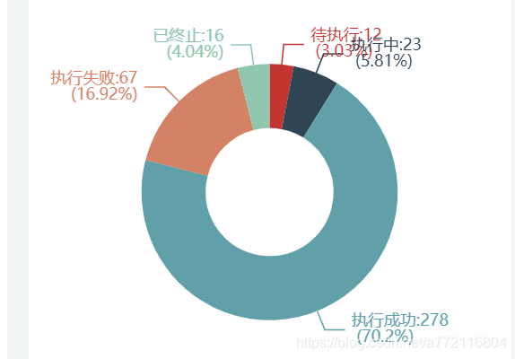
data: [
{ value: 12, name: "待执行" },
{ value: 23, name: "执行中" },
{ value: 278, name: "执行成功" },
{ value: 67, name: "执行失败" },
{ value: 16, name: "已终止" },
],
},
],
};
饼状图 legend 平铺底部展示
环形图
图例位置调整:
将图例位置从左侧垂直布局改为底部水平布局
使用 bottom: 0 和 left: 'center' 将图例置于底部居中
调整了图例项的大小 itemWidth: 15, itemHeight: 10
图表位置调整:
使用 center: ['50%', '40%'] 将图表主体向上移动,为底部图例留出空间
调整了饼图的半径,确保图表大小合适
样式优化:
添加了图例文字大小设置 fontSize: 12
为了更好的显示效果,将处理结果饼图的半径从 70% 调整为 65%
radius: ['30%', '50%'], // 设置饼图大小第一个参数是控制里面小圈的大小,第二个参数是控制外面大圈的大小;
legend: {
          orient: 'horizontal',
          bottom: 0,
          left: 'center',
          itemWidth: 15,
          itemHeight: 10,
          textStyle: {
            fontSize: 12
          }
        },

series: [{
          name: '违法处理率',
          type: 'pie',
          radius: ['50%', '70%'],// 设置饼图大小第一个参数是控制里面小圈的大小,第二个参数是控制外面大圈的大小;
          center: ['50%', '40%'],


        }]
前往低代码交流专区
更多推荐


 7
7 0
0- 0


 已为社区贡献60条内容

所有评论(0)