vue带缩略图的轮播图插件_带有缩略图轮播的自适应图像库
vue带缩略图的轮播图插件View demo查看演示Download Source下载源Today we want to show you how to create a responsive image gallery with a thumbnail carousel using Elastislide. Inspired by Twitter’s ...

vue带缩略图的轮播图插件
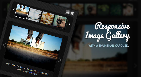
Today we want to show you how to create a responsive image gallery with a thumbnail carousel using Elastislide. Inspired by Twitter’s “user gallery” and upon a request to show an integration of Elastislide, we want to implement a responsive gallery that adapts to the view-port width. The gallery will have a view switch that allows to view it with the thumbnail carousel or without. We’ll also add the possibility to navigate with the keyboard.
今天,我们想向您展示如何使用Elastislide用缩略图轮播创建响应式图像库。 受Twitter的“用户画廊”的启发,并应要求显示Elastislide的集成,我们希望实现一个适应视口宽度的响应画廊。 画廊将具有一个视图开关,可以使用或不使用缩略图轮播对其进行查看。 我们还将添加使用键盘导航的可能性。
We’ll use the jQuery Touchwipe Plugin that will make it possible to navigate the images by “wiping” on the iPhone and iPad.
我们将使用jQuery Touchwipe插件,通过在iPhone和iPad上“擦拭”来导航图像。
The images in the demo are by über-talented Sherman Geronimo-Tan and you can find his Flickr photostream here: Sherman Geronimo-Tan’s Flickr Photostream The photos are licensed under the Creative Commons Attribution 2.0 Generic (CC BY 2.0) License.
演示中的图像是由über-talentedSherman Geronimo-Tan制作的,您可以在这里找到他的Flickr照片流: Sherman Geronimo-Tan的Flickr照片流这些照片均根据Creative Commons Attribution 2.0 Generic(CC BY 2.0)许可进行许可。
So, let’s do it!
所以,让我们开始吧!
标记 (The Markup)
For the HTML structure we’ll have a main wrapper with the class “rg-gallery”. We’ll also give it the same ID. In another div with the class “rg-thumbs” we’ll add the structure of the Elastislide carousel:
对于HTML结构,我们将有一个主包装,带有“ rg-gallery”类。 我们还将为其赋予相同的ID。 在“ rg-thumbs”类的另一个div中,我们将添加Elastislide轮播的结构:
<div id="rg-gallery" class="rg-gallery">
	<div class="rg-thumbs">
		<!-- Elastislide Carousel Thumbnail Viewer -->
		<div class="es-carousel-wrapper">
			<div class="es-nav">
				<span class="es-nav-prev">Previous</span>
				<span class="es-nav-next">Next</span>
			</div>
			<div class="es-carousel">
				<ul>
					<li>
						<a href="#">
							<img src="images/thumbs/1.jpg" data-large="images/1.jpg" alt="image01" data-description="Some description" />
						</a>
					</li>
					<li>...</li>
				</ul>
			</div>
		</div>
		<!-- End Elastislide Carousel Thumbnail Viewer -->
	</div><!-- rg-thumbs -->
</div><!-- rg-gallery -->
The thumbnails will have two data attributes that we’ll use later in our JavaScript. The “data-large” attribute will have the path to the large image and the “data-description” attribute will contain the caption of the image that we will display under the current large image.
缩略图将具有两个数据属性,稍后我们将在JavaScript中使用它们。 “ data-large”属性将具有指向大图像的路径,“ data-description”属性将包含将在当前大图像下显示的图像标题。
For the structure of the large preview area we will create a jQuery template that we’ll add to the head of our document:
对于大型预览区域的结构,我们将创建一个jQuery模板,该模板将添加到文档的开头:
<script id="img-wrapper-tmpl" type="text/x-jquery-tmpl">
	<div class="rg-image-wrapper">
		{{if itemsCount > 1}}
			<div class="rg-image-nav">
				<a href="#" class="rg-image-nav-prev">Previous Image</a>
				<a href="#" class="rg-image-nav-next">Next Image</a>
			</div>
		{{/if}}
		<div class="rg-image"></div>
		<div class="rg-loading"></div>
		<div class="rg-caption-wrapper">
			<div class="rg-caption" style="display:none;">
				<p></p>
			</div>
		</div>
	</div>
</script>
We are adding a condition that will make sure that the navigation is only shown if there is more than one image. The “rg-image” container will be used to add the large image.
我们添加了一个条件,以确保仅当有多个图像时才显示导航。 “ rg-image”容器将用于添加大图像。
Let’s take a look at the style.
让我们看一下样式。
CSS (The CSS)
Besides adjusting a few values like the padding and the margins of the Elastislide thumbnail carousel, we need to style the resting elements of the gallery.
除了调整一些值(如Elastislide缩略图轮播的填充和边距)外,我们还需要设置画廊休息元素的样式。
The “rg-image-wrapper” that you saw in our jQuery template will be of relative position and we’ll add a repeated semi-transparent black background image. The borders will be rounded and we’ll give it a min-height of 20 pixels so that the loading element fits into the container initially when the first image get’s loaded:
您在jQuery模板中看到的“ rg-image-wrapper”将处于相对位置,我们将添加重复的半透明黑色背景图像。 边框将被四舍五入,我们将为其设置最小高度20像素,以便在加载第一个图像时,加载元素最初适合容器:
.rg-image-wrapper{
	position:relative;
	padding:20px 30px;
	background:transparent url(../images/black.png) repeat top left;
	-moz-border-radius: 10px;
	-webkit-border-radius: 10px;
	border-radius: 10px;
	min-height:20px;
}
The container that we’ll use to add the big image will be relative and have a line-height of 0. By adding text-align “center” we make all inline elements align in the center. But since we’ll not set the image to “display:block”, we need to add a line-height of 0. This will make sure that there is no gap under the image which is an inline-element by default:
我们将用来添加大图的容器将是相对的,并且行高为0。通过添加text-align“ center”,我们使所有内联元素在中心对齐。 但是,由于我们不会将图片设置为“ display:block”,因此我们需要将line-height添加为0。这将确保图片下方没有间隙,默认情况下为inline-element:
.rg-image{
	position:relative;
	text-align:center;
	line-height:0px;
}
By setting the max-width of our large image to 100%, we make sure that it will always stay in the surrounding fluid container. This is very nicely explained in Fluid Images by Ethan Marcotte on A List Apart. Now, why setting the max-height to 100% as well? We actually don’t need this but if you would like to restrict the size of the preview area you could set a fixed height for the “rg-image” class and the image would fit in it while still resizing when the width of the view-port changes.
通过将大图像的最大宽度设置为100%,我们可以确保它始终留在周围的液体容器中。 Ethan Marcotte的《流体图像》在A List Apart上对此做了很好的解释。 现在,为什么还要将最大高度也设置为100%? 我们实际上不需要这个,但是如果您想限制预览区域的大小,则可以为“ rg-image”类设置一个固定的高度,并且图像将适合其中,同时在调整视图宽度时仍会调整大小端口更改。
.rg-image img{
	max-height:100%;
	max-width:100%;
}
Let’s style the navigation elements. The style of the arrow anchors will be the following:
让我们设置导航元素的样式。 箭头锚点的样式如下:
.rg-image-nav a{
	position:absolute;
	top:0px;
	left:0px;
	background:#000 url(../images/nav.png) no-repeat -20% 50%;
	width:28px;
	height:100%;
	text-indent:-9000px;
	cursor:pointer;
	opacity:0.3;
	outline:none;
	-moz-border-radius: 10px 0px 0px 10px;
	-webkit-border-radius: 10px 0px 0px 10px;
	border-radius: 10px 0px 0px 10px;
}
This is actually the style of the left arrow and now we’ll overwrite some properties for the right arrow:
这实际上是左箭头的样式,现在我们将覆盖右箭头的一些属性:
.rg-image-nav a.rg-image-nav-next{
	right:0px;
	left:auto;
	background-position:115% 50%;
	-moz-border-radius: 0px 10px 10px 0px;
	-webkit-border-radius: 0px 10px 10px 0px;
	border-radius: 0px 10px 10px 0px;
}
Since we already defined the left value for the elements in general we need to set it to auto again if we want to use “right” instead.
由于我们通常已经为元素定义了left值,因此,如果要使用“ right”,则需要再次将其设置为auto。
On hover we want to make them more opaque:
悬停时,我们要使它们更加不透明:
.rg-image-nav a:hover{
	opacity:0.8;
}
The caption will have the following style:
标题将具有以下样式:
.rg-caption {
	text-align:center;
	margin-top:15px;
	position:relative;
}
.rg-caption p{
	font-size:11px;
	letter-spacing:2px;
	font-family: 'Trebuchet MS', 'Myriad Pro', Arial, sans-serif;
	line-height:16px;
	padding:0 15px;
	text-transform:uppercase;
}
Now, let’s style the switch options:
现在,让我们设置开关选项的样式:
.rg-view{
	height:30px;
}
.rg-view a{
	display:block;
	float:right;
	width:16px;
	height:16px;
	margin-right:3px;
	background:#464646 url(../images/views.png) no-repeat top left;
	border:3px solid #464646;
	opacity:0.8;
}
.rg-view a:hover{
	opacity:1.0;
}
.rg-view a.rg-view-full{
	background-position:0px 0px;
}
.rg-view a.rg-view-selected{
	background-color:#6f6f6f;
	border-color:#6f6f6f;
}
.rg-view a.rg-view-thumbs{
	background-position:0px -16px;
}
And finally, we’ll make the loading element appear in the center of the image preview:
最后,我们将使loading元素出现在图像预览的中心:
.rg-loading{
	width:46px;
	height:46px;
	position:absolute;
	top:50%;
	left:50%;
	background:#000 url(../images/ajax-loader.gif) no-repeat center center;
	margin:-23px 0px 0px -23px;
	z-index:100;
	-moz-border-radius: 10px;
	-webkit-border-radius: 10px;
	border-radius: 10px;
	opacity:0.7;
}
And that’s all the style! Let’s take a look at the JavaScript.
这就是所有样式! 让我们看一下JavaScript。
JavaScript (The JavaScript)
The main idea of the gallery is to make it flexible, so partly we have achieved that by our style: the large image will adjust to the container. For making the thumbnail carousel responsive, we’ll use Elastislide, our previous plugin. First, lets define some variables:
画廊的主要思想是使其具有灵活性,因此我们在某种程度上已通过风格实现了这一目标:大图像将适应容器。 为了使缩略图轮播具有响应性,我们将使用我们之前的插件Elastislide。 首先,让我们定义一些变量:
	// gallery container
var $rgGallery			= $('#rg-gallery'),
	// carousel container
	$esCarousel			= $rgGallery.find('div.es-carousel-wrapper'),
	// the carousel items
	$items				= $esCarousel.find('ul > li'),
	// total number of items
	itemsCount			= $items.length;
Then we’ll define our gallery function:
然后,我们定义图库函数:
	Gallery				= (function() {
		//gallery function
	})();

Gallery.init();
Here we’ll define some variables for the current image, the mode and a variable for controlling if an image is being loaded. Then we’ll call some of our functions that are following below:
在这里,我们将为当前图像定义一些变量,模式以及用于控制是否加载图像的变量。 然后,我们将调用以下一些函数:
var current			= 0,
	// mode : carousel || fullview
	mode 			= 'carousel',
	// control if one image is being loaded
	anim			= false,
	init			= function() {

		// (not necessary) preloading the images here...
		$items.add('<img src="images/ajax-loader.gif"/><img src="images/black.png"/>').imagesLoaded( function() {
			// add options
			_addViewModes();

			// add large image wrapper
			_addImageWrapper();

			// show first image
			_showImage( $items.eq( current ) );
		});

		// initialize the carousel
		_initCarousel();

	},
We need to call the Elastislide plugin:
我们需要调用Elastislide插件:
_initCarousel	= function() {
	$esCarousel.show().elastislide({
		imageW 	: 65,
		onClick	: function( $item ) {
			if( anim ) return false;
			anim	= true;
			// on click show image
			_showImage($item);
			// change current
			current	= $item.index();
		}
	});

	// set elastislide's current to current
	$esCarousel.elastislide( 'setCurrent', current );

},
Read more about Elastislide’s options here: Elastislide – A Responsive jQuery Carousel Plugin.
在此处阅读有关Elastislide选项的更多信息: Elastislide –响应式jQuery Carousel插件。
Our next function will take care of the viewing modes and what happens when we switch the views:
我们的下一个功能将负责查看模式以及切换视图时发生的情况:
_addViewModes	= function() {

	// top right buttons: hide / show carousel

	var $viewfull	= $('<a href="#" class="rg-view-full"></a>'),
		$viewthumbs	= $('<a href="#" class="rg-view-thumbs rg-view-selected"></a>');

	$rgGallery.prepend( $('<div class="rg-view"/>').append( $viewfull ).append( $viewthumbs ) );

	$viewfull.bind('click.rgGallery', function( event ) {
		$esCarousel.elastislide( 'destroy' ).hide();
		$viewfull.addClass('rg-view-selected');
		$viewthumbs.removeClass('rg-view-selected');
		mode	= 'fullview';
		return false;
	});

	$viewthumbs.bind('click.rgGallery', function( event ) {
		_initCarousel();
		$viewthumbs.addClass('rg-view-selected');
		$viewfull.removeClass('rg-view-selected');
		mode	= 'carousel';
		return false;
	});

},
The _addImageWrapper function adds the structure for the large image and the navigation buttons if the number of total items is greater than one. It also initializes the navigation events. Using the jQuery Touchwipe Plugin, we’ll add support for the wipe gesture and also for keyboard navigation:
如果总项数大于一,则_addImageWrapper函数将为大图像和导航按钮添加结构。 它还会初始化导航事件。 使用jQuery Touchwipe插件,我们将添加对划像手势以及键盘导航的支持:
_addImageWrapper= function() {

	$('#img-wrapper-tmpl').tmpl( {itemsCount : itemsCount} ).appendTo( $rgGallery );

	if( itemsCount > 1 ) {
		// addNavigation
		var $navPrev		= $rgGallery.find('a.rg-image-nav-prev'),
			$navNext		= $rgGallery.find('a.rg-image-nav-next'),
			$imgWrapper		= $rgGallery.find('div.rg-image');

		$navPrev.bind('click.rgGallery', function( event ) {
			_navigate( 'left' );
			return false;
		});

		$navNext.bind('click.rgGallery', function( event ) {
			_navigate( 'right' );
			return false;
		});

		// add touchwipe events on the large image wrapper
		$imgWrapper.touchwipe({
			wipeLeft			: function() {
				_navigate( 'right' );
			},
			wipeRight			: function() {
				_navigate( 'left' );
			},
			preventDefaultEvents: false
		});

		$(document).bind('keyup.rgGallery', function( event ) {
			if (event.keyCode == 39)
				_navigate( 'right' );
			else if (event.keyCode == 37)
				_navigate( 'left' );
		});

	}

},
The navigation through the large images is controlled by the following function:
大图像的导航由以下功能控制:
_navigate		= function( dir ) {

	if( anim ) return false;
	anim	= true;

	if( dir === 'right' ) {
		if( current + 1 >= itemsCount )
			current = 0;
		else
			++current;
	}
	else if( dir === 'left' ) {
		if( current - 1 < 0 )
			current = itemsCount - 1;
		else
			--current;
	}

	_showImage( $items.eq( current ) );

},
Depening in which direction we are moving, we are setting the current element to one less or one more.
取决于我们朝哪个方向移动,我们将当前元素设置为少一或多一。
And finally we’ll define the _showImage function that will add the large image and its caption:
最后,我们将定义_showImage函数,该函数将添加大图像及其标题:
_showImage		= function( $item ) {

	// shows the large image that is associated to the $item

	var $loader	= $rgGallery.find('div.rg-loading').show();

	$items.removeClass('selected');
	$item.addClass('selected');

	var $thumb		= $item.find('img'),
		largesrc	= $thumb.data('large'),
		title		= $thumb.data('description');

	$('<img/>').load( function() {

		$rgGallery.find('div.rg-image').empty().append('<img src="' + largesrc + '"/>');

		if( title )
			$rgGallery.find('div.rg-caption').show().children('p').empty().text( title );

		$loader.hide();

		if( mode === 'carousel' ) {
			$esCarousel.elastislide( 'reload' );
			$esCarousel.elastislide( 'setCurrent', current );
		}

		anim	= false;

	}).attr( 'src', largesrc );

};

return { init : init };
And that’s all folks! I hope you enjoyed this gallery tutorial and find it useful!
这就是所有人! 我希望您喜欢这个画廊教程并发现它有用!
翻译自: https://tympanus.net/codrops/2011/09/20/responsive-image-gallery/
vue带缩略图的轮播图插件

前往低代码交流专区
更多推荐

 1
1 0
0- 0


 已为社区贡献1条内容

所有评论(0)