Timeline bar graph using python and matplotlib
Answer a question
I am looking to draw a timeline bar graph using matplotlib that will show the things a person did in one day. I am adding the code below's output and an expected output that I am looking for. Any library can be used, in my case the closest I could get to was using matplotlib. Any help would be greatly appreciated.
import datetime as dt
import pandas as pd
import matplotlib.pyplot as plt
import numpy as np

data = [    (dt.datetime(2018, 7, 17, 0, 15), dt.datetime(2018, 7, 17, 0, 30), 'sleep'),
            (dt.datetime(2018, 7, 17, 0, 30), dt.datetime(2018, 7, 17, 0, 45), 'eat'),
            (dt.datetime(2018, 7, 17, 0, 45), dt.datetime(2018, 7, 17, 1, 0), 'work'),
            (dt.datetime(2018, 7, 17, 1, 0), dt.datetime(2018, 7, 17, 1, 30), 'sleep'),
            (dt.datetime(2018, 7, 17, 1, 15), dt.datetime(2018, 7, 17, 1, 30), 'eat'),
            (dt.datetime(2018, 7, 17, 1, 30), dt.datetime(2018, 7, 17, 1, 45), 'work')
        ]

rng=[]
for i in range(len(data)):
    rng.append((data[i][0]).strftime('%H:%M'))

index={}
activity = []
for i in range(len(data)):
    index[(data[i][2])]=[]
    activity.append(data[i][2])

for i in range(len(index)):
    for j in range(len(activity)):
        if activity[j]==index.keys()[i]:
            index[index.keys()[i]].append(15)
        else:
            index[index.keys()[i]].append(0)

data = list(index.values())
df = pd.DataFrame(data,index=list(index.keys()))
df.plot.barh(stacked=True, sharex=False)
plt.show()
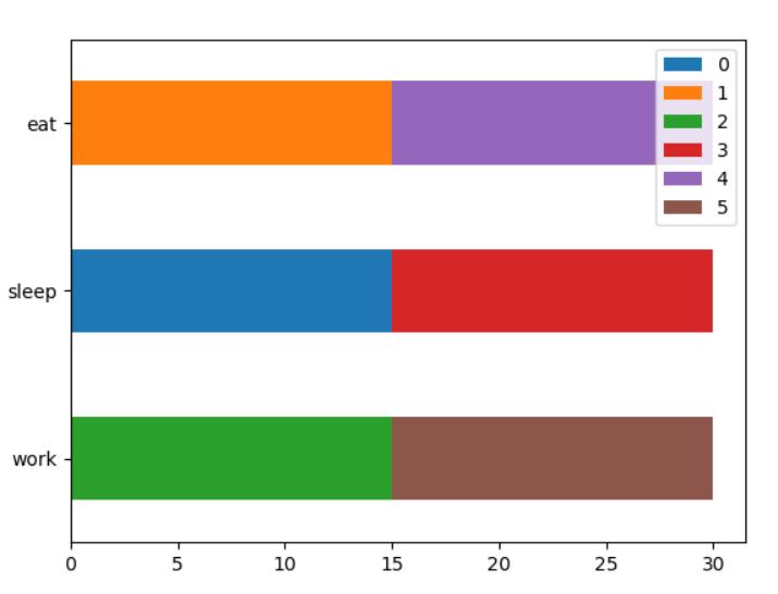
My Output:
Using matplotlib this is what I was getting
Expected Output:
I got this using google charts' Timeline graph but I need this using python and the data used for generating both graphs is not exactly the same, I hope you get the point 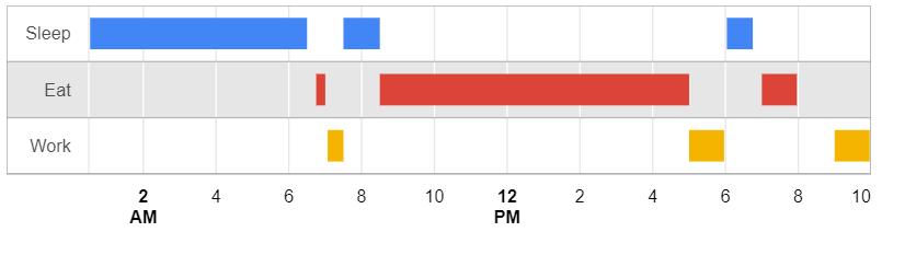
Answers
You may create a PolyCollection of "bars". For this you would need to convert your dates to numbers (matplotlib.dates.date2num).
import datetime as dt
import matplotlib.pyplot as plt
import matplotlib.dates as mdates
from matplotlib.collections import PolyCollection

data = [    (dt.datetime(2018, 7, 17, 0, 15), dt.datetime(2018, 7, 17, 0, 30), 'sleep'),
            (dt.datetime(2018, 7, 17, 0, 30), dt.datetime(2018, 7, 17, 0, 45), 'eat'),
            (dt.datetime(2018, 7, 17, 0, 45), dt.datetime(2018, 7, 17, 1, 0), 'work'),
            (dt.datetime(2018, 7, 17, 1, 0), dt.datetime(2018, 7, 17, 1, 30), 'sleep'),
            (dt.datetime(2018, 7, 17, 1, 15), dt.datetime(2018, 7, 17, 1, 30), 'eat'),
            (dt.datetime(2018, 7, 17, 1, 30), dt.datetime(2018, 7, 17, 1, 45), 'work')
        ]

cats = {"sleep" : 1, "eat" : 2, "work" : 3}
colormapping = {"sleep" : "C0", "eat" : "C1", "work" : "C2"}

verts = []
colors = []
for d in data:
    v =  [(mdates.date2num(d[0]), cats[d[2]]-.4),
          (mdates.date2num(d[0]), cats[d[2]]+.4),
          (mdates.date2num(d[1]), cats[d[2]]+.4),
          (mdates.date2num(d[1]), cats[d[2]]-.4),
          (mdates.date2num(d[0]), cats[d[2]]-.4)]
    verts.append(v)
    colors.append(colormapping[d[2]])

bars = PolyCollection(verts, facecolors=colors)

fig, ax = plt.subplots()
ax.add_collection(bars)
ax.autoscale()
loc = mdates.MinuteLocator(byminute=[0,15,30,45])
ax.xaxis.set_major_locator(loc)
ax.xaxis.set_major_formatter(mdates.AutoDateFormatter(loc))

ax.set_yticks([1,2,3])
ax.set_yticklabels(["sleep", "eat", "work"])
plt.show()
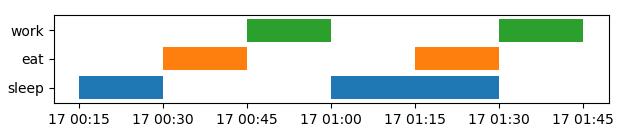
Note that such plots can equally be generated with a Broken Bar plot (broken_barh), however, the (unsorted) data used here, make it a bit easier using a PolyCollection.
And now you would need to explain to me how you can sleep and eat at the same time - something I can never quite get at, as hard as I try.

Python社区为您提供最前沿的新闻资讯和知识内容
更多推荐

 0
0 0
0- 0


 已为社区贡献126440条内容

所有评论(0)