Create A Multi-page Interactive Dashboard with Streamlit and Plotly
The great thing about Streamlit is, not only is it beautiful, but it's simple, too.
A few months ago I wrote about how to write a dashboard using Plotly and Flask - it was an alternative approach to using Dash and I was quite pleased with it. The app consisted of two files, a Python/Flask app of 20-odd lines and an HTML/Javascript file of nearly 30 lines. You can see the article here:
An Interactive Web Dashboard with Plotly and Flask towardsdatascience.com
Then I decided to have a go at implementing the same thing using Streamlit: the result a single Python file of around a dozen lines. A quarter of the size! And not only was it easy and quick to write, it was better looking, too.
So, I thought I'd share my experience of creating, first, a simple interactive Streamlit app with Plotly charts and then developing it into a more sophisticated (but still simple) multi-page app. Along the way I look at how to draw Plotly charts, control layout in Streamlit and navigating with drop-down menus.
The first app will be a clone of my Flask app and will look like this:
 A simple Streamlit app -image by author
The user selects a country from the drop-down menu on the left and the appropriate graph is drawn on the right.
A Streamlit app is just a Python program that uses the Streamlit library and is run using the Streamlit command from a terminal window. e.g.
streamlit run myapp.py
It will then fire up your browser and run the app there.
First things first, though. To use Streamlit you obviously have to install it:
pip3 install streamlit
Or conda, or whatever other arcane method you use to install Python packages.
A simple Streamlit app
You start your Python program with something like this:
import streamlit as st
import pandas as pd
import plotly.express as px
I'm going to use Pandas to store and manipulate the data and Plotly to create the charts.
For demonstration purposes I'm using the Gapminder data included in the Plotly package. So, the next bit of code is:
df = pd.DataFrame(px.data.gapminder())
This creates a dataframe that holds a table of information about all the countries the world and looks like this:
 Country data -image by author
Each country is listed in the table along with data about life expectancy, population and GDP per capita over a few decades. The continent for each country is also given (there are other data, too, but they are not of interest, here).
What we are initially going to do is create plots of population and GDP per capita for a selected nation. So, we need a list of country names from which the user can select. This is easily achieved by selecting the country column from the dataframe and creating a list of unique names.
clist = df['country'].unique()
After running this we have a list of unique names in the variable clist.
 The country list - image by author
The drop-down menu is created in a sidebar from clist like this:
country = st.sidebar.selectbox("Select a country:",clist)
All of the Streamlit functions start with st. st.sidebar creates a sidebar on the left of the screen and .selectbox creates a drop-down from the list using the prompt provided in the first parameter.
Next we draw the chart.
fig = px.line(df[df['country'] == country],
    x = "year", y = "gdpPercap", title = country)
Here you can see we are creating a line chart in the variable fig by selecting only the rows in the dataframe that correspond to the chosen country.
The entire program is shown below and, as I mentioned earlier, it is only around a dozen lines of code.
import streamlit as st
import pandas as pd
import plotly.express as px

df = pd.DataFrame(px.data.gapminder())
clist = df['country'].unique()

country = st.sidebar.selectbox("Select a country:",clist)

st.header("GDP per Capita over time")

fig = px.line(df[df['country'] == country],
    x = "year", y = "gdpPercap", title = country)
st.plotly_chart(fig)
There a couple of lines that I haven't covered. st.header("GDP per Capita over time") creates a heading and st.plotly_chart(fig) plots the chart.
And when we run the program we get this:
A simple Streamlit app -image by author
Which is, I think, pretty good for such a tiny program.
But it gets better.
Multi-page app
As part of my efforts to persuade myself that I could make apps as easily with Flask and HTML as I could with Dash, I created a simple multi-page app that used the same HTML template for each page but loaded different data into it from Flask. You can see the article here:
Web Visualization with Plotly and Flask. towardsdatascience.com
It' a different story with Streamlit. There's no specific support for multiple page and I'm guessing that's not an omission. Streamlit just isn't meant for creating whole web sites.
But sometimes a little pagination is useful so I wrote a new app that expands on the first, gives more information and runs over two pages. It looks better, too!
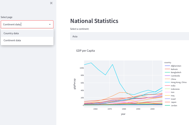
The aim is to have two pages, one for countries and the other for continents. On each page you can select a country or continent and you'll get two graphs, one for GDP and the other for population. You can see what the continent page looks like below.
 A multi-page Streamlit app -image by author
Actually, maybe you can't see it that well, so here is a zoomed in image of the left of the page.
 Detail from a multi-page Streamlit app -image by author
On the left is the sidebar with a drop-down menu where you select either country or continent. the main part of the page holds the graphs and has its own drop-down to select which continent (Europe, Asia, etc.) or which country.
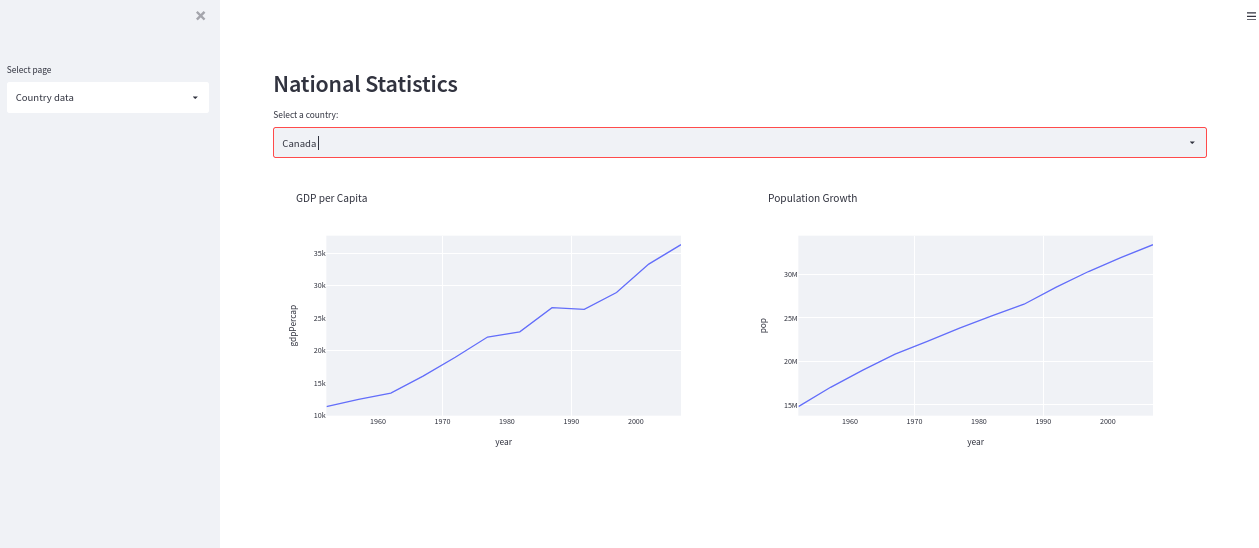
The country page looks like this.
 A multi-page Streamlit app -image by author
The method is easy. Just use the value returned from the drop-down menu in the sidebar in an if... else statement and display the appropriate data in the if block or the else block. The code looks like this:
page = st.sidebar.selectbox('Select page',
  ['Country data','Continent data'])

if page == 'Country data':
  # Display the country content here
else:
  # Display the continent content here
I'm using columns to display the charts side by side and I've set the layout to wide to give myself a bit more space.
Other than that, the code that replaces those comments is pretty much the same as we have seen in the first example.
Here's the full listing:
import streamlit as st
import pandas as pd
import plotly.express as px

st.set_page_config(layout = "wide")

df = pd.DataFrame(px.data.gapminder())

st.header("National Statistics")

page = st.sidebar.selectbox('Select page',
  ['Country data','Continent data'])

if page == 'Country data':
  ## Countries
  clist = df['country'].unique()

  country = st.selectbox("Select a country:",clist)

  col1, col2 = st.columns(2)

  fig = px.line(df[df['country'] == country],
    x = "year", y = "gdpPercap",title = "GDP per Capita")

  col1.plotly_chart(fig,use_container_width = True)

  fig = px.line(df[df['country'] == country],
    x = "year", y = "pop",title = "Population Growth")

  col2.plotly_chart(fig,use_container_width = True)

else:
  ## Continents
  contlist = df['continent'].unique()

  continent = st.selectbox("Select a continent:",contlist)

  col1,col2 = st.columns(2)

  fig = px.line(df[df['continent'] == continent],
    x = "year", y = "gdpPercap",
    title = "GDP per Capita",color = 'country')

  col1.plotly_chart(fig)

  fig = px.line(df[df['continent'] == continent],
    x = "year", y = "pop",
    title = "Population",color = 'country')

  col2.plotly_chart(fig, use_container_width = True)
Now, if I were clever, I'd realise that I've got a fair amount of very similar code in this app and so would write some functions to reduce this. But I'll leave it as it is for now.
Pros and cons
Streamlit is easy to use and produces very nice results but it is only designed for fairly simple apps. Multi-page apps with complex layouts are not really what it is intended for and that is fair enough.
Thanks for reading and if you would like to hear from me now and again about articles that I publish, please consider subscribing to my free newsletter Technofile or visit my Github page.
You can get the code for this and other articles on Github and see a demo of the final app here.

Python社区为您提供最前沿的新闻资讯和知识内容
更多推荐

 0
0 0
0- 0


 已为社区贡献126442条内容

所有评论(0)