
构建 Tailwind CSS 表单和输入组件
我在我的项目中经常使用 Tailwind CSS,并且在构建 Web 用户界面时,我非常喜欢这种实用程序优先的方法。 我确实遇到的一个问题是每次开始一个新项目时都必须设计和编码一些常用的 Web 组件。 [](https://res.cloudinary.com/practicaldev/image/fetch/s--sIGRzOWc--/c_limit%2Cf_auto%2Cfl_progres
我在我的项目中经常使用 Tailwind CSS,并且在构建 Web 用户界面时,我非常喜欢这种实用程序优先的方法。
我确实遇到的一个问题是每次开始一个新项目时都必须设计和编码一些常用的 Web 组件。
[ ](https://res.cloudinary.com/practicaldev/image/fetch/s--sIGRzOWc--/c_limit%2Cf_auto%2Cfl_progressive%2Cq_auto%2Cw_880/https://dev- to-uploads.s3.amazonaws.com/uploads/articles/8z32ac6bkppo37vndylu.png)
这就是为什么我决定开始一个教程系列,向您展示如何仅使用 Tailwind CSS 中的实用程序类来构建一些最常用的 Web 组件,例如按钮、下拉菜单、导航栏等。
上次我向您展示了如何使用 Tailwind CSS](https://dev.to/themesberg/building-a-tailwind-css-dropdown-component-ban)构建一个[下拉组件,今天我想向您展示如何设计和构建表单输入元素。
Tailwind CSS 中的表单输入元素
首先,让我们为单个文本输入元素和一个标签构建样式。让我们先构建 HTML:
<label for="email">Your email</label>
<input type="email" id="email" placeholder="name@flowbite.com" required>
进入全屏模式 退出全屏模式
伟大的。我们仍然需要应用一些样式。让我们为标签和输入元素添加一些基本样式。
<label for="email" class="text-sm font-medium text-gray-900 block mb-2">Your email</label>
<input type="email" id="email" class="bg-gray-50 border border-gray-300 text-gray-900 sm:text-sm rounded-lg block w-full p-2.5" placeholder="name@flowbite.com" required>
进入全屏模式 退出全屏模式
看起来更好!让我们也添加一些focus样式。
<label for="email" class="text-sm font-medium text-gray-900 block mb-2">Your email</label>
    <input type="email" id="email" class="bg-gray-50 border border-gray-300 text-gray-900 sm:text-sm rounded-lg focus:ring-blue-500 focus:border-blue-500 block w-full p-2.5" placeholder="name@flowbite.com" required>
进入全屏模式 退出全屏模式
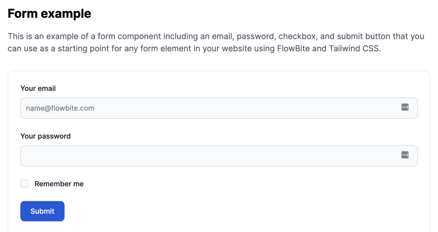
虽然这看起来不错,但输入元素通常是form元素的一部分,并且有多个输入。
这是一个简单的身份验证表单的示例。
<form>
  <div class="mb-6">
    <label for="email" class="text-sm font-medium text-gray-900 block mb-2">Your email</label>
    <input type="email" id="email" class="bg-gray-50 border border-gray-300 text-gray-900 sm:text-sm rounded-lg focus:ring-blue-500 focus:border-blue-500 block w-full p-2.5" placeholder="name@flowbite.com" required="">
  </div>
  <div class="mb-6">
    <label for="password" class="text-sm font-medium text-gray-900 block mb-2">Your password</label>
    <input type="password" id="password" class="bg-gray-50 border border-gray-300 text-gray-900 sm:text-sm rounded-lg focus:ring-blue-500 focus:border-blue-500 block w-full p-2.5" required="">
  </div>
  <div class="flex items-start mb-6">
    <div class="flex items-center h-5">
      <input id="remember" aria-describedby="remember" type="checkbox" class="bg-gray-50 border-gray-300 focus:ring-3 focus:ring-blue-300 h-4 w-4 rounded" required="">
    </div>
    <div class="text-sm ml-3">
      <label for="remember" class="font-medium text-gray-900">Remember me</label>
    </div>
  </div>
  <button type="submit" class="text-white bg-blue-700 hover:bg-blue-800 focus:ring-4 focus:ring-blue-300 font-medium rounded-lg text-sm px-5 py-2.5 text-center">Login</button>
</form>
进入全屏模式 退出全屏模式
这些Tailwind CSS 表单输入元素是名为Flowbite的更大的开源 Tailwind CSS 组件库的一部分。
[ ](https://res.cloudinary.com/practicaldev/image/fetch/s--nBzNtyj6--/c_limit%2Cf_auto%2Cfl_progressive%2Cq_auto%2Cw_880/https://dev- to-uploads.s3.amazonaws.com/uploads/articles/4n9e8c2gtup11i81feg9.png)
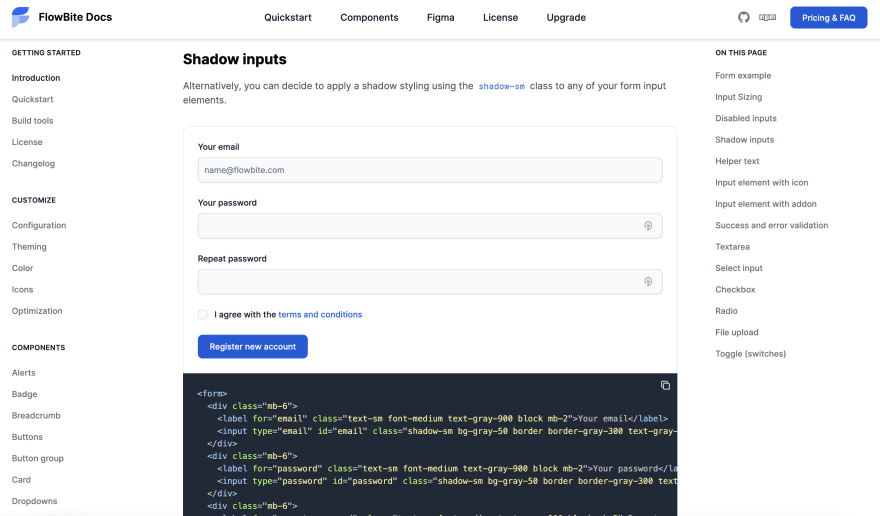
如果您想查看更多表单输入元素,例如复选框、单选框、成功和错误消息样式,请务必查看 Flowbite 的Tailwind CSS Forms部分。

ModelScope旨在打造下一代开源的模型即服务共享平台,为泛AI开发者提供灵活、易用、低成本的一站式模型服务产品,让模型应用更简单!
更多推荐
 0
0 0
0- 0


 已为社区贡献27141条内容

所有评论(0)