
构建 Tailwind CSS 复选框和单选输入字段
自从我使用 Tailwind CSS 以来,它彻底改变了我构建用户界面的方式,就目前的情况而言,我无法想象回到 OOCSS 框架,例如 Bootstrap。它只是更快。
[ ](https://res.cloudinary.com/practicaldev/image/fetch/s--rLhIkLGQ--/c_limit%2Cf_auto%2Cfl_progressive%2Cq_auto%2Cw_880/https://dev -to-uploads.s3.amazonaws.com/uploads/articles/j4dkspfv7izwxlhza4go.png)
然而,我遇到的一个缺点是没有可以立即开始使用的组件。我知道 Tailwind CSS 应该是一个实用程序优先的框架,但这并不意味着几个常用的 Web 组件,例如按钮、下拉列表、表单没有帮助。
这就是为什么我在 DEV 社区开始了 Tailwind CSS 组件教程系列的原因。上次我向您展示了如何使用 Tailwind CSS](https://dev.to/themesberg/building-tailwind-css-form-and-input-components-2ang)构建带有输入字段的[表单,今天我将向您展示如何构建复选框和单选输入元素。
让我们开始吧!
Tailwind CSS 复选框
首先,让我们为复选框字段构建 HTML 标记。
<div>
      <input id="flowbite" aria-describedby="flowbite" type="checkbox">
      <label for="flowbite">I love how Flowbite works</label>
</div>
进入全屏模式 退出全屏模式
我添加了一个额外的div元素,以便我们可以包装input和label元素。
现在让我们为复选框元素添加一些样式:
<div>
      <input class="bg-gray-50 border-gray-300 focus:ring-3 focus:ring-blue-300 h-4 w-4 rounded" id="flowbite" aria-describedby="flowbite" type="checkbox">
      <label for="flowbite">I love how Flowbite works</label>
</div>
进入全屏模式 退出全屏模式
很酷。您当然可以决定是否要使用蓝色或其他颜色。
现在让我们也为label元素添加一些样式:
<div>
      <input class="bg-gray-50 border-gray-300 focus:ring-3 focus:ring-blue-300 h-4 w-4 rounded" id="flowbite" aria-describedby="flowbite" type="checkbox">
      <label class="text-sm ml-3 font-medium text-gray-900" for="flowbite">I love how Flowbite works</label>
</div>
进入全屏模式 退出全屏模式
最后,我们还应该为包装器div元素添加一些样式:
<div class="flex items-start items-center">
      <input class="bg-gray-50 border-gray-300 focus:ring-3 focus:ring-blue-300 h-4 w-4 rounded" id="flowbite" aria-describedby="flowbite" type="checkbox">
      <label class="text-sm ml-3 font-medium text-gray-900" for="flowbite">I love how Flowbite works</label>
</div>
进入全屏模式 退出全屏模式
惊人的!您已经使用 Tailwind CSS 创建了一个复选框元素。
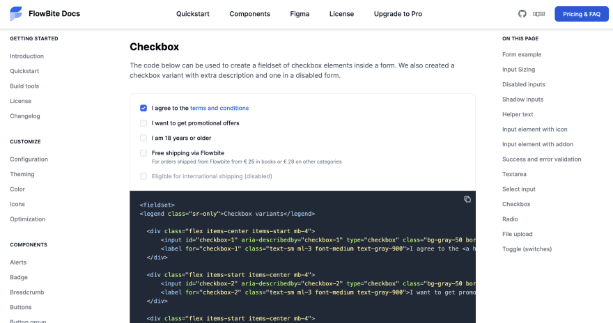
这是一个包含多个复选框元素的字段集示例,您可以使用:
<fieldset>
<legend class="sr-only">Checkbox variants</legend>

  <div class="flex items-center items-start mb-4">
      <input id="checkbox-1" aria-describedby="checkbox-1" type="checkbox" class="bg-gray-50 border-gray-300 focus:ring-3 focus:ring-blue-300 h-4 w-4 rounded" checked="">
      <label for="checkbox-1" class="text-sm ml-3 font-medium text-gray-900">I agree to the <a href="#" class="text-blue-600 hover:underline">terms and conditions</a></label>
  </div>

  <div class="flex items-start items-center mb-4">
      <input id="checkbox-2" aria-describedby="checkbox-2" type="checkbox" class="bg-gray-50 border-gray-300 focus:ring-3 focus:ring-blue-300 h-4 w-4 rounded">
      <label for="checkbox-2" class="text-sm ml-3 font-medium text-gray-900">I want to get promotional offers</label>
  </div>

  <div class="flex items-start items-center mb-4">
      <input id="checkbox-3" aria-describedby="checkbox-3" type="checkbox" class="bg-gray-50 border-gray-300 focus:ring-3 focus:ring-blue-300 h-4 w-4 rounded">
      <label for="checkbox-3" class="text-sm ml-3 font-medium text-gray-900">I am 18 years or older</label>
  </div>

  <div class="flex items-start mb-4">
    <div class="flex items-center h-5">
      <input id="shipping-2" aria-describedby="shipping-2" type="checkbox" class="bg-gray-50 border-gray-300 focus:ring-3 focus:ring-blue-300 h-4 w-4 rounded">
    </div>
    <div class="text-sm ml-3">
      <label for="shipping-2" class="font-medium text-gray-900">Free shipping via Flowbite</label>
      <div class="text-gray-500"><span class="font-normal text-xs">For orders shipped from Flowbite from <span class="font-medium">€ 25</span> in books or <span>€ 29</span> on other categories</span></div>
    </div>
  </div>

  <div class="flex items-start items-center">
      <input id="international-shipping-disabled" aria-describedby="international-shipping-disabled" type="checkbox" class="bg-gray-50 border-gray-300 focus:ring-3 focus:ring-blue-300 h-4 w-4 rounded" disabled="">
      <label for="international-shipping-disabled" class="text-sm ml-3 font-medium text-gray-400">Eligible for international shipping (disabled)</label>
  </div>
</fieldset>
进入全屏模式 退出全屏模式
最终结果应如下所示:
[ ](https://res.cloudinary.com/practicaldev/image/fetch/s--Bm8Q08zj--/c_limit%2Cf_auto%2Cfl_progressive%2Cq_auto%2Cw_880/https://dev-to -uploads.s3.amazonaws.com/uploads/articles/k32nmodnm4dfefqogho1.png)
Tailwind CSS 收音机
我们将构建的下一个元素与第一个元素非常相似,但这次它将是一个无线电类型。
单选输入字段与复选框不同,因为当与其他单选输入以相同的形式放在一起时,您只能选择一个选项,而使用复选框元素,您可以选择任意数量的选项。
这是您可以在样式方面使用的无线电输入字段集:
<fieldset>
  <legend class="sr-only">
    Countries
  </legend>

  <div class="flex items-center mb-4">
    <input id="country-option-1" type="radio" name="countries" value="USA" class="h-4 w-4 border-gray-300 focus:ring-2 focus:ring-blue-300" aria-labelledby="country-option-1" aria-describedby="country-option-1" checked>
    <label for="country-option-1" class="text-sm font-medium text-gray-900 ml-2 block">
      United States
    </label>
  </div>

  <div class="flex items-center mb-4">
    <input id="country-option-2" type="radio" name="countries" value="Germany" class="h-4 w-4 border-gray-300 focus:ring-2 focus:ring-blue-300" aria-labelledby="country-option-2" aria-describedby="country-option-2">
    <label for="country-option-2" class="text-sm font-medium text-gray-900 ml-2 block">
      Germany
    </label>
  </div>

  <div class="flex items-center mb-4">
    <input id="country-option-3" type="radio" name="countries" value="Spain" class="h-4 w-4 border-gray-300 focus:ring-2 focus:ring-blue-300" aria-labelledby="country-option-3" aria-describedby="country-option-3">
    <label for="country-option-3" class="text-sm font-medium text-gray-900 ml-2 block">
      Spain
    </label>
  </div>

  <div class="flex items-center mb-4">
    <input id="country-option-4" type="radio" name="countries" value="United Kingdom" class="h-4 w-4 border-gray-300 focus:ring-2 focus:ring-blue-300" aria-labelledby="country-option-4" aria-describedby="country-option-4">
    <label for="country-option-4" class="text-sm font-medium text-gray-900 ml-2 block">
      United Kingdom
    </label>
  </div>

  <div class="flex items-center">
    <input id="option-disabled" type="radio" name="countries" value="China" class="h-4 w-4 border-gray-200 focus:ring-2 focus:ring-blue-300" aria-labelledby="option-disabled" aria-describedby="option-disabled" disabled>
    <label for="option-disabled" class="text-sm font-medium text-gray-400 ml-2 block">
      China (disabled)
    </label>
  </div>
</fieldset>
进入全屏模式 退出全屏模式
最终结果应如下所示:
[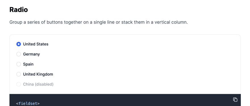 ](https://res.cloudinary.com/practicaldev/image/fetch/s--h7lrrg14--/c_limit%2Cf_auto%2Cfl_progressive%2Cq_auto%2Cw_880/https://dev-to -uploads.s3.amazonaws.com/uploads/articles/hfrub57pyqu7rml7padu.png)
Flowbite - Tailwind CSS 组件库
我希望本教程对您的 Web 开发之旅和项目有所帮助。请允许我通知您,这些Tailwind CSS 复选框和Tailwind CSS radio组件是更大的开源Tailwind CSS 组件库的一部分,称为 Flowbite。
[ ](https://res.cloudinary.com/practicaldev/image/fetch/s--0komIXdo--/c_limit%2Cf_auto%2Cfl_progressive%2Cq_auto%2Cw_880/https://dev- to-uploads.s3.amazonaws.com/uploads/articles/8clb9q846irlr4s7p3oh.png)
随意查看它,因为它包含数百个使用 Tailwind CSS 实用程序优先类的组件。你也可以选择从官方 Github Repository克隆它。

ModelScope旨在打造下一代开源的模型即服务共享平台,为泛AI开发者提供灵活、易用、低成本的一站式模型服务产品,让模型应用更简单!
更多推荐
 0
0 0
0- 0


 已为社区贡献27136条内容

所有评论(0)