
如何使用 Tailwind CSS 和 Flowbite 构建 toast(通知)组件
Tailwind CSS 是基于实用程序优先方法的最流行的开源 CSS 框架之一,据估计,今年它在 NPM 上的每周下载量将超过 Bootstrap。
Flowbite是一个基于 Tailwind CSS 的开源组件库,具有暗模式支持、Figma 设计系统、按钮、下拉菜单、模式、导航栏等组件。
[ ](https://res.cloudinary.com/practicaldev/image/fetch/s--kpVuoewp--/c_limit%2Cf_auto%2Cfl_progressive%2Cq_auto%2Cw_880/https://dev-to -uploads.s3.amazonaws.com/uploads/articles/d1f5wzbxp7sd3ezsi2mn.png)
在本文中,我想向您展示如何使用 Flowbite 为您的 Tailwind CSS 项目构建一个 toast/notification 组件。
让我们开始吧!
Tailwind CSS toast 组件
首先,我们应该设置语义 HTML5 标记:
<div id="toast-default" role="alert">
    <div>Set yourself free.</div>
</div>
进入全屏模式 退出全屏模式
现在让我们为 toast 包装器和里面的文本添加一些样式:
<div id="toast-default" class="flex items-center w-full max-w-xs p-4 text-gray-500 bg-white rounded-lg shadow dark:text-gray-400 dark:bg-gray-800" role="alert">
    <div class="ml-3 text-sm font-normal">Set yourself free.</div>
</div>
进入全屏模式 退出全屏模式
Toast 和通知弹出窗口应该始终有一个关闭图标。让我们使用 SVG X 图标:
<div id="toast-default" class="flex items-center w-full max-w-xs p-4 text-gray-500 bg-white rounded-lg shadow dark:text-gray-400 dark:bg-gray-800" role="alert">
    <div class="ml-3 text-sm font-normal">Set yourself free.</div>
    <button type="button" class="ml-auto -mx-1.5 -my-1.5 bg-white text-gray-400 hover:text-gray-900 rounded-lg focus:ring-2 focus:ring-gray-300 p-1.5 hover:bg-gray-100 inline-flex h-8 w-8 dark:text-gray-500 dark:hover:text-white dark:bg-gray-800 dark:hover:bg-gray-700" aria-label="Close">
        <span class="sr-only">Close</span>
        <svg class="w-5 h-5" fill="currentColor" viewBox="0 0 20 20" xmlns="http://www.w3.org/2000/svg"><path fill-rule="evenodd" d="M4.293 4.293a1 1 0 011.414 0L10 8.586l4.293-4.293a1 1 0 111.414 1.414L11.414 10l4.293 4.293a1 1 0 01-1.414 1.414L10 11.414l-4.293 4.293a1 1 0 01-1.414-1.414L8.586 10 4.293 5.707a1 1 0 010-1.414z" clip-rule="evenodd"></path></svg>
    </button>
</div>
进入全屏模式 退出全屏模式
让我们在文本前添加一个描述性图标:
<div id="toast-default" class="flex items-center w-full max-w-xs p-4 text-gray-500 bg-white rounded-lg shadow dark:text-gray-400 dark:bg-gray-800" role="alert">
    <div class="inline-flex items-center justify-center flex-shrink-0 w-8 h-8 text-blue-500 bg-blue-100 rounded-lg dark:bg-blue-800 dark:text-blue-200">
        <svg class="w-5 h-5" fill="currentColor" viewBox="0 0 20 20" xmlns="http://www.w3.org/2000/svg"><path fill-rule="evenodd" d="M12.395 2.553a1 1 0 00-1.45-.385c-.345.23-.614.558-.822.88-.214.33-.403.713-.57 1.116-.334.804-.614 1.768-.84 2.734a31.365 31.365 0 00-.613 3.58 2.64 2.64 0 01-.945-1.067c-.328-.68-.398-1.534-.398-2.654A1 1 0 005.05 6.05 6.981 6.981 0 003 11a7 7 0 1011.95-4.95c-.592-.591-.98-.985-1.348-1.467-.363-.476-.724-1.063-1.207-2.03zM12.12 15.12A3 3 0 017 13s.879.5 2.5.5c0-1 .5-4 1.25-4.5.5 1 .786 1.293 1.371 1.879A2.99 2.99 0 0113 13a2.99 2.99 0 01-.879 2.121z" clip-rule="evenodd"></path></svg>
    </div>
    <div class="ml-3 text-sm font-normal">Set yourself free.</div>
    <button type="button" class="ml-auto -mx-1.5 -my-1.5 bg-white text-gray-400 hover:text-gray-900 rounded-lg focus:ring-2 focus:ring-gray-300 p-1.5 hover:bg-gray-100 inline-flex h-8 w-8 dark:text-gray-500 dark:hover:text-white dark:bg-gray-800 dark:hover:bg-gray-700" aria-label="Close">
        <span class="sr-only">Close</span>
        <svg class="w-5 h-5" fill="currentColor" viewBox="0 0 20 20" xmlns="http://www.w3.org/2000/svg"><path fill-rule="evenodd" d="M4.293 4.293a1 1 0 011.414 0L10 8.586l4.293-4.293a1 1 0 111.414 1.414L11.414 10l4.293 4.293a1 1 0 01-1.414 1.414L10 11.414l-4.293 4.293a1 1 0 01-1.414-1.414L8.586 10 4.293 5.707a1 1 0 010-1.414z" clip-rule="evenodd"></path></svg>
    </button>
</div>
进入全屏模式 退出全屏模式
如果您想添加关闭图标的功能以实际隐藏 toast 组件,我建议您在 Tailwind CSS 项目中安装 Flowbite](https://flowbite.com/docs/getting-started/quickstart/)作为插件[并包含 JS 脚本。
确保已安装Node.js和Tailwind CSS。
- 通过运行以下命令,使用 NPM 将 Flowbite 安装为依赖项:
npm i flowbite
进入全屏模式 退出全屏模式
- 需要 Flowbite 作为
tailwind.config.js文件中的插件:
module.exports = {

    plugins: [
        require('flowbite/plugin')
    ]

}
进入全屏模式 退出全屏模式
- 包含主 JavaScript 文件以使交互元素工作:
<script src="../path/to/flowbite/dist/flowbite.js"></script>
进入全屏模式 退出全屏模式
- 除了您自己的
content数据之外,您应该添加flowbite以应用tailwind.config.js文件中交互式元素的类:
module.exports = {

    content: [
        "./node_modules/flowbite/**/*.js"
    ]

}
进入全屏模式 退出全屏模式
现在添加data-collapse-toggle="toast-default"数据属性来关闭 toast 组件:
<div id="toast-default" class="flex items-center w-full max-w-xs p-4 text-gray-500 bg-white rounded-lg shadow dark:text-gray-400 dark:bg-gray-800" role="alert">
    <div class="inline-flex items-center justify-center flex-shrink-0 w-8 h-8 text-blue-500 bg-blue-100 rounded-lg dark:bg-blue-800 dark:text-blue-200">
        <svg class="w-5 h-5" fill="currentColor" viewBox="0 0 20 20" xmlns="http://www.w3.org/2000/svg"><path fill-rule="evenodd" d="M12.395 2.553a1 1 0 00-1.45-.385c-.345.23-.614.558-.822.88-.214.33-.403.713-.57 1.116-.334.804-.614 1.768-.84 2.734a31.365 31.365 0 00-.613 3.58 2.64 2.64 0 01-.945-1.067c-.328-.68-.398-1.534-.398-2.654A1 1 0 005.05 6.05 6.981 6.981 0 003 11a7 7 0 1011.95-4.95c-.592-.591-.98-.985-1.348-1.467-.363-.476-.724-1.063-1.207-2.03zM12.12 15.12A3 3 0 017 13s.879.5 2.5.5c0-1 .5-4 1.25-4.5.5 1 .786 1.293 1.371 1.879A2.99 2.99 0 0113 13a2.99 2.99 0 01-.879 2.121z" clip-rule="evenodd"></path></svg>
    </div>
    <div class="ml-3 text-sm font-normal">Set yourself free.</div>
    <button type="button" class="ml-auto -mx-1.5 -my-1.5 bg-white text-gray-400 hover:text-gray-900 rounded-lg focus:ring-2 focus:ring-gray-300 p-1.5 hover:bg-gray-100 inline-flex h-8 w-8 dark:text-gray-500 dark:hover:text-white dark:bg-gray-800 dark:hover:bg-gray-700" data-collapse-toggle="toast-default" aria-label="Close">
        <span class="sr-only">Close</span>
        <svg class="w-5 h-5" fill="currentColor" viewBox="0 0 20 20" xmlns="http://www.w3.org/2000/svg"><path fill-rule="evenodd" d="M4.293 4.293a1 1 0 011.414 0L10 8.586l4.293-4.293a1 1 0 111.414 1.414L11.414 10l4.293 4.293a1 1 0 01-1.414 1.414L10 11.414l-4.293 4.293a1 1 0 01-1.414-1.414L8.586 10 4.293 5.707a1 1 0 010-1.414z" clip-rule="evenodd"></path></svg>
    </button>
</div>
进入全屏模式 退出全屏模式
暗模式
如果你注意到了,我还向你展示了如何为暗模式添加dark:x个变体类。查看此Tailwind CSS 暗模式教程了解如何使用 Flowbite 和 Tailwind CSS 设置暗模式切换器。
[ ](https://res.cloudinary.com/practicaldev/image/fetch/s--_efOvmPQ--/c_limit%2Cf_auto%2Cfl_progressive%2Cq_auto%2Cw_880/https://dev -to-uploads.s3.amazonaws.com/uploads/articles/7lprb1d6450ebtwroi00.png)
Flowbite - Tailwind CSS 组件
这个使用 Tailwind 构建的 toast 组件是更大的开源组件库 Flowbite 的一部分。
[ ](https://res.cloudinary.com/practicaldev/image/fetch/s--KHEtzhV4--/c_limit%2Cf_auto%2Cfl_progressive%2Cq_auto%2Cw_880/https://dev-to -uploads.s3.amazonaws.com/uploads/articles/hldt1t2on5mqy9yxq7dx.png)
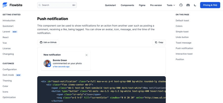
您可以查看以下链接以查看更多 toast 组件样式、大小和变体,以及其他组件,如按钮、模式、导航栏等。
👉Tailwind CSS toast 组件
📚Flowbite - Tailwind CSS 组件

ModelScope旨在打造下一代开源的模型即服务共享平台,为泛AI开发者提供灵活、易用、低成本的一站式模型服务产品,让模型应用更简单!
更多推荐
 0
0 0
0- 0


 已为社区贡献27134条内容

所有评论(0)