
如何在 Tailwind CSS 和 Flowbite 中使用手风琴组件
在构建网站时,我最喜欢的堆栈之一是使用 Tailwind CSS 中的实用程序类和Flowbite中的 UI 组件。开发速度快、用途广泛,我几乎可以毫不费力地做任何事情。
[ ](https://res.cloudinary.com/practicaldev/image/fetch/s--h5C1nc17--/c_limit%2Cf_auto%2Cfl_progressive%2Cq_auto%2Cw_880/https://dev-to -uploads.s3.amazonaws.com/uploads/articles/jtxnkolybhajr65pmehm.png)
今天我想向您展示如何构建一个使用 Tailwind CSS 和 Flowbite 编码的手风琴组件。您可以使用它来显示和隐藏网站部分的信息,例如常见问题解答。
让我们开始吧!
Tailwind CSS 手风琴
首先,要使手风琴工作,您需要安装 Tailwind CSS,然后还安装 Flowbite作为插件。
如果您已经这样做了,您现在可以从 Flowbite 查看手风琴组件并将它们复制粘贴到您的项目中。
您可以使用两个主要选项来初始化手风琴:
-
data-accordion="collapse"只显示一个活动子元素 -
data-accordion="open"保持多个元素打开
这是一个例子:
<div id="accordion-collapse" data-accordion="collapse">
  <h2 id="accordion-collapse-heading-1">
    <button type="button" class="flex items-center focus:ring-4 focus:ring-gray-200 dark:focus:ring-gray-800 justify-between p-5 w-full font-medium text-left border border-gray-200 dark:border-gray-700 border-b-0 text-gray-900 dark:text-white bg-gray-100 dark:bg-gray-800 hover:bg-gray-100 dark:hover:bg-gray-800 rounded-t-xl" data-accordion-target="#accordion-collapse-body-1" aria-expanded="true" aria-controls="accordion-collapse-body-1">
      <span>What is Flowbite?</span>
      <svg data-accordion-icon class="w-6 h-6 shrink-0 rotate-180" fill="currentColor" viewBox="0 0 20 20" xmlns="http://www.w3.org/2000/svg"><path fill-rule="evenodd" d="M5.293 7.293a1 1 0 011.414 0L10 10.586l3.293-3.293a1 1 0 111.414 1.414l-4 4a1 1 0 01-1.414 0l-4-4a1 1 0 010-1.414z" clip-rule="evenodd"></path></svg>
    </button>
  </h2>
  <div id="accordion-collapse-body-1" aria-labelledby="accordion-collapse-heading-1">
    <div class="p-5 border border-gray-200 dark:border-gray-700 dark:bg-gray-900 border-b-0">
      <p class="mb-2 text-gray-500 dark:text-gray-400">Flowbite is an open-source library of interactive components built on top of Tailwind CSS including buttons, dropdowns, modals, navbars, and more.</p>
      <p class="text-gray-500 dark:text-gray-400">Check out this guide to learn how to <a href="https://flowbite.com/docs/getting-started/introduction/" target="_blank" class="text-blue-600 dark:text-blue-500 hover:underline">get started</a> and start developing websites even faster with components on top of Tailwind CSS.</p>
    </div>
  </div>
  <h2 id="accordion-collapse-heading-2">
    <button type="button" class="flex items-center focus:ring-4 focus:ring-gray-200 dark:focus:ring-gray-800 justify-between p-5 w-full font-medium border border-gray-200 dark:border-gray-700 border-b-0 text-left text-gray-500 dark:text-gray-400 hover:bg-gray-100 dark:hover:bg-gray-800" data-accordion-target="#accordion-collapse-body-2" aria-expanded="false" aria-controls="accordion-collapse-body-2">
      <span>Is there a Figma file available?</span>
      <svg data-accordion-icon class="w-6 h-6 shrink-0" fill="currentColor" viewBox="0 0 20 20" xmlns="http://www.w3.org/2000/svg"><path fill-rule="evenodd" d="M5.293 7.293a1 1 0 011.414 0L10 10.586l3.293-3.293a1 1 0 111.414 1.414l-4 4a1 1 0 01-1.414 0l-4-4a1 1 0 010-1.414z" clip-rule="evenodd"></path></svg>
    </button>
  </h2>
  <div id="accordion-collapse-body-2" class="hidden" aria-labelledby="accordion-collapse-heading-2">
    <div class="p-5 border border-gray-200 dark:border-gray-700 border-b-0">
      <p class="mb-2 text-gray-500 dark:text-gray-400">Flowbite is first conceptualized and designed using the Figma software so everything you see in the library has a design equivalent in our Figma file.</p>
      <p class="text-gray-500 dark:text-gray-400">Check out the <a href="https://flowbite.com/figma/" target="_blank" class="text-blue-600 dark:text-blue-500 hover:underline">Figma design system</a> based on the utility classes from Tailwind CSS and components from Flowbite.</p>
    </div>
  </div>
  <h2 id="accordion-collapse-heading-3">
    <button type="button" class="flex items-center border focus:ring-4 focus:ring-gray-200 dark:focus:ring-gray-800 border-gray-200 dark:border-gray-700 justify-between p-5 w-full font-medium text-left text-gray-500 dark:text-gray-400 hover:bg-gray-100 dark:hover:bg-gray-800" data-accordion-target="#accordion-collapse-body-3" aria-expanded="false" aria-controls="accordion-collapse-body-3">
      <span>What are the differences between Flowbite and Tailwind UI?</span>
      <svg data-accordion-icon class="w-6 h-6 shrink-0" fill="currentColor" viewBox="0 0 20 20" xmlns="http://www.w3.org/2000/svg"><path fill-rule="evenodd" d="M5.293 7.293a1 1 0 011.414 0L10 10.586l3.293-3.293a1 1 0 111.414 1.414l-4 4a1 1 0 01-1.414 0l-4-4a1 1 0 010-1.414z" clip-rule="evenodd"></path></svg>
    </button>
  </h2>
  <div id="accordion-collapse-body-3" class="hidden" aria-labelledby="accordion-collapse-heading-3">
    <div class="p-5 border border-gray-200 dark:border-gray-700 border-t-0">
      <p class="mb-2 text-gray-500 dark:text-gray-400">The main difference is that the core components from Flowbite are open source under the MIT license, whereas Tailwind UI is a paid product. Another difference is that Flowbite relies on smaller and standalone components, whereas Tailwind UI offers sections of pages.</p>
      <p class="mb-2 text-gray-500 dark:text-gray-400">However, we actually recommend using both Flowbite, Flowbite Pro, and even Tailwind UI as there is no technical reason stopping you from using the best of two worlds.</p>
      <p class="mb-2 text-gray-500 dark:text-gray-400">Learn more about these technologies:</p>
      <ul class="list-disc pl-5 dark:text-gray-400 text-gray-500">
        <li><a href="https://flowbite.com/pro/" target="_blank" class="text-blue-600 dark:text-blue-500 hover:underline">Flowbite Pro</a></li>
        <li><a href="https://tailwindui.com/" rel="nofollow" target="_blank" class="text-blue-600 dark:text-blue-500 hover:underline">Tailwind UI</a></li>
      </ul>
    </div>
  </div>
</div>
进入全屏模式 退出全屏模式
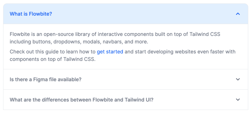
这个特殊的手风琴组件在打开一个元素时会每隔一个元素折叠,这意味着总是只有一个元素展开。
如果添加data-accordion="open"选项,则之前打开的每个手风琴元素都将保持打开状态。
[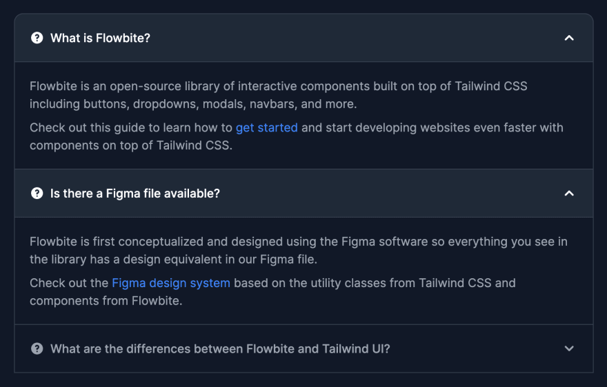 ](https://res.cloudinary.com/practicaldev/image/fetch/s--5_xEd1S5--/c_limit%2Cf_auto%2Cfl_progressive%2Cq_auto%2Cw_880/https://dev -to-uploads.s3.amazonaws.com/uploads/articles/lfri46pcdes0k90ppsjg.png)
这是一个例子:
<div id="accordion-open" data-accordion="open">
  <h2 id="accordion-open-heading-1">
    <button type="button" class="flex items-center focus:ring-4 focus:ring-gray-200 dark:focus:ring-gray-800 justify-between p-5 w-full font-medium text-left border border-gray-200 dark:border-gray-700 border-b-0 text-gray-900 dark:text-white bg-gray-100 dark:bg-gray-800 hover:bg-gray-100 dark:hover:bg-gray-800 rounded-t-xl" data-accordion-target="#accordion-open-body-1" aria-expanded="true" aria-controls="accordion-open-body-1">
      <span class="flex items-center"><svg class="w-5 h-5 shrink-0 mr-2" fill="currentColor" viewBox="0 0 20 20" xmlns="http://www.w3.org/2000/svg"><path fill-rule="evenodd" d="M18 10a8 8 0 11-16 0 8 8 0 0116 0zm-8-3a1 1 0 00-.867.5 1 1 0 11-1.731-1A3 3 0 0113 8a3.001 3.001 0 01-2 2.83V11a1 1 0 11-2 0v-1a1 1 0 011-1 1 1 0 100-2zm0 8a1 1 0 100-2 1 1 0 000 2z" clip-rule="evenodd"></path></svg> What is Flowbite?</span>
      <svg data-accordion-icon class="w-6 h-6 shrink-0 rotate-180" fill="currentColor" viewBox="0 0 20 20" xmlns="http://www.w3.org/2000/svg"><path fill-rule="evenodd" d="M5.293 7.293a1 1 0 011.414 0L10 10.586l3.293-3.293a1 1 0 111.414 1.414l-4 4a1 1 0 01-1.414 0l-4-4a1 1 0 010-1.414z" clip-rule="evenodd"></path></svg>
    </button>
  </h2>
  <div id="accordion-open-body-1" aria-labelledby="accordion-open-heading-1">
    <div class="p-5 border border-gray-200 dark:border-gray-700 dark:bg-gray-900 border-b-0">
      <p class="mb-2 text-gray-500 dark:text-gray-400">Flowbite is an open-source library of interactive components built on top of Tailwind CSS including buttons, dropdowns, modals, navbars, and more.</p>
      <p class="text-gray-500 dark:text-gray-400">Check out this guide to learn how to <a href="https://flowbite.com/docs/getting-started/introduction/" target="_blank" class="text-blue-600 dark:text-blue-500 hover:underline">get started</a> and start developing websites even faster with components on top of Tailwind CSS.</p>
    </div>
  </div>
  <h2 id="accordion-open-heading-2">
    <button type="button" class="flex items-center focus:ring-4 focus:ring-gray-200 dark:focus:ring-gray-800 justify-between p-5 w-full font-medium border border-gray-200 dark:border-gray-700 border-b-0 text-left text-gray-500 dark:text-gray-400 hover:bg-gray-100 dark:hover:bg-gray-800" data-accordion-target="#accordion-open-body-2" aria-expanded="false" aria-controls="accordion-open-body-2">
      <span class="flex items-center"><svg class="w-5 h-5 shrink-0 mr-2" fill="currentColor" viewBox="0 0 20 20" xmlns="http://www.w3.org/2000/svg"><path fill-rule="evenodd" d="M18 10a8 8 0 11-16 0 8 8 0 0116 0zm-8-3a1 1 0 00-.867.5 1 1 0 11-1.731-1A3 3 0 0113 8a3.001 3.001 0 01-2 2.83V11a1 1 0 11-2 0v-1a1 1 0 011-1 1 1 0 100-2zm0 8a1 1 0 100-2 1 1 0 000 2z" clip-rule="evenodd"></path></svg>Is there a Figma file available?</span>
      <svg data-accordion-icon class="w-6 h-6 shrink-0" fill="currentColor" viewBox="0 0 20 20" xmlns="http://www.w3.org/2000/svg"><path fill-rule="evenodd" d="M5.293 7.293a1 1 0 011.414 0L10 10.586l3.293-3.293a1 1 0 111.414 1.414l-4 4a1 1 0 01-1.414 0l-4-4a1 1 0 010-1.414z" clip-rule="evenodd"></path></svg>
    </button>
  </h2>
  <div id="accordion-open-body-2" class="hidden" aria-labelledby="accordion-open-heading-2">
    <div class="p-5 border border-gray-200 dark:border-gray-700 border-b-0">
      <p class="mb-2 text-gray-500 dark:text-gray-400">Flowbite is first conceptualized and designed using the Figma software so everything you see in the library has a design equivalent in our Figma file.</p>
      <p class="text-gray-500 dark:text-gray-400">Check out the <a href="https://flowbite.com/figma/" target="_blank" class="text-blue-600 dark:text-blue-500 hover:underline">Figma design system</a> based on the utility classes from Tailwind CSS and components from Flowbite.</p>
    </div>
  </div>
  <h2 id="accordion-open-heading-3">
    <button type="button" class="flex items-center border focus:ring-4 focus:ring-gray-200 dark:focus:ring-gray-800 border-gray-200 dark:border-gray-700 justify-between p-5 w-full font-medium text-left text-gray-500 dark:text-gray-400 hover:bg-gray-100 dark:hover:bg-gray-800" data-accordion-target="#accordion-open-body-3" aria-expanded="false" aria-controls="accordion-open-body-3">
      <span class="flex items-center"><svg class="w-5 h-5 shrink-0 mr-2" fill="currentColor" viewBox="0 0 20 20" xmlns="http://www.w3.org/2000/svg"><path fill-rule="evenodd" d="M18 10a8 8 0 11-16 0 8 8 0 0116 0zm-8-3a1 1 0 00-.867.5 1 1 0 11-1.731-1A3 3 0 0113 8a3.001 3.001 0 01-2 2.83V11a1 1 0 11-2 0v-1a1 1 0 011-1 1 1 0 100-2zm0 8a1 1 0 100-2 1 1 0 000 2z" clip-rule="evenodd"></path></svg> What are the differences between Flowbite and Tailwind UI?</span>
      <svg data-accordion-icon class="w-6 h-6 shrink-0" fill="currentColor" viewBox="0 0 20 20" xmlns="http://www.w3.org/2000/svg"><path fill-rule="evenodd" d="M5.293 7.293a1 1 0 011.414 0L10 10.586l3.293-3.293a1 1 0 111.414 1.414l-4 4a1 1 0 01-1.414 0l-4-4a1 1 0 010-1.414z" clip-rule="evenodd"></path></svg>
    </button>
  </h2>
  <div id="accordion-open-body-3" class="hidden" aria-labelledby="accordion-open-heading-3">
    <div class="p-5 border border-gray-200 dark:border-gray-700 border-t-0">
      <p class="mb-2 text-gray-500 dark:text-gray-400">The main difference is that the core components from Flowbite are open source under the MIT license, whereas Tailwind UI is a paid product. Another difference is that Flowbite relies on smaller and standalone components, whereas Tailwind UI offers sections of pages.</p>
      <p class="mb-2 text-gray-500 dark:text-gray-400">However, we actually recommend using both Flowbite, Flowbite Pro, and even Tailwind UI as there is no technical reason stopping you from using the best of two worlds.</p>
      <p class="mb-2 text-gray-500 dark:text-gray-400">Learn more about these technologies:</p>
      <ul class="list-disc pl-5 dark:text-gray-400 text-gray-500">
        <li><a href="https://flowbite.com/pro/" target="_blank" class="text-blue-600 dark:text-blue-500 hover:underline">Flowbite Pro</a></li>
        <li><a href="https://tailwindui.com/" rel="nofollow" target="_blank" class="text-blue-600 dark:text-blue-500 hover:underline">Tailwind UI</a></li>
      </ul>
    </div>
  </div>
</div>
进入全屏模式 退出全屏模式
颜色选项
我们还可以使用data-active-classes和data-inactive-classes数据属性来设置 Tailwind CSS 中的类,以便为手风琴的活动和非活动状态应用自定义颜色和样式,这非常方便。
[ ](https://res.cloudinary.com/practicaldev/image/fetch/s--9yjeTlUt--/c_limit%2Cf_auto%2Cfl_progressive%2Cq_auto%2Cw_880/https://dev- to-uploads.s3.amazonaws.com/uploads/articles/fhetz8rqmo24bi3mqirq.png)
这是一个使手风琴标题元素变为蓝色而不是灰色的示例:
<div id="accordion-color" data-accordion="collapse" data-active-classes="bg-blue-100 dark:bg-gray-800 text-blue-600 dark:text-white">
  <h2 id="accordion-color-heading-1">
    <button type="button" class="flex items-center focus:ring-4 focus:ring-blue-200 dark:focus:ring-blue-800 justify-between p-5 w-full font-medium text-left border border-gray-200 dark:border-gray-700 border-b-0 text-blue-600 dark:text-white bg-blue-100 dark:bg-gray-800 hover:bg-blue-100 dark:hover:bg-gray-800 rounded-t-xl" data-accordion-target="#accordion-color-body-1" aria-expanded="true" aria-controls="accordion-color-body-1">
      <span>What is Flowbite?</span>
      <svg data-accordion-icon class="w-6 h-6 shrink-0 rotate-180" fill="currentColor" viewBox="0 0 20 20" xmlns="http://www.w3.org/2000/svg"><path fill-rule="evenodd" d="M5.293 7.293a1 1 0 011.414 0L10 10.586l3.293-3.293a1 1 0 111.414 1.414l-4 4a1 1 0 01-1.414 0l-4-4a1 1 0 010-1.414z" clip-rule="evenodd"></path></svg>
    </button>
  </h2>
  <div id="accordion-color-body-1" aria-labelledby="accordion-color-heading-1">
    <div class="p-5 border border-gray-200 dark:border-gray-700 dark:bg-gray-900 border-b-0">
      <p class="mb-2 text-gray-500 dark:text-gray-400">Flowbite is an open-source library of interactive components built on top of Tailwind CSS including buttons, dropdowns, modals, navbars, and more.</p>
      <p class="text-gray-500 dark:text-gray-400">Check out this guide to learn how to <a href="https://flowbite.com/docs/getting-started/introduction/" target="_blank" class="text-blue-600 dark:text-blue-500 hover:underline">get started</a> and start developing websites even faster with components on top of Tailwind CSS.</p>
    </div>
  </div>
  <h2 id="accordion-color-heading-2">
    <button type="button" class="flex items-center focus:ring-4 focus:ring-blue-200 dark:focus:ring-blue-800 justify-between p-5 w-full font-medium border border-gray-200 dark:border-gray-700 border-b-0 text-left text-gray-500 dark:text-gray-400 hover:bg-blue-100 dark:hover:bg-gray-800" data-accordion-target="#accordion-color-body-2" aria-expanded="false" aria-controls="accordion-color-body-2">
      <span>Is there a Figma file available?</span>
      <svg data-accordion-icon class="w-6 h-6 shrink-0" fill="currentColor" viewBox="0 0 20 20" xmlns="http://www.w3.org/2000/svg"><path fill-rule="evenodd" d="M5.293 7.293a1 1 0 011.414 0L10 10.586l3.293-3.293a1 1 0 111.414 1.414l-4 4a1 1 0 01-1.414 0l-4-4a1 1 0 010-1.414z" clip-rule="evenodd"></path></svg>
    </button>
  </h2>
  <div id="accordion-color-body-2" class="hidden" aria-labelledby="accordion-color-heading-2">
    <div class="p-5 border border-gray-200 dark:border-gray-700 border-b-0">
      <p class="mb-2 text-gray-500 dark:text-gray-400">Flowbite is first conceptualized and designed using the Figma software so everything you see in the library has a design equivalent in our Figma file.</p>
      <p class="text-gray-500 dark:text-gray-400">Check out the <a href="https://flowbite.com/figma/" target="_blank" class="text-blue-600 dark:text-blue-500 hover:underline">Figma design system</a> based on the utility classes from Tailwind CSS and components from Flowbite.</p>
    </div>
  </div>
  <h2 id="accordion-color-heading-3">
    <button type="button" class="flex items-center border focus:ring-4 focus:ring-blue-200 dark:focus:ring-blue-800 border-gray-200 dark:border-gray-700 justify-between p-5 w-full font-medium text-left text-gray-500 dark:text-gray-400 hover:bg-blue-100 dark:hover:bg-gray-800" data-accordion-target="#accordion-color-body-3" aria-expanded="false" aria-controls="accordion-color-body-3">
      <span>What are the differences between Flowbite and Tailwind UI?</span>
      <svg data-accordion-icon class="w-6 h-6 shrink-0" fill="currentColor" viewBox="0 0 20 20" xmlns="http://www.w3.org/2000/svg"><path fill-rule="evenodd" d="M5.293 7.293a1 1 0 011.414 0L10 10.586l3.293-3.293a1 1 0 111.414 1.414l-4 4a1 1 0 01-1.414 0l-4-4a1 1 0 010-1.414z" clip-rule="evenodd"></path></svg>
    </button>
  </h2>
  <div id="accordion-color-body-3" class="hidden" aria-labelledby="accordion-color-heading-3">
    <div class="p-5 border border-gray-200 dark:border-gray-700 border-t-0">
      <p class="mb-2 text-gray-500 dark:text-gray-400">The main difference is that the core components from Flowbite are open source under the MIT license, whereas Tailwind UI is a paid product. Another difference is that Flowbite relies on smaller and standalone components, whereas Tailwind UI offers sections of pages.</p>
      <p class="mb-2 text-gray-500 dark:text-gray-400">However, we actually recommend using both Flowbite, Flowbite Pro, and even Tailwind UI as there is no technical reason stopping you from using the best of two worlds.</p>
      <p class="mb-2 text-gray-500 dark:text-gray-400">Learn more about these technologies:</p>
      <ul class="list-disc pl-5 dark:text-gray-400 text-gray-500">
        <li><a href="https://flowbite.com/pro/" target="_blank" class="text-blue-600 dark:text-blue-500 hover:underline">Flowbite Pro</a></li>
        <li><a href="https://tailwindui.com/" rel="nofollow" target="_blank" class="text-blue-600 dark:text-blue-500 hover:underline">Tailwind UI</a></li>
      </ul>
    </div>
  </div>
</div>
进入全屏模式 退出全屏模式
当然,您可以添加任意数量的手风琴元素,只要您正确设置了data-accordion-target="{selector}"、手风琴主体的 id 和aria-expanded="{true|false}"属性即可。
如果您想了解有关该组件的更多信息,请查看 Flowbite 的官方文档:
-
Tailwind CSS 手风琴 - Flowbite
-
Flowbite - Tailwind CSS 组件

ModelScope旨在打造下一代开源的模型即服务共享平台,为泛AI开发者提供灵活、易用、低成本的一站式模型服务产品,让模型应用更简单!
更多推荐
 0
0 0
0- 0


 已为社区贡献27134条内容

所有评论(0)