

Tailwind CSS is one of the fastest growing frameworks and it is popular for its utility-first methodology when working with classes.
One of the disadvantages of Tailwind CSS is that it doesn't offer a ready-to-use set of UI components like buttons, navbars, and modals and you have to build them from the ground up.
That is why I started a tutorial series to show you how to build the most commonly used UI components using Tailwind CSS and Flowbite.
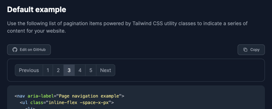
Today I will show you how to build a pagination component. Here's a preview of how it will look:

Let's get started!
Tailwind CSS pagination
First of all we want to have the HTML tags ready so it's properly accessible. We'll use a <ul> element for that:
<nav aria-label="Page navigation example">
  <ul>
    <li>
      <a href="#">Previous</a>
    </li>
    <li>
      <a href="#">1</a>
    </li>
    <li>
      <a href="#">2</a>
    </li>
    <li>
      <a href="#">3</a>
    </li>
    <li>
      <a href="#">4</a>
    </li>
    <li>
      <a href="#">5</a>
    </li>
    <li>
      <a href="#">Next</a>
    </li>
  </ul>
</nav>
Now we should style the pagination elements and the links within using the utility classes from Tailwind CSS:
<nav aria-label="Page navigation example">
  <ul class="inline-flex -space-x-px">
    <li>
      <a href="#" class="py-2 px-3 ml-0 leading-tight text-gray-500 bg-white rounded-l-lg border border-gray-300">Previous</a>
    </li>
    <li>
      <a href="#" class="py-2 px-3 leading-tight text-gray-500 bg-white border border-gray-300">1</a>
    </li>
    <li>
      <a href="#" class="py-2 px-3 leading-tight text-gray-500 bg-white border border-gray-300">2</a>
    </li>
    <li>
      <a href="#" aria-current="page" class="py-2 px-3 text-blue-600 bg-blue-50 border border-gray-300">3</a>
    </li>
    <li>
      <a href="#" class="py-2 px-3 leading-tight text-gray-500 bg-white border border-gray-300">4</a>
    </li>
    <li>
      <a href="#" class="py-2 px-3 leading-tight text-gray-500 bg-white border border-gray-300">5</a>
    </li>
    <li>
      <a href="#" class="py-2 px-3 leading-tight text-gray-500 bg-white rounded-r-lg border border-gray-300">Next</a>
    </li>
  </ul>
</nav>
Looking good! Let's also add the hover state styles:
<nav aria-label="Page navigation example">
  <ul class="inline-flex -space-x-px">
    <li>
      <a href="#" class="py-2 px-3 ml-0 leading-tight text-gray-500 bg-white rounded-l-lg border border-gray-300 hover:bg-gray-100 hover:text-gray-700">Previous</a>
    </li>
    <li>
      <a href="#" class="py-2 px-3 leading-tight text-gray-500 bg-white border border-gray-300 hover:bg-gray-100 hover:text-gray-700">1</a>
    </li>
    <li>
      <a href="#" class="py-2 px-3 leading-tight text-gray-500 bg-white border border-gray-300 hover:bg-gray-100 hover:text-gray-700">2</a>
    </li>
    <li>
      <a href="#" aria-current="page" class="py-2 px-3 text-blue-600 bg-blue-50 border border-gray-300 hover:bg-blue-100 hover:text-blue-700">3</a>
    </li>
    <li>
      <a href="#" class="py-2 px-3 leading-tight text-gray-500 bg-white border border-gray-300 hover:bg-gray-100 hover:text-gray-70">4</a>
    </li>
    <li>
      <a href="#" class="py-2 px-3 leading-tight text-gray-500 bg-white border border-gray-300 hover:bg-gray-100 hover:text-gray-700">5</a>
    </li>
    <li>
      <a href="#" class="py-2 px-3 leading-tight text-gray-500 bg-white rounded-r-lg border border-gray-300 hover:bg-gray-100 hover:text-gray-700">Next</a>
    </li>
  </ul>
</nav>
Lastly, let's also add the dark mode styles to this pagination component. Check out this page to learn how to add dark mode to Tailwind CSS.
<nav aria-label="Page navigation example">
  <ul class="inline-flex -space-x-px">
    <li>
      <a href="#" class="py-2 px-3 ml-0 leading-tight text-gray-500 bg-white rounded-l-lg border border-gray-300 hover:bg-gray-100 hover:text-gray-700 dark:bg-gray-800 dark:border-gray-700 dark:text-gray-400 dark:hover:bg-gray-700 dark:hover:text-white">Previous</a>
    </li>
    <li>
      <a href="#" class="py-2 px-3 leading-tight text-gray-500 bg-white border border-gray-300 hover:bg-gray-100 hover:text-gray-700 dark:bg-gray-800 dark:border-gray-700 dark:text-gray-400 dark:hover:bg-gray-700 dark:hover:text-white">1</a>
    </li>
    <li>
      <a href="#" class="py-2 px-3 leading-tight text-gray-500 bg-white border border-gray-300 hover:bg-gray-100 hover:text-gray-700 dark:bg-gray-800 dark:border-gray-700 dark:text-gray-400 dark:hover:bg-gray-700 dark:hover:text-white">2</a>
    </li>
    <li>
      <a href="#" aria-current="page" class="py-2 px-3 text-blue-600 bg-blue-50 border border-gray-300 hover:bg-blue-100 hover:text-blue-700 dark:border-gray-700 dark:bg-gray-700 dark:text-white">3</a>
    </li>
    <li>
      <a href="#" class="py-2 px-3 leading-tight text-gray-500 bg-white border border-gray-300 hover:bg-gray-100 hover:text-gray-700 dark:bg-gray-800 dark:border-gray-700 dark:text-gray-400 dark:hover:bg-gray-700 dark:hover:text-white">4</a>
    </li>
    <li>
      <a href="#" class="py-2 px-3 leading-tight text-gray-500 bg-white border border-gray-300 hover:bg-gray-100 hover:text-gray-700 dark:bg-gray-800 dark:border-gray-700 dark:text-gray-400 dark:hover:bg-gray-700 dark:hover:text-white">5</a>
    </li>
    <li>
      <a href="#" class="py-2 px-3 leading-tight text-gray-500 bg-white rounded-r-lg border border-gray-300 hover:bg-gray-100 hover:text-gray-700 dark:bg-gray-800 dark:border-gray-700 dark:text-gray-400 dark:hover:bg-gray-700 dark:hover:text-white">Next</a>
    </li>
  </ul>
</nav>
Great job! The pagination component should look like this when dark mode is enabled:
This Tailwind CSS pagination component is part of a larger and open source Tailwind CSS component library called Flowbite. If you want to use more variants of the pagination component or browse other ones, make sure to check out the documentation.
👉 Flowbite - Tailwind CSS components


 已为社区贡献3966条内容

所有评论(0)