
CSS3 grid网格布局
·
文章目录
- CSS3 grid网格布局
- 概述
- 基本概念
- 使用
- grid-template-rows & grid-template-columns 定义行高和列宽
- grid-auto-flow 定义项目的排列顺序
- grid-auto-rows & grid-auto-columns 定义多余网格的行高和列宽
- row-gap & column-gap 设置行间距和列间距
- gap 简写形式
- grid-template-areas 定义区域
- justify-items & align-items 设置项目的水平位置和垂直位置
- place-items 简写形式
- align-content & justify-content 设置整个内容的位置
- place-content 简写形式
- grid-row-start & grid-row-end & grid-column-start & grid-column-end 指定项目位置
- grid-column & grid-row 简写形式
- grid-area 简写形式
- align-self & justify-self 设置项目的垂直位置和水平位置
- place-self 简写形式
- repeat()
- 案例
CSS3 grid网格布局
概述
- flex 弹性布局,是一维布局,只能处理单一方向上排列元素。
- grid 网格布局,是二维布局,可以同时控制行和列的排列。
.container {
    display: grid; /* 或 inline-grid */
}
基本概念
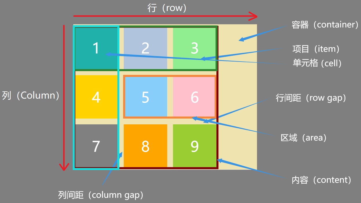
- 网格轨道(Grid Tracks):定义网格容器的布局结构,为子元素提供位置。
- 列轨道(Column Tracks)
- 行轨道(Row Tracks)
- 网格项目(Grid Item):Grid子元素。
- 网格线(Grid Lines):构成网格结构的分界线,水平或垂直的。编号从1开始,3列就有4根线。
- 网格单元格(Grid Cell):行和列交叉形成的单个单元。
- 网格区域(Grid Area):一个或多个网格单元格组成的矩形区域。
容器属性
display:定义元素为网格容器
- grid
- inline-grid
grid-template-columns:定义网格中的列
- none
<track-list>:例如:200px 200px 200px,1fr 1fr 1fr,repeat(3, 1fr)
grid-template-rows:定义网格中的行
- none
<track-list>
grid-template-areas:定义网格区域
- none
<string>
gap / row-gap / column-gap:设置间距
- 像素值
justify-content:控制列轨道的在容器内的分布
- start
- end
- center
- stretch
- space-around
- space-between
- space-evenly
align-content:控制行轨道在容器内的分布
- start
- end
- center
- stretch
- space-around
- space-between
- space-evenly
justify-items:控制元素在网格内的水平对齐方式
- start
- end
- center
- stretch
align-items:控制元素在网格内的垂直对齐方式
- start
- end
- center
- stretch
place-items:justify-items+align-items的缩写
grid-auto-flow:自动填充模式
- row
- column
- dense
项目属性
grid-column:设置列跨越单元格
- 语法一:grid-column: 1/3,表示从第1列到第3列
- 语法二:grid-column: 1 / span 2,表示从第1根线开始,跨越2个单元格
grid-row:设置行跨越单元格
- 语法一:grid-row: 1/3,表示从第1行到第3行
- 语法二:grid-row: 1 / span 2,表示从第1根线开始,跨越2个单元格
间距
gap 用于设置网格间距。
- gap: 20px; 行和列之间的间距为20px
- gap: 20px 30px; 行间距为20px,列间距为30px
- column-gap: 30px; 列间距为30px
- row-gap: 20px; 行间距为20px
repeat()
repeat(参数一, 参数二)
- 参数一:
- 次数
- 自动填充模式:auto-fill 尽可能多的创建列,auto-fit 尽可能填充满容器
- 参数二:尺寸
minmax()
minmax(最小值, 最大值)
使用
grid-template-rows & grid-template-columns 定义行高和列宽
grid-template-rows和 grid-template-columns属性取值
| 属性值 | 说明 |
|---|---|
| px | 固定值 |
| % | 百分比 |
| fr | 片段,分配剩余空间 |
| auto | 先于fr计算,获取必要的最小空间 |
| repeat() | 简化重复值 |
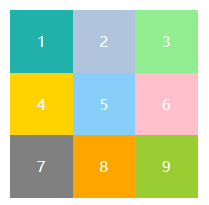
固定值使用
<!DOCTYPE html>
<html lang="en">
  <head>
    <meta charset="UTF-8" />
    <meta http-equiv="X-UA-Compatible" content="IE=edge" />
    <meta name="viewport" content="width=device-width, initial-scale=1.0" />
    <title>Document</title>
    <style>
      .container {
        display: grid;
        grid-template-rows: 50px 50px 50px;
        grid-template-columns: 50px 50px 50px;
      }

      .item {
        display: flex;
        align-items: center;
        justify-content: center;
        color: white;
        font-size: 12px;
      }

      .item-1 {
        background-color: lightseagreen;
      }
      .item-2 {
        background-color: lightsteelblue;
      }
      .item-3 {
        background-color: lightgreen;
      }
      .item-4 {
        background-color: #ffd200;
      }
      .item-5 {
        background-color: lightskyblue;
      }
      .item-6 {
        background-color: pink;
      }
      .item-7 {
        background-color: gray;
      }
      .item-8 {
        background-color: orange;
      }
      .item-9 {
        background-color: yellowgreen;
      }
    </style>
  </head>
  <body>
    <div class="wrap">
      <div class="item item-1">1</div>
      <div class="item item-2">2</div>
      <div class="item item-3">3</div>
      <div class="item item-4">4</div>
      <div class="item item-5">5</div>
      <div class="item item-6">6</div>
      <div class="item item-7">7</div>
      <div class="item item-8">8</div>
      <div class="item item-9">9</div>
    </div>
  </body>
</html>
百分比使用
.container {
    display: grid;
    width: 150px;
    height: 150px;
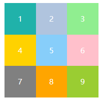
    grid-template-rows: 33.33% 33.33% 33.33%;
    grid-template-columns: 33.33% 33.33% 33.33%;
}
fr使用
.container {
    display: grid;
    width: 150px;
    height: 150px;
    grid-template-rows: 1fr 1fr 1fr;
    grid-template-columns: 1fr 1fr 1fr;
}
.container {
    display: grid;
    width: 150px;
    height: 150px;
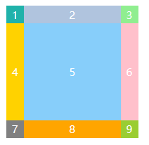
    grid-template-rows: 20px 1fr 20px;
    grid-template-columns: 20px 1fr 20px;
}
auto使用
.container {
    display: grid;
    width: 150px;
    height: 150px;
    grid-template-rows: 20px auto 20px;
    grid-template-columns: 20px auto 20px;
}
.container {
    display: grid;
    width: 150px;
    height: 150px;
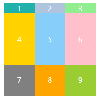
    grid-template-rows: auto 1fr 50px;
    grid-template-columns: auto auto auto;
}
repeat()使用
.container {
    display: grid;
    width: 150px;
    height: 150px;
    grid-template-rows: repeat(3, 50px);
    grid-template-columns: repeat(3, 50px);
}
grid-auto-flow 定义项目的排列顺序
grid-auto-flow属性取值
| 属性 | 说明 |
|---|---|
| row | 先填入第一行 |
| column | 先填入第一列 |
| row dense | 按行填充空白 |
| column dense | 按列填充空白 |
使用
.container {
display: grid;
width: 150px;
height: 150px;
grid-template-rows: repeat(3, 50px);
grid-template-columns: repeat(3, 50px);
grid-auto-flow: row;
}
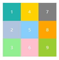
.container {
    display: grid;
    width: 150px;
    height: 150px;
    grid-template-rows: repeat(3, 50px);
    grid-template-columns: repeat(3, 50px);
    grid-auto-flow: column;
}
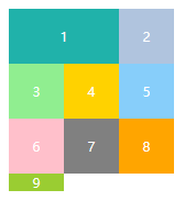
.container {
    display: grid;
    width: 150px;
    height: 150px;
    grid-template-rows: repeat(3, 50px);
    grid-template-columns: repeat(3, 50px);
    grid-auto-flow: row dense;
}

.item-1 {
    grid-column-start: 1;
    grid-column-end: 3;
}
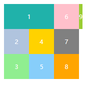
.container {
    display: grid;
    width: 150px;
    height: 150px;
    grid-template-rows: repeat(3, 50px);
    grid-template-columns: repeat(3, 50px);
    grid-auto-flow: column dense;
}

.item-1 {
    grid-column-start: 1;
    grid-column-end: 3;
}
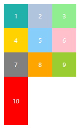
grid-auto-rows & grid-auto-columns 定义多余网格的行高和列宽
使用
.container {
    display: grid;
    width: 150px;
    height: 150px;
    grid-template-rows: repeat(3, 50px);
    grid-template-columns: repeat(3, 50px);
    grid-auto-rows: 100px;
    grid-auto-columns: 100px;
}
row-gap & column-gap 设置行间距和列间距
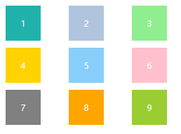
.container {
    display: grid;
    width: 150px;
    height: 150px;
    grid-template-rows: repeat(3, 50px);
    grid-template-columns: repeat(3, 50px);
    row-gap: 10px;
    column-gap: 40px;
}
gap 简写形式
.container {
    display: grid;
    width: 150px;
    height: 150px;
    grid-template-rows: repeat(3, 50px);
    grid-template-columns: repeat(3, 50px);
    gap: 10px 40px;
}
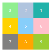
grid-template-areas 定义区域
.container {
    display: grid;
    grid-template-rows: repeat(3, 50px);
    grid-template-columns: repeat(3, 50px);
    grid-template-areas:
        "a b c"
        "e f g"
        "h i j";
}

.item-1 {
    grid-area: c;
}

.item-3 {
    grid-area: a;
}
justify-items & align-items 设置项目的水平位置和垂直位置
justify-items & align-items属性取值
| 属性值 | 说明 |
|---|---|
| stretch | 默认值,拉伸 |
| start | 开始位置 |
| center | 居中位置 |
| end | 结束位置 |
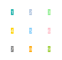
使用
.container {
    display: grid;
    grid-template-rows: repeat(3, 50px);
    grid-template-columns: repeat(3, 50px);
    justify-items: center;
    align-items: center;
}
place-items 简写形式
.container {
    display: grid;
    grid-template-rows: repeat(3, 50px);
    grid-template-columns: repeat(3, 50px);
    place-items: center center;
}
align-content & justify-content 设置整个内容的位置
align-content & justify-content属性取值
| 属性 | 说明 |
|---|---|
| stretch | 默认值,没有指定大小时,拉伸 |
| start | 开始位置 |
| center | 居中位置 |
| end | 结束位置 |
| space-around | 每个项目的间隔相等 |
| space-between | 每个项目的间隔相等,项目与边框之间没有间隔 |
| space-evenly | 每个项目的间隔相等,项目与边框之间也是一样的间隔 |
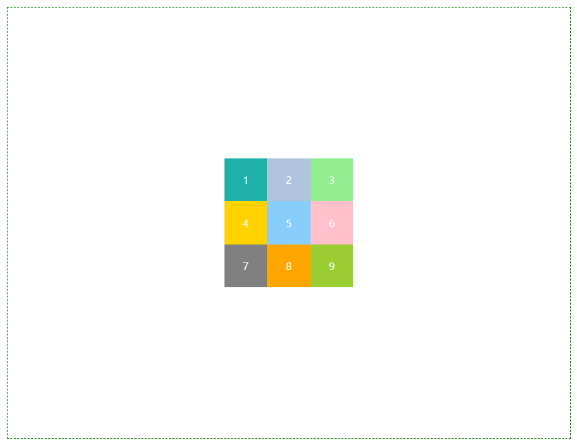
使用
.container {
    display: grid;
    height: 500px;
    border: 1px dashed green;
    grid-template-rows: repeat(3, 50px);
    grid-template-columns: repeat(3, 50px);
    align-content: center;
    justify-content: center;
}
place-content 简写形式
.container {
    display: grid;
    height: 500px;
    border: 1px dashed green;
    grid-template-rows: repeat(3, 50px);
    grid-template-columns: repeat(3, 50px);
    place-content: center;
}
grid-row-start & grid-row-end & grid-column-start & grid-column-end 指定项目位置
属性取值
| 属性值 | 说明 |
|---|---|
| number | 从第几个网格线开始,到第几个网格线结束 |
| name | 需要先定义网格线 |
| span number | 表示跨域几个网格 |
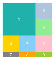
使用
.container {
    display: grid;
    grid-template-rows: repeat(3, 50px);
    grid-template-columns: repeat(3, 50px);
}

.item-1 {
    grid-row-start: 1;
    grid-row-end: 3;
    grid-column-start: 1;
    grid-column-end: 3;
}
.container {
    display: grid;
    grid-template-rows: [c1] 50px [c2] 50px [c3] 50px [c4];
    grid-template-columns: [r1] 50px [r2] 50px [r3] 50px [r4];
}

.item-1 {
    grid-row-start: c1;
    grid-row-end: c3;
    grid-column-start: r1;
    grid-column-end: r3;
}
.container {
    display: grid;
    grid-template-rows: repeat(3, 50px);
    grid-template-columns: repeat(3, 50px);
}

.item-1 {
    grid-row-start: span 2;
    grid-column-start: span 2;
}
grid-column & grid-row 简写形式
grid-column 是 grid-column-start 和 grid-column-end 的合并简写形式
grid-row 是 grid-row-start 和 grid-row-end 的合并简写形式
.container {
    display: grid;
    grid-template-rows: repeat(3, 50px);
    grid-template-columns: repeat(3, 50px);
}

.item-1 {
    grid-column: 1 / 3;
    grid-row: 1 / 3;
}
grid-area 简写形式
.container {
    display: grid;
    grid-template-rows: repeat(3, 50px);
    grid-template-columns: repeat(3, 50px);
}

.item-1 {
    grid-area: 1/1/3/3;
}
align-self & justify-self 设置项目的垂直位置和水平位置
属性取值
| 属性值 | 说明 |
|---|---|
| stretch | 默认值,拉伸 |
| start | 开始位置 |
| center | 居中位置 |
| end | 结束位置 |
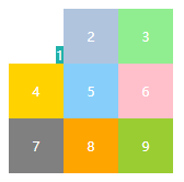
使用
.container {
    display: grid;
    grid-template-rows: repeat(3, 50px);
    grid-template-columns: repeat(3, 50px);
}

.item-1 {
    align-self: end;
    justify-self: end;
}
place-self 简写形式
.container {
    display: grid;
    grid-template-rows: repeat(3, 50px);
    grid-template-columns: repeat(3, 50px);
}

.item-1 {
    place-self: end;
}
repeat()
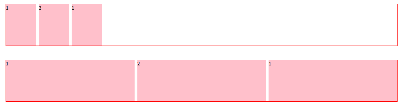
<!DOCTYPE html>
<html lang="en">
<head>
    <meta charset="UTF-8">
    <title>repeat</title>
    <style>
        * {
            margin: 0;
            padding: 0;
            box-sizing: border-box;
        }

        .box {
            display: grid;
            gap: 10px;
            width: 80%;
            height: 150px;
            border: 1px solid red;
            margin: 50px auto;
        }

        .box .item {
            background: pink;
        }

        .box1 {
            grid-template-columns: repeat(auto-fill, minmax(100px, 1fr));
        }

        .box2 {
            grid-template-columns: repeat(auto-fit, minmax(100px, 1fr));
        }
    </style>
</head>
<body>
<div class="box box1">
    <div class="item">1</div>
    <div class="item">2</div>
    <div class="item">1</div>
</div>

<div class="box box2">
    <div class="item">1</div>
    <div class="item">2</div>
    <div class="item">1</div>
</div>
</body>
</html>
案例
仿B站导航条

<!DOCTYPE html>
<html lang="en">
<head>
    <meta charset="UTF-8">
    <title>B站导航条</title>
    <style>
        * {
            margin: 0;
            padding: 0;
            box-sizing: border-box;
        }

        a {
            text-decoration: none;
        }

        .container {
            display: grid;
            grid-template-columns: repeat(11, 1fr);
            grid-template-rows: 1fr 1fr;
            gap: 10px;
            width: 935px;
            height: 66px;
            margin: 100px auto;
        }

        .container a {
            color: #61666D;
            background: #F6F7F8;
            border: 1px solid #F1F2F3;
            border-radius: 6px;
            text-align: center;
            line-height: 28px;
            font-size: 14px;
        }
    </style>
</head>
<body>
<div class="container">
    <a href="#">番剧</a>
    <a href="#">国创</a>
    <a href="#">综艺</a>
    <a href="#">动漫</a>
    <a href="#">鬼畜</a>
    <a href="#">舞蹈</a>
    <a href="#">直播</a>
    <a href="#">科技数码</a>
    <a href="#">美食</a>
    <a href="#">汽车</a>
    <a href="#">体育运动</a>
    <a href="#">电影</a>
    <a href="#">电视剧</a>
    <a href="#">纪录片</a>
    <a href="#">游戏</a>
    <a href="#">音乐</a>
    <a href="#">影视</a>
    <a href="#">知识</a>
    <a href="#">咨询</a>
    <a href="#">小剧场</a>
    <a href="#">时尚美妆</a>
    <a href="#">更多</a>
</div>
</body>
</html>
仿B站布局
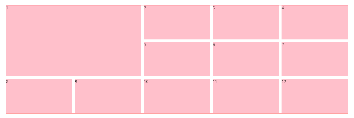
<!DOCTYPE html>
<html lang="en">
<head>
    <meta charset="UTF-8">
    <title>B站布局</title>
    <style>
        * {
            margin: 0;
            padding: 0;
            box-sizing: border-box;
        }

        .container {
            display: grid;
            grid-template-columns: repeat(5, 1fr);
            gap: 10px;
            max-width: 1200px;
            border: 1px solid red;
            margin: 100px auto;
        }

        .container .item {
            height: 120px;
            background: pink;
        }

        .container .item:first-child {
            /*grid-column: 1 / 3;*/
            /*grid-row: 1 / 3;*/
            grid-column: 1 / span 2;
            grid-row: 1 / span 2;
            height: auto;
        }
    </style>
</head>
<body>
<div class="container">
    <div class="item">1</div>
    <div class="item">2</div>
    <div class="item">3</div>
    <div class="item">4</div>
    <div class="item">5</div>
    <div class="item">6</div>
    <div class="item">7</div>
    <div class="item">8</div>
    <div class="item">9</div>
    <div class="item">10</div>
    <div class="item">11</div>
    <div class="item">12</div>
</div>
</body>
</html>
网格布局
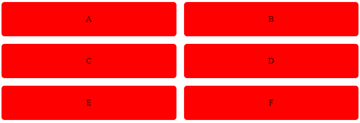
<!DOCTYPE html>
<html lang="en">
<head>
    <meta charset="UTF-8">
    <title>Title</title>
    <style>
        .container {
            display: grid;
            grid-template-columns: repeat(auto-fill, minmax(300px, 1fr));
            gap: 15px;
            margin: 50px auto;
        }

        .container div {
            padding: 25px;
            border-radius: 5px;
            background: red;
            text-align: center;
        }
    </style>
</head>
<body>
<div class="container">
    <div>A</div>
    <div>B</div>
    <div>C</div>
    <div>D</div>
    <div>E</div>
    <div>F</div>
</div>
</body>
</html>
圣杯布局
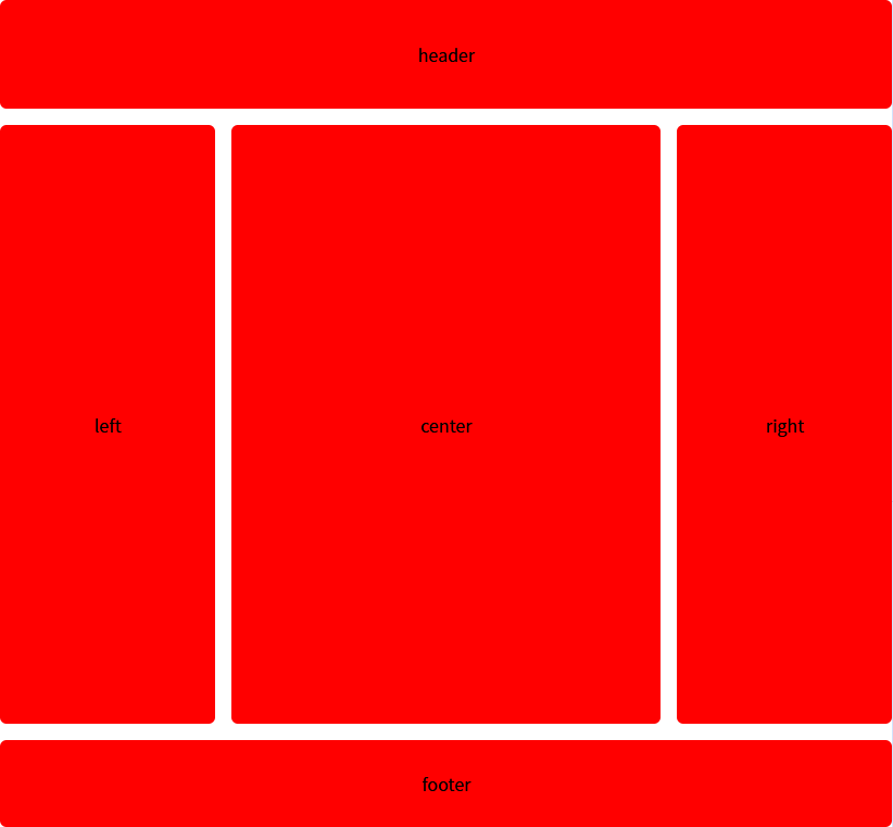
<!DOCTYPE html>
<html lang="en">
<head>
    <meta charset="UTF-8">
    <title>Title</title>
    <style>
        * {
            margin: 0;
            padding: 0;
            box-sizing: border-box;
        }

        .container {
            min-height: 100vh;
            display: grid;
            grid-template-areas: "header header header" "left center right" "footer footer footer";
            grid-template-columns: 1fr 2fr 1fr;
            grid-template-rows: 100px 1fr 80px;
            gap: 15px;
        }

        .container div {
            padding: 25px;
            border-radius: 6px;
            background: #f00;
            text-align: center;
            display: grid;
            justify-items: center;
            align-items: center;
        }

        .header {
            grid-area: header;
        }

        .left {
            grid-area: left;
        }

        .center {
            grid-area: center;
        }

        .right {
            grid-area: right;
        }

        .footer {
            grid-area: footer;
        }
    </style>
</head>
<body>
<div class="container">
    <div class="header"></div>
    <div class="left"></div>
    <div class="center"></div>
    <div class="right"></div>
    <div class="footer"></div>
</div>
</body>
</html>
表单布局
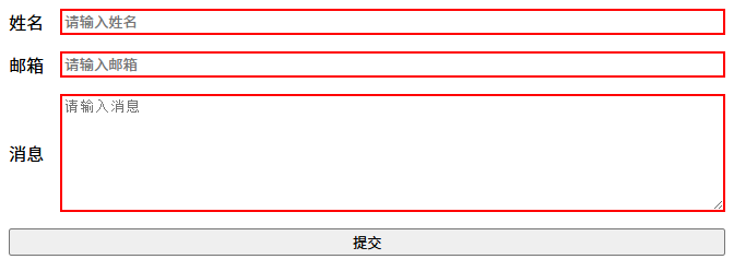
<!DOCTYPE html>
<html lang="en">
<head>
    <meta charset="UTF-8">
    <title>Title</title>
    <style>
        .container {
            display: grid;
            grid-template-columns: [labels] auto [inputs] 1fr;
            gap: 15px;
        }

        .item {
            text-align: center;
            display: flex;
            justify-content: center;
            align-items: center;
        }

        .label {
            grid-column: labels;
            justify-self: end;
        }

        .input {
            grid-column: inputs;
            border: 2px solid red;
        }

        .input input, .input textarea {
            width: 100%;
            border: none;
            outline: none;
        }

        .btn {
            grid-column: span 2;
            text-align: center;
        }
    </style>
</head>
<body>
<div class="container">
    <div class="item label">姓名</div>
    <div class="item input">
        <input placeholder="请输入姓名"/>
    </div>
    <div class="item label">邮箱</div>
    <div class="item input">
        <input placeholder="请输入邮箱"/>
    </div>
    <div class="item label">消息</div>
    <div class="item input">
        <textarea style="height: 100px;" placeholder="请输入消息"></textarea>
    </div>
    <button class="item btn">提交</button>
</div>
</body>
</html>
图片画廊
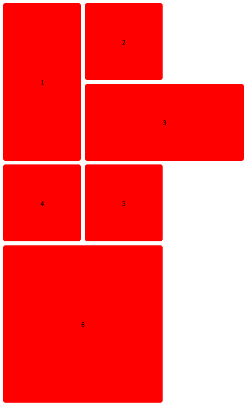
<!DOCTYPE html>
<html lang="en">
<head>
    <meta charset="UTF-8">
    <title>Title</title>
    <style>
        .container {
            display: grid;
            grid-template-columns: repeat(3, 1fr);
            grid-auto-rows: 200px;
            gap: 10px;
        }

        .item {
            padding: 25px;
            border-radius: 6px;
            background: #f00;
            text-align: center;
            display: grid;
            justify-items: center;
            align-items: center;
        }

        .item:nth-child(1) {
            grid-row: span 2;
        }

        .item:nth-child(3) {
            grid-column: span 2;
        }

        .item:nth-child(6) {
            grid-row: span 2;
            grid-column: span 2;
        }
    </style>
</head>
<body>
<div class="container">
    <div class="item">1</div>
    <div class="item">2</div>
    <div class="item">3</div>
    <div class="item">4</div>
    <div class="item">5</div>
    <div class="item">6</div>
</div>
</body>
</html>

欢迎加入北京社区
更多推荐

 1
1 0
0- 0


 已为社区贡献1条内容

所有评论(0)