
前端解决弹性容器设置“flex: 1”但内部的表格设置“text-overflow: ellipsis”却无法正常显示省略号的问题
一、问题描述:
当表格列的内容文本长度过长,没有如预期显示左侧内容+右侧表格,样式错乱,左侧内容消失了,因为右侧被撑开了,左侧因为空间不足被挤压
问题原因:
- flex弹性子元素不会缩小到它的最小内容尺寸(指的是完整展示内容所需的最小宽度或高度)
- 普通情况下默认min-width为auto(不会被压缩到小于内容的尺寸)
- 但当overflow属性非visible时min-width为0(表示可以无限收缩,不被内容撑开),因此设置overflow属性或者设置width(min-width,width,max-width)就是解决问题的思路
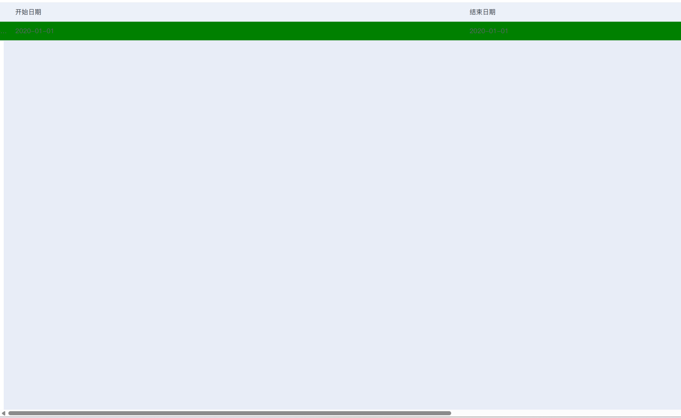
问题代码:
.flex-box-right {
flex: 1;
background-color: green;
}
完整代码:
<!DOCTYPE html>
<html lang="en">

<head>
    <meta charset="UTF-8">
    <meta name="viewport" content="width=device-width, initial-scale=1.0">
    <title>Document</title>
    <style>
        .page-container {
            min-height: 100vh;
            background: #e8edf7;
            padding-bottom: 50px;
        }

        .content {
            display: flex;
            width: 1200px;
            margin: 0 auto;
            justify-content: center;
        }

        .flex-box-left {
            width: 292px;
            flex: 0 0 292px;
            display: flex;
            flex-direction: column;
            justify-content: flex-start;
            background-color: orange;
        }

        .flex-box-right {
            flex: 1;
            background-color: green;
            /*overflow: hidden;
            max-width: 900px;*/
        }

        .custom-table {
            width: 100%;
            font-family: PingFang SC;
            font-size: 14px;
            border: 1px solid #e4e9f1;
        }

        .custom-tr {
            display: flex;
        }

        .custom-td {
            flex: 1 1 0%;
            height: 40px;
            line-height: 40px;
            text-align: left;
            padding-left: 16px;
            color: #60666e;
            border-bottom: 1px solid #e4e9f1;
            color: #60666e;
            white-space: nowrap;
            overflow: hidden;
            text-overflow: ellipsis;
        }


        .custom-thead .custom-td {
            color: #30363e;
            background: #ecf1f9;
            font-weight: 500;
        }
    </style>
</head>

<body>
    <div class="page-container">
        <div class="content mt-10">
            <div class="flex-box-left mt-10">
                left-content
            </div>
            <div class="flex-box-right ml-10">
                <div class="custom-table">
                    <div class="custom-thead">
                        <div class="custom-tr">
                            <div class="custom-td">项目</div>
                            <div class="custom-td">开始日期</div>
                            <div class="custom-td">结束日期</div>
                            <div class="custom-td">课程</div>
                        </div>
                    </div>
                    <div class="custom-tbody">
                        <div class="custom-tr">
                            <div class="custom-td">
                                dwefewfewfewfewfewfewfewfewfwefwedwefewfewfewfewfewfewfewfewfwefwedwefewfewfewfewfewfewfewfewfwefwedwefewfewfewfewfewfewfewfewfwefwedwefewfewfewfewfewfewfewfewfwefwedwefewfewfewfewfewfewfewfewfwefwedwefewfewfewfewfewfewfewfewfwefwe
                            </div>
                            <div class="custom-td">2020-01-01</div>
                            <div class="custom-td">2020-01-01</div>
                            <div class="custom-td">
                                dwefewfewfewfewfewfewfewfewfwefwedwefewfewfewfewfewfewfewfewfwefwedwefewfewfewfewfewfewfewfewfwefwedwefewfewfewfewfewfewfewfewfwefwedwefewfewfewfewfewfewfewfewfwefwedwefewfewfewfewfewfewfewfewfwefwedwefewfewfewfewfewfewfewfewfwefwe
                            </div>
                        </div>
                    </div>
                </div>
            </div>
        </div>
    </div>
</body>

</html>
二、解决方案
1.设置max-width
关键代码:
.flex-box-right {
flex: 1;
background-color: green;
/*overflow: hidden;*/
max-width: 900px;
}
完整代码:
<!DOCTYPE html>
<html lang="en">

<head>
    <meta charset="UTF-8">
    <meta name="viewport" content="width=device-width, initial-scale=1.0">
    <title>Document</title>
    <style>
        .page-container {
            min-height: 100vh;
            background: #e8edf7;
            padding-bottom: 50px;
        }

        .content {
            display: flex;
            width: 1200px;
            margin: 0 auto;
            justify-content: center;
        }

        .flex-box-left {
            width: 292px;
            flex: 0 0 292px;
            display: flex;
            flex-direction: column;
            justify-content: flex-start;
            background-color: orange;
        }

        .flex-box-right {
            flex: 1;
            background-color: green;
            /*overflow: hidden;*/
            max-width: 900px;
        }

        .custom-table {
            width: 100%;
            font-family: PingFang SC;
            font-size: 14px;
            border: 1px solid #e4e9f1;
        }

        .custom-tr {
            display: flex;
        }

        .custom-td {
            flex: 1 1 0%;
            height: 40px;
            line-height: 40px;
            text-align: left;
            padding-left: 16px;
            color: #60666e;
            border-bottom: 1px solid #e4e9f1;
            color: #60666e;
            white-space: nowrap;
            overflow: hidden;
            text-overflow: ellipsis;
        }


        .custom-thead .custom-td {
            color: #30363e;
            background: #ecf1f9;
            font-weight: 500;
        }
    </style>
</head>

<body>
    <div class="page-container">
        <div class="content mt-10">
            <div class="flex-box-left mt-10">
                left-content
            </div>
            <div class="flex-box-right ml-10">
                <div class="custom-table">
                    <div class="custom-thead">
                        <div class="custom-tr">
                            <div class="custom-td">项目</div>
                            <div class="custom-td">开始日期</div>
                            <div class="custom-td">结束日期</div>
                            <div class="custom-td">课程</div>
                        </div>
                    </div>
                    <div class="custom-tbody">
                        <div class="custom-tr">
                            <div class="custom-td">
                                dwefewfewfewfewfewfewfewfewfwefwedwefewfewfewfewfewfewfewfewfwefwedwefewfewfewfewfewfewfewfewfwefwedwefewfewfewfewfewfewfewfewfwefwedwefewfewfewfewfewfewfewfewfwefwedwefewfewfewfewfewfewfewfewfwefwedwefewfewfewfewfewfewfewfewfwefwe
                            </div>
                            <div class="custom-td">2020-01-01</div>
                            <div class="custom-td">2020-01-01</div>
                            <div class="custom-td">
                                dwefewfewfewfewfewfewfewfewfwefwedwefewfewfewfewfewfewfewfewfwefwedwefewfewfewfewfewfewfewfewfwefwedwefewfewfewfewfewfewfewfewfwefwedwefewfewfewfewfewfewfewfewfwefwedwefewfewfewfewfewfewfewfewfwefwedwefewfewfewfewfewfewfewfewfwefwe
                            </div>
                        </div>
                    </div>
                </div>
            </div>
        </div>
    </div>
</body>

</html>
2.设置min-width或者width为0
关键代码:
.flex-box-right {
flex: 1;
background-color: green;
min-width: 0;
}或者
.flex-box-right {
flex: 1;
background-color: green;
width: 0;
}
完整代码:
<!DOCTYPE html>
<html lang="en">

<head>
    <meta charset="UTF-8">
    <meta name="viewport" content="width=device-width, initial-scale=1.0">
    <title>Document</title>
    <style>
        .page-container {
            min-height: 100vh;
            background: #e8edf7;
            padding-bottom: 50px;
        }

        .content {
            display: flex;
            width: 1200px;
            margin: 0 auto;
            justify-content: center;
        }

        .flex-box-left {
            width: 292px;
            flex: 0 0 292px;
            display: flex;
            flex-direction: column;
            justify-content: flex-start;
            background-color: orange;
        }

        .flex-box-right {
            flex: 1;
            background-color: green;
            min-width: 0;
        }

        .custom-table {
            width: 100%;
            font-family: PingFang SC;
            font-size: 14px;
            border: 1px solid #e4e9f1;
        }

        .custom-tr {
            display: flex;
        }

        .custom-td {
            flex: 1 1 0%;
            height: 40px;
            line-height: 40px;
            text-align: left;
            padding-left: 16px;
            color: #60666e;
            border-bottom: 1px solid #e4e9f1;
            color: #60666e;
            white-space: nowrap;
            overflow: hidden;
            text-overflow: ellipsis;
        }


        .custom-thead .custom-td {
            color: #30363e;
            background: #ecf1f9;
            font-weight: 500;
        }
    </style>
</head>

<body>
    <div class="page-container">
        <div class="content mt-10">
            <div class="flex-box-left mt-10">
                left-content
            </div>
            <div class="flex-box-right ml-10">
                <div class="custom-table">
                    <div class="custom-thead">
                        <div class="custom-tr">
                            <div class="custom-td">项目</div>
                            <div class="custom-td">开始日期</div>
                            <div class="custom-td">结束日期</div>
                            <div class="custom-td">课程</div>
                        </div>
                    </div>
                    <div class="custom-tbody">
                        <div class="custom-tr">
                            <div class="custom-td">
                                dwefewfewfewfewfewfewfewfewfwefwedwefewfewfewfewfewfewfewfewfwefwedwefewfewfewfewfewfewfewfewfwefwedwefewfewfewfewfewfewfewfewfwefwedwefewfewfewfewfewfewfewfewfwefwedwefewfewfewfewfewfewfewfewfwefwedwefewfewfewfewfewfewfewfewfwefwe
                            </div>
                            <div class="custom-td">2020-01-01</div>
                            <div class="custom-td">2020-01-01</div>
                            <div class="custom-td">
                                dwefewfewfewfewfewfewfewfewfwefwedwefewfewfewfewfewfewfewfewfwefwedwefewfewfewfewfewfewfewfewfwefwedwefewfewfewfewfewfewfewfewfwefwedwefewfewfewfewfewfewfewfewfwefwedwefewfewfewfewfewfewfewfewfwefwedwefewfewfewfewfewfewfewfewfwefwe
                            </div>
                        </div>
                    </div>
                </div>
            </div>
        </div>
    </div>
</body>

</html>
3.设置overflow:hidden
overflow: auto有滚动条不介意的话也可以
关键代码:
.flex-box-right {
flex: 1;
background-color: green;
overflow: hidden;
}
完整代码:
<!DOCTYPE html>
<html lang="en">

<head>
    <meta charset="UTF-8">
    <meta name="viewport" content="width=device-width, initial-scale=1.0">
    <title>Document</title>
    <style>
        .page-container {
            min-height: 100vh;
            background: #e8edf7;
            padding-bottom: 50px;
        }

        .content {
            display: flex;
            width: 1200px;
            margin: 0 auto;
            justify-content: center;
        }

        .flex-box-left {
            width: 292px;
            flex: 0 0 292px;
            display: flex;
            flex-direction: column;
            justify-content: flex-start;
            background-color: orange;
        }

        .flex-box-right {
            flex: 1;
            background-color: green;
            overflow: hidden;
            /*max-width: 900px;*/
        }

        .custom-table {
            width: 100%;
            font-family: PingFang SC;
            font-size: 14px;
            border: 1px solid #e4e9f1;
        }

        .custom-tr {
            display: flex;
        }

        .custom-td {
            flex: 1 1 0%;
            height: 40px;
            line-height: 40px;
            text-align: left;
            padding-left: 16px;
            color: #60666e;
            border-bottom: 1px solid #e4e9f1;
            color: #60666e;
            white-space: nowrap;
            overflow: hidden;
            text-overflow: ellipsis;
        }


        .custom-thead .custom-td {
            color: #30363e;
            background: #ecf1f9;
            font-weight: 500;
        }
    </style>
</head>

<body>
    <div class="page-container">
        <div class="content mt-10">
            <div class="flex-box-left mt-10">
                left-content
            </div>
            <div class="flex-box-right ml-10">
                <div class="custom-table">
                    <div class="custom-thead">
                        <div class="custom-tr">
                            <div class="custom-td">项目</div>
                            <div class="custom-td">开始日期</div>
                            <div class="custom-td">结束日期</div>
                            <div class="custom-td">课程</div>
                        </div>
                    </div>
                    <div class="custom-tbody">
                        <div class="custom-tr">
                            <div class="custom-td">
                                dwefewfewfewfewfewfewfewfewfwefwedwefewfewfewfewfewfewfewfewfwefwedwefewfewfewfewfewfewfewfewfwefwedwefewfewfewfewfewfewfewfewfwefwedwefewfewfewfewfewfewfewfewfwefwedwefewfewfewfewfewfewfewfewfwefwedwefewfewfewfewfewfewfewfewfwefwe
                            </div>
                            <div class="custom-td">2020-01-01</div>
                            <div class="custom-td">2020-01-01</div>
                            <div class="custom-td">
                                dwefewfewfewfewfewfewfewfewfwefwedwefewfewfewfewfewfewfewfewfwefwedwefewfewfewfewfewfewfewfewfwefwedwefewfewfewfewfewfewfewfewfwefwedwefewfewfewfewfewfewfewfewfwefwedwefewfewfewfewfewfewfewfewfwefwedwefewfewfewfewfewfewfewfewfwefwe
                            </div>
                        </div>
                    </div>
                </div>
            </div>
        </div>
    </div>
</body>

</html>
三、问题:如果custom-td还有子元素cell-cont却无法显示省略号
设置max-width: 100%;或者width: 100%;再加上ellipsis样式代码
.cell-cont {
max-width: 100%;
display: inline-block;
white-space: nowrap;
overflow: hidden;
text-overflow: ellipsis;
}
完整代码:
<!DOCTYPE html>
<html lang="en">

<head>
    <meta charset="UTF-8">
    <meta name="viewport" content="width=device-width, initial-scale=1.0">
    <title>Document</title>
    <style>
        .page-container {
            min-height: 100vh;
            background: #e8edf7;
            padding-bottom: 50px;
        }

        .content {
            display: flex;
            width: 1200px;
            margin: 0 auto;
            justify-content: center;
        }

        .flex-box-left {
            width: 292px;
            flex: 0 0 292px;
            display: flex;
            flex-direction: column;
            justify-content: flex-start;
            background-color: orange;
        }

        .flex-box-right {
            flex: 1;
            background-color: green;
            min-width: 0;
        }

        .custom-table {
            width: 100%;
            font-family: PingFang SC;
            font-size: 14px;
            border: 1px solid #e4e9f1;
        }

        .custom-tr {
            display: flex;
        }

        .custom-td {
            flex: 1 1 0%;
            height: 40px;
            line-height: 40px;
            text-align: left;
            padding-left: 16px;
            color: #60666e;
            border-bottom: 1px solid #e4e9f1;
            color: #60666e;
            white-space: nowrap;
            overflow: hidden;
            text-overflow: ellipsis;
        }


        .custom-thead .custom-td {
            color: #30363e;
            background: #ecf1f9;
            font-weight: 500;
        }
        .cell-cont {
            max-width: 100%;
            display: inline-block;
            white-space: nowrap;
            overflow: hidden;
            text-overflow: ellipsis;
        }
    </style>
</head>

<body>
    <div class="page-container">
        <div class="content mt-10">
            <div class="flex-box-left mt-10">
                left-content
            </div>
            <div class="flex-box-right ml-10">
                <div class="custom-table">
                    <div class="custom-thead">
                        <div class="custom-tr">
                            <div class="custom-td">项目</div>
                            <div class="custom-td">开始日期</div>
                            <div class="custom-td">结束日期</div>
                            <div class="custom-td">课程</div>
                        </div>
                    </div>
                    <div class="custom-tbody">
                        <div class="custom-tr">
                            <div class="custom-td">
                                dwefewfewfewfewfewfewfewfewfwefwedwefewfewfewfewfewfewfewfewfwefwedwefewfewfewfewfewfewfewfewfwefwedwefewfewfewfewfewfewfewfewfwefwedwefewfewfewfewfewfewfewfewfwefwedwefewfewfewfewfewfewfewfewfwefwedwefewfewfewfewfewfewfewfewfwefwe
                            </div>
                            <div class="custom-td">2020-01-01</div>
                            <div class="custom-td">2020-01-01</div>
                            <div class="custom-td">
                                <div class="cell-cont">dwefewfewfewfewfewfewfewfewfwefwedwefewfewfewfewfewfewfewfewfwefwedwefewfewfewfewfewfewfewfewfwefwedwefewfewfewfewfewfewfewfewfwefwedwefewfewfewfewfewfewfewfewfwefwedwefewfewfewfewfewfewfewfewfwefwedwefewfewfewfewfewfewfewfewfwefwe</div>
                            </div>
                        </div>
                    </div>
                </div>
            </div>
        </div>
    </div>
</body>

</html>
四、参考资料
参考资料地址:
- 参考资料1:
https://www.w3.org/TR/css-flexbox-1/#min-size-auto
搜索:“Automatic Minimum Size of Flex Items”
- 参考资料2:
搜素“Positive and negative free space”
在Flexbox布局中,Positive Free Space指容器剩余的可分配空间,用于扩展Flex项目的尺寸;Negative Free Space指当容器空间不足时,Flex项目需要收缩的基准空间。
更多推荐
 2
2 0
0- 0


 已为社区贡献1条内容

所有评论(0)