
机器学习——数据预处理+类别不平衡分析与采样方式对比+SHAP高级可视化(分类)
感谢关注,一起来学习干货。
本期摘要
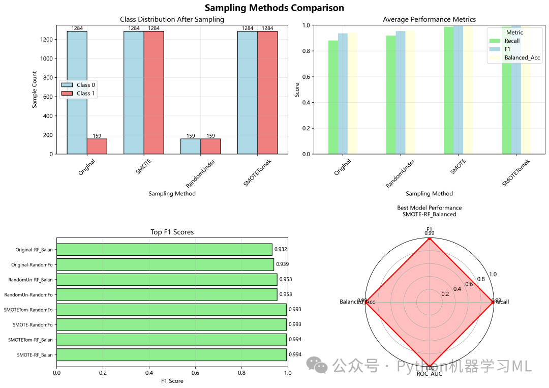
1、统计检验综合分析、SMOTE (过采样)、RandomUnder (欠采样)、
SMOTETomek (混合采样)性能对比
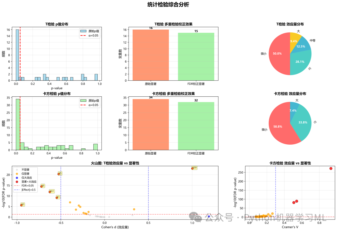
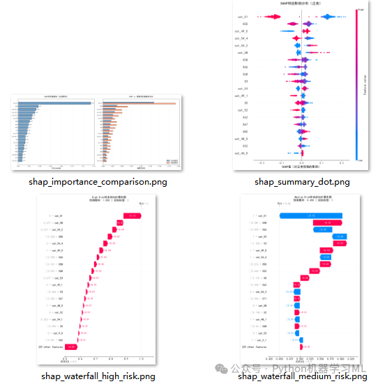
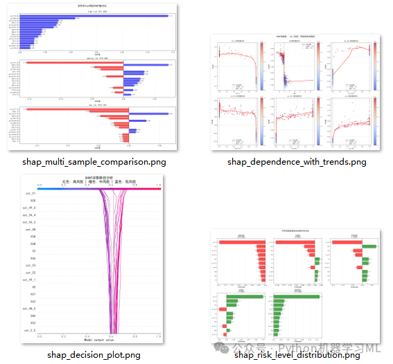
2、shap高级可视化
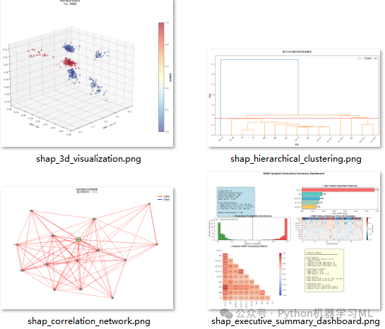
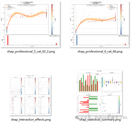
阶段 1: 环境设置与库导入
这个阶段负责导入所有必需的Python库和设置基本环境。它为后续的数据处理、统计分析和可视化奠定了基础。
作用解释: 此阶段导入了用于数据操作的pandas和numpy,用于统计分析的scipy和statsmodels,用于机器学习预处理的sklearn,以及用于可视化的matplotlib和seaborn。代码还设置了忽略不必要的警告,并配置了中文字体以确保图表能正确显示中文内容。
python
import pandas as pd
import numpy as np
import warnings
from typing importList, Tuple, Dict, Optional
import pickle

# 科学计算
from scipy import stats
from scipy.stats import (chi2_contingency, ttest_ind, mannwhitneyu,
                         shapiro, fisher_exact, anderson, kstest)

# 机器学习
from sklearn.preprocessing import StandardScaler, LabelEncoder, OneHotEncoder
from sklearn.impute import SimpleImputer
from sklearn.model_selection import train_test_split
from sklearn.pipeline import Pipeline
from sklearn.compose import ColumnTransformer
from sklearn.base import BaseEstimator, TransformerMixin

# 统计校正
from statsmodels.stats.multitest import multipletests

# 可视化
import matplotlib.pyplot as plt
import seaborn as sns
import matplotlib

# 配置
warnings.filterwarnings('ignore')
matplotlib.rcParams['font.sans-serif'] = ['microsoft yahei']
matplotlib.rcParams['axes.unicode_minus'] = False
阶段 2: 智能变量识别器 (SmartVariableIdentifier)
这个阶段定义了一个名为SmartVariableIdentifier的类,用于自动识别数据集中的变量类型。
作用解释: 在自动化处理流程中,手动区分数值型和类别型变量很繁琐。这个类通过一系列规则实现智能识别:
- 强制指定
可以强制将某些列指定为数值型或类别型。
- 数据类型
非数值类型的列(如object)直接归为类别型。
- 唯一值数量与比例
对于数值类型的列,如果其唯一值的数量很少(例如,小于10个)且占总样本的比例很低,则它很可能是编码后的类别变量(如
0, 1, 2代表不同等级),因此被识别为类别型。否则,被识别为数值型。 - 二分类
唯一值数量为2的列被自动识别为类别型。
这为后续针对不同类型变量采取不同处理策略(如标准化 vs. 编码)提供了基础。
python
# ============================================
# 第一部分:数据预处理模块
# ============================================

classSmartVariableIdentifier:
"""智能变量类型识别器"""

def__init__(self,
                 unique_ratio_threshold: float = 0.05,
                 max_categories: int = 10,
                 force_numerical: Optional[List[str]] = None,
                 force_categorical: Optional[List[str]] = None,
                 exclude_cols: Optional[List[str]] = None):
self.unique_ratio_threshold = unique_ratio_threshold
self.max_categories = max_categories
self.force_numerical = force_numerical or []
self.force_categorical = force_categorical or []
self.exclude_cols = exclude_cols or []

deffit(self, X: pd.DataFrame, y: Optional[pd.Series] = None):
"""识别变量类型"""
self.numerical_cols_ = []
self.categorical_cols_ = []
self.excluded_cols_ = []

for col in X.columns:
if col inself.exclude_cols:
self.excluded_cols_.append(col)
continue

if col inself.force_numerical:
self.numerical_cols_.append(col)
continue
if col inself.force_categorical:
self.categorical_cols_.append(col)
continue

if X[col].dtype in ['int64', 'float64']:
                n_unique = X[col].nunique()
                unique_ratio = n_unique / len(X)

if n_unique == 2:
self.categorical_cols_.append(col)
elif n_unique <= self.max_categories and unique_ratio < self.unique_ratio_threshold:
self.categorical_cols_.append(col)
else:
self.numerical_cols_.append(col)
else:
self.categorical_cols_.append(col)

returnself

defget_feature_types(self) -> Tuple[List[str], List[str]]:
returnself.numerical_cols_, self.categorical_cols_
阶段 3: 智能类别编码器 (SmartCategoricalEncoder)
这个阶段定义了一个名为SmartCategoricalEncoder的类,用于对类别变量进行智能编码。
作用解释: 不同的类别变量需要不同的编码策略。这个类实现了自动化的编码选择:
- 二分类变量 (如 "是/否")
使用标签编码 (Label Encoding),将其转换为
0和1,节省空间且高效。 - 少量类别的变量 (如 "低/中/高")
使用独热编码 (One-Hot Encoding),为每个类别创建一个新的二元特征,避免了错误的顺序关系。
- 大量类别的变量 (如 "城市名称")
使用频率编码 (Frequency Encoding),将每个类别替换为其在数据集中出现的频率。这可以捕捉到类别的重要性信息,同时避免了独热编码导致的维度爆炸。
这个类被设计为sklearn的Transformer,可以无缝集成到Pipeline中。
python
classSmartCategoricalEncoder(BaseEstimator, TransformerMixin):
"""
    智能类别编码器(修复版 - 支持numpy数组)

    - 二分类: Label Encoding
    - 少量类别(<=max_categories): One-Hot Encoding
    - 大量类别(>max_categories): Frequency Encoding
    """

def__init__(self, max_categories: int = 10):
self.max_categories = max_categories
self.encoders_ = {}
self.encoding_types_ = {}
self.feature_names_in_ = None
self.feature_names_out_ = None

deffit(self, X, y=None):
"""学习编码方式"""
# 转换为DataFrame(如果是numpy数组)
ifisinstance(X, np.ndarray):
ifself.feature_names_in_ isNone:
self.feature_names_in_ = [f'cat_{i}'for i inrange(X.shape[1])]
            X = pd.DataFrame(X, columns=self.feature_names_in_)
else:
self.feature_names_in_ = list(X.columns)

# 生成输出特征名称
self.feature_names_out_ = []

for col in X.columns:
            n_categories = X[col].nunique()

if n_categories == 2:
# 二分类 -> Label Encoding
self.encoding_types_[col] = 'label'
                le = LabelEncoder()
                le.fit(X[col].astype(str))
self.encoders_[col] = le
self.feature_names_out_.append(col)

elif n_categories <= self.max_categories:
# 少量类别 -> One-Hot Encoding
self.encoding_types_[col] = 'onehot'
                categories = sorted(X[col].unique())  # 排序以保持一致性
self.encoders_[col] = categories
# 为每个类别生成特征名
for cat in categories:
self.feature_names_out_.append(f'{col}_{cat}')

else:
# 大量类别 -> Frequency Encoding
self.encoding_types_[col] = 'frequency'
                freq_map = X[col].value_counts(normalize=True).to_dict()
self.encoders_[col] = freq_map
self.feature_names_out_.append(col)

returnself

deftransform(self, X):
"""应用编码"""
# 转换为DataFrame(如果是numpy数组)
ifisinstance(X, np.ndarray):
            X = pd.DataFrame(X, columns=self.feature_names_in_)

        X_encoded = pd.DataFrame(index=X.index)

for col in X.columns:
            encoding_type = self.encoding_types_[col]

if encoding_type == 'label':
# Label Encoding
                le = self.encoders_[col]
                encoded = X[col].astype(str).map(
lambda x: le.transform([x])[0] if x in le.classes_ else -1
                )
                X_encoded[col] = encoded

elif encoding_type == 'onehot':
# One-Hot Encoding
                categories = self.encoders_[col]
for cat in categories:
                    X_encoded[f'{col}_{cat}'] = (X[col] == cat).astype(int)

else:  # frequency
# Frequency Encoding
                freq_map = self.encoders_[col]
                X_encoded[col] = X[col].map(freq_map).fillna(0)

# 返回numpy数组(保持与Pipeline兼容)
return X_encoded.values

defget_feature_names_out(self, input_features=None):
"""返回输出特征名称"""
return np.array(self.feature_names_out_)
阶段 4: 预处理管道创建 (create_preprocessing_pipeline)
这个阶段定义了一个函数,用于将数值和类别变量的预处理步骤组合成一个统一的ColumnTransformer。
作用解释: ColumnTransformer是sklearn中一个强大的工具,它允许对数据集的不同列应用不同的转换器。这个函数创建了一个这样的转换器,具体流程如下:
- 数值变量
首先用中位数填充缺失值(对异常值稳健),然后进行标准化(
StandardScaler),使其均值为0,方差为1。 - 类别变量
首先用众数填充缺失值,然后应用上一阶段定义的
SmartCategoricalEncoder进行智能编码。
这个函数将复杂的预处理流程封装成一个单一的对象,大大简化了后续的建模过程。
python
defcreate_preprocessing_pipeline(numerical_cols: List[str],
                                  categorical_cols: List[str],
                                  max_onehot_categories: int = 10) -> ColumnTransformer:
"""
    创建完整的预处理Pipeline

    数值变量: 中位数填充 + 标准化
    类别变量: 众数填充 + 智能编码
    """

# 数值变量处理器
    numeric_transformer = Pipeline(steps=[
        ('imputer', SimpleImputer(strategy='median')),
        ('scaler', StandardScaler())
    ])

# 类别变量处理器
if categorical_cols:
        categorical_transformer = Pipeline(steps=[
            ('imputer', SimpleImputer(strategy='most_frequent', fill_value='Unknown')),
            ('encoder', SmartCategoricalEncoder(max_categories=max_onehot_categories))
        ])
else:
        categorical_transformer = 'passthrough'

# 组合转换器
    transformers = []
if numerical_cols:
        transformers.append(('num', numeric_transformer, numerical_cols))
if categorical_cols:
        transformers.append(('cat', categorical_transformer, categorical_cols))

    preprocessor = ColumnTransformer(
        transformers=transformers,
        remainder='drop',
        verbose_feature_names_out=False
    )

return preprocessor
阶段 5: 完整数据预处理流程 (complete_data_preprocessing)
这个阶段定义了一个核心函数,它整合了前面所有模块,执行从数据加载到预处理完成的全套流程。
作用解释: 这是一个高级封装函数,按顺序执行了以下关键步骤:
- 分离特征与目标
将数据集分为
X(特征)和y(目标变量)。 - 识别变量类型
调用
SmartVariableIdentifier自动区分数值和类别变量。 - 划分数据集
将数据划分为训练集和测试集,使用分层抽样确保类别比例一致,避免数据泄露。
- 创建并应用Pipeline
调用
create_preprocessing_pipeline创建预处理器,并在训练集上fit_transform(学习并转换),在测试集上只transform(仅转换)。 - 获取特征名称
处理独热编码等导致的特征名称变化问题,确保处理后的数据有正确的列名。
- 保存预处理器
使用
pickle将训练好的预处理器保存到文件,以便在未来对新数据应用完全相同的处理。 - 返回结果
返回一个包含所有处理后数据、预处理器和元信息(如特征名)的字典,方便后续使用。
defcomplete_data_preprocessing(data: pd.DataFrame,
                                target_col: str = 'Y',
                                test_size: float = 0.2,
                                random_state: int = 42,
                                max_onehot_categories: int = 10,
                                save_preprocessor: bool = True) -> Dict:
"""完整的数据预处理流程"""

print("="*60)
print("开始数据预处理流程")
print("="*60)

# 1. 分离特征和目标
    X = data.drop(target_col, axis=1)
    y = data[target_col]

print()
print("原始数据:")
print(f"  样本数: {len(X)}")
print(f"  特征数: {X.shape[1]}")
print(f"  目标变量分布:")
print(y.value_counts())

# 2. 识别变量类型
print()
print("识别变量类型...")
    identifier = SmartVariableIdentifier(
        max_categories=10,
        force_categorical=['NSICC', 'TCR', 'Cre']
    )
    identifier.fit(X)
    numerical_cols, categorical_cols = identifier.get_feature_types()

print(f"  数值变量: {len(numerical_cols)}个")
print(f"  类别变量: {len(categorical_cols)}个")
if categorical_cols:
print(f"  类别变量列表: {categorical_cols}")

# 3. 检查缺失值
    missing_info = X.isnull().sum()
    missing_info = missing_info[missing_info > 0]
iflen(missing_info) > 0:
print()
print("缺失值情况:")
for col, count in missing_info.items():
print(f"  {col}: {count} ({count/len(X)*100:.1f}%)")
else:
print()
print("无缺失值")

# 4. 划分训练集和测试集
print()
print(f"划分训练集和测试集 (test_size={test_size})...")
try:
        X_train, X_test, y_train, y_test = train_test_split(
            X, y,
            test_size=test_size,
            random_state=random_state,
            stratify=y
        )
print(f"  训练集: {len(X_train)}样本")
print(f"  测试集: {len(X_test)}样本")
except:
print("  警告: 分层抽样失败,使用随机抽样")
        X_train, X_test, y_train, y_test = train_test_split(
            X, y,
            test_size=test_size,
            random_state=random_state
        )

# 5. 创建预处理Pipeline
print()
print("创建预处理Pipeline...")
    preprocessor = create_preprocessing_pipeline(
        numerical_cols,
        categorical_cols,
        max_onehot_categories=max_onehot_categories
    )

# 6. 仅在训练集上fit
print("在训练集上fit预处理器...")
    X_train_processed = preprocessor.fit_transform(X_train)

# 7. 在测试集上transform
print("在测试集上transform...")
    X_test_processed = preprocessor.transform(X_test)

# 8. 获取特征名称(修复版)
print("生成特征名称...")
    feature_names = []

# 数值特征名称(直接使用原始列名)
if numerical_cols:
        feature_names.extend(numerical_cols)

# 类别特征名称(从编码器获取)
if categorical_cols:
try:
# 获取类别编码器
            cat_encoder = preprocessor.named_transformers_['cat'].named_steps['encoder']
# 获取编码后的特征名称
            cat_feature_names = cat_encoder.get_feature_names_out()
            feature_names.extend(cat_feature_names)
except Exception as e:
print(f"  警告: 无法获取类别特征名称: {e}")
# 如果获取失败,生成默认名称
            n_cat_features = X_train_processed.shape[1] - len(numerical_cols)
            feature_names.extend([f'cat_{i}'for i inrange(n_cat_features)])

# 验证特征名称数量
iflen(feature_names) != X_train_processed.shape[1]:
print(f"  警告: 特征名称数量({len(feature_names)})与实际特征数({X_train_processed.shape[1]})不匹配")
print(f"  使用默认特征名称")
        feature_names = [f'feature_{i}'for i inrange(X_train_processed.shape[1])]

print(f"  生成 {len(feature_names)} 个特征名称")

# 9. 转换为DataFrame
    X_train_processed = pd.DataFrame(
        X_train_processed,
        columns=feature_names,
        index=X_train.index
    )
    X_test_processed = pd.DataFrame(
        X_test_processed,
        columns=feature_names,
        index=X_test.index
    )

print()
print("预处理完成:")
print(f"  原始特征数: {X.shape[1]}")
print(f"  处理后特征数: {X_train_processed.shape[1]}")
print(f"  特征数变化: {X_train_processed.shape[1] - X.shape[1]:+d}")

# 10. 检查数据质量
print()
print("数据质量检查:")
    train_missing = X_train_processed.isnull().sum().sum()
    test_missing = X_test_processed.isnull().sum().sum()
print(f"  训练集缺失值: {train_missing}")
print(f"  测试集缺失值: {test_missing}")
print(f"  数据类型: {X_train_processed.dtypes.value_counts().to_dict()}")

# 11. 保存预处理器
if save_preprocessor:
withopen('preprocessor.pkl', 'wb') as f:
            pickle.dump(preprocessor, f)
print()
print("预处理器已保存到: preprocessor.pkl")

return {
'X_train': X_train_processed,
'X_test': X_test_processed,
'y_train': y_train,
'y_test': y_test,
'preprocessor': preprocessor,
'feature_names': list(feature_names),
'numerical_cols': numerical_cols,
'categorical_cols': categorical_cols,
'original_X_train': X_train,
'original_X_test': X_test
    }
阶段 6: 正态性检验函数 (test_normality)
这个阶段定义了一个工具函数,用于智能地选择并执行正态性检验。
作用解释: 不同的正态性检验方法适用于不同样本量的数据。这个函数实现了自动选择:
- 小样本 (n < 50)
使用Shapiro-Wilk检验,这是小样本中最强大的正态性检验方法。
- 中等样本 (50 <= n < 5000)
使用Anderson-Darling检验,它对数据尾部的偏差更敏感。
- 大样本 (n >= 5000)
使用Kolmogorov-Smirnov检验,适用于大样本数据。
这个函数返回检验名称、统计量、p值以及是否符合正态分布的布尔值,为后续选择参数检验(T检验)还是非参数检验(曼-惠特尼U检验)提供了依据。
python
# ============================================
# 第二部分:统计检验模块(保持不变)
# ============================================

def test_normality(data: np.ndarray, alpha: float = 0.05) -> Dict:
"""根据样本量选择合适的正态性检验"""
    n = len(data)

try:
if n < 50:
            stat, p = shapiro(data)
            test_name = "Shapiro-Wilk"
elif n < 5000:
            result = anderson(data, dist='norm')
            stat = result.statistic
            critical_value = result.critical_values[2]
            p = 0.05if stat > critical_value else0.10
            test_name = "Anderson-Darling"
else:
            stat, p = kstest(data, 'norm', args=(np.mean(data), np.std(data)))
            test_name = "Kolmogorov-Smirnov"

return {
'test': test_name,
'statistic': stat,
'p_value': p,
'is_normal': p > alpha
        }
except Exception as e:
return {
'test': 'Failed',
'statistic': np.nan,
'p_value': np.nan,
'is_normal': False,
'error': str(e)
        }
阶段 7: 详细的T检验与卡方检验函数
这个阶段定义了三个核心的统计检验函数,用于分析变量与目标之间的关系。
作用解释:
-
detailed_ttest_analysis- 用途
专门用于分析数值变量与二分类目标变量之间的关系。
- 流程
首先对两组数据进行正态性检验和方差齐性检验(Levene检验),然后智能选择使用学生T检验(方差齐)或韦尔奇T检验(方差不齐)。
- 产出
返回一个包含详细信息的字典,包括p值、均值差异、效应量(Cohen's d)等,全面评估差异的统计显著性和实际意义。
- 用途
-
smart_contingency_test- 用途
这是一个内部辅助函数,用于智能选择对列联表(类别变量之间关系)的检验方法。
- 流程
默认使用卡方检验,但当期望频数过低(不满足卡方检验的假设)时,会自动切换到更适用的Fisher精确检验(2x2表)或G检验(大表)。
- 用途
-
detailed_chi2_analysis- 用途
专门用于分析类别变量之间的关系。
- 流程
创建列联表,然后调用
smart_contingency_test进行检验。 - 产出
返回详细结果,包括p值、效应量(Cramer's V)以及用于事后分析的标准化残差。
- 用途
这些函数共同构成了强大的统计分析工具箱。
defdetailed_ttest_analysis(data: pd.DataFrame,
                            target: str,
                            feature_col: str,
                            alpha: float = 0.05) -> Optional[Dict]:
"""详细的T检验分析"""

try:
        groups = data.groupby(target)[feature_col]
        group_data = [group.dropna().values for name, group in groups]
        group_names = [name for name, group in groups]

iflen(group_data) != 2:
returnNone

        group0, group1 = group_data[0], group_data[1]
        name0, name1 = group_names[0], group_names[1]

iflen(group0) < 2orlen(group1) < 2:
returnNone

        stats_dict = {
'feature': feature_col,
'group0_name': name0,
'group1_name': name1,
'group0_n': len(group0),
'group1_n': len(group1),
'group0_mean': np.mean(group0),
'group1_mean': np.mean(group1),
'group0_std': np.std(group0, ddof=1),
'group1_std': np.std(group1, ddof=1),
'group0_median': np.median(group0),
'group1_median': np.median(group1),
        }

        stats_dict['mean_diff'] = stats_dict['group1_mean'] - stats_dict['group0_mean']
if stats_dict['group0_mean'] != 0:
            stats_dict['mean_diff_percent'] = (stats_dict['mean_diff'] /
abs(stats_dict['group0_mean']) * 100)
else:
            stats_dict['mean_diff_percent'] = np.inf

        norm_test0 = test_normality(group0, alpha)
        norm_test1 = test_normality(group1, alpha)

        stats_dict['group0_normality_test'] = norm_test0['test']
        stats_dict['group0_normality_p'] = norm_test0['p_value']
        stats_dict['group0_normal'] = norm_test0['is_normal']

        stats_dict['group1_normality_test'] = norm_test1['test']
        stats_dict['group1_normality_p'] = norm_test1['p_value']
        stats_dict['group1_normal'] = norm_test1['is_normal']

        levene_stat, levene_p = stats.levene(group0, group1)
        stats_dict['levene_statistic'] = levene_stat
        stats_dict['levene_p'] = levene_p
        stats_dict['equal_variance'] = levene_p > alpha

if stats_dict['equal_variance']:
            t_stat, t_p = ttest_ind(group0, group1, equal_var=True)
            test_type = "Student's t-test"
else:
            t_stat, t_p = ttest_ind(group0, group1, equal_var=False)
            test_type = "Welch's t-test"

        stats_dict['t_statistic'] = t_stat
        stats_dict['t_pvalue'] = t_p
        stats_dict['test_type'] = test_type
        stats_dict['significant'] = t_p < alpha

        u_stat, u_p = mannwhitneyu(group0, group1, alternative='two-sided')
        stats_dict['mannwhitney_u'] = u_stat
        stats_dict['mannwhitney_p'] = u_p
        stats_dict['mannwhitney_significant'] = u_p < alpha

        pooled_std = np.sqrt(((len(group0) - 1) * stats_dict['group0_std']**2 +
                             (len(group1) - 1) * stats_dict['group1_std']**2) /
                            (len(group0) + len(group1) - 2))

if pooled_std > 0:
            cohens_d = stats_dict['mean_diff'] / pooled_std
            stats_dict['cohens_d'] = cohens_d

            abs_d = abs(cohens_d)
if abs_d < 0.2:
                effect_size = "微小"
elif abs_d < 0.5:
                effect_size = "小"
elif abs_d < 0.8:
                effect_size = "中等"
else:
                effect_size = "大"
            stats_dict['effect_size_interpretation'] = effect_size
else:
            stats_dict['cohens_d'] = 0
            stats_dict['effect_size_interpretation'] = "无法计算"

return stats_dict

except Exception as e:
print(f"T检验失败 - {feature_col}: {str(e)}")
returnNone


defsmart_contingency_test(crosstab: pd.DataFrame, alpha: float = 0.05) -> Dict:
"""智能列联表检验"""

    chi2_stat, chi2_p, dof, expected = chi2_contingency(crosstab)

    min_expected = np.min(expected)
    percent_less_5 = np.sum(expected < 5) / expected.size * 100
    assumptions_met = (min_expected >= 1) and (percent_less_5 <= 20)

if crosstab.shape == (2, 2) and min_expected < 5:
try:
            oddsratio, p_value = fisher_exact(crosstab)
            test_type = "Fisher's Exact Test"
            statistic = oddsratio
except:
            test_type = "Pearson's Chi-square"
            p_value = chi2_p
            statistic = chi2_stat

elifnot assumptions_met:
try:
            g_stat, g_p, dof, _ = chi2_contingency(crosstab, lambda_="log-likelihood")
            test_type = "G-test (Likelihood Ratio)"
            p_value = g_p
            statistic = g_stat
except:
            test_type = "Pearson's Chi-square (Warning: assumptions not met)"
            p_value = chi2_p
            statistic = chi2_stat
else:
        test_type = "Pearson's Chi-square"
        p_value = chi2_p
        statistic = chi2_stat

return {
'test_type': test_type,
'statistic': statistic,
'p_value': p_value,
'dof': dof,
'min_expected': min_expected,
'percent_less_5': percent_less_5,
'assumptions_met': assumptions_met,
'chi2_statistic': chi2_stat
    }


defdetailed_chi2_analysis(data: pd.DataFrame,
                          target: str,
                          feature_col: str,
                          alpha: float = 0.05) -> Optional[Dict]:
"""详细的卡方检验分析"""

try:
        crosstab = pd.crosstab(data[feature_col], data[target])

        stats_dict = {
'feature': feature_col,
'n_feature_categories': crosstab.shape[0],
'n_target_categories': crosstab.shape[1],
'total_samples': crosstab.sum().sum(),
        }

        test_result = smart_contingency_test(crosstab, alpha)
        stats_dict.update(test_result)
        stats_dict['significant'] = test_result['p_value'] < alpha

        n = crosstab.sum().sum()
        min_dim = min(crosstab.shape) - 1
        cramers_v = np.sqrt(test_result['chi2_statistic'] / (n * min_dim))
        stats_dict['cramers_v'] = cramers_v

if min_dim == 1:
if cramers_v < 0.1:
                effect_size = "微小"
elif cramers_v < 0.3:
                effect_size = "小"
elif cramers_v < 0.5:
                effect_size = "中等"
else:
                effect_size = "大"
else:
if cramers_v < 0.07:
                effect_size = "微小"
elif cramers_v < 0.21:
                effect_size = "小"
elif cramers_v < 0.35:
                effect_size = "中等"
else:
                effect_size = "大"

        stats_dict['effect_size_interpretation'] = effect_size

        chi2_stat, _, _, expected = chi2_contingency(crosstab)
        standardized_residuals = (crosstab - expected) / np.sqrt(expected)
        stats_dict['max_abs_residual'] = np.max(np.abs(standardized_residuals.values))

        stats_dict['observed_crosstab'] = crosstab
        stats_dict['expected_frequencies'] = pd.DataFrame(
            expected,
            index=crosstab.index,
            columns=crosstab.columns
        )
        stats_dict['standardized_residuals'] = standardized_residuals

return stats_dict

except Exception as e:
print(f"卡方检验失败 - {feature_col}: {str(e)}")
returnNone
阶段 8: 批量统计检验与多重校正
(perform_statistical_tests_with_correction)
这个阶段定义了一个函数,用于批量执行T检验和卡方检验,并对结果进行多重检验校正。
作用解释: 当同时进行大量统计检验时,仅使用0.05的p值阈值会导致假阳性(错误地认为有差异)的概率增加。这个函数解决了这个问题:
- 批量执行
它遍历所有数值和类别变量,分别调用上一阶段定义的
detailed_ttest_analysis和detailed_chi2_analysis函数。 - 多重检验校正
收集所有检验的p值后,使用FDR (False Discovery Rate) Benjamini-Hochberg方法进行校正。FDR校正比传统的Bonferroni校正更强大,能在控制假阳性率的同时,保留更多的真阳性结果。
- 结果对比
函数会打印出校正前和校正后显著变量的数量,让用户直观地看到校正的效果。
- 返回DataFrame
返回两个包含详细统计结果和校正后p值的DataFrame,便于后续分析。
defperform_statistical_tests_with_correction(data: pd.DataFrame,
                                              target_col: str,
                                              numerical_cols: List[str],
                                              categorical_cols: List[str],
                                              alpha: float = 0.05) -> Tuple[pd.DataFrame, pd.DataFrame]:
"""执行统计检验并进行多重检验校正"""

print()
print("=" * 60)
print("统计检验分析(含多重检验校正)")
print("=" * 60)

# T检验
print()
print(f"执行T检验 ({len(numerical_cols)}个数值变量)...")
    ttest_results = []

for i, col inenumerate(numerical_cols, 1):
if i % 10 == 0or i == len(numerical_cols):
print(f"  进度: {i}/{len(numerical_cols)}")

        result = detailed_ttest_analysis(data, target_col, col, alpha)
if result:
            ttest_results.append(result)

if ttest_results:
        df_ttest = pd.DataFrame(ttest_results)

print()
print("应用FDR多重检验校正...")
        _, pvals_fdr, _, _ = multipletests(
            df_ttest['t_pvalue'],
            alpha=alpha,
            method='fdr_bh'
        )

        df_ttest['fdr_pvalue'] = pvals_fdr
        df_ttest['fdr_significant'] = pvals_fdr < alpha

print(f"  T检验完成: {len(df_ttest)}个变量")
print(f"  原始显著变量: {df_ttest['significant'].sum()}个 ({df_ttest['significant'].mean() * 100:.1f}%)")
print(
f"  FDR校正后显著: {df_ttest['fdr_significant'].sum()}个 ({df_ttest['fdr_significant'].mean() * 100:.1f}%)")
else:
        df_ttest = pd.DataFrame()
print("  无有效T检验结果")

# 卡方检验
print()
print(f"执行卡方检验 ({len(categorical_cols)}个类别变量)...")
    chi2_results = []

for i, col inenumerate(categorical_cols, 1):
if i % 5 == 0or i == len(categorical_cols):
print(f"  进度: {i}/{len(categorical_cols)}")

        result = detailed_chi2_analysis(data, target_col, col, alpha)
if result:
            simple_result = {k: v for k, v in result.items()
ifnotisinstance(v, pd.DataFrame)}
            chi2_results.append(simple_result)

if chi2_results:
        df_chi2 = pd.DataFrame(chi2_results)

print()
print("应用FDR多重检验校正...")
        _, pvals_fdr, _, _ = multipletests(
            df_chi2['p_value'],
            alpha=alpha,
            method='fdr_bh'
        )

        df_chi2['fdr_pvalue'] = pvals_fdr
        df_chi2['fdr_significant'] = pvals_fdr < alpha

print(f"  卡方检验完成: {len(df_chi2)}个变量")
print(f"  原始显著变量: {df_chi2['significant'].sum()}个 ({df_chi2['significant'].mean() * 100:.1f}%)")
print(f"  FDR校正后显著: {df_chi2['fdr_significant'].sum()}个 ({df_chi2['fdr_significant'].mean() * 100:.1f}%)")
else:
        df_chi2 = pd.DataFrame()
print("  无有效卡方检验结果")

return df_ttest, df_chi2
阶段 9: 特征重要性报告 (generate_feature_importance_report)
这个阶段定义了一个函数,用于根据统计检验的结果生成一份特征重要性报告。
作用解释: 仅仅统计显著(p值小)并不意味着特征在实际中一定重要。这个函数结合了统计显著性和效应量来筛选真正重要的特征:
- 筛选标准
一个特征被认为是“重要”的,必须同时满足两个条件:
-
其FDR校正后的p值小于显著性水平(如0.05)。
-
其效应量(Cohen's d或Cramer's V)达到一个有实际意义的阈值(如0.3)。
-
- 报告内容
函数会汇总所有满足条件的特征,并按效应量大小进行排序。报告内容包括特征名称、类型、p值、效应量大小及其解释,帮助研究者快速识别出最值得关注的变量。
python
defgenerate_feature_importance_report(df_ttest: pd.DataFrame,
                                       df_chi2: pd.DataFrame,
                                       effect_threshold: float = 0.3,
                                       top_n: int = 20) -> pd.DataFrame:
"""生成特征重要性报告"""

print()
print("=" * 60)
print("特征重要性分析")
print("=" * 60)

    important_features = []

iflen(df_ttest) > 0:
for _, row in df_ttest.iterrows():
if row.get('fdr_significant', False) andabs(row.get('cohens_d', 0)) >= effect_threshold:
                important_features.append({
'feature': row['feature'],
'type': 'numerical',
'raw_pvalue': row['t_pvalue'],
'fdr_pvalue': row['fdr_pvalue'],
'effect_size': abs(row['cohens_d']),
'effect_interpretation': row['effect_size_interpretation'],
'test': row['test_type'],
'mean_diff': row['mean_diff'],
'mean_diff_percent': row['mean_diff_percent']
                })

iflen(df_chi2) > 0:
for _, row in df_chi2.iterrows():
if row.get('fdr_significant', False) and row.get('cramers_v', 0) >= effect_threshold:
                important_features.append({
'feature': row['feature'],
'type': 'categorical',
'raw_pvalue': row['p_value'],
'fdr_pvalue': row['fdr_pvalue'],
'effect_size': row['cramers_v'],
'effect_interpretation': row['effect_size_interpretation'],
'test': row['test_type'],
'mean_diff': np.nan,
'mean_diff_percent': np.nan
                })

if important_features:
        df_importance = pd.DataFrame(important_features)
        df_importance = df_importance.sort_values('effect_size', ascending=False)

print()
print(f"识别出 {len(df_importance)} 个重要特征")
print(f"  数值特征: {(df_importance['type'] == 'numerical').sum()}个")
print(f"  类别特征: {(df_importance['type'] == 'categorical').sum()}个")

print()
print("效应量分布:")
for effect in ['大', '中等', '小', '微小']:
            count = (df_importance['effect_interpretation'] == effect).sum()
if count > 0:
print(f"  {effect}: {count}个")

print()
print(f"Top {min(top_n, len(df_importance))} 重要特征:")
print("-" * 60)
for i, row in df_importance.head(top_n).iterrows():
print(f"{row['feature']:20s} | {row['type']:12s} | "
f"Effect={row['effect_size']:.3f} ({row['effect_interpretation']}) | "
f"FDR p={row['fdr_pvalue']:.2e}")

return df_importance
else:
print()
print(f"未发现显著且有实际意义的特征(阈值: 效应量>{effect_threshold})")
return pd.DataFrame()
阶段 10: 预处理过程可视化 (plot_preprocessing_summary)
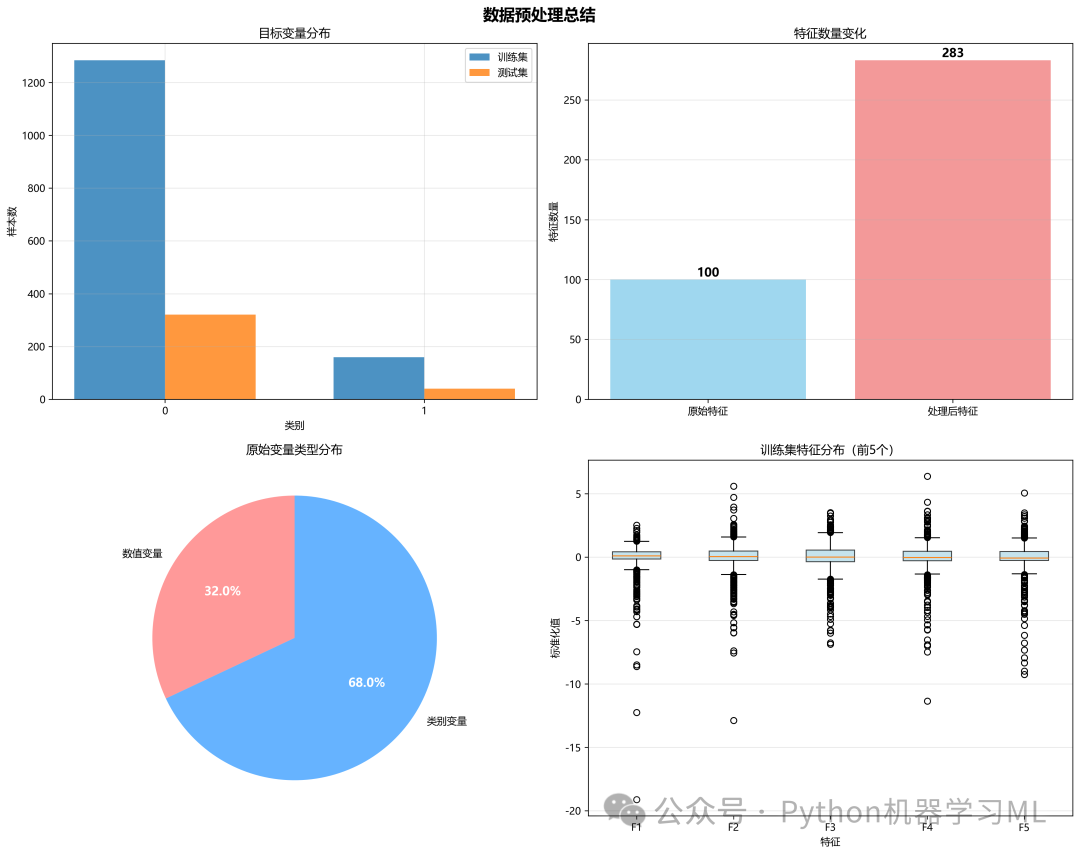
这个阶段定义了一个函数,用于将数据预处理的过程和结果进行可视化。
作用解释: 一张图胜过千言万语。这个函数创建了一个2x2的子图布局,从四个方面总结了预处理过程:
- 目标变量分布
展示了划分后的训练集和测试集中目标变量的样本数量,验证分层抽样的效果。
- 特征数量变化
对比了预处理前后特征数量的变化,直观反映独热编码等操作对维度的影响。
- 原始变量类型分布
用饼图展示了原始数据中数值和类别变量的比例。
- 处理后特征分布
用箱线图展示了部分处理后(标准化)特征的分布,验证缩放效果。
这个可视化报告使得复杂的预处理流程一目了然。
# ============================================
# 第三部分:可视化模块
# ============================================

defplot_preprocessing_summary(preprocessing_result: Dict):
"""预处理过程可视化总结"""

    fig, axes = plt.subplots(2, 2, figsize=(15, 12))
    fig.suptitle('数据预处理总结', fontsize=16, fontweight='bold')

    ax = axes[0, 0]
    y_train = preprocessing_result['y_train']
    y_test = preprocessing_result['y_test']

    x = np.arange(len(y_train.value_counts()))
    width = 0.35

    train_counts = y_train.value_counts().sort_index()
    test_counts = y_test.value_counts().sort_index()

    ax.bar(x - width / 2, train_counts.values, width, label='训练集', alpha=0.8)
    ax.bar(x + width / 2, test_counts.values, width, label='测试集', alpha=0.8)

    ax.set_xlabel('类别')
    ax.set_ylabel('样本数')
    ax.set_title('目标变量分布')
    ax.set_xticks(x)
    ax.set_xticklabels(train_counts.index)
    ax.legend()
    ax.grid(True, alpha=0.3)

    ax = axes[0, 1]
    categories = ['原始特征', '处理后特征']
    counts = [
len(preprocessing_result['numerical_cols']) + len(preprocessing_result['categorical_cols']),
len(preprocessing_result['feature_names'])
    ]

    bars = ax.bar(categories, counts, color=['skyblue', 'lightcoral'], alpha=0.8)
    ax.set_ylabel('特征数量')
    ax.set_title('特征数量变化')

for bar, count inzip(bars, counts):
        height = bar.get_height()
        ax.text(bar.get_x() + bar.get_width() / 2., height,
f'{int(count)}',
                ha='center', va='bottom', fontsize=12, fontweight='bold')

    ax.grid(True, alpha=0.3, axis='y')

    ax = axes[1, 0]
    type_counts = {
'数值变量': len(preprocessing_result['numerical_cols']),
'类别变量': len(preprocessing_result['categorical_cols'])
    }

    colors = ['#ff9999', '#66b3ff']
    wedges, texts, autotexts = ax.pie(
        type_counts.values(),
        labels=type_counts.keys(),
        autopct='%1.1f%%',
        colors=colors,
        startangle=90
    )

for autotext in autotexts:
        autotext.set_color('white')
        autotext.set_fontsize(12)
        autotext.set_fontweight('bold')

    ax.set_title('原始变量类型分布')

    ax = axes[1, 1]
    X_train = preprocessing_result['X_train']
    feature_subset = X_train.iloc[:, :min(5, X_train.shape[1])]

    bp = ax.boxplot([feature_subset.iloc[:, i].values for i inrange(feature_subset.shape[1])],
                    labels=[f'F{i + 1}'for i inrange(feature_subset.shape[1])],
                    patch_artist=True)

for patch in bp['boxes']:
        patch.set_facecolor('lightblue')
        patch.set_alpha(0.7)

    ax.set_xlabel('特征')
    ax.set_ylabel('标准化值')
    ax.set_title('训练集特征分布(前5个)')
    ax.grid(True, alpha=0.3, axis='y')

    plt.tight_layout()
    plt.savefig('preprocessing_summary.png', dpi=300, bbox_inches='tight')
print()
print("预处理可视化已保存: preprocessing_summary.png")
    plt.show()
阶段 11: 统计检验结果综合可视化
(plot_statistical_tests_comprehensive)
这个阶段定义了一个函数,用于创建一张信息密度极高的综合图表,来展示统计检验的结果。
作用解释: 这张图表通过一个3x3的网格,全面展示了T检验和卡方检验的分析结果:
- p值分布 (直方图)
展示原始p值的分布,帮助判断检验结果的整体趋势。
- 多重检验校正效果 (条形图)
直观对比校正前后显著变量的数量。
- 效应量分布 (饼图)
显示效应量为“大、中、小、微小”的特征各自的比例。
- 火山图 (散点图)
这是图表的精华。它将效应量(x轴)和统计显著性(y轴,-log10(p值))结合在一张图中。图中的点代表每个特征,越往上代表p值越小(越显著),越往左右两侧代表效应量越大。通过这张图,可以一眼识别出那些既统计显著又有实际意义(效应量大)的明星特征。
python
def plot_statistical_tests_comprehensive(df_ttest: pd.DataFrame,
df_chi2: pd.DataFrame):
"""统计检验结果综合可视化"""
fig = plt.figure(figsize=(20, 12))
gs = fig.add_gridspec(3, 3, hspace=0.3, wspace=0.3)
fig.suptitle('统计检验综合分析', fontsize=18, fontweight='bold', y=0.98)
colors_effect = ['#ff6b6b', '#4ecdc4', '#45b7d1', '#f9ca24']
if len(df_ttest) > 0:
ax1 = fig.add_subplot(gs[0, 0])
ax1.hist(df_ttest['t_pvalue'], bins=30, alpha=0.7, color='skyblue',
edgecolor='black', label='原始p值')
ax1.axvline(0.05, color='red', linestyle='--', linewidth=2, label='α=0.05')
ax1.set_xlabel('p-value', fontsize=11)
ax1.set_ylabel('频数', fontsize=11)
ax1.set_title('T检验 p值分布', fontsize=12, fontweight='bold')
ax1.legend()
ax1.grid(True, alpha=0.3)
ax2 = fig.add_subplot(gs[0, 1])
categories = ['原始显著', 'FDR校正显著']
counts = [
df_ttest['significant'].sum(),
df_ttest['fdr_significant'].sum()
]
bars = ax2.bar(categories, counts, color=['coral', 'lightgreen'], alpha=0.8)
ax2.set_ylabel('变量数', fontsize=11)
ax2.set_title('T检验 多重检验校正效果', fontsize=12, fontweight='bold')
for bar, count in zip(bars, counts):
height = bar.get_height()
ax2.text(bar.get_x() + bar.get_width() / 2., height,
f'{int(count)}',
ha='center', va='bottom', fontsize=10, fontweight='bold')
ax2.grid(True, alpha=0.3, axis='y')
ax3 = fig.add_subplot(gs[0, 2])
effect_counts = df_ttest['effect_size_interpretation'].value_counts()
wedges, texts, autotexts = ax3.pie(
effect_counts.values,
labels=effect_counts.index,
autopct='%1.1f%%',
colors=colors_effect[:len(effect_counts)],
startangle=90
)
for autotext in autotexts:
autotext.set_color('white')
autotext.set_fontsize(10)
autotext.set_fontweight('bold')
ax3.set_title('T检验 效应量分布', fontsize=12, fontweight='bold')
if len(df_chi2) > 0:
ax4 = fig.add_subplot(gs[1, 0])
ax4.hist(df_chi2['p_value'], bins=20, alpha=0.7, color='lightgreen',
edgecolor='black', label='原始p值')
ax4.axvline(0.05, color='red', linestyle='--', linewidth=2, label='α=0.05')
ax4.set_xlabel('p-value', fontsize=11)
ax4.set_ylabel('频数', fontsize=11)
ax4.set_title('卡方检验 p值分布', fontsize=12, fontweight='bold')
ax4.legend()
ax4.grid(True, alpha=0.3)
ax5 = fig.add_subplot(gs[1, 1])
categories = ['原始显著', 'FDR校正显著']
counts = [
df_chi2['significant'].sum(),
df_chi2['fdr_significant'].sum()
]
bars = ax5.bar(categories, counts, color=['coral', 'lightgreen'], alpha=0.8)
ax5.set_ylabel('变量数', fontsize=11)
ax5.set_title('卡方检验 多重检验校正效果', fontsize=12, fontweight='bold')
for bar, count in zip(bars, counts):
height = bar.get_height()
ax5.text(bar.get_x() + bar.get_width() / 2., height,
f'{int(count)}',
ha='center', va='bottom', fontsize=10, fontweight='bold')
ax5.grid(True, alpha=0.3, axis='y')
ax6 = fig.add_subplot(gs[1, 2])
effect_counts = df_chi2['effect_size_interpretation'].value_counts()
wedges, texts, autotexts = ax6.pie(
effect_counts.values,
labels=effect_counts.index,
autopct='%1.1f%%',
colors=colors_effect[:len(effect_counts)],
startangle=90
)
for autotext in autotexts:
autotext.set_color('white')
autotext.set_fontsize(10)
autotext.set_fontweight('bold')
ax6.set_title('卡方检验 效应量分布', fontsize=12, fontweight='bold')
if len(df_ttest) > 0:
ax7 = fig.add_subplot(gs[2, :2])
df_ttest['neg_log_p'] = -np.log10(df_ttest['fdr_pvalue'])
significant = df_ttest['fdr_significant']
large_effect = np.abs(df_ttest['cohens_d']) > 0.5
ax7.scatter(df_ttest[~significant & ~large_effect]['cohens_d'],
df_ttest[~significant & ~large_effect]['neg_log_p'],
c='lightgray', alpha=0.5, s=30, label='不显著')
ax7.scatter(df_ttest[significant & ~large_effect]['cohens_d'],
df_ttest[significant & ~large_effect]['neg_log_p'],
c='orange', alpha=0.7, s=40, label='仅显著')
ax7.scatter(df_ttest[~significant & large_effect]['cohens_d'],
df_ttest[~significant & large_effect]['neg_log_p'],
c='blue', alpha=0.7, s=40, label='仅大效应')
ax7.scatter(df_ttest[significant & large_effect]['cohens_d'],
df_ttest[significant & large_effect]['neg_log_p'],
c='red', alpha=0.8, s=50, label='显著+大效应', edgecolors='darkred')
ax7.axhline(-np.log10(0.05), color='red', linestyle='--', alpha=0.5, label='FDR=0.05')
ax7.axvline(0.5, color='blue', linestyle='--', alpha=0.5)
ax7.axvline(-0.5, color='blue', linestyle='--', alpha=0.5, label='|Effect|=0.5')
important = df_ttest[significant & large_effect].nlargest(8, 'neg_log_p')
for _, row in important.iterrows():
ax7.annotate(row['feature'][:15],
(row['cohens_d'], row['neg_log_p']),
fontsize=8, alpha=0.7,
bbox=dict(boxstyle='round,pad=0.3', facecolor='yellow', alpha=0.3))
ax7.set_xlabel("Cohen's d (效应量)", fontsize=11)
ax7.set_ylabel('-log10(FDR p-value)', fontsize=11)
ax7.set_title('火山图: T检验效应量 vs 显著性', fontsize=12, fontweight='bold')
ax7.legend(loc='upper left', fontsize=9)
ax7.grid(True, alpha=0.3)
if len(df_chi2) > 0:
ax8 = fig.add_subplot(gs[2, 2])
df_chi2['neg_log_p'] = -np.log10(df_chi2['fdr_pvalue'])
significant = df_chi2['fdr_significant']
large_effect = df_chi2['cramers_v'] > 0.3
ax8.scatter(df_chi2[~significant & ~large_effect]['cramers_v'],
df_chi2[~significant & ~large_effect]['neg_log_p'],
c='lightgray', alpha=0.5, s=50)
ax8.scatter(df_chi2[significant & ~large_effect]['cramers_v'],
df_chi2[significant & ~large_effect]['neg_log_p'],
c='orange', alpha=0.7, s=60)
ax8.scatter(df_chi2[significant & large_effect]['cramers_v'],
df_chi2[significant & large_effect]['neg_log_p'],
c='red', alpha=0.8, s=80, edgecolors='darkred')
ax8.axhline(-np.log10(0.05), color='red', linestyle='--', alpha=0.5)
ax8.axvline(0.3, color='blue', linestyle='--', alpha=0.5)
ax8.set_xlabel("Cramer's V", fontsize=11)
ax8.set_ylabel('-log10(FDR p-value)', fontsize=11)
ax8.set_title('卡方检验 效应量 vs 显著性', fontsize=12, fontweight='bold')
ax8.grid(True, alpha=0.3)
plt.savefig('statistical_tests_comprehensive.png', dpi=300, bbox_inches
阶段 13: 环境设置与数据准备
这个阶段负责导入新项目所需的库,并定义了两个关键的数据准备函数,最后确定了用于分析的初始数据集。
作用解释:
fix_column_names这是一个健壮的工具函数,用于清理DataFrame的列名。它能将所有列名转为字符串,去除首尾空格,用下划线替换空格,并移除所有非字母数字字符,最后处理重名问题。这可以防止因列名格式不规范导致的后续错误。
prepare_data_for_sampling这个函数确保输入给采样算法(如SMOTE)的数据格式正确。它会检查并填充缺失值,将所有列转换为数值类型(如果可能),并处理无穷值,从而提高后续处理的稳定性。
- 数据来源确定
代码会智能地寻找之前步骤中可能存在的预处理结果(如
preprocessing_result或X_processed),如果找不到,则会报错。这确保了本流程可以无缝衔接在之前的预处理流程之后。
python
import pandas as pd
import numpy as np
import warnings
from typing importList, Tuple, Dict, Optional
import pickle

# 科学计算
from scipy import stats
from scipy.stats import (chi2_contingency, ttest_ind, mannwhitneyu,
                         shapiro, fisher_exact, anderson, kstest)

# 机器学习
from sklearn.preprocessing import StandardScaler, LabelEncoder, OneHotEncoder
from sklearn.impute import SimpleImputer
from sklearn.model_selection import train_test_split
from sklearn.pipeline import Pipeline
from sklearn.compose import ColumnTransformer
from sklearn.base import BaseEstimator, TransformerMixin

# 统计校正
from statsmodels.stats.multitest import multipletests

# 可视化
import matplotlib.pyplot as plt
import seaborn as sns
import matplotlib

# 配置
warnings.filterwarnings('ignore')
matplotlib.rcParams['font.sans-serif'] = ['microsoft yahei']
matplotlib.rcParams['axes.unicode_minus'] = False
"""
============================================
不平衡样本处理与高级特征工程
============================================
"""

import pandas as pd
import numpy as np
from collections import Counter
from imblearn.over_sampling import SMOTE
from imblearn.under_sampling import RandomUnderSampler
from imblearn.combine import SMOTETomek
from sklearn.ensemble import RandomForestClassifier
from sklearn.model_selection import cross_val_score, StratifiedKFold, train_test_split
from sklearn.metrics import classification_report, confusion_matrix
from sklearn.preprocessing import StandardScaler
import matplotlib.pyplot as plt
import seaborn as sns
from scipy.stats import chi2_contingency
import joblib
import warnings

warnings.filterwarnings('ignore')

# ============================================
# 统一列名类型
# ============================================

deffix_column_names(df):
"""
    修复列名类型问题,确保所有列名都是字符串
    """
# 将所有列名转换为字符串
    df.columns = df.columns.astype(str)

# 清理列名中的特殊字符
    df.columns = df.columns.str.strip()  # 去除首尾空格
    df.columns = df.columns.str.replace(' ', '_')  # 空格替换为下划线
    df.columns = df.columns.str.replace('[^\w\s]', '', regex=True)  # 移除特殊字符

# 确保列名唯一
    seen = {}
    new_columns = []
for col in df.columns:
if col in seen:
            seen[col] += 1
            new_columns.append(f"{col}_{seen[col]}")
else:
            seen[col] = 0
            new_columns.append(col)
    df.columns = new_columns

return df


# ============================================
# 数据准备函数
# ============================================

defprepare_data_for_sampling(X, y):
"""
    准备数据用于采样,确保格式正确
    """
# 确保X是DataFrame
ifnotisinstance(X, pd.DataFrame):
        X = pd.DataFrame(X)

# 修复列名
    X = fix_column_names(X)

# 确保y是numpy array或Series
ifisinstance(y, pd.DataFrame):
        y = y.values.ravel()
elifisinstance(y, pd.Series):
        y = y.values

# 检查并处理缺失值
if X.isnull().any().any():
print("检测到缺失值,进行填充...")
# 数值列用中位数填充
        numeric_columns = X.select_dtypes(include=[np.number]).columns
for col in numeric_columns:
            X[col].fillna(X[col].median(), inplace=True)

# 非数值列用众数填充
        non_numeric_columns = X.select_dtypes(exclude=[np.number]).columns
for col in non_numeric_columns:
            X[col].fillna(X[col].mode()[0] ifnot X[col].mode().empty else'missing', inplace=True)

# 确保所有数据都是数值型
for col in X.columns:
if X[col].dtype == 'object'or X[col].dtype == 'bool':
try:
                X[col] = pd.to_numeric(X[col], errors='coerce')
except:
# 如果无法转换,使用标签编码
from sklearn.preprocessing import LabelEncoder
                le = LabelEncoder()
                X[col] = le.fit_transform(X[col].astype(str))

# 再次填充可能产生的缺失值
    X.fillna(0, inplace=True)

# 处理无穷值
    X.replace([np.inf, -np.inf], 0, inplace=True)

return X, y


# ============================================
# 主程序开始
# ============================================
# python
# 更健壮地准备采样用数据:优先使用 preprocessing_result,然后回退到常见变量名
if'preprocessing_result'inlocals() and preprocessing_result isnotNone:
    X_sampled = preprocessing_result.get('X_train').copy()
    y_sampled = preprocessing_result.get('y_train').copy()
elif'X_processed'inlocals() and'y'inlocals():
    X_sampled = X_processed.copy()
    y_sampled = y.copy()
elif'X_train'inlocals() and'y_train'inlocals():
    X_sampled = X_train.copy()
    y_sampled = y_train.copy()
else:
raise ValueError("请确保存在 `preprocessing_result`(包含 'X_train' 和 'y_train'),或已定义 `X_processed` / `X_train` 与 `y` / `y_train`。")

# 确保列名为字符串并清理(使用已有的 fix_column_names)
try:
    X_sampled = fix_column_names(X_sampled)
except Exception:
# 兜底:强制转换列名为字符串
    X_sampled.columns = X_sampled.columns.astype(str)

# 打印基本信息
print(f"数据形状: {X_sampled.shape}")
print(f"列名类型: {type(X_sampled.columns[0])}")
print(f"前5个列名: {list(X_sampled.columns[:5])}")
阶段 14: 类别不平衡分析与采样
这个阶段首先分析数据中类别不平衡的严重程度,然后应用多种采样方法来解决这个问题。
作用解释:
-
不平衡分析: 代码首先计算并打印出数据中多数类与少数类的比例(不平衡比率),并根据比率的大小给出一个“严重程度”的定性描述。这有助于理解问题的严重性。
-
动态参数调整: 像
SMOTE这样的算法,其k_neighbors参数不能大于少数类的样本数。代码会动态计算合适的k_neighbors值,避免程序因参数错误而崩溃。 -
应用多种采样方法:
代码将每种方法处理后的数据存储起来,以便后续进行性能对比。
- Original
保留原始数据作为基准。
- SMOTE (过采样)
人工合成新的少数类样本,使类别分布均衡。
- RandomUnder (欠采样)
随机删除多数类样本,使类别分布均衡。
- SMOTETomek (混合采样)
先用SMOTE生成新样本,再用Tomek Links移除可能引起类别重叠的样本,是一种更精细的策略。
- Original
python
# ============================================
# 第一步:类别不平衡分析
# 修复数据格式
print("\n修复数据格式...")
X_sampled, y_sampled = prepare_data_for_sampling(X_sampled, y_sampled)
print(f"数据形状: {X_sampled.shape}")
print(f"列名类型: {type(X_sampled.columns[0])}")
print(f"前5个列名: {list(X_sampled.columns[:5])}")

print("\n" + "=" * 60)
print("类别不平衡分析")
print("=" * 60)

class_dist = Counter(y_sampled)
iflen(class_dist) == 2:
    imbalance_ratio = max(class_dist.values()) / min(class_dist.values())
else:
    imbalance_ratio = 1.0

print(f"原始分布: {class_dist}")
print(f"不平衡比率: {imbalance_ratio:.1f}:1")

if imbalance_ratio >= 100:
    severity = "极度严重"
elif imbalance_ratio >= 20:
    severity = "严重"
elif imbalance_ratio >= 10:
    severity = "中等偏重"
else:
    severity = "中度"

print(f"严重程度: {severity}")

# ============================================
# 第二步:应用3种采样方法
# ============================================

print("\n" + "=" * 60)
print("应用3种采样方法")
print("=" * 60)

# 确保特征选择正确
best_features = list(X_sampled.columns)
X_selected = X_sampled[best_features].copy()

# 计算合适的k_neighbors参数
min_samples_minority = min(Counter(y_sampled).values())
k_neighbors = min(5, min_samples_minority - 1) if min_samples_minority > 1else1

print(f"少数类样本数: {min_samples_minority}")
print(f"SMOTE k_neighbors参数: {k_neighbors}")

# 定义采样方法
samplers = {
'Original': None,
'SMOTE': SMOTE(random_state=42, k_neighbors=k_neighbors),
'RandomUnder': RandomUnderSampler(random_state=42),
'SMOTETomek': SMOTETomek(random_state=42)
}

# 应用采样
sampling_data = {}
successful_methods = []

for name, sampler in samplers.items():
try:
if sampler isNone:
            sampling_data[name] = (X_selected, y_sampled)
            successful_methods.append(name)
print(f"✓ {name}: {Counter(y_sampled)} (样本数: {len(y_sampled)})")
else:
# 确保数据格式正确
            X_temp = X_selected.values ifhasattr(X_selected, 'values') else X_selected
            y_temp = y_sampled

            X_res, y_res = sampler.fit_resample(X_temp, y_temp)

# 转回DataFrame以保持列名
ifisinstance(X_selected, pd.DataFrame):
                X_res = pd.DataFrame(X_res, columns=X_selected.columns)

            sampling_data[name] = (X_res, y_res)
            successful_methods.append(name)
print(f"✓ {name}: {Counter(y_res)} (样本数: {len(y_res)})")

except Exception as e:
print(f"✗ {name}: 失败 - {str(e)[:100]}")
# 对于失败的方法,仍然使用原始数据
        sampling_data[name] = (X_selected, y_sampled)
阶段 15: 模型交叉验证评估
这个阶段系统地评估了不同采样策略对模型性能的影响。
作用解释: 为了找到最佳的“采样方法 + 模型”组合,代码进行了全面的对比实验:
- 定义模型
选择了两种随机森林模型进行对比:一个标准模型和一个内置了类别权重调整的模型(
class_weight='balanced')。后者是另一种处理不平衡问题的方法。 - 交叉验证
对每一种采样策略(Original, SMOTE等)处理后的数据,使用5折分层交叉验证来评估上述两个模型的性能。
- 多指标评估
评估不止看准确率,而是关注对不平衡问题更敏感的指标:
- Recall (召回率)
衡量模型识别出所有真实正样本的能力,对医学诊断等场景至关重要。
- F1-Score (F1分数)
精确率和召回率的调和平均,是综合性能的良好指标。
- Balanced Accuracy (平衡准确率)
对每个类别的准确率进行平均,避免了多数类主导结果。
- ROC AUC
衡量模型的整体排序能力。
- Recall (召回率)
所有评估结果都被记录下来,为下一阶段的分析推荐做准备。
python
# ============================================
# 第三步:模型对比评估
# ============================================

print("\n" + "=" * 60)
print("模型性能对比")
print("=" * 60)

models = {
'RandomForest': RandomForestClassifier(n_estimators=100, random_state=42, n_jobs=-1),
'RF_Balanced': RandomForestClassifier(n_estimators=100, class_weight='balanced', random_state=42, n_jobs=-1)
}

results = []
cv = StratifiedKFold(n_splits=5, shuffle=True, random_state=42)

for sampling_name in successful_methods:
if sampling_name notin sampling_data:
continue

    X_data, y_data = sampling_data[sampling_name]
print(f"\n--- {sampling_name} ---")

# 确保数据格式正确
ifisinstance(X_data, pd.DataFrame):
        X_data_values = X_data.values
else:
        X_data_values = X_data

for model_name, model in models.items():
try:
# 评估各项指标
            scores = {}

# Recall
            recall_scores = cross_val_score(model, X_data_values, y_data, cv=cv, scoring='recall')
            scores['recall'] = recall_scores.mean()

# F1
            f1_scores = cross_val_score(model, X_data_values, y_data, cv=cv, scoring='f1')
            scores['f1'] = f1_scores.mean()

# Balanced Accuracy
            ba_scores = cross_val_score(model, X_data_values, y_data, cv=cv, scoring='balanced_accuracy')
            scores['balanced_acc'] = ba_scores.mean()

# ROC AUC
try:
                auc_scores = cross_val_score(model, X_data_values, y_data, cv=cv, scoring='roc_auc')
                scores['roc_auc'] = auc_scores.mean()
except:
                scores['roc_auc'] = 0.5# 默认值

            results.append({
'Sampling': sampling_name,
'Model': model_name,
'Recall': scores['recall'],
'F1': scores['f1'],
'Balanced_Acc': scores['balanced_acc'],
'ROC_AUC': scores['roc_auc']
            })

print(f"  {model_name}:")
print(f"    召回率: {scores['recall']:.3f}")
print(f"    F1分数: {scores['f1']:.3f}")
print(f"    平衡准确率: {scores['balanced_acc']:.3f}")
print(f"    AUC: {scores['roc_auc']:.3f}")

except Exception as e:
print(f"  {model_name}: 评估失败 - {str(e)[:100]}")

# 转换结果为DataFrame
results_df = pd.DataFrame(results)
阶段 16: 结果分析与推荐
这个阶段汇总了所有实验结果,并自动推荐最佳的策略组合。
作用解释: 基于上一阶段生成的results_df,代码进行了排序和筛选:
- 按召回率排序
找出最能识别出少数类的组合,这在宁可错杀不可放过的场景(如疾病筛查)中非常重要。
- 按F1分数排序
找出综合性能最好的组合。
- 推荐最佳组合
最终,代码以F1分数为主要标准,选出得分最高的“采样方法 + 模型”组合,并详细列出其各项性能指标。这为决策者提供了明确、数据驱动的建议。
所有详细的对比结果也被保存到Excel文件中,方便进行更深入的离线分析。
python
# ============================================
# 第四步:结果分析和推荐
# ============================================

print("\n" + "=" * 60)
print("最佳策略推荐")
print("=" * 60)

iflen(results_df) > 0:
# 按召回率排序
print("\n按召回率排序(少数类识别能力):")
    top_recall = results_df.nlargest(min(5, len(results_df)), 'Recall')
for idx, row in top_recall.iterrows():
print(f"  {row['Sampling']}-{row['Model']}: 召回率={row['Recall']:.4f}")

# 按F1分数排序
print("\n按F1分数排序(综合平衡性能):")
    top_f1 = results_df.nlargest(min(5, len(results_df)), 'F1')
for idx, row in top_f1.iterrows():
print(f"  {row['Sampling']}-{row['Model']}: F1={row['F1']:.4f}")

# 最佳组合
    best_combo = results_df.loc[results_df['F1'].idxmax()]
print(f"\n🏆 推荐最佳组合: {best_combo['Sampling']}-{best_combo['Model']}")
print(f"   召回率: {best_combo['Recall']:.4f}")
print(f"   F1分数: {best_combo['F1']:.4f}")
print(f"   平衡准确率: {best_combo['Balanced_Acc']:.4f}")
print(f"   AUC: {best_combo['ROC_AUC']:.4f}")

# 保存结果
    results_df.to_excel('sampling_comparison_results.xlsx', index=False)
print(f"\n详细结果已保存到: sampling_comparison_results.xlsx")
else:
print("没有成功的评估结果")
    best_combo = pd.Series({
'Sampling': 'Original',
'Model': 'RandomForest',
'Recall': 0.5,
'F1': 0.5,
'Balanced_Acc': 0.5,
'ROC_AUC': 0.5
    })
阶段 17: 综合可视化对比
这个阶段将复杂的对比结果通过一系列图表直观地展示出来。
作用解释: 代码创建了一个2x2的综合图表,从不同维度对比了采样策略和模型性能:
- 样本分布对比
展示了不同采样方法对类别分布的改变。可以清晰地看到过采样增加了样本,欠采样减少了样本,而混合采样则介于两者之间。
- 性能指标对比
对比了不同采样方法下,模型的平均性能(召回率、F1等)。
- F1分数对比
用水平条形图展示了F1分数最高的几个组合,一目了然地看出谁是优胜者。
- 最佳模型雷达图
对推荐的最佳组合,用雷达图全面展示其在多个核心指标上的表现,评估其综合能力。
这些图表将数值结果转化为直观的视觉信息,极大地增强了报告的可读性。
python
# ============================================
# 第五步:可视化对比
# ============================================

print("\n" + "=" * 60)
print("生成对比图表")
print("=" * 60)

try:
    fig, axes = plt.subplots(2, 2, figsize=(14, 10))
    fig.suptitle('Sampling Methods Comparison', fontsize=16, fontweight='bold')

# 1. 样本分布对比
    ax1 = axes[0, 0]
    plot_methods = []
    pos_counts = []
    neg_counts = []

for method in ['Original', 'SMOTE', 'RandomUnder', 'SMOTETomek']:
if method in sampling_data:
            X_data, y_data = sampling_data[method]
            counts = Counter(y_data)
            plot_methods.append(method)
            neg_counts.append(counts.get(0, 0))
            pos_counts.append(counts.get(1, 0))

if plot_methods:
        x = np.arange(len(plot_methods))
        width = 0.35

        bars1 = ax1.bar(x - width / 2, neg_counts, width, label='Class 0', color='lightblue', edgecolor='black')
        bars2 = ax1.bar(x + width / 2, pos_counts, width, label='Class 1', color='lightcoral', edgecolor='black')

# 添加数值标签
for bar in bars1:
            height = bar.get_height()
            ax1.text(bar.get_x() + bar.get_width() / 2., height,
f'{int(height)}', ha='center', va='bottom', fontsize=9)
for bar in bars2:
            height = bar.get_height()
            ax1.text(bar.get_x() + bar.get_width() / 2., height,
f'{int(height)}', ha='center', va='bottom', fontsize=9)

        ax1.set_xlabel('Sampling Method')
        ax1.set_ylabel('Sample Count')
        ax1.set_title('Class Distribution After Sampling')
        ax1.set_xticks(x)
        ax1.set_xticklabels(plot_methods, rotation=45)
        ax1.legend()
        ax1.grid(True, alpha=0.3)
else:
        ax1.text(0.5, 0.5, 'No data available', ha='center', va='center', transform=ax1.transAxes)
        ax1.set_title('Class Distribution')

# 2. 性能指标对比
    ax2 = axes[0, 1]
iflen(results_df) > 0:
# 计算每种方法的平均性能
        avg_performance = results_df.groupby('Sampling')[['Recall', 'F1', 'Balanced_Acc']].mean()

ifnot avg_performance.empty:
            avg_performance.plot(kind='bar', ax=ax2, color=['lightgreen', 'lightblue', 'lightyellow'])
            ax2.set_xlabel('Sampling Method')
            ax2.set_ylabel('Score')
            ax2.set_title('Average Performance Metrics')
            ax2.legend(title='Metric')
            ax2.grid(True, alpha=0.3)
            ax2.set_ylim([0, 1])

# 旋转x轴标签
            ax2.set_xticklabels(ax2.get_xticklabels(), rotation=45)
else:
        ax2.text(0.5, 0.5, 'No results available', ha='center', va='center', transform=ax2.transAxes)
        ax2.set_title('Performance Metrics')

# 3. F1分数对比
    ax3 = axes[1, 0]
iflen(results_df) > 0:
# 按F1分数排序的条形图
        f1_sorted = results_df.sort_values('F1', ascending=False).head(10)

ifnot f1_sorted.empty:
            y_pos = np.arange(len(f1_sorted))
            bars = ax3.barh(y_pos, f1_sorted['F1'].values, color='lightgreen', edgecolor='black')

# 添加数值标签
for i, (bar, value) inenumerate(zip(bars, f1_sorted['F1'].values)):
                ax3.text(value + 0.01, bar.get_y() + bar.get_height() / 2,
f'{value:.3f}', va='center', fontsize=9)

# 设置y轴标签
            labels = [f"{row['Sampling'][:8]}-{row['Model'][:8]}"
for _, row in f1_sorted.iterrows()]
            ax3.set_yticks(y_pos)
            ax3.set_yticklabels(labels, fontsize=8)
            ax3.set_xlabel('F1 Score')
            ax3.set_title('Top F1 Scores')
            ax3.grid(True, alpha=0.3, axis='x')
            ax3.set_xlim([0, 1])
else:
        ax3.text(0.5, 0.5, 'No F1 scores available', ha='center', va='center', transform=ax3.transAxes)
        ax3.set_title('F1 Score Comparison')

# 4. 最佳模型雷达图
    ax4 = axes[1, 1]
    ax4.remove()
    ax4 = fig.add_subplot(224, projection='polar')

if'best_combo'inlocals() andnot best_combo.empty:
        metrics = ['Recall', 'F1', 'Balanced_Acc', 'ROC_AUC']
        values = []

for metric in metrics:
if metric in best_combo:
                values.append(float(best_combo[metric]))
else:
                values.append(0.5)

        angles = np.linspace(0, 2 * np.pi, len(metrics), endpoint=False).tolist()
        values_plot = values + values[:1]
        angles_plot = angles + angles[:1]

        ax4.plot(angles_plot, values_plot, 'o-', linewidth=2, color='red')
        ax4.fill(angles_plot, values_plot, alpha=0.25, color='red')
        ax4.set_xticks(angles)
        ax4.set_xticklabels(metrics)
        ax4.set_ylim(0, 1)

# 添加数值标签
for angle, value, metric inzip(angles, values, metrics):
            ax4.text(angle, value + 0.05, f'{value:.2f}', ha='center', fontsize=9)

        ax4.set_title(f'Best Model Performance\n{best_combo["Sampling"]}-{best_combo["Model"]}',
                      size=10, pad=20)
        ax4.grid(True)
else:
# 如果没有最佳组合,显示默认图
        ax4.text(0, 0, 'No best model selected', ha='center', va='center')
        ax4.set_title('Best Model Performance')

    plt.tight_layout()
    plt.savefig('sampling_comparison_fixed.png', dpi=300, bbox_inches='tight')
print("对比图表已保存: sampling_comparison_fixed.png")
    plt.show()

except Exception as e:
print(f"可视化失败: {str(e)}")
阶段 18: 最佳模型最终评估
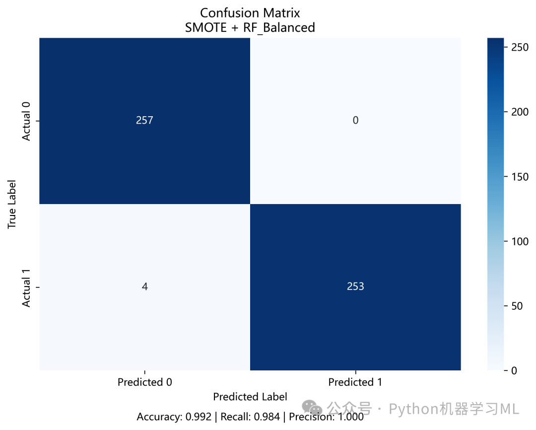
这个阶段使用推荐的最佳组合,在独立的测试集上进行最终的、详细的性能评估。
作用解释: 交叉验证给出了模型性能的平均估计,但最终我们需要在模型从未见过的数据上评估其泛化能力。
- 数据准备
使用最佳采样策略处理后的数据被划分为新的训练集和测试集。
- 模型训练
最佳模型在新的训练集上进行训练。
- 最终评估
在新的测试集上进行预测,并生成:
- 分类报告 (
classification_report)提供了每个类别的精确率、召回率、F1分数等详细指标。
- 混淆矩阵 (
confusion_matrix)直观地展示了模型在每个类别上的预测正确和错误的数量(真阳性、假阳性、真阴性、假阴性),对于分析模型的具体错误类型非常有帮助。
- 分类报告 (
这一步是验证模型在模拟真实世界场景下表现的关键环节。
python
# ============================================
# 第六步:训练和评估最佳模型
# ============================================

print("\n" + "=" * 60)
print("最佳模型详细评估")
print("=" * 60)

if'best_combo'inlocals() andnot best_combo.empty:
    best_sampling = best_combo['Sampling']
    best_model_name = best_combo['Model']

# 获取数据
    X_best, y_best = sampling_data[best_sampling]

# 确保数据格式正确
ifisinstance(X_best, pd.DataFrame):
        X_best_values = X_best.values
else:
        X_best_values = X_best

print(f"使用组合: {best_sampling} + {best_model_name}")
print(f"数据形状: {X_best_values.shape}")
print(f"类别分布: {Counter(y_best)}")

# 划分训练集和测试集
try:
        X_train, X_test, y_train, y_test = train_test_split(
            X_best_values, y_best, test_size=0.2, random_state=42, stratify=y_best
        )

# 训练模型
        best_model = models[best_model_name]
        best_model.fit(X_train, y_train)

# 预测
        y_pred = best_model.predict(X_test)

# 评估报告
print("\n测试集性能:")
print(classification_report(y_test, y_pred))

# 混淆矩阵
        cm = confusion_matrix(y_test, y_pred)

        plt.figure(figsize=(8, 6))
        sns.heatmap(cm, annot=True, fmt='d', cmap='Blues', cbar=True,
                    xticklabels=['Predicted 0', 'Predicted 1'],
                    yticklabels=['Actual 0', 'Actual 1'])
        plt.title(f'Confusion Matrix\n{best_sampling} + {best_model_name}')
        plt.ylabel('True Label')
        plt.xlabel('Predicted Label')

# 添加更多信息
        accuracy = (cm[0, 0] + cm[1, 1]) / cm.sum()
        recall = cm[1, 1] / (cm[1, 0] + cm[1, 1]) if (cm[1, 0] + cm[1, 1]) > 0else0
        precision = cm[1, 1] / (cm[0, 1] + cm[1, 1]) if (cm[0, 1] + cm[1, 1]) > 0else0

        plt.text(0.5, -0.15, f'Accuracy: {accuracy:.3f} | Recall: {recall:.3f} | Precision: {precision:.3f}',
                 ha='center', transform=plt.gca().transAxes, fontsize=10)

        plt.tight_layout()
        plt.savefig('confusion_matrix_fixed.png', dpi=300, bbox_inches='tight')
print("\n混淆矩阵已保存: confusion_matrix_fixed.png")
        plt.show()

except Exception as e:
print(f"模型训练失败: {str(e)}")
        best_model = RandomForestClassifier(n_estimators=100, random_state=42)
阶段 19: 模型与配置持久化
这是整个流程的最后一步,负责将所有重要的产出物保存到磁盘,以备将来使用。
作用解释: 为了使整个分析流程可重现和可部署,代码将以下关键组件“持久化”
- 最佳模型
使用
joblib保存训练好的模型对象(.pkl文件)。这允许在其他应用中直接加载模型进行预测,而无需重新训练。 - 采样器
如果最佳策略中包含了采样步骤,相应的采样器也会被保存。
- 特征列表
保存模型训练时使用的特征列表(
.txt文件),确保未来对新数据进行预测时使用完全相同的特征。 - 配置文件
将最佳组合的名称、性能指标等关键配置信息保存为JSON文件。这为自动化部署和版本控制提供了便利。
这一步标志着从实验到生产的关键过渡,确保了研究成果的可用性和可重复性。
python
# ============================================
# 第七步:保存模型和配置
# ============================================

print("\n" + "=" * 60)
print("保存模型和配置")
print("=" * 60)

try:
# 保存最佳模型
if'best_model'inlocals():
        model_filename = f'best_model_{best_sampling}_{best_model_name}.pkl'
        joblib.dump(best_model, model_filename)
print(f"✓ 模型已保存: {model_filename}")

# 保存采样器(如果使用了)
if best_sampling != 'Original'and best_sampling in samplers:
        sampler_filename = f'sampler_{best_sampling}.pkl'
        joblib.dump(samplers[best_sampling], sampler_filename)
print(f"✓ 采样器已保存: {sampler_filename}")

# 保存特征列表
    feature_filename = 'selected_features.txt'
withopen(feature_filename, 'w', encoding='utf-8') as f:
for feature in best_features:
            f.write(f"{feature}\n")
print(f"✓ 特征列表已保存: {feature_filename}")

# 保存配置信息
    config = {
'best_sampling': best_sampling,
'best_model': best_model_name,
'imbalance_ratio': imbalance_ratio,
'n_features': len(best_features),
'performance': {
'recall': float(best_combo['Recall']),
'f1': float(best_combo['F1']),
'balanced_acc': float(best_combo['Balanced_Acc']),
'roc_auc': float(best_combo['ROC_AUC'])
        }
    }

import json

withopen('model_config.json', 'w', encoding='utf-8') as f:
        json.dump(config, f, indent=4, ensure_ascii=False)
print(f"✓ 配置文件已保存: model_config.json")

except Exception as e:
print(f"保存失败: {str(e)}")
阶段 20: 环境设置与数据模型加载
这个阶段负责为SHAP分析设置环境,并智能地加载之前流程中产生的最优模型和数据。
作用解释:
- 环境设置
导入
shap库和其他必要的库,并设置中文字体以确保图表能正确显示。shap.initjs()用于在Jupyter Notebook或类似环境中加载SHAP所需的JavaScript库,以便交互式图表的显示。 - 智能加载
-
- 模型加载
代码会优先使用内存中已经存在的
best_model。如果不存在,它会尝试从磁盘加载一个预先定义好的模型文件。如果都失败了,它会准备训练一个新模型。这种健壮的设计使得脚本既可以独立运行,也可以作为之前流程的延续。 - 数据加载
类似地,代码会优先使用之前流程处理好的
X_best和y_best数据。
- 模型加载
- 数据准备
无论数据来源如何,代码都会将其划分为训练集和测试集,并重置索引。重置索引是一个非常重要的步骤,可以避免后续因索引不匹配导致的数据对齐问题。
python
"""
============================================
SHAP模型可解释性分析
============================================
"""

import numpy as np
import pandas as pd
import matplotlib.pyplot as plt
import seaborn as sns
import shap
from sklearn.ensemble import RandomForestClassifier
from sklearn.model_selection import train_test_split
from sklearn.metrics import classification_report, roc_auc_score, confusion_matrix
from sklearn.preprocessing import StandardScaler
from scipy import stats
import joblib
import warnings

warnings.filterwarnings('ignore')

# 设置中文显示
plt.rcParams['font.sans-serif'] = ['SimHei', 'Arial']
plt.rcParams['axes.unicode_minus'] = False

# 初始化SHAP
shap.initjs()

# ============================================
# 第一步:加载最优模型和数据
# ============================================

print("=" * 60)
print("SHAP模型可解释性分析 - 整合版")
print("=" * 60)

# 使用前面代码中的最优数据和模型
if'best_model'inlocals():
    model = best_model
print("✓ 使用已训练的最优模型")
else:
# 如果没有加载的模型,尝试从文件读取
try:
        model = joblib.load('best_model_SMOTE_RF_Balanced.pkl')
print("✓ 从文件加载最优模型")
except:
print("⚠ 未找到已训练模型,将训练新模型")
        model = None

# 准备数据
if'X_best'inlocals() and'y_best'inlocals():
    X_data = X_best
    y_data = y_best
print(f"✓ 使用最优采样后的数据: {X_data.shape}")
else:
# 使用原始数据
    X_data = X_sampled if'X_sampled'inlocals() else pd.DataFrame()
    y_data = y_sampled if'y_sampled'inlocals() else pd.Series()
print(f"✓ 使用原始数据: {X_data.shape}")

# 确保数据格式正确
ifisinstance(X_data, pd.DataFrame):
    feature_names = list(X_data.columns)
    X_values = X_data.values
else:
    X_values = X_data
    feature_names = [f'Feature_{i}'for i inrange(X_values.shape[1])]
    X_data = pd.DataFrame(X_values, columns=feature_names)

print(f"特征数量: {len(feature_names)}")
print(f"样本数量: {len(y_data)}")

# 数据分割
X_train, X_test, y_train, y_test = train_test_split(
    X_data, y_data, test_size=0.2, random_state=42, stratify=y_data
)

# 重置索引,避免索引问题
X_train = X_train.reset_index(drop=True)
X_test = X_test.reset_index(drop=True)
y_train = y_train.reset_index(drop=True) ifhasattr(y_train, 'reset_index') else pd.Series(y_train).reset_index(
    drop=True)
y_test = y_test.reset_index(drop=True) ifhasattr(y_test, 'reset_index') else pd.Series(y_test).reset_index(drop=True)

print(f"训练集: {X_train.shape}, 测试集: {X_test.shape}")
阶段 21: SHAP值计算
这个阶段的核心是训练或加载一个待解释的模型,然后使用SHAP库计算每个特征对模型预测的贡献度(即SHAP值)。
作用解释:
- 模型准备
如果上一步没有加载到模型,这里会训练一个随机森林分类器。
class_weight='balanced'参数会自动调整权重,以应对类别不平衡问题。 - 性能评估
在计算SHAP值之前,首先评估模型的性能(如AUC和分类报告),确保我们正在解释的是一个性能良好、有意义的模型。
- 创建解释器
使用
shap.TreeExplainer(model)。TreeExplainer是专门为树模型(如随机森林、XGBoost)优化的解释器,它利用了模型的内部结构,计算速度非常快。 - 数据采样
如果测试集样本过多,计算SHAP值会非常耗时。代码在这里做了一个优化:如果样本数大于500,就随机抽取500个样本进行分析,以在效率和解释的全面性之间取得平衡。
- 计算SHAP值
explainer.shap_values(X_test_sample)是核心步骤。它会为测试样本中的每个样本的每个特征计算一个SHAP值。这个值表示该特征将该样本的预测从基准值“推”向最终预测值的贡献。 - 处理SHAP值
对于二分类问题,
TreeExplainer通常会返回一个包含两个数组的列表(一个对应类别0,一个对应类别1)。代码将它们分别提取出来,我们通常关注对“正类”(类别1)的预测贡献。
python
# ============================================
# 第二步:训练或加载模型
# ============================================

if model isNone:
print("\n训练新的随机森林模型...")
    model = RandomForestClassifier(
        n_estimators=100,
        max_depth=10,
        min_samples_split=5,
        min_samples_leaf=2,
        class_weight='balanced',
        random_state=42,
        n_jobs=-1
    )
    model.fit(X_train, y_train)

# 保存模型
    joblib.dump(model, 'rf_model_for_shap.pkl')
print("✓ 模型训练完成并保存")

# 评估模型性能
y_pred = model.predict(X_test)
y_proba = model.predict_proba(X_test)[:, 1]

print("\n" + "=" * 60)
print("模型性能评估")
print("=" * 60)
print(f"ROC-AUC Score: {roc_auc_score(y_test, y_proba):.4f}")
print("\n分类报告:")
print(classification_report(y_test, y_pred))

# ============================================
# 第三步:计算SHAP值(使用TreeExplainer)
# ============================================

print("\n" + "=" * 60)
print("计算SHAP值")
print("=" * 60)

# 创建SHAP解释器
print("创建TreeExplainer(针对随机森林优化)...")
explainer = shap.TreeExplainer(model)

# 为了加速,可以使用测试集的一个子集
# 但如果测试集不大,可以使用全部
iflen(X_test) > 500:
print(f"测试集较大({len(X_test)}个样本),采样500个样本进行分析...")
# 使用sample方法并重置索引
    sample_indices = np.random.choice(len(X_test), 500, replace=False)
    X_test_sample = X_test.iloc[sample_indices].reset_index(drop=True)
    y_test_sample = y_test.iloc[sample_indices].reset_index(drop=True)
else:
print(f"使用全部测试集({len(X_test)}个样本)进行分析...")
    X_test_sample = X_test.copy()
    y_test_sample = y_test.copy()

print(f"分析样本数: {len(X_test_sample)}")

# 计算SHAP值
print("计算SHAP值...")
shap_values_raw = explainer.shap_values(X_test_sample)

# 正确处理SHAP值的维度
print(f"原始SHAP值类型: {type(shap_values_raw)}")

ifisinstance(shap_values_raw, np.ndarray):
print(f"原始SHAP值形状: {shap_values_raw.shape}")
# 如果是三维数组 (n_samples, n_features, n_classes)
iflen(shap_values_raw.shape) == 3:
        shap_values_class0 = shap_values_raw[:, :, 0]
        shap_values_class1 = shap_values_raw[:, :, 1]
else:
        shap_values_class1 = shap_values_raw
        shap_values_class0 = -shap_values_raw
elifisinstance(shap_values_raw, list):
print(f"SHAP值列表长度: {len(shap_values_raw)}")
    shap_values_class0 = shap_values_raw[0]
    shap_values_class1 = shap_values_raw[1]
else:
    shap_values_class1 = shap_values_raw
    shap_values_class0 = -shap_values_raw

print(f"✓ SHAP值处理完成")
print(f"  正类SHAP值形状: {shap_values_class1.shape}")
print(f"  负类SHAP值形状: {shap_values_class0.shape}")

# 获取基准值
ifisinstance(explainer.expected_value, (list, np.ndarray)):
    base_value = explainer.expected_value[1]
    base_value_class0 = explainer.expected_value[0]
else:
    base_value = explainer.expected_value
    base_value_class0 = explainer.expected_value

print(f"  基准值(正类): {base_value:.4f}")
print(f"  基准值(负类): {base_value_class0:.4f}")

# 创建SHAP值DataFrame(用于后续分析)
shap_values_df = pd.DataFrame(
    shap_values_class1,
    columns=X_test_sample.columns
)

# 计算预测概率(用于风险分层)
y_proba_sample = model.predict_proba(X_test_sample)[:, 1]
阶段 22: 全局特征重要性分析与可视化
这个阶段利用计算出的SHAP值,从全局视角分析和可视化特征的重要性。
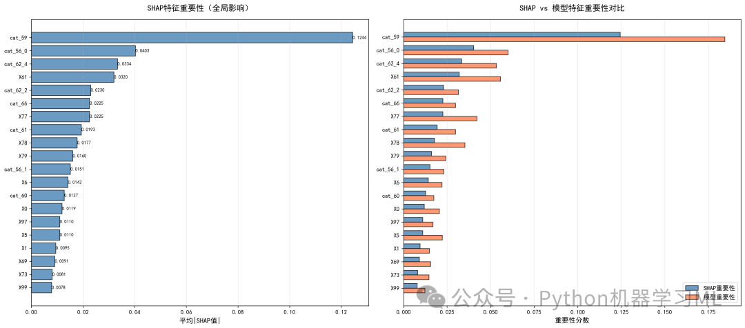
作用解释:
- 计算SHAP重要性
通过计算每个特征SHAP值的绝对值的平均值,得到该特征对模型预测的平均影响大小。这是一种比模型自带的
feature_importances_(通常基于基尼不纯度或分裂增益)更可靠的重要性度量。 - 重要性对比
代码将SHAP重要性与模型自带的重要性进行对比,可以验证两者的一致性。通常SHAP重要性更受推荐。
- 全局可视化
-
- 条形图 (
summary_plot(plot_type="bar"))简单直观地展示了最重要的前20个特征及其全局重要性排序。
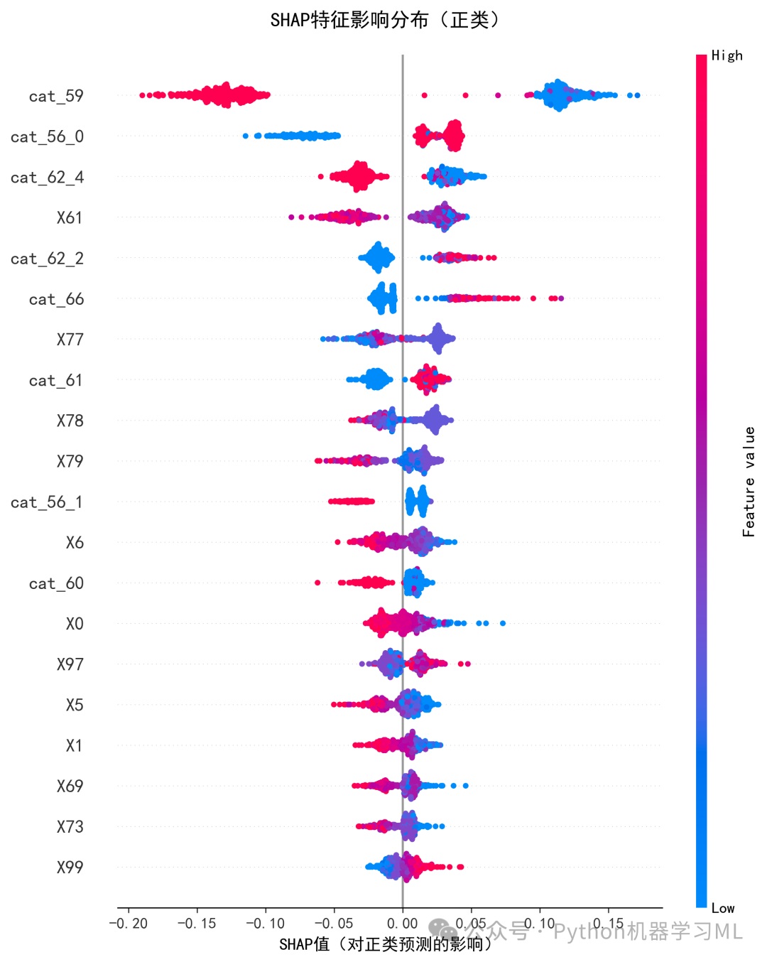
- 摘要散点图 (
summary_plot)这是SHAP最经典的图之一。它不仅显示了特征的重要性(y轴),还通过散点的分布和颜色,揭示了特征值的高低(颜色)如何影响预测结果(x轴,SHAP值)。例如,一个点在右侧意味着它推动预测概率升高,如果这个点是红色的(特征值高),则说明“该特征值高时,会提高预测为正类的概率”。
- 自定义对比图
为了更好地控制图表样式,代码还手动绘制了SHAP重要性与模型重要性的对比条形图,提供了更精细的控制和更清晰的数值标签。
- 条形图 (
python
# ============================================
# 第四步:特征重要性分析
# ============================================

print("\n" + "=" * 60)
print("特征重要性分析")
print("=" * 60)

# 计算特征重要性
feature_importance_shap = np.abs(shap_values_class1).mean(axis=0)
feature_importance_model = model.feature_importances_

# 创建重要性DataFrame
importance_df = pd.DataFrame({
'Feature': feature_names,
'SHAP_Importance': feature_importance_shap,
'Model_Importance': feature_importance_model,
'Mean_SHAP': shap_values_df.mean(),
'Std_SHAP': shap_values_df.std(),
'Min_SHAP': shap_values_df.min(),
'Max_SHAP': shap_values_df.max()
})
importance_df = importance_df.sort_values('SHAP_Importance', ascending=False)

print("\nTop 15 最重要特征(基于SHAP):")
print("-" * 80)
for idx, row in importance_df.head(15).iterrows():
print(f"{row['Feature'][:35]:35s} | SHAP={row['SHAP_Importance']:.4f} | "
f"Model={row['Model_Importance']:.4f} | Mean={row['Mean_SHAP']:+.4f}")

# 保存重要性数据
importance_df.to_csv('shap_feature_importance_detailed.csv', index=False)
print("\n✓ 详细特征重要性已保存: shap_feature_importance_detailed.csv")

# 获取Top特征列表
top_9_features = importance_df.head(9)['Feature'].tolist()
top_15_features = importance_df.head(15)['Feature'].tolist()
# ============================================
# 第六步:SHAP可视化 - 全局特征重要性
# ============================================

print("\n" + "=" * 60)
print("生成SHAP全局可视化")
print("=" * 60)

# 1. 特征重要性条形图(改进版)
print("\n1. 生成特征重要性条形图...")

# 左图:SHAP重要性 - 单独绘制
plt.figure(figsize=(10, 8))
shap.summary_plot(shap_values_class1, X_test_sample,
                  plot_type="bar", show=False, max_display=20)
plt.title("SHAP特征重要性(全局影响)", fontsize=14, fontweight='bold', pad=15)
plt.xlabel("平均|SHAP值|", fontsize=12)
plt.tight_layout()
plt.savefig('shap_importance_bar.png', dpi=300, bbox_inches='tight')
plt.show()
print("✓ 已保存: shap_importance_bar.png")

# 右图:SHAP vs 模型重要性对比
plt.figure(figsize=(12, 10))
top_20 = importance_df.head(20)
x_pos = np.arange(len(top_20))
width = 0.35

bars1 = plt.barh(x_pos - width/2, top_20['SHAP_Importance'],
                 width, label='SHAP重要性', color='steelblue', alpha=0.8, edgecolor='black')
bars2 = plt.barh(x_pos + width/2, top_20['Model_Importance'],
                 width, label='模型重要性', color='coral', alpha=0.8, edgecolor='black')

plt.yticks(x_pos, [f[:30] for f in top_20['Feature']], fontsize=10)
plt.xlabel('重要性分数', fontsize=12)
plt.title('SHAP vs 模型特征重要性对比', fontsize=14, fontweight='bold', pad=15)
plt.legend(loc='lower right', fontsize=11)
plt.grid(True, alpha=0.3, axis='x')

# 添加数值标签
for bars in [bars1, bars2]:
for bar in bars:
        width_val = bar.get_width()
        plt.text(width_val, bar.get_y() + bar.get_height()/2,
f'{width_val:.4f}',
                ha='left', va='center', fontsize=8)

plt.tight_layout()
plt.savefig('shap_vs_model_importance.png', dpi=300, bbox_inches='tight')
plt.show()
print("✓ 已保存: shap_vs_model_importance.png")

# 额外:组合对比图(使用自定义绘制)
print("\n1b. 生成组合对比图...")
fig, axes = plt.subplots(1, 2, figsize=(18, 8))

# 左图:手动绘制SHAP重要性
ax1 = axes[0]
top_20_left = importance_df.head(20)
y_pos = np.arange(len(top_20_left))
bars = ax1.barh(y_pos, top_20_left['SHAP_Importance'],
                color='steelblue', alpha=0.8, edgecolor='black')

ax1.set_yticks(y_pos)
ax1.set_yticklabels([f[:30] for f in top_20_left['Feature']], fontsize=10)
ax1.set_xlabel('平均|SHAP值|', fontsize=12)
ax1.set_title('SHAP特征重要性(全局影响)', fontsize=14, fontweight='bold', pad=15)
ax1.grid(True, alpha=0.3, axis='x')
ax1.invert_yaxis()  # 最重要的在上面

# 添加数值标签
for bar in bars:
    width = bar.get_width()
    ax1.text(width, bar.get_y() + bar.get_height()/2,
f'{width:.4f}',
            ha='left', va='center', fontsize=8)

# 右图:SHAP vs 模型重要性对比
ax2 = axes[1]
top_20_right = importance_df.head(20)
x_pos = np.arange(len(top_20_right))
width = 0.35

bars1 = ax2.barh(x_pos - width/2, top_20_right['SHAP_Importance'],
                 width, label='SHAP重要性', color='steelblue', alpha=0.8, edgecolor='black')
bars2 = ax2.barh(x_pos + width/2, top_20_right['Model_Importance'],
                 width, label='模型重要性', color='coral', alpha=0.8, edgecolor='black')

ax2.set_yticks(x_pos)
ax2.set_yticklabels([f[:30] for f in top_20_right['Feature']], fontsize=10)
ax2.set_xlabel('重要性分数', fontsize=12)
ax2.set_title('SHAP vs 模型特征重要性对比', fontsize=14, fontweight='bold', pad=15)
ax2.legend(loc='lower right', fontsize=11)
ax2.grid(True, alpha=0.3, axis='x')
ax2.invert_yaxis()  # 最重要的在上面

plt.tight_layout()
plt.savefig('shap_importance_comparison.png', dpi=300, bbox_inches='tight')
plt.show()
print("✓ 已保存: shap_importance_comparison.png")

# 2. SHAP摘要散点图
print("\n2. 生成SHAP摘要散点图...")
plt.figure(figsize=(12, 10))
shap.summary_plot(shap_values_class1, X_test_sample,
                  feature_names=feature_names,
                  max_display=20, show=False)
plt.title("SHAP特征影响分布(正类)", fontsize=14, fontweight='bold', pad=20)
plt.xlabel("SHAP值(对正类预测的影响)", fontsize=12)
plt.tight_layout()
plt.savefig('shap_summary_dot.png', dpi=300, bbox_inches='tight')
plt.show()
print("✓ 已保存: shap_summary_dot.png")
阶段 23: 风险分层与单样本解释
这个阶段从全局分析转向局部解释,通过对不同风险等级的单个样本进行深入剖析,来理解模型对具体个案的决策逻辑。
作用解释:
- 风险分层
代码根据模型预测的概率,将测试样本分为“高风险”、“中风险”和“低风险”三组。这是一种常见的业务应用,便于对不同人群采取不同策略。
- 代表性样本选择
从每个风险层中选择一个代表性样本,用于后续的详细解释。
- 瀑布图 (
shap.waterfall_plot)
-
- 用途
为单个样本生成瀑布图,这是解释单个预测的最佳工具之一。
- 解读
图表从底部的基准值(
E[f(x)],即所有样本的平均预测概率)开始,每一行代表一个特征对预测的贡献。红色的条表示该特征将预测概率“推高”,蓝色的条表示“拉低”。所有特征的贡献累加起来,最终得到顶部的最终预测值(f(x))。通过瀑布图,可以清晰地看到是哪些特征以及它们的取值导致了某个样本被预测为高风险或低风险。
- 用途
- 力图 (
shap.force_plot)
-
- 用途
另一种解释单个样本预测的方式,更侧重于“力”的平衡。
- 解读
图中,红色的特征(SHAP值为正)像一股力量将预测推向更高的值,蓝色的特征(SHAP值为负)则将其拉向更低的值。所有力量达到平衡的点就是最终的预测值。力图非常直观,适合快速理解关键驱动因素。
- 用途
python
# ============================================
# 第五步:风险分层样本识别
# ============================================

print("\n" + "=" * 60)
print("风险分层样本识别")
print("=" * 60)

# 定义风险等级
high_risk_idx = np.where(y_proba_sample > 0.7)[0]
medium_risk_idx = np.where((y_proba_sample >= 0.4) & (y_proba_sample <= 0.6))[0]
low_risk_idx = np.where(y_proba_sample < 0.3)[0]

print(f"高风险样本 (概率>0.7): {len(high_risk_idx)}个")
print(f"中风险样本 (0.4≤概率≤0.6): {len(medium_risk_idx)}个")
print(f"低风险样本 (概率<0.3): {len(low_risk_idx)}个")

# 选择代表性样本
sample_indices = {}

iflen(high_risk_idx) > 0:
    sample_indices['high_risk'] = high_risk_idx[0]
print(f"  高风险代表样本: 索引{high_risk_idx[0]}, 概率={y_proba_sample[high_risk_idx[0]]:.3f}")

iflen(medium_risk_idx) > 0:
    sample_indices['medium_risk'] = medium_risk_idx[len(medium_risk_idx) // 2]
print(f"  中风险代表样本: 索引{medium_risk_idx[len(medium_risk_idx) // 2]}, "
f"概率={y_proba_sample[medium_risk_idx[len(medium_risk_idx) // 2]]:.3f}")

iflen(low_risk_idx) > 0:
    sample_indices['low_risk'] = low_risk_idx[0]
print(f"  低风险代表样本: 索引{low_risk_idx[0]}, 概率={y_proba_sample[low_risk_idx[0]]:.3f}")
# ============================================
# 第七步:单样本详细解释(瀑布图)
# ============================================

print("\n" + "=" * 60)
print("生成单样本详细解释")
print("=" * 60)

# 为每个风险等级生成瀑布图
for risk_level, sample_idx in sample_indices.items():
print(f"\n生成{risk_level}样本的瀑布图...")

# 创建Explanation对象
    shap_explanation = shap.Explanation(
        values=shap_values_class1[sample_idx],
        base_values=base_value,
        data=X_test_sample.iloc[sample_idx].values,
        feature_names=feature_names
    )

    plt.figure(figsize=(14, 8))
    shap.waterfall_plot(shap_explanation, max_display=20, show=False)

    prob = y_proba_sample[sample_idx]
    actual = y_test_sample.iloc[sample_idx]

    plt.title(f"{risk_level.replace('_', ' ').title()}样本的SHAP瀑布图\n"
f"预测概率: {prob:.3f} | 实际标签: {actual}",
              fontsize=13, fontweight='bold')
    plt.tight_layout()
    plt.savefig(f'shap_waterfall_{risk_level}.png', dpi=300, bbox_inches='tight')
    plt.show()
print(f"✓ 已保存: shap_waterfall_{risk_level}.png")

# ============================================
# 第八步:力图(Force Plot)- 数据保留2位小数
# ============================================

print("\n" + "=" * 60)
print("生成力图")
print("=" * 60)

# 为每个风险等级生成力图
for risk_level, sample_idx in sample_indices.items():
print(f"\n生成{risk_level}样本的力图...")

# 获取样本数据并格式化为2位小数
    sample_data = X_test_sample.iloc[sample_idx].copy()
    sample_data_formatted = sample_data.round(2)  # 保留2位小数

# 获取SHAP值并格式化为2位小数
    shap_values_formatted = np.round(shap_values_class1[sample_idx], 2)

    plt.figure(figsize=(20, 3))
    shap.force_plot(
        base_value,
        shap_values_formatted,  # 使用格式化后的SHAP值
        sample_data_formatted,  # 使用格式化后的特征值
        feature_names=feature_names,
        matplotlib=True,
        show=False
    )

    prob = y_proba_sample[sample_idx]
    plt.title(f"{risk_level.replace('_', ' ').title()}样本预测解释 (概率: {prob:.3f})",
              fontsize=12, fontweight='bold', y=1.15)
    plt.tight_layout()
    plt.savefig(f'shap_force_{risk_level}.png', dpi=300, bbox_inches='tight')
    plt.show()
print(f"✓ 已保存: shap_force_{risk_level}.png")
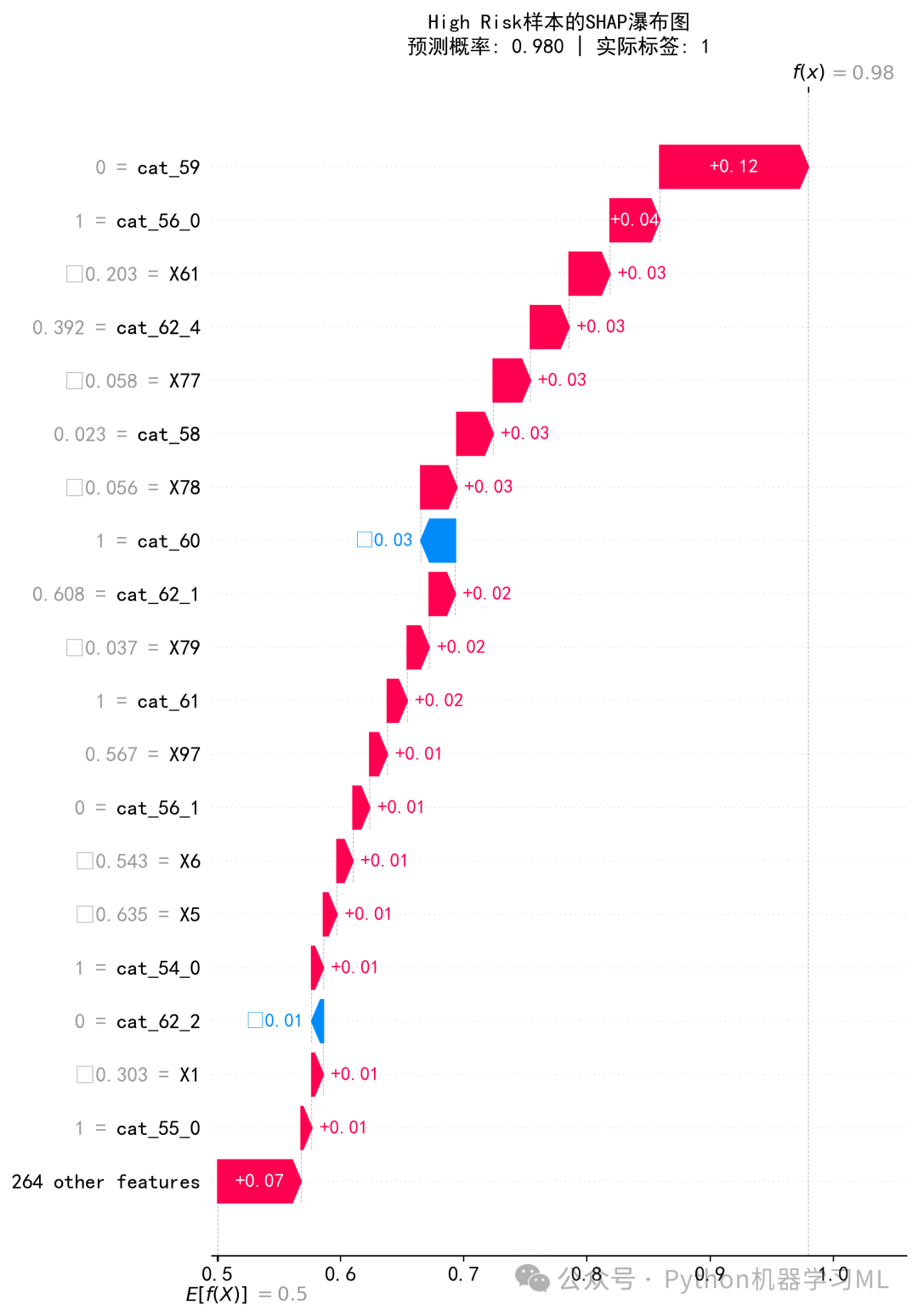

阶段 24: 多样本对比分析
这个阶段通过自定义的可视化方法,将不同风险等级的样本并排比较,以揭示导致预测差异的关键因素。
作用解释: 虽然瀑布图和力图对单个样本的解释效果很好,但要比较不同样本的决策逻辑,来回切换图片会很低效。这个函数解决了这个问题:
- 选择对比样本
选择之前分层好的高、中、低风险代表性样本。
- 自定义条形图
为每个选定的样本生成一个水平条形图。
- 内容
图中显示了对该样本预测贡献最大的前15个特征。
- 方向
条形的长度表示SHAP值的大小(贡献度),方向表示是正向还是负向贡献。
- 颜色
红色表示负向贡献(降低风险),蓝色表示正向贡献(提高风险)。
- 标签
每个条形旁边都标注了特征的名称和该样本中该特征的具体取值(如
Age=55.00)。
- 内容
- 对比分析
通过将这些图垂直堆叠在一起,可以非常直观地对比:
-
对于高风险样本,是哪些特征(及其取值)共同把它“推”向了高风险区?
-
对于低风险样本,又是哪些特征把它“拉”回了低风险区?
-
对于中风险样本,可以看到正负向贡献的特征是如何相互“角力”的。
-
这种可视化对于理解模型在不同情境下的行为模式、发现潜在的数据问题或模型偏见非常有价值。
python
# ============================================
# 第九步:多样本SHAP值堆叠条形图
# ============================================

print("\n" + "=" * 60)
print("生成多样本SHAP值对比图")
print("=" * 60)

# 选择多个代表性样本
selected_samples = []
selected_labels = []

for risk_level, sample_idx in sample_indices.items():
    selected_samples.append(sample_idx)
    selected_labels.append(f"{risk_level} (P={y_proba_sample[sample_idx]:.3f})")

iflen(selected_samples) > 0:
    fig, axes = plt.subplots(len(selected_samples), 1,
                             figsize=(14, 4 * len(selected_samples)))

iflen(selected_samples) == 1:
        axes = [axes]

for idx, (sample_idx, label) inenumerate(zip(selected_samples, selected_labels)):
        ax = axes[idx]

# 获取该样本的SHAP值
        sample_shap = shap_values_class1[sample_idx]
        sample_features = X_test_sample.iloc[sample_idx]

# 选择最重要的特征(按绝对值排序)
        top_indices = np.argsort(np.abs(sample_shap))[-15:]

# 创建条形图
        colors = ['red'if x < 0else'blue'for x in sample_shap[top_indices]]
        bars = ax.barh(range(len(top_indices)), sample_shap[top_indices],
                       color=colors, alpha=0.7, edgecolor='black', linewidth=0.5)

# 设置标签
        feature_labels = [f"{feature_names[i][:25]}={sample_features.iloc[i]:.2f}"
for i in top_indices]
        ax.set_yticks(range(len(top_indices)))
        ax.set_yticklabels(feature_labels, fontsize=9)
        ax.set_xlabel('SHAP值', fontsize=11)
        ax.set_title(f'{label}', fontsize=12, fontweight='bold')
        ax.axvline(x=0, color='black', linestyle='-', linewidth=1)
        ax.grid(True, alpha=0.3, axis='x')

# 添加数值标签
for bar in bars:
            width = bar.get_width()
            ax.text(width, bar.get_y() + bar.get_height() / 2,
f'{width:+.3f}',
                    ha='left'if width > 0else'right',
                    va='center', fontsize=8)

    plt.suptitle('多样本Top特征SHAP值对比', fontsize=15, fontweight='bold', y=1.00)
    plt.tight_layout()
    plt.savefig('shap_multi_sample_comparison.png', dpi=300, bbox_inches='tight')
    plt.show()
print("✓ 已保存: shap_multi_sample_comparison.png")

print("\n" + "=" * 60)
print("第一步整合完成!")
print("=" * 60)
print("\n生成的文件:")
print("  ✓ shap_feature_importance_detailed.csv - 详细特征重要性")
print("  ✓ shap_importance_comparison.png - 特征重要性对比")
print("  ✓ shap_summary_dot.png - SHAP摘要散点图")
print("  ✓ shap_waterfall_*.png - 各风险等级瀑布图")
print("  ✓ shap_force_*.png - 各风险等级力图")
print("  ✓ shap_multi_sample_comparison.png - 多样本对比图")
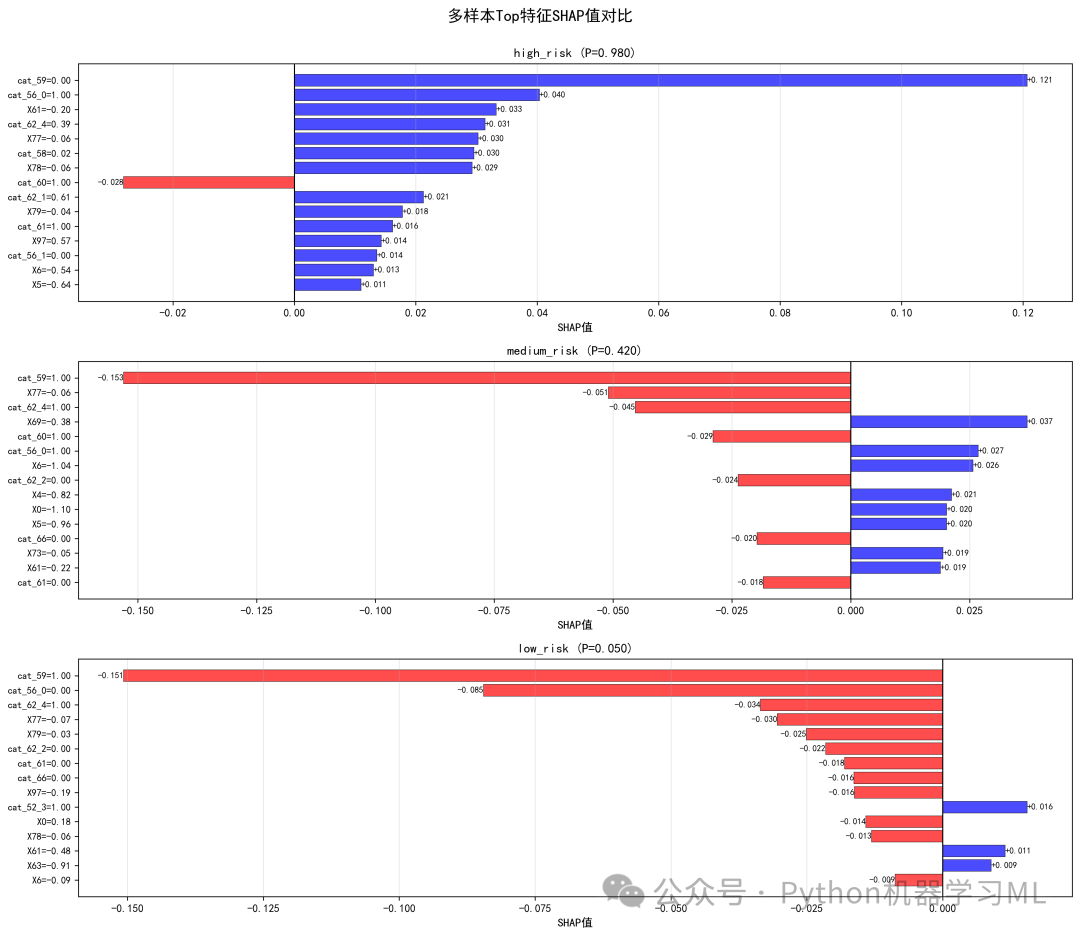
阶段 25: 高级依赖图分析
这个阶段生成了比标准shap.dependence_plot更高级的依赖图,它不仅展示了特征值与SHAP值的关系,还加入了趋势线和关键阈值,以揭示更深层次的模式。
作用解释:
- 依赖关系可视化
散点图的每个点代表一个样本,x轴是某个特征的取值,y轴是该特征对该样本预测的SHAP值。这揭示了当一个特征值变化时,它对模型预测的影响(是正向还是负向)。
- 交互效应探索
散点的颜色由预测概率决定。如果某个特征的依赖图中,相同x值附近散点的颜色有明显分层,这通常暗示着存在一个未被画出的特征与当前特征发生了强烈的交互作用。
- 非线性关系揭示
通过添加LOESS趋势线(一种局部回归平滑方法),可以清晰地看出特征与SHAP值之间的非线性关系,例如U型、S型或阈值效应。
- 关键阈值识别
- 拐点 (
find_knee_point)代码通过计算趋势线二阶导数的方法,尝试自动寻找曲线上曲率最大的点,这个点可能代表特征影响发生质变的关键阈值。
- 中位数
标注中位数作为数据分布的参考。
-
这些参考线对于从业务上理解特征的临界值非常有帮助。
- 拐点 (
# ============================================
# 第十步:依赖图(Dependence Plots)- 带趋势线和阈值
# ============================================

print("\n" + "=" * 60)
print("生成特征依赖图(带趋势线)")
print("=" * 60)


deffind_knee_point(x_data, y_data, window_length=5, polyorder=2):
"""通过基于曲率的方法寻找曲线上趋势变化最显著的点"""
from scipy.signal import savgol_filter

# 确保数据有序
    sort_idx = np.argsort(x_data)
    x_sorted = np.array(x_data)[sort_idx]
    y_sorted = np.array(y_data)[sort_idx]

iflen(x_sorted) < window_length:
return np.median(x_sorted)

# 确保window_length是奇数
if window_length % 2 == 0:
        window_length += 1

# 确保polyorder小于window_length
if polyorder >= window_length:
        polyorder = window_length - 1

if polyorder < 1:
        polyorder = 1

try:
        y_second_deriv = savgol_filter(y_sorted, window_length, polyorder, deriv=2)
        knee_index = np.argmax(np.abs(y_second_deriv))
        knee_point_x = x_sorted[knee_index]
return knee_point_x
except:
return np.median(x_sorted)


# 选择前6个最重要的特征
top_6_features = importance_df.head(6)['Feature'].tolist()

fig, axes = plt.subplots(2, 3, figsize=(18, 12))
axes = axes.flatten()

for i, feature inenumerate(top_6_features):
    ax = axes[i]

# 获取数据
    x_data = X_test_sample[feature].values
    y_data = shap_values_class1[:, feature_names.index(feature)]

# 使用预测概率作为颜色
    color_data = y_proba_sample

# 绘制散点图
    scatter = ax.scatter(x_data, y_data, c=color_data, cmap='coolwarm',
                         s=30, alpha=0.7, edgecolors='gray', linewidth=0.3)

# 添加颜色条
    cbar = plt.colorbar(scatter, ax=ax)
    cbar.ax.set_title('Prob', fontsize=9)
    cbar.ax.tick_params(labelsize=8)

# 添加LOESS趋势线
try:
from statsmodels.nonparametric.smoothers_lowess import lowess

        smoothed = lowess(y_data, x_data, frac=0.3)
        ax.plot(smoothed[:, 0], smoothed[:, 1], color='red', linewidth=2.5,
                alpha=0.8, label='LOESS趋势')
except:
# 如果LOESS失败,使用多项式拟合
        z = np.polyfit(x_data, y_data, 2)
        p = np.poly1d(z)
        x_range = np.linspace(x_data.min(), x_data.max(), 100)
        ax.plot(x_range, p(x_range), color='red', linewidth=2.5,
                alpha=0.8, label='多项式拟合')

# 计算中位数和拐点
    median_val = np.median(x_data)
try:
        threshold_val = find_knee_point(x_data, y_data)
except:
        threshold_val = median_val

# 绘制参考线
    ax.axvline(median_val, color='black', linestyle='--', linewidth=1.2,
               alpha=0.6, label=f'中位数: {median_val:.2f}')
    ax.axvline(threshold_val, color='green', linestyle=':', linewidth=1.5,
               alpha=0.7, label=f'拐点: {threshold_val:.2f}')
    ax.axhline(y=0, color='gray', linestyle='-', linewidth=0.8, alpha=0.4)

# 设置标签和标题
    ax.set_xlabel(feature[:30], fontsize=11, fontweight='bold')
    ax.set_ylabel('SHAP值', fontsize=11)
    ax.set_title(f'{feature[:30]}的依赖关系', fontsize=12, fontweight='bold', pad=10)

# 添加图例
    ax.legend(loc='best', fontsize=9, framealpha=0.9)
    ax.grid(True, alpha=0.3, linestyle=':')

plt.suptitle('SHAP依赖图 - Top 6特征(带趋势线和阈值)',
             fontsize=15, fontweight='bold', y=1.00)
plt.tight_layout()
plt.savefig('shap_dependence_with_trends.png', dpi=300, bbox_inches='tight')
plt.show()
print("✓ 已保存: shap_dependence_with_trends.png")
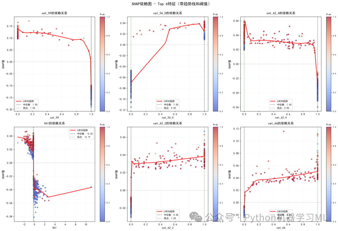
阶段 26: 决策路径可视化
这个阶段使用决策图(Decision Plot)来可视化多个样本的预测形成过程。
作用解释: 决策图是瀑布图的“多样本”版本。
- 图表解读
图的底部是模型的基准值。从下往上,每个特征按其重要性被依次加入。图中的每一条彩色线代表一个样本的预测路径。当一个特征被加入时,如果它对该样本的SHAP值为正,线就向右偏;如果为负,就向左偏。所有特征加入后,线条最终到达的位置就是该样本的最终预测值(在logit空间)。
- 对比分析
代码选择了高、中、低风险的多个样本进行绘制,并用不同颜色表示。通过观察,可以清晰地看到:
-
高风险样本(红色)的路径普遍被特征“推”向右侧(高预测值)。
-
低风险样本(蓝色)的路径则被“拉”向左侧。
-
不同路径之间的交叉和分离点揭示了是哪些关键特征导致了预测结果的差异。
-
这对于理解群体决策模式和识别异常预测路径非常有用。
# ============================================
# 第十一步:决策图(Decision Plot)
# ============================================

print("\n" + "=" * 60)
print("生成SHAP决策图")
print("=" * 60)

# 选择代表性样本(每个风险等级15个)
n_samples_per_category = 15

high_risk_samples = np.where(y_proba_sample > 0.7)[0][:n_samples_per_category]
medium_risk_samples = np.where((y_proba_sample >= 0.4) & (y_proba_sample <= 0.6))[0][:n_samples_per_category]
low_risk_samples = np.where(y_proba_sample < 0.3)[0][:n_samples_per_category]

# 合并样本
decision_samples = []
iflen(high_risk_samples) > 0:
    decision_samples.extend(high_risk_samples)
iflen(medium_risk_samples) > 0:
    decision_samples.extend(medium_risk_samples)
iflen(low_risk_samples) > 0:
    decision_samples.extend(low_risk_samples)

iflen(decision_samples) > 0:
    plt.figure(figsize=(14, 10))

    shap.decision_plot(
        base_value,
        shap_values_class1[decision_samples],
        X_test_sample.iloc[decision_samples],
        feature_names=feature_names,
        link='logit',
        show=False
    )

    plt.title(f'SHAP决策路径分析\n'
f'红色: 高风险 | 橙色: 中风险 | 蓝色: 低风险',
              fontsize=14, fontweight='bold', pad=20)
    plt.tight_layout()
    plt.savefig('shap_decision_plot.png', dpi=300, bbox_inches='tight')
    plt.show()
print("✓ 已保存: shap_decision_plot.png")
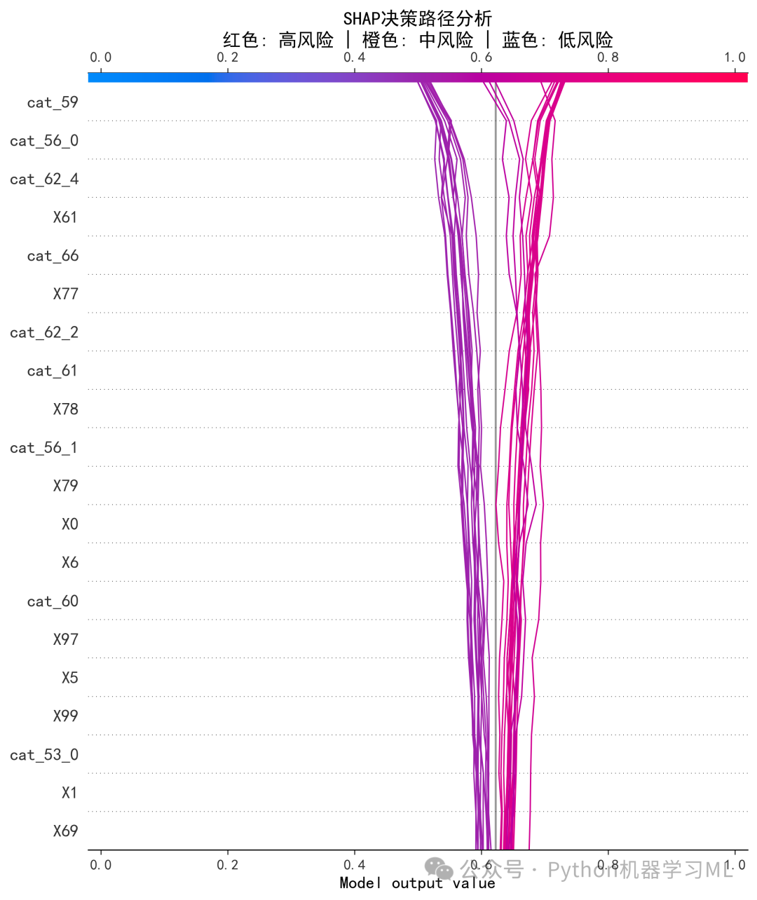
阶段 27: 分层风险分析
这个阶段通过自定义的可视化,分析在不同风险等级的群体中,哪些特征是主要的驱动因素。
作用解释: 模型对不同风险人群的判断逻辑可能不同。这个函数通过以下步骤来揭示这种差异:
- 风险分箱
将所有样本按预测概率分为“极低风险”、“低风险”、“中等风险”等多个区间。
- 分组分析
对每个风险区间的样本,计算其内部所有特征的平均SHAP值。
- 可视化对比
为每个风险区间绘制一个条形图,展示该区间内平均SHAP值最高(或最低)的几个特征。
- 绿色条
代表该特征在该风险区间内平均起到了提高风险的作用。
- 红色条
代表该特征在该风险区间内平均起到了降低风险的作用。
- 绿色条
通过对比不同风险区间的图表,可以回答诸如“是什么核心因素将人群推向了极高风险?”或“哪些保护性因素使得人群维持在低风险水平?”等业务问题。
# ============================================
# 第十二步:风险级别SHAP分布对比
# ============================================

print("\n" + "=" * 60)
print("生成风险级别SHAP分布对比图")
print("=" * 60)

# 定义预测区间
prediction_bins = [
    (0, 0.2, '极低风险'),
    (0.2, 0.4, '低风险'),
    (0.4, 0.6, '中等风险'),
    (0.6, 0.8, '高风险'),
    (0.8, 1.0, '极高风险')
]

fig, axes = plt.subplots(2, 3, figsize=(18, 12))
axes = axes.flatten()

for idx, (low, high, label) inenumerate(prediction_bins):
if idx >= 6:
break

    ax = axes[idx]

# 找到该区间的样本
    mask = (y_proba_sample >= low) & (y_proba_sample < high)
    n_samples = mask.sum()

if n_samples > 0:
# 获取该区间内的SHAP值
        shap_subset = shap_values_class1[mask]

# 计算每个特征的平均SHAP值
        mean_shap = np.mean(shap_subset, axis=0)

# 选择前10个最重要的特征
        top_indices = np.argsort(np.abs(mean_shap))[-10:]

# 创建条形图
        colors = ['red'if x < 0else'green'for x in mean_shap[top_indices]]
        bars = ax.barh(range(len(top_indices)), mean_shap[top_indices],
                       color=colors, alpha=0.7, edgecolor='black', linewidth=0.5)

# 设置标签
        feature_labels = [feature_names[i][:25] for i in top_indices]
        ax.set_yticks(range(len(top_indices)))
        ax.set_yticklabels(feature_labels, fontsize=9)
        ax.set_xlabel('平均SHAP值', fontsize=11)
        ax.set_title(f'{label}\n({n_samples}个样本)',
                     fontsize=12, fontweight='bold')

# 添加数值标签
for bar in bars:
            width = bar.get_width()
            ax.text(width, bar.get_y() + bar.get_height() / 2,
f'{width:+.2f}',
                    ha='left'if width > 0else'right',
                    va='center', fontsize=8)

# 添加零线
        ax.axvline(x=0, color='black', linestyle='-', linewidth=1)
        ax.grid(True, alpha=0.3, axis='x')
else:
        ax.text(0.5, 0.5, f'{label}\n(无样本)',
                ha='center', va='center', fontsize=12,
                transform=ax.transAxes)
        ax.set_title(label, fontsize=12, fontweight='bold')

# 隐藏多余的子图
iflen(prediction_bins) < 6:
for idx inrange(len(prediction_bins), 6):
        axes[idx].axis('off')

plt.suptitle('不同风险级别的SHAP值分布对比',
             fontsize=15, fontweight='bold', y=1.00)
plt.tight_layout()
plt.savefig('shap_risk_level_distribution.png', dpi=300, bbox_inches='tight')
plt.show()
print("✓ 已保存: shap_risk_level_distribution.png")
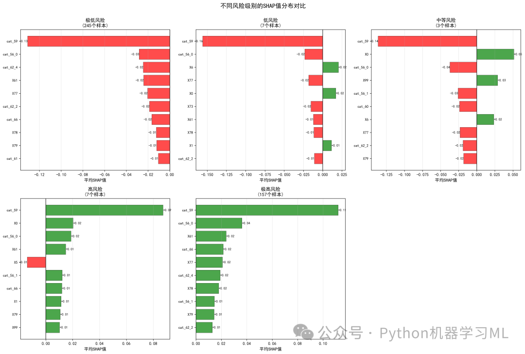
阶段 28: 特征交互与结构分析
这个阶段使用聚类、3D图和网络图等多种高级可视化手段,来探索特征之间的复杂关系和交互效应。
作用解释:
- 层级聚类图
- 方法
它将每个特征看作一个由其在所有样本上的SHAP值组成的向量,然后计算这些向量之间的距离,并进行层级聚类。
- 解读
在聚类树上距离相近的特征,意味着它们对模型预测的贡献模式相似。这可能表明这些特征在模型中被用作替代品,或者它们之间存在信息冗余。
- 方法
- 3D可视化
- 方法
选取最重要的3个特征,将其SHAP值作为三维空间的x, y, z轴,绘制3D散点图。
- 解读
这个图可以帮助我们直观地探索Top 3特征之间的交互作用。例如,观察高概率(红色)或低概率(蓝色)的点是否在空间的特定角落聚集。
- 方法
- 相关性网络图
- 方法
将特征视为网络中的节点,节点大小代表其全局重要性。如果两个特征的SHAP值在样本间的相关性超过一定阈值,就在它们之间画一条边。
- 解读
边的颜色代表相关性正负(红色正相关,蓝色负相关),粗细代表相关性强度。这个图清晰地展示了哪些特征在模型中倾向于“协同作战”(正相关),哪些倾向于“相互制衡”(负相关)。
- 方法
# ============================================
# 第十三步:层级聚类图
# ============================================

print("\n" + "=" * 60)
print("生成SHAP层级聚类图")
print("=" * 60)

from scipy.cluster.hierarchy import dendrogram, linkage
from scipy.spatial.distance import pdist

# 选择前15个最重要的特征进行聚类
top_15_for_cluster = importance_df.head(15)['Feature'].tolist()
shap_matrix_for_clustering = shap_values_df[top_15_for_cluster].values.T

# 计算距离矩阵和层级聚类
distance_matrix = pdist(shap_matrix_for_clustering, metric='euclidean')
linkage_matrix = linkage(distance_matrix, method='ward')

# 创建聚类图
plt.figure(figsize=(14, 8))

dendrogram_plot = dendrogram(
    linkage_matrix,
    labels=top_15_for_cluster,
    leaf_rotation=45,
    leaf_font_size=11
)

plt.title('基于SHAP值的特征层级聚类', fontsize=14, fontweight='bold', pad=20)
plt.xlabel('特征', fontsize=12)
plt.ylabel('距离', fontsize=12)
plt.grid(True, alpha=0.3, axis='y')

# 添加阈值线
threshold = np.mean(linkage_matrix[:, 2])
plt.axhline(y=threshold, color='red', linestyle='--', linewidth=2,
            label=f'平均距离: {threshold:.2f}')
plt.legend(fontsize=11)

plt.tight_layout()
plt.savefig('shap_hierarchical_clustering.png', dpi=300, bbox_inches='tight')
plt.show()
print("✓ 已保存: shap_hierarchical_clustering.png")

# ============================================
# 第十四步:3D可视化
# ============================================

print("\n" + "=" * 60)
print("生成SHAP值3D可视化")
print("=" * 60)

from mpl_toolkits.mplot3d import Axes3D

# 选择3个最重要的特征
top_3_for_3d = importance_df.head(3)['Feature'].tolist()

fig = plt.figure(figsize=(14, 10))
ax = fig.add_subplot(111, projection='3d')

# 获取数据
x = shap_values_df[top_3_for_3d[0]].values
y = shap_values_df[top_3_for_3d[1]].values
z = shap_values_df[top_3_for_3d[2]].values

# 使用预测概率作为颜色
scatter = ax.scatter(x, y, z, c=y_proba_sample, cmap='RdYlBu_r',
                     s=50, alpha=0.6, edgecolors='gray', linewidth=0.5)

# 设置标签
ax.set_xlabel(f'SHAP: {top_3_for_3d[0][:20]}', fontsize=11, labelpad=10)
ax.set_ylabel(f'SHAP: {top_3_for_3d[1][:20]}', fontsize=11, labelpad=10)
ax.set_zlabel(f'SHAP: {top_3_for_3d[2][:20]}', fontsize=11, labelpad=10)

# 添加颜色条
cbar = plt.colorbar(scatter, ax=ax, pad=0.1, shrink=0.8)
cbar.set_label('预测概率', fontsize=11)

# 设置标题
ax.set_title('SHAP值3D可视化\nTop 3特征',
             fontsize=14, fontweight='bold', pad=20)

# 添加网格
ax.grid(True, alpha=0.3)

# 设置视角
ax.view_init(elev=20, azim=45)

plt.tight_layout()
plt.savefig('shap_3d_visualization.png', dpi=300, bbox_inches='tight')
plt.show()
print("✓ 已保存: shap_3d_visualization.png")

# ============================================
# 第十五步:相关性网络图
# ============================================

print("\n" + "=" * 60)
print("生成SHAP相关性网络图")
print("=" * 60)

import networkx as nx

# 计算前15个特征的SHAP值相关性
top_15_for_network = importance_df.head(15)['Feature'].tolist()
correlation_matrix = shap_values_df[top_15_for_network].corr()

# 创建网络图
G = nx.Graph()

# 添加节点
for feature in top_15_for_network:
    importance = importance_df[importance_df['Feature'] == feature]['SHAP_Importance'].values[0]
    G.add_node(feature, importance=importance)

# 添加边(只添加强相关的边)
threshold = 0.3
for i inrange(len(top_15_for_network)):
for j inrange(i + 1, len(top_15_for_network)):
        corr_value = correlation_matrix.iloc[i, j]
ifabs(corr_value) > threshold:
            G.add_edge(top_15_for_network[i], top_15_for_network[j],
                       weight=abs(corr_value), correlation=corr_value)

# 创建布局
pos = nx.spring_layout(G, k=1, iterations=50, seed=42)

# 绘制网络图
plt.figure(figsize=(14, 10))

# 节点大小基于特征重要性
node_sizes = [G.nodes[node]['importance'] * 5000for node in G.nodes()]

# 边的颜色基于相关性正负
edge_colors = []
edge_widths = []
for (u, v) in G.edges():
    corr = G[u][v]['correlation']
    edge_colors.append('red'if corr > 0else'blue')
    edge_widths.append(abs(corr) * 5)

# 绘制网络
nx.draw_networkx_nodes(G, pos, node_color='lightgreen',
                       node_size=node_sizes, alpha=0.7,
                       edgecolors='black', linewidths=2)
nx.draw_networkx_labels(G, pos, font_size=9, font_weight='bold')
nx.draw_networkx_edges(G, pos, edge_color=edge_colors,
                       width=edge_widths, alpha=0.5)

# 添加图例
from matplotlib.lines import Line2D

red_line = Line2D([0], [0], color='red', linewidth=3, label='正相关')
blue_line = Line2D([0], [0], color='blue', linewidth=3, label='负相关')
plt.legend(handles=[red_line, blue_line], loc='upper right', fontsize=12)

plt.title(f'SHAP值相关性网络图\n(显示相关性 > {threshold})',
          fontsize=14, fontweight='bold')
plt.axis('off')
plt.tight_layout()
plt.savefig('shap_correlation_network.png', dpi=300, bbox_inches='tight')
plt.show()
print("✓ 已保存: shap_correlation_network.png")
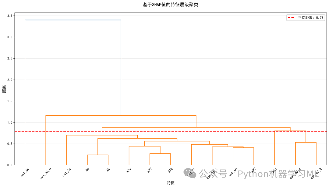
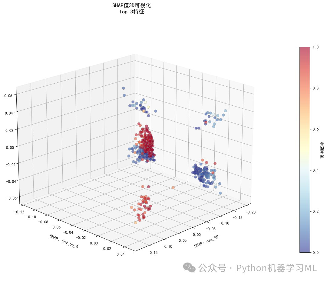
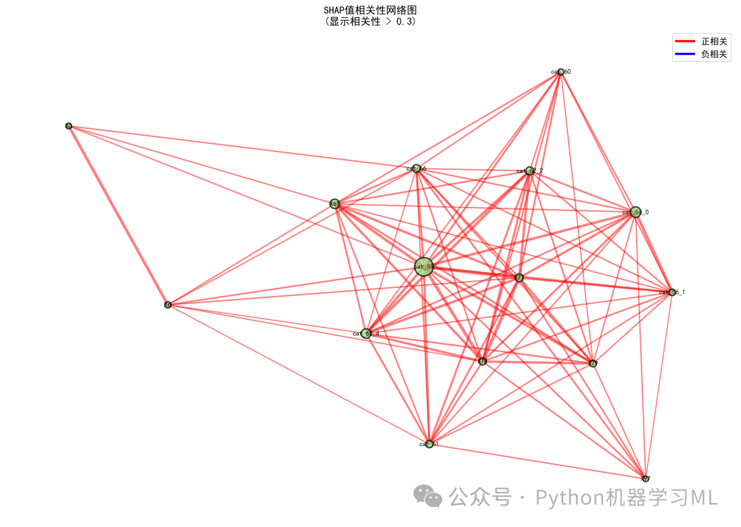
阶段 29: 执行摘要仪表板与元数据保存
这个阶段将所有分析结果汇总成一个高度浓缩的“执行摘要仪表板”,并保存所有分析的元数据,是整个分析流程的点睛之笔。
作用解释:
- 执行摘要仪表板
- 关键指标卡
显示了样本数、风险分布、模型一致性等核心指标。
- Top 5特征
最重要的信息,突出显示。
- 预测分布图
展示模型预测概率的整体分布情况。
- SHAP热力图
快速浏览少量样本在多个重要特征上的SHAP值模式。
- 相关性矩阵
可视化特征SHAP值之间的相关性。
- 分析摘要
用文本总结了关键发现、统计洞察和风险因素。
- 目的
为决策者或非技术人员提供一份一目了然的、信息密度极高的分析报告。
- 布局
使用
GridSpec创建了一个复杂的仪表板布局,包含了多个关键视图: -
这个仪表板是沟通分析结果的强大工具。
- 关键指标卡
- 元数据保存
- 目的
将本次分析的所有关键参数和结果以结构化的方式保存下来,便于追溯、复现和自动化处理。
- 内容
将分析时间、样本数、基准值、重要特征列表、风险分布统计、SHAP值统计信息、模型一致性等所有元信息保存为一个JSON文件。这对于建立规范化的机器学习流程至关重要。
- 目的
# ============================================
# 第十六步:执行摘要仪表板
# ============================================
# ============================================
# Step 16: Executive Summary Dashboard
# ============================================

print("\n" + "=" * 60)
print("Generating Executive Summary Dashboard")
print("=" * 60)

from matplotlib import gridspec
# Set font for better display
plt.rcParams['font.sans-serif'] = ['DejaVu Sans']

# Calculate statistical metrics
n_80 = np.where(importance_df['SHAP_Importance'].cumsum() /
                importance_df['SHAP_Importance'].sum() >= 0.8)[0][0] + 1
n_90 = np.where(importance_df['SHAP_Importance'].cumsum() /
                importance_df['SHAP_Importance'].sum() >= 0.9)[0][0] + 1

# Calculate correlation between SHAP predictions and model predictions
shap_predictions = base_value + shap_values_class1.sum(axis=1)
from scipy.special import expit

shap_proba = expit(shap_predictions)
corr = np.corrcoef(y_proba_sample, shap_proba)[0, 1]

# Create executive summary figure
fig = plt.figure(figsize=(20, 14))
gs = gridspec.GridSpec(4, 4, figure=fig, hspace=0.35, wspace=0.35)

# 1. Key Metrics Card
ax1 = fig.add_subplot(gs[0, :2])
ax1.axis('off')

metrics_text = f"""
📊 Key Metrics
━━━━━━━━━━━━━━━━━━━━━━━
Analyzed Samples: {len(X_test_sample)}
Total Features: {len(feature_names)}
Base Value: {base_value:.2f}

Risk Distribution:
• High Risk (>0.7): {(y_proba_sample > 0.7).sum()} ({(y_proba_sample > 0.7).mean() * 100:.1f}%)
• Medium Risk (0.4-0.7): {((y_proba_sample >= 0.4) & (y_proba_sample <= 0.7)).sum()} ({((y_proba_sample >= 0.4) & (y_proba_sample <= 0.7)).mean() * 100:.1f}%)
• Low Risk (<0.4): {(y_proba_sample < 0.4).sum()} ({(y_proba_sample < 0.4).mean() * 100:.1f}%)

Model Consistency: {corr:.2f}
"""

ax1.text(0.05, 0.95, metrics_text, transform=ax1.transAxes,
         fontsize=12, verticalalignment='top', family='monospace',
         bbox=dict(boxstyle='round,pad=0.8', facecolor='lightblue', alpha=0.8))

# 2. Top 5 Feature Importance
ax2 = fig.add_subplot(gs[0, 2:])
top_5 = importance_df.head(5)
colors_bar = ['#FF6B6B', '#4ECDC4', '#45B7D1', '#96CEB4', '#FECA57']
bars = ax2.barh(range(5), top_5['SHAP_Importance'].values,
                color=colors_bar, edgecolor='black', linewidth=1)
ax2.set_yticks(range(5))
ax2.set_yticklabels([f[:25] for f in top_5['Feature'].values], fontsize=10)
ax2.set_xlabel('Mean |SHAP Value|', fontsize=11)
ax2.set_title('🎯 Top 5 Most Important Features', fontsize=13, fontweight='bold')
ax2.invert_yaxis()
ax2.grid(True, alpha=0.3, axis='x')

# Add value labels
for i, (bar, value) inenumerate(zip(bars, top_5['SHAP_Importance'].values)):
    ax2.text(value, i, f' {value:.2f}', va='center', fontsize=10, fontweight='bold')

# 3. Prediction Distribution
ax3 = fig.add_subplot(gs[1, :2])
counts, bins, patches = ax3.hist(y_proba_sample, bins=30, edgecolor='black',
                                 alpha=0.7, linewidth=1)

# Color different risk levels
for i, patch inenumerate(patches):
if bins[i] < 0.4:
        patch.set_facecolor('green')
elif bins[i] < 0.7:
        patch.set_facecolor('orange')
else:
        patch.set_facecolor('red')

ax3.axvline(x=0.5, color='black', linestyle='--', linewidth=2,
            label='Decision Threshold (0.5)')
ax3.set_xlabel('Prediction Probability', fontsize=11)
ax3.set_ylabel('Number of Samples', fontsize=11)
ax3.set_title('📈 Prediction Probability Distribution', fontsize=13, fontweight='bold')
ax3.legend(fontsize=10)
ax3.grid(True, alpha=0.3, axis='y')

# 4. SHAP Values Heatmap
ax4 = fig.add_subplot(gs[1, 2:])
top_10_for_heatmap = importance_df.head(10)['Feature'].tolist()
shap_matrix_display = shap_values_df[top_10_for_heatmap].values[:50].T

im = ax4.imshow(shap_matrix_display, cmap='RdBu_r', aspect='auto',
                vmin=-np.max(np.abs(shap_matrix_display)),
                vmax=np.max(np.abs(shap_matrix_display)))

ax4.set_yticks(range(len(top_10_for_heatmap)))
ax4.set_yticklabels([f[:25] for f in top_10_for_heatmap], fontsize=9)
ax4.set_xlabel('Sample Index', fontsize=11)
ax4.set_title('🔥 SHAP Values Heatmap (First 50 Samples)', fontsize=13, fontweight='bold')
cbar = plt.colorbar(im, ax=ax4)
cbar.set_label('SHAP Value', fontsize=10)

# 5. Feature Correlation Matrix
ax5 = fig.add_subplot(gs[2:, :2])
corr_matrix = shap_values_df[top_10_for_heatmap].corr()
mask = np.triu(np.ones_like(corr_matrix, dtype=bool))
sns.heatmap(corr_matrix, mask=mask, annot=True, fmt='.2f',
            cmap='coolwarm', center=0, square=True,
            linewidths=1, cbar_kws={"shrink": 0.8}, ax=ax5,
            vmin=-1, vmax=1)
ax5.set_title('🔗 Feature SHAP Correlation Matrix', fontsize=13, fontweight='bold')

# 6. Analysis Summary
ax6 = fig.add_subplot(gs[2:, 2:])
ax6.axis('off')

summary_text = f"""
📋 Analysis Summary
━━━━━━━━━━━━━━━━━━━━━━━━━━━━━━━━━━━━

🎯 Key Findings:
• Most Important Feature: {importance_df.iloc[0]['Feature'][:30]}
  (Impact: {importance_df.iloc[0]['SHAP_Importance']:.2f})
• Features for 80% Importance: {n_80}
• Features for 90% Importance: {n_90}
• SHAP-Prediction Correlation: {corr:.2f}

📊 Statistical Insights:
• Mean |SHAP|: {np.mean(np.abs(shap_values_class1)):.2f}
• SHAP Std Dev: {np.std(shap_values_class1):.2f}
• SHAP Range: [{np.min(shap_values_class1):.2f}, {np.max(shap_values_class1):.2f}]

🔍 Risk Factors:
• Main Risk Drivers: {', '.join([f[:15] for f in importance_df.head(3)['Feature'].tolist()])}
• Mean Prediction: {y_proba_sample.mean():.2f} ± {y_proba_sample.std():.2f}

📁 Generated Files:
• Visualizations: 15+ charts
• Data Files: CSV statistical report
• Analysis Time: {pd.Timestamp.now().strftime("%Y-%m-%d %H:%M:%S")}
"""

ax6.text(0.05, 0.95, summary_text, transform=ax6.transAxes,
         fontsize=10, verticalalignment='top', family='monospace',
         bbox=dict(boxstyle='round,pad=0.8', facecolor='lightyellow', alpha=0.9))

# Add main title
fig.suptitle('SHAP Analysis Executive Summary Dashboard\n',
             fontsize=16, fontweight='bold', y=0.98)

plt.tight_layout()
plt.savefig('shap_executive_summary_dashboard.png', dpi=300, bbox_inches='tight')
plt.show()
print("✓ Saved: shap_executive_summary_dashboard.png")

# ============================================
# 第十七步:保存分析元数据
# ============================================

print("\n" + "=" * 60)
print("保存分析元数据")
print("=" * 60)

import json

metadata = {
'analysis_timestamp': pd.Timestamp.now().strftime('%Y-%m-%d %H:%M:%S'),
'n_samples': len(X_test_sample),
'n_features': len(feature_names),
'base_value': float(base_value),
'top_10_features': importance_df.head(10)['Feature'].tolist(),
'top_10_importance': importance_df.head(10)['SHAP_Importance'].round(2).tolist(),
'risk_distribution': {
'high_risk': int((y_proba_sample > 0.7).sum()),
'medium_risk': int(((y_proba_sample >= 0.4) & (y_proba_sample <= 0.7)).sum()),
'low_risk': int((y_proba_sample < 0.4).sum())
    },
'shap_statistics': {
'mean_abs': float(np.mean(np.abs(shap_values_class1))),
'std': float(np.std(shap_values_class1)),
'min': float(np.min(shap_values_class1)),
'max': float(np.max(shap_values_class1))
    },
'model_consistency': {
'shap_prediction_correlation': float(corr)
    },
'feature_coverage': {
'features_for_80_percent': int(n_80),
'features_for_90_percent': int(n_90)
    }
}

# 保存为JSON
withopen('shap_analysis_metadata.json', 'w', encoding='utf-8') as f:
    json.dump(metadata, f, indent=4, ensure_ascii=False)

print("✓ 分析元数据已保存: shap_analysis_metadata.json")
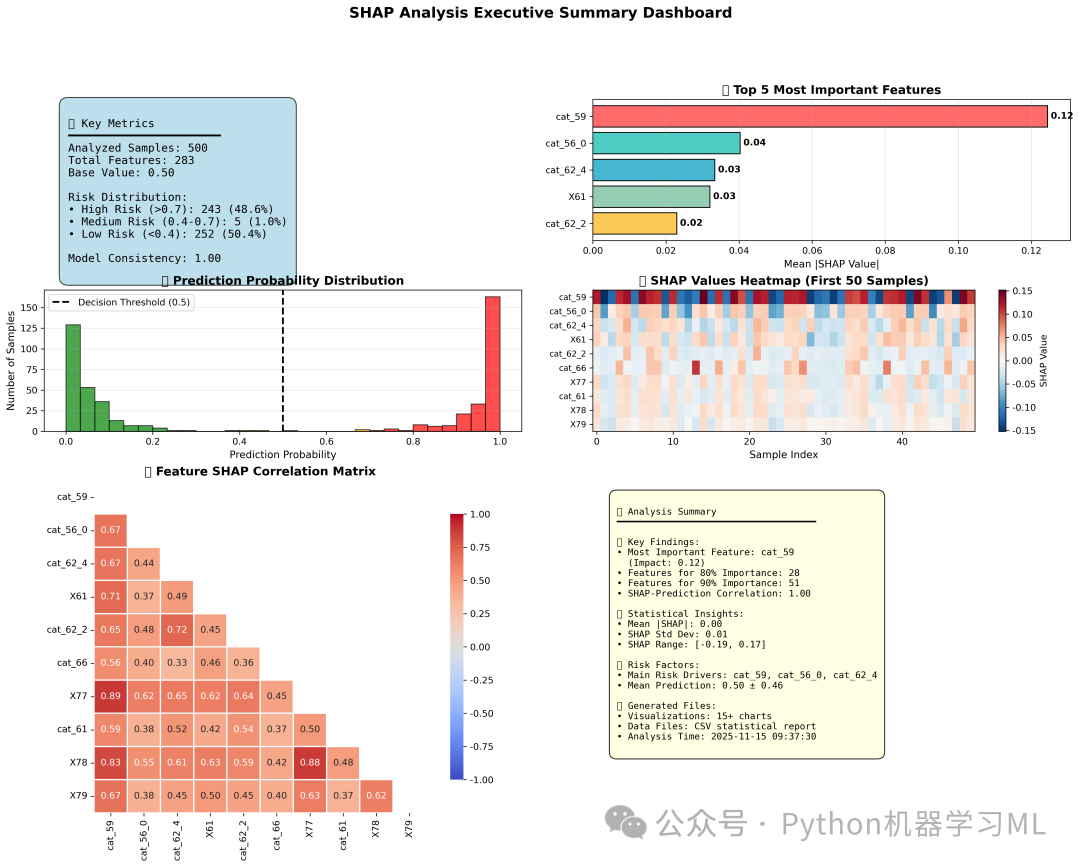
阶段 30: 专业依赖图分析(统计增强版)
这是对依赖图的最终和最专业的版本,它不仅展示了数据关系,还提供了统计上的严谨性。
作用解释: 这个函数 plot_professional_shap_dependence 将依赖图提升到了一个新的水平:
- 多项式拟合
使用多项式回归来拟合特征值与SHAP值之间的趋势,并计算R²(决定系数)和p值来评估拟合的好坏。这比简单的LOESS平滑更具解释性。
- 置信区间
通过Bootstrap方法(一种重采样技术),计算出拟合曲线的95%置信区间。这个区间(图中橙色区域)告诉我们,真实趋势线有多大的可能性落在这个范围内,增加了结论的可靠性。
- 双图布局
采用上下两个子图的布局,将依赖图和特征的分布直方图对齐。这使得我们可以同时观察到一个特征值在何处对模型影响最大,以及该特征值在数据中的分布是密集还是稀疏。
- 高亮显示
在直方图中,对那些SHAP值影响较大的区域进行高亮(红色),直观地展示了哪些取值范围是模型决策的关键区域。
这种专业级的图表非常适合用于学术论文、研究报告或需要严谨统计支持的业务演示。
# ============================================
# 第十八步:专业SHAP依赖图(带多项式拟合和置信区间)
# ============================================

print("\n" + "=" * 60)
print("生成专业SHAP依赖图(多项式拟合)")
print("=" * 60)

from scipy import stats
from scipy.optimize import curve_fit
from sklearn.preprocessing import PolynomialFeatures
from sklearn.linear_model import LinearRegression
from sklearn.metrics import r2_score
from matplotlib.gridspec import GridSpec


defplot_professional_shap_dependence(feature_name, X_data, shap_values_df,
                                      poly_degree=4, save_name=None,
                                      legend_location='upper right'):
"""
    绘制专业SHAP依赖图,展示特征对模型输出的影响
    包含多项式拟合、置信区间和分布直方图
    """

# 设置中文字体
    plt.rcParams['font.sans-serif'] = ['SimHei', 'Arial']
    plt.rcParams['axes.unicode_minus'] = False

# 创建图形布局
    fig = plt.figure(figsize=(12, 9))
    gs = GridSpec(2, 1, height_ratios=[3, 1], hspace=0.02)

# 上部分:散点图和拟合曲线
    ax1 = fig.add_subplot(gs[0])

# 获取特征值和对应的SHAP值
if feature_name in X_data.columns:
        feature_values = X_data[feature_name].values
else:
print(f"警告:特征 {feature_name} 不在数据中")
returnNone

# 获取SHAP值
ifisinstance(shap_values_df, pd.DataFrame):
if feature_name in shap_values_df.columns:
            shap_values = shap_values_df[feature_name].values
else:
            feature_idx = list(X_data.columns).index(feature_name)
            shap_values = shap_values_class1[:, feature_idx]
else:
        feature_idx = list(X_data.columns).index(feature_name)
        shap_values = shap_values_class1[:, feature_idx]

# 移除缺失值
    mask = ~np.isnan(feature_values) & ~np.isnan(shap_values)
    feature_values = feature_values[mask]
    shap_values = shap_values[mask]

iflen(feature_values) == 0:
print(f"警告:特征 {feature_name} 没有有效数据")
returnNone

# 绘制散点图,使用预测概率作为颜色
    scatter = ax1.scatter(feature_values, shap_values, alpha=0.5, s=30,
                          c=y_proba_sample[mask], cmap='RdYlBu_r',
                          label='样本点', edgecolors='gray', linewidth=0.5)

# 添加颜色条
    cbar = plt.colorbar(scatter, ax=ax1)
    cbar.set_label('预测概率', fontsize=10)
    cbar.ax.tick_params(labelsize=9)

# 多项式拟合
    sorted_indices = np.argsort(feature_values)
    x_sorted = feature_values[sorted_indices]
    y_sorted = shap_values[sorted_indices]

# 创建多项式特征
    poly_features = PolynomialFeatures(degree=poly_degree, include_bias=True)
    X_poly = poly_features.fit_transform(x_sorted.reshape(-1, 1))

# 拟合多项式模型
    poly_model = LinearRegression()
    poly_model.fit(X_poly, y_sorted)
    y_pred = poly_model.predict(X_poly)

# 计算R²
    r2 = r2_score(y_sorted, y_pred)

# 计算p值(使用F统计量)
    n = len(y_sorted)
    k = poly_degree
if n > k + 1:
        f_stat = (r2 / k) / ((1 - r2) / (n - k - 1))
        p_value = 1 - stats.f.cdf(f_stat, k, n - k - 1)
else:
        p_value = 1.0

# 生成平滑的预测曲线
    x_smooth = np.linspace(x_sorted.min(), x_sorted.max(), 300)
    X_smooth_poly = poly_features.transform(x_smooth.reshape(-1, 1))
    y_smooth = poly_model.predict(X_smooth_poly)

# 计算95%置信区间(使用bootstrap方法)
    n_bootstrap = 100
    bootstrap_preds = []

print(f"  计算 {feature_name} 的Bootstrap置信区间...")
for i inrange(n_bootstrap):
        idx = np.random.choice(len(x_sorted), size=len(x_sorted), replace=True)
        X_boot = X_poly[idx]
        y_boot = y_sorted[idx]

        model_boot = LinearRegression()
        model_boot.fit(X_boot, y_boot)
        pred_boot = model_boot.predict(X_smooth_poly)
        bootstrap_preds.append(pred_boot)

    bootstrap_preds = np.array(bootstrap_preds)
    ci_lower = np.percentile(bootstrap_preds, 2.5, axis=0)
    ci_upper = np.percentile(bootstrap_preds, 97.5, axis=0)

# 绘制置信区间
    ax1.fill_between(x_smooth, ci_lower, ci_upper, alpha=0.3,
                     color='orange', label='95%置信区间')

# 绘制拟合曲线
    p_label = 'P < 0.05'if p_value < 0.05elsef'P = {p_value:.3f}'
    ax1.plot(x_smooth, y_smooth, '--', color='red', linewidth=2.5,
             label=f'多项式拟合 (度={poly_degree})\nR2 = {r2:.3f}, {p_label}')

# 构建多项式公式字符串
    coeffs = poly_model.coef_
    intercept = poly_model.intercept_

# 创建简化的公式字符串
    formula_parts = []
    feature_powers = poly_features.powers_

for i, (coef, power) inenumerate(zip(coeffs, feature_powers)):
ifabs(coef) > 1e-6and i > 0:  # 忽略截距和非常小的系数
            power_val = power[0]
if power_val == 1:
                formula_parts.append(f'{coef:.4f}X')
elif power_val > 1:
                formula_parts.append(f'{coef:.4e}X^{power_val}')

ifabs(intercept) > 1e-6:
        formula_parts.append(f'{intercept:.4f}')

if formula_parts:
        formula = 'Y = ' + ' + '.join(formula_parts[:3]) + '...'# 只显示前3项
        ax1.text(0.5, 0.98, formula, transform=ax1.transAxes,
                 fontsize=9, ha='center', va='top',
                 bbox=dict(boxstyle='round,pad=0.5', facecolor='white', alpha=0.8))

# 添加零线
    ax1.axhline(y=0, color='gray', linestyle='-', linewidth=1, alpha=0.5)

# 添加中位数线
    median_val = np.median(feature_values)
    ax1.axvline(x=median_val, color='green', linestyle=':', linewidth=1.5,
                alpha=0.7, label=f'中位数: {median_val:.2f}')

# 设置标签和标题
    ax1.set_ylabel('SHAP值', fontsize=12)
    ax1.set_title(f'{feature_name}对模型输出的影响\n(多项式度数={poly_degree})',
                  fontsize=13, fontweight='bold')
    ax1.grid(True, alpha=0.3)
    ax1.legend(loc=legend_location, framealpha=0.9, fontsize=9)

# 移除x轴标签(因为下面还有直方图)
    ax1.set_xticklabels([])

# 下部分:特征分布直方图
    ax2 = fig.add_subplot(gs[1], sharex=ax1)

# 绘制分布直方图
    bins = np.linspace(feature_values.min(), feature_values.max(), 50)
    counts, _, patches = ax2.hist(feature_values, bins=bins,
                                  color='steelblue', alpha=0.8,
                                  edgecolor='black', linewidth=0.5)

# 为高SHAP值区域着色
    shap_threshold = np.percentile(np.abs(shap_values), 75)
for i, patch inenumerate(patches):
        bin_center = (bins[i] + bins[i + 1]) / 2
# 找到最接近的特征值
        closest_idx = np.argmin(np.abs(feature_values - bin_center))
if closest_idx < len(shap_values) and np.abs(shap_values[closest_idx]) > shap_threshold:
            patch.set_facecolor('red')
            patch.set_alpha(0.7)

# 设置标签
    ax2.set_xlabel(f'{feature_name}', fontsize=12)
    ax2.set_ylabel('频数', fontsize=12)
    ax2.grid(True, alpha=0.3, axis='y')

# 添加统计信息
    stats_text = f'均值: {np.mean(feature_values):.2f} | 标准差: {np.std(feature_values):.2f}'
    ax2.text(0.99, 0.95, stats_text, transform=ax2.transAxes,
             fontsize=9, ha='right', va='top',
             bbox=dict(boxstyle='round,pad=0.3', facecolor='white', alpha=0.8))

# 调整布局
    plt.tight_layout()

# 保存图形
if save_name:
        plt.savefig(save_name, dpi=300, bbox_inches='tight')
print(f"  ✓ 图形已保存: {save_name}")

return fig, {'r2': r2, 'p_value': p_value, 'formula': formula if'formula'inlocals() else'N/A'}


# 为前6个最重要的特征生成专业依赖图
print("\n开始生成专业SHAP依赖图...")
professional_results = {}

top_6_features = importance_df.head(6)['Feature'].tolist()

for i, feature inenumerate(top_6_features, 1):
print(f"\n处理特征 {i}/6: {feature}")

    fig, stats_info = plot_professional_shap_dependence(
        feature_name=feature,
        X_data=X_test_sample,
        shap_values_df=shap_values_df,
        poly_degree=4,
        save_name=f'shap_professional_{i}_{feature[:20]}.png',
        legend_location='upper right'if i % 2 == 0else'upper left'
    )

if fig isnotNone:
        plt.show()
        professional_results[feature] = stats_info
print(f"  R2 = {stats_info['r2']:.3f}, P值 = {stats_info['p_value']:.4f}")
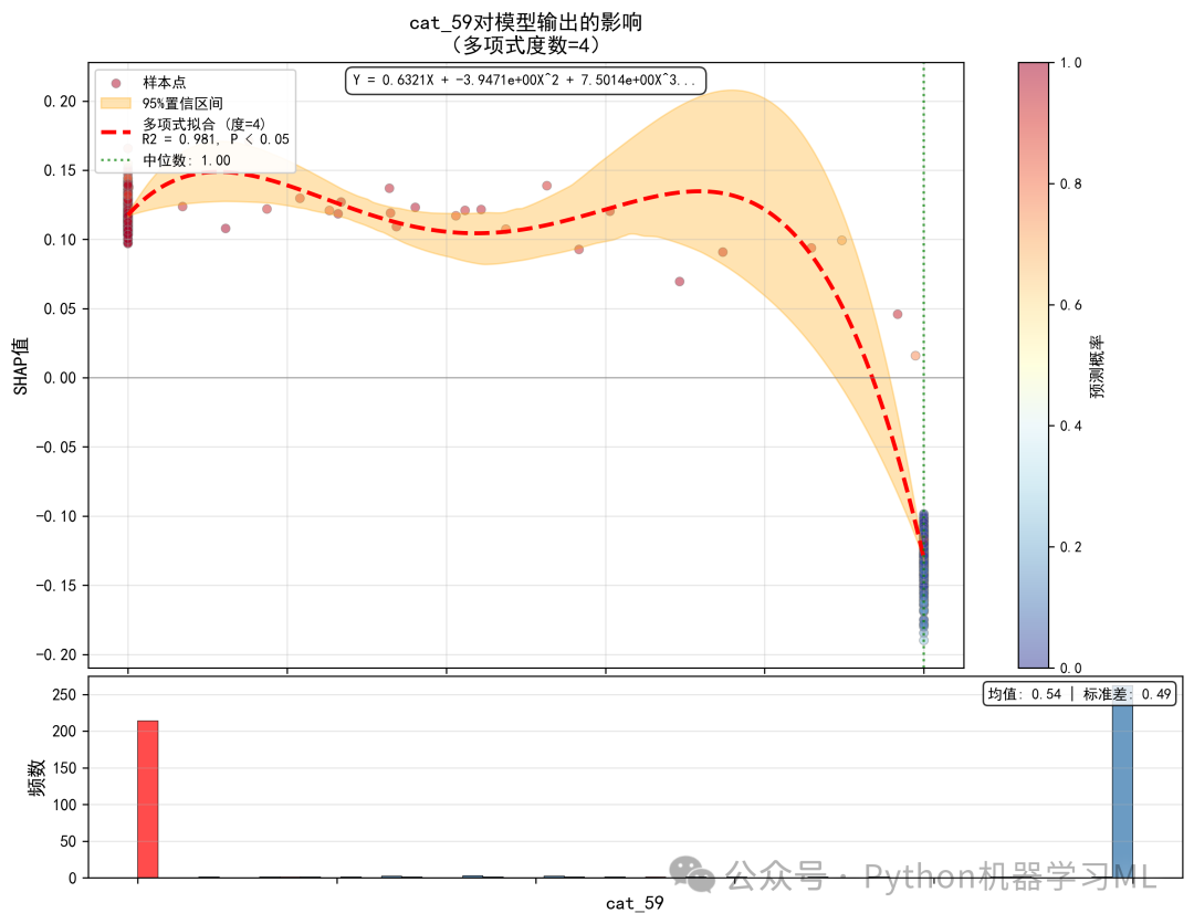
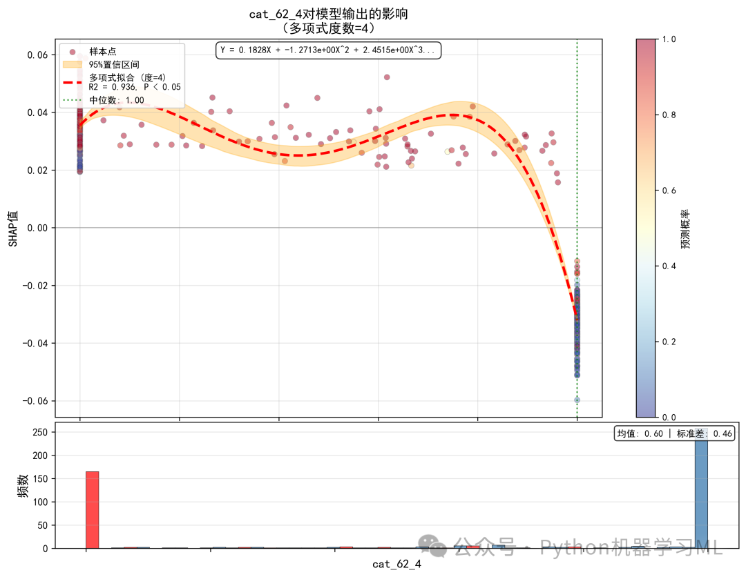
阶段 31: 组合专业依赖图
这个阶段将之前生成的多个独立的“专业依赖图”整合到一个2x3的网格布局中,便于横向比较和报告。
作用解释:
- 信息密度
将最重要的6个特征的影响模式和数据分布紧凑地展示在一张大图上,极大地提高了信息密度。
- 横向对比
观察者可以方便地在不同特征之间进行比较。例如,可以快速看出特征A是线性影响,而特征B是阈值效应;或者特征C的影响范围比特征D更广。
- 报告友好
这种组合图非常适合直接插入到PPT演示文稿或研究报告中,作为对模型核心驱动因素的总结性展示。
代码通过手动计算和设置每个子图的位置(fig.add_axes)来实现这种复杂的布局,虽然比plt.subplots更繁琐,但提供了对布局的精细控制。
# =========================================== =
# 第十九步:组合专业依赖图(2x3布局)
# ============================================

print("\n" + "=" * 60)
print("生成组合专业依赖图")
print("=" * 60)

fig = plt.figure(figsize=(20, 14))

for idx, feature inenumerate(top_6_features):
# 创建子图网格
    gs_sub = GridSpec(2, 1, height_ratios=[3, 1], hspace=0.02)

# 计算子图位置
    row = idx // 3
    col = idx % 3

# 创建嵌套的GridSpec
    left = col / 3 + 0.02
    right = (col + 1) / 3 - 0.02
    bottom = (1 - (row + 1) / 2) + 0.02
    top = (1 - row / 2) - 0.02

# 上部分:散点图和拟合曲线
    ax1 = fig.add_axes([left, bottom + (top - bottom) * 0.25,
                        right - left, (top - bottom) * 0.72])

# 获取数据
    feature_values = X_test_sample[feature].values
    feature_idx = list(X_test_sample.columns).index(feature)
    shap_values = shap_values_class1[:, feature_idx]

# 移除缺失值
    mask = ~np.isnan(feature_values) & ~np.isnan(shap_values)
    feature_values = feature_values[mask]
    shap_values = shap_values[mask]

# 绘制散点图
    scatter = ax1.scatter(feature_values, shap_values, alpha=0.4, s=20,
                          c=y_proba_sample[mask], cmap='RdYlBu_r',
                          edgecolors='none')

# 多项式拟合(简化版)
iflen(feature_values) > 10:
        sorted_indices = np.argsort(feature_values)
        x_sorted = feature_values[sorted_indices]
        y_sorted = shap_values[sorted_indices]

# 拟合
        poly_features = PolynomialFeatures(degree=3, include_bias=True)
        X_poly = poly_features.fit_transform(x_sorted.reshape(-1, 1))
        poly_model = LinearRegression()
        poly_model.fit(X_poly, y_sorted)

# 预测
        x_smooth = np.linspace(x_sorted.min(), x_sorted.max(), 100)
        X_smooth_poly = poly_features.transform(x_smooth.reshape(-1, 1))
        y_smooth = poly_model.predict(X_smooth_poly)

# 计算R²
        y_pred = poly_model.predict(X_poly)
        r2 = r2_score(y_sorted, y_pred)

# 绘制拟合线
        ax1.plot(x_smooth, y_smooth, 'r--', linewidth=2, alpha=0.8,
                 label=f'R2={r2:.2f}')

# 添加零线
    ax1.axhline(y=0, color='gray', linestyle='-', linewidth=0.8, alpha=0.4)

# 设置标题和标签
    ax1.set_title(f'{feature[:25]}', fontsize=11, fontweight='bold')
    ax1.set_ylabel('SHAP', fontsize=9)
    ax1.tick_params(axis='both', labelsize=8)
    ax1.grid(True, alpha=0.3)
if r2 > 0:
        ax1.legend(loc='best', fontsize=8)

# 下部分:分布直方图
    ax2 = fig.add_axes([left, bottom, right - left, (top - bottom) * 0.22])

# 绘制直方图
    ax2.hist(X_test_sample[feature].values, bins=30,
             color='steelblue', alpha=0.7, edgecolor='black', linewidth=0.5)
    ax2.set_xlabel(feature[:25], fontsize=9)
    ax2.set_ylabel('Count', fontsize=9)
    ax2.tick_params(axis='both', labelsize=8)
    ax2.grid(True, alpha=0.3, axis='y')

# 添加总标题
fig.suptitle('专业SHAP依赖图 - Top 6特征(多项式拟合)',
             fontsize=16, fontweight='bold', y=0.98)

plt.savefig('shap_professional_combined.png', dpi=300, bbox_inches='tight')
plt.show()
print("✓ 已保存: shap_professional_combined.png")
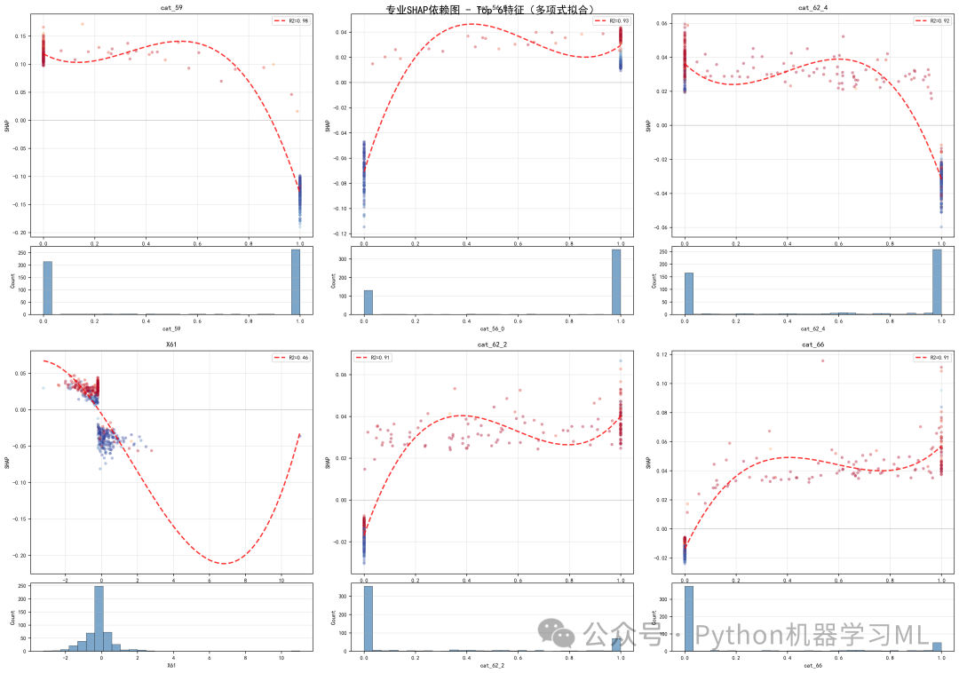
阶段 32: 特征交互效应分析
这个阶段深入分析了特征之间的交互作用,即一个特征的影响如何被另一个特征所改变。
作用解释:
- 计算交互强度
SHAP本身可以计算精确的交互SHAP值,但计算量很大。这里采用了一种简化但有效的方法:计算任意两个特征的SHAP值向量之间的相关性。如果两个特征的SHAP值高度相关(例如,特征A的SHAP值高时,特征B的SHAP值也高),则说明它们在模型中起到了协同作用。
- 可视化交互效应
- 方法
对于交互最强的几对特征,代码绘制了二维散点图。图中,x轴和y轴分别是两个特征的原始值,而点的颜色代表这两个特征的组合SHAP值(两个特征SHAP值的和)。
- 解读
这个图能直观地揭示两个特征的组合如何影响预测。例如,如果图的右上角(代表两个特征值都高)的点颜色鲜红(组合SHAP值高),则说明这两个特征在高值时有很强的正向协同作用,共同将预测推向高风险。等高线则进一步描绘了组合效应的“地形”。
- 方法
这种分析对于理解模型复杂的非线性行为、发现隐藏的业务规则至关重要。
# ============================================
# 第二十步:特征交互效应分析
# ============================================

print("\n" + "=" * 60)
print("特征交互效应分析")
print("=" * 60)

# 选择前4个最重要的特征进行交互分析
top_4_features = importance_df.head(4)['Feature'].tolist()

# 计算所有特征对的交互效应
interaction_scores = {}

print("\n计算特征交互强度...")
for i, feature1 inenumerate(top_4_features):
for j, feature2 inenumerate(top_4_features):
if i < j:  # 避免重复计算
# 获取特征索引
            idx1 = list(X_test_sample.columns).index(feature1)
            idx2 = list(X_test_sample.columns).index(feature2)

# 获取SHAP值
            shap1 = shap_values_class1[:, idx1]
            shap2 = shap_values_class1[:, idx2]

# 计算交互强度(使用相关系数)
            interaction_strength = np.abs(np.corrcoef(shap1, shap2)[0, 1])

            pair_name = f"{feature1[:15]} × {feature2[:15]}"
            interaction_scores[pair_name] = interaction_strength

print(f"  {pair_name}: {interaction_strength:.3f}")

# 可视化交互效应
fig, axes = plt.subplots(2, 3, figsize=(18, 12))
axes = axes.flatten()

sorted_interactions = sorted(interaction_scores.items(), key=lambda x: x[1], reverse=True)

for idx, (pair_name, score) inenumerate(sorted_interactions[:6]):
    ax = axes[idx]

# 解析特征名
    feature1_short, feature2_short = pair_name.split(' × ')

# 找到完整特征名
    feature1 = None
    feature2 = None
for f in top_4_features:
if f[:15] == feature1_short:
            feature1 = f
if f[:15] == feature2_short:
            feature2 = f

if feature1 and feature2:
# 获取数据
        idx1 = list(X_test_sample.columns).index(feature1)
        idx2 = list(X_test_sample.columns).index(feature2)

        x = X_test_sample[feature1].values
        y = X_test_sample[feature2].values
        z = shap_values_class1[:, idx1] + shap_values_class1[:, idx2]  # 组合SHAP值

# 创建散点图
        scatter = ax.scatter(x, y, c=z, cmap='RdBu_r', s=30, alpha=0.6,
                             vmin=-np.max(np.abs(z)), vmax=np.max(np.abs(z)))

# 添加颜色条
        cbar = plt.colorbar(scatter, ax=ax)
        cbar.set_label('组合SHAP', fontsize=9)
        cbar.ax.tick_params(labelsize=8)

# 添加等高线
try:
from scipy.interpolate import griddata

# 创建网格
            xi = np.linspace(x.min(), x.max(), 50)
            yi = np.linspace(y.min(), y.max(), 50)
            xi, yi = np.meshgrid(xi, yi)

# 插值
            zi = griddata((x, y), z, (xi, yi), method='linear')

# 绘制等高线
            contours = ax.contour(xi, yi, zi, levels=5, colors='black',
                                  alpha=0.4, linewidths=1)
            ax.clabel(contours, inline=True, fontsize=8, fmt='%.2f')
except:
pass

# 设置标签
        ax.set_xlabel(feature1[:20], fontsize=10)
        ax.set_ylabel(feature2[:20], fontsize=10)
        ax.set_title(f'交互强度: {score:.3f}', fontsize=11, fontweight='bold')
        ax.grid(True, alpha=0.3)

plt.suptitle('特征交互效应分析 - Top 6交互对',
             fontsize=15, fontweight='bold', y=1.00)
plt.tight_layout()
plt.savefig('shap_interaction_effects.png', dpi=300, bbox_inches='tight')
plt.show()
print("✓ 已保存: shap_interaction_effects.png")
阶段 33: 时间序列SHAP分析
这个阶段是针对特定数据类型的专门分析。如果数据中包含时间相关特征,它将分析这些特征的SHAP值如何随时间变化。
作用解释:
- 自动检测
代码首先会自动扫描特征名称,寻找与时间相关的关键词(如
time,date,month等)。 - 趋势分析
如果找到时间特征,它会绘制一张以时间为x轴,SHAP值为y轴的趋势图。
- 移动平均线
为了平滑短期波动,揭示长期趋势,图中加入了移动平均线(红色实线)。
- 高亮重要时期
代码还会自动识别并高亮显示SHAP值绝对值最大的前10%的时期(红色填充区域)。
- 移动平均线
- 业务洞察
这种分析对于理解模型的“时效性”至关重要。例如,你可以发现:
-
某个特征在特定季节或月份的影响力会显著增强或减弱。
-
模型的预测行为是否随时间发生了漂移。
-
是否存在某些异常的时间点,模型的决策逻辑在这些点上与平时大不相同。
-
如果数据中没有时间特征,该步骤会自动跳过。
# ============================================
# 第二十一步:时间序列SHAP分析(如果有时间特征)
# ============================================

print("\n" + "=" * 60)
print("时间序列SHAP分析")
print("=" * 60)

# 检查是否有时间相关特征
time_features = []
for col in X_test_sample.columns:
    col_lower = col.lower()
ifany(keyword in col_lower for keyword in ['time', 'date', 'year', 'month', 'day', 'hour', 'week']):
        time_features.append(col)

if time_features:
print(f"发现时间特征: {time_features}")

# 为每个时间特征创建趋势图
    fig, axes = plt.subplots(len(time_features), 1, figsize=(14, 5 * len(time_features)))

iflen(time_features) == 1:
        axes = [axes]

for idx, time_feature inenumerate(time_features):
        ax = axes[idx]

# 获取数据
        time_values = X_test_sample[time_feature].values
        feature_idx = list(X_test_sample.columns).index(time_feature)
        shap_values_time = shap_values_class1[:, feature_idx]

# 排序
        sorted_indices = np.argsort(time_values)
        time_sorted = time_values[sorted_indices]
        shap_sorted = shap_values_time[sorted_indices]

# 绘制趋势
        ax.plot(time_sorted, shap_sorted, 'b-', alpha=0.3, linewidth=1)

# 添加移动平均
        window = min(50, len(time_sorted) // 10)
if window > 1:
            moving_avg = pd.Series(shap_sorted).rolling(window=window, center=True).mean()
            ax.plot(time_sorted, moving_avg, 'r-', linewidth=2.5,
                    label=f'移动平均 (窗口={window})')

# 添加零线
        ax.axhline(y=0, color='gray', linestyle='--', linewidth=1, alpha=0.5)

# 高亮重要时期
        threshold = np.percentile(np.abs(shap_sorted), 90)
        important_periods = np.abs(shap_sorted) > threshold
        ax.fill_between(time_sorted, shap_sorted, 0,
                        where=important_periods, alpha=0.3, color='red',
                        label='高影响时期')

# 设置标签
        ax.set_xlabel(time_feature, fontsize=11)
        ax.set_ylabel('SHAP值', fontsize=11)
        ax.set_title(f'{time_feature}的时间序列SHAP分析',
                     fontsize=12, fontweight='bold')
        ax.legend(loc='best', fontsize=10)
        ax.grid(True, alpha=0.3)

    plt.tight_layout()
    plt.savefig('shap_time_series_analysis.png', dpi=300, bbox_inches='tight')
    plt.show()
print("✓ 已保存: shap_time_series_analysis.png")
else:
print("未发现时间相关特征,跳过时间序列分析")
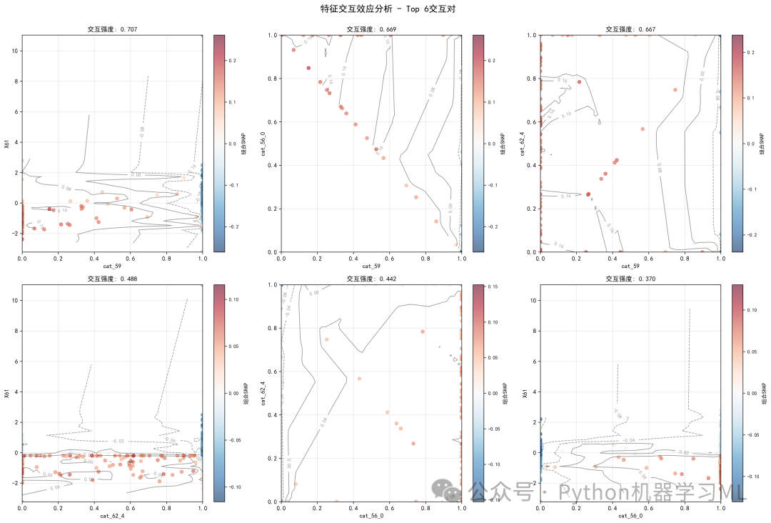
阶段 34: SHAP统计报告与可视化
这是对SHAP分析结果的最全面、最量化的总结,它将SHAP值的各种统计特性制成报告和图表。
作用解释:
- 生成CSV统计报告
Mean_SHAP,
Std_SHAP: SHAP值的均值和标准差,反映影响的平均方向和波动性。Abs_Mean_SHAP绝对SHAP值的均值,即全局特征重要性。
Positive_Impact,
Negative_Impact: 该特征在多大比例的样本中起到了增加或降低风险的作用。Q25_SHAP,
Q75_SHAP: SHAP值的分位数,描述其分布范围。SHAP_Feature_Corr特征值与SHAP值的相关性,量化了依赖图中的趋势。
-
代码为每个特征计算了超过10个详细的统计指标,例如:
-
将这些数据保存为CSV文件,为深入的数据挖掘和建模提供了宝贵的数据源。
- 统计可视化
- 正负影响比例图
直观对比了Top 10特征是更多地作为风险因素(正向影响)还是保护因素(负向影响)。
- SHAP值分布箱线图
展示了Top 10特征SHAP值的分布情况,可以看到哪些特征的影响范围更广,哪些更集中。
- 特征-SHAP相关性图
快速识别哪些特征是“值越大,风险越高”(正相关),哪些是“值越大,风险越低”(负相关)。
- SHAP值稳定性分析
通过绘制“重要性” vs “变异性”的散点图,帮助识别那些既重要又稳定的“黄金特征”(图右下角),以及那些虽然重要但影响不一致的“不稳定特征”(图右上角)。
- 正负影响比例图
这一整套报告和可视化,为从统计学角度彻底理解模型行为提供了坚实的基础。
# ============================================
# 第二十二步:SHAP值统计汇总报告
# ============================================

print("\n" + "=" * 60)
print("生成SHAP统计汇总报告")
print("=" * 60)

# 创建详细统计报告
statistical_report = pd.DataFrame()

for feature in feature_names:
    feature_idx = list(X_test_sample.columns).index(feature)
    shap_vals = shap_values_class1[:, feature_idx]
    feature_vals = X_test_sample[feature].values

# 计算各种统计量
    stats_dict = {
'Feature': feature[:50],
'Mean_SHAP': np.mean(shap_vals),
'Std_SHAP': np.std(shap_vals),
'Min_SHAP': np.min(shap_vals),
'Max_SHAP': np.max(shap_vals),
'Abs_Mean_SHAP': np.mean(np.abs(shap_vals)),
'Positive_Impact': (shap_vals > 0).mean(),
'Negative_Impact': (shap_vals < 0).mean(),
'Q25_SHAP': np.percentile(shap_vals, 25),
'Q50_SHAP': np.percentile(shap_vals, 50),
'Q75_SHAP': np.percentile(shap_vals, 75),
'Feature_Mean': np.mean(feature_vals),
'Feature_Std': np.std(feature_vals),
'SHAP_Feature_Corr': np.corrcoef(shap_vals, feature_vals)[0, 1] iflen(np.unique(feature_vals)) > 1else0
    }

    statistical_report = pd.concat([statistical_report, pd.DataFrame([stats_dict])], ignore_index=True)

# 排序并保存
statistical_report = statistical_report.sort_values('Abs_Mean_SHAP', ascending=False)
statistical_report.to_csv('shap_statistical_report.csv', index=False)

print("\n统计报告预览(前10个特征):")
print(statistical_report[['Feature', 'Mean_SHAP', 'Std_SHAP', 'Abs_Mean_SHAP',
'Positive_Impact', 'Negative_Impact']].head(10).to_string(index=False))

print("\n✓ 完整统计报告已保存: shap_statistical_report.csv")

# 生成统计摘要可视化
fig, axes = plt.subplots(2, 2, figsize=(16, 12))

# 1. 正负影响比例
ax1 = axes[0, 0]
top_10_stats = statistical_report.head(10)
x_pos = np.arange(len(top_10_stats))
width = 0.35

positive_bars = ax1.bar(x_pos - width / 2, top_10_stats['Positive_Impact'],
                        width, label='正向影响', color='green', alpha=0.7)
negative_bars = ax1.bar(x_pos + width / 2, top_10_stats['Negative_Impact'],
                        width, label='负向影响', color='red', alpha=0.7)

ax1.set_xlabel('特征', fontsize=11)
ax1.set_ylabel('影响比例', fontsize=11)
ax1.set_title('特征正负影响比例分布', fontsize=12, fontweight='bold')
ax1.set_xticks(x_pos)
ax1.set_xticklabels([f[:15] for f in top_10_stats['Feature']], rotation=45, ha='right')
ax1.legend()
ax1.grid(True, alpha=0.3, axis='y')

# 2. SHAP值分布箱线图
ax2 = axes[0, 1]
shap_data_for_box = []
labels_for_box = []

for i, feature inenumerate(top_10_stats['Feature'].head(10)):
    feature_idx = list(X_test_sample.columns).index(feature)
    shap_data_for_box.append(shap_values_class1[:, feature_idx])
    labels_for_box.append(feature[:15])

bp = ax2.boxplot(shap_data_for_box, labels=labels_for_box, patch_artist=True)
for patch, color inzip(bp['boxes'], plt.cm.Set3(np.linspace(0, 1, len(bp['boxes'])))):
    patch.set_facecolor(color)

ax2.set_xlabel('特征', fontsize=11)
ax2.set_ylabel('SHAP值', fontsize=11)
ax2.set_title('SHAP值分布箱线图', fontsize=12, fontweight='bold')
ax2.tick_params(axis='x', rotation=45)
ax2.grid(True, alpha=0.3, axis='y')
ax2.axhline(y=0, color='red', linestyle='--', linewidth=1, alpha=0.5)

# 3. 特征-SHAP相关性
ax3 = axes[1, 0]
correlations = statistical_report['SHAP_Feature_Corr'].head(20)
colors = ['green'if x > 0else'red'for x in correlations]
bars = ax3.barh(range(len(correlations)), correlations, color=colors, alpha=0.7)
ax3.set_yticks(range(len(correlations)))
ax3.set_yticklabels(statistical_report['Feature'].head(20).str[:20], fontsize=8)
ax3.set_xlabel('相关系数', fontsize=11)
ax3.set_title('特征值与SHAP值相关性', fontsize=12, fontweight='bold')
ax3.axvline(x=0, color='black', linestyle='-', linewidth=1)
ax3.grid(True, alpha=0.3, axis='x')

# 4. SHAP值变异系数
ax4 = axes[1, 1]
cv_values = statistical_report['Std_SHAP'] / (statistical_report['Abs_Mean_SHAP'] + 1e-10)
cv_top = cv_values.head(15)
feature_labels_cv = statistical_report['Feature'].head(15).str[:20]

scatter = ax4.scatter(statistical_report['Abs_Mean_SHAP'].head(15),
                      cv_top,
                      c=np.arange(15),
                      cmap='viridis',
                      s=100,
                      alpha=0.7,
                      edgecolors='black',
                      linewidth=1)

# 添加标签
for i, (x, y, label) inenumerate(zip(statistical_report['Abs_Mean_SHAP'].head(15),
                                      cv_top,
                                      feature_labels_cv)):
if i < 5:  # 只标注前5个
        ax4.annotate(label, (x, y), fontsize=8,
                     xytext=(5, 5), textcoords='offset points')

ax4.set_xlabel('平均|SHAP值|', fontsize=11)
ax4.set_ylabel('变异系数', fontsize=11)
ax4.set_title('SHAP值稳定性分析', fontsize=12, fontweight='bold')
ax4.grid(True, alpha=0.3)

plt.colorbar(scatter, ax=ax4, label='特征排名')

plt.suptitle('SHAP统计分析摘要', fontsize=15, fontweight='bold', y=1.00)
plt.tight_layout()
plt.savefig('shap_statistical_summary.png', dpi=300, bbox_inches='tight')
plt.show()
print("✓ 已保存: shap_statistical_summary.png")
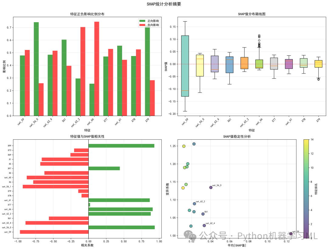
该文章案例
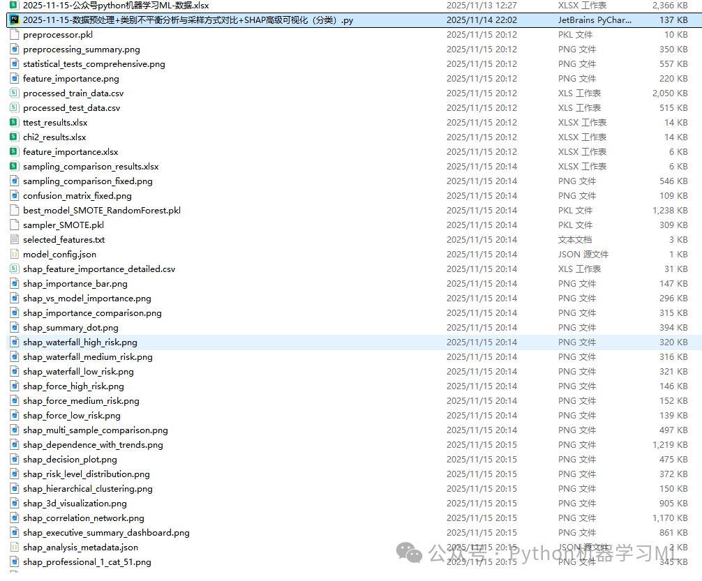
数据加微信免费获取。
注:本代码全程Python语言实现,拿到代码后,先用示例数据复现跑通,确认环境没问题后,再上自己的数据。
【数据,请加微信免费获取】
如果你对类似于这样的文章感兴趣。
欢迎关注、点赞、转发~
更多推荐
 15
15 0
0- 0


 已为社区贡献9条内容

所有评论(0)