
机器学习入门<3>逻辑回归大战垃圾邮件:从直觉到实战
我们如何教会计算机像我们一样,一眼识别出那些恼人的垃圾邮件?
答案就藏在逻辑回归这个优雅而强大的算法里。
一、引言部分
每天早上打开邮箱,你的第一反应是什么?
是迅速扫过列表,把那些标着 恭喜中奖、免费领取的邮件拖进垃圾箱?
我们人类能瞬间完成这个分类任务,因为大脑已经学会了关联某些特征与垃圾邮件这个类别。今天,我们要做的就是将这种直觉,赋予计算机。而赋予它这种能力的核心工具之一,便是逻辑回归。
二、核心思想
1.线性部分
想象我们训练了一个 AI 侦察兵来审核邮件。我们教会它关注几个关键的特征:
x₁:标题是否包含“免费”(是=1,否=0)
x₂:发件人是否在通讯录(是=1,否=0)
x₃:正文感叹号是否 >5 个(是=1,否=0)
侦察兵每看到一封邮件,就会根据这些特征计算一个总分:
z = w₁*x₁ + w₂*x₂ + w₃*x₃ + b
这里:
w 是 权重,代表每个特征的重要性。例如,“免费”这个词很可疑,
w₁就是一个较大的正数;“认识发件人”是安全信号,w₂就是一个负数。b 是 偏置,代表整体的倾向性(例如,默认邮件多是正常的,
b可能为负)。
2.概率转换
如果侦察兵算出的总分 z = 5.8,这意味什么?80% 的可能性还是 100%?我们更希望听到的是:“这封邮件有 83% 的可能性是垃圾邮件。”
这就需要将任意范围的分数(-∞ 到 +∞),压缩到一个直观的 概率区间 [0, 1]。这个神奇的转换器,就是 Sigmoid 函数。
三、Sigmoid函数
1.Sigmoid函数
Sigmoid函数是一个优雅的概率转换器。
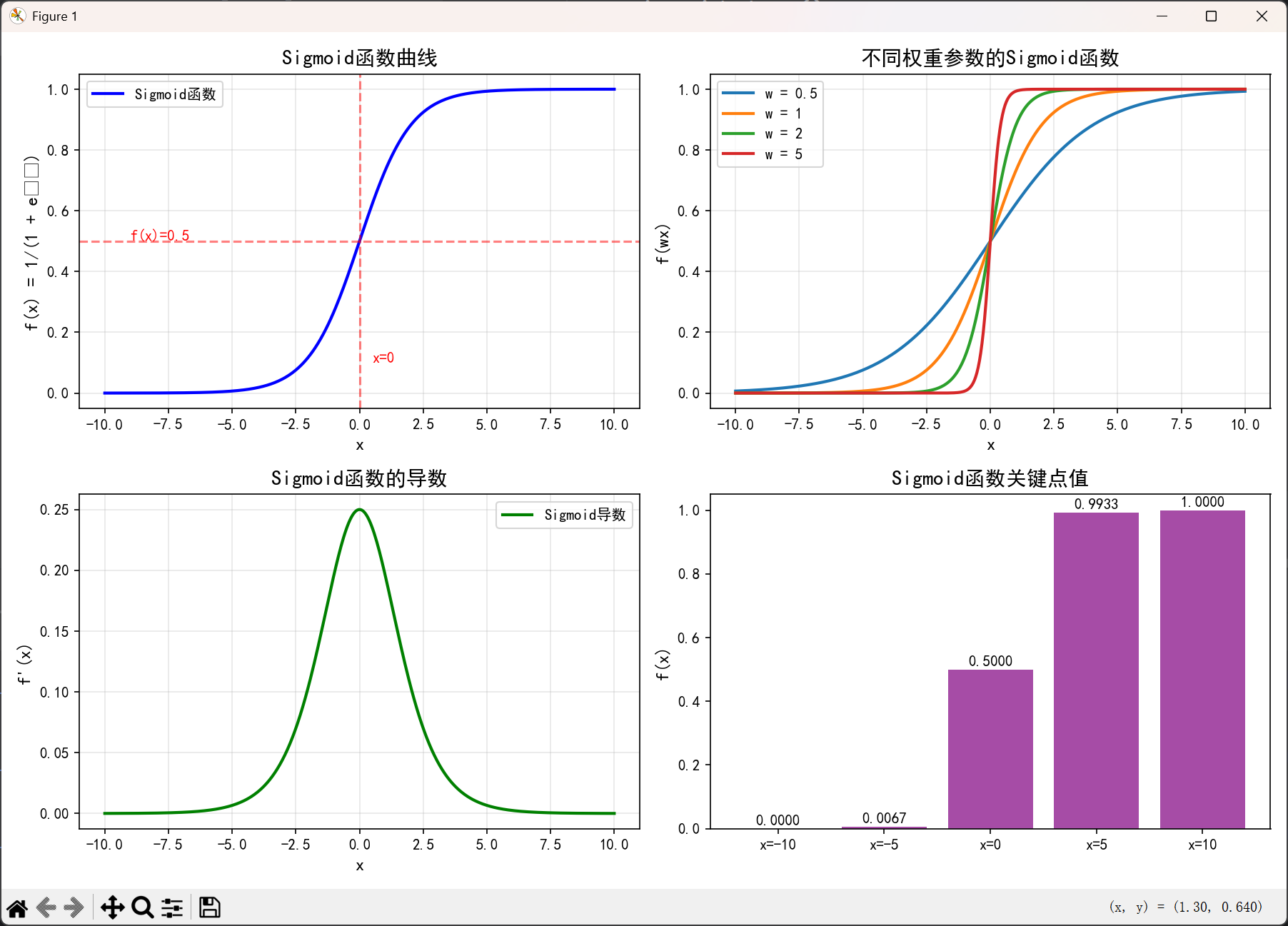
如下是Sigmoid函数的函数图像:
绘制这个函数的代码:
import numpy as np
import matplotlib.pyplot as plt
import matplotlib

# 设置中文字体和负号显示
matplotlib.rcParams['font.sans-serif'] = ['SimHei', 'DejaVu Sans']
matplotlib.rcParams['axes.unicode_minus'] = False


def sigmoid(x):
    """Sigmoid函数"""
    return 1 / (1 + np.exp(-x))


def plot_sigmoid():
    """绘制Sigmoid函数图像"""
    # 创建x值范围
    x = np.linspace(-10, 10, 400)

    # 计算对应的y值
    y = sigmoid(x)

    # 创建图形
    plt.figure(figsize=(12, 8))

    # 绘制Sigmoid曲线
    plt.subplot(2, 2, 1)
    plt.plot(x, y, 'b-', linewidth=2, label='Sigmoid函数')
    plt.title('Sigmoid函数曲线', fontsize=14, fontweight='bold')
    plt.xlabel('x', fontsize=12)
    plt.ylabel('f(x) = 1/(1 + e⁻ˣ)', fontsize=12)
    plt.grid(True, alpha=0.3)
    plt.legend()

    # 添加关键点标记
    plt.axhline(y=0.5, color='r', linestyle='--', alpha=0.5)
    plt.axvline(x=0, color='r', linestyle='--', alpha=0.5)
    plt.text(-9, 0.5, 'f(x)=0.5', fontsize=10, color='red')
    plt.text(0.5, 0.1, 'x=0', fontsize=10, color='red')

    # 绘制不同参数的Sigmoid函数对比
    plt.subplot(2, 2, 2)
    for w in [0.5, 1, 2, 5]:
        y_w = sigmoid(w * x)
        plt.plot(x, y_w, linewidth=2, label=f'w = {w}')
    plt.title('不同权重参数的Sigmoid函数', fontsize=14, fontweight='bold')
    plt.xlabel('x', fontsize=12)
    plt.ylabel('f(wx)', fontsize=12)
    plt.grid(True, alpha=0.3)
    plt.legend()

    # 绘制导数曲线
    plt.subplot(2, 2, 3)
    y_derivative = y * (1 - y)  # Sigmoid的导数公式
    plt.plot(x, y_derivative, 'g-', linewidth=2, label='Sigmoid导数')
    plt.title('Sigmoid函数的导数', fontsize=14, fontweight='bold')
    plt.xlabel('x', fontsize=12)
    plt.ylabel("f'(x)", fontsize=12)
    plt.grid(True, alpha=0.3)
    plt.legend()

    # 绘制Sigmoid函数的特殊值
    plt.subplot(2, 2, 4)
    special_points = [-10, -5, 0, 5, 10]
    y_special = sigmoid(np.array(special_points))

    plt.bar(range(len(special_points)), y_special, alpha=0.7, color='purple')
    plt.xticks(range(len(special_points)), [f'x={x}' for x in special_points])
    plt.title('Sigmoid函数关键点值', fontsize=14, fontweight='bold')
    plt.ylabel('f(x)', fontsize=12)

    # 在柱状图上显示数值
    for i, v in enumerate(y_special):
        plt.text(i, v + 0.01, f'{v:.4f}', ha='center', fontsize=10)

    plt.tight_layout()
    plt.show()


def sigmoid_demo():
    """演示Sigmoid函数的特性"""
    print("=" * 60)
    print("Sigmoid函数特性演示")
    print("=" * 60)

    # 定义一些特殊点
    test_points = [-10, -5, -2, -1, 0, 1, 2, 5, 10]

    print("\n1. Sigmoid函数值表:")
    print("-" * 40)
    print(f"{'输入 x':<10} {'Sigmoid(x)':<15} {'解释':<30}")
    print("-" * 40)

    for x in test_points:
        y = sigmoid(x)
        if x < 0:
            explanation = "负值,接近0"
        elif x == 0:
            explanation = "中间点"
        else:
            explanation = "正值,接近1"
        print(f"{x:>8.1f} {y:>15.6f} {explanation:<30}")

    print("\n2. Sigmoid函数重要特性:")
    print("-" * 40)
    print("• 值域: (0, 1)")
    print("• 单调性: 严格单调递增")
    print("• 对称性: f(-x) = 1 - f(x)")
    print("• 导数: f'(x) = f(x)(1 - f(x))")

    # 验证对称性
    x_test = 3
    print(f"\n3. 对称性验证:")
    print(f"   f({x_test}) = {sigmoid(x_test):.6f}")
    print(f"   1 - f({-x_test}) = {1 - sigmoid(-x_test):.6f}")
    print(f"   两者相等: {np.isclose(sigmoid(x_test), 1 - sigmoid(-x_test))}")

    print("=" * 60)


if __name__ == "__main__":
    # 运行演示
    sigmoid_demo()

    # 绘制图形
    print("\n正在生成图形...")
    plot_sigmoid()

    # 显示安装提示
    print("\n" + "=" * 60)
    print("安装提示:")
    print("=" * 60)
    print("如果运行报错,请确保已安装必要的库:")
    print("1. 在PyCharm终端中运行: pip install numpy matplotlib")
    print("2. 或者使用PyCharm的包管理器安装")
    print("=" * 60)
看这条优美的 S 型曲线:
横轴 是侦察兵打的总分
z。纵轴 是 预测为垃圾邮件的概率 P。
它的妙处在于:
当
z = 0时,P = 0.5(完全拿不准,50%对50%)。当
z很大(正数)时,P无限逼近 1(几乎肯定是垃圾邮件)。当
z很小(负数)时,P无限逼近 0(几乎肯定是正常邮件)。
它就像一个 “压扁一切的打分尺”,将极端分数转化为合理的概率,并且永远给不确定性留有空间(概率永远不会等于 0 或 1)。
2.阈值设定
现在,侦察兵告诉我们:“这封邮件有 76% 的可能是垃圾邮件。”那我们到底判它是什么?这需要一个人为设定的阈值。
如果你害怕误杀重要邮件:阈值设高(如 0.9),只有概率 > 90% 才进垃圾箱。
如果你极度厌恶骚扰:阈值设低(如 0.5),概率过半就过滤。
通常,我们默认选择 0.5 作为阈值。在 Sigmoid 曲线上,P=0.5 正好对应 z=0。因此,决策边界 就是 z = 0 这条线:
若
z > 0,则P > 0.5,判为垃圾邮件(类别1)。若
z < 0,则P < 0.5,判为正常邮件(类别0)。
3.模型的学习过程
起初,侦察兵的权重 W 和偏置 b 是随机设置的,判断得一塌糊涂。学习的过程就是:
喂给它大量已标记的邮件(训练数据):这是垃圾邮件(标签1),那是正常邮件(标签0)。
让它做预测,并计算与真实标签的差距(损失)。
通过“梯度下降”算法,自动调整
W和b,让预测越来越准(损失越来越小)。
这个过程就像新兵通过反复看错题、纠错来成长,最终成为一个可靠的过滤器。
四、动手实践,复现逻辑回归
1.可视化理解
场景:假设邮件只有两个特征(如“免费”词频、正文长度),我们可以在二维平面上展示。
散点图:正常邮件(蓝点)和垃圾邮件(红点)分布在坐标系中。
决策边界:逻辑回归学习后,会画出一条直线(或曲线,如果特征复杂)试图将两类点分开。
互动:点击图上的任意一点(代表一封邮件),程序会动态显示其 特征值、计算得分、Sigmoid概率、最终分类。
远离边界的点:概率接近 0 或 1,分类确信度高。
靠近边界的点:概率在 0.5 附近摇摆,分类模糊。
2.极简代码体验
下面是一段使用 scikit-learn 的 Python 代码。我们的目标不是成为编程专家,而是建立概念与代码的映射,消除对机器学习代码的恐惧。
# 1. 导入工具箱(魔法口袋)
from sklearn.linear_model import LogisticRegression
import numpy as np

# 2. 准备训练数据(教侦察兵认字)
# 特征X: [是否有“免费”, 是否认识发件人]
# 让我们“手动标注”5封历史邮件
X_train = np.array([
    [1, 0],  # 邮件1:有“免费”,不认识发件人
    [0, 1],  # 邮件2:无“免费”,认识发件人
    [1, 1],  # 邮件3:有“免费”,认识发件人
    [0, 0],  # 邮件4:无“免费”,不认识发件人
    [1, 0]   # 邮件5:有“免费”,不认识发件人
])
# 标签y: 0=正常邮件, 1=垃圾邮件 (对应上面5封邮件)
y_train = np.array([1, 0, 1, 0, 1])  # 你认为邮件3应该标什么?为什么?

# 3. 创建并训练逻辑回归模型(招募并训练侦察兵)
model = LogisticRegression()
model.fit(X_train, y_train)  # 这行代码就是核心的“学习”过程!

# 4. 预测新邮件(侦察兵上岗)
new_email = np.array([[1, 0]])  # 一封新邮件:有“免费”,不认识发件人
probability = model.predict_proba(new_email)  # 输出概率
prediction = model.predict(new_email)          # 输出分类(默认阈值0.5)

print(f"这封新邮件是垃圾邮件的概率为:{probability[0][1]:.2%}")
print(f"最终分类为:{'垃圾邮件' if prediction[0]==1 else '正常邮件'}")
运行结果:

关键映射:
model.fit(X_train, y_train)-> 模型的学习/训练过程。
model.predict_proba()-> 输出概率(Sigmoid函数的输出)。
model.predict()-> 输出最终分类(基于阈值做决策)。
五、总结与拓展
1.总结
我们今天的“侦察兵”培养计划非常成功:
特征观察:让模型关注邮件的关键属性(X)。
综合打分:通过线性组合
z = W·X + b计算一个原始分数。概率化:利用 Sigmoid 函数 将分数
z转化为通俗易懂的概率P。做出决策:设定一个 阈值(如0.5),将概率转化为最终的类别判断。
持续学习:模型通过 梯度下降 在训练数据上自动优化参数
W和b。
2.拓展
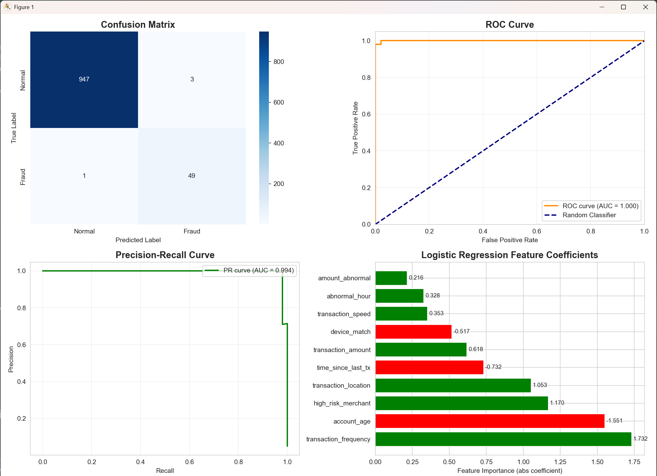
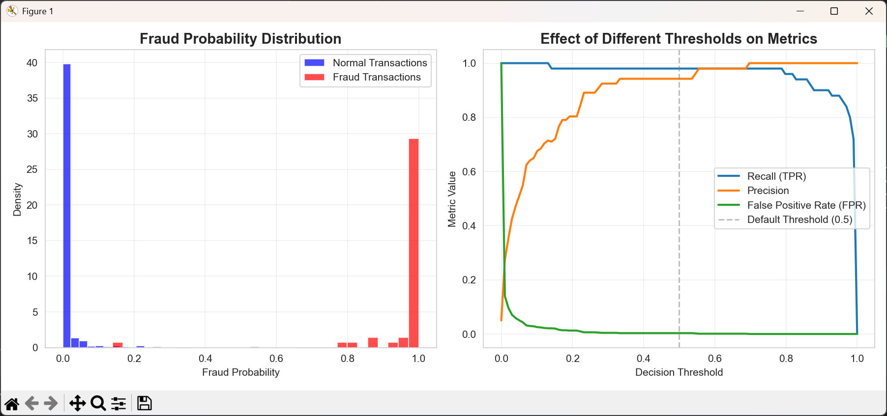
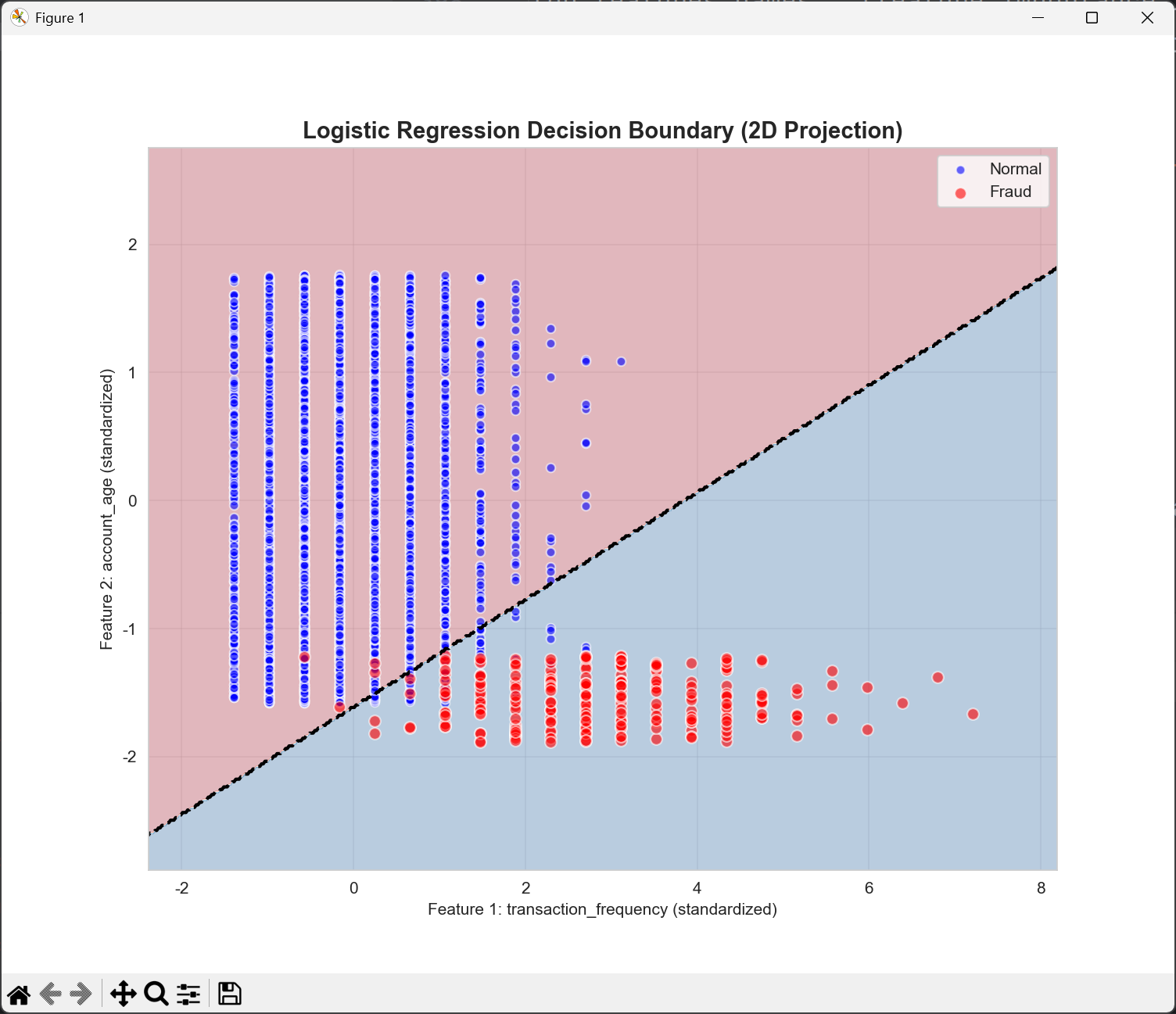
可以写一个金融风控的项目:判断一笔交易是否有欺诈风险
import numpy as np
import pandas as pd
import matplotlib.pyplot as plt
import seaborn as sns
from sklearn.linear_model import LogisticRegression
from sklearn.preprocessing import StandardScaler
from sklearn.model_selection import train_test_split
from sklearn.metrics import (confusion_matrix, classification_report,
                             roc_curve, auc, precision_recall_curve)
import warnings

warnings.filterwarnings('ignore')

# ======================
# 修复中文字体显示问题
# ======================
import matplotlib

# 设置中文字体 - 根据系统选择可用的字体
try:
    # Windows系统
    matplotlib.rcParams['font.sans-serif'] = ['Microsoft YaHei', 'SimHei', 'Arial Unicode MS']
    matplotlib.rcParams['axes.unicode_minus'] = False
except:
    # macOS或Linux系统
    try:
        matplotlib.rcParams['font.sans-serif'] = ['Arial Unicode MS', 'DejaVu Sans']
        matplotlib.rcParams['axes.unicode_minus'] = False
    except:
        print("警告:无法设置中文字体,图表中的中文可能显示为方框")
        print("解决方案:安装中文字体或使用英文标签")

# 设置美观样式
sns.set_style("whitegrid")
plt.rcParams['figure.figsize'] = (12, 8)

# ======================
# 1. 生成模拟金融交易数据
# ======================
print("=" * 60)
print("Financial Risk Control: Transaction Fraud Detection System")
print("=" * 60)

np.random.seed(42)
n_samples = 5000  # 总交易数量

# 正常交易特征
normal_transactions = pd.DataFrame({
    'transaction_amount': np.random.exponential(200, int(n_samples * 0.95)),  # 指数分布,小额交易多
    'transaction_hour': np.random.randint(0, 24, int(n_samples * 0.95)),  # 0-23点
    'transaction_location': np.random.choice([0, 1, 2], int(n_samples * 0.95), p=[0.6, 0.3, 0.1]),  # 0=常用地,1=国内异地,2=国外
    'transaction_frequency': np.random.poisson(3, int(n_samples * 0.95)),  # 泊松分布,均值为3
    'account_age': np.random.uniform(6, 60, int(n_samples * 0.95)),  # 6-60个月
    'device_match': np.random.binomial(1, 0.9, int(n_samples * 0.95)),  # 90%使用常用设备
    'merchant_category': np.random.choice(range(10), int(n_samples * 0.95)),  # 10类商户
    'time_since_last_tx': np.random.exponential(3, int(n_samples * 0.95)),  # 小时
})

# 欺诈交易特征 (更可疑的模式)
fraud_transactions = pd.DataFrame({
    'transaction_amount': np.random.exponential(1000, int(n_samples * 0.05)),  # 欺诈交易金额更大
    'transaction_hour': np.random.choice([0, 1, 2, 3, 22, 23], int(n_samples * 0.05)),  # 凌晨时段更多
    'transaction_location': np.random.choice([1, 2], int(n_samples * 0.05), p=[0.4, 0.6]),  # 更多异地和国外交易
    'transaction_frequency': np.random.poisson(10, int(n_samples * 0.05)),  # 欺诈交易频率更高
    'account_age': np.random.uniform(1, 12, int(n_samples * 0.05)),  # 新账户风险更高
    'device_match': np.random.binomial(1, 0.3, int(n_samples * 0.05)),  # 70%使用新设备
    'merchant_category': np.random.choice([7, 8, 9], int(n_samples * 0.05)),  # 高风险商户类别
    'time_since_last_tx': np.random.exponential(0.5, int(n_samples * 0.05)),  # 欺诈交易间隔更短
})

# 合并数据并添加标签
normal_transactions['is_fraud'] = 0
fraud_transactions['is_fraud'] = 1
df = pd.concat([normal_transactions, fraud_transactions], ignore_index=True)

# 打乱数据
df = df.sample(frac=1, random_state=42).reset_index(drop=True)

print(f"Dataset size: {df.shape}")
print(f"Normal transactions: {sum(df['is_fraud'] == 0)}")
print(f"Fraud transactions: {sum(df['is_fraud'] == 1)}")
print(f"Fraud rate: {sum(df['is_fraud'] == 1) / len(df) * 100:.2f}%")

# ======================
# 2. 特征工程 - 创建更有意义的特征
# ======================
print("\n" + "=" * 60)
print("Feature Engineering")
print("=" * 60)

# 创建衍生特征
df['amount_abnormal'] = (df['transaction_amount'] > df['transaction_amount'].quantile(0.95)).astype(int)
df['abnormal_hour'] = ((df['transaction_hour'] >= 0) & (df['transaction_hour'] <= 4)).astype(int)
df['high_risk_merchant'] = df['merchant_category'].apply(lambda x: 1 if x in [7, 8, 9] else 0)
df['transaction_speed'] = 1 / (df['time_since_last_tx'] + 0.1)  # 避免除零

# 交易金额标准化(相对于用户历史)
df['amount_normalized'] = df['transaction_amount'] / df.groupby('account_age')['transaction_amount'].transform('mean')

# 选择最终特征
features = ['transaction_amount', 'transaction_location', 'transaction_frequency',
            'account_age', 'device_match', 'time_since_last_tx',
            'amount_abnormal', 'abnormal_hour', 'high_risk_merchant', 'transaction_speed']

X = df[features]
y = df['is_fraud']

# 特征缩放
scaler = StandardScaler()
X_scaled = scaler.fit_transform(X)

# 分割数据集
X_train, X_test, y_train, y_test = train_test_split(
    X_scaled, y, test_size=0.2, random_state=42, stratify=y
)

print(f"Training set size: {X_train.shape}")
print(f"Test set size: {X_test.shape}")

# ======================
# 3. 训练逻辑回归模型
# ======================
print("\n" + "=" * 60)
print("Training Logistic Regression Model")
print("=" * 60)

# 创建模型 - 添加类别权重处理不平衡数据
model = LogisticRegression(
    class_weight='balanced',  # 平衡类别权重
    max_iter=1000,
    random_state=42,
    C=0.1  # 正则化强度
)

# 训练模型
model.fit(X_train, y_train)

# 显示特征重要性
feature_importance = pd.DataFrame({
    'Feature': features,
    'Coefficient': model.coef_[0],
    'Importance': np.abs(model.coef_[0])
}).sort_values('Importance', ascending=False)

print("\nFeature Importance Ranking:")
print(feature_importance.to_string(index=False))

# ======================
# 4. 模型评估
# ======================
print("\n" + "=" * 60)
print("Model Evaluation")
print("=" * 60)

# 预测
y_pred = model.predict(X_test)
y_pred_proba = model.predict_proba(X_test)[:, 1]

# 评估指标
print("\nClassification Report:")
print(classification_report(y_test, y_pred, target_names=['Normal', 'Fraud']))

# 混淆矩阵
cm = confusion_matrix(y_test, y_pred)
plt.figure(figsize=(14, 10))

plt.subplot(2, 2, 1)
sns.heatmap(cm, annot=True, fmt='d', cmap='Blues',
            xticklabels=['Normal', 'Fraud'], yticklabels=['Normal', 'Fraud'])
plt.title('Confusion Matrix', fontsize=14, fontweight='bold')
plt.ylabel('True Label')
plt.xlabel('Predicted Label')

# ======================
# 5. 可视化分析
# ======================
# ROC曲线
plt.subplot(2, 2, 2)
fpr, tpr, _ = roc_curve(y_test, y_pred_proba)
roc_auc = auc(fpr, tpr)

plt.plot(fpr, tpr, color='darkorange', lw=2, label=f'ROC curve (AUC = {roc_auc:.3f})')
plt.plot([0, 1], [0, 1], color='navy', lw=2, linestyle='--', label='Random Classifier')
plt.xlim([0.0, 1.0])
plt.ylim([0.0, 1.05])
plt.xlabel('False Positive Rate')
plt.ylabel('True Positive Rate')
plt.title('ROC Curve', fontsize=14, fontweight='bold')
plt.legend(loc="lower right")
plt.grid(True, alpha=0.3)

# Precision-Recall曲线
plt.subplot(2, 2, 3)
precision, recall, _ = precision_recall_curve(y_test, y_pred_proba)
pr_auc = auc(recall, precision)

plt.plot(recall, precision, color='green', lw=2, label=f'PR curve (AUC = {pr_auc:.3f})')
plt.xlabel('Recall')
plt.ylabel('Precision')
plt.title('Precision-Recall Curve', fontsize=14, fontweight='bold')
plt.legend(loc="upper right")
plt.grid(True, alpha=0.3)

# 特征系数可视化
plt.subplot(2, 2, 4)
colors = ['red' if x < 0 else 'green' for x in feature_importance['Coefficient']]
bars = plt.barh(range(len(feature_importance)), feature_importance['Importance'], color=colors)
plt.yticks(range(len(feature_importance)), feature_importance['Feature'])
plt.xlabel('Feature Importance (abs coefficient)')
plt.title('Logistic Regression Feature Coefficients', fontsize=14, fontweight='bold')

# 添加系数值标签
for i, (bar, coeff) in enumerate(zip(bars, feature_importance['Coefficient'])):
    plt.text(bar.get_width() + 0.01, bar.get_y() + bar.get_height() / 2,
             f'{coeff:.3f}', va='center', fontsize=9)

plt.tight_layout()
plt.show()

# ======================
# 6. 欺诈概率分布
# ======================
plt.figure(figsize=(12, 5))

# 欺诈概率分布图
plt.subplot(1, 2, 1)
plt.hist(y_pred_proba[y_test == 0], bins=30, alpha=0.7, label='Normal Transactions', color='blue', density=True)
plt.hist(y_pred_proba[y_test == 1], bins=30, alpha=0.7, label='Fraud Transactions', color='red', density=True)
plt.xlabel('Fraud Probability')
plt.ylabel('Density')
plt.title('Fraud Probability Distribution', fontsize=14, fontweight='bold')
plt.legend()
plt.grid(True, alpha=0.3)

# 不同阈值的影响
plt.subplot(1, 2, 2)
thresholds = np.linspace(0, 1, 100)
fpr_list, tpr_list, precision_list = [], [], []

for threshold in thresholds:
    y_pred_threshold = (y_pred_proba >= threshold).astype(int)

    # 计算混淆矩阵元素
    tn, fp, fn, tp = confusion_matrix(y_test, y_pred_threshold).ravel()

    if (tp + fp) > 0:
        precision_list.append(tp / (tp + fp))
    else:
        precision_list.append(1.0)

    fpr_list.append(fp / (fp + tn))
    tpr_list.append(tp / (tp + fn))

plt.plot(thresholds, tpr_list, label='Recall (TPR)', linewidth=2)
plt.plot(thresholds, precision_list, label='Precision', linewidth=2)
plt.plot(thresholds, fpr_list, label='False Positive Rate (FPR)', linewidth=2)
plt.axvline(x=0.5, color='gray', linestyle='--', alpha=0.5, label='Default Threshold (0.5)')
plt.xlabel('Decision Threshold')
plt.ylabel('Metric Value')
plt.title('Effect of Different Thresholds on Metrics', fontsize=14, fontweight='bold')
plt.legend()
plt.grid(True, alpha=0.3)

plt.tight_layout()
plt.show()

# ======================
# 7. 业务应用示例
# ======================
print("\n" + "=" * 60)
print("Business Application Examples")
print("=" * 60)

# 模拟几笔交易进行风险评估
test_cases = [
    [500, 0, 2, 24, 1, 2, 0, 0, 0, 0.5],  # 正常交易: 小额、常用地、常用设备
    [5000, 2, 8, 3, 0, 0.2, 1, 0, 1, 5],  # 高风险交易: 大额、国外、新账户、新设备
    [1500, 1, 4, 12, 0, 1, 0, 1, 0, 1],  # 可疑交易: 异地、异常时段、新设备
    [8000, 0, 1, 36, 1, 5, 0, 0, 0, 0.2],  # 正常大额: 常用地、老账户、常用设备
]

case_descriptions = [
    "Normal transaction: User A spends 500 at local mall",
    "High-risk transaction: New user B spends 5000 on foreign website",
    "Suspicious transaction: User C spends 1500 at midnight in different city",
    "Normal large transaction: Long-term user D buys appliance for 8000"
]

for i, (case, desc) in enumerate(zip(test_cases, case_descriptions)):
    # 特征缩放
    case_scaled = scaler.transform([case])

    # 预测
    prob = model.predict_proba(case_scaled)[0][1]
    pred = model.predict(case_scaled)[0]

    print(f"\nCase {i + 1}: {desc}")
    print(f"  Fraud probability: {prob:.2%}")
    print(f"  Risk assessment: {'High risk - manual review needed' if pred == 1 else 'Low risk - auto approval'}")

    # 给出解释
    risk_factors = []
    if case[0] > 3000:
        risk_factors.append("Large transaction amount")
    if case[1] == 2:
        risk_factors.append("Foreign transaction")
    if case[2] > 5:
        risk_factors.append("Abnormal transaction frequency")
    if case[3] < 6:
        risk_factors.append("New account")
    if case[4] == 0:
        risk_factors.append("New device used")
    if case[6] == 1:
        risk_factors.append("Abnormal amount flag")

    if risk_factors:
        print(f"  Risk factors: {', '.join(risk_factors)}")

# ======================
# 8. 模型解释性 - 单个预测解释
# ======================
print("\n" + "=" * 60)
print("Model Interpretability Analysis")
print("=" * 60)

# 选择一个高风险案例进行详细解释
case_idx = 1  # 高风险交易
case_scaled = scaler.transform([test_cases[case_idx]])

print(f"\nDetailed analysis for: {case_descriptions[case_idx]}")
print("-" * 50)

# 计算每个特征的贡献度
feature_contributions = model.coef_[0] * case_scaled[0]

# 创建贡献度表格
contribution_df = pd.DataFrame({
    'Feature': features,
    'Value': test_cases[case_idx],
    'Coefficient': model.coef_[0],
    'Contribution': feature_contributions
}).sort_values('Contribution', ascending=False)

print("Feature contributions to fraud probability:")
print(contribution_df.to_string(index=False))

# 计算基础概率(偏置项)
base_prob = model.intercept_[0]
total_effect = base_prob + sum(feature_contributions)

print(f"\nCalculation process:")
print(f"  Base risk (bias): {base_prob:.4f}")
print(f"  Total feature contribution: {sum(feature_contributions):.4f}")
print(f"  Total score: {total_effect:.4f}")
print(f"  Fraud probability = 1 / (1 + exp(-{total_effect:.4f})) = {1 / (1 + np.exp(-total_effect)):.2%}")

# ======================
# 9. 部署建议和业务规则
# ======================
print("\n" + "=" * 60)
print("Risk Control System Deployment Recommendations")
print("=" * 60)

print("""
Recommended Deployment Strategy:

1. Multi-level Risk Control System:
   - Probability < 0.3: Auto approve
   - 0.3 ≤ Probability < 0.7: Secondary verification (SMS/biometric)
   - Probability ≥ 0.7: Manual review/auto reject

2. Real-time Monitoring Metrics:
   - Daily fraud capture rate
   - False positive rate (affects user experience)
   - Model stability (feature distribution drift)

3. Model Update Strategy:
   - Daily incremental training
   - Weekly full training
   - Monthly feature engineering optimization

4. Business Rule Supplements:
   - Daily transaction limit
   - Single transaction amount limit
   - High-risk region blacklist
""")

# ======================
# 10. 模型决策边界可视化 (2D简化版)
# ======================
print("\n" + "=" * 60)
print("Decision Boundary Visualization (2D Simplified)")
print("=" * 60)

# 选择两个最重要的特征进行可视化
top_features_idx = [list(features).index(feature_importance.iloc[0]['Feature']),
                    list(features).index(feature_importance.iloc[1]['Feature'])]
top_features_names = [feature_importance.iloc[0]['Feature'],
                      feature_importance.iloc[1]['Feature']]

X_2d = X_scaled[:, top_features_idx]
model_2d = LogisticRegression(class_weight='balanced', max_iter=1000, random_state=42)
model_2d.fit(X_2d, y)

# 创建网格用于可视化
h = 0.02  # 网格步长
x_min, x_max = X_2d[:, 0].min() - 1, X_2d[:, 0].max() + 1
y_min, y_max = X_2d[:, 1].min() - 1, X_2d[:, 1].max() + 1
xx, yy = np.meshgrid(np.arange(x_min, x_max, h),
                     np.arange(y_min, y_max, h))

# 预测网格上每个点的类别
Z = model_2d.predict(np.c_[xx.ravel(), yy.ravel()])
Z = Z.reshape(xx.shape)

plt.figure(figsize=(10, 8))
plt.contourf(xx, yy, Z, alpha=0.3, cmap=plt.cm.RdBu)
plt.scatter(X_2d[y == 0, 0], X_2d[y == 0, 1], c='blue', alpha=0.6,
            s=30, edgecolor='white', label='Normal')
plt.scatter(X_2d[y == 1, 0], X_2d[y == 1, 1], c='red', alpha=0.6,
            s=50, edgecolor='white', label='Fraud')

# 绘制决策边界
plt.contour(xx, yy, Z, levels=[0.5], linewidths=2, colors='black', linestyles='--')

plt.xlabel(f'Feature 1: {top_features_names[0]} (standardized)')
plt.ylabel(f'Feature 2: {top_features_names[1]} (standardized)')
plt.title('Logistic Regression Decision Boundary (2D Projection)', fontsize=14, fontweight='bold')
plt.legend(loc='upper right')
plt.grid(True, alpha=0.3)
plt.show()

print("\n" + "=" * 60)
print("Analysis Complete!")
print("=" * 60)
更多推荐
 35
35 0
0- 0


 已为社区贡献36条内容

所有评论(0)