
Python机器学习常用库快速精通
python在机器学习领域的有很多经典的第三方库,本文主要是介绍Nump、Pandas、Matplotlib、Seaborn、与Sklearn五个库的基础使用

一 Numpy库
Python 科学计算的基石和性能引擎。
1.1 核心概念:ndarray
NumPy的核心是同质数据的多维数组(所有元素类型相同),相比Python列表具有:
-
内存效率高:连续内存存储
-
运算速度快:向量化操作,无需Python循环
-
功能丰富:广播、矩阵运算、随机数等
import numpy as np

# 基础属性
arr = np.array([[1, 2, 3], [4, 5, 6]])
print(arr.ndim)      # 维度数:2
print(arr.shape)     # 形状:(2, 3)
print(arr.dtype)     # 数据类型:int64
print(arr.size)      # 元素总数:6
1.2 数组创建方法
# 从Python结构转换
np.array([1, 2, 3])                    # 列表转数组
np.array([(1, 2), (3, 4)], dtype=float) # 指定类型

# 内置创建函数
np.zeros((3, 4))        # 3×4零矩阵
np.ones((2, 3, 4))      # 2×3×4全1数组(三维)
np.eye(3)               # 3×3单位矩阵
np.full((2, 2), 7)      # 填充特定值

# 序列生成
np.arange(0, 10, 2)     # [0, 2, 4, 6, 8],步长为2
np.linspace(0, 1, 5)    # [0, 0.25, 0.5, 0.75, 1],5个等间距点

# 随机数组
np.random.rand(3, 3)           # 0-1均匀分布
np.random.randn(3, 3)          # 标准正态分布
np.random.randint(1, 10, (3,3)) # 随机整数
np.random.seed(42)             # 设置随机种子保证可复现
1.3数据类型(dtype)
# 常见类型
np.array([1, 2, 3], dtype=np.int32)    # 32位整数
np.array([1.0, 2.0], dtype=np.float64) # 64位浮点(默认)
np.array([True, False], dtype=np.bool_) # 布尔型

# 类型转换
arr.astype(np.float32)  # 转换数据类型
1.4 索引与切片
arr = np.arange(10).reshape(2, 5)  # 2×5数组

# 基础索引
arr[0, 1]          # 0行1列元素:1
arr[0][1]          # 同上(但不建议,效率较低)

# 切片(重要:切片是视图view,非副本)
arr[:, 1:3]        # 所有行,1-2列
arr[::-1]          # 行逆序

# 布尔索引(筛选)
arr[arr > 5]       # 所有大于5的元素(一维结果)
arr[(arr > 2) & (arr < 8)]  # 多条件(&|, ~分别代表与或非)

# 花式索引(整数数组索引)
arr[[0, 1], [2, 3]]  # 取(0,2)和(1,3)元素 → [2, 8]
arr[:, [0, 2, 4]]    # 取第0,2,4列

# 获取副本(避免修改原数组)
arr[0:2, 0:2].copy()
1.5 数组运算与广播
向量化运算是NumPy的核心优势:
a = np.array([1, 2, 3])
b = np.array([4, 5, 6])

# 元素级运算
a + b          # [5, 7, 9]
a * b          # [4, 10, 18](逐元素乘,非矩阵乘)
a ** 2         # [1, 4, 9]
np.sqrt(a)     # 开方

# 矩阵乘法
A = np.array([[1, 2], [3, 4]])
B = np.array([[5, 6], [7, 8]])
A @ B          # 或 np.dot(A, B),矩阵乘法

# 广播机制(Broadcasting)
# 标量广播
a + 10         # [11, 12, 13]

# 维度广播(自动扩展较小数组)
matrix = np.ones((3, 3))
vector = np.arange(3)          # [0, 1, 2]
matrix + vector                # 每行加vector,结果为[[1,2,3], [1,2,3], [1,2,3]]

# 广播规则:从后向前比较维度,相等或其中一个为1时可广播
1.6 常用数学与统计函数
arr = np.random.randn(4, 5)

# 基础统计
arr.sum()          # 总和
arr.mean()         # 均值
arr.std()          # 标准差
arr.var()          # 方差
arr.min()          # 最小值
arr.max()          # 最大值
arr.argmin()       # 最小值索引(扁平化后)
arr.argmax()       # 最大值索引

# 轴参数(axis)关键概念
arr.sum(axis=0)    # 按列求和(压缩行,结果形状(5,))
arr.sum(axis=1)    # 按行求和(压缩列,结果形状(4,))
arr.mean(axis=0, keepdims=True)  # 保持维度,结果形状(1,5)

# 其他数学函数
np.exp(arr)        # 指数
np.log(arr)        # 自然对数
np.sin(arr)        # 三角函数
np.ceil(arr)       # 向上取整
np.floor(arr)      # 向下取整
np.clip(arr, -1, 1) # 限制在[-1,1]区间
1.7 数组形状操作
arr = np.arange(12)  # [0..11]

# 重塑(reshape,返回视图或副本)
arr.reshape(3, 4)          # 3×4数组
arr.reshape(3, -1)         # -1自动计算该维度大小
arr.reshape(2, 2, 3)       # 三维数组

# 转置与换轴
arr.T                      # 转置(二维)
arr.transpose(1, 0, 2)     # 指定轴顺序
arr.swapaxes(0, 1)         # 交换两个轴

# 扁平化
arr.flatten()              # 返回副本(一维)
arr.ravel()                # 返回视图(高效,修改会影响原数组)

# 增删维度
arr[np.newaxis, :]         # 增加轴,形状(1, 12)
arr[:, np.newaxis]         # 形状(12, 1)
np.squeeze(arr)            # 移除长度为1的轴
1.8 数组合并与分割
a = np.array([[1, 2], [3, 4]])
b = np.array([[5, 6]])

# 合并
np.vstack((a, b))          # 垂直堆叠(行增加)
np.hstack((a, b.T))        # 水平堆叠(列增加)
np.concatenate([a, b], axis=0)  # 指定轴连接
np.stack([a, a], axis=0)   # 在新轴上堆叠,结果(2,2,2)

# 分割
np.split(arr, 3, axis=0)   # 等分为3份
np.array_split(arr, 3)     # 不等分(更常用)
np.hsplit(arr, 2)          # 水平分割
np.vsplit(arr, 2)          # 垂直分割
1.9 线性代数(np.linalg)
A = np.array([[3, 1], [1, 2]])
b = np.array([9, 8])

# 核心运算
np.linalg.inv(A)           # 逆矩阵
np.linalg.det(A)           # 行列式
np.linalg.matrix_rank(A)   # 矩阵秩
np.linalg.solve(A, b)      # 解线性方程组 Ax = b

# 分解与特征
eigenvalues, eigenvectors = np.linalg.eig(A)  # 特征值与特征向量
U, S, Vh = np.linalg.svd(A)  # 奇异值分解

# 范数
np.linalg.norm(A)          # Frobenius范数
np.linalg.norm(A, ord=2)   # 谱范数(最大奇异值)
1.10 实用技巧与最佳实践
# 1. 预分配内存(避免动态扩展)
result = np.empty((1000, 1000))
for i in range(1000):
    result[i] = some_computation()

# 2. 布尔掩码赋值
arr[arr < 0] = 0           # 将所有负数置零(clip的替代)

# 3. 结构化数组(类似数据库记录)
dt = np.dtype([('name', 'U10'), ('age', 'i4'), ('score', 'f4')])
students = np.array([('Alice', 20, 85.5), ('Bob', 21, 92.0)], dtype=dt)
students['name']           # 访问字段

# 4. 内存布局
arr = np.array([[1, 2], [3, 4]], order='C')  # C风格(行优先,默认)
arr = np.array([[1, 2], [3, 4]], order='F')  # Fortran风格(列优先)

# 5. 视图vs副本
view = arr[::2]            # 步长切片,总是视图
copy = arr[::2].copy()     # 显式复制

# 6. 性能优化:避免Python循环,使用向量化
# 慢
result = [np.sin(x) for x in arr]
# 快
result = np.sin(arr)
1.11 实用建议
-
忘掉循环,拥抱向量化:养成直接用数组运算思考的习惯,这是用好 NumPy 的关键。
-
理解维度:时刻清楚你的
arr.shape,这是进行复杂操作和广播的基础。 -
关注数据类型:创建数组时,用
dtype参数(如np.float32)可节省大量内存。 -
作为基石:NumPy 数组是 Pandas(数据分析)、Scikit-learn(机器学习)等所有主流数据科学库的底层数据结构。
import pandas as pd
df = pd.DataFrame(np.random.randn(100, 4), columns=list('ABCD'))
values = df.values         # 转为NumPy数组(视图或副本视情况而定)
二 Pandas库
定位:表格数据操作的事实标准,R 语言 DataFrame 的 Python 实现。
核心概念:DataFrame(二维标签化表格)和 Series(一维标签化数组),自带行列索引。
关键能力:
-
数据 IO:读写 CSV/Excel/SQL/JSON,自动类型推断
-
数据清洗:缺失值处理(fillna/dropna)、重复值删除、异常值筛选、类型转换
-
数据变换:透视表(pivot)、长宽格式转换(melt)、分组聚合(groupby)、合并连接(merge/join)
-
时间序列:日期解析、重采样(resample)、移动窗口计算
典型场景:数据探索性分析(EDA)、特征工程、金融时间序列处理、日志分析。
2.1 核心数据结构
Series(一维带标签数组)
import pandas as pd
import numpy as np

# 创建
s = pd.Series([1, 3, 5, np.nan, 6, 8], index=['a', 'b', 'c', 'd', 'e', 'f'])
# 自动对齐:基于标签运算,而非位置
s['b']  # 3
DataFrame(二维表格)
# 从字典创建(最常用)
df = pd.DataFrame({
    'name': ['Alice', 'Bob', 'Charlie'],
    'age': [25, 30, 35],
    'salary': [5000, 6000, 7000]
}, index=['a', 'b', 'c'])

# 基础属性
df.shape      # (3, 3) - 行列数
df.columns    # Index(['name', 'age', 'salary'], dtype='object')
df.index      # 行标签
df.dtypes     # 各列数据类型
df.info()     # 详细信息(非空值数量、内存等)
df.describe() # 统计摘要(数值列)
2.2 数据读取与导出
# 读取(自动推断类型、处理表头)
df = pd.read_csv('data.csv', encoding='utf-8',
                 sep=',',           # 分隔符
                 header=0,          # 第几行作为列名
                 index_col=0,       # 指定某列为索引
                 parse_dates=['date'], # 解析日期
                 na_values=['NA', 'NULL']) # 识别为NaN的值

# 读取多个sheet
all_sheets = pd.read_excel('example.xlsx', sheet_name=None)
for sheet, data in all_sheets.items():
   print(f"Sheet Name: {sheet}")
   print(data)

# 其他格式
pd.read_excel('data.xlsx', sheet_name='Sheet1')
pd.read_sql('SELECT * FROM table', conn)
pd.read_json('data.json')

# 导出
df.to_csv('output.csv', index=False, encoding='utf-8-sig') # index=False不保存行索引
df.to_excel('output.xlsx', sheet_name='Sheet1')


# 导出多个sheet
df1 = pd.DataFrame({'姓名': ['张三', '李四'], '年龄': [23, 25]})
df2 = pd.DataFrame({'姓名': ['张三', '李四'], '身高': [170, 171]})

with pd.ExcelWriter('multi_sheets.xlsx', engine='xlsxwriter') as writer:
    df1.to_excel(writer, sheet_name='Sheet1', index=False)
    df2.to_excel(writer, sheet_name='Sheet2', index=False)
2.3 索引与选择(核心)
# 列选择(返回Series或DataFrame)
df['name']          # 单列(Series)
df[['name', 'age']] # 多列(DataFrame)
df.name             # 属性访问(仅当列名是有效标识符时)

# loc(基于标签/名称)
df.loc['a']         # 选择'a'行
df.loc[:, 'name']   # 选择'name'列
df.loc['a':'b', ['name', 'age']]  # 切片(包含'b')
df.loc[df['age'] > 25]  # 布尔索引

# iloc(基于整数位置,左闭右开)
df.iloc[0]          # 第1行
df.iloc[0:2, 0:2]   # 前2行,前2列
df.iloc[[0, 2], [1, 2]] # 特定行列

# at/iat(快速标量访问,比loc/iloc快)
df.at['a', 'name']  # 单个值
df.iat[0, 0]

# 布尔索引(筛选)
df[df['age'] > 25]
df[(df['age'] > 25) & (df['salary'] < 7000)]  # & | ~ 代替 and or not
df.query('age > 25 and salary < 7000')        # 字符串查询(更直观)
df[df['name'].isin(['Alice', 'Bob'])]
df[df['name'].str.contains('li')]             # 字符串匹配
2.4 数据清洗
缺失值处理
# 检测
df.isnull()       # 或 isna()
df.notnull()
df.isnull().sum() # 每列缺失值数量

# 处理
df.dropna()                    # 删除含NaN的行
df.dropna(subset=['age'])      # 仅当age为NaN时删除
df.dropna(how='all')           # 仅删除全为NaN的行
df.dropna(axis=1)              # 删除含NaN的列

df.fillna(0)                   # 填充0
df['age'].fillna(df['age'].mean()) # 用均值填充
df.fillna(method='ffill')      # 前向填充(用前值)
df.fillna(method='bfill')      # 后向填充
重复值与类型转换
# 重复值
df.duplicated()                # 标记重复行(除第一次外)
df.duplicated(keep=False)      # 标记所有重复
df.drop_duplicates()           # 删除重复行(保留第一个)
df.drop_duplicates(subset=['name'], keep='last')

# 类型转换
df['age'] = df['age'].astype(int)
df['salary'] = df['salary'].astype(float)
df['category'] = df['category'].astype('category') # 类别型(省内存)
pd.to_numeric(df['col'], errors='coerce') # 无法转换设为NaN
pd.to_datetime(df['date'])     # 转为日期时间
异常值与替换
# 替换
df['gender'].replace({'M': 'Male', 'F': 'Female'})
df.replace(np.nan, 0)
df['age'].clip(0, 100)         # 限制在0-100之间

# 重命名
df.rename(columns={'old_name': 'new_name'})
df.rename(index={'a': 'row_a'})
df.columns = ['col1', 'col2', 'col3'] # 直接赋值
2.5 数据变换
应用函数
# apply(沿轴应用函数)
df['age'].apply(lambda x: x + 1)  # Series
df.apply(lambda row: row['age'] * 2, axis=1) # 行操作(axis=1)
df.applymap(str)                  # 逐元素(DataFrame专用,已弃用,用map替代)

# map(Series专用,逐元素映射)
df['gender'].map({'M': 0, 'F': 1})

# apply返回多列
def process(row):
    return pd.Series([row['a']+row['b'], row['a']*row['b']])
df[['sum', 'product']] = df.apply(process, axis=1)
新增/删除列
# 新增
df['new_col'] = df['age'] * 12
df.insert(1, 'middle_name', 'Unknown') # 在位置1插入

# 删除
del df['temp_col']
df.drop('temp_col', axis=1)      # 返回新DataFrame(原df不变)
df.drop(['col1', 'col2'], axis=1, inplace=True) # 原地修改
排序与排名
df.sort_values('age', ascending=False)
df.sort_values(['age', 'salary'], ascending=[True, False])
df.sort_index()

df['rank'] = df['salary'].rank(method='dense', ascending=False) # 排名
2.6 . 数据合并与重塑
合并(Merge/Join)
# merge(类似SQL join)
pd.merge(df1, df2, on='key', how='inner')    # 内连接
pd.merge(df1, df2, left_on='lkey', right_on='rkey', how='left')
pd.merge(df1, df2, on=['key1', 'key2'], how='outer')

# join(基于索引,更便捷)
df1.join(df2, how='left', lsuffix='_left', rsuffix='_right')

# concat(轴向连接)
pd.concat([df1, df2], axis=0)    # 纵向拼接(增加行)
pd.concat([df1, df2], axis=1)    # 横向拼接(增加列)
pd.concat([df1, df2], ignore_index=True) # 重置索引
重塑(Pivot/Melt)
# pivot(长转宽)
df_pivot = df.pivot(index='date', columns='category', values='sales')

# pivot_table(透视表,支持聚合)
df.pivot_table(values='sales', index='category',
               columns='region', aggfunc='sum', fill_value=0)

# melt(宽转长)
df_melt = pd.melt(df, id_vars=['id'], value_vars=['A', 'B'],
                  var_name='variable', value_name='value')

# stack/unstack(层级索引转换)
df.stack()   # 列转行(长格式)
df.unstack() # 行转列(宽格式)
2.7 分组聚合(GroupBy)
# 基础分组
grouped = df.groupby('department')
grouped.mean()                   # 数值列均值
grouped.agg({'salary': 'mean', 'age': 'max'}) # 多聚合

# 多列分组
df.groupby(['dept', 'gender'])['salary'].agg(['mean', 'sum', 'count'])

# 自定义聚合
df.groupby('dept').agg({
    'salary': lambda x: x.max() - x.min(),  # 极差
    'age': 'mean'
})

# transform(保持原索引,常用于标准化)
df['avg_salary'] = df.groupby('dept')['salary'].transform('mean')

# apply(自定义复杂操作)
def top_n(group, n=3):
    return group.nlargest(n, 'salary')
df.groupby('dept').apply(top_n)

# 过滤
df.groupby('dept').filter(lambda x: x['salary'].mean() > 5000)
2.8 时间序列处理
# 时间索引
df['date'] = pd.to_datetime(df['date'])
df.set_index('date', inplace=True)

# 时间范围生成
pd.date_range(start='2024-01-01', periods=10, freq='D')   # 日
pd.date_range(start='2024-01-01', periods=12, freq='M')   # 月末
pd.date_range(start='2024-01-01', periods=4, freq='Q')    # 季末

# 重采样(Resample)
df.resample('M').mean()          # 月均值
df.resample('W').sum()           # 周求和
df.resample('D').ffill()         # 日填充

# 移动窗口
df['rolling_mean'] = df['value'].rolling(window=7).mean() # 7日移动平均
df['exp_mean'] = df['value'].ewm(span=7).mean()          # 指数加权平均

# 时间提取
df.index.year
df.index.month
df.index.dayofweek
df.index.to_period('M')          # 转为时期
2.9 高级技巧
多重索引(MultiIndex)
# 创建
arrays = [[1, 1, 2, 2], ['red', 'blue', 'red', 'blue']]
df_multi = pd.DataFrame({'value': [10, 20, 30, 40]},
                        index=pd.MultiIndex.from_arrays(arrays, names=('number', 'color')))

# 访问
df_multi.loc[1]          # 第一层
df_multi.loc[(1, 'red')] # 具体值
df_multi.xs('red', level='color') # cross section
内存优化
# 降型(Downcast)
df['int_col'] = pd.to_numeric(df['int_col'], downcast='integer')  # int64→int32/int8
df['float_col'] = pd.to_numeric(df['float_col'], downcast='float')

# 类别型
df['category_col'] = df['category_col'].astype('category') # 字符串→类别(省内存)
迭代(避免,尽量用向量化)
# 慢(逐行Python循环)
for index, row in df.iterrows():
    print(row['name'])

# 快(向量化)
df['new_col'] = df['col1'] + df['col2']

# itertuples(比iterrows快)
for row in df.itertuples():
    print(row.name)
字符串处理(矢量化)
df['name'].str.lower()
df['name'].str.contains('Alice')
df['name'].str.split(' ').str[0]  # 提取姓
df['name'].str.replace('Mr.', 'Ms.')
df['name'].str.len()
df['name'].str.extract(r'(\d+)')  # 正则提取
1.10与 NumPy/可视化协作
# 转NumPy(底层数据)
arr = df.values          # 或 to_numpy()
arr = df['col'].to_numpy()

# 快速绘图(基于Matplotlib)
df['age'].plot(kind='hist', bins=20)
df.plot(x='date', y='value', kind='line')
df.boxplot(column='salary', by='department')

# 相关性
df.corr()                # 相关系数矩阵
df.corr()['target'].sort_values(ascending=False) # 与目标变量相关性
1.11 最佳实践
# 链式操作:使用 df.pipe() 或括号换行保持代码可读性
result = (df
          .query('age > 25')
          .assign(age_month=lambda x: x['age']*12)
          .groupby('dept')
          .agg({'salary': 'mean'}))


# 避免SettingWithCopyWarning:使用 .loc 或 .copy() 明确赋值

# 错误
df[df['age'] > 25]['salary'] = 0
# 正确
df.loc[df['age'] > 25, 'salary'] = 0

# 方法链中赋值:用 assign() 新增列

df = df.assign(age_double=lambda x: x['age'] * 2)
三 Matplotlib
定位:Python 可视化的底层基础设施,提供类似 MATLAB 的绘图接口。
核心概念:Figure(画布)和 Axes(坐标系/子图),面向对象与 pyplot 状态机双接口。
关键能力:
-
基础图表:折线图、散点图、柱状图、直方图、饼图、箱线图
-
精细控制:坐标轴刻度、图例、标注、颜色映射(colormap)、子图布局(subplot)
-
多后端支持:Jupyter 内嵌、独立窗口、保存为 PNG/PDF/SVG 矢量图
-
可扩展性:几乎所有高级可视化库(Seaborn、Plotly 等)都基于它构建
典型场景:出版级论文插图、需要像素级控制的复杂图表、快速数据探查。
3.1 Matplotlib 核心架构:三层理解
理解其架构,能让你从“调用函数”变为“驾驭框架”。
-
脚本层(
pyplot模块):我们最常接触的plt.plot()、plt.xlabel()就属于这一层。它提供一套类似MATLAB的命令式API,适合快速绘图和交互式环境,它会自动管理当前的图形(Figure)和坐标轴(Axes)。 -
艺术家层(
Artist对象):这是Matplotlib的核心抽象层。一切可见元素(Figure画布、Axes坐标轴、Line2D线条、Text文本)都是一个“艺术家”对象。通过直接操作这些对象,你可以实现像素级的精细控制。 -
后端层(Backend):这是渲染引擎,负责将抽象的艺术家对象输出为屏幕上的像素(如
TkAgg、Qt5Agg)或文件(如PDF、PNG)。用户通常无需直接干预。
关键思想:当你在脚本层调用 plt.plot() 时,底层其实是在当前 Axes 对象上创建了一个 Line2D 艺术家对象,并由后端渲染出来。
import matplotlib.pyplot as plt
import numpy as np

# 1. 数据准备 (通常从Pandas DataFrame来)
x = np.linspace(0, 10, 100)
categories = ['A', 'B', 'C', 'D']
values = [25, 40, 30, 35]

# 2. 创建画布和坐标轴 (面向对象风格,更清晰,推荐)
fig, ax = plt.subplots(figsize=(8, 5)) # fig是画布,ax是坐标轴

# 3. 绘制图表(在坐标轴ax上绘制)
ax.plot(x, np.sin(x), label='sin(x)', color='steelblue', linewidth=2) # 折线图
ax.scatter(x[::10], np.sin(x[::10]), color='darkorange', zorder=5) # 散点图(叠加)

# 4. 定制化图表(设置标题、标签、图例等)
ax.set_xlabel('X Axis Label', fontsize=12)
ax.set_ylabel('Y Axis Label', fontsize=12)
ax.set_title('A Professional Plot Example', fontsize=14, fontweight='bold')
ax.legend(frameon=True) # 显示图例
ax.grid(True, linestyle='--', alpha=0.6) # 显示网格

# 5. 保存与展示
fig.tight_layout() # 自动调整子图参数,使之填充整个图像区域
fig.savefig('professional_plot.png', dpi=300, bbox_inches='tight') # 保存高分辨率图片
plt.show()
3.2 基础图表类型(Plot Types)
| 图表类型 | 核心方法 | 典型数据分析应用场景 | 关键参数/技巧 |
| 折线图 | ax.plot(x, y) | 时间序列趋势(股价、销量)、连续变量关系。 | marker(标记点)、linestyle(线型)、linewidth(线宽)。 |
| 散点图 | ax.scatter(x, y) | 两个变量间的相关性、数据分布、聚类发现。 | s(点大小)、c(颜色,可赋值为数组以表示第三维)、alpha(透明度)。 |
| 柱状图 | ax.bar(x, height) | 分类数据对比(不同产品销量)、离散数据分布。 | 用 bar 表示并列,用 barh 绘制水平条形图。注意 x 为分类位置。 |
| 直方图 | ax.hist(data, bins) | 单一连续变量的分布情况(年龄分布、成绩分布)。 | bins(箱子数/边界)是关键,决定分布形状的呈现。density=True 可显示概率密度。 |
| 箱线图 | ax.boxplot(data) | 展示数据分布、中位数、异常值,多组数据对比。 | 一眼看出数据的四分位距(IQR)和离群点。 |
| 饼图 | ax.pie(sizes) | 显示各部分占整体的比例(市场份额、预算分配)。 | autopct='%1.1f%%'(显示百分比)、explode(部分突出)、startangle(起始角度)。 |
3.2.1 线图(Line Plot)
fig, ax = plt.subplots()
ax.plot(x, y,
        color='red',           # 颜色:'r', '#FF0000', (1,0,0)
        linestyle='--',        # 线型:'-', '--', '-.', ':'
        linewidth=2,           # 线宽
        marker='o',            # 标记:'o', 's', '^', 'D'
        markersize=8,
        label='Series A')
3.2.2散点图(Scatter Plot)
# 基础散点
ax.scatter(x, y, c=colors, s=sizes, alpha=0.6, cmap='viridis')

# 气泡图(三维信息:x, y, size)
ax.scatter(x, y, s=df['population']*0.1, c=df['growth_rate'],
           cmap='RdYlGn', edgecolors='black', linewidth=0.5)
plt.colorbar(label='Growth Rate')
3.2.3 3 柱状图(Bar Chart)
# 垂直柱状图
ax.bar(categories, values, width=0.6, color='steelblue', edgecolor='black')

# 水平柱状图(适合类别多的情况)
ax.barh(categories, values, height=0.5)

# 分组柱状图
x = np.arange(len(categories))
width = 0.35
ax.bar(x - width/2, men_means, width, label='Men')
ax.bar(x + width/2, women_means, width, label='Women')
ax.set_xticks(x)
ax.set_xticklabels(categories)
3.2.4 直方图与密度图(Histogram / KDE)
# 直方图
ax.hist(data, bins=30, density=True, alpha=0.7, color='blue', edgecolor='black')

# 叠加核密度估计(需 scipy)
from scipy.stats import gaussian_kde
kde = gaussian_kde(data)
x_range = np.linspace(data.min(), data.max(), 100)
ax.plot(x_range, kde(x_range), 'r-', linewidth=2)
3.2.5 饼图与环形图(Pie Chart)
# 基础饼图
wedges, texts, autotexts = ax.pie(sizes,
                                    labels=labels,
                                    autopct='%1.1f%%',
                                    startangle=90,
                                    explode=[0, 0.1, 0])  # 突出显示第二块

# 环形图(Donut)
centre_circle = plt.Circle((0,0), 0.70, fc='white')
ax.add_artist(centre_circle)
3.2.6 箱线图与小提琴图(Boxplot / Violin)
# 箱线图
bp = ax.boxplot([data1, data2, data3],
                labels=['A', 'B', 'C'],
                patch_artist=True,  # 填充颜色
                notch=True)         # 凹槽显示中位数置信区间

# 美化箱线图
colors = ['pink', 'lightblue', 'lightgreen']
for patch, color in zip(bp['boxes'], colors):
    patch.set_facecolor(color)
3.3 图形元素精细控制
3.3.1 标题与标签
ax.set_title('Main Title', fontsize=16, fontweight='bold', pad=20)
ax.set_xlabel('X Axis', fontsize=12)
ax.set_ylabel('Y Axis', fontsize=12)
ax.text(0.5, 0.5, 'Annotation', transform=ax.transAxes,  # 相对坐标
        ha='center', fontsize=10, bbox=dict(boxstyle='round', facecolor='wheat'))
3.3.2 坐标轴控制
# 范围与刻度
ax.set_xlim(0, 10)
ax.set_ylim(-1, 1)
ax.set_xticks(np.arange(0, 11, 2))
ax.set_xticklabels(['Zero', 'Two', 'Four', 'Six', 'Eight', 'Ten'])

# 对数坐标
ax.set_xscale('log')
ax.set_yscale('log')

# 双 Y 轴(次要坐标轴)
ax2 = ax.twinx()
ax2.plot(x, y2, color='red')
ax2.set_ylabel('Secondary Axis', color='red')
ax2.tick_params(axis='y', labelcolor='red')
3.3.3 图例(Legend)
ax.legend(loc='upper left',           # 位置:best, upper right, lower left 等
          frameon=True,               # 边框
          fancybox=True,              # 圆角
          shadow=True,
          ncol=2)                     # 多列显示

# 自定义图例(不依赖 label 参数)
from matplotlib.lines import Line2D
custom_lines = [Line2D([0], [0], color='blue', lw=2),
                Line2D([0], [0], color='red', lw=2, linestyle='--')]
ax.legend(custom_lines, ['Line 1', 'Line 2'])
3.3.4注释(Annotation)
# 指向特定点的注释
ax.annotate('Peak Value',
            xy=(peak_x, peak_y),      # 被注释点
            xytext=(peak_x+1, peak_y+0.5),  # 文本位置
            arrowprops=dict(arrowstyle='->', color='red', lw=1.5),
            fontsize=10, color='red')

# 区域阴影
ax.axvspan(xmin=2, xmax=4, alpha=0.2, color='gray', label='Critical Zone')
ax.axhline(y=0.5, color='k', linestyle='--', linewidth=0.5)  # 水平参考线
3.4 颜色与样式系统
3.4.1 颜色映射(Colormap)
# 内置 colormap:viridis, plasma, inferno, magma, cividis(感知均匀)
# 定性:tab10, tab20, Set1, Paired
# 连续:Blues, Greens, Oranges
# 发散:RdBu, coolwarm, Spectral

scatter = ax.scatter(x, y, c=z, cmap='viridis')
cbar = plt.colorbar(scatter, ax=ax)
cbar.set_label('Intensity', rotation=270, labelpad=15)
3.4.2 样式表(Style Sheets)
# 内置样式
plt.style.use('seaborn-v0_8-whitegrid')  # 白色网格背景
plt.style.use('ggplot')                   # R 风格
plt.style.use('fivethirtyeight')          # 网站风格

# 临时样式
with plt.style.context('dark_background'):
    plt.plot(x, y)
3.4.3 自定义 RC 参数(全局配置)
plt.rcParams['font.size'] = 12
plt.rcParams['figure.figsize'] = (10, 6)
plt.rcParams['axes.grid'] = True
plt.rcParams['grid.alpha'] = 0.3
3.5. 子图与复杂布局(Layout)
3.5.1 基础子图(Subplot)
# 2×2 子图
fig, axes = plt.subplots(2, 2, figsize=(12, 10))

# 遍历绘制
for i, ax in enumerate(axes.flat):
    ax.plot(x, y)
    ax.set_title(f'Subplot {i+1}')

plt.tight_layout()  # 自动调整间距
3.5.2 不规则布局(GridSpec)
from matplotlib.gridspec import GridSpec

fig = plt.figure(figsize=(12, 8))
gs = GridSpec(3, 3, figure=fig)

ax1 = fig.add_subplot(gs[0, :])      # 第一行占满
ax2 = fig.add_subplot(gs[1:, 0])     # 第二三行第一列
ax3 = fig.add_subplot(gs[1, 1:])     # 第二行后两列
ax4 = fig.add_subplot(gs[2, 1:])     # 第三行后两列
3.5.3 嵌套子图(Inset Axes)
from mpl_toolkits.axes_grid1.inset_locator import inset_axes

# 在主图中添加小图
ax_inset = inset_axes(ax, width="30%", height="30%", loc='upper right')
ax_inset.plot(x, y)
ax_inset.set_xlim(2, 4)  # 放大局部区域
ax_inset.set_ylim(-0.5, 0.5)
3.6. 高级图表类型
3.6.1 误差条与填充区域
# 误差条
ax.errorbar(x, y, yerr=error, fmt='o', capsize=5, capthick=2, elinewidth=1)

# 填充区域(置信区间)
ax.fill_between(x, y-std, y+std, alpha=0.3, label='±1 Std Dev')
ax.fill_between(x, 0, y, where=(y > 0), interpolate=True, alpha=0.3)
3.6.2 堆叠图与面积图
# 堆叠面积图
ax.stackplot(years, layer1, layer2, layer3,
             labels=['Layer 1', 'Layer 2', 'Layer 3'],
             colors=['#1f77b4', '#ff7f0e', '#2ca02c'],
             alpha=0.8)
3.6.3 极坐标图(Polar)
fig = plt.figure()
ax = fig.add_subplot(111, projection='polar')
ax.plot(theta, r)
ax.set_rticks([0.5, 1, 1.5])  # 径向刻度
3.6.4 3D 绘图(需 mpl_toolkits)
from mpl_toolkits.mplot3d import Axes3D

fig = plt.figure()
ax = fig.add_subplot(111, projection='3d')

# 3D 散点
ax.scatter(x, y, z, c=z, cmap='viridis', s=50)

# 3D 曲面
X, Y = np.meshgrid(x, y)
Z = np.sin(X) * np.cos(Y)
ax.plot_surface(X, Y, Z, cmap='coolwarm', alpha=0.8)
ax.set_xlabel('X')
ax.set_ylabel('Y')
ax.set_zlabel('Z')
3.7. 数据分析师必备技巧
3.7.1 中文显示解决方案
# 方法1:全局设置(推荐)
plt.rcParams['font.sans-serif'] = ['SimHei', 'Arial Unicode MS', 'DejaVu Sans']
plt.rcParams['axes.unicode_minus'] = False  # 解决负号显示问题

# 方法2:局部设置
plt.text(0.5, 0.5, '中文', fontproperties='SimHei', fontsize=14)
3.7.2 时间序列绘图(与 Pandas 集成)
# Pandas 时间序列自动格式化
df['date'] = pd.to_datetime(df['date'])
df.set_index('date', inplace=True)
df['value'].plot(figsize=(12, 6))  # 自动处理时间刻度
plt.gcf().autofmt_xdate()  # 自动旋转日期标签
3.7.3 保存高分辨率图像
plt.savefig('figure.png',
            dpi=300,              # 分辨率(出版级通常300+)
            bbox_inches='tight',  # 去除白边
            facecolor='white',    # 背景色
            format='png')         # 或 'pdf', 'svg', 'eps'(矢量图)

# 透明背景
plt.savefig('figure.png', transparent=True)
3.7.4 性能优化(大数据集)
# 降采样(避免百万级点卡死)
mask = np.arange(0, len(x), step=100)  # 每100个点取1个
ax.plot(x[mask], y[mask])

# 使用 Datashader(超大数据集)或简化绘图
ax.plot(x, y, rasterized=True)  # 栅格化(矢量输出时减小文件大小)
3.8 完整实战示例模板
import matplotlib.pyplot as plt
import numpy as np
import pandas as pd

# 设置中文字体
plt.rcParams['font.sans-serif'] = ['SimHei']
plt.rcParams['axes.unicode_minus'] = False

# 创建数据
np.random.seed(42)
df = pd.DataFrame({
    '月份': ['1月', '2月', '3月', '4月', '5月'],
    '销售额': [120, 150, 180, 140, 200],
    '利润': [20, 30, 45, 25, 50]
})

# 创建图形(OO 风格)
fig, (ax1, ax2) = plt.subplots(1, 2, figsize=(14, 6))

# 左图:柱状图
bars = ax1.bar(df['月份'], df['销售额'], color='steelblue', edgecolor='black')
ax1.set_title('月度销售额', fontsize=14, fontweight='bold')
ax1.set_ylabel('金额(万元)')
for bar in bars:
    height = bar.get_height()
    ax1.text(bar.get_x() + bar.get_width()/2., height,
             f'{height}', ha='center', va='bottom')

# 右图:双轴图(销售额 vs 利润率)
ax2_twin = ax2.twinx()
line1 = ax2.plot(df['月份'], df['销售额'], 'o-', color='blue', label='销售额')
line2 = ax2_twin.plot(df['月份'], df['利润'], 's--', color='red', label='利润')

ax2.set_title('销售额与利润趋势', fontsize=14, fontweight='bold')
ax2.set_ylabel('销售额', color='blue')
ax2_twin.set_ylabel('利润', color='red')
ax2.tick_params(axis='y', labelcolor='blue')
ax2_twin.tick_params(axis='y', labelcolor='red')

# 合并图例
lines = line1 + line2
labels = [l.get_label() for l in lines]
ax2.legend(lines, labels, loc='upper left')

plt.tight_layout()
plt.savefig('report_chart.png', dpi=300, bbox_inches='tight')
plt.show()
四 Seaborn
4.1 简介
Seaborn基于Matplotlib、专门为统计可视化设计的王牌库。它的核心理念是:用更少的代码,绘制更美观、信息更丰富的统计图形
| 特性 | Matplotlib | Seaborn |
| 定位 | 底层绘图引擎,全能但繁琐。 | 高级统计图形接口,专注、简洁。 |
| API风格 | 偏向“如何画”(指定每个图形属性)。 | 偏向“画什么”(关联数据和统计任务)。 |
| 美观度 | 默认样式较基础,需大量调校。 | 默认样式现代美观,颜色板专业。 |
| 与数据结合 | 主要接受数组、列表。 | 深度集成Pandas,直接使用DataFrame的列名。 |
| 关系 | Seaborn是Matplotlib的高级封装,最终仍调用Matplotlib渲染。 | 你可以用Matplotlib的API对Seaborn生成的图进行最终微调。 |
核心思想:用Seaborn快速探索数据、生成统计图表,遇到极个性化的定制需求时,再组合使用Matplotlib的原生方法进行精细调整。
4.2 Seaborn核心功能模块与速查
Seaborn的API按功能模块组织,清晰直观。下表总结了其核心模块、用途和经典函数。
| 模块/图表类型 | 核心函数 | 核心用途与简介 | 关键参数/技巧 |
| 关系图 | sns.relplot() | 绘制变量间关系的总入口(散点、折线)。通过kind参数切换。 | kind=’scatter‘/‘line’, hue(颜色分组), size(大小分组), col/row(分面)。 |
| 分类图 | sns.catplot() | 绘制分类数据的总入口(箱型、提琴、柱状等)。功能最强大。 | kind=’box‘/‘violin’/‘bar’/‘count’/‘point’等。x, y指定分类与数值轴。 |
| 分布图 | sns.displot() | 绘制单变量或双变量分布的总入口(直方、密度、经验分布)。 | kind=’hist‘/‘kde’/‘ecdf’, hue分组, rug=True添加地毯图。 |
| 矩阵图 | sns.heatmap() | 绘制热力图,用于相关性矩阵、混淆矩阵等。 | annot=True显示数值,cmap调色板,fmt数值格式,center居中色彩。 |
| 回归图 | sns.regplot() | 绘制带有回归拟合线的散点图。 | ci置信区间,order多项式阶数,robust稳健回归。 |
| 多图网格 | sns.FacetGrid() | 创建基于数据子集的多面板网格,高度自定义分面绘图。 | .map()方法将绘图函数映射到每个子图。灵活性极高。 |
| 配对图 | sns.pairplot() | 一键绘制数据集中所有数值变量两两之间的关系(散点)和单变量分布(直方)。 | hue分组,diag_kind对角线图类型,corner=True只显示下三角。 |
| 联合分布图 | sns.jointplot() | 展示两个变量的关系(中央)及各自的分布(边缘)。 | kind=’scatter‘/‘kde’/‘hex’/‘reg’等。 |
代码例子
import seaborn as sns
import matplotlib.pyplot as plt
import pandas as pd

# 1. 设置美学风格(一键美化)
sns.set_theme(style="darkgrid", context="talk", palette="husl") # 核心!设置全局主题
# style可选: darkgrid, whitegrid, dark, white, ticks
# context可选: paper, notebook, talk, poster (控制字体和线条大小)

# 2. 加载内置数据集(或使用你的Pandas DataFrame)
df = sns.load_dataset("tips") # 小费数据集
# 通常你的数据: df = pd.read_csv('your_data.csv')

# 3. 核心绘图:一行代码生成复杂统计图形
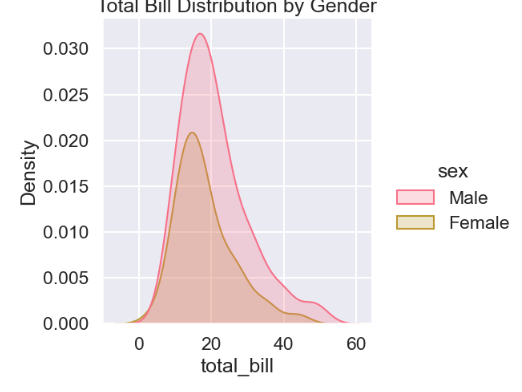
# 示例1:分布图 - 查看小费金额的分布,并按性别分组
sns.displot(data=df, x='total_bill', hue='sex', kind='kde', fill=True)
plt.title('Total Bill Distribution by Gender')
plt.show()

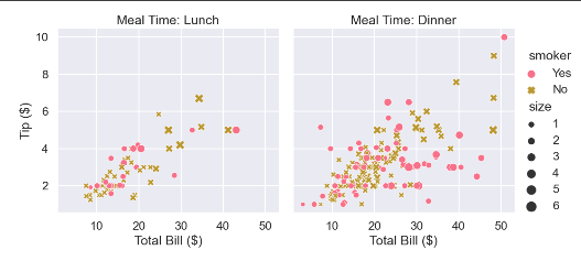
# 示例2:关系图 - 查看总账单与小费的关系,并用天数分面
g = sns.relplot(data=df, x='total_bill', y='tip', hue='smoker',
                col='time', style='smoker', size='size', kind='scatter')
g.set_axis_labels("Total Bill ($)", "Tip ($)")
g.set_titles("Meal Time: {col_name}")
g.legend.set_title("") # 调整图例标题
plt.show()

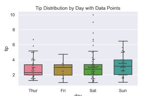
# 示例3:分类图 - 不同日期的小费比例(箱型图+蜂群图)
fig, ax = plt.subplots(figsize=(8,5))
sns.boxplot(data=df, x='day', y='tip', ax=ax, width=0.6, fliersize=3)
sns.swarmplot(data=df, x='day', y='tip', color='.25', ax=ax, size=3) # 叠加原始数据点
ax.set_title('Tip Distribution by Day with Data Points')
plt.show()

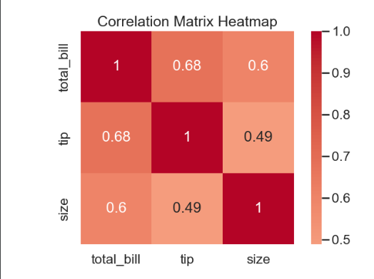
# 示例4:矩阵图 - 计算数值列的相关性并可视化
corr_matrix = df.select_dtypes(include='number').corr()
sns.heatmap(corr_matrix, annot=True, cmap='coolwarm', center=0, square=True)
plt.title('Correlation Matrix Heatmap')
plt.tight_layout()
plt.show()
生成的图形如下:
4.3 主题与样式系统(全局配置)
4.3.1 图形样式(Style)
# 五种内置样式:darkgrid, whitegrid, dark, white, ticks
sns.set_style('whitegrid')  # 推荐:网格便于读数

# 样式细节控制
sns.set_style('whitegrid', {'grid.linestyle': '--',
                            'grid.linewidth': 0.5,
                            'axes.edgecolor': 'black'})

# 临时样式(上下文管理器)
with sns.axes_style('dark'):
    plt.plot(x, y)
4.3.2 上下文环境(Context)
sns.set_context('notebook',       # 可选:paper, notebook, talk, poster
                font_scale=1.2,   # 字体缩放
                rc={'lines.linewidth': 2.5})  # 细部控制

# talk/poster 适合演示,paper 适合出版物
4.3.3 调色板(Color Palette)
# 分类调色板(离散数据)
sns.set_palette('Set2')          # 定性:Set1/Set2/Set3, Paired, Accent
sns.color_palette('Set2', n_colors=8)  # 查看颜色

# 连续调色板(数值数据)
sns.set_palette('Blues')         # 单色系:Blues, Greens, Oranges
sns.set_palette('viridis')       # 感知均匀:viridis, plasma, rocket

# 发散调色板(有正负的数据)
sns.set_palette('RdBu')          # 红-蓝:RdBu, coolwarm, seismic
sns.set_palette('vlag')          # 中心白色

# 自定义调色板
my_palette = ['#1f77b4', '#ff7f0e', '#2ca02c']
sns.set_palette(my_palette)
4.4 分布型图表(Distribution Plots)
用于探索单个或多个变量的分布
4.4.1 单变量分布
# 直方图 + 核密度曲线(KDE)
sns.histplot(data=tips, x='total_bill',
             bins=30,                # 直方图分箱
             kde=True,               # 叠加KDE曲线
             stat='density',         # 统计量:'count', 'frequency', 'density', 'probability'
             color='steelblue',
             alpha=0.7,
             linewidth=1.5,
             edgecolor='black')

# 仅KDE图(更平滑)
sns.kdeplot(data=tips, x='total_bill',
            bw_adjust=0.5,            # 带宽调整(越小越波折)
            fill=True,                # 填充区域
            alpha=0.5,
            color='darkblue')

# 累积分布函数(CDF)
sns.ecdfplot(data=tips, x='total_bill', color='red')
4.4.2 双变量分布
# 散点图 + 边缘分布(联合分布图)
sns.jointplot(data=tips, x='total_bill', y='tip',
              kind='scatter',         # 可选:'scatter', 'hex', 'kde', 'hist', 'reg', 'resid'
              color='purple',
              height=8,               # 图形大小
              ratio=4,                # 主图与边缘图高度比
              marginal_kws={'fill': True})  # 边缘图参数

# 六边形分箱(大数据集性能更好)
sns.jointplot(data=tips, x='total_bill', y='tip', kind='hex', color='blue')

# KDE 等高线图
sns.jointplot(data=tips, x='total_bill', y='tip', kind='kde', fill=True)

# 回归线 + 置信区间
sns.jointplot(data=tips, x='total_bill', y='tip', kind='reg',
              color='green',
              joint_kws={'scatter_kws': {'alpha': 0.5}})
4.4.3 配对分布(Pairwise)
# 所有数值列两两组合的散点图 + 对角线直方图
sns.pairplot(data=iris,
             hue='species',           # 按类别着色(核心功能)
             diag_kind='kde',         # 对角线图类型
             kind='scatter',          # 非对角线图类型
             palette='Set2',
             markers=['o', 's', 'D'], # 不同类别用不同标记
             height=2.5,
             plot_kws={'alpha': 0.6})

# 自定义变量子集
sns.pairplot(data=iris,
             vars=['sepal_length', 'sepal_width', 'petal_length'],
             hue='species')
4.5 关系型图表(Relational Plots)
用于探索变量间的关系
4.5.1 散点图(Scatter Plot)
# 基础散点图(已升级)
sns.scatterplot(data=tips, x='total_bill', y='tip',
                hue='time',               # 颜色映射到分类变量
                size='size',              # 点大小映射到数值变量(气泡图)
                style='time',             # 形状映射
                palette='deep',           # 调色板
                sizes=(20, 200),          # 大小范围
                alpha=0.7,
                edgecolor='black',        # 边框
                linewidth=0.5)

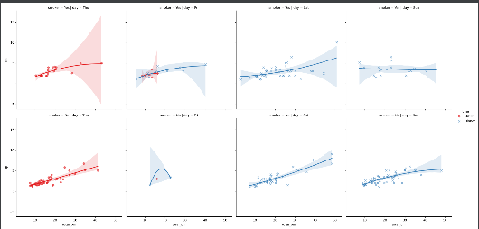
# 添加回归线(lmplot)
sns.lmplot(data=tips, x='total_bill', y='tip',
           hue='time',                  # 分组回归
           col='day',                   # 分面(按天)
           row='smoker',                # 多维度分面
           palette='Set1',
           markers=['o', 'x'],
           ci=95,                       # 置信区间
           order=2,                     # 多项式回归阶数(非线性)
           scatter_kws={'alpha': 0.6},
           line_kws={'linewidth': 2})
4.6 分类图表(Categorical Plots)
优雅处理分类数据可视化
4.6.1 散点图(显示分布)
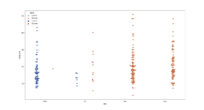
# 带抖动的散点图(避免重叠)
sns.stripplot(data=tips, x='day', y='total_bill',
              hue='time',               # 细分午餐/晚餐
              jitter=True,              # 添加随机抖动
              dodge=True,               # 分离hue组
              palette='Set2',
              alpha=0.6,
              size=4)

# 蜂群图(不重叠,但数据量大时慢)
sns.swarmplot(data=tips, x='day', y='total_bill',
              hue='time',
              dodge=True,
              palette='dark')
4.6.2 分布图(箱线/小提琴)
# 箱线图
sns.boxplot(data=tips, x='day', y='total_bill',
            hue='time',               # 分组箱线
            palette='pastel',         # 柔和配色
            linewidth=1.5,
            fliersize=4,              # 异常点大小
            notch=True)               # 凹槽显示中位数置信区间

# 小提琴图(显示密度分布)
sns.violinplot(data=tips, x='day', y='total_bill',
               hue='time',
               split=True,             # 分割显示hue(仅两个水平)
               inner='quart',          # 内部显示:'box', 'quart', 'stick', None
               palette='muted',
               bw=0.2)                 # 核密度带宽

# 组合图(箱线 + 蜂群)
fig, ax = plt.subplots(figsize=(10, 6))
sns.boxplot(data=tips, x='day', y='total_bill', ax=ax, color='white', linewidth=1.5)
sns.stripplot(data=tips, x='day', y='total_bill', ax=ax,
              color='black', alpha=0.5, jitter=0.1, size=3)
4.6.3 估计图(点估计 + 置信区间)
# 点图(显示均值和置信区间)
sns.pointplot(data=tips, x='day', y='total_bill',
              hue='time',
              dodge=True,
              capsize=0.1,            # 置信区间端点宽度
              palette='dark',
              markers=['o', 's'],
              linestyles=['-', '--'])

# 条形图(显示均值)
sns.barplot(data=tips, x='day', y='total_bill',
            hue='time',
            ci=95,                    # 置信区间
            palette='bright',
            edgecolor='black',
            linewidth=1)

# 计数条形图(自动计数)
sns.countplot(data=tips, x='day', hue='time', palette='Set3')
4.7 . 回归与线性模型(Regression)
4.7.1 线性回归图
# 简单线性回归 + 置信区间
sns.regplot(data=tips, x='total_bill', y='tip',
            scatter=True,             # 是否显示散点
            ci=95,                    # 置信区间水平
            order=1,                  # 多项式阶数
            robust=True,              # 鲁棒回归(抗异常值)
            x_bins=5,                 # 分箱回归(离散化)
            color='purple',
            line_kws={'linewidth': 2, 'color': 'red'},
            scatter_kws={'alpha': 0.5, 's': 50})

# 残差图(检查模型假设)
sns.residplot(data=tips, x='total_bill', y='tip',
              lowess=True,            # 添加平滑曲线
              color='green')
4.8 矩阵与热力图(Matrix Plots)
4.8.1 相关性热力图
# 计算相关性矩阵
corr = iris.corr(numeric_only=True)

# 热力图
sns.heatmap(data=corr,
            annot=True,               # 显示数值
            cmap='coolwarm',          # 发散调色板
            center=0,                 # 中心值(使0为无色)
            square=True,              # 单元格为正方形
            fmt='.2f',                # 数值格式
            linewidths=0.5,           # 单元格边框
            linecolor='gray',
            cbar_kws={'shrink': 0.8, 'label': 'Correlation'})

# 聚类热力图(hierarchical clustering)
sns.clustermap(data=iris.drop('species', axis=1),
               method='average',      # 聚类方法
               metric='euclidean',    # 距离度量
               standard_scale=1,      # 按行/列标准化
               figsize=(10, 8),
               cmap='vlag')
4.9分面网格(FacetGrid)
4.9.1 FacetGrid 通用接口
# 创建网格
g = sns.FacetGrid(data=tips,
                  col='time',        # 列分面
                  row='smoker',      # 行分面
                  hue='sex',         # 颜色映射
                  palette='Set1',
                  height=4,          # 每个子图高度
                  aspect=1.2,        # 宽高比
                  margin_titles=True, # 边缘标题
                  sharex=True,       # 共享X轴
                  sharey=True)       # 共享Y轴

# 在每个子图上绘制(类似 apply)
g.map(sns.scatterplot, 'total_bill', 'tip', alpha=0.7)

# 添加回归线
g.map(sns.regplot, 'total_bill', 'tip', scatter=False,
      line_kws={'linewidth': 1, 'color': 'red'})

# 总标题
g.figure.subplots_adjust(top=0.9)
g.figure.suptitle('Bill vs Tip by Time & Smoker', fontsize=16, fontweight='bold')

# 添加图例
g.add_legend(title='Gender', loc='upper right')
4.9.2 内置分面函数
# catplot(分类图分面)
sns.catplot(data=tips, x='day', y='total_bill',
            hue='time',
            col='smoker',             # 分面
            kind='box',               # 箱线图
            palette='pastel',
            height=4,
            aspect=1.5)

# relplot(关系图分面)
sns.relplot(data=tips, x='total_bill', y='tip',
            hue='time',
            size='size',              # 气泡大小
            col='day',                # 按天分面
            kind='scatter',
            facet_kws={'sharex': False})  # 取消共享X轴
4.10 高级自定义与技巧
4.10.1 与 Matplotlib 协作
fig, ax = plt.subplots(figsize=(10, 6))

# Seaborn 绘图
sns.boxplot(data=tips, x='day', y='total_bill', ax=ax, color='white')

# Matplotlib 自定义
ax.set_title('Custom Title', fontsize=16, fontweight='bold')
ax.axhline(y=20, color='red', linestyle='--', label='Threshold')
ax.legend()
plt.tight_layout()
4.10.2 多图布局(PairGrid)
g = sns.PairGrid(iris, diag_sharey=False)
g.map_upper(sns.scatterplot, alpha=0.6)
g.map_lower(sns.kdeplot, fill=True)
g.map_diag(sns.histplot, kde=True, color='gray')
4.10.3 颜色映射到数值
# 散点图中颜色表示第三个数值变量
sns.scatterplot(data=tips, x='total_bill', y='tip',
                size='size',              # 大小
                hue='size',               # 颜色也映射到size
                palette='YlOrRd',         # 黄-橙-红渐变
                sizes=(20, 200),
                alpha=0.7,
                legend='full')
4.10.4 中文支持
plt.rcParams['font.sans-serif'] = ['SimHei', 'Arial Unicode MS']
plt.rcParams['axes.unicode_minus'] = False
sns.set(font='SimHei')  # 如果设置后无效,需重启内核
4.10.5 常用模板
# EDA 标准流程
def eda_numeric(df, col):
    fig, (ax1, ax2) = plt.subplots(1, 2, figsize=(12, 5))
    sns.histplot(data=df, x=col, kde=True, ax=ax1)
    sns.boxplot(data=df, y=col, ax=ax2)
    plt.suptitle(f'Distribution of {col}', fontsize=16)
    plt.tight_layout()
    plt.show()

# 分类对比
def compare_categories(df, cat_col, num_col, hue_col=None):
    plt.figure(figsize=(10, 6))
    sns.barplot(data=df, x=cat_col, y=num_col, hue=hue_col, palette='Set2')
    plt.xticks(rotation=45)
    plt.tight_layout()
    plt.show()
4.10.6 性能优化
# 大数据集避免蜂群图
sns.stripplot(data=large_df, x='cat', y='val', jitter=True)  # 用 jitter 替代 swarm

# 采样后绘图
sample_df = df.sample(n=1000, random_state=42)
sns.scatterplot(data=sample_df, x='x', y='y')
例子
import seaborn as sns
import matplotlib.pyplot as plt
import pandas as pd

# 设置
sns.set_theme(style='whitegrid', palette='Set2', font='SimHei')
plt.rcParams['axes.unicode_minus'] = False

# 加载数据
df = sns.load_dataset('titanic')

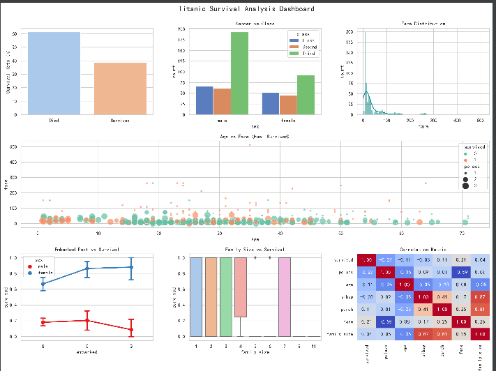
# 创建仪表盘
fig = plt.figure(figsize=(16, 12))
gs = fig.add_gridspec(3, 3)

# 1. 生存率总览(左上)
ax1 = fig.add_subplot(gs[0, 0])
sns.barplot(data=df, x='survived', y='survived', estimator=lambda x: len(x) / len(df) * 100,
            ax=ax1, palette='pastel')
ax1.set_ylabel('Survival Rate (%)')
ax1.set_xlabel('')
ax1.set_xticklabels(['Died', 'Survived'])

# 2. 性别与舱位(上中)
ax2 = fig.add_subplot(gs[0, 1])
sns.countplot(data=df, x='sex', hue='class', ax=ax2, palette='muted')
ax2.set_title('Gender vs Class')

# 3. 票价分布(右上)
ax3 = fig.add_subplot(gs[0, 2])
sns.histplot(data=df, x='fare', kde=True, ax=ax3, color='teal')
ax3.set_title('Fare Distribution')

# 4. 年龄与票价关系(中间整行)
ax4 = fig.add_subplot(gs[1, :])
sns.scatterplot(data=df, x='age', y='fare', hue='survived', size='pclass',
                sizes=(20, 200), ax=ax4, alpha=0.7)
ax4.set_title('Age vs Fare (Hue: Survived)')

# 5. 登船港口与生存率(左下)
ax5 = fig.add_subplot(gs[2, 0])
sns.pointplot(data=df, x='embarked', y='survived', hue='sex',
              ax=ax5, palette='Set1', capsize=0.1)
ax5.set_title('Embarked Port vs Survival')

# 6. 家庭规模影响(中下)
ax6 = fig.add_subplot(gs[2, 1])
df['family_size'] = df['sibsp'] + df['parch'] + 1
sns.boxplot(data=df, x='family_size', y='survived', ax=ax6, palette='pastel')
ax6.set_title('Family Size vs Survival')

# 7. 相关性热力图(右下)
ax7 = fig.add_subplot(gs[2, 2])
numeric_df = df.select_dtypes(include=[np.number]).dropna()
sns.heatmap(numeric_df.corr(), annot=True, cmap='coolwarm',
            ax=ax7, cbar=False, fmt='.2f')
ax7.set_title('Correlation Matrix')

plt.suptitle('Titanic Survival Analysis Dashboard', fontsize=18, y=0.995)
plt.tight_layout()
plt.savefig('titanic_dashboard.png', dpi=300, bbox_inches='tight')
plt.show()
4.11 总结 Seaborn 使用决策树
需要可视化什么?
├── 单个变量分布 → histplot / kdeplot / ecdfplot
├── 两个变量关系
│   ├── 连续 vs 连续 → scatterplot / regplot / jointplot
│   ├── 分类 vs 连续 → boxplot / violinplot / stripplot / barplot
│   └── 分类 vs 分类 → countplot / heatmap(交叉表)
├── 多变量关系 → pairplot / PairGrid
├── 多维度分面 → catplot / relplot / lmplot (FacetGrid)
└── 相关性矩阵 → heatmap / clustermap
-
EDA 阶段:用
pairplot()和catplot()快速探索全貌 -
报告阶段:用
FacetGrid和自定义seaborn + matplotlib出出版级图 -
永远记住:Seaborn 的
hue,col,row三参数能解决 80% 的多维分析需求
五 SkLearn
5.1 核心定位与设计哲学
sklearn不是为深度学习而生的,它的核心在于传统机器学习算法(如回归、分类、聚类、降维)和完整的模型生命周期管理。其三大支柱是:
-
一致性:所有模型都遵循
fit()、predict()、transform()、score()等统一的API接口。 -
管道化:通过
Pipeline将数据预处理、特征工程、模型训练、评估等步骤串联为一个整体,避免数据泄漏。 -
实用性:算法实现高效稳定,文档详尽,社区成熟,是工业界和学术界的首选。
5.2 核心API与典型工作流
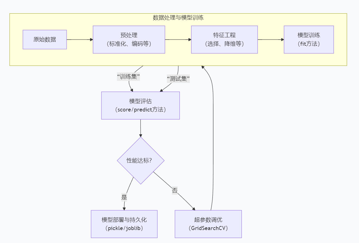
这个流程的核心,是围绕着几个最基础、最重要的API方法展开的:
-
model.fit(X_train, y_train):在训练集上学习模型参数。 -
model.predict(X_test):在测试集上进行预测。 -
model.score(X_test, y_test):返回模型的默认评估分数(如分类准确率、回归R²)。 -
model.transform(X)(针对预处理器和特征提取器):应用学到的转换规则。
5.3 六大核心模块详解
| 模块类别 | 核心子模块/类 | 主要功能与简介 | 常用代表类/函数 |
| 数据预处理 | sklearn.preprocessing | 数据标准化、编码、缺失值(简单)处理等。 | StandardScaler, MinMaxScaler, OneHotEncoder, LabelEncoder |
| sklearn.impute | 专门的缺失值填充。 | SimpleImputer, KNNImputer | |
| 特征工程 | sklearn.feature_selection | 从原始特征中选择最有用的子集。 | SelectKBest, VarianceThreshold, RFECV |
| sklearn.feature_extraction | 从文本、图像等非数值数据中提取特征。 | text.CountVectorizer, text.TfidfVectorizer | |
| sklearn.decomposition | 降维,减少特征数量,保留主要信息。 | PCA, TruncatedSVD | |
| 模型训练 | sklearn.linear_model | 线性模型,如回归、分类。 | LinearRegression, LogisticRegression, Ridge, Lasso |
| sklearn.tree | 决策树及其集成方法。 | DecisionTreeClassifier, RandomForestClassifier, GradientBoostingClassifier | |
| sklearn.svm | 支持向量机。 | SVC, SVR | |
| sklearn.neighbors | 基于距离的算法,如KNN。 | KNeighborsClassifier | |
| sklearn.cluster | 无监督聚类算法。 | KMeans, DBSCAN, AgglomerativeClustering | |
| 模型评估 | sklearn.metrics | 评估模型性能的指标。 | accuracy_score, precision_score, recall_score, f1_score, roc_auc_score, mean_squared_error, confusion_matrix, classification_report |
| sklearn.model_selection | 划分数据集、交叉验证、超参数调优。 | train_test_split, KFold, cross_val_score, GridSearchCV, RandomizedSearchCV | |
| 模型持久化 | sklearn 外接 joblib | 将训练好的模型保存到磁盘或从磁盘加载。 | joblib.dump(model, ‘model.pkl’), joblib.load(‘model.pkl’) |
| 实用工具 | sklearn.pipeline | 构建自动化机器学习流程管道。 |
Pipeline, make_pipeline |
分类项目例子
import pandas as pd
import numpy as np
from sklearn.model_selection import train_test_split, GridSearchCV
from sklearn.preprocessing import StandardScaler, OneHotEncoder
from sklearn.compose import ColumnTransformer
from sklearn.pipeline import Pipeline
from sklearn.ensemble import RandomForestClassifier
from sklearn.metrics import classification_report, confusion_matrix
import joblib

# 1. 加载数据(假设是结构化数据)
df = pd.read_csv('your_dataset.csv')
X = df.drop('target_column', axis=1)
y = df['target_column']

# 2. 划分数据集
X_train, X_test, y_train, y_test = train_test_split(X, y, test_size=0.2, random_state=42, stratify=y)

# 3. 构建预处理管道(区分数值和分类特征)
numeric_features = X.select_dtypes(include=['int64', 'float64']).columns
categorical_features = X.select_dtypes(include=['object']).columns

preprocessor = ColumnTransformer(
    transformers=[
        ('num', StandardScaler(), numeric_features),
        ('cat', OneHotEncoder(handle_unknown='ignore'), categorical_features)
    ])

# 4. 构建完整的机器学习管道(预处理 + 模型)
pipeline = Pipeline(steps=[
    ('preprocessor', preprocessor),
    ('classifier', RandomForestClassifier(random_state=42))
])

# 5. 定义超参数网格并进行搜索
param_grid = {
    'classifier__n_estimators': [100, 200],
    'classifier__max_depth': [10, 20, None]
}
grid_search = GridSearchCV(pipeline, param_grid, cv=5, scoring='f1_macro', n_jobs=-1)
grid_search.fit(X_train, y_train)

# 6. 评估最佳模型
best_model = grid_search.best_estimator_
y_pred = best_model.predict(X_test)
print("Best Parameters:", grid_search.best_params_)
print("\nClassification Report:")
print(classification_report(y_test, y_pred))
print("\nConfusion Matrix:")
print(confusion_matrix(y_test, y_pred))

# 7. 模型持久化(部署)
joblib.dump(best_model, 'best_model.pkl')
# 加载模型: loaded_model = joblib.load('best_model.pkl')
5.4 统一 API 接口
# 三大核心方法
estimator.fit(X_train, y_train)      # 训练:学习参数
estimator.predict(X_test)            # 预测:输出标签
estimator.transform(X_test)          # 转换:特征工程

# 两大基类
# 1. Predictor(预测器):分类/回归模型
# 2. Transformer(转换器):预处理/降维
5.5 数据加载与预处理
5.5.1 内置数据集(快速原型)
from sklearn import datasets

# 结构化数据
iris = datasets.load_iris()          # 分类:鸢尾花
X, y = iris.data, iris.target

diabetes = datasets.load_diabetes()  # 回归:糖尿病
digits = datasets.load_digits()      # 图像分类:手写数字

# 生成合成数据(教学/调参)
X, y = datasets.make_classification(n_samples=1000, n_features=20, n_classes=2)
X, y = datasets.make_regression(n_samples=1000, n_features=10, noise=0.1)
X, y = datasets.make_blobs(n_samples=1000, centers=3, cluster_std=2.0)  # 聚类
5.5.2 数据预处理(核心模块 preprocessing)
from sklearn.preprocessing import StandardScaler, MinMaxScaler, RobustScaler

# 标准化(均值为0,方差为1)- 适用于大多数算法
scaler = StandardScaler()
X_scaled = scaler.fit_transform(X_train)  # 注意:只在训练集fit!

# 归一化(缩放到0-1)- 适用于神经网络、距离计算
minmax = MinMaxScaler()
X_minmax = minmax.fit_transform(X_train)

# 鲁棒缩放(抗异常值)- 适用于有极端值的数据
robust = RobustScaler()
X_robust = robust.fit_transform(X_train)
类别特征编码
from sklearn.preprocessing import OneHotEncoder, LabelEncoder, OrdinalEncoder

# 独热编码(分类变量 → 二进制矩阵)- 推荐
encoder = OneHotEncoder(sparse_output=False, drop='first')  # drop避免共线性
X_encoded = encoder.fit_transform(df[['category', 'city']])

# 标签编码(有序类别)- 慎用,会引入大小关系
le = LabelEncoder()
y_encoded = le.fit_transform(['low', 'mid', 'high'])  # 0,1,2

# 序数编码(自定义顺序)
oe = OrdinalEncoder(categories=[['low', 'mid', 'high']])
y_ord = oe.fit_transform([['low'], ['high']])
缺失值处理
from sklearn.impute import SimpleImputer, KNNImputer

# 均值填充(数值型)
imp = SimpleImputer(strategy='mean')  # 可选:median, most_frequent, constant
X_imputed = imp.fit_transform(X_train)

# 中位数填充(抗异常值)
imp_median = SimpleImputer(strategy='median')

# KNN填充(更智能,但慢)
knn_imp = KNNImputer(n_neighbors=5)
X_knn = knn_imp.fit_transform(X_train)
5.6 监督学习:分类算法
5.6.1 线性模型
from sklearn.linear_model import LogisticRegression, SGDClassifier

# 逻辑回归(基准模型,必会)
logreg = LogisticRegression(
    penalty='l2',              # 正则化:l1, l2, elasticnet
    C=1.0,                     # 正则化强度(越小越强)
    solver='lbfgs',            # 优化器:liblinear, sag, saga
    max_iter=1000,
    multi_class='auto'         # 多分类策略
)
logreg.fit(X_train, y_train)
y_pred = logreg.predict(X_test)
y_pred_proba = logreg.predict_proba(X_test)  # 预测概率

# SGD(大规模数据/在线学习)
sgd = SGDClassifier(loss='log_loss', penalty='l2', random_state=42)
sgd.fit(X_train, y_train)
5.6.2 树模型(工业界主流)
from sklearn.tree import DecisionTreeClassifier
from sklearn.ensemble import RandomForestClassifier, GradientBoostingClassifier

# 决策树(可解释性强,易过拟合)
dt = DecisionTreeClassifier(
    max_depth=5,               # 最大深度(防过拟合)
    min_samples_split=20,      # 分裂最小样本数
    min_samples_leaf=10,       # 叶子节点最小样本数
    criterion='gini'           # 分裂标准:gini, entropy
)
dt.fit(X_train, y_train)

# 随机森林(Bagging,抗过拟合,特征重要性)
rf = RandomForestClassifier(
    n_estimators=100,          # 树数量
    max_depth=10,
    min_samples_split=5,
    random_state=42,
    n_jobs=-1,                 # 并行核心数(-1=全部)
    class_weight='balanced'    # 处理类别不平衡
)
rf.fit(X_train, y_train)
feature_imp = rf.feature_importances_  # 特征重要性

# 梯度提升(Boosting,精度更高,但易过拟合)
gb = GradientBoostingClassifier(
    n_estimators=100,
    learning_rate=0.1,         # 每棵树贡献度
    max_depth=3,
    subsample=0.8              # 子采样(防止过拟合)
)
gb.fit(X_train, y_train)
5.6.3 支持向量机
from sklearn.svm import SVC, LinearSVC

# 线性SVM(大规模数据)
linear_svm = LinearSVC(penalty='l2', C=1.0, max_iter=5000)
linear_svm.fit(X_train, y_train)

# 核SVM(小样本/高维,性能敏感)
svm = SVC(
    kernel='rbf',              # 核函数:linear, poly, rbf, sigmoid
    C=1.0,                     # 软间隔惩罚系数
    gamma='scale',             # 核系数
    probability=True           # 启用predict_proba(慢)
)
svm.fit(X_train, y_train)
5.6.4 K近邻(KNN)
from sklearn.neighbors import KNeighborsClassifier

knn = KNeighborsClassifier(
    n_neighbors=5,             # K值
    weights='uniform',         # 权重:uniform, distance(距离加权)
    metric='minkowski',        # 距离度量
    p=2                        # p=2 欧氏距离,p=1 曼哈顿距离
)
knn.fit(X_train, y_train)

# 寻找最优 K 值
from sklearn.model_selection import cross_val_score
k_range = range(1, 31)
cv_scores = [cross_val_score(KNeighborsClassifier(k), X_train, y_train, cv=5).mean() for k in k_range]
5.6.5 朴素贝叶斯(文本分类)
from sklearn.naive_bayes import MultinomialNB, GaussianNB

# 多项式NB(离散特征,如词频)
mnb = MultinomialNB(alpha=1.0)  # alpha: 拉普拉斯平滑
mnb.fit(X_train, y_train)  # X需为非负值

# 高斯NB(连续特征)
gnb = GaussianNB()
gnb.fit(X_train, y_train)
5.7 监督学习:回归算法
from sklearn.linear_model import LinearRegression, Ridge, Lasso, ElasticNet
from sklearn.tree import DecisionTreeRegressor
from sklearn.ensemble import RandomForestRegressor, GradientBoostingRegressor

# 线性回归(基准)
lr = LinearRegression()
lr.fit(X_train, y_train)
y_pred = lr.predict(X_test)

# 岭回归(L2正则,处理共线性)
ridge = Ridge(alpha=1.0)  # alpha: 正则化强度

# Lasso回归(L1正则,特征选择)
lasso = Lasso(alpha=0.1, max_iter=10000)  # 会稀疏化系数

# ElasticNet(L1+L2)
enet = ElasticNet(alpha=0.1, l1_ratio=0.5)  # l1_ratio: L1占比

# 树模型回归(API与分类类似)
rf_reg = RandomForestRegressor(n_estimators=100, max_depth=10)
gb_reg = GradientBoostingRegressor(n_estimators=100, learning_rate=0.1)
5.8 无监督学习
5.8.1 聚类(Clustering)
from sklearn.cluster import KMeans, DBSCAN, AgglomerativeClustering

# KMeans(最常用)
kmeans = KMeans(
    n_clusters=3,              # 簇数量
    init='k-means++',          # 初始化方法
    n_init=10,                 # 运行次数,取最优
    max_iter=300,
    random_state=42
)
kmeans.fit(X)
labels = kmeans.labels_
centroids = kmeans.cluster_centers_
inertia = kmeans.inertia_      # 簇内平方和(评估指标)

# DBSCAN(密度聚类,无需指定簇数,抗噪声)
dbscan = DBSCAN(
    eps=0.5,                   # 邻域半径
    min_samples=5,             # 核心点最小样本数
    metric='euclidean'
)
dbscan.fit(X)
labels = dbscan.labels_
n_clusters = len(set(labels) - { -1 })  # -1 表示噪声点

# 层次聚类
agg = AgglomerativeClustering(
    n_clusters=3,
    linkage='ward',            # 链接方式:ward, complete, average, single
    distance_threshold=None    # 若指定,则自动确定簇数
)
agg.fit(X)
5.8.2 降维(Dimensionality Reduction)
from sklearn.decomposition import PCA, TruncatedSVD
from sklearn.manifold import TSNE

# PCA(主成分分析)
pca = PCA(
    n_components=0.95,         # 保留 95% 方差(自动选择)
    svd_solver='auto'          # 或指定 'full', 'arpack', 'randomized'
)
X_pca = pca.fit_transform(X)
explained_variance = pca.explained_variance_ratio_

# t-SNE(高维可视化,仅转换)
tsne = TSNE(
    n_components=2,
    perplexity=30,             # 困惑度(样本数较多时增大)
    n_iter=1000,
    random_state=42
)
X_tsne = tsne.fit_transform(X)  # 无 transform 方法!
5.9 模型评估与验证
5.9.1 数据划分
from sklearn.model_selection import train_test_split

X_train, X_test, y_train, y_test = train_test_split(
    X, y,
    test_size=0.2,             # 测试集比例
    random_state=42,           # 可复现性
    stratify=y                 # 分层采样(保持类别比例)
)
5.9.2 交叉验证(核心技能)
from sklearn.model_selection import cross_val_score, KFold, StratifiedKFold

# K折交叉验证
cv = KFold(n_splits=5, shuffle=True, random_state=42)
scores = cross_val_score(model, X, y, cv=cv, scoring='accuracy')

# 分层交叉验证(分类问题推荐)
skf = StratifiedKFold(n_splits=5)
scores = cross_val_score(model, X, y, cv=skf)

# 交叉验证预测(获取每个样本的预测)
from sklearn.model_selection import cross_val_predict
y_pred = cross_val_predict(model, X, y, cv=5)
5.9.3 评估指标
from sklearn.metrics import accuracy_score, precision_score, recall_score, f1_score
from sklearn.metrics import mean_squared_error, r2_score, mean_absolute_error
from sklearn.metrics import confusion_matrix, classification_report, roc_auc_score

# 分类指标
y_pred = model.predict(X_test)
print(f"Accuracy: {accuracy_score(y_test, y_pred):.3f}")
print(f"Precision: {precision_score(y_test, y_pred):.3f}")
print(f"Recall: {recall_score(y_test, y_pred):.3f}")
print(f"F1: {f1_score(y_test, y_pred):.3f}")
print(f"AUC: {roc_auc_score(y_test, y_pred_proba):.3f}")  # 需预测概率

# 回归指标
print(f"MSE: {mean_squared_error(y_test, y_pred):.3f}")
print(f"RMSE: {np.sqrt(mean_squared_error(y_test, y_pred)):.3f}")
print(f"MAE: {mean_absolute_error(y_test, y_pred):.3f}")
print(f"R²: {r2_score(y_test, y_pred):.3f}")
5.10 超参数调优(模型优化)
5.10.1 网格搜索(Grid Search)
from sklearn.model_selection import GridSearchCV

param_grid = {
    'n_estimators': [50, 100, 200],
    'max_depth': [5, 10, 15, None],
    'min_samples_split': [2, 5, 10],
    'class_weight': ['balanced', None]
}

grid_search = GridSearchCV(
    estimator=RandomForestClassifier(random_state=42),
    param_grid=param_grid,
    cv=5,                      # 交叉验证折数
    scoring='f1_macro',        # 评估指标
    n_jobs=-1,                 # 并行
    verbose=2                  # 显示进度
)
grid_search.fit(X_train, y_train)

# 最优结果
best_model = grid_search.best_estimator_
print(grid_search.best_params_)
print(grid_search.best_score_)
5.10.2 随机搜索(Randomized Search)
from sklearn.model_selection import RandomizedSearchCV
from scipy.stats import randint, uniform

param_dist = {
    'n_estimators': randint(50, 200),
    'max_depth': randint(5, 20),
    'min_samples_split': randint(2, 20),
    'learning_rate': uniform(0.01, 0.3)  # 连续分布
}

random_search = RandomizedSearchCV(
    estimator=GradientBoostingClassifier(),
    param_distributions=param_dist,
    n_iter=50,                 # 采样次数(比网格搜索快)
    cv=5,
    random_state=42,
    n_jobs=-1
)
random_search.fit(X_train, y_train)
5.10.3 贝叶斯优化(更高效)
# 需安装 scikit-optimize
from skopt import BayesSearchCV

opt = BayesSearchCV(
    RandomForestClassifier(),
    {
        'n_estimators': (50, 200),
        'max_depth': (5, 30),
        'min_samples_split': (2, 20)
    },
    n_iter=32,
    cv=5
)
opt.fit(X_train, y_train)
5.11 Pipeline(核心最佳实践)
Pipeline 解决三大问题:
-
防止数据泄露:交叉验证中避免测试集信息污染训练集
-
代码复用:训练与预测步骤一致
-
部署简化:序列化整个流程,而非单独组件
5.11.1 基础 Pipeline
from sklearn.pipeline import Pipeline
from sklearn.preprocessing import StandardScaler
from sklearn.ensemble import RandomForestClassifier

# 定义步骤(名称, 转换器/估计器)
pipeline = Pipeline([
    ('scaler', StandardScaler()),          # 步骤1:标准化
    ('classifier', RandomForestClassifier( # 步骤2:分类器
        n_estimators=100,
        random_state=42
    ))
])

# 使用(像单个估计器一样)
pipeline.fit(X_train, y_train)  # 自动执行 scaler.fit_transform + classifier.fit
y_pred = pipeline.predict(X_test)  # 自动执行 scaler.transform + classifier.predict

# 交叉验证(防止数据泄露)
from sklearn.model_selection import cross_val_score
scores = cross_val_score(pipeline, X, y, cv=5)  # 每折内部独立拟合scaler
5.11.2 ColumnTransformer(处理混合类型数据)
from sklearn.compose import ColumnTransformer

# 定义数值列和类别列
numeric_features = ['age', 'income', 'credit_score']
categorical_features = ['gender', 'city']

# 为不同列指定不同处理器
preprocessor = ColumnTransformer([
    ('num', StandardScaler(), numeric_features),
    ('cat', OneHotEncoder(handle_unknown='ignore'), categorical_features)
])

# 集成到 Pipeline
pipeline = Pipeline([
    ('preprocessor', preprocessor),
    ('classifier', RandomForestClassifier())
])
pipeline.fit(X_train, y_train)
5.11.3 FeatureUnion(特征组合)
from sklearn.pipeline import FeatureUnion
from sklearn.decomposition import PCA
from sklearn.feature_selection import SelectKBest

# 并行特征工程
feature_union = FeatureUnion([
    ('pca', PCA(n_components=3)),
    ('kbest', SelectKBest(k=5))
])

pipeline = Pipeline([
    ('features', feature_union),
    ('clf', RandomForestClassifier())
])
5.12 特征工程与选择
5.12.1 特征选择
from sklearn.feature_selection import SelectKBest, RFE, SelectFromModel

# 单变量统计检验(ANOVA F值)
selector = SelectKBest(k=10)  # 选择前10个
X_new = selector.fit_transform(X_train, y_train)

# 递归特征消除(RFE)
rfe = RFE(estimator=RandomForestClassifier(), n_features_to_select=5)
X_rfe = rfe.fit_transform(X_train, y_train)

# 基于模型的选择(L1正则)
from sklearn.linear_model import LogisticRegression
sfm = SelectFromModel(estimator=LogisticRegression(penalty='l1', solver='saga'))
X_sfm = sfm.fit_transform(X_train, y_train)
5.12.2 特征降维
# PCA(线性降维)
pca = PCA(n_components=0.95)  # 保留95%方差
X_pca = pca.fit_transform(X_train)

# 核PCA(非线性降维)
from sklearn.decomposition import KernelPCA
kpca = KernelPCA(kernel='rbf', n_components=2, gamma=0.1)
X_kpca = kpca.fit_transform(X_train)
5.13 模型持久化与部署
import joblib
from sklearn.pipeline import Pipeline

# 保存模型(推荐 joblib,比 pickle 快)
pipeline.fit(X_train, y_train)
joblib.dump(pipeline, 'model_v1.joblib')

# 加载模型
loaded_model = joblib.load('model_v1.joblib')
y_pred = loaded_model.predict(X_new)
5.14 实战:分类任务
import pandas as pd
import numpy as np
from sklearn.model_selection import train_test_split, GridSearchCV, cross_val_score
from sklearn.preprocessing import StandardScaler, OneHotEncoder
from sklearn.compose import ColumnTransformer
from sklearn.pipeline import Pipeline
from sklearn.ensemble import RandomForestClassifier
from sklearn.metrics import classification_report, confusion_matrix, roc_auc_score
import joblib

# 1. 数据加载
df = pd.read_csv('data.csv')
X = df.drop('target', axis=1)
y = df['target']

# 2. 数据划分
X_train, X_test, y_train, y_test = train_test_split(
    X, y, test_size=0.2, random_state=42, stratify=y
)

# 3. 定义预处理
numeric_features = ['age', 'income']
categorical_features = ['city', 'gender']

preprocessor = ColumnTransformer(
    transformers=[
        ('num', StandardScaler(), numeric_features),
        ('cat', OneHotEncoder(handle_unknown='ignore'), categorical_features)
    ]
)

# 4. 构建 Pipeline
pipeline = Pipeline([
    ('preprocessor', preprocessor),
    ('classifier', RandomForestClassifier(random_state=42))
])

# 5. 超参数调优
param_grid = {
    'classifier__n_estimators': [100, 200],
    'classifier__max_depth': [10, 20, None],
    'classifier__min_samples_split': [2, 5]
}

grid_search = GridSearchCV(
    pipeline, param_grid, cv=5, scoring='roc_auc', n_jobs=-1, verbose=2
)
grid_search.fit(X_train, y_train)

# 6. 评估
best_model = grid_search.best_estimator_
y_pred = best_model.predict(X_test)
y_pred_proba = best_model.predict_proba(X_test)[:, 1]

print("最佳参数:", grid_search.best_params_)
print("交叉验证分数:", grid_search.best_score_)
print("\n分类报告:")
print(classification_report(y_test, y_pred))
print("ROC-AUC:", roc_auc_score(y_test, y_pred_proba))

# 7. 保存模型
joblib.dump(best_model, 'best_model.joblib')
5.15 特殊场景处理
5.15.1 类别不平衡
from sklearn.utils import class_weight

# 方法1:调整class_weight
model = RandomForestClassifier(class_weight='balanced')

# 方法2:指定权重字典
weights = {0: 1, 1: 10}
model = LogisticRegression(class_weight=weights)

# 方法3:SMOTE过采样(需 imbalanced-learn库)
from imblearn.over_sampling import SMOTE
sm = SMOTE(random_state=42)
X_res, y_res = sm.fit_resample(X_train, y_train)
5.15.2 多标签分类
from sklearn.multioutput import MultiOutputClassifier
from sklearn.linear_model import LogisticRegression

# y是形状为(n_samples, n_classes)的矩阵
multi_clf = MultiOutputClassifier(LogisticRegression())
multi_clf.fit(X_train, y_train)
5.16 Sklearn使用场景
Sklearn vs 深度学习框架
| 特性 | Scikit-learn | TensorFlow/PyTorch |
| 适用数据 | 结构化数据(表格) | 非结构化数据(图像/文本) |
| 模型复杂度 | 线性/树模型(可解释) | 神经网络(黑盒) |
| 训练速度 | 快(CPU) | 慢(需GPU) |
| 数据量 | < 1M 样本 | > 1M 样本 |
| 调参难度 | 低 | 高 |
| 可解释性 | 高 | 低 |
Sklearn 最佳场景:
业务数据建模(用户画像、风控、推荐)
特征工程复杂但模型简单的任务
需要快速迭代的项目
可解释性要求高的场景(金融、医疗)
黄金法则
永远 Pipeline:防止数据泄露,代码可维护
交叉验证是王道:单次 train_test_split 不可靠
先基准再优化:先用逻辑回归/随机森林建立基准,再调优
特征工程 > 模型选择:数据质量决定上限
超参数调优最后做:避免浪费时间在烂数据上
参数策略
# 步骤1:快速基准
model = RandomForestClassifier(n_estimators=100)
base_score = cross_val_score(model, X, y, cv=5).mean()

# 步骤2:粗粒度搜索
param_dist = {
    'max_depth': [5, 10, 20, None],
    'min_samples_split': [2, 10, 20]
}

# 步骤3:细粒度搜索(在粗粒度最优附近)
best_params = {'max_depth': 10}
param_fine = {
    'max_depth': [8, 9, 10, 11, 12],
    'min_samples_leaf': [1, 2, 4]
}
模型选择捷径
# 分类:快速选择指南
if n_samples < 1000:
    model = SVC(kernel='rbf')  # 小样本用SVM
elif n_features > n_samples:
    model = LinearSVC()  # 高维用线性
else:
    model = RandomForestClassifier()  # 默认用 RF

# 回归:快速选择
if n_samples > 10000:
    model = SGDRegressor()  # 大规模
else:
    model = GradientBoostingRegressor()  # 中小规模
一句话总结:Sklearn 的精髓在于 Pipeline + 交叉验证 + 超参数调优 三驾马车,掌握这三点即可解决 90% 的工业界传统机器学习问题。
更多推荐
 9
9 0
0- 0


 已为社区贡献1条内容

所有评论(0)