
CSS3全面解析:现代网页样式设计的核心技术
·
一、CSS3概述与核心优势
CSS3是层叠样式表的第三代标准,相较于CSS2.1,它引入了模块化架构,允许按需加载特定功能模块。CSS3不仅增强了传统样式控制能力,还引入了众多创新特性,彻底改变了网页设计方式。
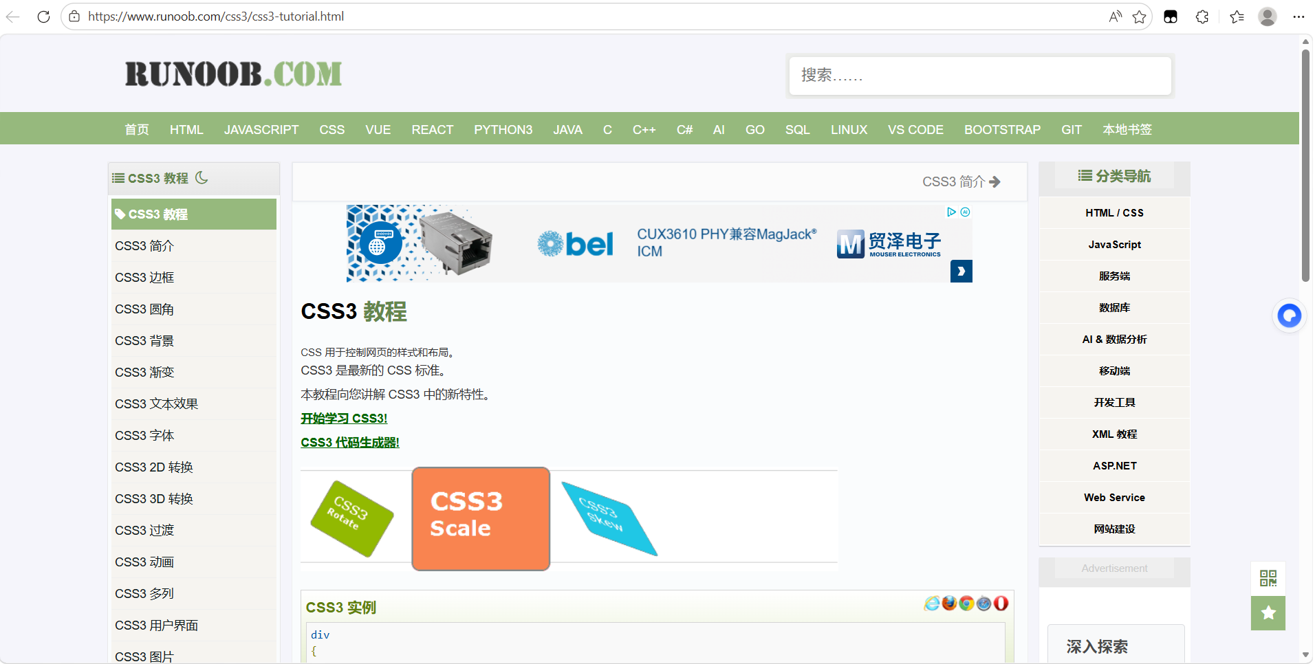
附(转载):CSS3 教程 | 菜鸟教程
主要优势:
-
模块化设计 - 功能划分为独立模块,便于渐进式采用
-
丰富选择器 - 更精确、更灵活的元素选择能力
-
强大视觉效果 - 圆角、阴影、渐变、变换、动画等
-
响应式支持 - 媒体查询为多设备适配提供基础
-
布局革命 - Flexbox和Grid系统彻底解决布局难题
-
性能优化 - GPU加速、硬件渲染提升动画性能
二、CSS3核心模块详解
1. 选择器增强
CSS3选择器提供了更精细的元素定位能力:
属性选择器扩展
/* 属性值匹配 */
input[type="email"] { }          /* 精确匹配 */
input[type^="tel"] { }           /* 以指定值开头 */
input[type$="number"] { }        /* 以指定值结尾 */
input[type*="search"] { }        /* 包含指定值 */
input[class~="required"] { }     /* 包含指定单词 */
input[lang|="zh"] { }            /* 指定值或以其开头 */

/* 表单状态选择器 */
input:enabled { }                /* 可用元素 */
input:disabled { }               /* 禁用元素 */
input:checked { }                /* 选中状态 */
input:indeterminate { }          /* 不确定状态 */
input:required { }               /* 必填字段 */
input:optional { }               /* 可选字段 */
input:valid { }                  /* 有效输入 */
input:invalid { }                /* 无效输入 */
input:in-range { }               /* 在范围内 */
input:out-of-range { }           /* 超出范围 */
input:read-only { }              /* 只读 */
input:read-write { }             /* 可读写 */
结构伪类
/* 位置选择 */
li:first-child { }               /* 第一个子元素 */
li:last-child { }                /* 最后一个子元素 */
li:nth-child(n) { }              /* 第n个子元素 */
li:nth-last-child(n) { }         /* 倒数第n个子元素 */
li:only-child { }                /* 唯一子元素 */

/* 类型选择 */
p:first-of-type { }              /* 同类型第一个 */
p:last-of-type { }               /* 同类型最后一个 */
p:nth-of-type(n) { }             /* 同类型第n个 */
p:nth-last-of-type(n) { }        /* 同类型倒数第n个 */
p:only-of-type { }               /* 同类型唯一 */

/* 其他伪类 */
:root { }                        /* 文档根元素 */
:empty { }                       /* 空元素 */
:target { }                      /* URL目标元素 */
:not(selector) { }               /* 反选 */
UI元素状态伪类
/* 链接与交互状态 */
a:link { }                       /* 未访问链接 */
a:visited { }                    /* 已访问链接 */
a:hover { }                      /* 鼠标悬停 */
a:active { }                     /* 激活状态 */
a:focus { }                      /* 获取焦点 */

/* 新增UI状态 */
:default { }                     /* 默认选项 */
:fullscreen { }                  /* 全屏模式 */
:playing { }                     /* 正在播放媒体 */
:paused { }                      /* 暂停媒体 */
2. 盒模型与背景增强
边框样式
/* 圆角边框 */
.rounded {
  border-radius: 10px;                     /* 统一圆角 */
  border-radius: 10px 20px 30px 40px;      /* 四角分别设置 */
  border-top-left-radius: 10px 20px;       /* 水平/垂直半径 */
}

/* 边框图片 */
.image-border {
  border: 20px solid transparent;
  border-image: url(border.png) 30 round;  /* 图片边框 */
  border-image-slice: 30;                   /* 图片切片 */
  border-image-width: 20px;                 /* 边框宽度 */
  border-image-outset: 5px;                 /* 边框外延 */
  border-image-repeat: round;               /* 重复方式 */
}

/* 多重边框 */
.multi-border {
  border: 2px solid #000;
  box-shadow: 0 0 0 5px red,               /* 内阴影模拟边框 */
              0 0 0 10px blue;
  outline: 5px solid green;                 /* 外边框 */
}
背景增强
.advanced-bg {
  /* 多背景图 */
  background:
    url(bg1.png) top left no-repeat,
    url(bg2.png) bottom right no-repeat,
    linear-gradient(45deg, #f06, #4a9);

  /* 背景控制 */
  background-size: 100px auto, cover;       /* 分别控制尺寸 */
  background-origin: content-box;           /* 定位区域 */
  background-clip: padding-box;              /* 绘制区域 */
  background-attachment: fixed, scroll;      /* 附着方式 */

  /* 渐变背景 */
  background-image:
    linear-gradient(45deg, red, blue),      /* 线性渐变 */
    radial-gradient(circle, yellow, green), /* 径向渐变 */
    repeating-linear-gradient(45deg, #ccc, #ccc 10px, #eee 10px, #eee 20px);
}
3. 文字与字体效果
字体控制
/* 自定义字体 */
@font-face {
  font-family: 'MyFont';
  src: url('myfont.woff2') format('woff2'),
       url('myfont.woff') format('woff');
  font-weight: 400;
  font-style: normal;
  font-display: swap;                       /* 字体显示策略 */
}

/* 高级文字属性 */
.text-effects {
  /* 阴影效果 */
  text-shadow: 2px 2px 5px rgba(0,0,0,0.5);
  text-shadow: 0 0 10px #f00, 0 0 20px #ff0; /* 多重阴影 */

  /* 溢出处理 */
  overflow: hidden;
  text-overflow: ellipsis;                  /* 省略号 */
  white-space: nowrap;
  display: -webkit-box;
  -webkit-line-clamp: 3;                    /* 多行省略 */
  -webkit-box-orient: vertical;

  /* 文字修饰 */
  text-decoration: underline wavy red;      /* 波浪下划线 */
  text-decoration-skip-ink: auto;           /* 避免交叉 */
  text-underline-position: under;           /* 下划线位置 */

  /* 书写模式 */
  writing-mode: vertical-rl;                 /* 竖排文字 */
  text-orientation: mixed;
}
4. 2D/3D变换与过渡
2D变换
.transform-2d {
  transform: translate(50px, 100px);        /* 平移 */
  transform: rotate(30deg);                  /* 旋转 */
  transform: scale(1.5, 0.5);               /* 缩放 */
  transform: skew(20deg, 10deg);             /* 倾斜 */
  transform: matrix(1, 0.3, 0, 1, 0, 0);     /* 矩阵变换 */
  transform-origin: 0 0;                     /* 变换原点 */
}
3D变换
.transform-3d {
  perspective: 1000px;                       /* 透视距离 */
  transform-style: preserve-3d;             /* 3D空间 */
  backface-visibility: hidden;              /* 背面可见性 */

  transform:
    translate3d(100px, 50px, 0)            /* 3D平移 */
    rotate3d(1, 1, 0, 45deg)               /* 3D旋转 */
    scale3d(1.2, 1.2, 1.2);                /* 3D缩放 */
}
过渡动画
.transition-effect {
  transition-property: all;                 /* 过渡属性 */
  transition-duration: 0.5s;                /* 持续时间 */
  transition-timing-function: ease-in-out;  /* 时间函数 */
  transition-delay: 0.2s;                    /* 延迟时间 */

  /* 简写 */
  transition: all 0.5s ease-in-out 0.2s;
  transition: color 0.3s, transform 0.5s;  /* 多属性 */
}
5. 关键帧动画
/* 定义动画 */
@keyframes slideIn {
  from {
    opacity: 0;
    transform: translateX(-100%);
  }
  50% {
    opacity: 0.5;
    transform: translateX(10%);
  }
  to {
    opacity: 1;
    transform: translateX(0);
  }
}

/* 应用动画 */
.animated-element {
  animation-name: slideIn;                  /* 动画名称 */
  animation-duration: 1s;                   /* 持续时间 */
  animation-timing-function: ease-out;      /* 时间函数 */
  animation-delay: 0.5s;                    /* 延迟 */
  animation-iteration-count: 3;             /* 重复次数 */
  animation-direction: alternate;           /* 方向 */
  animation-fill-mode: both;                /* 填充模式 */
  animation-play-state: running;            /* 播放状态 */

  /* 简写 */
  animation: slideIn 1s ease-out 0.5s 3 both;
}
6. 现代布局系统
Flexbox弹性盒布局
.flex-container {
  display: flex;                            /* 定义flex容器 */

  /* 主轴方向 */
  flex-direction: row;                      /* row | row-reverse | column | column-reverse */

  /* 换行方式 */
  flex-wrap: nowrap;                       /* nowrap | wrap | wrap-reverse */

  /* 简写:方向+换行 */
  flex-flow: row wrap;

  /* 主轴对齐 */
  justify-content: center;                  /* flex-start | center | flex-end | space-between | space-around | space-evenly */

  /* 交叉轴对齐 */
  align-items: stretch;                     /* stretch | flex-start | center | flex-end | baseline */

  /* 多行对齐 */
  align-content: stretch;                   /* 类似justify-content */
}

.flex-item {
  /* 项目伸缩性 */
  flex-grow: 0;                            /* 扩展比例 */
  flex-shrink: 1;                          /* 收缩比例 */
  flex-basis: auto;                        /* 基准大小 */

  /* 简写:grow shrink basis */
  flex: 1 0 auto;

  /* 自身对齐覆盖 */
  align-self: auto;                        /* 覆盖align-items */
  order: 0;                                /* 显示顺序 */
}
Grid网格布局
.grid-container {
  display: grid;                           /* 定义grid容器 */
  display: inline-grid;                     /* 行内grid */

  /* 显式网格定义 */
  grid-template-columns: 100px 1fr 2fr;     /* 列定义 */
  grid-template-rows: 100px auto 200px;     /* 行定义 */
  grid-template-areas:
    "header header header"
    "sidebar main main"
    "footer footer footer";                 /* 区域模板 */

  /* 自动网格 */
  grid-auto-columns: 100px;                 /* 隐式列大小 */
  grid-auto-rows: minmax(100px, auto);      /* 隐式行大小 */
  grid-auto-flow: row;                      /* 自动放置方向 */

  /* 间距 */
  gap: 20px;                               /* 行列间距 */
  row-gap: 10px;                           /* 行间距 */
  column-gap: 15px;                        /* 列间距 */

  /* 对齐方式 */
  justify-items: stretch;                   /* 单元格水平对齐 */
  align-items: stretch;                     /* 单元格垂直对齐 */
  justify-content: center;                  /* 网格水平对齐 */
  align-content: center;                    /* 网格垂直对齐 */
}

.grid-item {
  /* 项目位置 */
  grid-column-start: 1;                    /* 列起始线 */
  grid-column-end: 3;                       /* 列结束线 */
  grid-row-start: 1;                        /* 行起始线 */
  grid-row-end: 3;                          /* 行结束线 */

  /* 简写:行/列 */
  grid-column: 1 / 3;                       /* 等价上面两行 */
  grid-row: 1 / span 2;                    /* 跨2行 */

  /* 区域名称 */
  grid-area: header;                       /* 对应template-areas名称 */

  /* 对齐覆盖 */
  justify-self: center;                     /* 单个项目水平对齐 */
  align-self: center;                       /* 单个项目垂直对齐 */
}
7. 响应式设计
媒体查询
/* 语法结构 */
@media 媒体类型 and (媒体特性) {
  /* 样式规则 */
}

/* 设备类型 */
@media screen { }                          /* 屏幕设备 */
@media print { }                           /* 打印设备 */
@media speech { }                          /* 语音设备 */
@media all { }                             /* 所有设备 */

/* 常用特性查询 */
@media (max-width: 768px) { }              /* 最大宽度 */
@media (min-width: 992px) { }              /* 最小宽度 */
@media (orientation: portrait) { }         /* 竖屏 */
@media (orientation: landscape) { }        /* 横屏 */
@media (min-resolution: 2dppx) { }         /* 高分辨率 */
@media (prefers-color-scheme: dark) { }    /* 暗色模式 */
@media (prefers-reduced-motion: reduce) { }/* 减少动画 */
@media (hover: hover) { }                  /* 支持悬停 */

/* 逻辑运算符 */
@media screen and (min-width: 768px) and (max-width: 1024px) { }
@media screen, print { }                   /* 或运算 */
@media not screen and (color) { }          /* 非运算 */
8. 现代CSS特性
自定义属性(CSS变量)
:root {
  /* 定义变量 */
  --primary-color: #3498db;
  --spacing-unit: 8px;
  --font-family: 'Helvetica', sans-serif;
  --shadow: 0 2px 4px rgba(0,0,0,0.1);
}

.element {
  /* 使用变量 */
  color: var(--primary-color);
  padding: calc(var(--spacing-unit) * 2);
  font-family: var(--font-family);
  box-shadow: var(--shadow);

  /* 变量回退值 */
  background: var(--custom-bg, #f5f5f5);
}
滤镜与混合模式
.filter-effects {
  /* 滤镜效果 */
  filter: blur(5px);                       /* 模糊 */
  filter: brightness(150%);                 /* 亮度 */
  filter: contrast(200%);                   /* 对比度 */
  filter: grayscale(50%);                   /* 灰度 */
  filter: hue-rotate(90deg);                /* 色相旋转 */
  filter: invert(100%);                     /* 反相 */
  filter: opacity(50%);                     /* 不透明度 */
  filter: saturate(200%);                   /* 饱和度 */
  filter: sepia(100%);                      /* 褐色 */
  filter: drop-shadow(5px 5px 5px #000);    /* 阴影 */

  /* 多重滤镜 */
  filter: blur(2px) brightness(120%) contrast(150%);

  /* 混合模式 */
  mix-blend-mode: multiply;                /* 正片叠底 */
  mix-blend-mode: screen;                  /* 滤色 */
  mix-blend-mode: overlay;                 /* 叠加 */
  background-blend-mode: color-burn;        /* 背景混合 */
}
裁剪与遮罩
.clip-mask {
  /* 形状裁剪 */
  clip-path: circle(50%);                  /* 圆形 */
  clip-path: polygon(50% 0, 100% 50%, 50% 100%, 0 50%); /* 多边形 */
  clip-path: url(#svg-clip);               /* SVG路径 */

  /* 遮罩 */
  mask-image: url(mask.png);               /* 图片遮罩 */
  mask-image: linear-gradient(black, transparent); /* 渐变遮罩 */
  mask-mode: alpha;                        /* 遮罩模式 */
  mask-position: center;
  mask-size: cover;
  mask-composite: add;                      /* 遮罩合成 */
}
三、CSS3工程化与最佳实践
1. 性能优化策略
/* 硬件加速 */
.hardware-accelerate {
  transform: translateZ(0);
  backface-visibility: hidden;
  perspective: 1000;
}

/* 高效选择器 */
/* 避免低效 */
* { }                                      /* 通配符 */
div#id { }                                 /* 多余限定 */
.container div ul li a { }                 /* 过于复杂 */

/* 使用高效 */
.class { }
#id { }
a[href^="https"] { }
li:first-child { }

/* 减少重排重绘 */
.optimized {
  will-change: transform, opacity;         /* 提示浏览器 */
  contain: layout paint;                   /* 包含策略 */
}
2. 浏览器兼容性处理
/* 特性检测 */
@supports (display: grid) {
  .container { display: grid; }
}

@supports not (display: grid) {
  .container { display: flex; }
}

@supports (mix-blend-mode: overlay) {
  .overlay { mix-blend-mode: overlay; }
}

/* 渐进增强 */
.element {
  background: #ccc;                        /* 回退样式 */
  background: linear-gradient(45deg, #ccc, #fff);
  border: 1px solid #999;                  /* 边框回退 */
  border: none;
  box-shadow: none;                         /* 无阴影版本 */
  box-shadow: 0 2px 5px rgba(0,0,0,0.2);
}
3. 现代CSS架构
/* 实用类优先 */
.flex { display: flex; }
.grid { display: grid; }
.p-4 { padding: 1rem; }
.mx-auto { margin-left: auto; margin-right: auto; }

/* 设计系统 */
:root {
  /* 颜色系统 */
  --color-primary: #0066cc;
  --color-secondary: #6c757d;
  --color-success: #28a745;

  /* 间距系统 */
  --spacing-xs: 0.25rem;
  --spacing-sm: 0.5rem;
  --spacing-md: 1rem;

  /* 排版系统 */
  --font-size-sm: 0.875rem;
  --font-size-base: 1rem;
  --font-size-lg: 1.25rem;

  /* 响应式断点 */
  --breakpoint-sm: 576px;
  --breakpoint-md: 768px;
  --breakpoint-lg: 992px;
}
四、未来趋势与CSS4展望
-
容器查询 - 基于容器而非视口的响应式设计
-
层叠层 - 更精细的样式层控制
-
作用域样式 - 组件级别的样式封装
-
嵌套规则 - Sass-like的样式嵌套
-
颜色函数 - 更强大的颜色处理能力
-
父选择器 - 更灵活的父元素选择
总结
CSS3通过模块化设计和丰富的新特性,彻底改变了网页样式开发的方式。从基本样式到复杂动画,从传统布局到现代网格系统,CSS3提供了完整的解决方案。掌握这些技术不仅能创建视觉吸引人的界面,还能实现高性能、响应式、可维护的现代Web应用。
随着浏览器支持的不断完善和新特性的持续加入,CSS仍在快速发展。建议开发者关注W3C标准进展,持续学习新技术,同时在项目中采用渐进增强策略,确保良好的兼容性和用户体验。
更多推荐
 7
7 0
0- 0


 已为社区贡献1条内容

所有评论(0)