
HarmonyOS7 UI 布局:@BuilderParam 实现组件插槽,让容器组件真正灵活起来
前言
上一篇文章讲了 @Builder 可以在组件内封装可复用的 UI 片段。但有个问题:如果我想做一个通用的"卡片容器"组件,让使用方决定卡片里放什么内容,该怎么办?
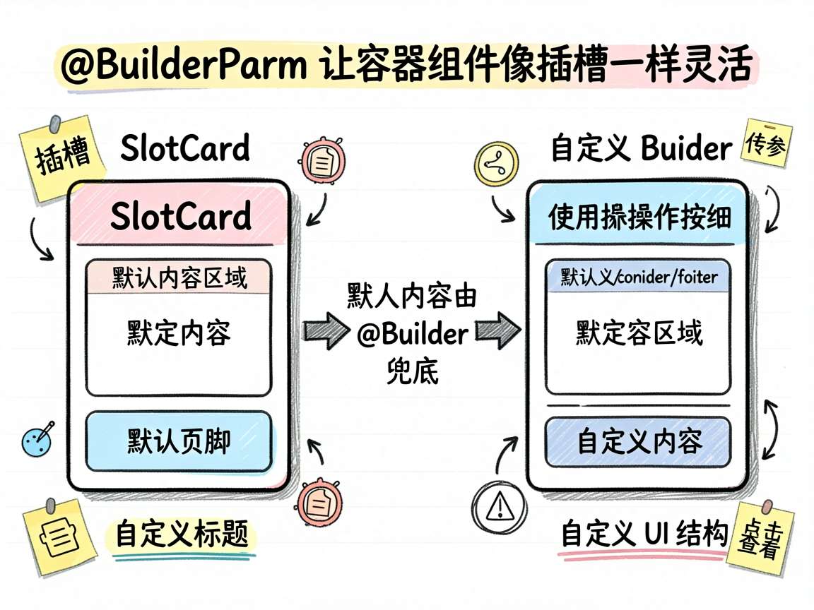
答案是 @BuilderParam。它就像 Web 开发中的"插槽"(slot)——容器组件预留好位置,使用方往里塞自定义 UI。这篇文章用一个"三段式卡片"的案例,把 @BuilderParam 的用法讲明白。
效果预览
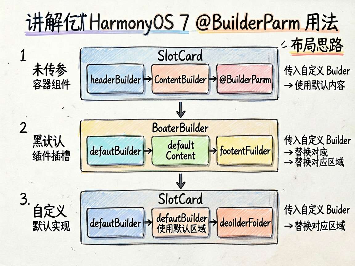
最终效果是一个 SlotCard 组件,它有 header、content、footer 三个插槽。可以全部使用默认内容,也可以每个插槽都自定义:
┌────────────────────┐    ┌────────────────────┐
│ 默认标题            │    │ 🔔 自定义标题       │
├────────────────────┤    ├────────────────────┤
│ 默认内容区域        │    │ 自定义内容...       │
│                    │    │ 可以完全自定义      │
│                    │    │ [操作1][操作2][操作3]│
├────────────────────┤    ├────────────────────┤
│ 默认页脚            │    │ ▼ 点击查看更多      │
└────────────────────┘    └────────────────────┘
左边是默认插槽,右边是自定义插槽。同一个组件,两种用法。
布局思路
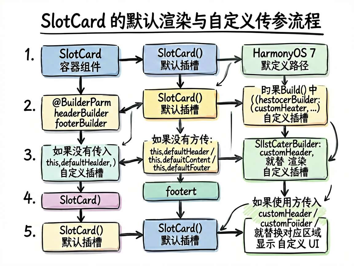
整体结构分三层:
- SlotCard 容器组件:定义三个
@BuilderParam插槽和对应的默认@Builder - 默认 Builder:当使用方没有传入自定义 Builder 时,使用默认内容
- 自定义 Builder:在使用方组件中定义,通过参数传递给 SlotCard
逐步实现
定义 SlotCard 容器组件
@Component
struct SlotCard {
  @BuilderParam headerBuilder: () => void = this.defaultHeader
  @BuilderParam contentBuilder: () => void = this.defaultContent
  @BuilderParam footerBuilder: () => void = this.defaultFooter

  @Builder defaultHeader() {
    Text('默认标题').fontSize(16).fontWeight(FontWeight.Bold)
  }

  @Builder defaultContent() {
    Text('默认内容区域').fontSize(13).fontColor('#666666')
  }

  @Builder defaultFooter() {
    Text('默认页脚').fontSize(11).fontColor('#CCCCCC')
  }

  build() {
    Column() {
      Column() { this.headerBuilder() }
        .width('100%').padding(12)
        .border({ width: { bottom: 1 }, color: '#E8E8E8' })

      Column() { this.contentBuilder() }
        .width('100%').padding(12)

      Column() { this.footerBuilder() }
        .width('100%').padding({ left: 12, right: 12, top: 8, bottom: 8 })
        .border({ width: { top: 1 }, color: '#E8E8E8' })
    }
    .width('100%').backgroundColor('#FFFFFF').borderRadius(12)
    .margin({ bottom: 10 })
  }
}
关键点解读:
@BuilderParam headerBuilder: () => void = this.defaultHeader:声明一个插槽,类型是() => void(即 Builder 函数),默认值是this.defaultHeader- 在
build()中用this.headerBuilder()调用插槽 - 每个插槽都有对应的默认
@Builder,保证不传参时也有内容显示
定义自定义 Builder
在使用方组件中,定义和插槽对应的 @Builder 函数:
@Builder customHeader() {
  Row() {
    Text('\u{1F514}').fontSize(18)
    Text('自定义标题').fontSize(16).fontWeight(FontWeight.Bold).margin({ left: 6 })
  }
}

@Builder customContent() {
  Column({ space: 6 }) {
    Text('这是通过 @BuilderParam 传入的自定义内容').fontSize(13)
    Text('可以完全自定义插槽中的 UI 结构').fontSize(13).fontColor('#4D96FF')
    Row({ space: 8 }) {
      Button('操作1').fontSize(11).height(28)
      Button('操作2').fontSize(11).height(28)
      Button('操作3').fontSize(11).height(28)
    }.margin({ top: 4 })
  }
}

@Builder customFooter() {
  Text('\u{25BC} 点击查看更多').fontSize(12).fontColor('#4D96FF')
}
使用 SlotCard
默认插槽和自定义插槽的使用方式:
// 默认插槽 - 不传参
SlotCard()

// 自定义插槽 - 传入自定义 Builder
SlotCard({
  headerBuilder: this.customHeader,
  contentBuilder: this.customContent,
  footerBuilder: this.customFooter
})
关键代码
完整的页面代码:
@Entry
@Component
struct BuilderParamSlotPage {
  @Builder customHeader() {
    Row() {
      Text('\u{1F514}').fontSize(18)
      Text('自定义标题').fontSize(16)
        .fontWeight(FontWeight.Bold).margin({ left: 6 })
    }
  }

  @Builder customContent() {
    Column({ space: 6 }) {
      Text('这是通过 @BuilderParam 传入的自定义内容').fontSize(13)
      Text('可以完全自定义插槽中的 UI 结构')
        .fontSize(13).fontColor('#4D96FF')
      Row({ space: 8 }) {
        Button('操作1').fontSize(11).height(28)
        Button('操作2').fontSize(11).height(28)
        Button('操作3').fontSize(11).height(28)
      }.margin({ top: 4 })
    }
  }

  @Builder customFooter() {
    Text('\u{25BC} 点击查看更多').fontSize(12).fontColor('#4D96FF')
  }

  build() {
    Column() {
      Scroll() {
        Column() {
          Text('@BuilderParam 插槽')
            .fontSize(18).fontWeight(FontWeight.Bold).margin({ bottom: 8 })

          Text('默认插槽')
            .fontSize(14).fontWeight(FontWeight.Medium).margin({ bottom: 8 })
          SlotCard()

          Text('自定义插槽')
            .fontSize(14).fontWeight(FontWeight.Medium)
            .margin({ top: 12, bottom: 8 })
          SlotCard({
            headerBuilder: this.customHeader,
            contentBuilder: this.customContent,
            footerBuilder: this.customFooter
          })
        }
        .width('100%')
      }
      .layoutWeight(1)
    }
    .width('100%').height('100%').backgroundColor('#F5F6FA').padding(16)
  }
}
踩坑记录
坑1:Builder 传参方式
传递 @Builder 给 @BuilderParam 时,要用 this.builderName 而不是 this.builderName()。前者传的是函数引用,后者是直接调用。
坑2:this 指向
传入的 @Builder 函数中的 this 指向的是定义它的组件,而不是 SlotCard。这意味着你在自定义 Builder 中访问的 @State 变量是使用方组件的,不是容器的。
坑3:类型签名
@BuilderParam 的类型必须是 () => void。不能加参数——如果需要参数传递,改用 @Builder 配合 @State 间接实现。
写在最后
@BuilderParam 让 ArkUI 的自定义组件有了真正的"插槽"能力。容器负责布局框架,使用方负责填充内容,这种模式在 UI 组件库开发中非常实用。做弹窗、卡片、列表项这些需要灵活定制内容的场景时,@BuilderParam 是首选方案。
更多推荐
 9
9 0
0- 0


 已为社区贡献1条内容

所有评论(0)