
【Python】Matplotlib库展示的的24种图表
·
Python代码,Matplotlib库展示的的24种图表
运行时对于缺少的库,注意及时
24种图表预览图
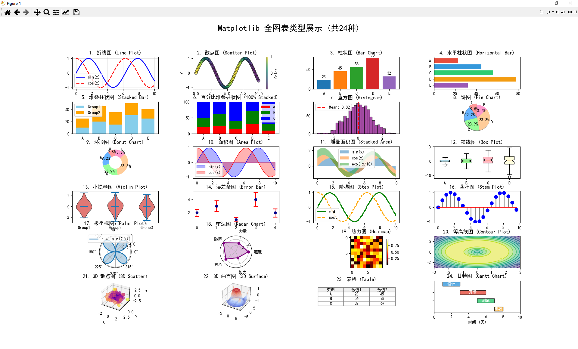
24种图表列表
| 序号 | 图表类型 | 函数 |
|---|---|---|
| 1 | 折线图 | plot() |
| 2 | 散点图 | scatter() |
| 3 | 柱状图 | bar() |
| 4 | 水平柱状图 | barh() |
| 5 | 堆叠柱状图 | bar(bottom=) |
| 6 | 百分比堆叠 | bar(bottom=, normed) |
| 7 | 直方图 | hist() |
| 8 | 饼图 | pie() |
| 9 | 环形图 | pie() + Circle |
| 10 | 面积图 | fill_between() |
| 11 | 堆叠面积 | fill_between(stacked) |
| 12 | 箱线图 | boxplot() |
| 13 | 小提琴图 | violinplot() |
| 14 | 误差条图 | errorbar() |
| 15 | 阶梯图 | step() |
| 16 | 茎叶图 | stem() |
| 17 | 极坐标图 | projection=‘polar’ |
| 18 | 雷达图 | polar + plot/fill |
| 19 | 热力图 | imshow() |
| 20 | 等高线图 | contour() / contourf() |
| 21 | 3D散点图 | projection=‘3d’ + scatter |
| 22 | 3D曲面图 | projection=‘3d’ + plot_surface |
| 23 | 表格 | table() |
| 24 | 甘特图 | barh(left=) |
24种图表代码
如果运行报错,可能是没有导入引用库的原因,可以win+r进入运行界面,
输入pip install matplotlib,可导入matplotlib库。
同理如果有其他库缺失报错,同样可以(pip install 库名)运行导入。
import matplotlib.pyplot as plt
import numpy as np
from mpl_toolkits.mplot3d import Axes3D
import matplotlib.gridspec as gridspec

# 设置中文字体
plt.rcParams['font.sans-serif'] = ['SimHei', 'DejaVu Sans']
plt.rcParams['axes.unicode_minus'] = False

# 生成示例数据
x = np.linspace(0, 10, 100)
y1 = np.sin(x)
y2 = np.cos(x)
y3 = np.exp(-x/10)
categories = ['A', 'B', 'C', 'D', 'E']
values = [23, 45, 56, 78, 32]
data = np.random.randn(1000)

# 创建大画布
fig = plt.figure(figsize=(20, 24))
gs = gridspec.GridSpec(6, 4, figure=fig, hspace=0.4, wspace=0.4)

# ========== 1. 折线图 (Line Plot) ==========
ax1 = fig.add_subplot(gs[0, 0])
ax1.plot(x, y1, label='sin(x)', color='blue', linewidth=2)
ax1.plot(x, y2, label='cos(x)', color='red', linewidth=2, linestyle='--')
ax1.set_title('1. 折线图 (Line Plot)')
ax1.legend()
ax1.grid(True, alpha=0.3)

# ========== 2. 散点图 (Scatter Plot) ==========
ax2 = fig.add_subplot(gs[0, 1])
ax2.scatter(x, y1, c=y2, cmap='viridis', s=50, alpha=0.6, edgecolors='k')
ax2.set_title('2. 散点图 (Scatter Plot)')
ax2.set_xlabel('X')
ax2.set_ylabel('Y')
plt.colorbar(ax2.collections[0], ax=ax2, label='Color')

# ========== 3. 柱状图 (Bar Chart) ==========
ax3 = fig.add_subplot(gs[0, 2])
bars = ax3.bar(categories, values, color=['#1f77b4', '#ff7f0e', '#2ca02c', '#d62728', '#9467bd'])
ax3.set_title('3. 柱状图 (Bar Chart)')
ax3.bar_label(bars, padding=3)

# ========== 4. 水平柱状图 (Horizontal Bar) ==========
ax4 = fig.add_subplot(gs[0, 3])
ax4.barh(categories, values, color=['#e74c3c', '#3498db', '#2ecc71', '#f39c12', '#9b59b6'])
ax4.set_title('4. 水平柱状图 (Horizontal Bar)')
ax4.invert_yaxis()

# ========== 5. 堆叠柱状图 (Stacked Bar) ==========
ax5 = fig.add_subplot(gs[1, 0])
ax5.bar(categories, [10, 20, 15, 30, 25], label='Group1', color='skyblue')
ax5.bar(categories, [15, 25, 20, 20, 15], bottom=[10, 20, 15, 30, 25], label='Group2', color='orange')
ax5.set_title('5. 堆叠柱状图 (Stacked Bar)')
ax5.legend()

# ========== 6. 百分比堆叠柱状图 (100% Stacked Bar) ==========
ax6 = fig.add_subplot(gs[1, 1])
data_stack = np.array([[20, 30, 50], [25, 35, 40], [15, 25, 60], [30, 40, 30], [10, 20, 70]])
data_norm = data_stack / data_stack.sum(axis=1, keepdims=True) * 100
ax6.bar(categories, data_norm[:, 0], label='A', color='red')
ax6.bar(categories, data_norm[:, 1], bottom=data_norm[:, 0], label='B', color='green')
ax6.bar(categories, data_norm[:, 2], bottom=data_norm[:, 0] + data_norm[:, 1], label='C', color='blue')
ax6.set_title('6. 百分比堆叠柱状图 (100% Stacked)')
ax6.set_ylim(0, 100)
ax6.legend()

# ========== 7. 直方图 (Histogram) ==========
ax7 = fig.add_subplot(gs[1, 2])
ax7.hist(data, bins=30, color='purple', alpha=0.7, edgecolor='black')
ax7.axvline(data.mean(), color='red', linestyle='--', linewidth=2, label=f'Mean: {data.mean():.2f}')
ax7.set_title('7. 直方图 (Histogram)')
ax7.legend()

# ========== 8. 饼图 (Pie Chart) ==========
ax8 = fig.add_subplot(gs[1, 3])
colors = ['#ff9999', '#66b3ff', '#99ff99', '#ffcc99', '#ff99cc']
explode = (0.1, 0, 0, 0, 0)
ax8.pie(values, labels=categories, autopct='%1.1f%%', startangle=90, colors=colors, explode=explode, shadow=True)
ax8.set_title('8. 饼图 (Pie Chart)')

# ========== 9. 环形图 (Donut Chart) ==========
ax9 = fig.add_subplot(gs[2, 0])
ax9.pie(values, labels=categories, autopct='%1.1f%%', startangle=90, colors=colors, pctdistance=0.85)
centre_circle = plt.Circle((0, 0), 0.50, fc='white')
ax9.add_artist(centre_circle)
ax9.set_title('9. 环形图 (Donut Chart)')

# ========== 10. 面积图 (Area Plot / Fill Between) ==========
ax10 = fig.add_subplot(gs[2, 1])
ax10.fill_between(x, y1, alpha=0.3, color='blue', label='sin(x)')
ax10.fill_between(x, y2, alpha=0.3, color='red', label='cos(x)')
ax10.plot(x, y1, color='blue', linewidth=1)
ax10.plot(x, y2, color='red', linewidth=1)
ax10.set_title('10. 面积图 (Area Plot)')
ax10.legend()

# ========== 11. 堆叠面积图 (Stacked Area) ==========
ax11 = fig.add_subplot(gs[2, 2])
ax11.fill_between(x, 0, y1, alpha=0.5, label='sin(x)')
ax11.fill_between(x, y1, y1 + y2, alpha=0.5, label='cos(x)')
ax11.fill_between(x, y1 + y2, y1 + y2 + y3, alpha=0.5, label='exp(-x/10)')
ax11.set_title('11. 堆叠面积图 (Stacked Area)')
ax11.legend()

# ========== 12. 箱线图 (Box Plot) ==========
ax12 = fig.add_subplot(gs[2, 3])
box_data = [np.random.normal(0, std, 100) for std in range(1, 5)]
bp = ax12.boxplot(box_data, labels=['A', 'B', 'C', 'D'], patch_artist=True, notch=True)
for patch, color in zip(bp['boxes'], ['lightblue', 'lightgreen', 'lightpink', 'lightyellow']):
    patch.set_facecolor(color)
ax12.set_title('12. 箱线图 (Box Plot)')

# ========== 13. 小提琴图 (Violin Plot) ==========
ax13 = fig.add_subplot(gs[3, 0])
parts = ax13.violinplot([data[:200], data[200:400], data[400:600]], showmeans=True, showmedians=True)
for pc in parts['bodies']:
    pc.set_facecolor('#D43F3A')
    pc.set_edgecolor('black')
    pc.set_alpha(0.7)
ax13.set_title('13. 小提琴图 (Violin Plot)')
ax13.set_xticks([1, 2, 3])
ax13.set_xticklabels(['Group1', 'Group2', 'Group3'])

# ========== 14. 误差条图 (Error Bar) ==========
ax14 = fig.add_subplot(gs[3, 1])
x_err = np.arange(5)
y_err = [2, 3, 1, 4, 2]
yerr = [0.5, 0.8, 0.3, 1.0, 0.6]
ax14.errorbar(x_err, y_err, yerr=yerr, fmt='o', capsize=5, capthick=2, ecolor='red', color='darkblue')
ax14.set_title('14. 误差条图 (Error Bar)')

# ========== 15. 阶梯图 (Step Plot) ==========
ax15 = fig.add_subplot(gs[3, 2])
ax15.step(x, y1, where='mid', label='mid', linewidth=2, color='green')
ax15.step(x, y2, where='post', label='post', linewidth=2, linestyle='--', color='orange')
ax15.set_title('15. 阶梯图 (Step Plot)')
ax15.legend()

# ========== 16. 茎叶图 (Stem Plot) ==========
ax16 = fig.add_subplot(gs[3, 3])
markerline, stemlines, baseline = ax16.stem(x[::5], y1[::5], linefmt='grey', markerfmt='bo', basefmt='r-')
plt.setp(stemlines, linewidth=2)
plt.setp(markerline, markersize=8)
ax16.set_title('16. 茎叶图 (Stem Plot)')

# ========== 17. 极坐标图 (Polar Plot) ==========
ax17 = fig.add_subplot(gs[4, 0], projection='polar')
theta = np.linspace(0, 2*np.pi, 100)
ax17.plot(theta, np.abs(np.sin(2*theta)), label='r = |sin(2θ)|', linewidth=2)
ax17.fill(theta, np.abs(np.sin(2*theta)), alpha=0.3)
ax17.set_title('17. 极坐标图 (Polar Plot)', va='bottom')
ax17.legend(loc='upper right', bbox_to_anchor=(1.1, 1.1))

# ========== 18. 雷达图 (Radar Chart) ==========
ax18 = fig.add_subplot(gs[4, 1], projection='polar')
categories_radar = ['速度', '力量', '防御', '技巧', '智力']
values_radar = [4, 3, 5, 4, 2]
angles = np.linspace(0, 2*np.pi, len(categories_radar), endpoint=False).tolist()
values_radar += values_radar[:1]
angles += angles[:1]
ax18.plot(angles, values_radar, 'o-', linewidth=2, color='purple')
ax18.fill(angles, values_radar, alpha=0.25, color='purple')
ax18.set_xticks(angles[:-1])
ax18.set_xticklabels(categories_radar)
ax18.set_title('18. 雷达图 (Radar Chart)', va='bottom')

# ========== 19. 热力图 (Heatmap) ==========
ax19 = fig.add_subplot(gs[4, 2])
heatmap_data = np.random.rand(10, 10)
im = ax19.imshow(heatmap_data, cmap='hot', interpolation='nearest')
ax19.set_title('19. 热力图 (Heatmap)')
plt.colorbar(im, ax=ax19, shrink=0.8)

# ========== 20. 等高线图 (Contour Plot) ==========
ax20 = fig.add_subplot(gs[4, 3])
X, Y = np.meshgrid(np.linspace(-3, 3, 100), np.linspace(-3, 3, 100))
Z = np.sin(np.sqrt(X**2 + Y**2))
contour = ax20.contour(X, Y, Z, levels=10, cmap='viridis')
ax20.contourf(X, Y, Z, levels=10, cmap='viridis', alpha=0.5)
ax20.clabel(contour, inline=True, fontsize=8)
ax20.set_title('20. 等高线图 (Contour Plot)')

# ========== 21. 3D 散点图 (3D Scatter) ==========
ax21 = fig.add_subplot(gs[5, 0], projection='3d')
x3d = np.random.randn(100)
y3d = np.random.randn(100)
z3d = np.random.randn(100)
colors_3d = np.sqrt(x3d**2 + y3d**2 + z3d**2)
ax21.scatter(x3d, y3d, z3d, c=colors_3d, cmap='plasma', s=50, alpha=0.6)
ax21.set_title('21. 3D 散点图 (3D Scatter)')
ax21.set_xlabel('X')
ax21.set_ylabel('Y')
ax21.set_zlabel('Z')

# ========== 22. 3D 曲面图 (3D Surface) ==========
ax22 = fig.add_subplot(gs[5, 1], projection='3d')
X_surf, Y_surf = np.meshgrid(np.linspace(-5, 5, 50), np.linspace(-5, 5, 50))
Z_surf = np.sin(np.sqrt(X_surf**2 + Y_surf**2))
ax22.plot_surface(X_surf, Y_surf, Z_surf, cmap='coolwarm', alpha=0.8, edgecolor='none')
ax22.set_title('22. 3D 曲面图 (3D Surface)')

# ========== 23. 表格 (Table) ==========
ax23 = fig.add_subplot(gs[5, 2])
ax23.axis('tight')
ax23.axis('off')
table_data = [['类别', '数值1', '数值2'],
              ['A', '23', '45'],
              ['B', '56', '78'],
              ['C', '32', '67']]
table = ax23.table(cellText=table_data, loc='center', cellLoc='center', colWidths=[0.3, 0.3, 0.3])
table.auto_set_font_size(False)
table.set_fontsize(10)
table.scale(1, 2)
for i in range(4):
    for j in range(3):
        table[(i, j)].set_facecolor('#f0f0f0' if i == 0 else 'white')
        table[(i, j)].set_edgecolor('gray')
ax23.set_title('23. 表格 (Table)', y=0.9)

# ========== 24. 甘特图风格 (Horizontal Bars with dates) ==========
ax24 = fig.add_subplot(gs[5, 3])
tasks = ['设计', '开发', '测试', '部署']
start = [1, 3, 5, 7]
duration = [2, 3, 2, 1]
colors_gantt = ['#3498db', '#e74c3c', '#2ecc71', '#f39c12']
for i, (task, s, d, c) in enumerate(zip(tasks, start, duration, colors_gantt)):
    ax24.barh(i, d, left=s, height=0.5, color=c, alpha=0.8, edgecolor='black')
    ax24.text(s + d/2, i, task, ha='center', va='center', color='white', fontweight='bold')
ax24.set_yticks(range(len(tasks)))
ax24.set_yticklabels([])
ax24.set_xlabel('时间 (天)')
ax24.set_title('24. 甘特图 (Gantt Chart)')
ax24.set_xlim(0, 10)
ax24.invert_yaxis()

plt.suptitle('Matplotlib 全图表类型展示 (共24种)', fontsize=20, fontweight='bold', y=0.98)
plt.tight_layout()
plt.savefig('matplotlib_all_charts.png', dpi=150, bbox_inches='tight')
plt.show()

print("✅ 图表已生成并保存为 matplotlib_all_charts.png")
更多推荐
 14
14 0
0- 0


 已为社区贡献6条内容

所有评论(0)