How can I place the navigation control of Woocommerce Product Gallery on the right side> [closed]
Answer a question
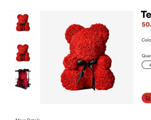
I am trying to style a custom theme for WordPress, currently, I am stuck at the single product page, where I can not work away with CSS or WooCommerce hooks and functions, to move the thumbnails from under the main picture to the left side, aligning vertically.
Here is an image that might describe my goals better.
Answers
This is a bit tricky, but hopefully it can help (I just did this for a recent site), but it's all CSS based. You may have to play with it in your instance.
The idea is to move the .woocommerce-product-gallery over a percentage and then absolutely position the .flex-control-nav to the left of the gallery. Setting it as a flex parent will stack the li (thumbnails). I created a very rough version of what Woocommerce outputs. You'll most likely need to make each selector more specific like body.single-product .product .woocommerce-product-gallery
This will get you close to what you want. If you run the snippet, view it fullscreen.
.product {
  position: relative;
  width: 100%;
  max-width: 1400px;
  margin: 0 auto;
}

figure {
  margin: 0;
}

.woocommerce-product-gallery {
  width: 33.3333% !important;
  margin: 0 !important;
  left: 8.333%;
  float: left;
  position: relative;
}

.flex-control-nav {
  display: flex;
  justify-content: space-between;
  position: absolute;
  top: 0;
  left: -25.0513347023%;
  width: calc(25% - 40px);
  flex-direction: column;
  margin-top: 0;
}

.flex-control-nav li {
  margin-bottom: 23px !important;
  width: 100% !important;
}

div.summary {
  float: right;
  width: 48%;
  clear: none;
}
<div id="product-1234" class="product">
  <div class="woocommerce-product-gallery woocommerce-product-gallery--with-images woocommerce-product-gallery--columns-5 images" data-columns="4" style="opacity: 1; transition: opacity 0.25s ease-in-out 0s;">
    <a href="#" class="woocommerce-product-gallery__trigger"></a>

    <div class="flex-viewport" style="overflow: hidden; position: relative; height: 544px;">
      <figure class="woocommerce-product-gallery__wrapper" style="width: 400%; transition-duration: 0s; transform: translate3d(0px, 0px, 0px);">
        <div data-thumb="https://via.placeholder.com/500x400" data-thumb-alt="" class="woocommerce-product-gallery__image flex-active-slide" style="width: 467px; margin-right: 0px; float: left; display: block;">
          <a href="https://via.placeholder.com/100x100"><img src="https://via.placeholder.com/400x500" class="wp-post-image" alt="" title="Placeholder" data-caption=""></a>
        </div>
      </figure>
    </div>
    <ol class="flex-control-nav flex-control-thumbs">
      <li><img src="https://via.placeholder.com/100x100" class="flex-active" draggable="false"></li>
      <li><img src="https://via.placeholder.com/100x100" draggable="false"></li>
    </ol>
  </div>

  <div class="summary entry-summary">
    <h1 class="product_title entry-title">Product Title</h1>
  </div>

</div>

WooCommerce社区为您提供最前沿的新闻资讯和知识内容
更多推荐
 0
0 0
0- 0


 已为社区贡献13067条内容

所有评论(0)