Introduction
Hi there, have you been thinking of how and when to start using NuxtJS to develop amazing vue applications, Alright, i'll take that as a yes, kindly grab a seat & ride with me.
Prerequisite->Vue.js
In this article, we'll demonstrate how to get started with NuxtJS & talk about the basic things required of you to know. Here is a list of what we will be covering
    * [Chapter 1](Setting up NuxtJS)
    * [Chapter 2](Nuxt Composition API)
    * [Chapter 3](Project)
    * [Chapter 4](How to use vee-validate with NuxtJS)
    * [Chapter 5](Lazy loading component)
    * [Chapter 6](Deployment to Netlify)
    * [Chapter 7](Conclusion)
Chapter 1: Setting up NuxtJS
NuxtJS is an intuitive open source framework which comes with simplicity , thereby helping in increasing productivity to get things done faster & delivering high performance server-side rendered web application with a focus on better developer experience. For more info on NuxtJS, check here NuxtJS
For this article, we'll be developing an address book. To get started, we start by installing NuxtJS, also we will be using Boostrapvue CSS framework with it. To install NuxtJS, run the following command
you can either use npm or yarn for package installation, for this tutorial, let's use yarn.
yarn create nuxt-app (project-name).
Project name here refers to the title you want to give your project. Here is what it looks like on my cmd,
After installing all dependencies, we can then navigate into the code editor and start the development server by running the code below
yarn dev
The image below shows what a NuxtJS project folder looks like.
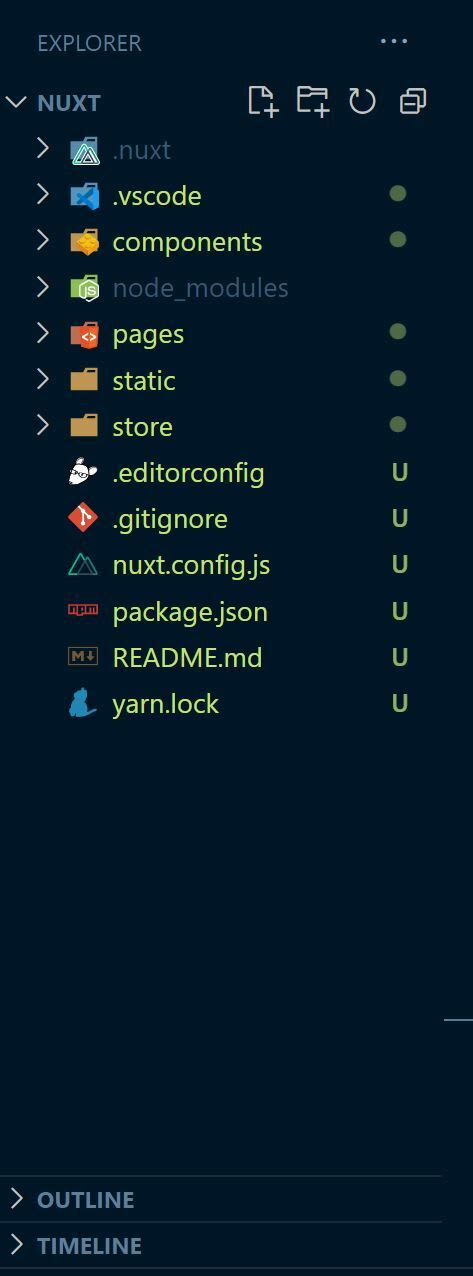
Chapter 2: Composition Api
NuxtJS composition API can be use with Vue 3, It provides a way to use the Vue 3 Composition API with Nuxt-specific features
To use the Composition API, you run the command shown below on your vscode terminal
yarn add @nuxtjs/composition-api
After installing composition API, the next step is to get it added to the buildModules in your nuxtconfig.js file. You can check here for more information. Composition API
buildModules: [
    '@nuxtjs/composition-api/module'
  ]
Chapter 3: Project
Now that we have installed all we needed, lets get started, We'll be building an app, It's an address book app. The first thing we will be doing is to create our routes.
To create a new route in NuxtJS, all you need to do is to create your file under the pages directory, NuxtJS will take care of all the routing configurations underneath for you. In our case, we will be creating three pages which are going to be called about, account & contact. For each of the pages, I've created an index.vue file where our code is going to be written. The pages are shown below

Also in the component folder, we'll be creating a sidebar and a Navbar component. Starting with the sidebar, the template section consists of a div with class name sidebar, the div contain three NuxtLink, this is what is going to be used for the redirection to various route, the pages created above is what is been passed into the to props. In addition, NuxtJS comes with a styling class that give styling to active classes, In the code below there is a class in style section with name a.nuxt-link-exact-active, it has a background color and color styling attached to it which get applied to any active pages the user clicked on. The sidebar.vue component code is shown below
Sidebar.vue code
<template>
    <div>
    <div class="head-text my-2 ml-1 px-2 py-2 ">
<h5 class="pt-2">AddressBook</h5>
</div>
<div class="sidebar ml-1 text-light">
      <NuxtLink class="sidebar-list"  to="/contact">Contact</NuxtLink> <br>
      <NuxtLink class="sidebar-list" to="/account">Account</NuxtLink> <br>
      <NuxtLink class="sidebar-list" to="/about">About</NuxtLink> <br>
</div>
    </div>
</template>

<script>
    export default {
    }
</script>

<style scoped>


.sidebar {
  height:100vh;
  width: 12rem;
   padding: 0.2rem;
   line-height:2.2;
   font-size:18px;
  background: #f5f5f5;
}

.head-text{
   background: #f5f5f5;
}
.sidebar-list{
  color: black;
  padding: 0.1rem;
  border-radius: 5px;
  padding-left: 0.5rem;
text-decoration: none;
}

a.nuxt-link-exact-active {
  color: white;
  background:#243B41;
  display: inline-block;
   width: 100%;
}


</style>
Now that we have created our sidebar, lets go ahead & create our Navbar, the Navbar is taken from bootstrap vue website, you can check into the bootstrap website to choose your desired. The navbar code is illustrated below
<template>
    <div>
        <div>
  <b-navbar toggleable="lg" class="ml-2 nav-text mt-2" type="light" >
    <b-navbar-brand href="#">NavBar</b-navbar-brand>

    <b-navbar-toggle target="nav-collapse"></b-navbar-toggle>

    <b-collapse id="nav-collapse" is-nav>
      <b-navbar-nav>
        <b-nav-item href="#">Link</b-nav-item>

      </b-navbar-nav>

      <!-- Right aligned nav items -->
      <b-navbar-nav class="ml-auto">
        <b-nav-form>
          <b-form-input size="sm" class="mr-sm-2" placeholder="Search"></b-form-input>
          <b-button size="sm" class="my-2 my-sm-0" type="submit">Search</b-button>
        </b-nav-form>


        <b-nav-item-dropdown right>
          <b-dropdown-item href="#">Profile</b-dropdown-item>
          <b-dropdown-item href="#">Sign Out</b-dropdown-item>
        </b-nav-item-dropdown>
      </b-navbar-nav>
    </b-collapse>
  </b-navbar>
</div>
    </div>
</template>

<script>
    export default {

    }
</script>

<style scoped>
.nav-text{
 background: #f5f5f5;
}
</style>
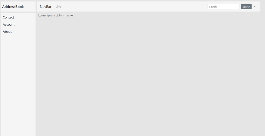
Let's take a look at the output below, before that, at the root folder of our pages, I have deleted the tutorial component that comes pre-installed with NuxtJS & also deleted it from the component folder. Right now what we have in the root folder is a lorem text, check out the output below.
Contact Page
The Contact page is a page with an index.vue file and inside this file, there is a component with name Address.vue. The Address.vue component is where we going to write our codes. The contact page index.vue code is shown below.
contact page (index.vue) code
<template>
    <div style="display:flex">
     <Address class="mx-4" />
    </div>
</template>

<script>
import Address from '../../components/Address.vue'
    export default {
        components:{Address}
    }
</script>

<style scoped>

</style>
In the template folder of our Address component, we have two input fields , (the b-form-input are gotten from bootstrapvue website) with a Save button. Each of the form input have their respective v-model. In the script folder, we start by importing ref from NuxtJS, followed by the codes to solve the problem. The code is shown below
Address.vue component code
<template>
<div class=" my-address" >
<h3 class="address-title mt-1">Address book</h3>
<div class="mt-4">
<form>
   <b-form-input
   placeholder="Name"
   v-model= "name" />

   <b-form-input
   class="mt-4"
   placeholder="Phone number"
   v-model= "numbers"
    />

    <b-button @click="saveMessage"
     :disabled="invalid"
    class="mt-3 address-btn"
    variant="info" >
    Save
    </b-button>
    </form>
  </div>

  <div class="contact-list mt-5">
  <h5>Contact List</h5>
  <div class="d-flex justify-content-between user-info p-2 mt-1"  v-for="results in result" :key="results">
<div class="">{{results.name}}</div>
<div class="">{{results.numbers}}</div>
  </div>
  </div>
  </div>
</template>

<script>
import {  ref } from "@nuxtjs/composition-api";
export default {
  name: 'Address',
  setup(){
    const name = ref('')
    const numbers = ref('')
    const result = ref([])
    const done = ref(false)

    const saveMessage=()=>{
     const message = {
        name:name.value,
        numbers:numbers.value,
     }
     result.value.push(message)
     name.value='',
     numbers.value=''
     done.value = true
    }

    return{ name, numbers, saveMessage, result, done }
  }
}
</script>

<style scoped>
.my-address{
width: 20rem;
}

.address-btn{
border: 1px solid green
}

.user-info{
  background: rgb(206, 210, 240);
  border-radius: 5px;
}
</style>
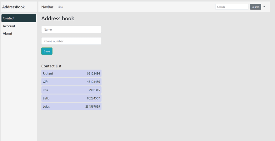
The output of the contact page is shown below
Contact page
Chapter 4: How to use vee-validate with NuxtJS
Lets talk about how to use vee-validate to enforce user to input in the required before submitting our forms, To do this in NuxtJS, we start by installing vee-validate & then run this on the terminal
yarn add vee-validate@3
After doing this, the next step is to add the vee-validate rules to the buildModules in the NuxtJS config files, You can check here for more info vee-validate with Nuxtjs
Adding vee-validate to the NuxtJS config files
build: {
  transpile: [
    "vee-validate/dist/rules"
  ],
  /*
    ** You can extend webpack config here
    */
  extend(config, ctx) {
    // ...
  }
}
Having done the following, we can now choose from the vee-validate available rules and get them applied to our code.
For our use case we will be using the required, alpha & numeric rule.Firstly, we will create a folder called plugins & inside the folder, we'll create a file called vee-validate.js. Inside the vee-validate.js file is where we'll import all the rules we'll be needing, check below to see code.
vee-validate.js
import { extend, } from 'vee-validate';
import { required,  numeric, alpha } from 'vee-validate/dist/rules';

extend('required', {
  ...required,
  message: 'This field is required',

});

extend('numeric', {
  ...numeric,
  message: 'The  field may only contain numbers',

});
extend('alpha', {
  ...alpha,
  message: 'The  field may only contain alphabetic letters',

});
Secondly, we'll add the plugin path to the NuxtJS config plugins
plugins: [
    "~/plugins/vee-validate.js",
  ],
After following the steps above, we can now make use of the rules globally in our code
For our first input field, we'll be using the required rule telling the user that its compulsory to fill their details & also the alpha rules telling the user only alphabet characters can be typed in. As for the second input field, we'll be using the required rule along side the numeric rules telling the users it is important to fill there details and its only numbers that is allowed.
Going back to our Address.vue component , we start by importing the ValidationProvider, ValidationObserver from vee-validate followed by adding them to the component in the script folder & returning them in the setup. Having done this, the next thing to be done is to wrap the form element with ValidationObserver. Each of the input fields is to be wrapped with validationProvider & the rules. After the form input is a div with span attribute, the span is the error msg to be displayed if the user didn't obey any of the validation rules. On each of the input fields , we have a (v-on:keyup="resetDone"), the resetDone function is to take off the error msg after submitting our forms. Also our button has a disabled prop with invalid passed to it. The invalid is coming from vee-validate, this is going to disable the button making it unclickable until the user passes every of the validation rules set to it. Code is shown below
<template>
<div class=" my-address" >
<h3 class="address-title">Address book</h3>
<div class="mt-4">
  <ValidationObserver v-slot="{ invalid }">
<form>
<ValidationProvider rules="required|alpha" v-slot="{ errors }">
   <b-form-input  v-on:keyup="resetDone"
   placeholder="Name"
   v-model= "name" />
<div class="" style="position: relative; padding-bottom:0.1rem ">
                                <span v-if="!done" style="color:red; position: absolute; left:0;">{{ errors[0] }}</span>
                                </div>
           </ValidationProvider>

<ValidationProvider rules="required|numeric" v-slot="{ errors }">
   <b-form-input v-on:keyup="resetDone"
   class="mt-4"
   placeholder="Phone number"
   v-model= "numbers"
    />
<div class="" style="position: relative; padding-bottom:0.1rem ">
                                <span v-if="!done" style="color:red; position: absolute; left:0;">{{ errors[0] }}</span>
                                </div>
           </ValidationProvider>

    <b-button @click="saveMessage"
     :disabled="invalid"
    class="mt-4 address-btn"
    variant="info" >
    Save
    </b-button>
    </form>
  </ValidationObserver>
  </div>

  <div class="contact-list mt-4">
  <h5>Contact List</h5>
  <div class="d-flex justify-content-between user-info p-2 mt-1"  v-for="results in result" :key="results">
<div class="">{{results.name}}</div>
<div class="">{{results.numbers}}</div>
  </div>
  </div>
  </div>
</template>

<script>
import {  ref } from "@nuxtjs/composition-api";
import { ValidationProvider, ValidationObserver } from 'vee-validate';
export default {
  name: 'Address',
  components:{ValidationProvider, ValidationObserver},
  setup(){
    const name = ref('')
    const numbers = ref('')
    const result = ref([])
    const done = ref(false)

    const saveMessage=()=>{
     const message = {
        name:name.value,
        numbers:numbers.value,
     }
     result.value.push(message)
     name.value='',
     numbers.value=''
     done.value = true
    }

    //  resetDone(){
    //   if(this.done == false) return
    //   this.done=false
    // }
    const resetDone=()=>{
      if(done.value == false) return
    }
    return{ name, numbers, saveMessage, result, done, resetDone }
  }
}
</script>

<style scoped>
.my-address{
width: 20rem;
}

.address-title{
  margin-top: 1rem;
}

.address-btn{
border: 1px solid green
}

.user-info{
  background: rgb(236, 238, 251);
  border-radius: 5px;
}
</style>
Output is shown below

The output below shows different error state as passed into our code, also the button is disabled & get enabled only when user has obey the validation rules.
Chapter 5: Lazy Loading component
Lets talk about lazy loading. LazyLoading is a good way of reducing less API calls until a user really needs to. Imagine having about 10 API calls to mount at the same time, this can really slow down your application, the best thing is to lazy load the components until when the page is been clicked on.
In this tutorial, we'll be lazyloading the about.vue page. In the index.vue of the about page , we have our AboutPage.vue component attached. To lazyLoad this, all you need do is add Lazy at the front of the AboutPage component. There is a v-if with name show attached to the component & also a function showData attached to the button.
In our script folder, our show is set to false by default and in the showData function, we turn it true which means that its only when that button is been clicked that it should make the API calls. Code is shown below
about page index.vue
<template>
    <div>
    <div class="ml-3 mt-4">
    <h5>Hello World</h5>
    <b-button @click="showData"
    class="mt-2"
    variant="info" >
    Click Me
    </b-button>
    </div>

    <div v-if="show">
      <LazyAboutPage  />
      </div>
    </div>
</template>

<script>
import { ref, } from '@vue/composition-api'
    export default {

        setup(){
            const show =ref(false)
            const showData=()=>{
                show.value=true
            }
            return { show, showData,}
        }
    }
</script>


<style scoped></style>
The AboutPage.vue component is where we call an endpoint, this endpoint is gotten from JSON Placeholder, link can be found here fake Json api. Code is attached below
<template>
    <div>
<div class="row ml-1">
  <div class="col-md-6 mt-3" v-for="todos in todo" :key="todos.id">
    <div class="card todo-card mt-2 p-2">
       {{todos.username}}
    </div>
  </div>
</div>
    </div>
</template>

<script>
import axios from 'axios'
import {  ref, useFetch } from '@nuxtjs/composition-api';
    export default {
        setup(){
            const todo = ref('')

             useFetch(async () => {
      await axios.get('https://jsonplaceholder.typicode.com/users')
     .then( response => todo.value = response?.data)
      .catch(error => console.log(error))
    })

            return { todo}
        }
    }
</script>

<style scoped>
.todo-card{
    border: 0.7px solid rgb(90, 65, 62);
}
</style>
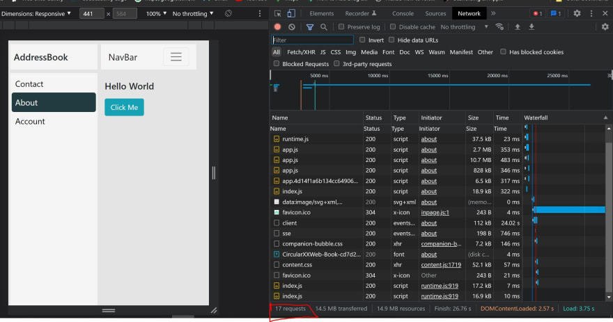
A snippet of our network tab before and after the API is called is displayed below
Before clicking our button
In our about.vue page, our network tab only had 17 request on first mount, meaning that it hasn't make the API call, remember we have lazy load the component meaning, its until when the button is been clicked before it makes the API call
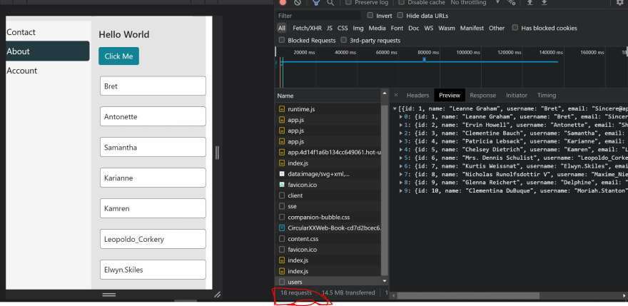
After clicking the button
Now that the button has been clicked, it then makes the API request, now showing total of 18 request.
Lazy Loading is a really a great way to improving the performance of your code.
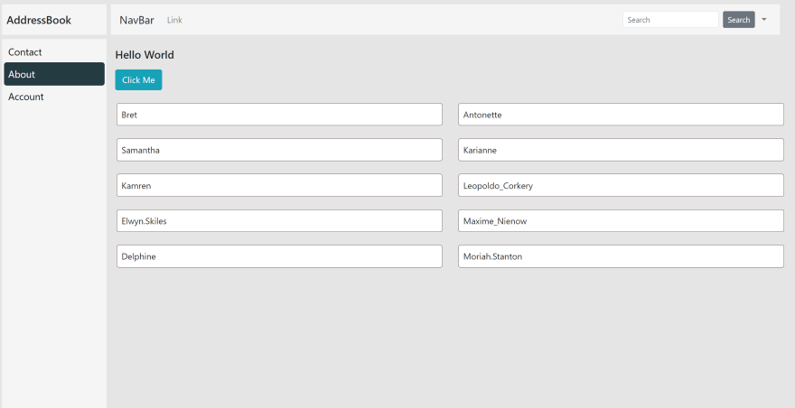
Here is the output of the about.vue page
Image (Full output )
Also we have the account page, Before I talk about the account page, lets talk about how to make our sidebar appears on every pages clicked on. To do this, we'll create a folder named layouts(this is from NuxtJS). Inside our layout folder we create a file name default.vue. Here is where we are going to import our sidebar and navbar components into. Whatever is been called in the default page is definitely going to be applicable through out the application. There is a <Nuxt /> at the end of our mainnav div, this is the entry point of our application in NuxtJs.
layouts>>default.vue
<template>
    <div class="wrapper" style="display: flex">
    <Sidebar />
    <div class="">
    <div class="nav-title">
    <MainNav />
    </div>
    <Nuxt />
    </div>
    </div>
</template>

<script>
    export default {

    }
</script>

<style  scoped>
.wrapper{
    background: #e5e5e5;
}

.nav-title{
width: calc(100vw - 14rem);
}
</style>
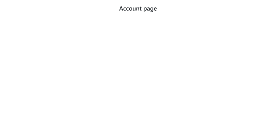
Back to our account page. Account page isn't different from the rest of the page but on this page, we don't want neither the navbar or sidebar to show. There are instance where you don't want a certain style which is already passed to the layout folder to be applicable to a page (e.g login page ) & that's what we want to achieve with this page.
To achieve this, we create a file under the layout directory, we'll name it no-sidenav.vue. Inside the file we won't be adding the sidebar and navbar as it is in the layout, The code is shown below
<template>
<div class="">
<Nuxt />
   </div>
</template>

<script>
export default {
  setup () {
  }
}
</script>
Now we can make use of it in the account page, all we need do is to add the no-sidenav to the layout in the script section. Code is shown below.
account.vue
<template>
    <div>
        <h2 class="text-center mt-4"> Account page</h2>
    </div>
</template>

<script>
    export default {
           layout: "no-sidenav",
    }
</script>

<style scoped>

</style>
The output is shown below
Chapter 6: Deployment to Netlify
To deploy to netlify, we'll go ahead and edit the build settings in our netlify dashboard. As shown below.
Chapter 7: Conclusion
This tutorial has walk us through on how to use NuxtJS to develop amazing Vue projects. The GitHub link code can be found here. Thanks for reading
!happyCoding




 已为社区贡献6083条内容

所有评论(0)