vue 实现一个简单的全局调用弹窗
1.实现效果图2.第一步,新建一个.vue文件 定义一个弹框的基本模板style样式放在了文章的最底部,如果需要看效果,需要将样式放入这个vue文件里,样式是用less写的,需要你的项目引入less注意:我这里的组件右上角关闭是一张图片 需要换成你自己本地的路径<template><div id="tip_alertModal"><...
·
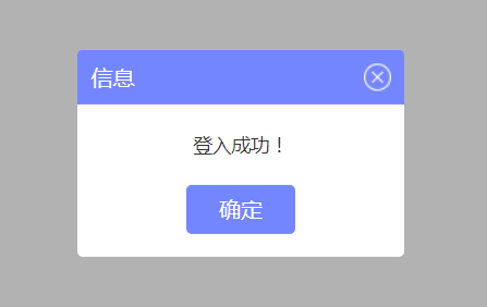
1.实现效果图

2.第一步,新建一个.vue文件 定义一个弹框的基本模板
 style样式放在了文章的最底部,如果需要看效果,需要将样式放入这个vue文件里
 ,样式是用less写的,需要你的项目引入less
 注意:我这里的组件右上角关闭是一张图片 需要换成你自己本地的路径
<template>
  <div id="tip_alertModal">
    <div class="t-alert-mask"></div>
    <div class="t-alert-container">
      <div class="t-alert-title">
        <span>
          {{title}}
        </span>
        <img @click="close" src="../../../static/images/alert/guanbi.png" alt="">
      </div>
      <div class="t-alert-content">
        <span class="content-text">
          {{content}}
        </span>
      </div>
      <div class="t-alert-confirm">
        <button @click="confirm">确定</button>
        <!-- 默认是没有取消按钮的,data定义默认true false -->
        <button class="cancel-btn" v-show="cancelBtn" @click="cancel">取消</button>
      </div>
    </div>
  </div>
</template>

<script>
  export default {
    data() {
      return {
        show: true, // 通过这个属性,控制是否移除dom元素
        title:'', // 顶部标题
        content:'', // 内容
        cancelBtn: false // 取消按钮
      };
    },
    methods: {
      close() {
        // 右上角关闭
        this.a_close && this.a_close();
        this.show = false;
        // 删除判断增加的window属性
        delete window.alertIsShow;
      },
      confirm() {
        // 确定
        this.a_confirm && this.a_confirm();
        this.show = false;
        // 删除判断增加的window属性
        delete window.alertIsShow;
      },
      cancel() {
        // 取消
        this.a_cancel && this.a_cancel();
        this.show = false;
        // 删除判断增加的window属性
        delete window.alertIsShow;
      }
    },
    watch: {
      show(cur, old) {
      	// 通过监控data里的show属性  弹框有三个事件(右上角取消  确定按钮  取消按钮)
      	// 每个事件写了 this.show = false
      	// 当弹框出现的时候 点击任何一个事件  都会触发这里的监控事件  将页面上的弹框Dom移除
        if (cur === false) {
          let tip_alert = document.getElementById('tip_alertModal');
          tip_alert.parentNode.removeChild(tip_alert);
        }
      }
    }
  }
</script>
3.定义一个js文件
import Vue from 'vue';
import Alert from '@/components/public/alertModal'; //引入刚才写的弹框组件
let AlertConstructor = Vue.extend(Alert); // 返回一个“扩展实例构造器”

let AlertModal = (o) => {
  let alertDom = new AlertConstructor({
    el: document.createElement('div'); //将Alert组件挂载到新创建的div上
  })
  document.body.appendChild(alertDom.$el); //把Alert组件的dom添加到body里

  // 标题
  alertDom.title = o.title || '信息';
  // 单条内容
  alertDom.content = o.content;
  // 关闭按钮
  alertDom.cancelBtn = o.cancelBtn;

  // 弹框三个事件 右上角关闭 确定 取消
  alertDom.a_close = o.close || null;
  alertDom.a_confirm = o.confirm || null;
  alertDom.a_cancel = o.cancel || null;

}
export default AlertModal;
4.mian.js
import alert from '@/common/alertModal' //这里引入的是js文件
Vue.prototype.$alert = alert;
5.在任意组件调用
<template>
  <div>
    <button @click="operate">点击调用弹框</button>
  </div>
</template>

<script>
export default {
  methods: {
    operate() {
      this.$alert({
        title: '信息',
        content: '登入成功!',
        cancelBtn: true, //这个是启用取消按钮,
        close() {
          // 这里执行点击右上角需要做的事,默认执行关闭弹框
        },
        confirm() {
          // 这里执行点击确定按钮需要做的事,默认执行关闭弹框
        },
        cancel() {
          // 这里执行点击取消按钮需要做的事,默认执行关闭弹框
        }
      })
    }
  }
}
</script>
取消按钮开启

调用之后是往body添加元素

5.通过window.alertIsShow,给window增加一个属性,来控制一个页面只会出现一个弹框
methods: {
    operate () {
      if (!window.alertIsShow) {
        // 弹框模板有个 delete window.alertIsShow 是为了弹框关闭之后能再次显示
        this.$alert({
          title: '信息',
          content: '登入成功!',
          cancelBtn: true,
          close () {
            // 这里执行点击右上角需要做的事,默认执行关闭弹框
          },
          confirm () {
            // 这里执行点击确定按钮需要做的事,默认执行关闭弹框
          },
          cancel () {
            // 这里执行点击取消按钮需要做的事,默认执行关闭弹框
          }
        })
        window.alertIsShow = true;
      }
    }
  }
6.最后是弹框组件的less样式
<style lang="less" scoped>
  #tip_alertModal {
    position: fixed;
    left: 0;
    top: 0;
    z-index: 100;
    width: 100%;
    height: 100%;

    .t-alert-mask {
      position: absolute;
      top: 0;
      left: 0;
      width: 100%;
      height: 100%;
      background-color: rgba(0, 0, 0, .3);
    }

    .t-alert-container {
      position: absolute;
      top: 50%;
      left: 50%;
      min-width: 240px;
      max-width: 400px;
      height: auto;
      background-color: #fff;
      transform: translate(-50%, -50%);
      border-radius: 4px;

      .t-alert-title {
        position: relative;
        width: 100%;
        height: 40px;
        line-height: 40px;
        background-color: rgba(115, 134, 255, 1);
        border-radius: 4px 4px 0px 0px;

        span {
          position: absolute;
          top: 50%;
          left: 10px;
          font-weight: 500;
          font-size: 16px;
          color: #fff;
          transform: translate(0, -50%);
        }

        img {
          position: absolute;
          top: 50%;
          right: 10px;
          transform: translate(0, -50%);
          cursor: pointer;
        }
      }

      .t-alert-content {
        text-align: center;
        span {
          font-family: PingFangSC-Regular;
          font-weight: 400;
          font-size: 14px;
          color: rgba(51,51,51,1);
        }

        span.content-text {
          display: inline-block;
          width: 100%;
          height: auto;
          font-weight: 400;
          font-size: 14px;
          color: #333;
          padding: 20px 18px;
        }
        .t-content-list {
            min-width: 320px;
            height: auto;
            text-align: left;
          .list-title {
            position: relative;
            padding: 10px 0 10px 10px;
            img {
              display: inline-block;
              position: absolute;
              width: 20px;
              margin-right: 10px;
            }
            span {
              display: inline-block;
              vertical-align: middle;
              padding-left: 31px;
            }
          }
          .list-content {
            width: 100%;
            height: auto;
            ul {
              padding-bottom: 10px;
              li {
                width: 100%;
                height: auto;
                padding-bottom: 10px;
                span {
                  vertical-align: top;
                }
                span.title {
                  display: inline-block;
                  padding-left: 41px;
                  padding-right: 3px;
                  text-align: left;
                }
              }
            }
          }
        }
      }

      .t-alert-confirm {
        width: 100%;
        padding-bottom: 17px;
        text-align: center;

        button {
          display: inline-block;
          width: 80px;
          height: 36px;
          border: none;
          background: rgba(115, 134, 255, 1);
          font-weight: 400;
          font-size: 16px;
          color: #fff;
          border-radius: 4px;
          outline: none;
          cursor: pointer;
        }
        .cancel-btn {
          margin-left:20px;
          background:rgba(151,193,234,1);
          font-family: PingFangSC-Regular;
          font-weight: 400;
          font-size: 16px;
          color: rgba(255,255,255,1);
        }
      }
    }
  }
</style>
如果本篇文章对你有帮助的话,很高兴能够帮助上你。
当然,如果你觉得文章有什么让你觉得不合理、或者有更简单的实现方法又或者有理解不来的地方,希望你在看到之后能够在评论里指出来,我会在看到之后尽快的回复你。

前往低代码交流专区
更多推荐

 11
11 0
0- 0


 已为社区贡献18条内容

所有评论(0)