
【前端系列】36种button样式
36种漂亮的CSS3网页按钮Button样式body{background: #f5faff;}.demo_con{width: 960px;margin:40px auto 0
·
💝💝💝欢迎来到我的博客,很高兴能够在这里和您见面!希望您在这里可以感受到一份轻松愉快的氛围,不仅可以获得有趣的内容和知识,也可以畅所欲言、分享您的想法和见解。
- 推荐:kuan 的首页,持续学习,不断总结,共同进步,活到老学到老
- 导航
非常期待和您一起在这个小小的网络世界里共同探索、学习和成长。💝💝💝 ✨✨ 欢迎订阅本专栏 ✨✨

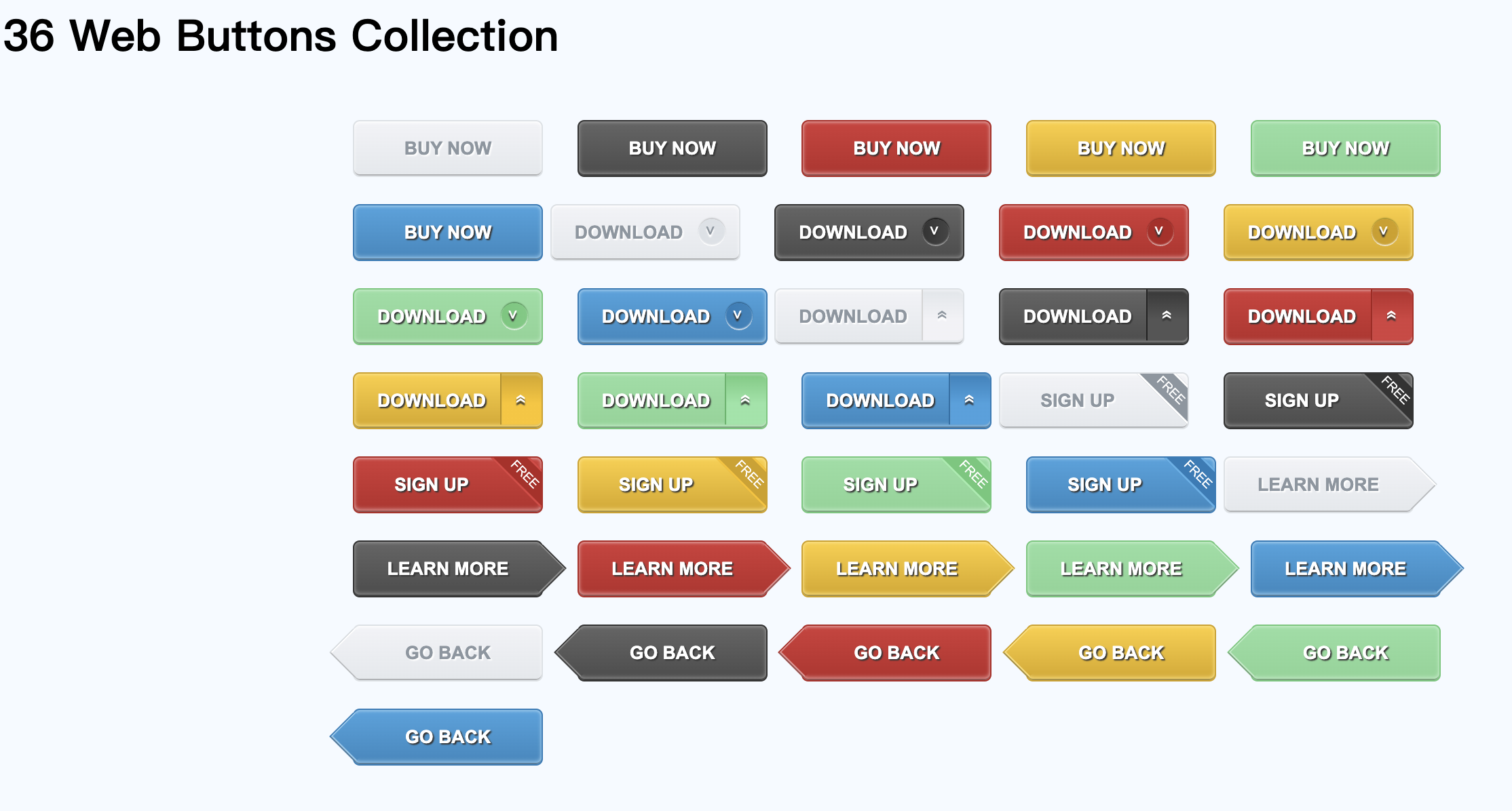
1.效果图
2.详细代码
<!DOCTYPE HTML>
<html lang="en-US">
<head>
<meta charset="UTF-8">
<title>36种漂亮的CSS3网页按钮Button样式</title>
<style type="text/css">
body{
background: #f5faff;
}
.demo_con{
width: 960px;
margin:40px auto 0;
}
.button{
width: 140px;
line-height: 38px;
text-align: center;
font-weight: bold;
color: #fff;
text-shadow:1px 1px 1px #333;
border-radius: 5px;
margin:0 20px 20px 0;
position: relative;
overflow: hidden;
}
.button:nth-child(6n){
margin-right: 0;
}
.button.gray{
color: #8c96a0;
text-shadow:1px 1px 1px #fff;
border:1px solid #dce1e6;
box-shadow: 0 1px 2px #fff inset,0 -1px 0 #a8abae inset;
background: -webkit-linear-gradient(top,#f2f3f7,#e4e8ec);
background: -moz-linear-gradient(top,#f2f3f7,#e4e8ec);
background: linear-gradient(top,#f2f3f7,#e4e8ec);
}
.button.black{
border:1px solid #333;
box-shadow: 0 1px 2px #8b8b8b inset,0 -1px 0 #3d3d3d inset,0 -2px 3px #8b8b8b inset;
background: -webkit-linear-gradient(top,#656565,#4c4c4c);
background: -moz-linear-gradient(top,#656565,#4a4a4a);
background: linear-gradient(top,#656565,#4a4a4a);
}
.button.red{
border:1px solid #b42323;
box-shadow: 0 1px 2px #e99494 inset,0 -1px 0 #954b4b inset,0 -2px 3px #e99494 inset;
background: -webkit-linear-gradient(top,#d53939,#b92929);
background: -moz-linear-gradient(top,#d53939,#b92929);
background: linear-gradient(top,#d53939,#b92929);
}
.button.yellow{
border:1px solid #d2a000;
box-shadow: 0 1px 2px #fedd71 inset,0 -1px 0 #a38b39 inset,0 -2px 3px #fedd71 inset;
background: -webkit-linear-gradient(top,#fece34,#d8a605);
background: -moz-linear-gradient(top,#fece34,#d8a605);
background: linear-gradient(top,#fece34,#d8a605);
}
.button.green{
border:1px solid #64c878;
box-shadow: 0 1px 2px #b9ecc4 inset,0 -1px 0 #6c9f76 inset,0 -2px 3px #b9ecc4 inset;
background: -webkit-linear-gradient(top,#90dfa2,#84d494);
background: -moz-linear-gradient(top,#90dfa2,#84d494);
background: linear-gradient(top,#90dfa2,#84d494);
}
.button.blue{
border:1px solid #1e7db9;
box-shadow: 0 1px 2px #8fcaee inset,0 -1px 0 #497897 inset,0 -2px 3px #8fcaee inset;
background: -webkit-linear-gradient(top,#42a4e0,#2e88c0);
background: -moz-linear-gradient(top,#42a4e0,#2e88c0);
background: linear-gradient(top,#42a4e0,#2e88c0);
}
.round,
	.side,
	.tags{
padding-right: 30px;
}
.round:after{
position: absolute;
display: inline-block;
content: "\003c";
top:50%;
right:10px;
margin-top: -10px;
width: 17px;
height: 20px;
padding-left: 3px;
line-height:18px;
font-size: 10px;
font-weight: normal;
border-radius: 10px;
text-shadow:-2px 0 1px #333;
-webkit-transform:rotate(-90deg);
-moz-transform:rotate(-90deg);
transform:rotate(-90deg);
}
.gray.round:after{
box-shadow:1px 0 1px rgba(255,255,255,1) inset,1px 0 1px rgba(0,0,0,.2);
background:-webkit-linear-gradient(top,#dce1e6,#dde2e7);
background:-moz-linear-gradient(top,#dce1e6,#dde2e7);
background:linear-gradient(top,#dce1e6,#dde2e7);
text-shadow:-2px 0 1px #fff;
}
.black.round:after{
box-shadow:1px 0 1px rgba(255,255,255,.5) inset,1px 0 1px rgba(0,0,0,.9);
background:-webkit-linear-gradient(top,#333,#454545);
background:-moz-linear-gradient(top,#333,#454545);
background:linear-gradient(top,#333,#454545);
}
.red.round:after{
box-shadow:1px 0 1px rgba(255,255,255,.6) inset,1px 0 1px rgba(130,25,25,.9);
background:-webkit-linear-gradient(top,#b12222,#b42323);
background:-moz-linear-gradient(top,#b12222,#b42323);
background:linear-gradient(top,#b12222,#b42323);
}
.yellow.round:after{
box-shadow:1px 0 1px rgba(255,255,255,.8) inset,1px 0 1px rgba(148,131,4,.9);
background:-webkit-linear-gradient(top,#cf9d00,#d2a000);
background:-moz-linear-gradient(top,#cf9d00,#d2a000);
background:linear-gradient(top,#cf9d00,#d2a000);
}
.green.round:after{
box-shadow:1px 0 1px rgba(255,255,255,.8) inset,1px 0 1px rgba(51,126,66,.9);
background:-webkit-linear-gradient(top,#64c878,#6dcb80);
background:-moz-linear-gradient(top,#64c878,#6dcb80);
background:linear-gradient(top,#64c878,#6dcb80);
}
.blue.round:after{
box-shadow:1px 0 1px rgba(255,255,255,.8) inset,1px 0 1px rgba(18,85,128,.9);
background:-webkit-linear-gradient(top,#1e7db9,#2b85bd);
background:-moz-linear-gradient(top,#1e7db9,#2b85bd);
background:linear-gradient(top,#1e7db9,#2b85bd);
}
.side:after{
position: absolute;
display: inline-block;
content: "\00bb";
top:3px;
right:-4px;
width: 38px;
height:30px;
font-weight: normal;
line-height: 26px;
border-radius:0 0 5px 5px;
text-shadow:-2px 0 1px #333;
-webkit-transform:rotate(-90deg);
-moz-transform:rotate(-90deg);
transform:rotate(-90deg);
}
.gray.side:after{
text-shadow:-2px 0 1px #fff;
border-top: 1px solid #d4d4d4;
box-shadow:-2px 0 1px #eceef1 inset;
background:-webkit-linear-gradient(right,#e1e6ea,#f2f2f6 60%);
background:-moz-linear-gradient(right,#e1e6ea,#f2f2f6 60%);
background:linear-gradient(right,#e1e6ea,#f2f2f6 60%);
}
.black.side:after{
border-top: 1px solid #222;
box-shadow:-2px 0 1px #606060 inset;
background:-webkit-linear-gradient(right,#373737,#555 60%);
background:-moz-linear-gradient(right,#373737,#555 60%);
background:linear-gradient(right,#373737,#555 60%);
}
.red.side:after{
border-top: 1px solid #aa1e1e;
box-shadow:-2px 0 1px #c75959 inset;
background:-webkit-linear-gradient(right,#b82929,#d73f3f 60%);
background:-moz-linear-gradient(top,#b82929,#d73f3f 60%);
background:linear-gradient(top,#b82929,#d73f3f 60%);
}
.yellow.side:after{
border-top: 1px solid #ba8f06;
box-shadow:-2px 0 1px #deb842 inset;
background:-webkit-linear-gradient(right,#d5a406,#fdc40b 60%);
background:-moz-linear-gradient(right,#d5a406,#fdc40b 60%);
background:linear-gradient(right,#d5a406,#fdc40b 60%);
}
.green.side:after{
border-top: 1px solid #53b567;
box-shadow:-2px 0 1px #8ad599 inset;
background:-webkit-linear-gradient(right,#69ca7c,#91e5a5 60%);
background:-moz-linear-gradient(right,#69ca7c,#91e5a5 60%);
background:linear-gradient(right,#69ca7c,#91e5a5 60%);
}
.blue.side:after{
border-top: 1px solid #1971a8;
box-shadow:-2px 0 1px #559dca inset;
background:-webkit-linear-gradient(right,#2482bd,#3fa2e0 60%);
background:-moz-linear-gradient(right,#2482bd,#3fa2e0 60%);
background:linear-gradient(right,#2482bd,#3fa2e0 60%);
}
.tags:after{
font-weight: normal;
position: absolute;
display: inline-block;
content: "FREE";
top:-3px;
right: -33px;
color: #fff;
text-shadow:none;
width: 85px;
height:25px;
line-height: 28px;
-webkit-transform:rotate(45deg) scale(.7,.7);
-moz-transform:rotate(45deg) scale(.7,.7);
transform:rotate(45deg) scale(.7,.7);
}
.gray.tags:after{
background: #8c96a0;
border:2px solid #fff;
}
.black.tags:after{
background: #333;
border:2px solid #777;
}
.red.tags:after{
background: #b42323;
border:2px solid #df4141;
}
.yellow.tags:after{
background: #d2a000;
border:2px solid #fcc100;
}
.green.tags:after{
background: #64c878;
border:2px solid #9bebac;
}
.blue.tags:after{
background: #1e7db9;
border:2px solid #54b1e9;
}
.button.rarrow,
	.button.larrow{
overflow:visible;
}
.rarrow:after,
	.rarrow:before,
	.larrow:after,
	.larrow:before{
position:absolute;
content: "";
display: block;
width: 28px;
height: 28px;
-webkit-transform:rotate(45deg);
-moz-transform:rotate(45deg);
transform:rotate(45deg);
}
.rarrow:before{
width: 27px;
height: 27px;
top: 6px;
right: -13px;
clip: rect(auto auto 26px 2px);
}
.rarrow:after{
top: 6px;
right: -12px;
clip: rect(auto auto 26px 2px);
}
.gray.rarrow:before{
background: #d6dbe0;
}
.gray.rarrow:after{
box-shadow: 0 1px 0 #fff inset,-1px 0 0 #b7babd inset;
background:-webkit-linear-gradient(top left,#f2f3f7,#e4e8ec);
background:-moz-linear-gradient(top left,#f2f3f7,#e4e8ec);
background:linear-gradient(top left,#f2f3f7,#e4e8ec);
}
.black.rarrow:before{
background: #333;
}
.black.rarrow:after{
box-shadow: 0 1px 0 #8B8B8B inset,-1px 0 0 #3d3d3d inset,-2px 0 0 #8B8B8B inset;
background:-webkit-linear-gradient(top left,#656565,#4C4C4C);
background:-moz-linear-gradient(top left,#656565,#4C4C4C);
background:linear-gradient(top left,#656565,#4C4C4C);
}
.red.rarrow:before{
background: #B42323;
}
.red.rarrow:after{
box-shadow: 0 1px 0 #E99494 inset,-1px 0 0 #954B4B inset,-2px 0 0 #E99494 inset;
background:-webkit-linear-gradient(top left,#D53939,#B92929);
background:-moz-linear-gradient(top left,#D53939,#B92929);
background:linear-gradient(top left,#D53939,#B92929);
}
.yellow.rarrow:before{
background: #D2A000;
}
.yellow.rarrow:after{
box-shadow: 0 1px 0 #FEDD71 inset,-1px 0 0 #A38B39 inset,-2px 0 0 #FEDD71 inset;
background:-webkit-linear-gradient(top left,#FECE34,#D8A605);
background:-moz-linear-gradient(top left,#FECE34,#D8A605);
background:linear-gradient(top left,#FECE34,#D8A605);
}
.green.rarrow:before{
background: #64C878;
}
.green.rarrow:after{
box-shadow: 0 1px 0 #B9ECC4 inset,-1px 0 0 #6C9F76 inset,-2px 0 0 #B9ECC4 inset;
background:-webkit-linear-gradient(top left,#90DFA2,#84D494);
background:-moz-linear-gradient(top left,#90DFA2,#84D494);
background:linear-gradient(top left,#90DFA2,#84D494);
}
.blue.rarrow:before{
background: #1E7DB9;
}
.blue.rarrow:after{
box-shadow: 0 1px 0 #8FCAEE inset,-1px 0 0 #497897 inset,-2px 0 0 #8FCAEE inset;
background:-webkit-linear-gradient(top left,#42A4E0,#2E88C0);
background:-moz-linear-gradient(top left,#42A4E0,#2E88C0);
background:linear-gradient(top left,#42A4E0,#2E88C0);
}
.larrow:before{
top: 6px;
left: -13px;
width: 27px;
height: 27px;
clip: rect(2px 26px auto auto);
}
.larrow:after{
top: 6px;
left: -12px;
clip: rect(2px 26px auto auto);
}
.gray.larrow:before{
background: #d6dbe0;
}
.gray.larrow:after{
box-shadow: 0 -1px 0 #b7babd inset,1px 0 0 #fff inset;
background:-webkit-linear-gradient(top left,#f2f3f7,#e4e8ec);
background:-moz-linear-gradient(top left,#f2f3f7,#e4e8ec);
background:linear-gradient(top left,#f2f3f7,#e4e8ec);
}
.black.larrow:before{
background: #333;
}
.black.larrow:after{
box-shadow: 0 -1px 0 #3d3d3d inset,0 -2px 0 #8B8B8B inset,1px 0 0 #8B8B8B inset;
background:-webkit-linear-gradient(top left,#656565,#4C4C4C);
background:-moz-linear-gradient(top left,#656565,#4C4C4C);
background:linear-gradient(top left,#656565,#4C4C4C);
}
.red.larrow:before{
background: #B42323;
}
.red.larrow:after{
box-shadow: 0 -1px 0 #954B4B inset,0 -2px 0 #E99494 inset,1px 0 0 #E99494 inset;
background:-webkit-linear-gradient(top left,#D53939,#B92929);
background:-moz-linear-gradient(top left,#D53939,#B92929);
background:linear-gradient(top left,#D53939,#B92929);
}
.yellow.larrow:before{
background: #D2A000;
}
.yellow.larrow:after{
box-shadow: 0 -1px 0 #A38B39 inset,0 -2px 0 #FEDD71 inset,1px 0 0 #FEDD71 inset;
background:-webkit-linear-gradient(top left,#FECE34,#D8A605);
background:-moz-linear-gradient(top left,#FECE34,#D8A605);
background:linear-gradient(top left,#FECE34,#D8A605);
}
.green.larrow:before{
background: #64C878;
}
.green.larrow:after{
box-shadow: 0 -1px 0 #6C9F76 inset,0 -2px 0 #B9ECC4 inset,1px 0 0 #B9ECC4 inset;
background:-webkit-linear-gradient(top left,#90DFA2,#84D494);
background:-moz-linear-gradient(top left,#90DFA2,#84D494);
background:linear-gradient(top left,#90DFA2,#84D494);
}
.blue.larrow:before{
background: #1E7DB9;
}
.blue.larrow:after{
box-shadow: 0 -1px 0 #497897 inset,0 -2px 0 #8FCAEE inset,1px 0 0 #8FCAEE inset;
background:-webkit-linear-gradient(top left,#42A4E0,#2E88C0);
background:-moz-linear-gradient(top left,#42A4E0,#2E88C0);
background:linear-gradient(top left,#42A4E0,#2E88C0);
}
.gray:hover{
background: -webkit-linear-gradient(top,#fefefe,#ebeced);
background: -moz-linear-gradient(top,#f2f3f7,#ebeced);
background: linear-gradient(top,#f2f3f7,#ebeced);
}
.black:hover{
background: -webkit-linear-gradient(top,#818181,#575757);
background: -moz-linear-gradient(top,#818181,#575757);
background: linear-gradient(top,#818181,#575757);
}
.red:hover{
background: -webkit-linear-gradient(top,#eb6f6f,#c83c3c);
background: -moz-linear-gradient(top,#eb6f6f,#c83c3c);
background: linear-gradient(top,#eb6f6f,#c83c3c);
}
.yellow:hover{
background: -webkit-linear-gradient(top,#ffd859,#e3bb38);
background: -moz-linear-gradient(top,#ffd859,#e3bb38);
background: linear-gradient(top,#ffd859,#e3bb38);
}
.green:hover{
background: -webkit-linear-gradient(top,#aaebb9,#82d392);
background: -moz-linear-gradient(top,#aaebb9,#82d392);
background: linear-gradient(top,#aaebb9,#82d392);
}
.blue:hover{
background: -webkit-linear-gradient(top,#70bfef,#4097ce);
background: -moz-linear-gradient(top,#70bfef,#4097ce);
background: linear-gradient(top,#70bfef,#4097ce);
}
.gray:active{
top:1px;
box-shadow: 0 1px 3px #a8abae inset,0 3px 0 #fff;
background: -webkit-linear-gradient(top,#e4e8ec,#e4e8ec);
background: -moz-linear-gradient(top,#e4e8ec,#e4e8ec);
background: linear-gradient(top,#e4e8ec,#e4e8ec);
}
.black:active{
top:1px;
box-shadow: 0 1px 3px #111 inset,0 3px 0 #fff;
background: -webkit-linear-gradient(top,#424242,#575757);
background: -moz-linear-gradient(top,#424242,#575757);
background: linear-gradient(top,#424242,#575757);
}
.red:active{
top:1px;
box-shadow: 0 1px 3px #5b0505 inset,0 3px 0 #fff;
background: -webkit-linear-gradient(top,#b11a1a,#bf2626);
background: -moz-linear-gradient(top,#b11a1a,#bf2626);
background: linear-gradient(top,#b11a1a,#bf2626);
}
.yellow:active{
top:1px;
box-shadow: 0 1px 3px #816b1f inset,0 3px 0 #fff;
background: -webkit-linear-gradient(top,#d3a203,#dba907);
background: -moz-linear-gradient(top,#d3a203,#dba907);
background: linear-gradient(top,#d3a203,#dba907);
}
.green:active{
top:1px;
box-shadow: 0 1px 3px #4d7254 inset,0 3px 0 #fff;
background: -webkit-linear-gradient(top,#5eac6e,#72b37e);
background: -moz-linear-gradient(top,#5eac6e,#72b37e);
background: linear-gradient(top,#5eac6e,#72b37e);
}
.blue:active{
top:1px;
box-shadow: 0 1px 3px #114566 inset,0 3px 0 #fff;
background: -webkit-linear-gradient(top,#1a71a8,#1976b1);
background: -moz-linear-gradient(top,#1a71a8,#1976b1);
background: linear-gradient(top,#1a71a8,#1976b1);
}
.gray.side:hover:after{
background:-webkit-linear-gradient(right,#e7ebee,#f8f8f8 60%);
background:-moz-linear-gradient(right,#e7ebee,#f8f8f8 60%);
background:linear-gradient(right,#e7ebee,#f8f8f8 60%);
}
.black.side:hover:after{
background:-webkit-linear-gradient(right,#555,#6f6f6f 60%);
background:-moz-linear-gradient(right,#555,#6f6f6f 60%);
background:linear-gradient(right,#555,#6f6f6f 60%);
}
.red.side:hover:after{
background:-webkit-linear-gradient(right,#c43333,#dc4949 60%);
background:-moz-linear-gradient(right,#c43333,#dc4949 60%);
background:linear-gradient(right,#c43333,#dc4949 60%);
}
.yellow.side:hover:after{
background:-webkit-linear-gradient(right,#e1b21a,#fbc71d 60%);
background:-moz-linear-gradient(right,#e1b21a,#fbc71d 60%);
background:linear-gradient(right,#e1b21a,#fbc71d 60%);
}
.green.side:hover:after{
background:-webkit-linear-gradient(right,#85da95,#94e0a5 60%);
background:-moz-linear-gradient(right,#85da95,#94e0a5 60%);
background:linear-gradient(right,#85da95,#94e0a5 60%);
}
.blue.side:hover:after{
background:-webkit-linear-gradient(right,#338fc8,#56b2eb 60%);
background:-moz-linear-gradient(right,#338fc8,#56b2eb 60%);
background:linear-gradient(right,#338fc8,#56b2eb 60%);
}
.gray.side:active:after{
top:4px;
border-top: 1px solid #9fa6ab;
box-shadow:-1px 0 1px #a8abae inset;
background:-webkit-linear-gradient(right,#e4e8ec,#e4e8ec 60%);
background:-moz-linear-gradient(right,#e4e8ec,#e4e8ec 60%);
background:linear-gradient(right,#e4e8ec,#e4e8ec 60%);
}
.black.side:active:after{
box-shadow:-1px 0 1px #111 inset;
background:-webkit-linear-gradient(right,#414040,#4d4c4c 60%);
background:-moz-linear-gradient(right,#414040,#4d4c4c 60%);
background:linear-gradient(right,#414040,#4d4c4c 60%);
}
.red.side:active:after{
box-shadow:-1px 0 1px #4b0707 inset;
background:-webkit-linear-gradient(right,#b11a1a,#b11a1a 60%);
background:-moz-linear-gradient(right,#b11a1a,#b11a1a 60%);
background:linear-gradient(right,#b11a1a,#b11a1a 60%);
}
.yellow.side:active:after{
box-shadow:-1px 0 1px #816b1f inset;
background:-webkit-linear-gradient(right,#d3a203,#dba907 60%);
background:-moz-linear-gradient(right,#d3a203,#dba907 60%);
background:linear-gradient(right,#d3a203,#dba907 60%);
}
.green.side:active:after{
box-shadow:-1px 0 1px #33663d inset;
background:-webkit-linear-gradient(right,#63a870,#72b37e 60%);
background:-moz-linear-gradient(right,#63a870,#72b37e 60%);
background:linear-gradient(right,#63a870,#72b37e 60%);
}
.blue.side:active:after{
box-shadow:-1px 0 1px #114566 inset;
background:-webkit-linear-gradient(right,#1a71a8,#1976b1 60%);
background:-moz-linear-gradient(right,#1a71a8,#1976b1 60%);
background:linear-gradient(right,#1a71a8,#1976b1 60%);
}
.gray.rarrow:hover:after,
	.gray.rarrow:hover:after{
background:-webkit-linear-gradient(top left,#fefefe,#ebeced);
background:-moz-linear-gradient(top left,#fefefe,#ebeced);
background:linear-gradient(top left,#fefefe,#ebeced);
}
.black.rarrow:hover:after,
	.black.larrow:hover:after{
background:-webkit-linear-gradient(top left,#818181,#575757);
background:-moz-linear-gradient(top left,#818181,#575757);
background:linear-gradient(top left,#818181,#575757);
}
.red.rarrow:hover:after,
	.red.larrow:hover:after{
background:-webkit-linear-gradient(top left,#eb6f6f,#c83c3c);
background:-moz-linear-gradient(top left,#eb6f6f,#c83c3c);
background:linear-gradient(top left,#eb6f6f,#c83c3c);
}
.yellow.rarrow:hover:after,
	.yellow.larrow:hover:after{
background:-webkit-linear-gradient(top left,#ffd859,#e3bb38);
background:-moz-linear-gradient(top left,#ffd859,#e3bb38);
background:linear-gradient(top left,#ffd859,#e3bb38);
}
.green.rarrow:hover:after,
	.green.larrow:hover:after{
background:-webkit-linear-gradient(top left,#aaebb9,#82d392);
background:-moz-linear-gradient(top left,#aaebb9,#82d392);
background:linear-gradient(top left,#aaebb9,#82d392);
}
.blue.rarrow:hover:after,
	.blue.larrow:hover:after{
background:-webkit-linear-gradient(top left,#70bfef,#4097ce);
background:-moz-linear-gradient(top left,#70bfef,#4097ce);
background:linear-gradient(top left,#70bfef,#4097ce);
}
.gray.rarrow:active:after,
	.gray.larrow:active:after{
background:-webkit-linear-gradient(top left,#e4e8ec,#e4e8ec);
background:-moz-linear-gradient(top left,#e4e8ec,#e4e8ec);
background:linear-gradient(top left,#e4e8ec,#e4e8ec);
}
.black.rarrow:active:after,
	.black.larrow:active:after{
background:-webkit-linear-gradient(top left,#424242,#575757);
background:-moz-linear-gradient(top left,#424242,#575757);
background:linear-gradient(top left,#424242,#575757);
}
.red.rarrow:active:after,
	.red.larrow:active:after{
background:-webkit-linear-gradient(top left,#b11a1a,#bf2626);
background:-moz-linear-gradient(top left,#b11a1a,#bf2626);
background:linear-gradient(top left,#b11a1a,#bf2626);
}
.yellow.rarrow:active:after,
	.yellow.larrow:active:after{
background:-webkit-linear-gradient(top left,#d3a203,#dba907);
background:-moz-linear-gradient(top left,#d3a203,#dba907);
background:linear-gradient(top left,#d3a203,#dba907);
}
.green.rarrow:active:after,
	.green.larrow:active:after{
background:-webkit-linear-gradient(top left,#63a870,#72b37e);
background:-moz-linear-gradient(top left,#63a870,#72b37e);
background:linear-gradient(top left,#63a870,#72b37e);
}
.blue.rarrow:active:after,
	.blue.larrow:active:after{
background:-webkit-linear-gradient(top left,#1a71a8,#1976b1);
background:-moz-linear-gradient(top left,#1a71a8,#1976b1);
background:linear-gradient(top left,#1a71a8,#1976b1);
}
.gray.rarrow:active:after{
box-shadow: 0 1px 0 #b7babd inset,-1px 0 0 #b7babd inset;
}
.gray.larrow:active:after{
box-shadow: 0 -1px 0 #b7babd inset,1px 0 0 #b7babd inset;
}
.black.rarrow:active:after{
box-shadow: 0 1px 0 #333 inset,-1px 0 0 #333 inset;
}
.black.larrow:active:after{
box-shadow: 0 -1px 0 #333 inset,1px 0 0 #333 inset;
}
.red.rarrow:active:after{
box-shadow: 0 1px 0 #640909 inset,-1px 0 0 #640909 inset;
}
.red.larrow:active:after{
box-shadow: 0 -1px 0 #640909 inset,1px 0 0 #640909 inset;
}
.yellow.rarrow:active:after{
box-shadow: 0 1px 0 #816b1f inset,-1px 0 0 #816b1f inset;
}
.yellow.larrow:active:after{
box-shadow: 0 -1px 0 #816b1f inset,1px 0 0 #816b1f inset;
}
.green.rarrow:active:after{
box-shadow: 0 1px 0 #4d7254 inset,-1px 0 0 #4d7254 inset;
}
.green.larrow:active:after{
box-shadow: 0 -1px 0 #4d7254 inset,1px 0 0 #4d7254 inset;
}
.blue.rarrow:active:after{
box-shadow: 0 1px 0 #114566 inset,-1px 0 0 #114566 inset;
}
.blue.larrow:active:after{
box-shadow: 0 -1px 0 #114566 inset,1px 0 0 #114566 inset;
}
	</style>
</head>
<body>
<div class="page">
	<header id="header">
		<hgrounp class="white blank">
			<h1>36 Web Buttons Collection</h1>
			<h2>作者:藤藤(如有更好建议或疑问请加群:1041263)<h2>
		</hgrounp>
	</header>
	<section class="demo">
<div class="demo_con">

	<button type="button" class="button gray">BUY NOW</button>
	<button type="button" class="button black">BUY NOW</button>
	<button type="button" class="button red">BUY NOW</button>
	<button type="button" class="button yellow">BUY NOW</button>
	<button type="button" class="button green">BUY NOW</button>
	<button type="button" class="button blue">BUY NOW</button>

	<button type="button" class="button gray round">DOWNLOAD</button>
	<button type="button" class="button black round">DOWNLOAD</button>
	<button type="button" class="button red round">DOWNLOAD</button>
	<button type="button" class="button yellow round">DOWNLOAD</button>
	<button type="button" class="button green round">DOWNLOAD</button>
	<button type="button" class="button blue round">DOWNLOAD</button>

	<button type="button" class="button gray side">DOWNLOAD</button>
	<button type="button" class="button black side">DOWNLOAD</button>
	<button type="button" class="button red side">DOWNLOAD</button>
	<button type="button" class="button yellow side">DOWNLOAD</button>
	<button type="button" class="button green side">DOWNLOAD</button>
	<button type="button" class="button blue side">DOWNLOAD</button>

	<button type="button" class="button gray tags">SIGN UP</button>
	<button type="button" class="button black tags">SIGN UP</button>
	<button type="button" class="button red tags">SIGN UP</button>
	<button type="button" class="button yellow tags">SIGN UP</button>
	<button type="button" class="button green tags">SIGN UP</button>
	<button type="button" class="button blue tags">SIGN UP</button>

	<button type="button" class="button gray rarrow">LEARN MORE</button>
	<button type="button" class="button black rarrow">LEARN MORE</button>
	<button type="button" class="button red rarrow">LEARN MORE</button>
	<button type="button" class="button yellow rarrow">LEARN MORE</button>
	<button type="button" class="button green rarrow">LEARN MORE</button>
	<button type="button" class="button blue rarrow">LEARN MORE</button>

	<button type="button" class="button gray larrow">GO BACK</button>
	<button type="button" class="button black larrow">GO BACK</button>
	<button type="button" class="button red larrow">GO BACK</button>
	<button type="button" class="button yellow larrow">GO BACK</button>
	<button type="button" class="button green larrow">GO BACK</button>
	<button type="button" class="button blue larrow">GO BACK</button>
</div>
	</section>
</div>
</body>
</html>
3.button 种类
"Button"可以指多种不同类型的按钮,以下是其中的一些:
- 普通按钮(Normal Button):最基本的按钮类型,当用户点击按钮时会触发一个事件。
- 切换按钮(Toggle Button):在按下按钮时,按钮会保持按下状态,再次按下时会取消选中状态。
- 单选按钮(Radio Button):用于在一组选项中选择一个选项,同时只能选中一个选项。
- 复选框(Checkbox):用于在一组选项中选择多个选项,可以同时选中多个选项。
- 悬停按钮(Hover Button):当用户将鼠标悬停在按钮上时,按钮的外观会发生变化。
- 图像按钮(Image Button):使用图片或图标作为按钮的外观。
- 开关按钮(Switch Button):用于切换一个状态,比如打开或关闭一个选项。
- 下拉按钮(Dropdown Button):当用户点击按钮时,会弹出一个下拉菜单,用户可以从中选择一个选项。
4.button 的添加
以下是一些 HTML 中设置按钮样式的常用方法:
1.使用 CSS 样式表:可以通过 CSS 样式表来设置按钮的外观,例如设置按钮的背景色、字体颜色、边框等。
<style>
  button {
    background-color: #4caf50;
    border: none;
    color: white;
    padding: 10px 20px;
    text-align: center;
    text-decoration: none;
    display: inline-block;
    font-size: 16px;
    margin: 4px 2px;
    cursor: pointer;
  }
</style>
2.使用内联样式:可以在按钮标签中使用 style 属性来设置按钮的样式。
<button style="background-color: #4CAF50; border: none; color: white; padding: 10px 20px; text-align: center; text-decoration: none; display: inline-block; font-size: 16px; margin: 4px 2px; cursor: pointer;">
    Click me
</button>
3.使用类名:可以为按钮设置一个类名,然后在 CSS 样式表中设置该类名的样式。
<style>  .my-button {
    background-color: #4CAF50;
    border: none;
    color: white;
    padding: 10px 20px;
    text-align: center;
    text-decoration: none;
    display: inline-block;
    font-size: 16px;
    margin: 4px 2px;
    cursor: pointer;
} </style>
<button class="my-button">Click me</button>
觉得有用的话点个赞 👍🏻 呗。
❤️❤️❤️本人水平有限,如有纰漏,欢迎各位大佬评论批评指正!😄😄😄
💘💘💘如果觉得这篇文对你有帮助的话,也请给个点赞、收藏下吧,非常感谢!👍 👍 👍
🔥🔥🔥Stay Hungry Stay Foolish 道阻且长,行则将至,让我们一起加油吧!🌙🌙🌙


为开发者提供学习成长、分享交流、生态实践、资源工具等服务,帮助开发者快速成长。
更多推荐


 31
31 0
0- 0


 已为社区贡献5条内容

所有评论(0)