
HTML5基础加强css样式篇(伸缩容器属性:flex-direction, flex-wrap,flex-flow,align-items,align-content)(五十三)
1.justify-content 属性详见(五十二)2.flex-direction:row || row-reverse || column || column-reverse //设置主轴的方向row:默认:row 反向设置主轴方向:column :主轴方向设置为纵轴方向(纵轴的方向为原来横轴的正方向);column-reverse:主轴方向设置为纵轴方向的反方向(纵轴的方向为原来横轴的正方
1.justify-content 属性详见(五十二)
2.flex-direction:row || row-reverse || column || column-reverse //设置主轴的方向
row:默认:
row 反向设置主轴方向:
column :主轴方向设置为纵轴方向(纵轴的方向为原来横轴的正方向);
column-reverse:主轴方向设置为纵轴方向的反方向(纵轴的方向为原来横轴的正方向)
测试代码如下:
<!DOCTYPE html>
<html lang="en">
<head>
    <meta charset="UTF-8">
    <title></title>
    <style type="text/css">
        .layout-box {
            width: 600px;
            height: 300px;
            background-color: #f0f0f0;
            /*声明一个元素为伸缩盒模型,伸缩容器
                 1.伸缩项目 沿主轴排列(start -> end)
                 2.所有的伸缩项目(子元素)与父元素等高。
                 3.伸缩项目自动升级为块元素。

             */

            display: flex;


            /*主轴方向对主轴对齐的影响 默认值  flex-direction: row*/
            flex-direction: row;
            /*反向设置主轴*/
            flex-direction: row-reverse;

           /* justify-content: flex-end;
            justify-content: center;
            justify-content: space-around;
            justify-content: space-between;*/

            /*主轴纵向*/
            /*flex-direction: column;*/

            /*justify-content: flex-end;*/
            /*justify-content: center;*/
            /*justify-content: space-around;*/
            /*justify-content: space-between;*/

            flex-direction: column-reverse;

            justify-content: flex-end;
            align-items: flex-end;
            /*justify-content: center;*/
            /*justify-content: space-between;*/


        }

        .item { }

        .item1 { background-color: #f00;}
        .item2 { background-color: #ff0; }
        .item3 { background-color: #00f;}
        .item4 { background-color: #f0f;}


    </style>
</head>
<body>

<div class="layout-box">
    <div class="item item1">1</div>
    <div class="item item2">222</div>
    <div class="item item3">3</div>
    <div class="item item4">4</div>
</div>


<script type="text/javascript">
</script>
</body>
</html>
3.flex-wrap:nowrap || wrap || wrap-reverse//伸缩容器对伸缩项目的包裹,当为伸缩项目设置宽度(或者高度)会造成伸缩项目沿主轴空间不足时设置
nowrap::默认当伸缩容器主轴方向空间不足,压缩伸缩项目,但不会换行
wrap:当伸缩容器主轴方向空间不足,换行显示 1.换行后,行高等于 容器的高度/行数 2.默认,侧轴拉伸基于行高。
wrap-reverse:侧轴 start 与 end 对调;
测试代码:
<!DOCTYPE html>
<html lang="en">
<head>
    <meta charset="UTF-8">
    <title></title>
    <style type="text/css">
        .layout-box {
            width: 600px;
            height: 300px;
            background-color: #f0f0f0;

            display: flex;
/*
            伸缩容器对伸缩项目的包裹

            当为伸缩项目设置宽度(或者高度)会造成伸缩项目沿主轴空间不足

            默认:当伸缩容器主轴方向空间不足,压缩伸缩项目,但不会换行  flex-wrap: nowrap;

*/
            flex-wrap: nowrap;


            /* 当伸缩容器主轴方向空间不足,换行显示

               1.换行后,行高等于 容器的高度/行数
               2.默认,侧轴拉伸基于行高。

            */
            flex-wrap: wrap;


            /*侧轴 start 与 end 对调*/
            flex-wrap: wrap-reverse;
            flex-direction: column;
            align-items: flex-start;
        }

        .item { width: 250px}

        .item1 { background-color: #f00;}
        .item2 { background-color: #ff0; }
        .item3 { background-color: #00f; }
        .item4 { background-color: #f0f;}

    </style>

</head>
<body>

    <div class="layout-box">
        <div class="item item1">1</div>
        <div class="item item2">222</div>
        <div class="item item3">3</div>
        <div class="item item4">4</div>
    </div>

<script type="text/javascript">
</script>
</body>
</html>
4.flex-flow:row nowrap;//属性是flex-direction属性和flex-wrap属性的简写形式,默认值为row nowrap
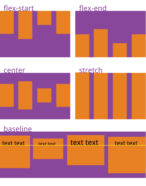
5.align-items: flex-start | flex-end | center | stretch|baseline;//属性定义项目在侧轴(交叉轴)上如何对齐。
flex-start:交叉轴的起点对齐。
flex-end:交叉轴的终点对齐。
center:交叉轴的中点对齐。
baseline: 项目的第一行文字的基线对齐。
stretch(默认值):如果项目未设置高度或设为auto,将占满整个容器的高度。
测试代码:
<!DOCTYPE html>
<html lang="en">
<head>
<meta charset="UTF-8">
<title></title>
<style type="text/css">
.layout-box {
width: 600px;
height: 300px;
background-color: #f0f0f0;
display: flex;
/*侧轴对齐 默认值 align-items: stretch; 沿侧轴拉伸伸缩项目与伸缩容器一致*/
align-items: stretch;
align-items: flex-start;
align-items: flex-end;
align-items: center;
/*基线对齐
伸缩项目沿着一行中,伸缩项目基线最大(行高或者字体最大的)的基线作为其对齐依据。
*/
align-items: baseline;
}
.item { }
.item1 { background-color: #f00;}
.item2 { background-color: #ff0; }
.item3 { background-color: #00f; font-size: 72px;}
.item4 { background-color: #f0f;}
</style>
</head>
<body>
<div class="layout-box">
<div class="item item1">1</div>
<div class="item item2">222</div>
<div class="item item3">3</div>
<div class="item item4">4</div>
</div>
<script type="text/javascript">
</script>
</body>
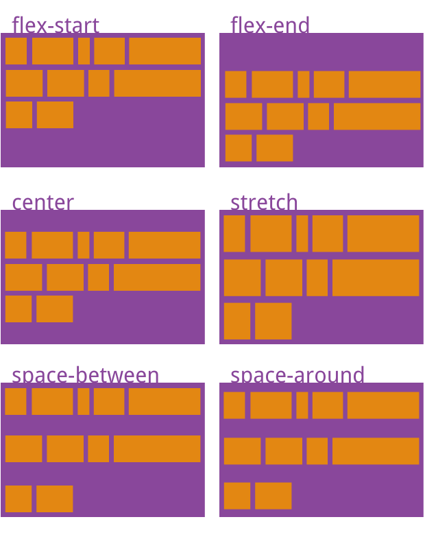
</html>6.align-content: flex-start | flex-end | center | space-between | space-around | stretch;//属性定义了多根轴线的对齐方式。如果项目只有一根轴线,该属性不起作用。
flex-start:与交叉轴的起点对齐。
flex-end:与交叉轴的终点对齐。
center:与交叉轴的中点对齐。
space-between:与交叉轴两端对齐,轴线之间的间隔平均分布。
space-around:每根轴线两侧的间隔都相等。所以,轴线之间的间隔比轴线与边框的间隔大一倍。
stretch(默认值):轴线占满整个交叉轴。
测试代码:
<!DOCTYPE html>
<html lang="en">
<head>
    <meta charset="UTF-8">
    <title></title>
    <style type="text/css">
        .layout-box {
            width: 800px;
            height: 300px;
            background-color: #f0f0f0;

            display: flex;
            /* 当伸缩容器主轴方向空间不足,换行显示

               1.换行后,行高等于 容器的高度/行数
               2.默认,侧轴拉伸基于行高。

            */
            flex-wrap: wrap;

            /*justify-content: flex-end;*/
            /*当出现多行时,align-items 是基于行的 start -> end 对齐*/
            /*align-items: flex-start;*/

            /*当出现多行时,配合 align-content 属性一起使用,实现在伸缩容器侧轴方向对齐*/

            align-content: flex-start;
            align-content: center;
            align-content: flex-end;

            /*让多行在侧轴均匀分布*/
            align-content: space-between;
            align-content: space-around;

        }

        .item { width: 300px}

        .item1 { background-color: #f00;}
        .item2 { background-color: #ff0; }
        .item3 { background-color: #00f; }
        .item4 { background-color: #f0f;}

    </style>

</head>
<body>

    <div class="layout-box">
        <div class="item item1">1</div>
        <div class="item item2">222</div>
        <div class="item item3">3</div>
        <div class="item item4">4</div>
    </div>

<script type="text/javascript">
</script>
</body>
</html>
权威|前沿|技术|干货|国内首个API全生命周期开发者社区
更多推荐
 1
1 0
0- 0


 已为社区贡献1条内容

所有评论(0)