
HTML定位
在 HTML 中,可以使用 CSS 来对元素进行定位。常见的定位方式有相对定位(relative),绝对定位(absolute),固定定位(fixed),和粘性定位(sticky)。- 相对定位(relative):元素相对于其正常位置进行定位,通过 top、bottom、left、right 属性来指定偏移量。- 绝对定位(absolute):元素相对于其最近的已定位祖先元素(非 static
 文章共3,858字 · 阅读需要大约13分钟
在 HTML 中,可以使用 CSS 来对元素进行定位。常见的定位方式有相对定位(relative),绝对定位(absolute),固定定位(fixed),和粘性定位(sticky)。
- 相对定位(relative):元素相对于其正常位置进行定位,通过 top、bottom、left、right 属性来指定偏移量。
- 绝对定位(absolute):元素相对于其最近的已定位祖先元素(非 static 定位)进行定位,或者相对于文档的初始坐标定位。同样使用 top、bottom、left、right 属性来指定偏移量。
- 固定定位(fixed):元素相对于视口进行定位,始终保持在固定的位置,通过 top、bottom、left、right 属性来指定偏移量。
- 粘性定位(sticky):元素基于用户滚动的位置进行定位,当滚动到指定位置时固定在屏幕上,可以通过设置 top、bottom、left、right 属性来指定偏移量。
可以使用 CSS 的 position 属性来定义元素的定位方式。例如:
<style>
  .relativeBox {
    position: relative;
    top: 10px;
    left: 20px;
  }

  .absoluteBox {
    position: absolute;
    top: 50px;
    right: 30px;
  }

  .fixedBox {
    position: fixed;
    bottom: 0;
    left: 0;
  }

  .stickyBox {
    position: sticky;
    top: 10px;
  }
</style>

<div class="relativeBox">相对定位</div>
<div class="absoluteBox">绝对定位</div>
<div class="fixedBox">固定定位</div>
<div class="stickyBox">粘性定位</div>
上述代码中,分别演示了相对定位、绝对定位、固定定位和粘性定位的用法。
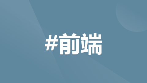
固定定位 也称流式布局 (默认)
<!DOCTYPE html>
<html>
<head>
<meta charset="utf-8">
<title></title>
<style type="text/css">
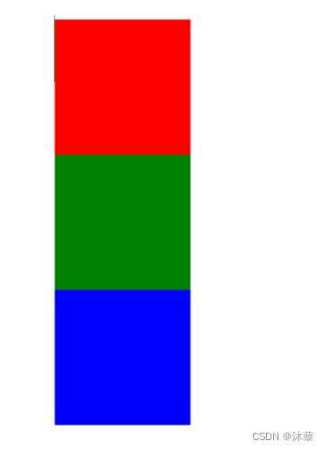
.box1,.box2,.box3{
width: 100px;
height: 100px;
display: inline-block;
}
.box1{
background-color: red;
}
.box2{
background-color: green;
}
.box3{
background-color: blue;
}
</style>
</head>
<body>
<div class="box1">
</div>
<div class="box2">
</div>
<div class="box3">
</div>
</body>
</html未设置display:inline-block时默认布局
定位布局
相对定位
参考点是标签默认所在的位置
标签移走之后,原来的位置不会释放(其它标签不能占用这个位置)
<html>
<head>
<meta charset="utf-8">
<title>定位</title>
<style type="text/css">
	.box1,.box2,.box3{
		width: 100px;
		height: 100px;

		position: relative;
	}
	.box1{
		background-color: red;
	}
	.box2{
		background-color: green;
		left: 100px;
		top:-100px;
	}
	.box3{
		background-color: blue;
		left: 200px;
		top: -200px;
	}
</style>
</head>
<body>
	<div class="box1">
	</div>
	<div class="box2">
	</div>
	<div class="box3">
	</div>
	<p>fdsaflasl</p>
</body>
</html>
绝对定位
参考点统一为父容器的左上角顶点,因此需要设定父容器为相对定位relative,<body>标签可以设置相对定位
标签移走之后,它原来所占的位置可以被其它标签补位
定位坐标可以用:
left + top
left + bottom
top + right
right + bottom
<html>
<head>
<meta charset="utf-8">
<title>定位</title>
<style type="text/css">
	#outer{
		width: 500px;
		height: 500px;
		margin: auto;
		border: 1px solid black;
		/* 绝对定位要求把父容器的定位方式设为relative
		参考点就是父容器的左上角顶点
		*/
		position: relative;
	}
	.box1,.box2,.box3{
		width: 100px;
		height: 100px;
	}
	.box1{
		background-color: red;
	}
	.box2{
		background-color: green;
		/* 绝对定位:
		参考点统一为父容器的左上角顶点
		标签移走之后,它原来所占的位置可以被其它标签补位
		*/
		position: absolute;
		left: 100px;
		top:0px;
	}
	.box3{
		background-color: blue;
		position: absolute;
		/* left: 200px;
			top: 0px; */
			/* right: 0px;
			bottom: 0px; */

		right: 0px;
		top: 0px;
	}
</style>
</head>
<body>
	<div id="outer">
		<div class="box1">
		</div>
		<div class="box2">
		</div>
		<div class="box3">
		</div>
		<p>fdsjalfjsa</p>
	</div>
</body>
</html
浮动布局
float: left 左浮动
right 右浮动,第一个标签排最右边
clear: 清除浮动
<!DOCTYPE html>
<html>
<head>
<meta charset="utf-8">
<title>浮动布局</title>
<style type="text/css">
#outer{
width: 500px;
height: 500px;
margin: auto;
border: 1px solid black;
}
.box1,.box2,.box3{
width: 100px;
height: 100px;
text-align: center;
line-height: 100px;
color: white;
/* 浮动:
left 左浮动
right 右浮动,第一个标签排最右边
*/
float: left;
}
.box1{
background-color: red;
}
.box2{
background-color: green;
}
.box3{
background-color: blue;
}
.p1{
/* 清除浮动:
标签设置浮动之后,后续标签也会跟着浮动
为了避免对后续标签的影响,要对后续第一个标签设置清除浮动
*/
/* clear: both; */
}
</style>
</head>
<body>
<div id="outer">
<div class="box1">
1
</div>
<div class="box2">
2
</div>
<div class="box3">
3
</div>
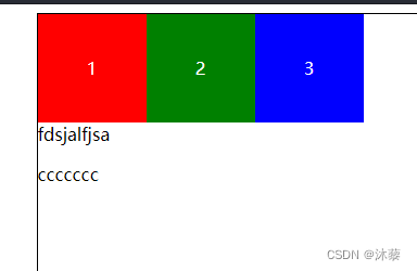
<p class="p1">fdsjalfjsa</p>
<p>ccccccc</p>
</div>
</body>
</html>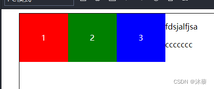
标签设置浮动之后,后续标签也会跟着浮动
为了避免对后续标签的影响,要对后续第一个标签设置清除浮动
.p1{

		clear: both;
	}
弹性布局
所有的样式都在容器里面设置
display:flex
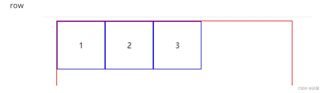
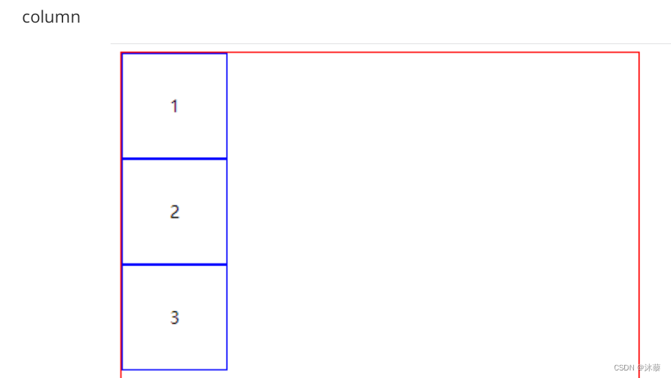
flex-direction 排列方向
row 横向排列,默认值
row-reverse 横向排列,右对齐,顺序反转
column 竖排
column-reverse 竖排,底边对齐,顺序反转
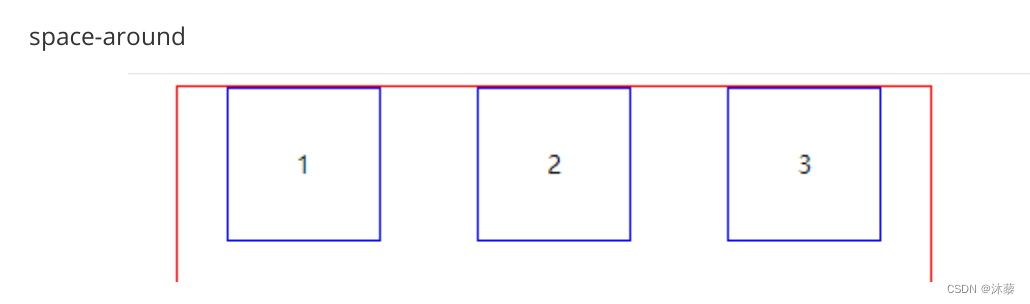
justify-content
对齐方式:
在排列方向对齐方式。横排时,水平方向对齐方式;竖排,垂直方向的对齐方式
(以下说明都是按row方向排列)
center 水平居中
flex-start 左对齐
flex-end 右对齐
space-around 中间等距间隔,两边的间距时中间间距的一半
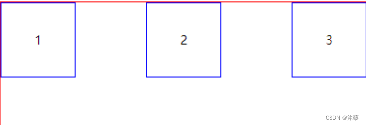
space-between 中间间隔等距,两边靠边
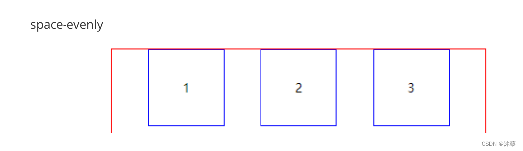
space-evenly 完全等距间隔排列(两边和中间都等距)

align-items
跟排列方向垂直的方向上的对齐方式:
(如果时横向排列,这个样式就是垂直对齐方式; 如果纵向排列,这个样式就是水平
方向的对齐方式)
center 居中
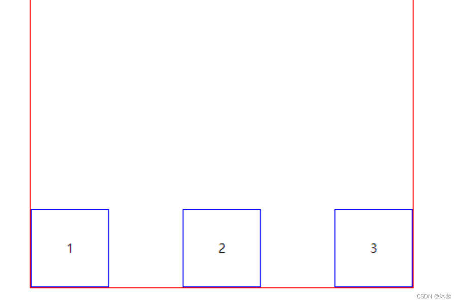
flex-start 顶对齐
flex-end 底边对齐
flex-start

flex-end
flex-wrap
换行方式
nowrap 不换行, 压缩标签的宽度,在一行显示完所有标签
wrap 换行
wrap-reverse 换行,顺序反转
(注意: 换行之后的行距由align-content样式决定)
<html>
<head>
<meta charset="utf-8">
<title>弹性布局</title>
<style type="text/css">
	#outer{
		height: 500px;
		width: 500px;
		border: 1px solid red;
		margin: auto;
		/* 弹性布局:
		  容器的display设为flex
		*/
		display: flex;
		/* 排列方向
		row 横向排列,默认值
		row-reverse  横向排列,右对齐,顺序反转
		column  竖排
		column-reverse  竖排,底边对齐,顺序反转
		*/
		flex-direction: row;
		/* 对齐方式:
		在排列方向对齐方式。横排时,水平方向对齐方式;竖排,垂直方向的对齐方
		式
(		以下说明都是按row方向排列)
		center 水平居中
		flex-start 左对齐
		flex-end  右对齐
		space-around  中间等距间隔,两边的间距时中间间距的一半
		space-between  中间间隔等距,两边靠边
		space-evenly  完全等距间隔排列(两边和中间都等距)
		*/
		justify-content: space-between;
		/* 跟排列方向垂直的方向上的对齐方式:
		(如果时横向排列,这个样式就是垂直对齐方式; 如果纵向排列,这个样式就是水
		平方向的对齐方式)
		center  居中
		flex-start  顶对齐
		flex-end  底边对齐
		*/
		align-items: flex-start;
		/* 换行方式
		nowrap  不换行, 压缩标签的宽度,在一行显示完所有标签
		wrap  换行
		wrap-reverse 换行,顺序反转
		(换行之后的行距由align-content样式决定)
		*/
		flex-wrap: wrap;
	}
	.box{
		width: 100px;
		height: 100px;
		border: 1px solid blue;
		text-align: center;
		line-height: 100px;
	}
</style>
</head>
<body>
<div id="outer">
<div class="box">
1
</div>
<div class="box">
2
</div>
<div class="box">
3
</div>
<!-- <div class="box">
4
</div>
<div class="box">
5
</div>
<div class="box">
6
</div>
<div class="box">
弹性布局实现上下左右居中显示
display: flex;
justify-content: center;
align-items: center;
练习:
7
</div>
<div class="box">
8
</div>
<div class="box">
9
</div> -->
</div>
</body>
</html>
弹性布局实现上下左右居中显示
<html>
<head>
<meta charset="utf-8">
<title>用flex实现上下左右居中</title>
<style type="text/css">
	.outer{
	/* vw视口宽度单位, 全屏宽度是100vw */
		width: 100vw;
	/* vh视口的高度单位,全屏的高度是100vh */
		height: 100vh;
		display: flex;
		justify-content: center;
		align-items: center;
	}
	.box{
		width: 100px;
		height: 100px;
		background-color: red;
	}
</style>
</head>
<body>
<div class="outer">
<div class="box">
</div>
</div>
</body>
</html>
布局练习
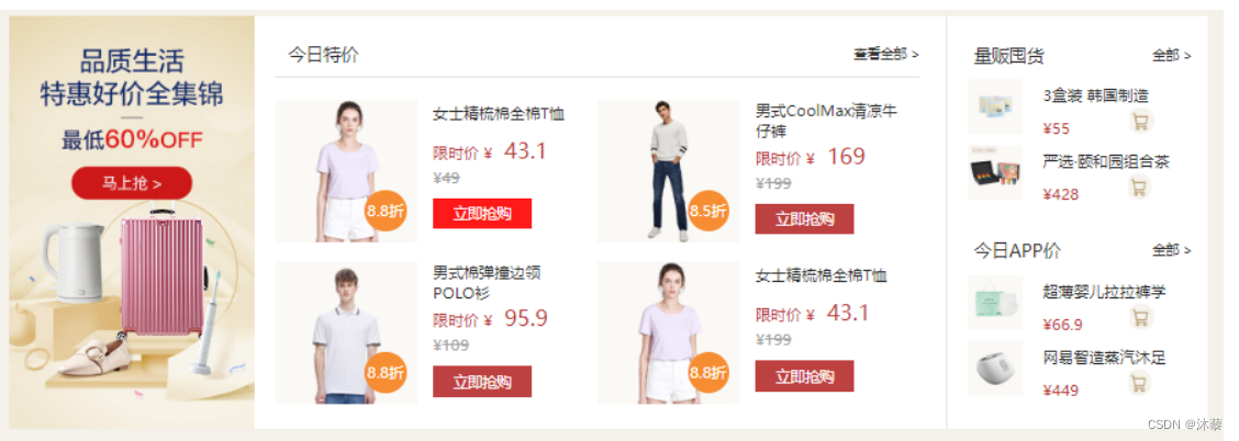
要求:图片可以截图添加,文字,折扣需要根据布局实现。
参考示例
<!DOCTYPE html>
<html>
<head>
<meta charset="utf-8">
<title>作业三</title>
<style type="text/css">
.outer {
width: 1200px;
height: 400px;
display: flex;
margin: auto;
}
.b1,
img {
width: 300px;
height: 400px;
/* background-color: aqua; */
}
.b2 {
width: 600px;
height: 400px;
}
.ds {
width: 580px;
height: 50px;
margin: 10px;
line-height: 50px;
font-size: 12px;
border-bottom: 1px solid rgb(252, 240, 179);
/* background-color: aquamarine; */
display: flex;
justify-content: space-between;
}
.dx {
width: 580px;
height: 330px;
display: flex;
flex-wrap: wrap;
justify-content: space-between;
}
.dx1 {
width: 280px;
height: 160px;
display: flex;
}
.dxl,
.i1 {
width: 150px;
height: 160px;
position: relative;
/* background-color: rgb(251, 207, 120); */
}
.dxl1 {
width: 30px;
height: 30px;
text-align: center;
line-height: 30px;
font-size: 10px;
border-radius: 50%;
background-color: rgb(251, 207, 120);
position: absolute;
right: 10px;
bottom: 10px;
}
.dxr {
width: 200px;
height: 160px;
}
.span1 {
display: inline-block;
width: 80px;
height: 30px;
background-color: red;
margin-left: 5px;
}
.b3 {
width: 300px;
height: 400px;
display: flex;
flex-direction:column;
justify-content: space-between;
}
.b31s {
width: 280px;
height: 40px;
line-height: 50px;
font-size: 12px;
display: flex;
justify-content: space-between;
margin: 10px;
}
.x1{
width: 280px;
height: 70px;
}
.img2{
height: 70px;
width: 50px;
float: left;
}
.x11{
width: 200px;
height: 70px;
float: right;
}
.ix{
width: 200px;
height: 30px;
}
.i2{
width: 20px;
height: 20px;
float: right;
}
</style>
</head>
<body>
<div class="outer">
<div class="b1">
<img src="../img/3551973afb9d667529a2b0ff1d10485b.jpg" alt="">
</div>
<div class="b2">
<div class="ds">
<span>今日特价</span>
<span>查看全部 ></span>
</div>
<div class="dx">
<div class="dx1">
<div class="dxl">
<img src="../img/6d07d4a90abe065daf453beb37534cd7.png" class="i1" alt="">
<div class="dxl1">
<span>8.8折</span>
</div>
</div>
<div class="dxr">
<p><b>女士纯棉T恤</b></p>
<p>限时价:¥43.1</p>
<p style="font-size: 11px;"><del>¥49</del></p>
<span class="span1">立即抢购</span>
</div>
</div>
</div>
</div>
<div class="b3">
<div class="b31">
<div class="b31s">
<span>量贩囤货</span>
<span>全部</span>
</div>
<div class="x1">
<img src="../img/h_pic.jpg" class="img2" alt="">
<div class="x11">
<p>三盒装 韩国制造</p>
<div class="ix">
<span>¥55</span>
<img src="../img/1.jpg" class="i2">
</div>
</div>
</div>
<div class="x1">
<img src="../img/h_pic.jpg" class="img2" alt="">
<div class="x11">
<p>三盒装 韩国制造</p>
<div class="ix">
<span>¥55</span>
<img src="../img/1.jpg" class="i2">
</div>
</div>
</div>
</div>
<div class="b31">
<div class="b31s">
<span>今日APP</span>
<span>全部</span>
</div>
<div class="x1">
<img src="../img/h_pic.jpg" class="img2" alt="">
<div class="x11">
<p>三盒装 韩国制造</p>
<div class="ix">
<span>¥55</span>
<img src="../img/1.jpg" class="i2">
</div>
</div>
</div>
<div class="x1">
<img src="../img/h_pic.jpg" class="img2" alt="">
<div class="x11">
<p>三盒装 韩国制造</p>
<div class="ix">
<span>¥55</span>
<img src="../img/1.jpg" class="i2">
</div>
</div>
</div>
</div>
</div>
</div>
</body>
</html>
旨在为数千万中国开发者提供一个无缝且高效的云端环境,以支持学习、使用和贡献开源项目。
更多推荐
 3
3 0
0- 0


 已为社区贡献1条内容

所有评论(0)