uniapp 封装滚动picker选择器
uniapp 封装滚动picker选择器
·
前言
因为uni自带的picker无法自定义样式,所以自定义封装了滚动选择器
注意
改封装基于Uview组件的popup弹出层,不想用uview的可自行写popup,或者使用uniapp的扩展组件自行调整
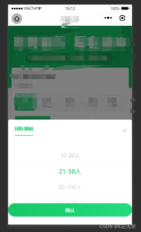
先看效果:
更多
标题,关闭按钮,确认按钮可以自定义修改组件,调整方便
组件介绍
子组件
<template>
	<u-popup :show="isShow" round="10rpx">
		<view class="team-popup">
			<view class="team-popup-head">
				<view class="team-popup-title">{{popupTitle}}</view>
				<view class="team-popup-close" @click="closeTeamPopup"><u-icon name="close" color="#B8B8B8" size="32rpx"></u-icon></view>
			</view>
			<view class="team-popup-body">
				<picker-view :value="value" @change="bindChange" class="team-picker-view" indicator-class="activeteamPicker">
					<picker-view-column>
						<view class="team-pickeritem" :class="currentTeamPick == index ? 'team-pickeritem activeteamPicker' : 'team-pickeritem'" v-for="(item, index) in dataList" :key="index">
							{{ item[label] }}
						</view>
					</picker-view-column>
				</picker-view>
			</view>
			<view class="team-popup-btn" @click="confirmTeam()">确认</view>
		</view>
	</u-popup>
</template>
<script>
export default {
	props: {
		isShow: {
			type: Boolean,
			default: false
		},
		dataList: {
			type: Array,
			default: []
		},
		label: {
			type: String
		},
		popupTitle:{
			type:String,
			default:'这是标题'
		}
	},
	data() {
		return {
			teamValue: '',
			currentTeamPick: 0,
		};
	},
	onLoad() {},
	methods: {
		closeTeamPopup() {
			this.$emit('getIsShow',false)
		},
		bindChange: function(e) {
			this.teamValue = this.dataList[e.detail.value[0]];
			this.$emit('getVal', this.teamValue ? this.teamValue : this.dataList[0]);
			this.currentTeamPick = e.detail.value[0];
		},
		confirmTeam() {
			this.teamValue = this.dataList[this.currentTeamPick];

			this.closeTeamPopup();
		}
	}
};
</script>
<style lang="scss" scoped>
.team-popup {
	display: flex;
	flex-direction: column;
	padding-bottom: 49rpx;
	.team-popup-head {
		padding: 34rpx 30rpx 0rpx 30rpx;
		display: flex;
		align-items: center;
		justify-content: space-between;
		border-bottom: 1rpx solid #f0f0f0;
		.team-popup-title {
			margin-left: 10rpx;
			font-size: 28rpx;
			font-family: PingFang SC;
			font-weight: bold;
			color: #16c869;
			border-bottom: 4rpx solid #16c869;
			padding-bottom: 20rpx;
		}
		.team-popup-close {
			width: 100rpx 80rpx;
			display: flex;
			align-items: center;
			justify-content: center;
		}
	}
	.team-popup-body {
		height: 409rpx;
		display: flex;
		align-items: center;
		justify-content: center;
	}
	.team-popup-btn {
		width: 100%;
		display: flex;
		align-items: center;
		justify-content: center;
		height: 82rpx;
		background: linear-gradient(90deg, #16c868 0%, #24db7e 100%);
		border-radius: 41rpx;
		font-size: 30rpx;
		font-family: PingFang SC;
		font-weight: 500;
		color: #ffffff;
	}
	.scrolltolower-item {
		width: 100%;
		display: flex;
		align-items: center;
		justify-content: center;
	}
}
.team-picker-view {
	width: 100%;
	height: 100%;
}
.team-pickeritem {
	display: flex;
	justify-content: center;
	align-items: center;
	height: 60rpx;
	font-size: 32rpx;
	color: #000000;
}
/deep/ .activeteamPicker {
	padding: 10rpx 0;
	color: #16c868;
	font-size: 36rpx;
}
</style>
父组件中使用
	import mypopup  from '../../components/mypopup.vue'
	export default {
		components:{
			mypopup
		},
<mypopup label="label"
:isShow="isShowTeamNumber"
:dataList="teamList"
@getVal="getVal"
popupTitle="团队规模"
@getIsShow="getIsShow">
</mypopup>
getVal(e) {
console.log(e,'123')
this.teamValue = e.label;
},
getIsShow(e) {
this.isShowTeamNumber = e
},
为开发者提供学习成长、分享交流、生态实践、资源工具等服务,帮助开发者快速成长。
更多推荐


 0
0 0
0- 0


 已为社区贡献2条内容

所有评论(0)