
跟着iMeta学做图|ggplot2绘制相关性分析线面组合热图
本文代码已经上传至https://github.com/iMetaScience/iMetaPlot230118corr 如果你使用本代码,请引用:Changchao Li. 2023. Destabilized microbial networks with distinct performances of abundant and rare biospheres in maintaining
本文代码已经上传至https://github.com/iMetaScience/iMetaPlot230118corr 如果你使用本代码,请引用:Changchao Li. 2023. Destabilized microbial networks with distinct performances of abundant and rare biospheres in maintaining networks under increasing salinity stress. iMeta 1: e79. https://doi.org/10.1002/imt2.79
代码编写及注释:农心生信工作室
写在前面
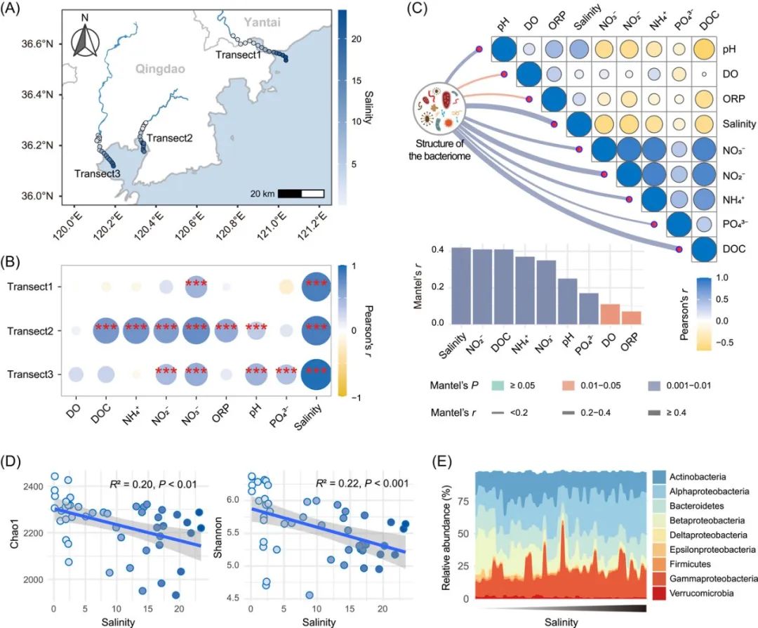
相关性热图 (Correlation Heatmap) 的使用在微生物组研究中非常普遍,尤其是线面组合的相关性热图,其中的相关性热图通常表示环境因子间的Pearson相关系数,连线则表示物种组成与各环境因子的Mantel相关性。本期我们挑选2023年1月9日刊登在iMeta上的Destabilized microbial networks with distinct performances of abundant and rare biospheres in maintaining networks under increasing salinity stress,选择文章的Figure 1C进行复现,讲解和探讨如何基于ggplot2绘制线面组合的相关性热图,先上原图:

接下来,我们将通过详尽的代码逐步拆解原图,最终实现对原图的复现。
R包检测和安装
01
安装核心R包ggplot2以及一些功能辅助性R包,并载入所有R包。
options(repos = list(CRAN = "https://mirrors.tuna.tsinghua.edu.cn/CRAN/"))
if (!require("ggplot2"))
  install.packages('ggplot2')
if (!require("vegan"))
  install.packages('vegan')
if (!require("tidyverse"))
  install.packages('tidyverse')
if (!require("BiocManager"))
  install.packages('BiocManager')
if (!require("ComplexHeatmap"))
  BiocManager::install('ComplexHeatmap')
# 检查开发者工具devtools,如没有则安装
if (!require("devtools"))
  install.packages("devtools")
# 加载开发者工具devtools
library(devtools)
# 检查linkET包,没有则通过github安装最新版
if (!require("linkET"))
  install_github("Hy4m/linkET", force = TRUE)
# 加载包
library(ggplot2)
library(vegan)
library(linkET)
library(tidyverse)
library(ComplexHeatmap)
读取数据及数据处理
02
绘制线面组合相关性热图,需要环境因子数据和物种组成数据。示例数据可在GitHub上获取。
#读取数据
#根据原文附表S1,获得样品的物理化学特性和地理分布情况,作为环境因子表
env <- read.csv("env.CSV",row.names = 1,header = T)
#生成一个物种组成的丰度表,行为样本,列为物种,行数必须与环境因子表的行数相同
spec <- read.csv("spec.CSV",row.names = 1,header = T)
03
计算环境因子的pearson相关系数,并根据绘图需求对数据进行处理。
corM <- cor(env,method = "pearson")#计算相关系数矩阵
#因为需要绘制的是上三角热图,需对矩阵进行处理,保留对角线及一半的数据即可
ncr <- nrow(corM)
for (i in 1:ncr){
  for (j in 1:ncr){
    if (j>i){
      corM[i,j] <- NA
    }
  }
}


corM <- as.data.frame(corM)%>%mutate(colID = rownames(corM))


#宽表转长表
corM_long <- pivot_longer(corM,cols = -"colID",names_to = "env",values_to = "cor")%>%na.omit()


#根据原图,固定x轴和y轴的顺序
corM_long$colID <- factor(corM_long$colID,levels = rownames(corM))
corM_long$env <- factor(corM_long$env,levels = rev(rownames(corM)))
绘图预览
04
使用ggplot2包绘制一个简单的上三角相关性热图:
p <- ggplot(corM_long)+
  geom_tile(aes(colID,env),fill = "white",color = "grey")+ #添加方框
  geom_point(aes(colID,env,size = abs(cor),color = cor)) #添加散点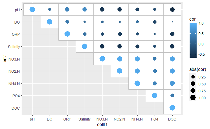
05
对相关性热图进行美化:
col_fun <- colorRampPalette(c("#FFC107","white","#3F51B5"))(50) #设置渐变色
p <- ggplot(corM_long)+
  geom_tile(aes(colID,env),fill = "white",color = "grey")+ #添加方框
  geom_point(aes(colID,env,size = abs(cor),fill = cor),color = "black",shape = 21)+ #添加散点
  scale_x_discrete(position = "top")+ #x轴移动到顶部
  scale_y_discrete(position = "right")+ #y轴移动到右侧
  scale_size_continuous(range = c(1,10))+
  scale_fill_gradientn(colours = col_fun)+ #渐变色设置
  theme(axis.ticks = element_blank(),
        axis.title = element_blank(),
        panel.background = element_blank())+ #去除背景
  guides(size = "none",  #隐藏size图例
         fill = guide_colorbar(title = "Pearson's r"))  #修改fill图例标题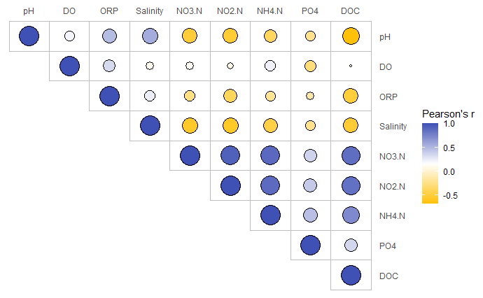
08
用Mantel test检验物种组成和不同环境因子之间的相关性。这里可以使用linkET包中的mantel_test()函数轻松完成检验:
mantel <- mantel_test(spec = spec,env = env)
#spec参数后是物种组成数据,env参数后是环境因子数据
07
生成绘制连接弧线所需的数据框。包括连线的起点和终点坐标,根据mantel r的值确定线条粗细,mantel p的值确定线条颜色:
n = nrow(corM)
curve_df <- data.frame(
  x0 = rep(-1,n),
  y0 = rep(6,n),
  x1 = c(0:(n-1)-0.1),
  y1 = c(n:1)
)%>%cbind(mantel)%>%
  mutate(
    line_col = ifelse(p <= 0.001, '#D1C4E9', NA),  #根据p值不同设置连接曲线的颜色不同
    line_col = ifelse(p > 0.001 & p <=  0.01, '#607D8B', line_col),
    line_col = ifelse(p > 0.01 & p <=  0.05, '#FF5722', line_col),
    line_col = ifelse(p > 0.05, '#4CAF50', line_col),
    linewidth = ifelse(r >=  0.4, 4, NA),
    # 根据r值不同设置连接曲线的宽度不同
    linewidth = ifelse(r >=  0.2 & r < 0.4, 2, linewidth),
    linewidth = ifelse(r < 0.2, 0.8, linewidth)
  )
08
绘制带有连线的相关性热图:
p <- ggplot(corM_long)+
  geom_tile(aes(colID,env),fill = "white",color = "grey")+ #添加方框
  geom_point(aes(colID,env,size = abs(cor),fill = cor),color = "black",shape = 21)+ #添加散点
  scale_x_discrete(position = "top")+ #x轴移动到顶部
  scale_y_discrete(position = "right")+ #y轴移动到右侧
  scale_size_continuous(range = c(1,10))+
  scale_fill_gradientn(colours = col_fun)+ #渐变色设置
  theme(axis.ticks = element_blank(),
        axis.title = element_blank(),
        panel.background = element_blank())+ #去除背景
  guides(size = "none",  #隐藏size图例
         fill = guide_colorbar(title = "Pearson's r"))+  #修改fill图例标题
  geom_curve(data = curve_df,aes(x = x0,y = y0,xend = x1,yend = y1), #根据起点终点绘制弧线
             size = curve_df$linewidth, #根据r值设置线条宽度
             color = curve_df$line_col,  #根据p值设置线条颜色
             curvature = 0.2)+ #设置弧度
  geom_point(data = curve_df,aes(x = x1,y = y1),size = 3,color = "red") #添加连线终点的点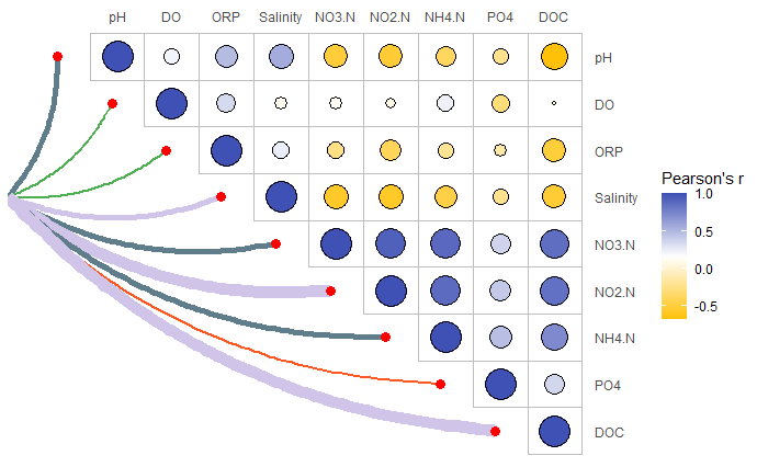
09
我们发现,目前的图形缺少连线颜色和粗细的图例。为此,我们利用顾祖光博士开发的ComplexHeatmap包(关于ComplexHeatmap包的使用,可以参考往期推文跟着iMeta学做图|ComplexHeatmap绘制多样的热图),绘制一个单独的图例,并置于画布的左下方:
pdf("fig5.pdf",width = 10.04, height = 6.26)
grid.newpage()
#重新创建一个1行1列的布局
pushViewport(viewport(layout = grid.layout(nrow = 1, ncol = 1)))
vp_value <- function(row, col){
  viewport(layout.pos.row = row, layout.pos.col = col)
}
p1 <- ggplot(corM_long)+
  geom_tile(aes(colID,env),fill = "white",color = "grey")+ #添加方框
  geom_point(aes(colID,env,size = abs(cor),fill = cor),color = "black",shape = 21)+ #添加散点
  scale_x_discrete(position = "top")+ #x轴移动到顶部
  scale_y_discrete(position = "right")+ #y轴移动到右侧
  scale_size_continuous(range = c(1,10))+
  scale_fill_gradientn(colours = col_fun)+ #渐变色设置
  theme(axis.ticks = element_blank(),
        axis.title = element_blank(),
        panel.background = element_blank())+ #去除背景
  guides(size = "none",  #隐藏size图例
         fill = guide_colorbar(title = "Pearson's r"))+  #修改fill图例标题
  geom_curve(data = curve_df,aes(x = x0,y = y0,xend = x1,yend = y1), #根据起点终点绘制弧线
             size = curve_df$linewidth, #根据r值设置线条宽度
             color = curve_df$line_col,  #根据p值设置线条颜色
             curvature = 0.2)+ #设置弧度
  geom_point(data = curve_df,aes(x = x1,y = y1),size = 3,color = "red") #添加连线终点的点
#将图p1添加进画布
print(p1,vp = vp_value(row = 1, col = 1))


#利用ComplexHeatmap的Legend()函数绘制单独的图例
#绘制Mantel's p图例
lgd1 = Legend(at = 1:4, legend_gp = gpar(fill = c('#D1C4E9','#607D8B','#FF5722','#4CAF50')),
              title = "Mantel's p",
              labels  = c("≤ 0.001","0.001 - 0.01","0.01 - 0.05","> 0.05"),
              nr = 1)
#绘制Mantel's r图例
lgd2 = Legend(labels  = c("< 0.02","0.02 - 0.04","≥ 0.04"),
              title = "Mantel's r",
              #graphics参数自定义图例的高度
              graphics = list(
                function(x, y, w, h) grid.rect(x, y, w, h*0.1*0.8, gp = gpar(fill = "black")),
                function(x, y, w, h) grid.rect(x, y, w, h*0.1*2, gp = gpar(fill = "black")),
                function(x, y, w, h) grid.rect(x, y, w, h*0.1*4, gp = gpar(fill = "black"))
              ),nr = 1)
lgd = packLegend(lgd1, lgd2)


#将图例添加进相关性热图中
draw(lgd, x = unit(45, "mm"), y = unit(5, "mm"), just = c( "bottom"))
dev.off()
#> quartz_off_screen
#>                 2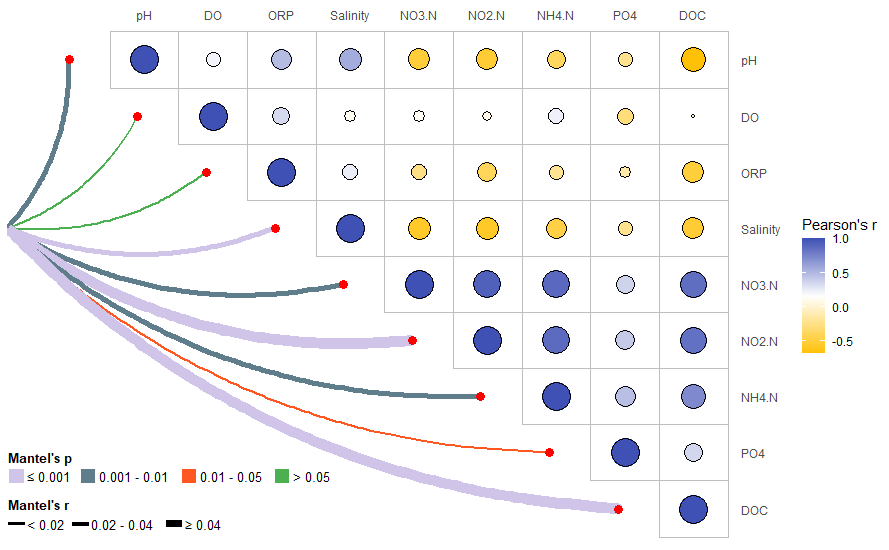
完整代码
if (!require("ggplot2"))
  install.packages('ggplot2')
if (!require("vegan"))
  install.packages('vegan')
if (!require("tidyverse"))
  install.packages('tidyverse')
if (!require("BiocManager"))
  install.packages('BiocManager')
if (!require("ComplexHeatmap"))
  BiocManager::install('ComplexHeatmap')
# 检查开发者工具devtools,如没有则安装
if (!require("devtools"))
  install.packages("devtools")
# 加载开发者工具devtools
library(devtools)
# 检查linkET包,没有则通过github安装最新版
if (!require("linkET"))
  install_github("Hy4m/linkET", force = TRUE)
# 加载包
library(ggplot2)
library(vegan)
library(linkET)
library(tidyverse)
library(ComplexHeatmap)
#读取数据
#根据原文附表S1,获得样品的物理化学特性和地理分布情况,作为环境因子表
env <- read.csv("env.CSV",row.names = 1,header = T)
#生成一个物种组成的丰度表,行为样本,列为物种,行数必须与环境因子表的行数相同
spec <- read.csv("spec.CSV",row.names = 1,header = T)


corM <- cor(env,method = "pearson")#计算相关系数矩阵
#因为需要绘制的是上三角热图,需对矩阵进行处理,保留对角线及一半的数据即可
ncr <- nrow(corM)
for (i in 1:ncr){
  for (j in 1:ncr){
    if (j>i){
      corM[i,j] <- NA
    }
  }
}


corM <- as.data.frame(corM)%>%mutate(colID = rownames(corM))


#宽表转长表
corM_long <- pivot_longer(corM,cols = -"colID",names_to = "env",values_to = "cor")%>%na.omit()


#根据原图,固定x轴和y轴的顺序
corM_long$colID <- factor(corM_long$colID,levels = rownames(corM))
corM_long$env <- factor(corM_long$env,levels = rev(rownames(corM)))


mantel <- mantel_test(spec = spec,env = env)
#spec参数后是物种组成数据,env参数后是环境因子数据
n = nrow(corM)
curve_df <- data.frame(
  x0 = rep(-1,n),
  y0 = rep(6,n),
  x1 = c(0:(n-1)-0.1),
  y1 = c(n:1)
)%>%cbind(mantel)%>%
  mutate(
    line_col = ifelse(p <=  0.001, '#D1C4E9', NA),  #根据p值不同设置连接曲线的颜色不同
    line_col = ifelse(p > 0.001 & p <=  0.01, '#607D8B', line_col),
    line_col = ifelse(p > 0.01 & p <=  0.05, '#FF5722', line_col),
    line_col = ifelse(p > 0.05, '#4CAF50', line_col),
    linewidth = ifelse(r >=  0.4, 4, NA),
    # 根据r值不同设置连接曲线的宽度不同
    linewidth = ifelse(r >=  0.2 & r < 0.4, 2, linewidth),
    linewidth = ifelse(r < 0.2, 0.8, linewidth)
  )


pdf("Figure1A.pdf",width = 10.04, height = 6.26)
grid.newpage()
#重新创建一个1行1列的布局
pushViewport(viewport(layout = grid.layout(nrow = 1, ncol = 1)))
vp_value <- function(row, col){
  viewport(layout.pos.row = row, layout.pos.col = col)
}
p1 <- ggplot(corM_long)+
  geom_tile(aes(colID,env),fill = "white",color = "grey")+ #添加方框
  geom_point(aes(colID,env,size = abs(cor),fill = cor),color = "black",shape = 21)+ #添加散点
  scale_x_discrete(position = "top")+ #x轴移动到顶部
  scale_y_discrete(position = "right")+ #y轴移动到右侧
  scale_size_continuous(range = c(1,10))+
  scale_fill_gradientn(colours = col_fun)+ #渐变色设置
  theme(axis.ticks = element_blank(),
        axis.title = element_blank(),
        panel.background = element_blank())+ #去除背景
  guides(size = "none",  #隐藏size图例
         fill = guide_colorbar(title = "Pearson's r"))+  #修改fill图例标题
  geom_curve(data = curve_df,aes(x = x0,y = y0,xend = x1,yend = y1), #根据起点终点绘制弧线
             size = curve_df$linewidth, #根据r值设置线条宽度
             color = curve_df$line_col,  #根据p值设置线条颜色
             curvature = 0.2)+ #设置弧度
  geom_point(data = curve_df,aes(x = x1,y = y1),size = 3,color = "red") #添加连线终点的点
#将图p1添加进画布
print(p1,vp = vp_value(row = 1, col = 1))


#利用ComplexHeatmap的Legend()函数绘制单独的图例
#绘制Mantel's p图例
lgd1 = Legend(at = 1:4, legend_gp = gpar(fill = c('#D1C4E9','#607D8B','#FF5722','#4CAF50')),
              title = "Mantel's p",
              labels  = c("≤ 0.001","0.001 - 0.01","0.01 - 0.05","> 0.05"),
              nr = 1)
#绘制Mantel's r图例
lgd2 = Legend(labels  = c("< 0.02","0.02 - 0.04","≥ 0.04"),
              title = "Mantel's r",
              #graphics参数自定义图例的高度
              graphics = list(
                function(x, y, w, h) grid.rect(x, y, w, h*0.1*0.8, gp = gpar(fill = "black")),
                function(x, y, w, h) grid.rect(x, y, w, h*0.1*2, gp = gpar(fill = "black")),
                function(x, y, w, h) grid.rect(x, y, w, h*0.1*4, gp = gpar(fill = "black"))
              ),nr = 1)
lgd = packLegend(lgd1, lgd2)


#将图例添加进相关性热图中
draw(lgd, x = unit(45, "mm"), y = unit(5, "mm"), just = c( "bottom"))


dev.off()
#> quartz_off_screen
#>                 2
以上数据和代码仅供大家参考,如有不完善之处,欢迎大家指正!
更多推荐
(▼ 点击跳转)
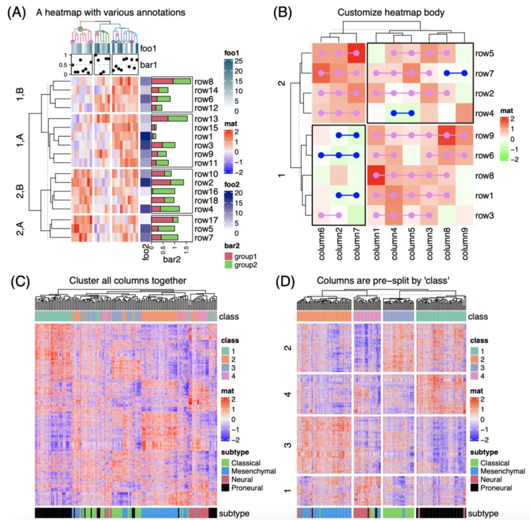
iMeta | 德国国家肿瘤中心顾祖光发表复杂热图(ComplexHeatmap)可视化方法
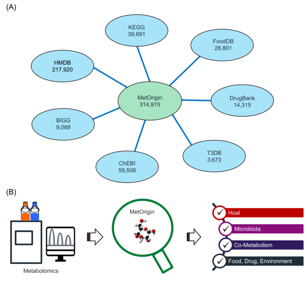
iMeta | 浙大倪艳组MetOrigin实现代谢物溯源和肠道微生物组与代谢组整合分析
第1卷第1期

第1卷第2期

第1卷第3期

第1卷第4期
期刊简介
“iMeta” 是由威立、肠菌分会和本领域数百位华人科学家合作出版的开放获取期刊,主编由中科院微生物所刘双江研究员和荷兰格罗宁根大学傅静远教授担任。目的是发表原创研究、方法和综述以促进宏基因组学、微生物组和生物信息学发展。目标是发表前10%(IF > 15)的高影响力论文。期刊特色包括视频投稿、可重复分析、图片打磨、青年编委、前3年免出版费、50万用户的社交媒体宣传等。2022年2月正式创刊发行!
联系我们
iMeta主页:http://www.imeta.science
出版社:https://onlinelibrary.wiley.com/journal/2770596x
投稿:https://mc.manuscriptcentral.com/imeta
邮箱:office@imeta.science
往期精品(点击图片直达文字对应教程)
|
|
|
|
|
|
|
|
|
|
|
|
|
|
|
|
|
|
|
|
|
|
|
|
|
|
|
|


后台回复“生信宝典福利第一波”或点击阅读原文获取教程合集


旨在为数千万中国开发者提供一个无缝且高效的云端环境,以支持学习、使用和贡献开源项目。
更多推荐


 2
2 0
0- 0


 已为社区贡献14条内容

所有评论(0)