
安卓详解四种基本布局
线性布局即LinearLayout,通过属性指定了排列方向,有两个可选值,vertical代表垂直方向排列,horizontal代表水平方向排列。我们在LinearLayout中添加了3个Button,每个Button的长和宽都是wrap_content,并指定了排列方向是vertical。现在运行一下程序,效果如下图:重新运行一下程序,效果如下图:线性布局还具有。
线性布局
线性布局即LinearLayout,通过android:orientation属性指定了排列方向,有两个可选值,vertical代表垂直方向排列,horizontal代表水平方向排列。
如将android:orientation属性设置为vertical,代码如下:
<LinearLayout xmlns:android="http://schemas.android.com/apk/res/android"
android:orientation="vertical"
android:layout_width="match_parent"
android:layout_height="match_parent">
<Button
android:id="@+id/button1"
android:layout_width="wrap_content"
android:layout_height="wrap_content"
android:text="Button 1" />
<Button
android:id="@+id/button2"
android:layout_width="wrap_content"
android:layout_height="wrap_content"
android:text="Button 2" />
<Button
android:id="@+id/button3"
android:layout_width="wrap_content"
android:layout_height="wrap_content"
android:text="Button 3" />
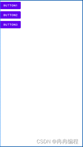
</LinearLayout>我们在LinearLayout中添加了3个Button,每个Button的长和宽都是wrap_content,并指定了排列方向是vertical。现在运行一下程序,效果如下图:
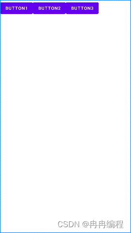
我们将LinearLayout的排列方向修改为horizontal,如下所示:
        <LinearLayout xmlns:android="http://schemas.android.com/apk/res/android"
            android:orientation="horizontal"
            android:layout_width="match_parent"
            android:layout_height="match_parent">
            ...
        </LinearLayout>
重新运行一下程序,效果如下图:
线性布局还具有android:layout_gravity属性,它与android:gravity属性有些相似,android:gravity用于指定文字在控件中的对齐方式,而android:layout_gravity用于指定控件在布局中的对齐方式。需要注意的是,当LinearLayout的排列方向是horizontal时,只有垂直方向上的对齐方式才会生效,因为此时水平方向上的长度是不固定的,每添加一个控件,水平方向上的长度都会改变,因而无法指定该方向上的对齐方式。同样的道理,当LinearLayout的排列方向是vertical时,只有水平方向上的对齐方式才会生效。
我们修改布局代码,如下所示:
<LinearLayout xmlns:android="http://schemas.android.com/apk/res/android"
android:orientation="horizontal"
android:layout_width="match_parent"
android:layout_height="match_parent">
<Button
android:id="@+id/button1"
android:layout_width="wrap_content"
android:layout_height="wrap_content"
android:layout gravity="top"
android:text="Button 1" />
<Button
android:id="@+id/button2"
android:layout_width="wrap_content"
android:layout_height="wrap_content"
android:layout gravity="center_vertical"
android:text="Button 2" />
<Button
android:id="@+id/button3"
android:layout_width="wrap_content"
android:layout_height="wrap_content"
android:layout gravity="bottom"
android:text="Button 3" />
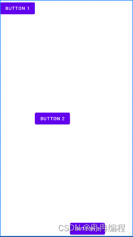
</LinearLayout>由于目前LinearLayout的排列方向是horizontal,因此我们只能指定垂直方向上的排列方向,将第一个Button的对齐方式指定为top,第二个Button的对齐方式指定为center_vertical,第三个Button的对齐方式指定为bottom。重新运行程序,效果如下图:
接下来我们学习下LinearLayout中的另一个重要属性——android:layout_weight。这个属性允许我们使用比例的方式来指定控件的大小,它在手机屏幕的适配性方面可以起到非常重要的作用。
比如我们正在编写一个消息发送界面,需要一个文本编辑框和一个发送按钮,修改activity_main.xml中的代码,如下所示:
<LinearLayout xmlns:android="http://schemas.android.com/apk/res/android"
android:orientation="horizontal"
android:layout_width="match_parent"
android:layout_height="match_parent">
<EditText
android:id="@+id/input_message"
android:layout_width="0dp"
android:layout_height="wrap_content"
android:layout_weight="1"
/>
<Button
android:id="@+id/send"
android:layout_width="0dp"
android:layout_height="wrap_content"
android:layout_weight="1"
android:text="Send"
/>
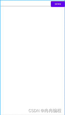
</LinearLayout>你会发现,这里竟然将EditText和Button的宽度都指定成了0dp,这样文本编辑框和按钮还能显示出来吗?不用担心,由于我们使用了android:layout_weight属性,此时控件的宽度就不应该再由android:layout_width来决定,这里指定成0dp是一种比较规范的写法。另外,dp是Android中用于指定控件大小、间距等属性的单位,后面我们还会经常用到它。然后在EditText和Button里都将android:layout_weight属性的值指定为1,这表示EditText和Button将在水平方向平分宽度。
重新运行程序,你会看到如下图的效果:

我们还可以只给EditText指定android:layout_weigth属性,不给Button指定android:layout_weigth属性,把Button的宽高指定为wrap_content,代码如下:
<LinearLayout xmlns:android="http://schemas.android.com/apk/res/android"
    xmlns:tools="http://schemas.android.com/tools"
    android:layout_width="match_parent"
    android:layout_height="match_parent"
    android:orientation="horizontal"
    tools:context=".MainActivity">

    <EditText
        android:layout_weight="1"
        android:layout_width="0dp"
        android:layout_height="wrap_content"></EditText>
    <Button
        android:text="Send"
        android:layout_width="wrap_content"
        android:layout_height="wrap_content"
        android:layout_gravity="top"></Button>
</LinearLayout>
重新运行程序,效果如下图:
这样看起来就比较舒适了。
其实以上主要就是介绍了LinearLayout线性布局的中的几个属性,android:orientation属性(写在LinearLayout布局控件中)指定线性布局的排列方式(可选值:vertical、horizontal),android:layout_gravity属性(写在具体的控件中,指定该控件在线性布局中的对齐方式),android:layout_weight属性(写在具体的控件中,指定该控件在线性布局中所占的比例大小)。
相对布局
RelativeLayout又称作相对布局,它可以通过相对定位的方式让控件出现在布局的任何位置。我们还是通过实践来体会一下,修改activity_main.xml中的代码,如下所示:
<RelativeLayout xmlns:android="http://schemas.android.com/apk/res/android"
android:layout_width="match_parent"
android:layout_height="match_parent">
<Button
android:id="@+id/button1"
android:layout_width="wrap_content"
android:layout_height="wrap_content"
android:layout_alignParentLeft="true"
android:layout_alignParentTop="true"
android:text="Button 1" />
<Button
android:id="@+id/button2"
android:layout_width="wrap_content"
android:layout_height="wrap_content"
android:layout_alignParentRight="true"
android:layout_alignParentTop="true"
android:text="Button 2" />
<Button
android:id="@+id/button3"
android:layout_width="wrap_content"
android:layout_height="wrap_content"
android:layout_centerInParent="true"
android:text="Button 3" />
<Button
android:id="@+id/button4"
android:layout_width="wrap_content"
android:layout_height="wrap_content"
android:layout_alignParentBottom="true"
android:layout_alignParentLeft="true"
android:text="Button 4" />
<Button
android:id="@+id/button5"
android:layout_width="wrap_content"
android:layout_height="wrap_content"
android:layout_alignParentBottom="true"
android:layout_alignParentRight="true"
android:text="Button 5" />
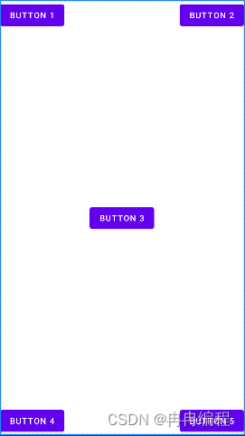
</RelativeLayout>上述代码中,我们让Button 1和父布局的左上角对齐,Button 2和父布局的右上角对齐,Button 3居中显示,Button 4和父布局的左下角对齐,Button 5和父布局的右下角对齐。
重新运行程序,效果如下图:
控件也可以相对于控件进行定位,修改activity_main.xml中的代码,如下所示:
<RelativeLayout xmlns:android="http://schemas.android.com/apk/res/android"
android:layout_width="match_parent"
android:layout_height="match_parent">
<Button
android:id="@+id/button3"
android:layout_width="wrap_content"
android:layout_height="wrap_content"
android:layout_centerInParent="true"
android:text="Button 3" />
<Button
android:id="@+id/button1"
android:layout_width="wrap_content"
android:layout_height="wrap_content"
android:layout above="@id/button3"
android:layout toLeftOf="@id/button3"
android:text="Button 1" />
<Button
android:id="@+id/button2"
android:layout_width="wrap_content"
android:layout_height="wrap_content"
android:layout above="@id/button3"
android:layout toRightOf="@id/button3"
android:text="Button 2" />
<Button
android:id="@+id/button4"
android:layout_width="wrap_content"
android:layout_height="wrap_content"
android:layout below="@id/button3"
android:layout toLeftOf="@id/button3"
android:text="Button 4" />
<Button
android:id="@+id/button5"
android:layout_width="wrap_content"
android:layout_height="wrap_content"
android:layout below="@id/button3"
android:layout toRightOf="@id/button3"
android:text="Button 5" />
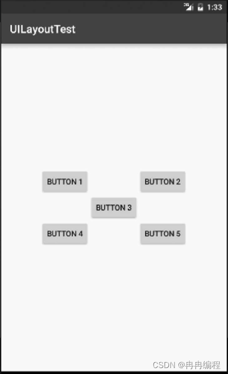
</RelativeLayout>android:layout_above属性可以让一个控件位于另一个控件的上方,需要为这个属性指定相对控件id的引用,这里我们填入了@id/button3,表示让该控件位于Button 3的上方。其他的属性也都是相似的,android:layout_below表示让一个控件位于另一个控件的下方,android:layout_toLeftOf表示让一个控件位于另一个控件的左侧,android:layout_toRightOf表示让一个控件位于另一个控件的右侧。注意,当一个控件去引用另一个控件的id时,该控件一定要定义在引用控件的后面,不然会出现找不到id的情况。重新运行程序,效果如图:
RelativeLayout中还有另外一组相对于控件进行定位的属性,android:layout_alignLeft表示让一个控件的左边缘和另一个控件的左边缘对齐,android:layout_alignRight表示让一个控件的右边缘和另一个控件的右边缘对齐。此外,还有android:layout_alignTop和android:layout_alignBottom,道理都是一样的,我就不再多说,这几个属性就留给你自己去尝试吧。
帧布局
FrameLayout又称作帧布局,这种布局没有方便的定位方式,所有的控件都会默认摆放在布局的左上角。让我们通过例子来看一看吧,修改activity_main.xml中的代码,如下所示:
<FrameLayout xmlns:android="http://schemas.android.com/apk/res/android"
android:layout_width="match_parent"
android:layout_height="match_parent">
<TextView
android:id="@+id/text_view"
android:layout_width="wrap_content"
android:layout_height="wrap_content"
android:text="This is TextView"
/>
<ImageView
android:id="@+id/image_view"
android:layout_width="wrap_content"
android:layout_height="wrap_content"
android:src="@mipmap/ic_launcher"
/>
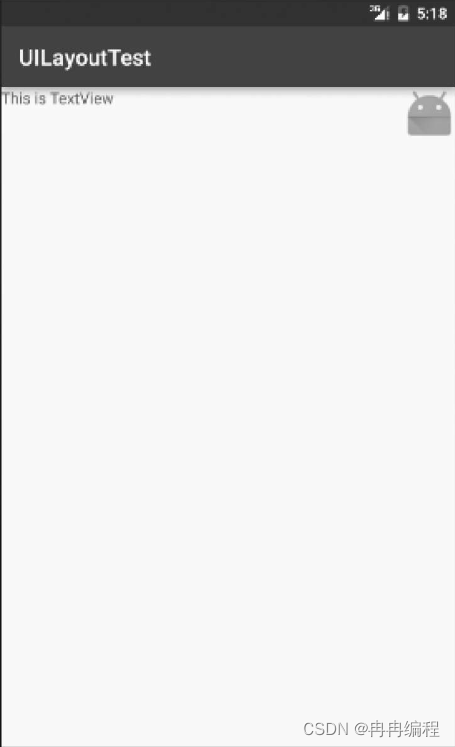
</FrameLayout>FrameLayout中只是放置了一个TextView和一个ImageView。需要注意的是,当前项目我们没有准备任何图片,所以这里ImageView直接使用了@mipmap来访问ic_launcher这张图,虽说这种用法的场景可能非常少,但我还是要告诉你,这是完全可行的。重新运行程序,效果如图:

可以看到,文字和图片都是位于布局的左上角。由于ImageView是在TextView之后添加的,因此图片压在了文字的上面。
我们还可以使用layout_gravity属性来指定控件在布局中的对齐方式,这和LinearLayout中的用法是相似的。修改activity_main.xml中的代码,如下所示:
        <FrameLayout xmlns:android="http://schemas.android.com/apk/res/android"
            android:layout_width="match_parent"
            android:layout_height="match_parent">
            <TextView
                android:id="@+id/text_view"
                android:layout_width="wrap_content"
                android:layout_height="wrap_content"
                android:layout_gravity="left"
                android:text="This is TextView"
                />
            <ImageView
                android:id="@+id/button"
                android:layout_width="wrap_content"
                android:layout_height="wrap_content"
                android:layout_gravity="right"
                android:src="@mipmap/ic_launcher"
                />
        </FrameLayout>
我们指定TextView在FrameLayout中居左对齐,指定ImageView在FrameLayout中居右对齐,然后重新运行程序,效果如图:
百分比布局
只有LinearLayout支持使用layout_weight属性来实现按比例指定控件大小的功能,其他两种布局都不支持。比如说,如果想用RelativeLayout来实现让两个按钮平分布局宽度的效果,则是比较困难的。
为此,Android引入了一种全新的布局方式来解决此问题——百分比布局。在这种布局中,我们可以不再使用wrap_content、match_parent等方式来指定控件的大小,而是允许直接指定控件在布局中所占的百分比,这样的话就可以轻松实现平分布局甚至是任意比例分割布局的效果了。
由于LinearLayout本身已经支持按比例指定控件的大小了,因此百分比布局只为FrameLayout和RelativeLayout进行了功能扩展,提供了PercentFrameLayout和PercentRelativeLayout这两个全新的布局,下面我们就来具体学习一下。
想要各个版本的安卓系统兼容百分比布局,需要在项目的build.gradle中添加百分比布局库的依赖,打开app/build.gradle文件,在dependencies闭包中添加如下内容:
dependencies {
    implementation 'androidx.appcompat:appcompat:1.4.1'
    implementation 'com.google.android.material:material:1.5.0'
    implementation 'androidx.constraintlayout:constraintlayout:2.1.3'
    testImplementation 'junit:junit:4.13.2'
    androidTestImplementation 'androidx.test.ext:junit:1.1.3'
    androidTestImplementation 'androidx.test.espresso:espresso-core:3.4.0'
    implementation 'androidx.percentlayout:percentlayout:1.0.0'
}
其中的最后一行代码即为添加百分比布局库依赖的代码,需要注意的是,每当修改了任何gradle文件时,Android Studio都会弹出一个如下图所示的提示:

这个提示告诉我们,gradle文件自上次同步之后又发生了变化,需要再次同步才能使项目正常工作。这里只需要点击Sync Now就可以了,然后gradle会开始进行同步,把我们新添加的百分比布局库引入到项目当中。
接下来修改activity_main.xml中的代码,如下所示:
<androidx.percentlayout.widget.PercentFrameLayout
    xmlns:android="http://schemas.android.com/apk/res/android"
    xmlns:app="http://schemas.android.com/apk/res-auto"
    android:layout_height="match_parent"
    android:layout_width="match_parent">
    <Button
        android:id="@+id/button1"
        android:text="Button 1"
        android:layout_gravity="left|top"
        app:layout_widthPercent="50%"
        app:layout_heightPercent="50%"/>
</androidx.percentlayout.widget.PercentFrameLayout>
最外层我们使用了PercentFrameLayout,由于百分比布局并不是内置在系统SDK当中的,所以需要把完整的包路径写出来。然后还必须定义一个app的命名空间,这样才能使用百分比布局的自定义属性。
这里还是借助了layout_gravity来指定控件在布局中的对齐方式,效果如下图:

可以看到,按钮的宽和高都占据了布局的50%。
ercentFrameLayout的用法就介绍到这里,另外一个PercentRelativeLayout的用法也是非常相似的,它继承了RelativeLayout中的所有属性,并且可以使用app:layout_widthPercent和app:layout_heightPercent来按百分比指定控件的宽高,相信聪明的你一定可以举一反三了。

为开发者提供学习成长、分享交流、生态实践、资源工具等服务,帮助开发者快速成长。
更多推荐


 1
1 0
0- 0


 已为社区贡献4条内容

所有评论(0)