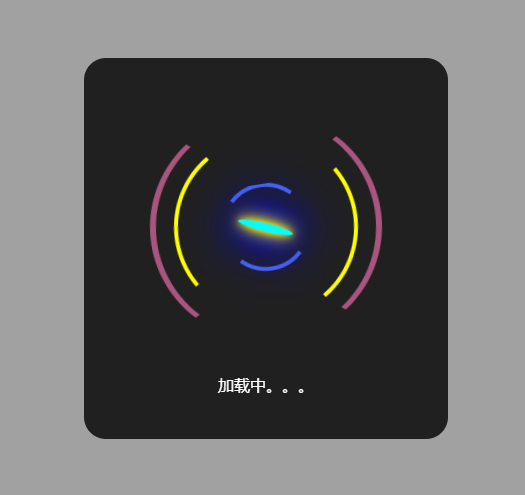
uniapp Modal自定义弹窗
代码】uniappModal自定义弹窗。
·
在components文件夹中新建showModal.vue
<template>
	<view>
		<view class="contarer" v-if="showBtn==true">
			<view class="main" :style="{width:width,height:height}" :class="{'loginW':loginW!==''}">
				<view class="mainTitel" v-if="!loginW">{{shouTitle}}</view>
				<view class="mainBox">
					<view class="mainName" :class="{'logintext':loginW!==''}" v-if="!loginW">{{nameGet}}</view>
					<view class="mainLongin" v-else>
						<view class="mainIcBox">
							<view class="mainIcon">
								<view class="mainIcons"></view>
							</view>
						</view>
						<view class="mainLingText" :class="{'logintext':loginW!==''}">{{loginW}}</view>
					</view>
					<view class="mainBtn" v-if="cancelna||confirmna">
						<view class="mainBtnl" @click="cancel" v-if="cancelna">{{cancelna}}</view>
						<view class="mainBtnr" @click="confirm" v-if="confirmna">{{confirmna}}</view>
					</view>
				</view>
			</view>
		</view>
	</view>
</template>

<script>
	export default {
		props: {
			width: {
				type: String, //弹窗宽度
				// default: '200rpx'
			},
			height: {
				type: String,  //弹窗高度
				// default: '100rpx'
			},
			shouTitle: {
				type: String,
				default: '提示'
			},
			nameGet: {
				type: String
			},
			showBtn: {
				type: Boolean,
				default: false,
			},
			cancelna: { //取消按钮
				type: String
			},
			confirmna: { //确认按钮
				type: String
			},
			loginW: {
				type: String
			}
		},
		data() {
			return {
				// showBtn:true
			}
		},
		methods: {
			cancel() {
				this.$emit('cancel', false)
				this.showBtn = false
			},
			confirm(e) {
				this.$emit('confirm', e || true)
				this.showBtn = false
			}

		}
	}
</script>

<style lang="scss" scoped>
	.loginW {
		background-color: rgba(0, 0, 0, 0.8) !important;
		color: #fff !important;
	}

	.logintext {
		color: #fff !important;
	}

	.contarer {
		position: fixed;
		left: 0;
		top: 0;
		width: 100%;
		height: 100%;
		background-color: rgba(0, 0, 0, 0.35);
		z-index: 999 !important;
		display: flex;
		align-items: center;
		justify-content: center;

		.main {
			background-color: #fff;
			border-radius: 20rpx;
			padding: 20rpx 0;
			max-width: 60%;
			animation: fadeZoom 0.15s linear;

			.mainTitel {
				min-width: 200rpx;
				text-align: center;
				border-bottom: #999 solid 1rpx;
				padding-bottom: 15rpx;
				font-family: 华文细黑;
				font-size: 33rpx;
				font-weight: bold;
			}

			.mainBox {
				padding: 0 30rpx;

				.mainName {
					padding: 20rpx;
					color: #333;
					word-wrap: break-word;
					text-align: center;
				}

				.mainLongin {
					.mainIcBox {
						width: 200rpx;
						height: 200rpx;
						margin: 30rpx;
						display: flex;
						justify-content: center;
						align-items: center;
						border-radius: 50%;
						border: solid 6rpx #aa557f;
						border-top: 4rpx solid transparent;
						border-bottom: 4rpx solid transparent;
						animation: y 4s infinite;

						.mainIcon {
							border-radius: 50%;
							width: 80%;
							height: 80%;
							border: solid 4rpx #ffff00;
							display: flex;
							justify-content: center;
							align-items: center;
							animation: yis 3s infinite;
							border-left: 4rpx solid transparent;
							border-right: 4rpx solid transparent;

							@keyframes yis {
								0% {
									transform: rotate(0deg);
								}

								100% {
									transform: rotate(-360deg);
								}
							}

							.mainIcons {
								transform: translate(-50%, -50%);
								width: 45%;
								height: 45%;
								border-radius: 50%;
								border: solid 4rpx #4e6ef2;
								border-top: 4rpx solid transparent;
								border-bottom: 4rpx solid transparent;
								display: flex;
								align-items: center;
								justify-content: center;
								animation: y 2s infinite;

								&:before {
									content: '';
									width: 70%;
									height: 10%;
									border-radius: 50%;
									background-color: #00ffff;
									animation: y 1s infinite;
									box-shadow: 0rpx 0rpx 10rpx #ffff00,
									0rpx 0rpx 20rpx #ffff00,
									0rpx 0rpx 30rpx #ffff00,
									0rpx 0rpx 40rpx #0000ff,
									0rpx 0rpx 50rpx #0000ff,
									0rpx 0rpx 60rpx #0000ff,
									0rpx 0rpx 70rpx #0000ff,
									0rpx 0rpx 80rpx #0000ff,
									0rpx 0rpx 90rpx #0000ff,
									0rpx 0rpx 100rpx #0000ff,
									0rpx 0rpx 110rpx #0000ff,
									;

									@keyframes y {
										0% {
											transform: rotate(0deg);
										}

										100% {
											transform: rotate(360deg);
										}
									}
								}
							}
						}
					}

					.mainLingText {
						text-align: center;
						padding-bottom: 20rpx;
						word-wrap: break-word;
					}
				}

				.mainBtn {
					margin-top: 15rpx;
					display: flex;
					justify-content: space-around;
					align-items: center;
					font-size: 34rpx;

					.mainBtnr {
						padding: 15rpx 30rpx;
						background-color: #4e6ef2;
						border-radius: 10rpx;
						color: #fff;
					}

					.mainBtnl {
						padding: 15rpx 30rpx;
						background-color: #aaaa00;
						border-radius: 10rpx;
						color: #fff;
					}
				}
			}
		}

		@keyframes fadeZoom {
			0% {
				transform: scale(0.7);
				opacity: 0.6;
			}

			80% {
				transform: scale(1.2);
				opacity: 0.3;
			}

			100% {
				transform: scale(1);
				opacity: 1;
			}
		}
	}
</style>
使用加载或提示框的时候记得给定时器将showBtn变成false
<template>
    <view>
		<show-modal :showBtn="showBtn" :loginW="loginW" :nameGet="nameGet"></show-modal>
	</view>
</template>
<script>
import showModal from "@/components/pageIndex/showModal.vue"
	export default {
		components:{
			showModal
		},
		data() {
			return {
				showBtn:false  ,//弹窗按钮
				loginW:'',  //正在加载   使用加载提示  nameGet就用不了
				nameGet:''  //提示框内容

			}
		},
        methods: {
            getpen() {
				this.showBtn=true
                this.loginW=""
				this.nameGet='直播未开始'
				setTimeout(()=>{
					this.showBtn=false
					this.nameGet=''
				}, 1500);
			},
        }
    }
</script>
为开发者提供学习成长、分享交流、生态实践、资源工具等服务,帮助开发者快速成长。
更多推荐


 2
2 0
0- 0


 已为社区贡献2条内容

所有评论(0)