MAUI 框架安卓入门开发03 界面样式优化
2.5需要使用一个集合控件CollectionView来进行展示,并且通过ItemsSource属性来绑定的方式加载集合数据源。1.1使用ScrollView滚动控件,该控件有一个属性Orientation,用来设置滚动的方向。2.3ViewModel需要设计一个集合,用于页面加载时集合存放的图标和文字信息。首先,标题模型设计,设计一个用于页面交互的ViewModel,和用于存放页面相关属性的Mo
·
1.超出界面范围后,如何让超出部分支持滚动
1.1 使用ScrollView 滚动控件,该控件有一个属性 Orientation,用来设置滚动的方向。
- Horizontal 水平方向滚动
Vertical垂直方向滚动Both水平方向和垂直方向滚动- Neither 不滚动
1.2 还需设置显示的滚动条属性
- Always 总是显示滚动条
- Never 不显示滚动条
- Default 默认显示滚动条
1.3 设置成不需要显示滚动条
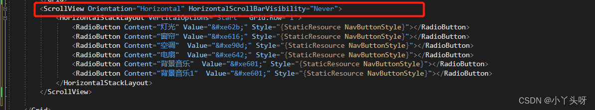
1.4 就能成功滚动了
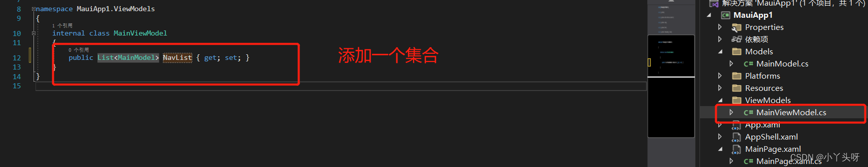
2. 标题部分处理,使用到MVVM数据模型
2.1 使用MVVM 分层架构,动态加载标题部分内容。
首先,标题模型设计,设计一个用于页面交互的ViewModel,和用于存放页面相关属性的Model
2.2 Model 需要设计2个属性,用于存放标题图标和显示文字

2.3 ViewModel 需要设计一个集合,用于页面加载时集合存放的图标和文字信息 。引用Model属性
2.4 修改MainPage.xaml 前台页面
2.5 需要使用一个集合控件CollectionView 来进行展示 ,并且通过ItemsSource 属性来绑定的方式加载集合数据源
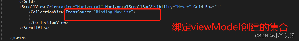
2.6 绑定好数据源后,还需要使数据源与当前页面进行绑定
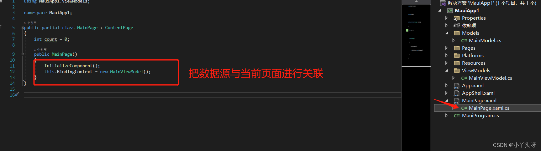
2.7 建立好页面与数据源关联后,在ViewModel 进行数据初始化
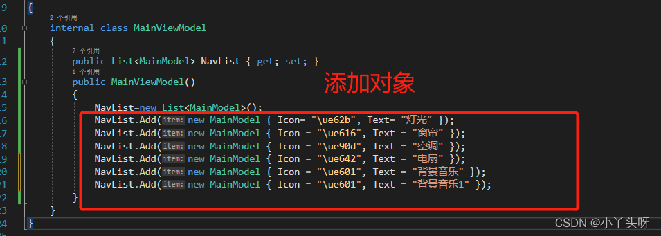
注意:\u 是转换字符,原来的  需要转换成\ue62b
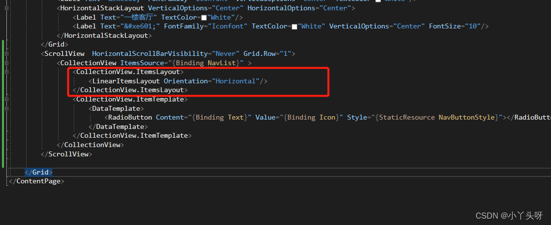
2.8 初始化数据有了,接下来需要定义数据模板,让内容按照指定的模板进行排放。

2.9 往数据模板里面绑定数据,并且指定前面已重写的按钮模板,把它们做上关联
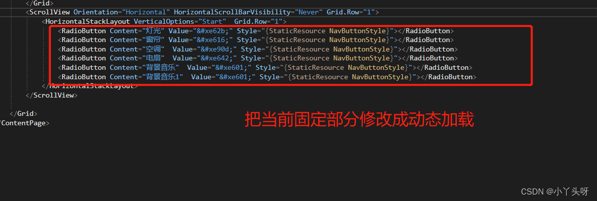
 3.0 调整CollectionView 控件的一个ItemsLayout 属性,把它设置成Horizontal
Vertical垂直方向展开Horizontal水平方向展开
4. 修改前的代码:
<?xml version="1.0" encoding="utf-8" ?>
<ContentPage xmlns="http://schemas.microsoft.com/dotnet/2021/maui"
xmlns:x="http://schemas.microsoft.com/winfx/2009/xaml"
x:Class="MauiApp1.NewPage1" Background="LightGray">
<ContentPage.Resources>
<Style TargetType="RadioButton" x:Key="NavButtonStyle">
<Setter Property="WidthRequest" Value="70"/>
<Setter Property="HeightRequest" Value="90"/>
<Setter Property="TextColor" Value="White"/>
<Setter Property="Margin" Value="5,10"/>
<Setter Property="FontSize" Value="40"/>
<Setter Property="VerticalOptions" Value="Center"/>
<Setter Property="HorizontalOptions" Value="Center"/>
<Setter Property="ControlTemplate">
<ControlTemplate>
<Grid>
<Grid.RowDefinitions>
<RowDefinition />
<RowDefinition Height="30" />
</Grid.RowDefinitions>
<Rectangle Fill="Yellow"
Stroke="#8de9ff" StrokeThickness="1"
RadiusX="20" RadiusY="20" WidthRequest="50" HeightRequest="50"
IsVisible="{TemplateBinding IsVisible}"/>
<Label Text="{TemplateBinding Value}" FontFamily="Iconfont" FontSize="30"
TextColor="{TemplateBinding TextColor}"
HorizontalOptions="Center"
VerticalOptions="Center"></Label>
<Label Text="{TemplateBinding Content}" Grid.Row="1"
HorizontalOptions="Center"
VerticalOptions="Center"
TextColor="White"
FontSize="13"></Label>
</Grid>
</ControlTemplate>
</Setter>
<Style.Triggers>
<Trigger TargetType="RadioButton" Property="IsChecked" Value="True">
<Setter Property="TextColor" Value="Blue"/>
</Trigger>
</Style.Triggers>
</Style>
</ContentPage.Resources>
<Grid Margin="0,30,0,0">
<Grid.RowDefinitions>
<RowDefinition Height="40"/>
<RowDefinition Height="120"/>
<RowDefinition />
</Grid.RowDefinitions>
<Grid Margin="10">
<Label Text="" FontFamily="Iconfont" VerticalOptions="Center" TextColor="White"/>
<HorizontalStackLayout VerticalOptions="Center" HorizontalOptions="Center">
<Label Text="一楼客厅" TextColor="White"/>
<Label Text="" FontFamily="Iconfont" TextColor="White" VerticalOptions="Center" FontSize="10"/>
</HorizontalStackLayout>
</Grid>
<ScrollView Orientation="Horizontal" HorizontalScrollBarVisibility="Never" Grid.Row="1">
<HorizontalStackLayout VerticalOptions="Start" Grid.Row="1">
<RadioButton Content="灯光" Value="" Style="{StaticResource NavButtonStyle}"></RadioButton>
<RadioButton Content="窗帘" Value="" Style="{StaticResource NavButtonStyle}"></RadioButton>
<RadioButton Content="空调" Value="" Style="{StaticResource NavButtonStyle}"></RadioButton>
<RadioButton Content="电扇" Value="" Style="{StaticResource NavButtonStyle}"></RadioButton>
<RadioButton Content="背景音乐" Value="" Style="{StaticResource NavButtonStyle}"></RadioButton>
<RadioButton Content="背景音乐1" Value="" Style="{StaticResource NavButtonStyle}"></RadioButton>
</HorizontalStackLayout>
</ScrollView>
</Grid>
</ContentPage>
5. 修改后的代码:
<?xml version="1.0" encoding="utf-8" ?>
<ContentPage xmlns="http://schemas.microsoft.com/dotnet/2021/maui"
xmlns:x="http://schemas.microsoft.com/winfx/2009/xaml"
x:Class="MauiApp1.MainPage" Background="LightGray">
<ContentPage.Resources>
<Style TargetType="RadioButton" x:Key="NavButtonStyle">
<Setter Property="WidthRequest" Value="70"/>
<Setter Property="HeightRequest" Value="90"/>
<Setter Property="TextColor" Value="White"/>
<Setter Property="Margin" Value="5,10"/>
<Setter Property="FontSize" Value="40"/>
<Setter Property="VerticalOptions" Value="Center"/>
<Setter Property="HorizontalOptions" Value="Center"/>
<Setter Property="ControlTemplate">
<ControlTemplate>
<Grid>
<Grid.RowDefinitions>
<RowDefinition />
<RowDefinition Height="30" />
</Grid.RowDefinitions>
<Rectangle Fill="Yellow"
Stroke="#8de9ff" StrokeThickness="1"
RadiusX="20" RadiusY="20" WidthRequest="50" HeightRequest="50"
IsVisible="{TemplateBinding IsVisible}"/>
<Label Text="{TemplateBinding Value}" FontFamily="Iconfont" FontSize="30"
TextColor="{TemplateBinding TextColor}"
HorizontalOptions="Center"
VerticalOptions="Center"></Label>
<Label Text="{TemplateBinding Content}" Grid.Row="1"
HorizontalOptions="Center"
VerticalOptions="Center"
TextColor="White"
FontSize="13"></Label>
</Grid>
</ControlTemplate>
</Setter>
<Style.Triggers>
<Trigger TargetType="RadioButton" Property="IsChecked" Value="True">
<Setter Property="TextColor" Value="Blue"/>
</Trigger>
</Style.Triggers>
</Style>
</ContentPage.Resources>
<Grid Margin="0,30,0,0">
<Grid.RowDefinitions>
<RowDefinition Height="40"/>
<RowDefinition Height="120"/>
<RowDefinition />
</Grid.RowDefinitions>
<Grid Margin="10">
<Label Text="" FontFamily="Iconfont" VerticalOptions="Center" TextColor="White"/>
<HorizontalStackLayout VerticalOptions="Center" HorizontalOptions="Center">
<Label Text="一楼客厅" TextColor="White"/>
<Label Text="" FontFamily="Iconfont" TextColor="White" VerticalOptions="Center" FontSize="10"/>
</HorizontalStackLayout>
</Grid>
<ScrollView HorizontalScrollBarVisibility="Never" Grid.Row="1">
<CollectionView ItemsSource="{Binding NavList}" >
<CollectionView.ItemsLayout>
<LinearItemsLayout Orientation="Horizontal"/>
</CollectionView.ItemsLayout>
<CollectionView.ItemTemplate>
<DataTemplate>
<RadioButton Content="{Binding Text}" Value="{Binding Icon}" Style="{StaticResource NavButtonStyle}"></RadioButton>
</DataTemplate>
</CollectionView.ItemTemplate>
</CollectionView>
</ScrollView>
</Grid>
</ContentPage>
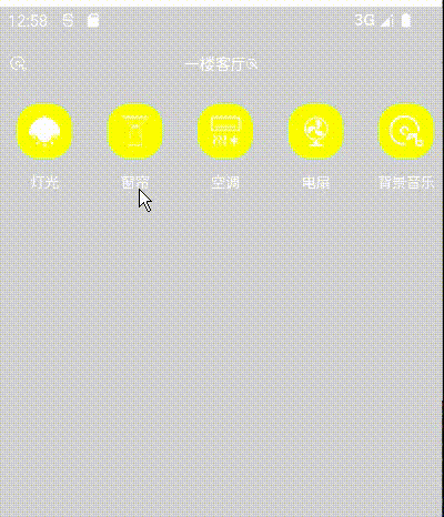
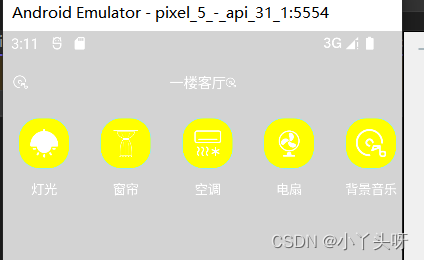
6. 最后效果
出自:全网首发.NET MAUI框架入门 已完结 附企业级WPF实战(C#/blazor/xamarin/停车场项目+通用框架+数据采集与监控/数据库)B0858_哔哩哔哩_bilibili
当前仅用于记录学习,不做任何教程提供。

为开发者提供学习成长、分享交流、生态实践、资源工具等服务,帮助开发者快速成长。
更多推荐


 2
2 0
0- 0


 已为社区贡献17条内容

所有评论(0)