Ant Design学习——Cascader
2021SC@SDUSCCascader级联选择框。需要从一组相关联的数据集合进行选择,例如省市区,公司层级,事物分类等。从一个较大的数据集合中进行选择时,用多级分类进行分隔,方便选择。比起 Select 组件,可以在同一个浮层中完成选择,有较好的体验。API<Cascader options={options} onChange={onChange} />Cascader参数说明类型
·
2021SC@SDUSC
Cascader级联选择框。
用法:
- 需要从一组相关联的数据集合进行选择,例如省市区,公司层级,事物分类等。
- 从一个较大的数据集合中进行选择时,用多级分类进行分隔,方便选择。
- 比起 Select 组件,可以在同一个浮层中完成选择,有较好的体验。
API
<Cascader options={options} onChange={onChange} />
Cascader
| 参数 | 说明 | 类型 | 默认值 | 版本 |
|---|---|---|---|---|
| allowClear | 是否支持清除 | boolean | true | |
| autoFocus | 自动获取焦点 | boolean | false | |
| bordered | 是否有边框 | boolean | true | |
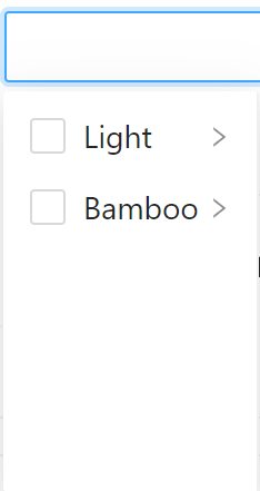
| changeOnSelect | 当此项为 true 时,点选每级菜单选项值都会发生变化,具体见上面的演示 | boolean | false | |
| className | 自定义类名 | string | - | |
| defaultValue | 默认的选中项 | string[] | number[] | [] | |
| disabled | 禁用 | boolean | false | |
| displayRender | 选择后展示的渲染函数 | (label, selectedOptions) => ReactNode | label => label.join(/) | |
| dropdownClassName | 自定义浮层类名 | string | - | 4.17.0 |
| dropdownRender | 自定义下拉框内容 | (menus: ReactNode) => ReactNode | - | 4.4.0 |
| expandIcon | 自定义次级菜单展开图标 | ReactNode | - | 4.4.0 |
| expandTrigger | 次级菜单的展开方式,可选 ‘click’ 和 ‘hover’ | string | click | |
| fieldNames | 自定义 options 中 label name children 的字段 | object | { label: label, value: value, children: children } | |
| getPopupContainer | 菜单渲染父节点。默认渲染到 body 上,如果你遇到菜单滚动定位问题,试试修改为滚动的区域,并相对其定位。 | function(triggerNode) | () => document.body | |
| loadData | 用于动态加载选项,无法与 showSearch 一起使用 | (selectedOptions) => void | - | |
| maxTagCount | 最多显示多少个 tag,响应式模式会对性能产生损耗 | number | responsive | - | 4.17.0 |
| maxTagPlaceholder | 隐藏 tag 时显示的内容 | ReactNode | function(omittedValues) | - | 4.17.0 |
| notFoundContent | 当下拉列表为空时显示的内容 | string | Not Found | |
| open | 控制浮层显隐 | boolean | - | 4.17.0 |
| options | 可选项数据源 | Option | - | |
| placeholder | 输入框占位文本 | string | 请选择 | |
| placement | 浮层预设位置:bottomLeft bottomRight topLeft topRight | string | bottomLeft | 4.17.0 |
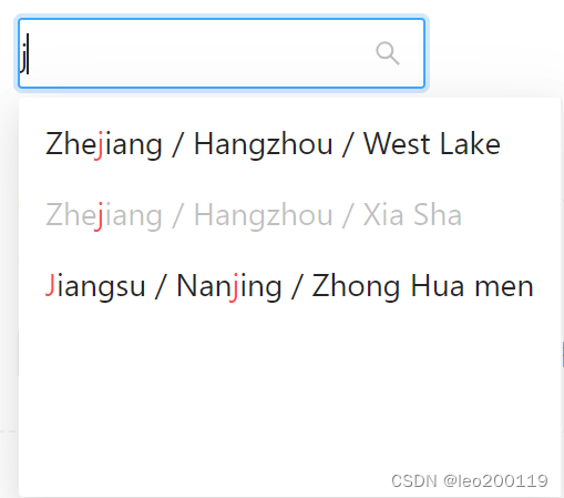
| showSearch | 在选择框中显示搜索框 | boolean | Object | false | |
| size | 输入框大小 | large | middle | small | - | |
| style | 自定义样式 | CSSProperties | - | |
| suffixIcon | 自定义的选择框后缀图标 | ReactNode | - | |
| tagRender | 自定义 tag 内容,多选时生效 | (props) => ReactNode | - | 4.17.0 |
| value | 指定选中项 | string[] | number[] | - | |
| onChange | 选择完成后的回调 | (value, selectedOptions) => void | - | |
| onDropdownVisibleChange | 显示/隐藏浮层的回调 | (value) => void | - | 4.17.0 |
| multiple | 支持多选节点 | boolean | - | 4.17.0 |
| searchValue | 设置搜索的值,需要与 showSearch 配合使用 | string | - | |
| onSearch | 监听搜索,返回输入的值 | (search: string) => void | - | |
| dropdownMenuColumnStyle | 下拉菜单列的样式 | CSSProperties | - | |
| loadingIcon | 动态加载时的加载动画 (目前这个属性设置后不生效) | ReactNode | - |
showSearch
showSearch 为对象时,其中的字段:
| 参数 | 说明 | 类型 | 默认值 |
|---|---|---|---|
| filter | 接收 inputValue path 两个参数,当 path 符合筛选条件时,应返回 true,反之则返回 false | function(inputValue, path): boolean | - |
| limit | 搜索结果展示数量 | number | false | 50 |
| matchInputWidth | 搜索结果列表是否与输入框同宽 | boolean | true |
| render | 用于渲染 filter 后的选项 | function(inputValue, path): ReactNode | - |
| sort | 用于排序 filter 后的选项 | function(a, b, inputValue) | - |
Option
interface Option {
  value: string | number;
  label?: React.ReactNode;
  disabled?: boolean;
  children?: Option[];
}
部分源码
import * as React from 'react';
import classNames from 'classnames';
import RcCascader from 'rc-cascader';
import type { CascaderProps as RcCascaderProps } from 'rc-cascader';
import type { ShowSearchType, FieldNames } from 'rc-cascader/lib/interface';
import omit from 'rc-util/lib/omit';
import RightOutlined from '@ant-design/icons/RightOutlined';
import RedoOutlined from '@ant-design/icons/RedoOutlined';
import LeftOutlined from '@ant-design/icons/LeftOutlined';
import devWarning from '../_util/devWarning';
import { ConfigContext } from '../config-provider';
import type { SizeType } from '../config-provider/SizeContext';
import SizeContext from '../config-provider/SizeContext';
import getIcons from '../select/utils/iconUtil';
import { getTransitionName } from '../_util/motion';
可以看出Cascader同样运用到了react中的cascader。
export type FieldNamesType = FieldNames;
export type FilledFieldNamesType = Required<FieldNamesType>;
function highlightKeyword(str: string, lowerKeyword: string, prefixCls: string | undefined) {
  const cells = str
    .toLowerCase()
    .split(lowerKeyword)
    .reduce((list, cur, index) => (index === 0 ? [cur] : [...list, lowerKeyword, cur]), []);
  const fillCells: React.ReactNode[] = [];
  let start = 0;

  cells.forEach((cell, index) => {
    const end = start + cell.length;
    let originWorld: React.ReactNode = str.slice(start, end);
    start = end;

    if (index % 2 === 1) {
      originWorld = (
        <span className={`${prefixCls}-menu-item-keyword`} key="seperator">
          {originWorld}
        </span>
      );
    }

    fillCells.push(originWorld);
  });

  return fillCells;
}
用lowerKeyword分割字符串成为数组,并运用reduce函数对其进行操作,生成cells,cells中存放的应是要使用的每一个选择。
- reduce 为数组中的每一个元素依次执行回调函数,不包括数组中被删除或从未被赋值的元素,接受四个参数:初始值(或者上一次回调函数的返回值),当前元素值,当前索引,调用 reduce 的数组。
之后对cells进行分割,并生成HTML并存入fillCells
const defaultSearchRender: ShowSearchType['render'] = (inputValue, path, prefixCls, fieldNames) => {
  const optionList: React.ReactNode[] = [];

  // We do lower here to save perf
  const lower = inputValue.toLowerCase();

  path.forEach((node, index) => {
    if (index !== 0) {
      optionList.push(' / ');
    }

    let label = (node as any)[fieldNames.label!];
    const type = typeof label;
    if (type === 'string' || type === 'number') {
      label = highlightKeyword(String(label), lower, prefixCls);
    }

    optionList.push(label);
  });
  return optionList;
};
对inputValue小写化,同时当label是字符串或数字时,将其进行highlightkeyword,将处理过的label存入optionlist
export interface CascaderProps extends Omit<RcCascaderProps, 'checkable'> {
  multiple?: boolean;
  size?: SizeType;
  bordered?: boolean;
}

interface CascaderRef {
  focus: () => void;
  blur: () => void;
}
供使用的接口
multiple支持多选节点
size输入框大小
bordered是否有边框
const Cascader = React.forwardRef((props: CascaderProps, ref: React.Ref<CascaderRef>) => {
  const {
    prefixCls: customizePrefixCls,
    size: customizeSize,
    className,
    multiple,
    bordered = true,
    transitionName,
    choiceTransitionName = '',
    popupClassName,
    dropdownClassName,
    expandIcon,
    showSearch,
    allowClear = true,
    notFoundContent,
    direction,
    getPopupContainer,
    ...rest
  } = props;

  const restProps = omit(rest, ['suffixIcon' as any]);

  const {
    getPopupContainer: getContextPopupContainer,
    getPrefixCls,
    renderEmpty,
    direction: rootDirection,
    // virtual,
    // dropdownMatchSelectWidth,
  } = React.useContext(ConfigContext);
forwardRef函数接受ref传递ref
以及hook函数useContext,接受一个context对象并返回当前context值
  // =================== Dropdown ====================
  const mergedDropdownClassName = classNames(
    dropdownClassName || popupClassName,
    `${cascaderPrefixCls}-dropdown`,
    {
      [`${cascaderPrefixCls}-dropdown-rtl`]: mergedDirection === 'rtl',
    },
  );
下拉框部分
  // =================== Multiple ====================
  const checkable = React.useMemo(
    () => (multiple ? <span className={`${cascaderPrefixCls}-checkbox-inner`} /> : false),
    [multiple],
  );
多选节点部分
  // ==================== Search =====================
  const mergedShowSearch = React.useMemo(() => {
    if (!showSearch) {
      return showSearch;
    }

    let searchConfig: ShowSearchType = {
      render: defaultSearchRender,
    };

    if (typeof showSearch === 'object') {
      searchConfig = {
        ...searchConfig,
        ...showSearch,
      };
    }

    return searchConfig;
  }, [showSearch]);
搜索部分
  // ==================== Render =====================
  return (
    <RcCascader
      prefixCls={prefixCls}
      className={classNames(
        !customizePrefixCls && cascaderPrefixCls,
        {
          [`${prefixCls}-lg`]: mergedSize === 'large',
          [`${prefixCls}-sm`]: mergedSize === 'small',
          [`${prefixCls}-rtl`]: isRtl,
          [`${prefixCls}-borderless`]: !bordered,
        },
        className,
      )}
      {...(restProps as any)}
      direction={mergedDirection}
      notFoundContent={mergedNotFoundContent}
      allowClear={allowClear}
      showSearch={mergedShowSearch}
      expandIcon={mergedExpandIcon}
      inputIcon={suffixIcon}
      removeIcon={removeIcon}
      clearIcon={clearIcon}
      loadingIcon={loadingIcon}
      checkable={checkable}
      dropdownClassName={mergedDropdownClassName}
      dropdownPrefixCls={customizePrefixCls || cascaderPrefixCls}
      choiceTransitionName={getTransitionName(rootPrefixCls, '', choiceTransitionName)}
      transitionName={getTransitionName(rootPrefixCls, 'slide-up', transitionName)}
      getPopupContainer={getPopupContainer || getContextPopupContainer}
      ref={ref}
    />
  );
渲染并最终返回

CSDN联合极客时间,共同打造面向开发者的精品内容学习社区,助力成长!
更多推荐


 0
0 0
0- 0


 已为社区贡献2条内容

所有评论(0)