Bootstrap5详细讲解
文章目录Boostrap v50.介绍1.快速开始2.布局容器Boostrap v50.介绍使用 Bootstrap 构建快速、响应式布局的网站Bootstrap 是全球最流行的前端开源工具包,它支持 Sass 变量和 mixins、响应式网格系统、大量的预建组件和强大的 JavaScript 插件,助你快速设计和自定义响应式、移动设备优先的站点。1.快速开始<!doctype html&g
文章目录
Bootstrap5详细讲解
0.介绍
使用 Bootstrap 构建快速、响应式布局的网站
Bootstrap 是全球最流行的前端开源工具包,它支持 Sass 变量和 mixins、响应式网格系统、大量的预建组件和强大的 JavaScript 插件,助你快速设计和自定义响应式、移动设备优先的站点。
1.快速开始
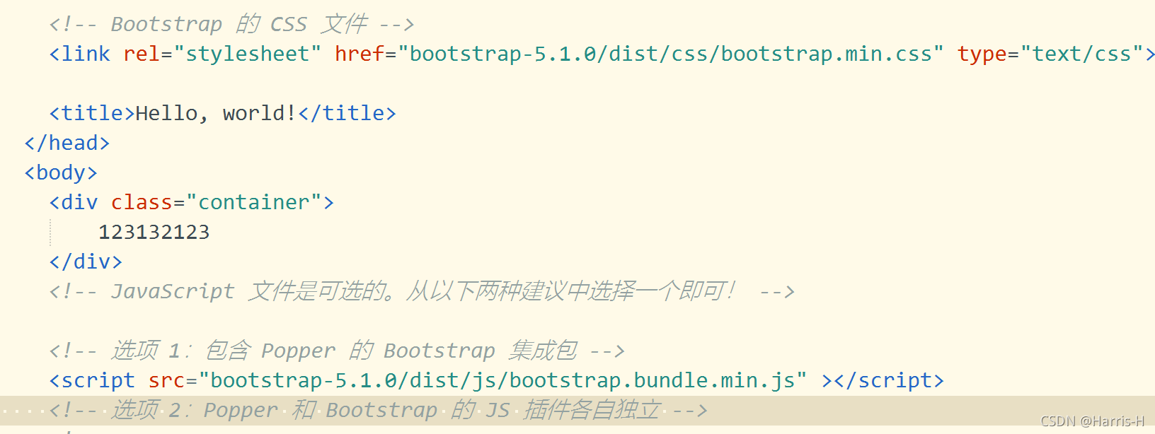
<!doctype html>
<html lang="zh-CN">
  <head>
    <!-- 必须的 meta 标签 -->
    <meta charset="utf-8">
    <meta name="viewport" content="width=device-width, initial-scale=1">

    <!-- Bootstrap 的 CSS 文件 -->
    <link href="https://cdn.jsdelivr.net/npm/bootstrap@5.1.0/dist/css/bootstrap.min.css" rel="stylesheet" integrity="sha384-dRYOpy/KcUgZUv3UgAdBrl5jPEmH+fTv2Vu1Bq4Wsr2/779iKnon9o5hZZVSM76I" crossorigin="anonymous">

    <title>Hello, world!</title>
  </head>
  <body>
    <h1>Hello, world!</h1>

    <!-- JavaScript 文件是可选的。从以下两种建议中选择一个即可! -->

    <!-- 选项 1:包含 Popper 的 Bootstrap 集成包 -->
    <script src="https://cdn.jsdelivr.net/npm/bootstrap@5.1.0/dist/js/bootstrap.bundle.min.js" integrity="sha384-KIT91OlDmsIXvQaqzxNONuO4ve97S3yDh9A0nea67fEK+03Wdyc/3oGgd0+DPaf7" crossorigin="anonymous"></script>

    <!-- 选项 2:Popper 和 Bootstrap 的 JS 插件各自独立 -->
    <!--
    <script src="https://cdn.jsdelivr.net/npm/@popperjs/core@2.9.3/dist/umd/popper.min.js" integrity="sha384-eMNCOe7tC1doHpGoWe/6oMVemdAVTMs2xqW4mwXrXsW0L84Iytr2wi5v2QjrP/xp" crossorigin="anonymous"></script>
    <script src="https://cdn.jsdelivr.net/npm/bootstrap@5.1.0/dist/js/bootstrap.min.js" integrity="sha384-eHUUET4pt56BkNH9bTjZqK3d9mJAjuwJF3IR0yb+k7goQPFwqV5q+Bn51DOhBWkk" crossorigin="anonymous"></script>
    -->
  </body>
</html>
或者下载Bootstrap源代码,然后保存到对应的项目下,引入的时候采用本地路径即可。
2.布局容器
<div class="container-fluid">
	.container-fluid:横跨视口的全宽度的容器。
</div>

<div class="container">
    .container:有最大固定宽度的容器。最大固定宽度依据于视口(viewport)的断点(breakpoints)而不同。
</div>
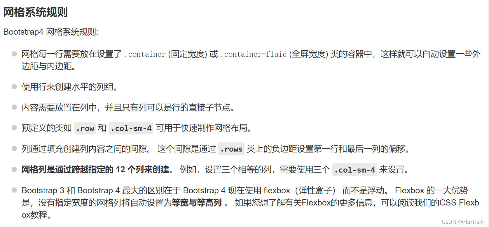
3.网格系统
1.每行最多12列.
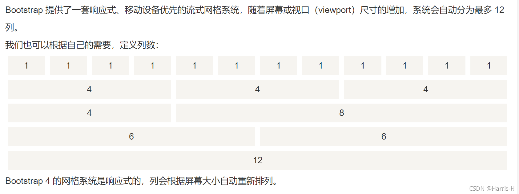
Bootstrap 4 网格系统有以下 5 个类:
.col- 针对所有设备
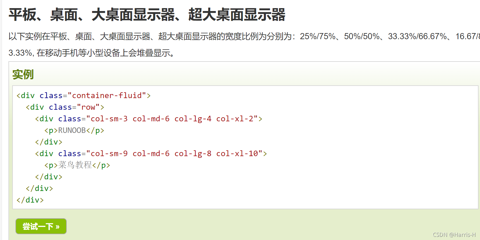
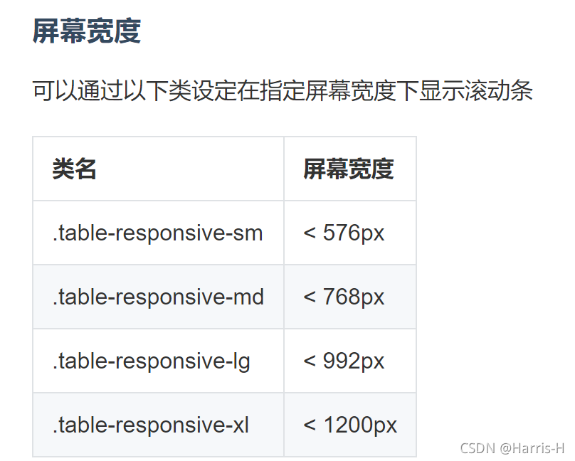
.col-sm- 平板 - 屏幕宽度等于或大于 576px
.col-md- 桌面显示器 - 屏幕宽度等于或大于 768px)
.col-lg- 大桌面显示器 - 屏幕宽度等于或大于 992px)
.col-xl- 超大桌面显示器 - 屏幕宽度等于或大于 1200px)
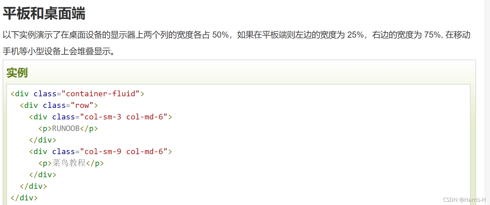
2.不同设备显示不同列分布
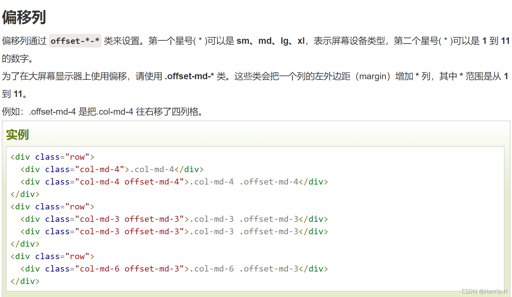
3.偏移列
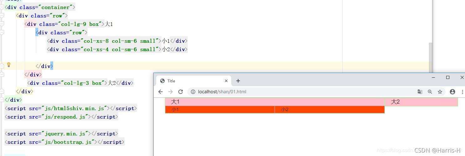
4.列嵌套
使用内置的栅格系统将内容再次嵌套,可以通过添加一个新的 .row
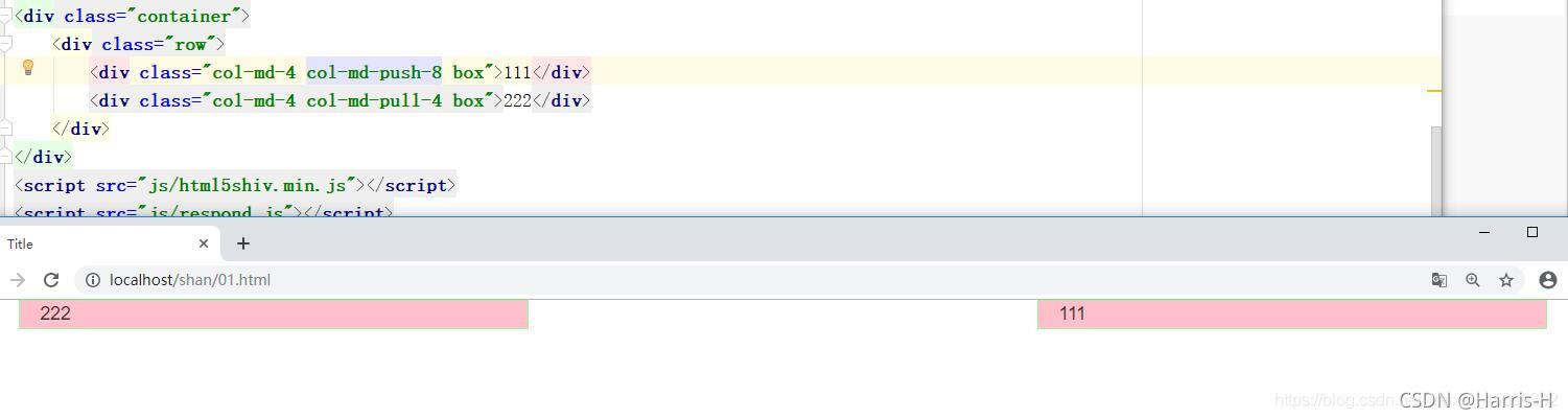
5.列排序
.col-md-push-份数 是把元素向右推动几份数
.col-md-pull-份数 是把元素向左拉动几份数
注意如果两个列移到同一位置,在编写时顺序靠后的会保留.
4.标题和段落
<!DOCTYPE HTML>
<html>
<head>
<meta charset="utf-8">
<title>标题(一)</title>
<link rel="stylesheet" href="https://cdn.bootcss.com/bootstrap/4.0.0-beta.2/css/bootstrap.min.css">
</head>
<body>
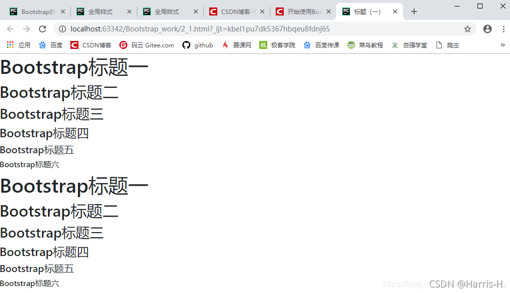
<!--Bootstrap中的标题-->
<h1>Bootstrap标题一</h1>
<h2>Bootstrap标题二</h2>
<h3>Bootstrap标题三</h3>
<h4>Bootstrap标题四</h4>
<h5>Bootstrap标题五</h5>
<h6>Bootstrap标题六</h6>
<!--Bootstrap中让非标题元素和标题使用相同的样式-->
<div class="h1">Bootstrap标题一</div>
<div class="h2">Bootstrap标题二</div>
<div class="h3">Bootstrap标题三</div>
<div class="h4">Bootstrap标题四</div>
<div class="h5">Bootstrap标题五</div>
<div class="h6">Bootstrap标题六</div>
</body>
</html>
副标题
<!DOCTYPE HTML>
<html>
<head>
<meta charset="utf-8">
<title>标题(二)</title>
<link rel="stylesheet" href="https://cdn.bootcss.com/bootstrap/4.0.0-beta.2/css/bootstrap.min.css">
</head>
<body>
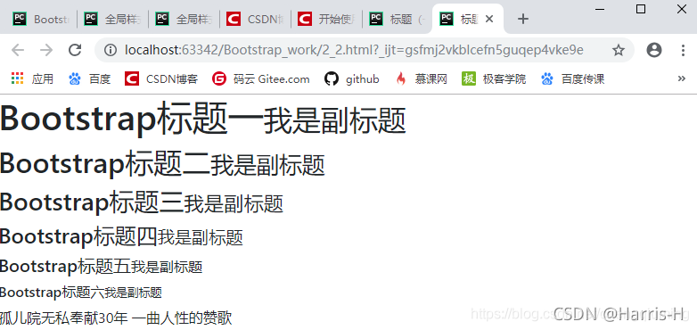
<!--Bootstrap中使用了<small>标签来制作副标题-->
<h1>Bootstrap标题一<small>我是副标题</small></h1>
<h2>Bootstrap标题二<small>我是副标题</small></h2>
<h3>Bootstrap标题三<small>我是副标题</small></h3>
<h4>Bootstrap标题四<small>我是副标题</small></h4>
<h5>Bootstrap标题五<small>我是副标题</small></h5>
<h6>Bootstrap标题六<small>我是副标题</small></h6>
孤儿院无私奉献30年 一曲人性的赞歌
</body>
</html>
段落,通过lead类名 突出强调内容.
<!DOCTYPE HTML>
<html>
<head>
<meta charset="utf-8">
<title>段落(正文文本)</title>
<link rel="stylesheet" href="https://cdn.bootcss.com/bootstrap/4.0.0-beta.2/css/bootstrap.min.css">
</head>
<body>
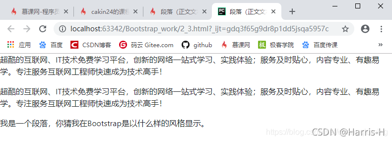
<p>超酷的互联网、IT技术免费学习平台,创新的网络一站式学习、实践体验;服务及时贴心,内容专业、有趣易学。专注服务互联网工程师快速成为技术高手!</p>
<p>超酷的互联网、IT技术免费学习平台,创新的网络一站式学习、实践体验;服务及时贴心,内容专业、有趣易学。专注服务互联网工程师快速成为技术高手!</p>
<p>我是一个段落,你猜我在Bootstrap是以什么样的风格显示。</p>
</body>
</html>
<!DOCTYPE HTML>
<html>
<head>
<meta charset="utf-8">
<title>强调内容</title>
<link rel="stylesheet" href="https://cdn.bootcss.com/bootstrap/4.0.0-beta.2/css/bootstrap.min.css">
</head>
<body>
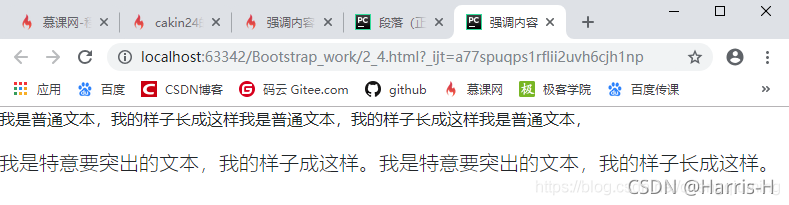
<p>我是普通文本,我的样子长成这样我是普通文本,我的样子长成这样我是普通文本,</p>
<p class="lead">我是特意要突出的文本,我的样子成这样。我是特意要突出的文本,我的样子长成这样。</p>
</body>
</html>
强调
HTML 的默认强调标签 <small>(设置文本为父文本大小的 85%)、<strong>(设置文本为更粗的文本)、<em>(设置文本为斜体)。
Bootstrap 提供了一些用于强调文本的类,如下面实例所示:
<!DOCTYPE html>
<html>
<head>
<meta charset="utf-8">
<title>Bootstrap 实例 - 强调</title>
<link rel="stylesheet" href="https://cdn.staticfile.org/twitter-bootstrap/3.3.7/css/bootstrap.min.css">
<script src="https://cdn.staticfile.org/jquery/2.1.1/jquery.min.js"></script>
<script src="https://cdn.staticfile.org/twitter-bootstrap/3.3.7/js/bootstrap.min.js"></script>
</head>
<body>
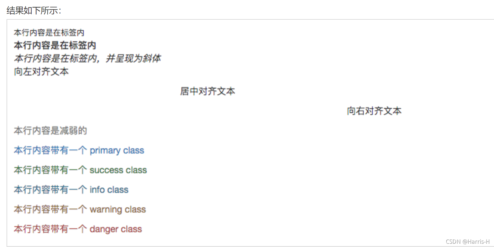
<small>本行内容是在标签内</small><br>
<strong>本行内容是在标签内</strong><br>
<em>本行内容是在标签内,并呈现为斜体</em><br>
<p class="text-left">向左对齐文本</p>
<p class="text-center">居中对齐文本</p>
<p class="text-right">向右对齐文本</p>
<p class="text-muted">本行内容是减弱的</p>
<p class="text-primary">本行内容带有一个 primary class</p>
<p class="text-success">本行内容带有一个 success class</p>
<p class="text-info">本行内容带有一个 info class</p>
<p class="text-warning">本行内容带有一个 warning class</p>
<p class="text-danger">本行内容带有一个 danger class</p>
</body>
</html>
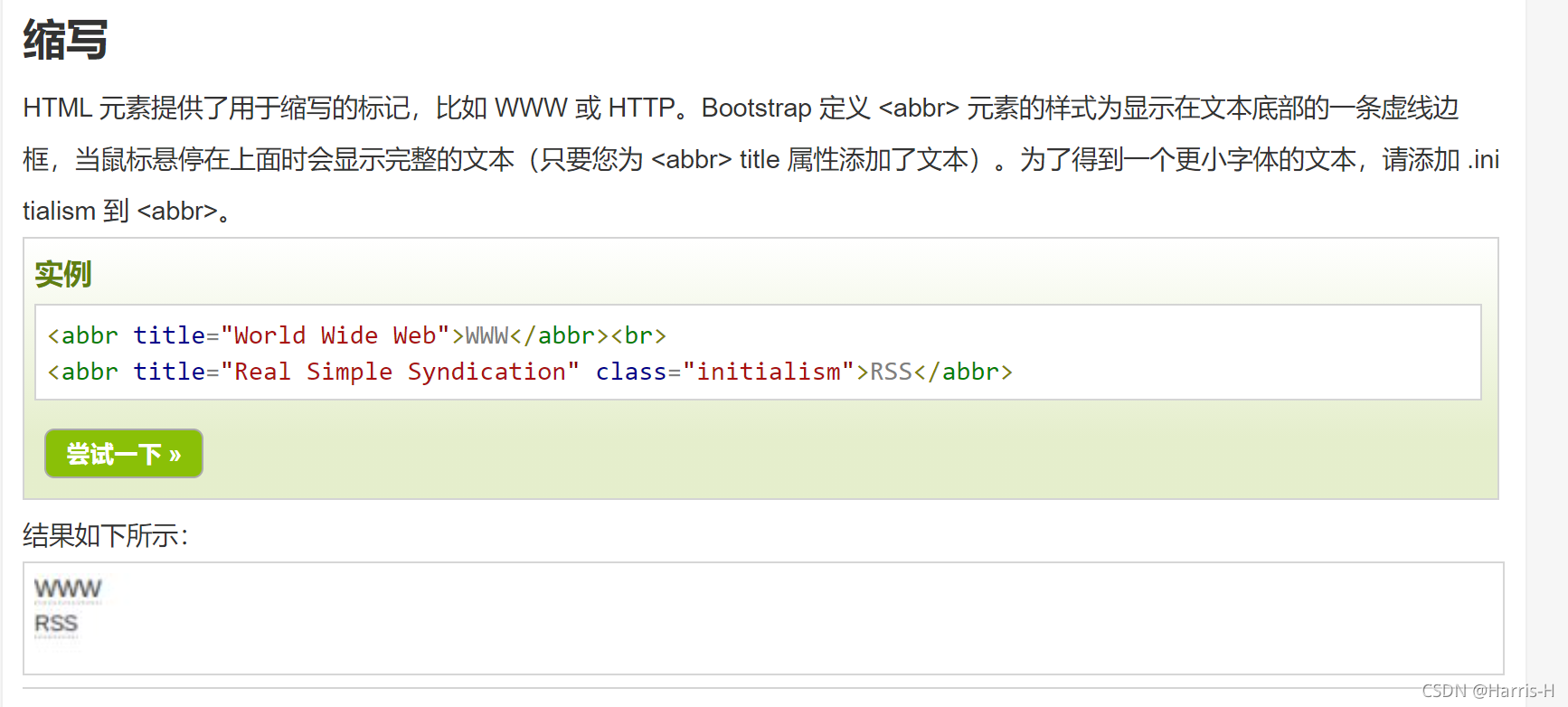
缩写
文本对齐
.text-left:左对齐
.text-center:居中对齐
.text-right:右对齐
.text-justify:两端对齐
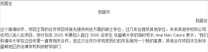
<p class="text-left">我居左</p>
<p class="text-center">我居中</p>
<p class="text-right">我居右</p>
<p class="text-justify">这个强调动手、项目主导的合作项目将首先提供科技方面的硕士学位,过几年会提供其他学位。未来其他学校和公司也可以加入此项目,按计划在 2025 年要招入超过 3000 名学生.华盛顿大学的临时校长 Ana Mari Cauce 表示:“我们和清华大学在这些年里一直有相关合作,但这次合作办学将把我们的关系推向一个新的高度。其他合作项目涉及到华盛顿地区的法律学校和放射学部门
</p>
5.列表
ul 无序列表,使用list-unstyled修饰则去掉无序列表的点。
<div class="container">
  <h2>排版</h2>
  <p>The class .list-unstyled removes the default list-style and left margin on list items (immediate children only):</p>
  <ul class="list-unstyled">
    <li>Coffee</li>
    <li>Tea
      <ul>
        <li>Black tea</li>
        <li>Green tea</li>
      </ul>
    </li>
    <li>Milk</li>
  </ul>
</div>
内联列表:通过添加类名“.list-inline”来实现内联列表,简单点说就是把垂直列表换成水平列表,而且去掉项目符号(编号),保持水平显示。
水平定义列表:给<dl>添加类名“.dl-horizontal”给定义列表实现水平显示效果
注:只有屏幕大于768px的时候,添加类名“.dl-horizontal”才具有水平定义列表效果。当你缩小你的浏览器屏幕时,水平定义列表将回复到原始的状态。
6.代码块
bootstrap 代码块
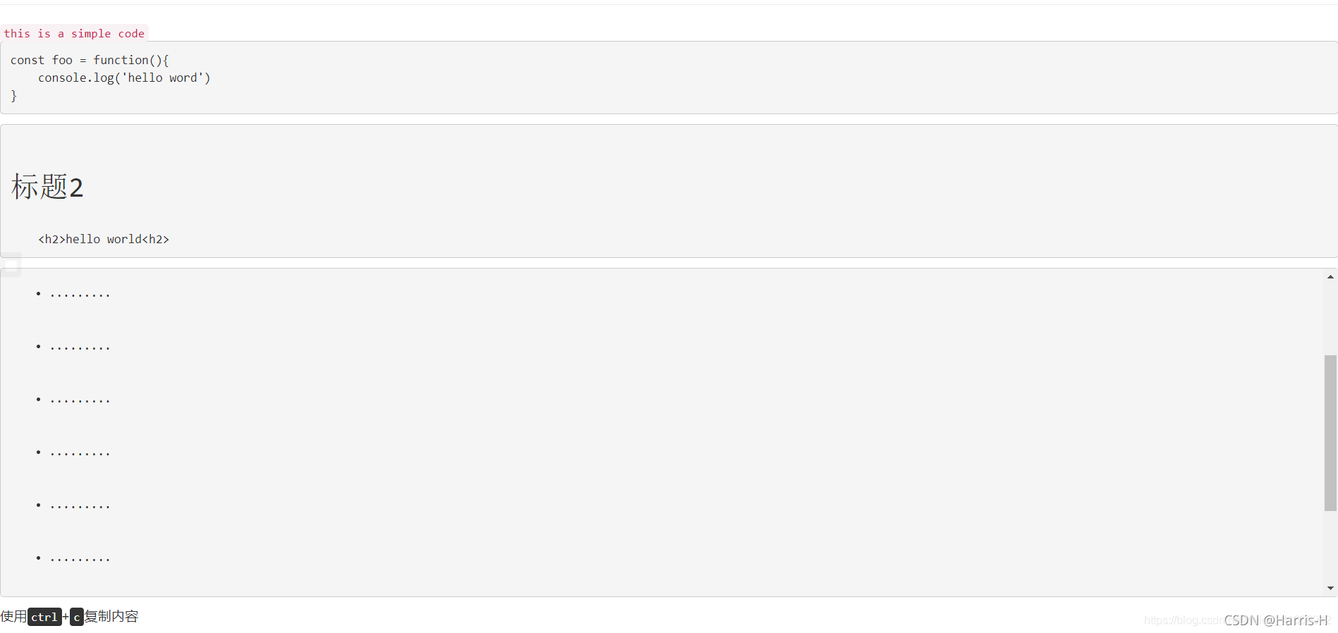
单行内联代码:<code></code>
多行块代码:<pre></pre>
代码长度过长可以用.pre-scrollable添加滚动条, 区域内会保留代码的所有格式包括空格和回车,显示html的标签需要使用字符实体< < > >
显示用户输入代码,如快捷键:<kbd></kbd>
<!-- 代码块 -->
<!-- 单行 -->
<code>this is a simple code</code>
<!-- 多行
由于多行代码内的空格和回车都是识别的,
所以顶格在代码块才严格靠左,否则会有大量tab
是下面代码缩进不同的理由
-->
<pre>
const foo = function(){
console.log('hello word')
}
</pre>
<!--代码块中识别标签-->
<pre>
<h2>标题2</h2>
<h2>hello world<h2>
</pre>
<pre class="pre-scrollable">
<ul>
<li>.........</li>
<li>.........</li>
<li>.........</li>
<li>.........</li>
<li>.........</li>
<li>.........</li>
<li>.........</li>
<li>.........</li>
<li>.........</li>
<li>.........</li>
</ul>
</pre>
<!-- 快捷键 -->
<p>使用<kbd>ctrl</kbd>+<kbd>c</kbd>复制内容</p>
7.表格
.table 基础样式
<table class="table">
    <thead>
      <tr>
        <th>姓</th>
        <th>名</th>
        <th>朝代</th>
      </tr>
    </thead>
    <tbody>
      <tr>
        <td>李</td>
        <td>白</td>
        <td>唐</td>
      </tr>
      <tr>
        <td>韩</td>
        <td>愈</td>
        <td>唐</td>
      </tr>
      <tr>
        <td>王</td>
        <td>安石</td>
        <td>宋</td>
      </tr>
    </tbody>
</table>
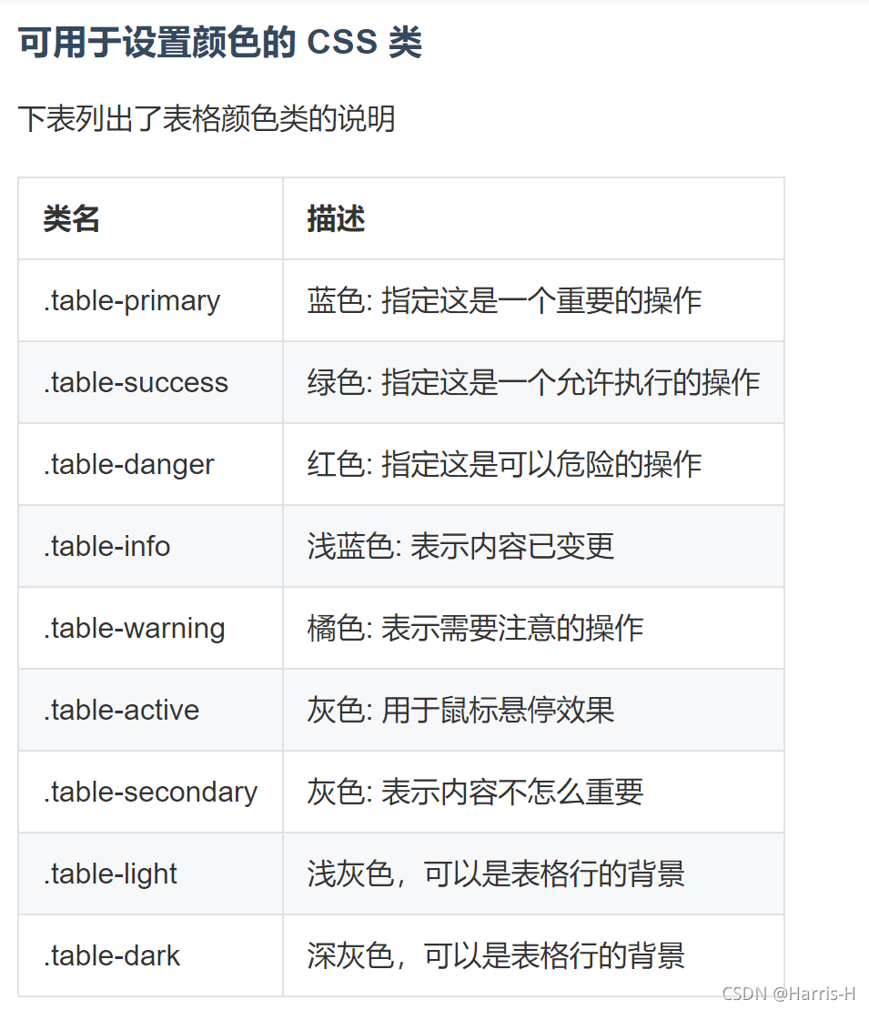
.table-striped 条纹效果
.table-bordered 边框
.table-hover 悬停高亮
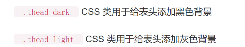
.table-dark 黑色背景
可以给<tr> 或 <td> 添加table-*为每一行或每个单元格设置颜色
<table class="table">
<thead>
      <tr>
        <th>姓</th>
        <th>名</th>
        <th>朝代</th>
      </tr>
    </thead>
    <tbody>
      <tr>
        <td>李</td>
        <td>白</td>
        <td>唐</td>
      </tr>
      <tr class="table-primary">
        <td>韩</td>
        <td>愈</td>
        <td>唐</td>
      </tr>
      <tr class="table-success">
        <td>王</td>
        <td>安石</td>
        <td>北宋</td>
      </tr>
      <tr class="table-danger">
        <td>欧阳</td>
        <td>修</td>
        <td>北宋</td>
      </tr>
      <tr class="table-info">
        <td>司马</td>
        <td>迁</td>
        <td>西汉</td>
      </tr>
      <tr class="table-warning">
        <td>杨</td>
        <td>修</td>
        <td>曹魏</td>
      </tr>
      <tr class="table-active">
        <td>曹</td>
        <td>操</td>
        <td>曹魏</td>
      </tr>
      <tr class="table-secondary">
        <td>曹</td>
        <td>植</td>
        <td>曹魏</td>
      </tr>
      <tr class="table-light">
        <td>施</td>
        <td>耐庵</td>
        <td>元</td>
      </tr>
      <tr class="table-dark text-dark">
        <td>苏</td>
        <td>轼</td>
        <td>北宋</td>
      </tr>
    </tbody>
</table>
.table-sm CSS 类用于通过减少内边距来设置紧凑的表格
8.表单
input 文本框和textarea文本域
.form -control 表单元素的样式 ,input-lg,input-sm 设置文本框大小。
select下拉框
.from-control 表单元素的样式
mutiple="mutiple" 设置下拉框多选。
9.单选框和复选框
bootstrap单选框
垂直显示:.radio
水平显示:.radio-inline
 <!-- 垂直 -->
    <div class="row">
        <div class="col-md-3">
            <div class="radio">
                <label for=""><input type="radio" name="sex" id="">男</label>
            </div>
            <div class="radio">
                <label for=""><input type="radio" name="sex" id="">女</label>
            </div>
        </div>
    </div>
    <!-- 水平 -->
    <div class="row">
        <div class="col-md-3">
            <div class="radio-inline">
                <label for=""><input type="radio" name="sex" id="">男</label>
            </div>
            <div class="radio-inline">
                <label for=""><input type="radio" name="sex" id="">女</label>
            </div>
        </div>
    </div>
bootstrap 复选框
垂直:.checkbox
水平:.checkbox-inline
 <!-- 垂直 -->
     <div class="row">
        <div class="col-md-3">
            <div class="checkbox">
                <label for=""><input type="checkbox" name="hobby" id="">唱歌</label>
            </div>
            <div class="checkbox">
                <label for=""><input type="checkbox" name="sex" id="">跳舞</label>
            </div>
        </div>
    </div>
    <!-- 水平 -->
    <div class="row">
        <div class="col-md-3">
            <div class="checkbox-inline">
                <label for=""><input type="checkbox" name="sex" id="">男</label>
            </div>
            <div class="checkbox-inline">
                <label for=""><input type="checkbox" name="sex" id="">女</label>
            </div>
        </div>
    </div>
参考文章

云原生社区为您提供最前沿的新闻资讯和知识内容
更多推荐


 6
6 0
0- 0


 已为社区贡献1条内容

所有评论(0)