
几个实用又好看的纯css 按钮样式
几个实用又好看的纯css 按钮样式1.带波纹效果的按钮html部分:<button class="niceButton2">click</button>css部分:.niceButton2{position: relative;background-color: rgb(32, 93, 224);border: none;font-size: 28px;
 文章共2,590字 · 阅读需要大约9分钟
一键AI生成摘要,助你高效阅读
问答
·
分享几个实用又好看的纯css 按钮样式
水波纹扩散效果按钮(推荐)
html部分
<div class="button">
	<span>click me</span>
</div>
css部分
  .button {
    position: relative;
    display: flex;
    align-items: center;
    justify-content: center;
    box-sizing: border-box;
    width: 279rpx;
    height: 80rpx;
    padding: 24rpx;
    overflow: hidden;
    font-weight: 700;
    font-size: 26rpx;
    text-align: center;
    border-radius: 65rpx;
    &::after {
      position: absolute;
      top: 0;
      right: 0;
      bottom: 0;
      left: 0;
      background-image: radial-gradient(circle, #ccc 10%, transparent 10.1%);
      transform: scale(10);
      opacity: 0;
      transition: all 0.45s;
      content: '';
    }

    &:active::after {
      transform: scale(0);
      opacity: 0.5;
      transition: 0s;
    }
  }
  .chat-now {
    color: #222;
    border: 1px solid #222;
  }
横向波纹效果的按钮
html部分:
<button class="niceButton2">click</button>
css部分:
.niceButton2{
            position: relative;
            background-color: rgb(32, 93, 224);
            border: none;
            font-size: 28px;
            color: #ffffff;
            padding: 20px;
            width: 200px;
            text-align: center;
            transition-duration: 0.6s;
            text-decoration: none;
            overflow: hidden;
            cursor: pointer;
        }
        .niceButton2::after{
            content: '';
            background:#53a4f0;
            display: block;
            position: absolute;
            padding-top: 300%;
            padding-left: 350%;
            margin-left: -20px !important;
            margin-top: -120%;
            opacity: 0;
            transition:all 0.8s;
        }
        .niceButton2:active::after{
            padding: 0;
            margin: 0;
            opacity: 1;
            transition: 0s;
        }
效果:

2.带下压效果的按钮
html部分:
<button class="niceButton">1111</button>
css部分:
.niceButton{
    display: inline-block;
    padding: 15px 25px;
    font-size: 24px;
    cursor: pointer;
    text-align: center;
    text-decoration: none;
    outline: none;
    color:#fff;
    background-color: rgb(16, 185, 214);
    border: none;
    border-radius: 15px;
    box-shadow: 0 9px #999;
}
.niceButton:hover{
background-color: #1795bb;
}
.niceButton:active{
    background-color: #1795bb;
    box-shadow: 0 5px #666;
    transform:translateY(4px);
}
效果:

鼠标悬停效果的按钮
html部分:
<button class="niceButton3">1111</button>
css部分:
    .niceButton3 {
        background-color: #1795bb;
        border-radius: 12px;
        border: none;
        color: white;
        padding: 16px 32px;
        text-align: center;
        text-decoration: none;
        display: inline-block;
        font-size: 16px;
        margin: 4px 2px;
        -webkit-transition-duration: 0.4s;
        transition-duration: 0.4s;
        cursor: pointer;
      }
      .niceButton3:hover {
        background-color: #fff;
        color: #1795bb;
        border: 1px solid #ccc;
      }
效果:

4.鼠标悬停后出现阴影
html部分:
<button class="niceButton4">1111</button>
css部分:
.niceButton4{
    background-color: skyblue;
    border: none;
    border-radius: 12px;
    color:white;
    padding: 15px 32px;
    text-align: center;
    text-decoration: none;
    display: inline-block;
    font-size: 16px;
    margin: 4px 2px;
    cursor: pointer;
    transition-duration: 0.4s;
    -webkit-transition-duration: 0.4s;
}
.niceButton4:hover{
    box-shadow: 0 12px 16px 0 rgba(0,0,0,.24),
    0 17px 50px 0 rgba(0,0,0,.19);
}
效果:

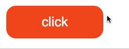
5.悬停后出现箭头图标
html部分:
<button class="niceButton5"><span>1111</span></button>
css部分:
/* 悬停添加箭头图标 */
   .niceButton5 {
        display: inline-block;
        border-radius: 20px;
        background-color: #f4511e;
        border: none;
        color: #ffff;
        text-align: center;
        font-size: 28px;
        font-weight: 400;
        padding: 18px;
        width: 200px;
        transition: all 0.5s;
        cursor: pointer;
        margin: 5px;
        vertical-align: middle;
      }
      .niceButton5 span {
        cursor: pointer;
        display: inline-block;
        position: relative;
        transition: 0.5s;
      }
      .niceButton5 span::after {
        content: ">";
        position: absolute;
        opacity: 0;
        top: 0;
        right: -20px;
        transition: 0.5s;
      }
      .niceButton5:hover span {
        padding-right: 30px;
      }
      .niceButton5:hover span::after {
        opacity: 1;
        right: 0;
      }
效果:


旨在为数千万中国开发者提供一个无缝且高效的云端环境,以支持学习、使用和贡献开源项目。
更多推荐

 22
22 0
0- 0


 已为社区贡献1条内容

所有评论(0)