

重点 (Top highlight)
In the previous article in this series on Android styling, we looked at the difference between themes and styles and how themes allow you to write more flexible styles and layouts which isolate changes:
在本系列有关Android样式的上一篇文章中,我们研究了主题和样式之间的区别,以及主题如何允许您编写更灵活的样式和布局来隔离更改:
Specifically we recommended using theme attributes to provide a point of indirection to resources, so that you can vary them (e.g. in dark theme). That is, if you find yourself writing a direct resource reference (or worse yet, a hardcoded value 😱) in a layout or style, consider if you should use a theme attribute instead.
特别是,我们建议使用主题属性来提供对资源的间接访问点,以便您可以改变它们(例如,在深色主题中 )。 也就是说,如果您发现自己在布局或样式中编写了直接的资源引用(或更糟糕的是,一个硬编码值😱),请考虑是否应该使用主题属性。
But what theme attributes are available to use? This post highlights the common ones that you should know about; those that come from Material, AppCompat or the platform. This is not a complete list (for that I’d recommend browsing the attrs files linked below where they are defined) but these are the attributes that I use all the time.
但是可以使用哪些主题属性? 这篇文章重点介绍了您应该了解的常见知识; 来自Material,AppCompat或平台的内容。 这不是一个完整的列表(为此,我建议您浏览下面定义了链接的attrs文件),但是这些都是我一直使用的属性。
色彩 (Colors)
Many of these colors come from the Material color system, which defines semantic names for colors that you can use throughout your app (implemented as theme attrs).
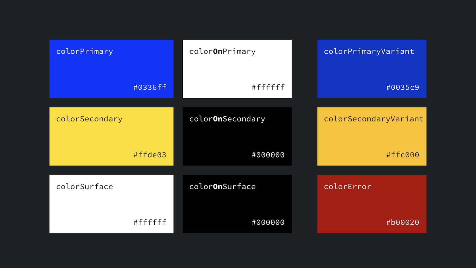
?attr/colorPrimaryThe primary branding color for the app.?attr/colorPrimary应用程序的主要品牌颜色。?attr/colorSecondaryThe secondary branding color for the app, usually a bright complement to the primary branding color.?attr/colorSecondary应用程序的辅助品牌颜色,通常是对主要品牌颜色的明亮补充。?attr/colorOn[Primary, Secondary, Surface etc]A color which contrasts against the named color.?attr/colorOn[Primary, Secondary, Surface etc]与指定颜色形成对比的颜色。?attr/color[Primary, Secondary]VariantAn alternate shade of the given color.?attr/color[Primary, Secondary]Variant给定颜色的替代阴影。?attr/colorSurfaceA color for surfaces of components, such as cards, sheets, and menus.?attr/colorSurface一种颜色,用于组件表面(如卡片,图纸和菜单)的颜色。?android:attr/colorBackgroundThe background for the screen.?android:attr/colorBackground屏幕的背景。?attr/colorPrimarySurfaceswitches betweencolorPrimaryin the Light themes,colorSurfacein the Dark theme.?attr/colorPrimarySurface之间切换colorPrimary在光的主题,colorSurface在黑暗的主题。?attr/colorErrorA color for displaying errors.?attr/colorError用于显示错误的颜色。
Other handy colors:
其他方便的颜色:
?attr/colorControlNormalThe color applied to icons/controls in their normal state.?attr/colorControlNormal在正常状态下应用于图标/控件的颜色。?attr/colorControlActivatedThe color applied to icons/controls in their activated state (e.g. checked).?attr/colorControlActivated处于激活状态(例如,选中)的颜色应用于图标/控件。?attr/colorControlHighlightThe color applied to control highlights (e.g. ripples, list selectors).?attr/colorControlHighlight应用于控制突出显示(例如波纹,列表选择器)的颜色。?android:attr/textColorPrimaryThe most prominent text color.?android:attr/textColorPrimary最突出的文本颜色。?android:attr/textColorSecondarySecondary text color.?android:attr/textColorSecondary次要文字颜色。
迪门斯 (Dimens)
?attr/listPreferredItemHeightStandard (min) height for list items.?attr/listPreferredItemHeight列表项的标准(最小)高度。?attr/actionBarSizeThe height of a toolbar.?attr/actionBarSize工具栏的高度。
画图 (Drawables)
?attr/selectableItemBackgroundA ripple/highlight for interactive items (also handy for foregrounds!!)?attr/selectableItemBackground交互式项目的波纹/高亮(对于前景也很方便!)?attr/selectableItemBackgroundBorderlessAn unbounded ripple.?attr/selectableItemBackgroundBorderless无限波纹。?attr/dividerVerticalA drawable that may be used as a vertical divider between visual elements.?attr/dividerVertical一个可绘制对象,可用作可视元素之间的垂直分隔符。?attr/dividerHorizontalA drawable that may be used as a horizontal divider between visual elements.?attr/dividerHorizontal一个可绘制对象,可用作可视元素之间的水平分隔线。
文字外观 (TextAppearances)
Material defines a type scale — a discrete set of text styles that you should use throughout your app, each of which is provided as a theme attribute which can be set as a textAppearance. Check out the Material type scale generator to help generate a scale for different fonts.
材质定义了一个规模型-一组离散的文本样式,你应该在你的应用程序中使用,其中的每一个提供的可设置为主题属性textAppearance 。 签出“ 材料类型”比例生成器,以帮助生成不同字体的比例。
?attr/textAppearanceHeadline1defaults to light 96sp text.?attr/textAppearanceHeadline1默认为浅96sp文本。?attr/textAppearanceHeadline2defaults to light 60sp text.?attr/textAppearanceHeadline2默认为浅60sp文本。?attr/textAppearanceHeadline3defaults to regular 48sp text.?attr/textAppearanceHeadline3默认为常规48sp文本。?attr/textAppearanceHeadline4defaults to regular 34sp text.?attr/textAppearanceHeadline4默认为常规34sp文本。?attr/textAppearanceHeadline5defaults to regular 24sp text.?attr/textAppearanceHeadline5默认为常规24sp文本。?attr/textAppearanceHeadline6defaults to medium 20sp text.?attr/textAppearanceHeadline6默认为中等20sp文本。?attr/textAppearanceSubtitle1defaults to regular 16sp text.?attr/textAppearanceSubtitle1默认为常规16sp文本。?attr/textAppearanceSubtitle2defaults to medium 14sp text.?attr/textAppearanceSubtitle2默认为中号14sp文本。?attr/textAppearanceBody1defaults to regular 16sp text.?attr/textAppearanceBody1默认为常规16sp文本。?attr/textAppearanceBody2defaults to regular 14sp text.?attr/textAppearanceBody2默认为常规14sp文本。?attr/textAppearanceCaptiondefaults to regular 12sp text.?attr/textAppearanceCaption默认为常规12sp文本。?attr/textAppearanceButtondefaults to medium all caps 14sp text.?attr/textAppearanceButton默认将所有大写14sp文本设置为中等。?attr/textAppearanceOverlinedefaults to regular all caps 10sp text.?attr/textAppearanceOverline默认为常规所有大写10sp文本。
形状 (Shape)
Material employs a shape system which is implemented as theme attrs for small, medium and large components. Note that if you’re setting a shape appearance on a custom component, you likely want to use a MaterialShapeDrawable as it’s background which understands and implements the shaping.
材料采用一种形状系统 ,该形状系统被实现为小型,中型和大型组件的主题属性。 请注意,如果要在自定义组件上设置形状外观,则可能要使用MaterialShapeDrawable作为其背景,该MaterialShapeDrawable可以理解和实现形状。
?attr/shapeAppearanceSmallComponentused for Buttons, Chips, Text Fields etc. Defaults to rounded 4dp corners.?attr/shapeAppearanceSmallComponent用于按钮,芯片,文本字段等。默认为4dp圆角。?attr/shapeAppearanceMediumComponentused for Cards, Dialogs, Date Pickers etc. Defaults to rounded 4dp corners.?attr/shapeAppearanceMediumComponent用于卡片,对话框,日期选择器等。默认为4dp圆角。?attr/shapeAppearanceLargeComponentused for Bottom Sheets etc. Defaults to rounded 0dp corners (i.e. square!)?attr/shapeAppearanceLargeComponent用于?attr/shapeAppearanceLargeComponent等。默认为圆的0dp角(即正方形!)
按钮样式 (Button Styles)
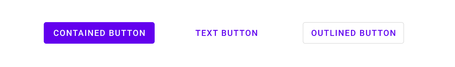
This might seem super specific, but Material defines three types of buttons: Contained, Text and Outlined. MDC offers theme attrs that you can use to set the style of a MaterialButton:
这似乎是超级特定的,但是Material定义了三种类型的按钮: Contained , Text和Outlined 。 MDC提供了主题属性,可用于设置MaterialButton的style :
?attr/materialButtonStyledefaults to contained (or just omit the style).?attr/materialButtonStyle默认为包含(或只是省略样式)。?attr/borderlessButtonStylefor a text style button.?attr/borderlessButtonStyle表示文本样式的按钮。?attr/materialButtonOutlinedStylefor outlined style.?attr/materialButtonOutlinedStyle用于轮廓样式。
浮点数 (Floats)
?android:attr/disabledAlphaDefault disabled alpha for widgets.?android:attr/disabledAlpha默认禁用小部件的alpha。?android:attr/primaryContentAlphaThe alpha applied to the foreground elements.?android:attr/primaryContentAlpha应用于前景元素的Alpha。?android:attr/secondaryContentAlphaThe alpha applied to secondary elements.?android:attr/secondaryContentAlpha应用于辅助元素的Alpha。
应用程式与Android名称空间 (App vs Android namespace)
You might have noticed that some attributes are referenced by ?android:attr/foo and others just by ?attr/bar. This is because some are defined by the Android platform, and as such you need the android part to reference them by their namespace (just like with view attributes in layouts: android:id). Those without come from static libraries (i.e. AppCompat or MDC) which are compiled into your application, so don’t need the namespace (similar to how you might use app:baz in a layout). Some elements are defined both in the platform and in a library e.g. colorPrimary. In these cases, prefer the non-platform version, as this can be used on all API levels i.e. they’re duplicated in a library precisely to backport them. In these cases, I’ve listed the non-platform versions above.
您可能已经注意到,某些属性由? android :attr/foo引用? android :attr/foo ? android :attr/foo和其他人仅通过?attr/bar 。 这是因为某些是由Android平台定义的,因此,您需要android部件通过其命名空间引用它们(就像布局中的view属性: android:id )。 那些不是来自静态库(即AppCompat或MDC),它们已编译到您的应用程序中,因此不需要名称空间(类似于您在布局中使用app:baz的方式)。 在平台和库中都定义了一些元素,例如colorPrimary 。 在这些情况下,最好使用非平台版本,因为它可以在所有API级别上使用,即它们被精确复制到库中以向后移植。 在这些情况下,我已经在上面列出了非平台版本。
prefer non-platform attributes which can be used on all API levels
首选可以在所有API级别上使用的非平台属性
更多资源 (More Resources)
For a complete list of the theme attributes available to use, go to the source of truth:
有关可使用的主题属性的完整列表,请转至真理的源头:
Material Design Components:
材料设计组件:
自己做 (Do It Yourself)
Sometimes there isn’t a theme attribute which abstracts something you’d like to vary by theme. No worries… create your own! Here’s an example from the Google I/O app which shows a list of conference sessions in two screens.
有时,没有主题属性可以抽象出您希望随主题变化的内容。 不用担心...创建自己的! 这是来自Google I / O应用程序的示例,该示例在两个屏幕中显示了会议列表。
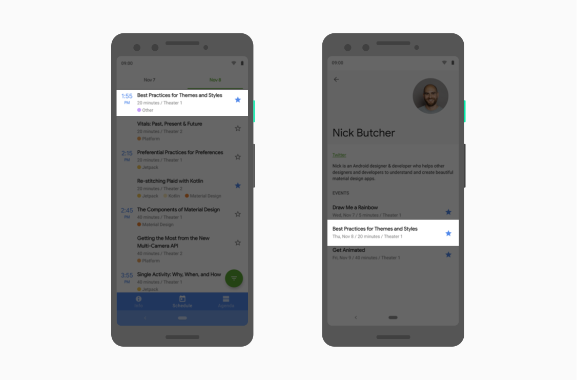
They’re largely similar but the left screen must leave space for the sticky time headers while the right screen does not. We implemented this by abstracting where to align items behind a theme attribute so that we can vary them by theme and use the same layout across two different screens:
它们在很大程度上相似,但是左屏幕必须为粘性时间标题留出空间,而右屏幕则不能。 我们通过抽象化在主题属性后面对齐项目的位置来实现此目的,以便我们可以根据主题来改变它们并在两个不同的屏幕上使用相同的布局:
1. Define the theme attribute in attrs.xml
1.在attrs.xml中定义主题属性
2. Provide different values in different themes:
3. Use the theme attr in the single layout used on both screens (each using one of the above themes):
3. 使用在两个屏幕上使用的单布局主题ATTR(上述主题的各使用一个):
提问(标记)一切 (Question (mark) everything)
Knowing what theme attributes are available, equips you to use them when writing your layouts, styles or drawables. Using theme attributes makes it much easier to support theming (like dark theme) and to write more flexible, maintainable code. For a deep dive on this, join us in our next post in this series:
知道可用的主题属性后,您便可以在编写布局,样式或可绘制对象时使用它们。 使用主题属性使支持主题(如深色主题 )和编写更灵活,可维护的代码变得更加容易。 要对此进行深入研究,请加入本系列的下一篇文章:
翻译自: https://medium.com/androiddevelopers/android-styling-common-theme-attributes-8f7c50c9eaba


 已为社区贡献11条内容

所有评论(0)