机器学习实践—基于Scikit-Learn、Keras和TensorFlow2第二版—第9章 无监督学习技术(Chapter9_Unsupervised_Learning_Techniques)
机器学习实践—基于Scikit-Learn、Keras和TensorFlow2第二版—第9章 无监督学习技术(Chapter9_Unsupervised_Learning_Techniques)虽然目前大部分机器学习应用都是基于有监督学习,但实际工作生活中,大部分数据都是没有标签的。著名的人工智能大牛Yann LeCun说过:如果人工智能一个蛋糕,监督学习就像是蛋糕上的糖霜,而增强学习则蛋糕上的樱
机器学习实践—基于Scikit-Learn、Keras和TensorFlow2第二版—第9章 无监督学习技术(Chapter9_Unsupervised_Learning_Techniques)
虽然目前大部分机器学习应用都是基于有监督学习,但实际工作生活中,大部分数据都是没有标签的。
著名的人工智能大牛Yann LeCun说过:如果人工智能一个蛋糕,监督学习就像是蛋糕上的糖霜,而增强学习则蛋糕上的樱桃。(if intelligence was a cake, unsupervised learning would be the cake, supervised learning would be the icing on the cake, and reinforcement learning would be the cherry on the cake.)
数据标注通常需要大量的人力,并且是一件极其无聊的事情。
常见的无监督学习算法:
- 降维:第8章已经进行了详细的介绍。
- 聚类:目的是将相似的样本分组到一起。聚类是一个非常有用的方法,常常用于数据分析、客户分类、推荐系统、搜索引擎、图像分隔、半监督学习、降维等等。
- 异常检测:目的是通常学习正常数据特征来判断异常样本。
- 密度估计:目的是估计数据生成随机过程的概率密度函数。密度估计常常被用来异常检测,认为位于低密度区域的样本应该是异常样本。同时,密度估计在数据分析和可视化中也很有用。
0. 导入所需的库
import sklearn
import numpy as np
import matplotlib as mpl
%matplotlib inline
import matplotlib.pyplot as plt
import os

for i in (sklearn, np, mpl):
    print(i.__name__,": ",i.__version__,sep="")
输出:
sklearn: 0.21.3
numpy: 1.17.4
matplotlib: 3.1.2
1. 聚类
1.1 聚类与分类任务的区别
聚类的任务就是将相似的样本归类到一起。与分类任务类似,将每一个样本分到不同的组中,但是聚类是无监督任务。
from sklearn.datasets import load_iris

data = load_iris()
X = data.data
y = data.target
data.target_names
输出:
array(['setosa', 'versicolor', 'virginica'], dtype='<U10')plt.figure(figsize=(12,5))
plt.subplot(121)
plt.plot(X[y==0,2], X[y==0,3], "yo", label="Iris setosa")
plt.plot(X[y==1,2], X[y==1,3], "bs", label="Iris versicolor")
plt.plot(X[y==2,2], X[y==2,3], "g^", label="Iris virginica")
plt.xlabel("Petal length",fontsize=16)
plt.ylabel("Petal width", fontsize=16)
plt.legend(fontsize=14)
plt.subplot(122)
plt.scatter(X[:,2], X[:,3], c="k", marker=".")
plt.xlabel("Petal length", fontsize=16)
plt.tick_params(labelleft=False)
plt.tight_layout()
plt.show()输出:

如上输出所示,左边是iris数据集结果,其中三类iris被打了标签,可以使用逻辑回归、SVM等算法进行分类。而右图是同样的数据,但是是没有标签的状态,就无法用分类算法进行分类。
对于上图右边这种没有标签的情况,聚类算法就派上用场了。聚类算法的用途很广泛:
- 客户分类:可以根据客户在网站上的购买情况和浏览情况进行分类。这样可以更好地了解客户,例如推荐系统会给不同的客户推荐不同的商品。
- 数据分析:对于新数据,可以先使用聚类对其进行聚类,再根据聚类结果对每类进行分析。
- 作为降维工具使用:
- 异常检测:叫称作离群值检测,对于没有被聚类到任何一个簇的样本,可以认为是离群值。
- 半监督学习:如果只有少量有标签的数据,可以将有标签和无标签的数据同时进行聚类,最终根据聚类结果给无标签的数据打上标签。
- 搜索引擎:某些搜索引擎可以根据上传图像返回相似图像。
- 图像分隔:对图像像素根据颜色聚类,然后将每个像素值替换成簇的平均值,这样可以大大减少图像中颜色的类别数量。图像分隔常常被用在目标检测、追踪系统,同时也可以用于目标边界检测。
1.2 K-Means
K-Means由贝尔实验室的Stuart Lloyd在1957年提出,但直到1982年才向外公布。但在1965年Edward W. Forgy发表了几乎与其相同的算法,因此K-Means有时也称为Lloyd–Forgy。
首先产生一些聚类数据:
from sklearn.datasets import make_blobs

blob_centers = np.array([[0.2,2.3],
                        [-1.5,2.3],
                        [-2.8,1.8],
                        [-2.8,2.8],
                        [-2.8,1.3]])
blob_std = np.array([0.4,0.3,0.1,0.1,0.1])

X, y = make_blobs(n_samples=2000, centers=blob_centers,cluster_std=blob_std,random_state=7)

X.shape, y.shape
输出:
((2000, 2), (2000,))def plot_clusters(X, y=None):
plt.scatter(X[:,0], X[:,1],c=y, s=1)
plt.xlabel("$x_1$", fontsize=16)
plt.ylabel("$x_2$", fontsize=16, rotation=0)
plt.figure(figsize=(12,5))
plot_clusters(X)
plt.show()输出:

from sklearn.cluster import KMeans

k = 5
kmeans = KMeans(n_clusters=k, random_state=42)
y_pred = kmeans.fit_predict(X)

y_pred
输出:
array([4, 0, 1, ..., 2, 1, 0])y_pred is kmeans.labels_输出:
Truekmeans.cluster_centers_输出:
array([[-2.80389616,  1.80117999],
       [ 0.20876306,  2.25551336],
       [-2.79290307,  2.79641063],
       [-1.46679593,  2.28585348],
       [-2.80037642,  1.30082566]])
X_new = np.array([[0, 2], [3, 2], [-3, 3], [-3, 2.5]])
kmeans.predict(X_new)输出:
array([1, 1, 2, 2])对聚类的决策边界作图,得到Voronoi tessellation:
def plot_data(X):
    plt.plot(X[:, 0], X[:, 1], 'k.', markersize=2)

def plot_centroids(centroids, weights=None, circle_color='w', cross_color='k'):
    if weights is not None:
        centroids = centroids[weights > weights.max() / 10]
    plt.scatter(centroids[:, 0], centroids[:, 1],marker='o', s=30, linewidths=8,
                color=circle_color, zorder=10, alpha=0.9)
    plt.scatter(centroids[:, 0], centroids[:, 1], marker='x', s=50, linewidths=50,
                color=cross_color, zorder=11, alpha=1)

def plot_decision_boundaries(clusterer, X, resolution=1000, show_centroids=True,
                             show_xlabels=True, show_ylabels=True):
    mins = X.min(axis=0) - 0.1
    maxs = X.max(axis=0) + 0.1
    xx, yy = np.meshgrid(np.linspace(mins[0], maxs[0], resolution),
                         np.linspace(mins[1], maxs[1], resolution))
    Z = clusterer.predict(np.c_[xx.ravel(), yy.ravel()])
    Z = Z.reshape(xx.shape)

    plt.contourf(Z, extent=(mins[0], maxs[0], mins[1], maxs[1]),cmap="Pastel2")
    plt.contour(Z, extent=(mins[0], maxs[0], mins[1], maxs[1]),linewidths=1, colors='k')
    plot_data(X)
    if show_centroids:
        plot_centroids(clusterer.cluster_centers_)

    if show_xlabels:
        plt.xlabel("$x_1$", fontsize=14)
    else:
        plt.tick_params(labelbottom=False)
    if show_ylabels:
        plt.ylabel("$x_2$", fontsize=14, rotation=0)
    else:
        plt.tick_params(labelleft=False)

plt.figure(figsize=(12, 5))
plot_decision_boundaries(kmeans, X)

plt.show()
输出:

如上输出所示,大部分样本被正确聚类,但是也有少量样本被错误聚类,例如黄色区域和粉红色区域决策边界附近的有些样本就被错误聚类了。
当样本簇具有不同直径的时候K-Means很容易聚类错误,因为K-Means是基于每个样本到中心点的距离进行聚类的。观察上图发现,粉红和黄色决策边界附近的点离粉红色聚类中心更近,因此被聚类到粉色类别上。
硬聚类:每个样本被聚类到单一类别中。
软聚类:每个样本给出属于各个聚类类别的得分,得分可以是样本到类别中心点的距离;也可以是相似度得分,例如高斯径向基函数。
sklearn中KMeans类提供了transform()方法用于输出每个样本到类别中心点的距离:
kmeans.transform(X_new)输出:
array([[2.81093633, 0.32995317, 2.9042344 , 1.49439034, 2.88633901],
       [5.80730058, 2.80290755, 5.84739223, 4.4759332 , 5.84236351],
       [1.21475352, 3.29399768, 0.29040966, 1.69136631, 1.71086031],
       [0.72581411, 3.21806371, 0.36159148, 1.54808703, 1.21567622]])
np.linalg.norm(np.tile(X_new, (1,k)).reshape(-1,k,2)-kmeans.cluster_centers_,axis=2)输出:
array([[2.81093633, 0.32995317, 2.9042344 , 1.49439034, 2.88633901],
       [5.80730058, 2.80290755, 5.84739223, 4.4759332 , 5.84236351],
       [1.21475352, 3.29399768, 0.29040966, 1.69136631, 1.71086031],
       [0.72581411, 3.21806371, 0.36159148, 1.54808703, 1.21567622]])
如上输出所示,transform()输出的确实是样本点到中心点的欧式距离。
1.3 K-means算法
K-Means算法不仅是聚类算法是最快的一个,而且还是最简单的。
假设给定中心点,只需根据每个样本到中心点的欧式距离就可以完成聚类的操作。或者反过来说,如果知道每个样本属于哪个类别,则也很容易能求出中心点。但是实际应用中的数据往往是既不知道中心点,也不知道样本的类别。
K-Means算法:随机初始化k个中心点,遍历样本进行聚类,然后根据聚类结果更新中心点,再遍历样本进行聚类,反复直到中心点不再发生变化。
K-Means基本上会在有限步骤内完成聚类,基本不会发生无法收敛的情况。
sklearn中的KMeans类是经过优化后的算法,如果想使用纯正的K-Means算法,则需要指定超参数init="random", n_init=1, algorithm="full":
kmeans_iter1 = KMeans(n_clusters=5, init="random",n_init=1,algorithm="full",
                     max_iter=1, random_state=1)
kmeans_iter2 = KMeans(n_clusters=5, init="random", n_init=1, algorithm="full",
                     max_iter=2, random_state=1)
kmeans_iter3 = KMeans(n_clusters=5, init="random", n_init=1, algorithm="full",
                     max_iter=3, random_state=1)
kmeans_iter1.fit(X)
kmeans_iter2.fit(X)
kmeans_iter3.fit(X)
输出:
KMeans(algorithm='full', copy_x=True, init='random', max_iter=3, n_clusters=5,
       n_init=1, n_jobs=None, precompute_distances='auto', random_state=1,
       tol=0.0001, verbose=0)
plt.figure(figsize=(12, 10))
plt.subplot(321)
plot_data(X)
plot_centroids(kmeans_iter1.cluster_centers_, circle_color='r', cross_color='w')
plt.ylabel("$x_2$", fontsize=14, rotation=0)
plt.tick_params(labelbottom=False)
plt.title("Update the centroids (initially randomly)", fontsize=14)
plt.subplot(322)
plot_decision_boundaries(kmeans_iter1, X, show_xlabels=False, show_ylabels=False)
plt.title("Label the instances", fontsize=14)
plt.subplot(323)
plot_decision_boundaries(kmeans_iter1, X, show_centroids=False, show_xlabels=False)
plot_centroids(kmeans_iter2.cluster_centers_)
plt.subplot(324)
plot_decision_boundaries(kmeans_iter2, X, show_xlabels=False, show_ylabels=False)
plt.subplot(325)
plot_decision_boundaries(kmeans_iter2, X, show_centroids=False)
plot_centroids(kmeans_iter3.cluster_centers_)
plt.subplot(326)
plot_decision_boundaries(kmeans_iter3, X, show_ylabels=False)
plt.tight_layout()
plt.show()输出:

如上输出所示,子图1中红叉点表示随机初始化中心点,子图2根据中心点进行聚类,子图3根据聚类结果更新中心点,子图4根据更新的中心点再次进行聚类,子图5根据聚类结果更新中心点,子图6根据更新的中心点再次进行聚类。观察可以发现,经过三轮迭代基本上就达到了不错的聚类效果。
注意:当数据集本身具有聚类结构时,K-Means算法的复杂度与样本量m、类别k和维数n(特征数)呈线性相关。如果数据集本身不具有聚类结构,那么最坏情况下复杂度与样本数量呈指数增长关系,但实际应用中很少会发生这样的事情。
虽然K-Means算法最终一定会收敛,但是可能会得到不是最佳的结果,这与中心点的随机初始化有关,例如请看下面例子:
def plot_clusterer_comparison(clusterer1, clusterer2, X, title1=None, title2=None):
    clusterer1.fit(X)
    clusterer2.fit(X)

    plt.figure(figsize=(12, 5))

    plt.subplot(121)
    plot_decision_boundaries(clusterer1, X)
    if title1:
        plt.title(title1, fontsize=14)

    plt.subplot(122)
    plot_decision_boundaries(clusterer2, X, show_ylabels=False)
    if title2:
        plt.title(title2, fontsize=14)

kmeans_rnd_init1 = KMeans(n_clusters=5, init="random", n_init=1,algorithm="full", random_state=11)
kmeans_rnd_init2 = KMeans(n_clusters=5, init="random", n_init=1,algorithm="full", random_state=19)

plot_clusterer_comparison(kmeans_rnd_init1, kmeans_rnd_init2, X,"Solution 1", "Solution 2 (with a different random init)")

plt.tight_layout()
plt.show()
输出:

如上输出所示,不同的随机初始化得到了不同的结果。
下面通过不同的方法来避免这种随机初始化带来的差异。
1.4 质心初始化方法
如果已知质心的位置,则可以通过超参数init对质心进行比较准确地初始化:
good_init = np.array([[-3, 3], [-3, 2], [-3, 1], [-1, 2], [0, 2]])
kmeans = KMeans(n_clusters=5, init=good_init, n_init=1, random_state=42)
kmeans.fit(X)
kmeans.inertia_
输出:
211.5985372581684另一种方法是进行多次不同的随机初始化,最终取结果最好的那个。随机初始化的次数由超参数n_init控制,默认值是10,也就意味着会进行10次随机初始化并输出最好的结果。
kmeans_rnd_10_inits = KMeans(n_clusters=5, init="random", n_init=10,
                              algorithm="full", random_state=11)
kmeans_rnd_10_inits.fit(X)
输出:
KMeans(algorithm='full', copy_x=True, init='random', max_iter=300, n_clusters=5,
       n_init=10, n_jobs=None, precompute_distances='auto', random_state=11,
       tol=0.0001, verbose=0)
plt.figure(figsize=(8, 4))
plot_decision_boundaries(kmeans_rnd_10_inits, X)
plt.show()输出:

如上输出所示,通过10次随机的初始化,最终得到了一个理想中的聚类结果。
但是如何知道哪个结果是最好的呢?采用了一个叫模型惯性(model’s inertia)的性能指标,该指标计算每个样本与最近质心的距离圴方和。很明显距离圴方和越小越好。
X_dist = kmeans.transform(X)
np.sum(X_dist[np.arange(len(X_dist)), kmeans.labels_]**2)
输出:
211.59853725816856score()方法返回惯性(inertia)的负值(为什么是负值?因为一般情况下模型的score越高越好):
kmeans.score(X)输出:
-211.59853725816856kmeans_rnd_init1.inertia_输出:
223.29108572819035kmeans_rnd_init2.inertia_输出:
237.46249169442845观察发现,kmeans_rnd_init1的效果要好于kmeans_rnd_init2
1.5 K-Means++
K-Means++由David Arthur和Sergei Vassilvitskii在2006年发表的文章中提出,其主要思想是初始化质心互相尽可能离的远。
该算法大大降低了陷入次优解的陷井的可能性。K-Means++算法额外增加的计算量是很有价值的,因为它极大地降低了算法迭代的次数。
算法步骤:
- 从数据集中随机选择1个质心c1
- 增加选择1个质心ci,使得ci离已经选择的质心越远越好,即距离当前已选质心越远的点有更高的概率被选为下一个质心。
- 重复上面步骤直到选择k个质心
在sklearn中默认的初始化方法也就是K-Means++的这种初始化算法。可以通过超参数init="k-means++"明确指定用K-Means++的初始化算法,不过与不指定没什么区别,因为默认参数值就是k-means++。如果想用纯粹的随机初始化,则可以指定成init="random"。
1.6 加速版K-Means(Accelerated K-Means)
Charles Elkan 2003年发表的文章中提出了一种加速K-Means算法的技巧,主要思想是通过避免不必要的距离计算从而提升K-Means速度。Elkan通过研究三角不等式(例如两点直线最短)和样本与质心距离的上下限发现了这项技术。
如果训练数据是密集数据,则sklearn的KMeans类的默认方法就是这种方法。如果在密集数据上想使用原生的K-Means,则可以通过超参数algorithm="full"指定。也可以使用algorithm="elkan"明确指定,效果与默认参数一样。
如果训练数据是稀疏数据,则sklearn的KMeans类的默认方法是full。
%timeit -n 50 KMeans(algorithm="elkan").fit(X)输出:
62 ms ± 1.19 ms per loop (mean ± std. dev. of 7 runs, 50 loops each)%timeit -n 50 KMeans(algorithm="full").fit(X)输出:
73.2 ms ± 951 µs per loop (mean ± std. dev. of 7 runs, 50 loops each)如上输出所示,使用加速版K-Means(elkan)训练速度比原生的快很多。
1.7 小批量K-Means(mini-batch K-Means)
小批量K-Means由David Sculley于2010年提出,主要思想是每次使用小批量的数据进行聚类,每次轻微地调整质心。这种方法基本上能将训练速度提升3至4倍,并且使得超大数据集无法聚类变成现实。但是速度快也是有牺牲的,使用小批量K-Means时惯性值(inertia)会轻微地变差(升高),尤其是在类别数目增大的时候。
from sklearn.cluster import MiniBatchKMeans

minibatch_kmeans = MiniBatchKMeans(n_clusters=5, random_state=42)
minibatch_kmeans.fit(X)
输出:
MiniBatchKMeans(batch_size=100, compute_labels=True, init='k-means++',
                init_size=None, max_iter=100, max_no_improvement=10,
                n_clusters=5, n_init=3, random_state=42,
reassignment_ratio=0.01, tol=0.0, verbose=0)minibatch_kmeans.inertia_输出:
211.93186531476775如上输出所示,MiniBatchKMeans类默认批大小为100,默认使用K-Means++的初始化算法。
如果数据集比较大,无法读入内存中,最简单的方法是使用NumPy的memmap类:
from sklearn.datasets import fetch_openml
from sklearn.model_selection import train_test_split

mnist = fetch_openml("mnist_784",version=1)
mnist.target = mnist.target.astype(np.int64)

X_train, X_test, y_train, y_test = train_test_split(mnist["data"],mnist["target"],random_state=42)

for i in (X_train, X_test, y_train, y_test):
    print(i.shape)
输出:
(52500, 784)
(17500, 784)
(52500,)
(17500,)
将MNIST数据集转换成memmap,并保存在本地磁盘:
filename = "my_mnist_kmeans.data"
X_mm = np.memmap(filename, dtype="float32",mode="write",shape=X_train.shape)
X_mm[:] = X_train

minibatch_kmeans = MiniBatchKMeans(n_clusters=10, batch_size=10, random_state=42)
minibatch_kmeans.fit(X_mm)
输出:
MiniBatchKMeans(batch_size=10, compute_labels=True, init='k-means++',
                init_size=None, max_iter=100, max_no_improvement=10,
                n_clusters=10, n_init=3, random_state=42,
                reassignment_ratio=0.01, tol=0.0, verbose=0)
如上输出所示,可以使用memmap的方法解决较大数据集无法读入内存的问题。然而,如果数据集非常大,则memmap也无法处理。此时就需要每次传入一小批量的数据并利用partial_fit()方法进行训练,但这种方法可能会有一些繁琐,因为需要额外做一些初始化和最终模型超参数选择的工作:
np.random.seed(42)
k = 5
n_init = 10
n_iterations = 100
batch_size = 100
init_size = 500
evaluate_on_last_n_iters = 10

best_kmeans = None

def load_next_batch(batch_size):
    return X[np.random.choice(len(X), batch_size, replace=False)]

for init in range(n_init):
    minibatch_kmeans = MiniBatchKMeans(n_clusters=k, init_size=init_size)
    X_init = load_next_batch(init_size)
    minibatch_kmeans.partial_fit(X_init)

    minibatch_kmeans.sum_inertia_ = 0
    for iteration in range(n_iterations):
        X_batch = load_next_batch(batch_size)
        minibatch_kmeans.partial_fit(X_batch)
        if iteration >= n_iterations - evaluate_on_last_n_iters:
            minibatch_kmeans.sum_inertia_ += minibatch_kmeans.inertia_
    if (best_kmeans is None or minibatch_kmeans.sum_inertia_ < best_kmeans.sum_inertia_):
        best_kmeans = minibatch_kmeans

best_kmeans.score(X)
输出:
-211.70999744411483%timeit KMeans(n_clusters=5).fit(X)输出:
32.8 ms ± 1.72 ms per loop (mean ± std. dev. of 7 runs, 10 loops each)%timeit MiniBatchKMeans(n_clusters=5).fit(X)输出:
17.7 ms ± 588 µs per loop (mean ± std. dev. of 7 runs, 100 loops each)如上输出所示,观察可以发现Mini-batch K-Means比普通的K-Means训练速度快很多。
下面对比分析Mini-batch K-Means和普通K-Means的惯性值(inertia)和训练时间:
from timeit import timeit

times, inertias = np.empty((100,2)), np.empty((100,2))
for k in range(1,101):
    kmeans_ = KMeans(n_clusters=k, random_state=42)
    minibatch_kmeans = MiniBatchKMeans(n_clusters=k, random_state=42)
    print("\r{}/{}".format(k,100), end="")
    times[k-1,0] = timeit("kmeans_.fit(X)", number=10, globals=globals())
    times[k-1,1] = timeit("minibatch_kmeans.fit(X)",number=10,globals=globals())
    inertias[k-1,0] = kmeans_.inertia_
    inertias[k-1,1] = minibatch_kmeans.inertia_
输出:
100/100plt.figure(figsize=(12,5))
plt.subplot(121)
plt.plot(range(1,101), inertias[:,0],"r--",label="K-Means")
plt.plot(range(1,101), inertias[:,1],"b.-",label="Mini-batch K-Means")
plt.xlabel("$k$", fontsize=16)
plt.title("Inertia", fontsize=16)
plt.legend(fontsize=14)
plt.axis([1,100,0,100])
plt.subplot(122)
plt.plot(range(1,101), times[:,0],"r--",label="K-Means")
plt.plot(range(1,101), times[:,1],"b.-",label="Mini-batch K-Means")
plt.xlabel("$k$",fontsize=16)
plt.title("Training time(seconds)", fontsize=16)
plt.axis([1,100,0,6])
plt.legend(fontsize=14)
plt.tight_layout()
plt.show()输出:

如上输出所示,上图对比了Mini-batch K-Means和普通K-Means在不同k值时训练模型的惯性值(inertias)和耗时。观察可以发现,随着k值的增大,两者之间的差距越来越大。
1.8 寻找最佳聚类数(Finding the optimal number of clusters)
对于上面的这些例子,我们事先知道能聚类成5个类别,但是实际应用中可能很难知道k取多少合适,如果k取的不合适,可以结果会很差。
kmeans_k3 = KMeans(n_clusters=3, random_state=42)
kmeans_k8 = KMeans(n_clusters=8, random_state=42)

plot_clusterer_comparison(kmeans_k3, kmeans_k8, X, "$k=3$", "$k=8$")

plt.tight_layout()
plt.show()
输出:

print(kmeans_k3.inertia_, kmeans_k8.inertia_)输出:
653.2167190021553 119.11983416102879如上输出所示,选择不适合的k值可能会得到很糟糕的结果。
注意:观察k=3和k=8时的模型inertia值,k值越大,inertia值越小,因此inertia值不能用于模型评估。
kmeans_per_k = [KMeans(n_clusters=k, random_state=42).fit(X) for k in range(1, 10)]
inertias = [model.inertia_ for model in kmeans_per_k]

plt.figure(figsize=(8, 5))
plt.plot(range(1, 10), inertias, "bo-")
plt.xlabel("$k$", fontsize=14)
plt.ylabel("Inertia", fontsize=14)
plt.annotate('Elbow', xy=(4, inertias[3]), xytext=(0.55, 0.55), textcoords='figure fraction',
             fontsize=16, arrowprops=dict(facecolor='black', shrink=0.1))
plt.axis([1, 8.5, 0, 1300])


plt.show()
输出:

如上输出所示,当k从1升到4时,inertia下降很快,k大于4之后inertia下降变得比较缓慢。因此,在无从得知数据簇个数的情况下,指定k=4是不错的选择。这种选择k值的方法显得有些随意。
使用所有样本的轮廓系数的平均值,即轮廓得分可以更加精准地寻找到这些超参数,但这种方法非常消耗算力。轮廓系数计算公式为(b-a)/max(a,b),其中a为相同簇中到其它样本的距离平均值,而b为所有样本到其它最近簇距离的平均值。轮廓系数取值范围为-1到1,1代表样本刚好处于自身所在的簇而远离其它的簇,-1代表样本可以聚类错了,本不属于现在所处的簇,0代表样本可能位于聚类的决策边界。
from sklearn.metrics import silhouette_score

silhouette_scores = [silhouette_score(X, model.labels_) for model in kmeans_per_k[1:]]

plt.figure(figsize=(8, 5))
plt.plot(range(2, 10), silhouette_scores, "bo-")
plt.xlabel("$k$", fontsize=14)
plt.ylabel("Silhouette score", fontsize=14)
plt.axis([1.8, 8.5, 0.55, 0.7])

plt.show()
输出:

如上输出所示,当k=4时轮廓分值最大,说明选择k=4比较合适。
from sklearn.metrics import silhouette_samples
from matplotlib.ticker import FixedLocator, FixedFormatter

plt.figure(figsize=(12, 10))

for k in (3, 4, 5, 6):
    plt.subplot(2, 2, k - 2)

    y_pred = kmeans_per_k[k - 1].labels_
    silhouette_coefficients = silhouette_samples(X, y_pred)

    padding = len(X) // 30
    pos = padding
    ticks = []
    for i in range(k):
        coeffs = silhouette_coefficients[y_pred == i]
        coeffs.sort()

        color = mpl.cm.Spectral(i / k)
        plt.fill_betweenx(np.arange(pos, pos + len(coeffs)), 0, coeffs,
                          facecolor=color, edgecolor=color, alpha=0.7)
        ticks.append(pos + len(coeffs) // 2)
        pos += len(coeffs) + padding

    plt.gca().yaxis.set_major_locator(FixedLocator(ticks))
    plt.gca().yaxis.set_major_formatter(FixedFormatter(range(k)))
    if k in (3, 5):
        plt.ylabel("Cluster")

    if k in (5, 6):
        plt.gca().set_xticks([-0.1, 0, 0.2, 0.4, 0.6, 0.8, 1])
        plt.xlabel("Silhouette Coefficient")
    else:
        plt.tick_params(labelbottom=False)

    plt.axvline(x=silhouette_scores[k - 2], color="red", linestyle="--")
    plt.title("$k={}$".format(k), fontsize=16)

plt.tight_layout()
plt.show()
输出:
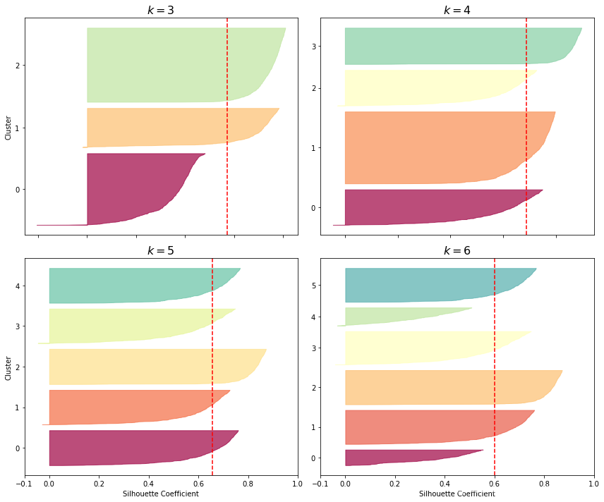
如上输出所示为轮廓直方图,其中每个簇呈刀形,刀形的高度表示簇中样本的个数,宽度表示这些样本的轮廓系数,虚线表示轮廓系数平均值,也就是说虚线代表了轮廓得分。
当一个簇中大部分样本的轮廓系数都比轮廓得分低,说明这个簇聚类的不好,因为它的大部分样本与其它簇更相近。观察发现,当k=3和k=6时就存在这样的簇,说明这些簇聚类的不好。当k=4和k=5时,这些簇都比较好,并且大部分样本都超过了虚线并去接近1。
k=4时第三个簇非常的大,也就是说聚类到这个簇的样本很多,而k=5时所有簇高度都差不多,也就是说每个簇的样本数量都差不多。因此,虽然k=4时轮廓得分比k=5的稍微高一些,但总体来看k=5是都好的选择。
1.9 K-Means的不足
尽管K-Means速度快、可扩展性好,但是K-Means每次训练需要尝试多次才能得到结果,并且需要指定k值,而且在训练集簇大小不一、密度不均匀的数据上效果不是很好。
X1, y1 = make_blobs(n_samples=1000, centers=((4, -4), (0, 0)), random_state=42)
X1 = X1.dot(np.array([[0.374, 0.95], [0.732, 0.598]]))
X2, y2 = make_blobs(n_samples=250, centers=1, random_state=42)
X2 = X2 + [6, -8]
X = np.r_[X1, X2]
y = np.r_[y1, y2]

plot_clusters(X)
输出:

kmeans_good = KMeans(n_clusters=3, init=np.array([[-1.5, 2.5], [0.5, 0], [4, 0]]), n_init=1, random_state=42)
kmeans_bad = KMeans(n_clusters=3, random_state=42)
kmeans_good.fit(X)
kmeans_bad.fit(X)
输出:
KMeans(algorithm='auto', copy_x=True, init='k-means++', max_iter=300,
       n_clusters=3, n_init=10, n_jobs=None, precompute_distances='auto',
       random_state=42, tol=0.0001, verbose=0)
plt.figure(figsize=(12, 5))

plt.subplot(121)
plot_decision_boundaries(kmeans_good, X)
plt.title("Inertia = {:.1f}".format(kmeans_good.inertia_), fontsize=14)

plt.subplot(122)
plot_decision_boundaries(kmeans_bad, X, show_ylabels=False)
plt.title("Inertia = {:.1f}".format(kmeans_bad.inertia_), fontsize=14)

plt.tight_layout()
plt.show()
输出:

如上输出所示,对一个具有不同维度、密度和方向的数据进行聚类,两个结果都不理想。虽然左图的结果可能更好一些,但其中有一定比例的样本被错误聚类了。而右图尽管inertia值比较低,但是结果很糟糕。
对于上述这类的数据,可能高斯混合模型会比较有用。
注意:在使用K-Means前对数据特征进行归一化很重要,否则聚类效果很差,还有可能簇被拉伸。
1.10 使用聚类进行图像分隔
图像分隔就是将图像分隔成多个部分的任务。语义分隔:相同目标类型的所有像素被分到相同的部分中。实例分隔:相同目标个体的所有像素被分到相同的部分中。颜色分隔:相同颜色的分到相同的簇中。
如果自动驾驶系统中,将所有行人归为一类时属于语义分隔,而将不同的人分为不同的类时属于实例分隔。例如根据遥感照片计算森林面积,就会用到颜色分隔。
import urllib

images_path = os.path.join("./images", "unsupervised_learning")
os.makedirs(images_path, exist_ok=True)
DOWNLOAD_ROOT = "https://raw.githubusercontent.com/ageron/handson-ml2/master/"
filename = "ladybug.png"
print("Downloading", filename)
url = DOWNLOAD_ROOT + "images/unsupervised_learning/" + filename
urllib.request.urlretrieve(url, os.path.join(images_path, filename))
输出:
Downloading ladybug.pngfrom matplotlib.image import imread
image = imread(os.path.join(images_path, filename))
print(image.shape)
X = image.reshape(-1, 3)
kmeans = KMeans(n_clusters=8, random_state=42).fit(X)
segmented_img = kmeans.cluster_centers_[kmeans.labels_]
segmented_img = segmented_img.reshape(image.shape)输出:
(533, 800, 3)segmented_imgs = []
n_colors = (10, 8, 6, 4, 2)
for n_clusters in n_colors:
kmeans = KMeans(n_clusters=n_clusters, random_state=42).fit(X)
segmented_img = kmeans.cluster_centers_[kmeans.labels_]
segmented_imgs.append(segmented_img.reshape(image.shape))
plt.figure(figsize=(12,6))
plt.subplots_adjust(wspace=0.05, hspace=0.1)
plt.subplot(231)
plt.imshow(image)
plt.title("Original image")
plt.axis('off')
for idx, n_clusters in enumerate(n_colors):
plt.subplot(232 + idx)
plt.imshow(segmented_imgs[idx])
plt.title("{} colors".format(n_clusters))
plt.axis('off')
plt.show()输出:

如上输出所示为K-Means用于图像分隔的例子。
1.11 使用聚类进行数据预处理
from sklearn.datasets import load_digits
from sklearn.model_selection import train_test_split

X_digits, y_digits = load_digits(return_X_y=True)
X_train, X_test, y_train, y_test = train_test_split(X_digits, y_digits, random_state=42)

for i in (X_train, X_test, y_train, y_test):
    print(i.shape)
输出:
(1347, 64)
(450, 64)
(1347,)
(450,)
from sklearn.linear_model import LogisticRegression
log_reg = LogisticRegression(multi_class="ovr", solver="lbfgs", max_iter=5000, random_state=42)
log_reg.fit(X_train, y_train)
log_reg.score(X_test, y_test)输出:
0.9688888888888889对数据进行逻辑回归前,先通过K-Means对数据进行预处理:
from sklearn.pipeline import Pipeline

pipeline = Pipeline([
    ("kmeans", KMeans(n_clusters=50, random_state=42)),
    ("log_reg", LogisticRegression(multi_class="ovr", solver="lbfgs", max_iter=5000, random_state=42)),
])
pipeline.fit(X_train, y_train)
pipeline.score(X_test, y_test)
输出:
0.97777777777777771 - (1 - 0.977777) / (1 - 0.968888)输出:
0.28570969400874346如上输出所示,经过K-Means预处理后,错误率从3.1%降到了2.2%。
下面通过网络搜索寻找更好的k值:
from sklearn.model_selection import GridSearchCV

param_grid = dict(kmeans__n_clusters=range(2, 100))
grid_clf = GridSearchCV(pipeline, param_grid, cv=3, verbose=2)
grid_clf.fit(X_train, y_train)
输出:
Fitting 3 folds for each of 98 candidates, totalling 294 fits
[CV] kmeans__n_clusters=2 ............................................
[CV] ............................. kmeans__n_clusters=2, total=   0.1s
[CV] kmeans__n_clusters=2 ............................................
[Parallel(n_jobs=1)]: Using backend SequentialBackend with 1 concurrent workers.
[Parallel(n_jobs=1)]: Done   1 out of   1 | elapsed:    0.0s remaining:    0.0s
[CV] ............................. kmeans__n_clusters=2, total=   0.1s
[CV] kmeans__n_clusters=2 ............................................
[CV] ............................. kmeans__n_clusters=2, total=   0.1s
[CV] kmeans__n_clusters=3 ............................................
[CV] ............................. kmeans__n_clusters=3, total=   0.1s
...
[CV] kmeans__n_clusters=99 ...........................................
[CV] ............................ kmeans__n_clusters=99, total=   3.4s
[CV] kmeans__n_clusters=99 ...........................................
[CV] ............................ kmeans__n_clusters=99, total=   3.3s
[CV] kmeans__n_clusters=99 ...........................................
[CV] ............................ kmeans__n_clusters=99, total=   3.7s
[Parallel(n_jobs=1)]: Done 294 out of 294 | elapsed: 12.9min finished
Out[105]:
GridSearchCV(cv=3, error_score='raise-deprecating',
             estimator=Pipeline(memory=None,
                                steps=[('kmeans',
                                        KMeans(algorithm='auto', copy_x=True,
                                               init='k-means++', max_iter=300,
                                               n_clusters=50, n_init=10,
                                               n_jobs=None,
                                               precompute_distances='auto',
                                               random_state=42, tol=0.0001,
                                               verbose=0)),
                                       ('log_reg',
                                        LogisticRegression(C=1.0,
                                                           class_weight=None,
                                                           dual=False,
                                                           fit_intercept=True,
                                                           intercept_scaling=1,
                                                           l1_ratio=None,
                                                           max_iter=5000,
                                                           multi_class='ovr',
                                                           n_jobs=None,
                                                           penalty='l2',
                                                           random_state=42,
                                                           solver='lbfgs',
                                                           tol=0.0001,
                                                           verbose=0,
                                                           warm_start=False))],
                                verbose=False),
             iid='warn', n_jobs=None,
             param_grid={'kmeans__n_clusters': range(2, 100)},
             pre_dispatch='2*n_jobs', refit=True, return_train_score=False,
scoring=None, verbose=2)grid_clf.best_params_输出:
{'kmeans__n_clusters': 77}grid_clf.score(X_test, y_test)输出:
0.9822222222222222如上输出所示,最好的k值是77,并且当k=77时,测试集上的准确率达到了98.22%。
1.12 聚类用于半监督学习
聚类的另一个用处是可以用在半监督学习中,假设手头有大量没有标签和少量有标签的数据,首先对所有包括有标签和无标签的数据同时进行聚类,然后根据聚类结果对无标签的数据打上相同类别中有标签数据的标签,这样就可以完成对大量数据的标签化。
from sklearn.linear_model import LogisticRegression

n_labeled = 50

log_reg = LogisticRegression(multi_class="ovr", solver="lbfgs", random_state=42)
log_reg.fit(X_train[:n_labeled], y_train[:n_labeled])
log_reg.score(X_test, y_test)
输出:
0.8333333333333334如上输出所示,使用50个有标签的数据进行逻辑回归模型的训练,结果测试集上准确率只有83.3%,似乎有些低。
k = 50

kmeans = KMeans(n_clusters=k, random_state=42)
X_digits_dist = kmeans.fit_transform(X_train)
representative_digit_idx = np.argmin(X_digits_dist, axis=0)
X_representative_digits = X_train[representative_digit_idx]

plt.figure(figsize=(12, 5))
for index, X_representative_digit in enumerate(X_representative_digits):
    plt.subplot(k // 10, 10, index + 1)
    plt.imshow(X_representative_digit.reshape(8, 8), cmap="binary", interpolation="bilinear")
    plt.axis('off')


plt.show()
输出:

如上输出所示,利用所有训练集数据,首先对数据进行聚类,k取50。根据聚类后结果,以离质心最近的样本为簇的代表。如上图片所示为聚类的50个类别的代表图像。
y_representative_digits = np.array([
    4, 8, 0, 6, 8, 3, 7, 7, 9, 2,
    5, 5, 8, 5, 2, 1, 2, 9, 6, 1,
    1, 6, 9, 0, 8, 3, 0, 7, 4, 1,
    6, 5, 2, 4, 1, 8, 6, 3, 9, 2,
    4, 2, 9, 4, 7, 6, 2, 3, 1, 1])

log_reg = LogisticRegression(multi_class="ovr", solver="lbfgs", max_iter=5000, random_state=42)
log_reg.fit(X_representative_digits, y_representative_digits)
log_reg.score(X_test, y_test)
输出:
0.9222222222222223如上输出所示,同样只使用50个样本,这次准确率达到了92.2%。然而这50个样本是聚类结果中离质心最近的50个样本。
对样本进行标注常常由业内专业人士完成,通常比较费时费力。因此,通过上面的例子,对具有代表性的样本进行标注比对随机样本进行标注更有意义。
y_train_propagated = np.empty(len(X_train), dtype=np.int32)
for i in range(k):
    y_train_propagated[kmeans.labels_==i] = y_representative_digits[i]

log_reg = LogisticRegression(multi_class="ovr", solver="lbfgs", max_iter=5000, random_state=42)
log_reg.fit(X_train, y_train_propagated)
输出:
LogisticRegression(C=1.0, class_weight=None, dual=False, fit_intercept=True,
                   intercept_scaling=1, l1_ratio=None, max_iter=5000,
                   multi_class='ovr', n_jobs=None, penalty='l2',
                   random_state=42, solver='lbfgs', tol=0.0001, verbose=0,
                   warm_start=False)
log_reg.score(X_test, y_test)输出:
0.9333333333333333如上输出所示,对所有数据根据聚类结果打上标签后,逻辑回归模型准确率只升高了约1%。为什么没有大幅度地提升准确率,这可能是将某些位于聚类边界的样本也进行了标注,导致标签可能是错误的。
下面例子只对与质心较近的20%的数据进行标注:
percentile_closest = 20

X_cluster_dist = X_digits_dist[np.arange(len(X_train)), kmeans.labels_]
for i in range(k):
    in_cluster = (kmeans.labels_ == i)
    cluster_dist = X_cluster_dist[in_cluster]
    cutoff_distance = np.percentile(cluster_dist, percentile_closest)
    above_cutoff = (X_cluster_dist > cutoff_distance)
    X_cluster_dist[in_cluster & above_cutoff] = -1

partially_propagated = (X_cluster_dist != -1)
X_train_partially_propagated = X_train[partially_propagated]
y_train_partially_propagated = y_train_propagated[partially_propagated]

log_reg = LogisticRegression(multi_class="ovr", solver="lbfgs", max_iter=5000, random_state=42)
log_reg.fit(X_train_partially_propagated, y_train_partially_propagated)
输出:
LogisticRegression(C=1.0, class_weight=None, dual=False, fit_intercept=True,
                   intercept_scaling=1, l1_ratio=None, max_iter=5000,
                   multi_class='ovr', n_jobs=None, penalty='l2',
                   random_state=42, solver='lbfgs', tol=0.0001, verbose=0,
                   warm_start=False)
log_reg.score(X_test, y_test)输出:
0.94np.mean(y_train_partially_propagated == y_train[partially_propagated])输出:
0.9896907216494846如上输出所示,对部分样本根据聚类结果打上标签后,测试集准确率达到94%。打上标签的样本预测类别与标签类别确率达到98.9%,说明根据聚类结果打上的标签可信度非常高。
为了更加提升模型和训练集,可以继续做一些主动学习的工作,即标注人员与模型相配合,对特定的样本进行标注。最常用的一种方法是不确定抽样(uncertainty sampling),其工作流程如下:
- 利用有限个有标签的数据进行模型的训练,然后利用模型对所有无标签的数据进行预测
- 对模型最不确定的那些数据进行人工标注
- 不断迭代,直到模型性能提升很少以至于不再值得人工标注
2. DBSCAN
DBSCAN基于局部密度估计,其优点是可以识别任意形状的簇,DBSCAN将簇定义为高密度的连续区域。
DBSCAN工作流程:
- 随机选择一个样本,统计在半径为epsilon的圆内样本的个数。这个圆也叫做epsilon邻域。
- 如果邻域内至少有min_samples个样本,则称这个样本为核心样本,该邻域内的样本组成一个簇。
- 对该簇中的其它样本做同样的事情,即以样本为中心画圆、统计个数,如果大于min_samples,则将圆中的样本加入到该簇。
- 直到遍历完该簇中所有样本,没有新样本加入时,再随机选择其它的样本进行如上工作,直到遍历完数据中所有样本。
from sklearn.datasets import make_moons
from sklearn.cluster import DBSCAN

X, y = make_moons(n_samples=1000, noise=0.05, random_state=42)

dbscan = DBSCAN(eps=0.05, min_samples=5)
dbscan.fit(X)
输出:
DBSCAN(algorithm='auto', eps=0.05, leaf_size=30, metric='euclidean',
metric_params=None, min_samples=5, n_jobs=None, p=None)dbscan.labels_[:10]输出:
array([ 0, 2, -1, -1, 1, 0, 0, 0, 2, 5], dtype=int64)所有样本的聚类标签存储在labels_变量中,标签为-1代表异常值或离群值。
len(dbscan.core_sample_indices_)输出:
808len(dbscan.components_)输出:
808dbscan.core_sample_indices_[:10]输出:
array([ 0, 4, 5, 6, 7, 8, 10, 11, 12, 13], dtype=int64)dbscan.components_[:3]输出:
array([[-0.02137124,  0.40618608],
       [-0.84192557,  0.53058695],
       [ 0.58930337, -0.32137599]])
核心样本的索引存储在core_sample_indices_变量中,核心样本的值存储在components_中。
np.unique(dbscan.labels_)输出:
array([-1, 0, 1, 2, 3, 4, 5, 6], dtype=int64)dbscan2 = DBSCAN(eps=0.2)
dbscan2.fit(X)输出:
DBSCAN(algorithm='auto', eps=0.2, leaf_size=30, metric='euclidean',
       metric_params=None, min_samples=5, n_jobs=None, p=None)
def plot_dbscan(dbscan, X, size, show_xlabels=True, show_ylabels=True):
core_mask = np.zeros_like(dbscan.labels_, dtype=bool)
core_mask[dbscan.core_sample_indices_] = True
anomalies_mask = dbscan.labels_ == -1
non_core_mask = ~(core_mask | anomalies_mask)
cores = dbscan.components_
anomalies = X[anomalies_mask]
non_cores = X[non_core_mask]
plt.scatter(cores[:, 0], cores[:, 1],
c=dbscan.labels_[core_mask], marker='o', s=size, cmap="Paired")
plt.scatter(cores[:, 0], cores[:, 1], marker='*', s=20, c=dbscan.labels_[core_mask])
plt.scatter(anomalies[:, 0], anomalies[:, 1],
c="r", marker="x", s=100)
plt.scatter(non_cores[:, 0], non_cores[:, 1], c=dbscan.labels_[non_core_mask], marker=".")
if show_xlabels:
plt.xlabel("$x_1$", fontsize=14)
else:
plt.tick_params(labelbottom=False)
if show_ylabels:
plt.ylabel("$x_2$", fontsize=14, rotation=0)
else:
plt.tick_params(labelleft=False)
plt.title("eps={:.2f}, min_samples={}".format(dbscan.eps, dbscan.min_samples), fontsize=14)
plt.figure(figsize=(12, 5))
plt.subplot(121)
plot_dbscan(dbscan, X, size=100)
plt.subplot(122)
plot_dbscan(dbscan2, X, size=600, show_ylabels=False)
plt.tight_layout()
plt.show()输出:

如上输出所示,使用不同的epsilon半径得到完全不同的结果。
如左图所示,半径epsilon=0.05时,聚类结果有7个簇,并且产生了大量的离群值。
如右图所示,半径epsilon=0.2时,聚类结果只有2个,没有产生离群值,很明显结果比较准确。
注意:DBSCAN类没有predict()方法(有fit_predict()方法),说明DBSCAN不能直接对新样本进行预测。可能DBSCAN的作者认为有更好的算法用于分类任务,因此让使用者自行选择。请看下面例子,根据DBSCAN聚类的结果,利用K近邻算法进行分类:
from sklearn.neighbors import KNeighborsClassifier

dbscan = dbscan2   # 选择epsilon=0.2的模型
knn = KNeighborsClassifier(n_neighbors=50)
knn.fit(dbscan.components_, dbscan.labels_[dbscan.core_sample_indices_])
输出:
KNeighborsClassifier(algorithm='auto', leaf_size=30, metric='minkowski',
                     metric_params=None, n_jobs=None, n_neighbors=50, p=2,
                     weights='uniform')
X_new = np.array([[-0.5, 0], [0, 0.5], [1, -0.1], [2, 1]])
knn.predict(X_new)输出:
array([1, 0, 1, 0], dtype=int64)knn.predict_proba(X_new)输出:
array([[0.18, 0.82],
       [1.  , 0.  ],
       [0.12, 0.88],
       [1.  , 0.  ]])
plt.figure(figsize=(6,3))
plot_decision_boundaries(knn, X, show_centroids=False)
plt.scatter(X_new[:, 0], X_new[:, 1], c="b", marker="+", s=200, zorder=10)
plt.show()输出:

如上输出所示为K近邻算法训练模型的结果,黑色实线代表决策边界,四个蓝色十字点代表预测样本。观察发现,有两个蓝色十字点预测正确,而另外两个离大部分样本比较远,虽然预测结果将它们归类到某一类,但很明显这两个点应该属于异常点或离群值。
KNeighborsClassifier中的kneighbors()方法,输入预测样本,返回k个最近点的距离和索引:
y_dist, y_pred_idx = knn.kneighbors(X_new, n_neighbors=1)
y_pred = dbscan.labels_[dbscan.core_sample_indices_][y_pred_idx]
y_pred[y_dist > 0.2] = -1
y_pred.ravel()
输出:
array([-1, 0, 1, -1], dtype=int64)如上输出所示,可以将距离大于0.2(epsilon半径)的样本预测为异常点或离群值。
DBSCAN对检测离群值非常有用,并且只需提供两个超参数:epsilon和min_samples。
DBSCAN计算复杂度大约为O(mlogm),但是在sklearn中如果epsilon比较大时计算复杂度会高达O(m^2)。
3. 其它聚类算法
3.1 Agglomerative clustering
自上而下构建的层次聚类。
from sklearn.cluster import AgglomerativeClustering

X_agg = np.array([0, 2, 5, 8.5]).reshape(-1, 1)
agg = AgglomerativeClustering(linkage="complete").fit(X_agg)

def learned_parameters(estimator):
    return [attrib for attrib in dir(estimator) if attrib.endswith("_") and not attrib.startswith("_")]

learned_parameters(agg)
输出:
['children_',
 'labels_',
 'n_clusters_',
 'n_components_',
 'n_connected_components_',
'n_leaves_']agg.children_输出:
array([[0, 1],
       [2, 3],
       [4, 5]])
3.2 BIRCH
BIRCH:Balanced Iterative Reducing and Clustering using Hierarchies,专门用于非常大的数据集,只要特征数不是太多(<20)该算法比Mini-batch K-Means算法快,并且能得到与之差不多的结果。
训练时会创建一棵包含足够信息的树结构,可以快速将每个样本分到不同的类中,因此当处理比较大的数据集时非常有用,节省内存。
3.3 Mean-Shift
以每个样本为中心画圆,然后统计每个圆中样本的均值,然后移动圆,使其以圴值为中心,不断迭代直到圆不再移动。
移动圆的方向是密度增大的方向,因此每个圆最终会落在局部密度最大的地方。该方法与DBSCAN类似,都是基于局部密度的,Mean-Shift只需要一个超参数,就是半径。与DBSCAN不同的是如果局部内存密度不同时,Mean-Shift倾向于将其切分成不同的簇。
Mean-Shift的计算复杂度为O(m^2),因此不太适合较大数据集。
3.4 Affinity propagation
每个样本选举与其相似的样本作为代表,最终模型收敛时代表和其投票都组成一个簇。
Affinity propagation计算复杂度也是O(m^2),因此也不太适合较大数据集。
3.5 Spectral clustering
根据样本间的相似矩阵,创建一个低维嵌入,然后利用其它聚类算法对该低维嵌入进行聚类。
Spectral clustering可以捕获到很复杂的簇结构,同时也可以用于图像切割。
当数据量比较大时Spectral clustering的扩展性不是很好,同时簇大小各不相同时效果也不好。
from sklearn.cluster import SpectralClustering

sc1 = SpectralClustering(n_clusters=2, gamma=100, random_state=42)
sc1.fit(X)
输出:
SpectralClustering(affinity='rbf', assign_labels='kmeans', coef0=1, degree=3,
                   eigen_solver=None, eigen_tol=0.0, gamma=100,
                   kernel_params=None, n_clusters=2, n_init=10, n_jobs=None,
                   n_neighbors=10, random_state=42)
np.percentile(sc1.affinity_matrix_, 95)输出:
0.04251990648936265sc2 = SpectralClustering(n_clusters=2, gamma=1, random_state=42)
sc2.fit(X)输出:
SpectralClustering(affinity='rbf', assign_labels='kmeans', coef0=1, degree=3,
                   eigen_solver=None, eigen_tol=0.0, gamma=1,
                   kernel_params=None, n_clusters=2, n_init=10, n_jobs=None,
                   n_neighbors=10, random_state=42)
def plot_spectral_clustering(sc, X, size, alpha, show_xlabels=True, show_ylabels=True):
plt.scatter(X[:, 0], X[:, 1], marker='o', s=size, c='gray', cmap="Paired", alpha=alpha)
plt.scatter(X[:, 0], X[:, 1], marker='o', s=30, c='w')
plt.scatter(X[:, 0], X[:, 1], marker='.', s=10, c=sc.labels_, cmap="Paired")
if show_xlabels:
plt.xlabel("$x_1$", fontsize=14)
else:
plt.tick_params(labelbottom=False)
if show_ylabels:
plt.ylabel("$x_2$", fontsize=14, rotation=0)
else:
plt.tick_params(labelleft=False)
plt.title("RBF gamma={}".format(sc.gamma), fontsize=14)
plt.figure(figsize=(12, 5))
plt.subplot(121)
plot_spectral_clustering(sc1, X, size=500, alpha=0.1)
plt.subplot(122)
plot_spectral_clustering(sc2, X, size=4000, alpha=0.01, show_ylabels=False)
plt.tight_layout()
plt.show()输出:

4. 高斯混合
高斯混合模型可以用于密度估计、聚类和异常检测。
4.1 高斯混合模型基础
高斯混合模型(GMM)是一种概率模型,它假定样本由参数未知的多个高斯分布的混合生成。由同一个高斯分布生成的样本形成一个椭圆形的簇。每个簇具有不同的椭圆形状、大小、密度和方向。对于任何一个样本,它应该是其中一个高斯分布生成的,但是不知道是哪一个,也不知道这些分布的参数。
GMM有很多变种,sklearn中GaussianMixture是最简单的一种,需要指定高斯分布的个数k值。
from sklearn.datasets import make_blobs

X1, y1 = make_blobs(n_samples=1000, centers=((4, -4), (0, 0)), random_state=42)
X1 = X1.dot(np.array([[0.374, 0.95], [0.732, 0.598]]))
X2, y2 = make_blobs(n_samples=250, centers=1, random_state=42)
X2 = X2 + [6, -8]
X = np.r_[X1, X2]
y = np.r_[y1, y2]

X.shape, y.shape
输出:
((1250, 2), (1250,))from sklearn.mixture import GaussianMixture
gm = GaussianMixture(n_components=3, n_init=10, random_state=42) # 默认n_init=1
gm.fit(X)输出:
GaussianMixture(covariance_type='full', init_params='kmeans', max_iter=100,
                means_init=None, n_components=3, n_init=10,
                precisions_init=None, random_state=42, reg_covar=1e-06,
                tol=0.001, verbose=0, verbose_interval=10, warm_start=False,
weights_init=None)gm.weights_输出:
array([0.20965228, 0.4000662 , 0.39028152])生成数据的比例分别为:0.2、0.4、0.4(250/1250=0.2, 500/1250=0.4),与上面输出基本一致。
gm.means_输出:
array([[ 3.39909717,  1.05933727],
       [-1.40763984,  1.42710194],
[ 0.05135313, 0.07524095]])gm.covariances_输出:
array([[[ 1.14807234, -0.03270354],
        [-0.03270354,  0.95496237]],

       [[ 0.63478101,  0.72969804],
        [ 0.72969804,  1.1609872 ]],

       [[ 0.68809572,  0.79608475],
[ 0.79608475, 1.21234145]]])gm.converged_输出:
Truegm.n_iter_输出:
4可以输出模型是否收敛,以及收敛的迭代轮数。
此时,可以对每个簇评估其位置、大小、形状、方向和相对权重,同时也可以对每个样本进行聚类,predict()方法对应硬聚类,即输出样本属于哪个簇;predict_proba()对应软聚类,即输出样本源于每个簇的可能性:
gm.predict(X)输出:
array([2, 2, 1, ..., 0, 0, 0], dtype=int64)gm.predict_proba(X)输出:
array([[2.32389467e-02, 6.77397850e-07, 9.76760376e-01],
       [1.64685609e-02, 6.75361303e-04, 9.82856078e-01],
       [2.01535333e-06, 9.99923053e-01, 7.49319577e-05],
       ...,
       [9.99999571e-01, 2.13946075e-26, 4.28788333e-07],
       [1.00000000e+00, 1.46454409e-41, 5.12459171e-16],
       [1.00000000e+00, 8.02006365e-41, 2.27626238e-15]])
高斯混合模型是个生成模型,因此可以生成新的样本:
X_new, y_new = gm.sample(6)
X_new
输出:
array([[ 2.95400315,  2.63680992],
       [-1.16654575,  1.62792705],
       [-1.39477712, -1.48511338],
       [ 0.27221525,  0.690366  ],
       [ 0.54095936,  0.48591934],
[ 0.38064009, -0.56240465]])y_new输出:
array([0, 1, 2, 2, 2, 2])如上输出所示,高斯混合模型可以计算出任意位置的密度,采用score_samples()方法:对于每一个样本,模型计算概率密度值(Probability Density Function, PDF)的log值,值越大表示密度越大:
gm.score_samples(X)输出:
array([-2.60782346, -3.57106041, -3.33003479, ..., -3.51352783,
       -4.39802535, -3.80743859])
如果对这些输出score值求e次幂,则可以得到给定样本位置的PDF值,所有高斯模型的PDF和为1:
resolution = 100

grid = np.arange(-10, 10, 1 / resolution)
xx, yy = np.meshgrid(grid, grid)
X_full = np.vstack([xx.ravel(), yy.ravel()]).T

pdf = np.exp(gm.score_samples(X_full))
pdf_probas = pdf * (1 / resolution) ** 2
pdf_probas.sum()
输出:
0.9999999999217849from matplotlib.colors import LogNorm
def plot_gaussian_mixture(clusterer, X, resolution=1000, show_ylabels=True):
mins = X.min(axis=0) - 0.1
maxs = X.max(axis=0) + 0.1
xx, yy = np.meshgrid(np.linspace(mins[0], maxs[0], resolution),np.linspace(mins[1], maxs[1], resolution))
Z = -clusterer.score_samples(np.c_[xx.ravel(), yy.ravel()])
Z = Z.reshape(xx.shape)
plt.contourf(xx, yy, Z, norm=LogNorm(vmin=1.0, vmax=30.0), levels=np.logspace(0, 2, 12))
plt.contour(xx, yy, Z, norm=LogNorm(vmin=1.0, vmax=30.0), levels=np.logspace(0, 2, 12), linewidths=1, colors='k')
Z = clusterer.predict(np.c_[xx.ravel(), yy.ravel()])
Z = Z.reshape(xx.shape)
plt.contour(xx, yy, Z, linewidths=2, colors='r', linestyles='dashed')
plt.plot(X[:, 0], X[:, 1], 'k.', markersize=2)
plot_centroids(clusterer.means_, clusterer.weights_)
plt.xlabel("$x_1$", fontsize=14)
if show_ylabels:
plt.ylabel("$x_2$", fontsize=14, rotation=0)
else:
plt.tick_params(labelleft=False)
plt.figure(figsize=(8, 4))
plot_gaussian_mixture(gm, X)
plt.show()输出:

如上输出所示,观察可以发现数据由三个高斯分布组成,红色虚线表示决策边界,黑色实线表示密度等高线。
很显然,上面模型得到了令人满意的结果,当然数据也是就几个高斯分布生成,然而实际生活中的数据往往不是这么简单,仅仅由这么几个高斯分布组成。如果数据维度很高、簇很多而样本很少,EM就很难收敛得到一个不错的结果。此时,就需要通过减少模型学习的参数量从而降低任务的难度,例如可以限制簇的形状和方向,sklearn中通过限制协方差矩阵来实现,通过超参数convariance_type设定:
- "full":默认参数,无限制,所有簇可以是任何大小、任何形状
- "tied":所有簇都必须具有相同的椭圆形状、大小和方向,例如所有簇使用同一个协方差矩阵
- "spherical":所有簇都必须是球形,但可以是不同直径的
- "diag":可以是任意大小的任意形状的椭圆,但椭圆的轴必须与坐标轴平等,例如协方差矩阵必须是对称阵
gm_full = GaussianMixture(n_components=3, n_init=10, covariance_type="full", random_state=42)
gm_tied = GaussianMixture(n_components=3, n_init=10, covariance_type="tied", random_state=42)
gm_spherical = GaussianMixture(n_components=3, n_init=10, covariance_type="spherical", random_state=42)
gm_diag = GaussianMixture(n_components=3, n_init=10, covariance_type="diag", random_state=42)

gm_full.fit(X)
gm_tied.fit(X)
gm_spherical.fit(X)
gm_diag.fit(X)

def compare_gaussian_mixtures(gm1, gm2, X):
    plt.figure(figsize=(12, 5))

    plt.subplot(121)
    plot_gaussian_mixture(gm1, X)
    plt.title('covariance_type="{}"'.format(gm1.covariance_type), fontsize=14)

    plt.subplot(122)
    plot_gaussian_mixture(gm2, X, show_ylabels=False)
    plt.title('covariance_type="{}"'.format(gm2.covariance_type), fontsize=14)

compare_gaussian_mixtures(gm_tied, gm_spherical, X)

plt.tight_layout()
plt.show()
输出:

compare_gaussian_mixtures(gm_full, gm_diag, X)

plt.tight_layout()
plt.show()
输出:

如上输出所示,分别使用tied、spherical、diag和full训练模型的结果。
高斯混合模型的计算复杂度与样本数量m、维度n、聚类数目k以及对协方差矩阵的限制等有关。当协方差类型为spherical或diag时,计算复杂度为O(kmn),而当协方差类型为tied或full时,计算复杂度为O(kmn^2+kn^3)。
4.2 高斯混合模型用于异常检测
异常检测也叫离群值检测,检测远离正常样本或正常分布的样本。
异常检测应用非常广泛,例如欺诈检测、工厂残次品检测、训练模型前剔除离群值等等。
用高斯混合模型进行异常检测的主要思想是:位于低密度区域的样本很有可能是异常样本。此时就需要设定一个阈值,密度低于多少才能属于异常。
densities = gm.score_samples(X)
density_threshold = np.percentile(densities, 4)
anomalies = X[densities < density_threshold]

plt.figure(figsize=(8, 5))

plot_gaussian_mixture(gm, X)
plt.scatter(anomalies[:, 0], anomalies[:, 1], color='r', marker='*')
plt.ylim(top=5.1)

plt.show()
输出:

4.3 高斯混合模型聚类数目选择
与K-Means类似,高斯混合模型也需要指定最终簇的数目,K-Means中可以使用inertia和轮廓分值(silhouette score)来选择合适的簇数目。而高斯混合模型无法使用这些指标,因为当簇不是球形或大小不一时这些指标就显得不可靠。
而高斯混合模型采用最小化理论信息标准的方法,例如贝叶斯信息标准(BIC)或Akaike信息标准(AIC),其定义公式如下:
其中:
- m:样本数量
- p:模型学习到的参数数目
:模型似然函数的最大值
注意:概率和似然函数是区别的:给定一个具有一组参数theta的模型,概率表示生成x的可能性的大小,而似然函数表示已知结果是x的情况下,模型参数为一组theta组合的可能性大小。
在关于x和theta的模型中,PDF就是关于x的函数,此时theta固定,而似然函数是关于theta的函数,此时x固定。对整个PDF积分最终值为1,而对整个似然函数积分最终值可能是任意正数。
gm.bic(X)输出:
8189.74345832983gm.aic(X)输出:
8102.518178214792也可以根据以上公式手动计算AIC和BIC,如下所示:
n_clusters = 3
n_dims = 2
n_params_for_weights = n_clusters - 1
n_params_for_means = n_clusters * n_dims
n_params_for_covariance = n_clusters * n_dims * (n_dims + 1) // 2
n_params = n_params_for_weights + n_params_for_means + n_params_for_covariance

max_log_likelihood = gm.score(X) * len(X) # log(L^)
bic = np.log(len(X)) * n_params - 2 * max_log_likelihood
aic = 2 * n_params - 2 * max_log_likelihood
print(bic, aic)
输出:
8189.74345832983 8102.518178214792如上输出所示,观察发现,结果是一致的。
n_params输出:
17使用不同的超参数k训练高斯混合模型:
gms_per_k = [GaussianMixture(n_components=k, n_init=10, random_state=42).fit(X) for k in range(1, 11)]

bics = [model.bic(X) for model in gms_per_k]
aics = [model.aic(X) for model in gms_per_k]

plt.figure(figsize=(6, 4))
plt.plot(range(1, 11), bics, "bo-", label="BIC")
plt.plot(range(1, 11), aics, "go--", label="AIC")
plt.xlabel("$k$", fontsize=14)
plt.ylabel("Information Criterion", fontsize=14)
plt.axis([1, 9.5, np.min(aics) - 50, np.max(aics) + 50])
plt.annotate('Minimum',xy=(3, bics[2]),xytext=(0.35, 0.6),textcoords='figure fraction',fontsize=14,
             arrowprops=dict(facecolor='black', shrink=0.1))
plt.legend()

plt.show()
输出:

如上输出所示,无论是AIC还是BIC,当k=3时应该是最好超参数。
搜索最佳超参数covariance_type:
min_bic = np.infty

for k in range(1, 11):
    for covariance_type in ("full", "tied", "spherical", "diag"):
        bic = GaussianMixture(n_components=k, n_init=10,covariance_type=covariance_type,random_state=42).fit(X).bic(X)
        if bic < min_bic:
            min_bic = bic
            best_k = k
            best_covariance_type = covariance_type

print(best_k, best_covariance_type)
输出:
3 full如上输出所示,当k=3,covariance_type="full"时为最佳超参数组合。
4.4 贝叶斯高斯混合模型
from sklearn.mixture import BayesianGaussianMixture

bgm = BayesianGaussianMixture(n_components=10, n_init=10, random_state=42)
bgm.fit(X)
输出:
BayesianGaussianMixture(covariance_prior=None, covariance_type='full',
                        degrees_of_freedom_prior=None, init_params='kmeans',
                        max_iter=100, mean_precision_prior=None,
                        mean_prior=None, n_components=10, n_init=10,
                        random_state=42, reg_covar=1e-06, tol=0.001, verbose=0,
                        verbose_interval=10, warm_start=False,
                        weight_concentration_prior=None,
                        weight_concentration_prior_type='dirichlet_process')
np.round(bgm.weights_, 2)输出:
array([0.4 , 0.21, 0.4 , 0. , 0. , 0. , 0. , 0. , 0. , 0. ])如上输出所示,观察可以发现,BayesianGaussianMixture类将无用的簇的权重设为0。而且权重比例与真实的0.2、0.4、0.4基本一致。
并且簇的权重、均值、协方差矩阵等参数不再是固定的,而是被当作潜在变量
plt.figure(figsize=(8, 5))
plot_gaussian_mixture(bgm, X)
plt.show()
输出:

bgm_low = BayesianGaussianMixture(n_components=10, max_iter=1000, n_init=1,
                                  weight_concentration_prior=0.01, random_state=42)
bgm_high = BayesianGaussianMixture(n_components=10, max_iter=1000, n_init=1,
                                  weight_concentration_prior=10000, random_state=42)
nn = 73
bgm_low.fit(X[:nn])
bgm_high.fit(X[:nn])
输出:
BayesianGaussianMixture(covariance_prior=None, covariance_type='full',
                        degrees_of_freedom_prior=None, init_params='kmeans',
                        max_iter=1000, mean_precision_prior=None,
                        mean_prior=None, n_components=10, n_init=1,
                        random_state=42, reg_covar=1e-06, tol=0.001, verbose=0,
                        verbose_interval=10, warm_start=False,
                        weight_concentration_prior=10000,
                        weight_concentration_prior_type='dirichlet_process')
np.round(bgm_low.weights_, 2)输出:
array([0.52, 0.48, 0. , 0. , 0. , 0. , 0. , 0. , 0. , 0. ])np.round(bgm_high.weights_, 2)输出:
array([0.01, 0.18, 0.27, 0.11, 0.01, 0.01, 0.01, 0.01, 0.37, 0.01])plt.figure(figsize=(12, 5))
plt.subplot(121)
plot_gaussian_mixture(bgm_low, X[:nn])
plt.title("weight_concentration_prior = 0.01", fontsize=14)
plt.subplot(122)
plot_gaussian_mixture(bgm_high, X[:nn], show_ylabels=False)
plt.title("weight_concentration_prior = 10000", fontsize=14)
plt.tight_layout()
plt.show()输出:

X_moons, y_moons = make_moons(n_samples=1000, noise=0.05, random_state=42)

bgm = BayesianGaussianMixture(n_components=10, n_init=10, random_state=42)
bgm.fit(X_moons)

plt.figure(figsize=(12, 5))

plt.subplot(121)
plot_data(X_moons)
plt.xlabel("$x_1$", fontsize=14)
plt.ylabel("$x_2$", fontsize=14, rotation=0)

plt.subplot(122)
plot_gaussian_mixture(bgm, X_moons, show_ylabels=False)

plt.tight_layout()
plt.show()
输出:

5. 异常检测和新颖性检测的其它算法
sklearn中还有其它很多用于异常检测和新颖性检测的算法。
5.1 PCA
包括其它含有inverse_transform()方法的降维算法。
对比正常样本和异常样本的重构误差可以发现,异常样本的重构误差会非常大。这种方法通常是最简单但非常有效的异常检测的方法。
5.2 最小协方差行列式(Fast-MCD, minimum covariance determinant)
sklearn中由EllipticEnvelope类实现,该算法对离群值检测特别有用,常常用于清洗数据。
主要思想是认为正常数据都是源于同一个高斯分布,而离群样本源于另一个高斯分布。当该算法估计高斯分布的参数时,会忽略最可能是异常值的那些样本。
5.3 隔离森林(Isolation Forest)
隔离森林对离群值检测特别有用,尤其是对于高维度的数据集。
隔离森林算法首先创建一个随机森林,其中每个决策树随机生长,每个节点随机挑选一个特征,然后随机选择阈值将数据一分为二,直到遍历所有样本。离群样本通常离正常样本很远。
5.4 局部异常因子(Local Outlier Factor (LOF))
局部异常因子适合于离群值检测。
主要思想是比较给定样本周围样本密度与其近邻样本的密度,通常离群值比其k年最近的近邻更孤立。
5.5 单分类SVM(One-class SVM)
单分类SVM比较适合于新颖性检测。在高维数据上效果很好,但无法应用于大型数据集。
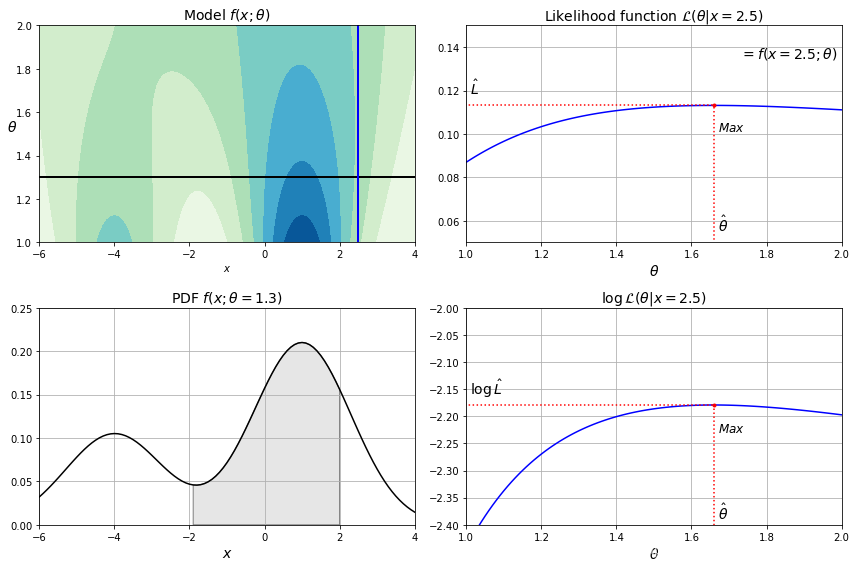
6. 似然函数
from scipy.stats import norm
from matplotlib.patches import Polygon

xx = np.linspace(-6, 4, 101)
ss = np.linspace(1, 2, 101)
XX, SS = np.meshgrid(xx, ss)
ZZ = 2 * norm.pdf(XX - 1.0, 0, SS) + norm.pdf(XX + 4.0, 0, SS)
ZZ = ZZ / ZZ.sum(axis=1)[:,np.newaxis] / (xx[1] - xx[0])

plt.figure(figsize=(12, 8))
x_idx = 85
s_idx = 30

plt.subplot(221)
plt.contourf(XX, SS, ZZ, cmap="GnBu")
plt.plot([-6, 4], [ss[s_idx], ss[s_idx]], "k-", linewidth=2)
plt.plot([xx[x_idx], xx[x_idx]], [1, 2], "b-", linewidth=2)
plt.xlabel(r"$x$")
plt.ylabel(r"$\theta$", fontsize=14, rotation=0)
plt.title(r"Model $f(x; \theta)$", fontsize=14)

plt.subplot(222)
plt.plot(ss, ZZ[:, x_idx], "b-")
max_idx = np.argmax(ZZ[:, x_idx])
max_val = np.max(ZZ[:, x_idx])
plt.plot(ss[max_idx], max_val, "r.")
plt.plot([ss[max_idx], ss[max_idx]], [0, max_val], "r:")
plt.plot([0, ss[max_idx]], [max_val, max_val], "r:")
plt.text(1.01, max_val + 0.005, r"$\hat{L}$", fontsize=14)
plt.text(ss[max_idx]+ 0.01, 0.055, r"$\hat{\theta}$", fontsize=14)
plt.text(ss[max_idx]+ 0.01, max_val - 0.012, r"$Max$", fontsize=12)
plt.axis([1, 2, 0.05, 0.15])
plt.xlabel(r"$\theta$", fontsize=14)
plt.grid(True)
plt.text(1.99, 0.135, r"$=f(x=2.5; \theta)$", fontsize=14, ha="right")
plt.title(r"Likelihood function $\mathcal{L}(\theta|x=2.5)$", fontsize=14)

plt.subplot(223)
plt.plot(xx, ZZ[s_idx], "k-")
plt.axis([-6, 4, 0, 0.25])
plt.xlabel(r"$x$", fontsize=14)
plt.grid(True)
plt.title(r"PDF $f(x; \theta=1.3)$", fontsize=14)
verts = [(xx[41], 0)] + list(zip(xx[41:81], ZZ[s_idx, 41:81])) + [(xx[80], 0)]
poly = Polygon(verts, facecolor='0.9', edgecolor='0.5')
plt.gca().add_patch(poly)

plt.subplot(224)
plt.plot(ss, np.log(ZZ[:, x_idx]), "b-")
max_idx = np.argmax(np.log(ZZ[:, x_idx]))
max_val = np.max(np.log(ZZ[:, x_idx]))
plt.plot(ss[max_idx], max_val, "r.")
plt.plot([ss[max_idx], ss[max_idx]], [-5, max_val], "r:")
plt.plot([0, ss[max_idx]], [max_val, max_val], "r:")
plt.axis([1, 2, -2.4, -2])
plt.xlabel(r"$\theta$", fontsize=14)
plt.text(ss[max_idx]+ 0.01, max_val - 0.05, r"$Max$", fontsize=12)
plt.text(ss[max_idx]+ 0.01, -2.39, r"$\hat{\theta}$", fontsize=14)
plt.text(1.01, max_val + 0.02, r"$\log \, \hat{L}$", fontsize=14)
plt.grid(True)
plt.title(r"$\log \, \mathcal{L}(\theta|x=2.5)$", fontsize=14)

plt.tight_layout()
plt.show()
输出:

CSDN联合极客时间,共同打造面向开发者的精品内容学习社区,助力成长!
更多推荐


 2
2 0
0- 0


 已为社区贡献2条内容

所有评论(0)