Python GUI tkinter 加入matplotlib图表
将matplotlib 生成的图表插入tkinter可以扩展软件的功能,比如选中excel文件生成自动生成图表本例需要的Python第三方库:tkinter:生成GUImatplotlib:生成图表numpy:计算均值标准差scipy:正态分布函数xlrd:读取excel内容import tkinterimport tkinter.filedialogfrom matplotlib.backend
·
将matplotlib 生成的图表插入tkinter可以扩展软件的功能,比如选中excel文件生成自动生成图表
本例需要的Python第三方库:
tkinter:生成GUI
matplotlib:生成图表
numpy:计算均值标准差
scipy:正态分布函数
xlrd:读取excel内容
import tkinter
import tkinter.filedialog
from matplotlib.backends.backend_tkagg import FigureCanvasTkAgg
from matplotlib.figure import Figure
import matplotlib.pyplot as plt
import numpy as np
import matplotlib
from scipy.stats import norm
import xlrd
matplotlib.rcParams['font.sans-serif']=['SimHei'] # 用黑体显示中文
matplotlib.rcParams['axes.unicode_minus']=False # 正常显示负号
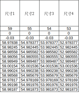
def get_excel_value(j,filename): #j代表列0是第一列,j,filename 为文件名
row_list =[] #建立空列表插入尺寸数据
excel = xlrd.open_workbook(r"%s"%filename)
#sheet = excel.sheet_by_index(0) #根据下标获取对应的sheet表
sheet = excel.sheet_by_name("report") #根据表名获取对应的sheet表
#for j in range(0,sheet.ncols):
for i in range(5, sheet.nrows): #从表的第6行开始到
if sheet.row_values(i, start_colx=j, end_colx=j+1): #内循环
row_list.append(sheet.row_values(i, start_colx=j, end_colx=j+1)[0]) #每次循环取一个单元格数据插入列表中
arr_mean = np.mean(row_list)
arr_std = np.std(row_list,ddof=1)
return row_list,arr_mean,arr_std #函数返回尺寸数据,尺寸均值,尺寸标准差
def get_tolerance(j,filename): #读取公差函数,公差在工作表的3-5行
excel = xlrd.open_workbook(r"%s"%filename)
sheet = excel.sheet_by_index(0) #根据下标获取对应的sheet表
nominalvalue = sheet.row_values(2, start_colx=j, end_colx=j+1)[0]
up=sheet.row_values(3, start_colx=j, end_colx=j+1)[0]
low=sheet.row_values(4, start_colx=j, end_colx=j+1)[0]
LSL=nominalvalue+low
USL=nominalvalue+up
return LSL,USL
def get_name(j,filename): #获取尺寸名
excel = xlrd.open_workbook(r"%s"%filename)
sheet = excel.sheet_by_index(0) #根据下标获取对应的sheet表
name = sheet.row_values(1, start_colx=j, end_colx=j+1)[0]
return name
def histgram(position,file): #直方图函数减少代码重复
dimension=get_name(position-1,file)
data=get_excel_value(position-1,file)[0] #尺寸数据
num_bins=60
mean=get_excel_value(position-1,file)[1] #尺寸均值
std=get_excel_value(position-1,file)[2] #尺寸标准差
LSL=get_tolerance(position-1,file)[0] #下公差
USL=get_tolerance(position-1,file)[1] #上公差
a=f.add_subplot(2,2,position,title=dimension+"_直方图",xlabel="区间",ylabel="频数/频率")
n, bins, patches = a.hist(data, num_bins, density=1, facecolor="blue", edgecolor="black", alpha=0.5)
y=norm.pdf(bins, mean, std)
a.plot(bins, y, 'r--',linestyle='-') #概率分布图"_"代表实线,"r--"代表红色
x = np.linspace(LSL, LSL, 100) #等差数列
y = np.linspace(0, 100, 100)
a.text(x[9],y[9],'LSL',size=13) #text(x,y,str),x,y 文字的坐标
a.plot(x, y, 'g--', linewidth=1)
x = np.linspace(USL, USL, 100)
y = np.linspace(0, 100, 100)
a.text(x[9],y[9],'USL',size=13)
a.plot(x, y, 'g--', linewidth=1)
root = tkinter.Tk()
root.title("tkinter显示图表")
width = 700
height = 700
screenwidth = root.winfo_screenwidth()
screenheight = root.winfo_screenheight()
alignstr = '%dx%d+%d+%d' % (width, height, (screenwidth-width)/2, (screenheight-height)/2)
root.geometry(alignstr)
f=Figure(figsize=(10,8),dpi=60, tight_layout=True, facecolor="WhiteSmoke")#WhiteSmoke
cv = tkinter.Canvas(root, background='white')
cv.place(relx=0.0,rely=0.1,relwidth=1,relheight=0.9)
def choosefile():
b =tkinter.filedialog.askopenfilename()
print(b)
a=b[b.rfind("/")+1:]#返回文件名
print(a)
listbox_file.insert(0,a)
return a
def chart():
fieselected=choosefile()
histgram(1,fieselected) #调用函数
histgram(2,fieselected)
histgram(3,fieselected)
histgram(4,fieselected)
canvas = FigureCanvasTkAgg(f, master=cv) # 创建画布控件
canvas.draw()
canvas.get_tk_widget().pack(side=tkinter.TOP,fill=tkinter.BOTH,expand=1) # 与画布相同大小
listbox_file=tkinter.Listbox(root,justify=tkinter.LEFT)
listbox_file.place(relx=0.0,rely=0.05,relwidth=0.5,height=30)
buttonfile=tkinter.Button(root,text="选择文件",command=chart)
buttonfile.place(relx=0.5,rely=0.05,width=100,height=30)
tkinter.mainloop()


CSDN联合极客时间,共同打造面向开发者的精品内容学习社区,助力成长!
更多推荐


 6
6 0
0- 0


 已为社区贡献1条内容

所有评论(0)