
python混淆矩阵可视化【热力图】
python混淆矩阵可视化【热力图】依赖包对比方法1方法2方法3讨论色彩映射依赖包seaborn 和 matplotlib 已经提供了很多种绘制方法了,后文各种方法都是围绕着这个进行的import itertoolsimport numpy as npimport pandas as pdimport seaborn as snsimport matplotlib.pyplot as plt&nb
依赖包
seaborn 和 matplotlib 已经提供了很多种绘制方法了,后文各种方法都是围绕着这个进行的
import itertools
import numpy as np
import pandas as pd

import seaborn as sns
import matplotlib.pyplot as plt
对比
下面将给出三种实现方法,效果图分别为:
方法1:

方法2:

方法3:
【注意】 关于每个图的颜色效果(称为色彩映射),三种方法的颜色效果都是可以改变的,详情见后文的 【色彩映射】 部分。
方法1
代码:
def heatmap(data, row_labels, col_labels, ax=None,
            cbar_kw={}, cbarlabel="", **kwargs):
    """
    Create a heatmap from a numpy array and two lists of labels.

    Parameters
    ----------
    data
        A 2D numpy array of shape (N, M).
    row_labels
        A list or array of length N with the labels for the rows.
    col_labels
        A list or array of length M with the labels for the columns.
    ax
        A `matplotlib.axes.Axes` instance to which the heatmap is plotted.  If
        not provided, use current axes or create a new one.  Optional.
    cbar_kw
        A dictionary with arguments to `matplotlib.Figure.colorbar`.  Optional.
    cbarlabel
        The label for the colorbar.  Optional.
    **kwargs
        All other arguments are forwarded to `imshow`.
    """

    if not ax:
        ax = plt.gca()

    # Plot the heatmap
    im = ax.imshow(data, **kwargs)

    # Create colorbar
    cbar = ax.figure.colorbar(im, ax=ax, **cbar_kw)
    cbar.ax.set_ylabel(cbarlabel, rotation=-90, va="bottom",
                       fontsize=15,family='Times New Roman')

    # We want to show all ticks...
    ax.set_xticks(np.arange(data.shape[1]))
    ax.set_yticks(np.arange(data.shape[0]))
    # ... and label them with the respective list entries.
    ax.set_xticklabels(col_labels,fontsize=12,family='Times New Roman')
    ax.set_yticklabels(row_labels,fontsize=12,family='Times New Roman')

    # Let the horizontal axes labeling appear on top.
    ax.tick_params(top=True, bottom=False,
                   labeltop=True, labelbottom=False)

    # Rotate the tick labels and set their alignment.
    plt.setp(ax.get_xticklabels(), rotation=-30, ha="right",
             rotation_mode="anchor")

    # Turn spines off and create white grid.
    for edge, spine in ax.spines.items():
        spine.set_visible(False)

    ax.set_xticks(np.arange(data.shape[1]+1)-.5, minor=True)
    ax.set_yticks(np.arange(data.shape[0]+1)-.5, minor=True)
    ax.grid(which="minor", color="w", linestyle='-', linewidth=3)
    ax.tick_params(which="minor", bottom=False, left=False)

    return im, cbar


def annotate_heatmap(im, data=None, valfmt="{x:.2f}",
                     textcolors=("black", "white"),
                     threshold=None, **textkw):
    """
    A function to annotate a heatmap.

    Parameters
    ----------
    im
        The AxesImage to be labeled.
    data
        Data used to annotate.  If None, the image's data is used.  Optional.
    valfmt
        The format of the annotations inside the heatmap.  This should either
        use the string format method, e.g. "$ {x:.2f}", or be a
        `matplotlib.ticker.Formatter`.  Optional.
    textcolors
        A pair of colors.  The first is used for values below a threshold,
        the second for those above.  Optional.
    threshold
        Value in data units according to which the colors from textcolors are
        applied.  If None (the default) uses the middle of the colormap as
        separation.  Optional.
    **kwargs
        All other arguments are forwarded to each call to `text` used to create
        the text labels.
    """

    if not isinstance(data, (list, np.ndarray)):
        data = im.get_array()

    # Normalize the threshold to the images color range.
    if threshold is not None:
        threshold = im.norm(threshold)
    else:
        threshold = im.norm(data.max())/2.

    # Set default alignment to center, but allow it to be
    # overwritten by textkw.
    kw = dict(horizontalalignment="center",
              verticalalignment="center")
    kw.update(textkw)

    # Get the formatter in case a string is supplied
    if isinstance(valfmt, str):
        valfmt = matplotlib.ticker.StrMethodFormatter(valfmt)

    # Loop over the data and create a `Text` for each "pixel".
    # Change the text's color depending on the data.
    texts = []
    for i in range(data.shape[0]):
        for j in range(data.shape[1]):
            kw.update(color=textcolors[int(im.norm(data[i, j]) > threshold)])
            text = im.axes.text(j, i, valfmt(data[i, j], None), **kw)
            texts.append(text)

    return texts


trans_mat = np.array([[62, 16, 32 ,9, 36],
                      [16, 16, 13, 8, 7],
                      [28, 16, 61, 8, 18],
                      [16, 2, 10, 40, 48],
                      [52, 11, 49, 8, 39]], dtype=int)

"""method 1"""
if True:
    np.random.seed(19680801)
    ax = plt.plot()

    y = ["Patt {}".format(i) for i in range(1, trans_mat.shape[0]+1)]
    x = ["Patt {}".format(i) for i in range(1, trans_mat.shape[1]+1)]

    im, _ = heatmap(trans_mat, y, x, ax=ax, vmin=0,
                    cmap="magma_r", cbarlabel="transition countings")
    annotate_heatmap(im, valfmt="{x:d}", size=10, threshold=20,
                     textcolors=("red", "white"), fontsize=12)

    # 紧致图片效果,方便保存
    plt.tight_layout()
    plt.savefig('res/method_1.png', transparent=True, dpi=800)
    plt.show()
效果图:
方法2
def plot_confusion_matrix(cm, classes, normalize=False, title='State transition matrix', cmap=plt.cm.Blues):

    plt.figure()
    plt.imshow(cm, interpolation='nearest', cmap=cmap)
    plt.title(title)
    plt.colorbar()
    tick_marks = np.arange(len(classes))
    plt.xticks(tick_marks, classes, rotation=90)
    plt.yticks(tick_marks, classes)

    plt.axis("equal")

    ax = plt.gca()
    left, right = plt.xlim()
    ax.spines['left'].set_position(('data', left))
    ax.spines['right'].set_position(('data', right))
    for edge_i in ['top', 'bottom', 'right', 'left']:
        ax.spines[edge_i].set_edgecolor("white")


    thresh = cm.max() / 2.
    for i, j in itertools.product(range(cm.shape[0]), range(cm.shape[1])):
        num = '{:.2f}'.format(cm[i, j]) if normalize else int(cm[i, j])
        plt.text(j, i, num,
                 verticalalignment='center',
                 horizontalalignment="center",
                 color="white" if num > thresh else "black")

    plt.ylabel('Self patt')
    plt.xlabel('Transition patt')

    plt.tight_layout()
    plt.savefig('res/method_2.png', transparent=True, dpi=800)

    plt.show()


trans_mat = np.array([[62, 16, 32 ,9, 36],
                      [16, 16, 13, 8, 7],
                      [28, 16, 61, 8, 18],
                      [16, 2, 10, 40, 48],
                      [52, 11, 49, 8, 39]], dtype=int)

"""method 2"""
if True:
    label = ["Patt {}".format(i) for i in range(1, trans_mat.shape[0]+1)]
    plot_confusion_matrix(trans_mat, label)
效果图:
以上两种方法的缺陷在于,它们都只能接受int类型的array或dataFrame,无法满足元素小于1的状态转移矩阵绘制。因此考虑第三种方法。
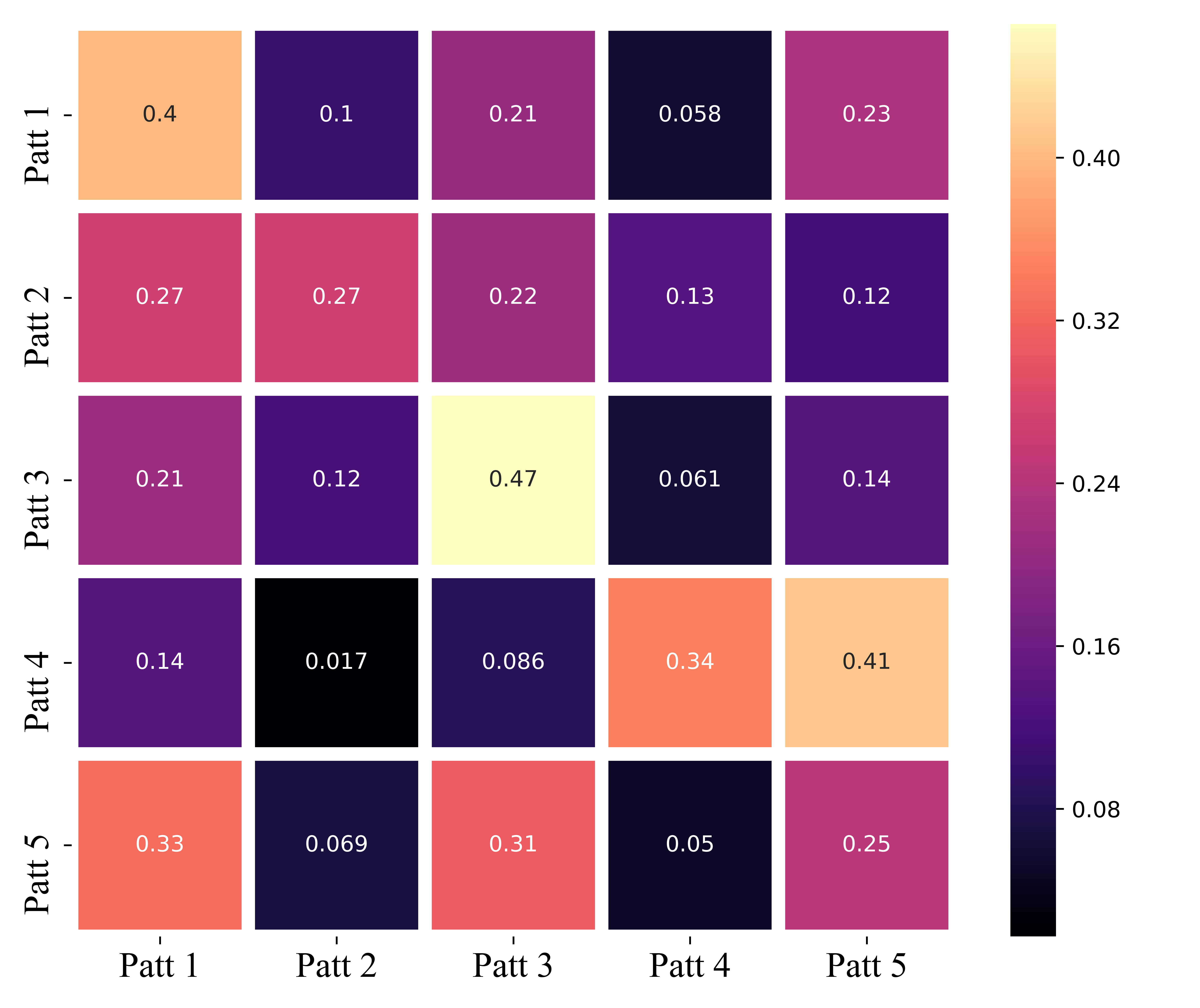
方法3
trans_mat = np.array([[62, 16, 32 ,9, 36],
                      [16, 16, 13, 8, 7],
                      [28, 16, 61, 8, 18],
                      [16, 2, 10, 40, 48],
                      [52, 11, 49, 8, 39]], dtype=int)

trans_prob_mat = (trans_mat.T/np.sum(trans_mat, 1)).T


if True:
    label = ["Patt {}".format(i) for i in range(1, trans_mat.shape[0]+1)]
    df = pd.DataFrame(trans_prob_mat, index=label, columns=label)


    # Plot
    plt.figure(figsize=(7.5, 6.3))
    ax = sns.heatmap(df, xticklabels=df.corr().columns,
                     yticklabels=df.corr().columns, cmap='magma',
                     linewidths=6, annot=True)

    # Decorations
    plt.xticks(fontsize=16,family='Times New Roman')
    plt.yticks(fontsize=16,family='Times New Roman')

    plt.tight_layout()
    plt.savefig('res/method_3.png', transparent=True, dpi=800)
    plt.show()
效果图:
可以看到,这种方法的一个弊端是,矩阵纵坐标yticks会有轻微的位移。
【BUG】 部分朋友在使用代码时可能会出现以下这种 第一行和最后一行显示不全 的问题。

解决方法:
1.更新matplotlib版本。实测更新为3.2.0后就不再出现类似问题了:
pip install --user --upgrade matplotlib==3.2.0
2.如果不想更新版本,也可以在plt.show()之前加入如下两行:
bottom, top = ax.get_ylim()
ax.set_ylim(bottom + 0.5, top - 0.5)
讨论
从延伸性和普适性的角度讲,第三种方法可能是最佳的,因为它是直接对seaborn的sns.heatmap()热力图函数的调用。关于热力图的详细参数信息,官方文档(http://seaborn.pydata.org/generated/seaborn.heatmap.html) 已经给了很全面的说明了,在此不再赘述。
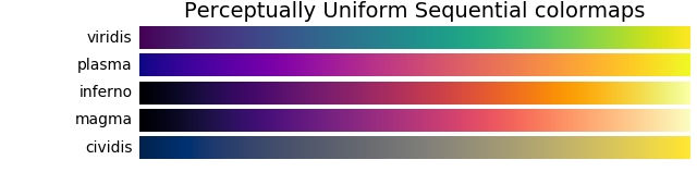
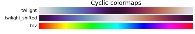
色彩映射
无论是 plt 还是 sns,在色彩映射上都用 参数cmap 来表示。
关于色彩映射,这篇博客已经写的很详细了,为追求美感不妨多尝试集中映射方式: matplotlib.pyplot.colormaps色彩图cmap
-
Sequential:顺序。通常使用单一色调,逐渐改变亮度和颜色渐渐增加。应该用于表示有顺序的信息。


-
Diverging:发散。改变两种不同颜色的亮度和饱和度,这些颜色在中间以不饱和的颜色相遇;当绘制的信息具有关键中间值(例如地形)或数据偏离零时,应使用此值。

-
Cyclic:循环。改变两种不同颜色的亮度,在中间和开始/结束时以不饱和的颜色相遇。应该用于在端点处环绕的值,例如相角,风向或一天中的时间。
-
Qualitative:定性。常是杂色,用来表示没有排序或关系的信息。

-
Miscellaneous:杂色。


旨在为数千万中国开发者提供一个无缝且高效的云端环境,以支持学习、使用和贡献开源项目。
更多推荐


 34
34 0
0- 0


 已为社区贡献1条内容

所有评论(0)