
HTML5+CSS3(黑马程序员)——第三篇
目录
- 三、CSS高级内容
- 1、定位-position
- 2、设置定位元素的层级顺序— z-index
- 3、CSS精灵图/CSS雪碧图
- 4、字体图标
- 5、垂直对齐方式 vertical-align
- 6、过渡-transition
- 7、透明度-opacity
- 8、光标类型-cursor
- 9、平面转换-transform
- 10、渐变
- 11、空间转换-transform
- 12、动画
- 12.1、概念
- 12.2、效果示例1—体验动画
- 12.3、效果示例2—走马灯
- 12.4、效果示例3—逐帧动画(配合精灵图做逐帧动作)
- 12.5、效果示例4—多组动画共同作用
- 12.6、效果示例5—唱吧首页弹出特效
- 12.7、效果示例6—直接在`class`类中设置最终状态(替换【设置成最后一帧forwards】的效果)+动画效果,当添加该类时,即添加上动画效果,并能实现最终状态的展示
- 12.8、效果示例7—多动画配合交替使用,解决同一名称动画无法多次重复执行问题,即使使用reverse也不行
- 12.9、效果示例8—在同一函数中同时移除class类(携带动画),然后添加同名class类,这样动画不会执行,最好将两种操作错开使用
- 13、滤镜属性
三、CSS高级内容
1、定位-position
1.1、相对定位(通常配合绝对定位一起使用)
1.1.1、概念
- 特点:
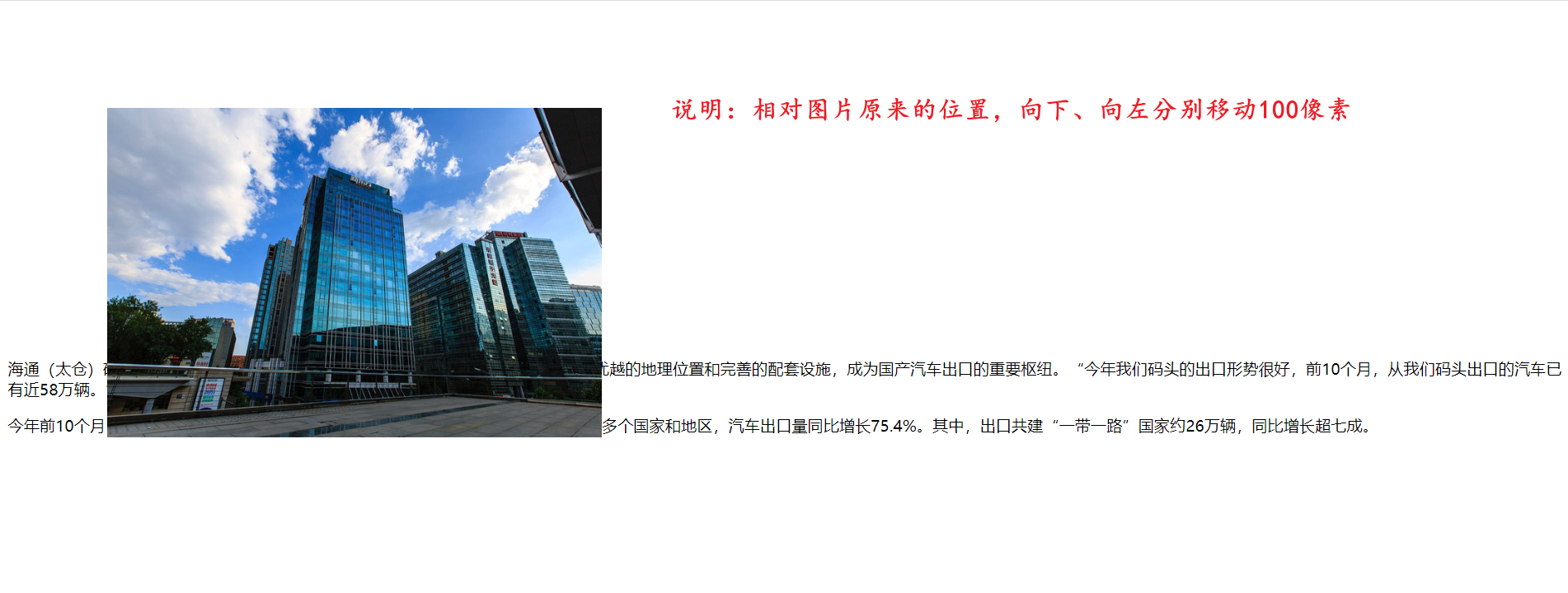
- 参照物:自己原来的位置
- 是否脱离标准流:不脱离标准流,自己原来的位置还是会占用着
- 标签显示模式:不会发生改变
1.1.2、代码示例
<!DOCTYPE html>
<html lang="en">

<head>
  <!-- 表头 -->
  <meta charset="UTF-8" />
  <meta name="viewport" content="width=device-width, initial-scale=1.0" />
  <title>你好,春天~</title>
  <style>
    img {
      width: 500px;
      position: relative;
      top: 100px;
      left: 100px;
    }
  </style>
</head>

<body>
  <!-- 主体 -->
  <img src="https://k.sinaimg.cn/n/sinakd20251119s/44/w986h658/20251119/baef-a93166130f5c5c0e5a650b3f6e6ffe0a.jpg/w700d1q75cms.jpg" alt="">
  <p>海通(太仓)码头是目前长江干线规模最大、专业化程度最高的汽车滚装码头,凭借优越的地理位置和完善的配套设施,成为国产汽车出口的重要枢纽。“今年我们码头的出口形势很好,前10个月,从我们码头出口的汽车已有近58万辆。”该码头船舶计划主管费晓宇介绍说。</p>
  <p>今年前10个月,南京海关所属太仓海关已监管太仓口岸69.25万辆汽车出口到全球160多个国家和地区,汽车出口量同比增长75.4%。其中,出口共建“一带一路”国家约26万辆,同比增长超七成。</p>
</body>

</html>
1.1.3、页面效果
1.2、绝对定位
1.2.1、概念
- 特点:
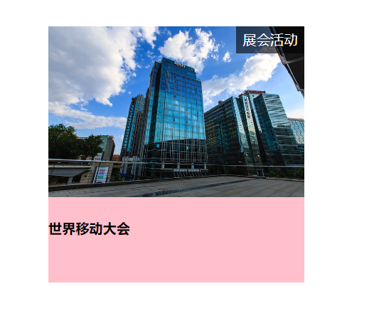
- 参照物:先寻找最近的已经定位的祖先元素,如果没有找到,那就参照浏览器可视区域改变位置(类似于固定定位了)
- 是否脱离标准流:脱离标准流,不占据自己原来的位置,相当于漂浮走了
- 标签显示模式:无论是行内元素(例如span)、块级元素(例如div),都会变成行内块元素,其中行内块元素的特点:宽高生效、不设置宽高时,宽高会被内容撑开
- 使用说明:根据上面介绍的参照物概念,一般遵循子绝父相的原则,也就是子元素绝对定位,而父元素相对定位
- 盒子宽度:设置绝对定位之后,如果没有明确设置盒子宽度,盒子依靠内容撑开。
- 如果设置盒子宽度width: 100%,此时盒子会完全 “填满其包含块”,绝对定位元素的 “包含块” 是其定位参考基准,优先级如下(找到第一个满足条件的):
- 1、最近的、设置了 position: relative/absolute/fixed/sticky 的祖先元素(常用场景,比如父容器设 relative)
- 2、若没有上述祖先,包含块是浏览器视口,类似 fixed 的参考基准。
1.2.2、代码示例
<!DOCTYPE html>
<html lang="en">

<head>
  <!-- 表头 -->
  <meta charset="UTF-8" />
  <meta name="viewport" content="width=device-width, initial-scale=1.0" />
  <title>你好,春天~</title>
  <style>
    .parent {
      position: relative;
      width: 300px;
      height: 300px;
      margin: 50px auto;
      background-color: pink;
    }

    .son {
      position: absolute;
      top: 0;
      right: 0;
      display: block;
      width: 80px;
      height: 32px;
      line-height: 32px;
      background-color: rgba(0, 0, 0, 0.6);
      text-align: center;
      color: #fff;
    }
  </style>
</head>

<body>
  <!-- 主体 -->
  <div class="parent">
    <img
      src="https://k.sinaimg.cn/n/sinakd20251119s/44/w986h658/20251119/baef-a93166130f5c5c0e5a650b3f6e6ffe0a.jpg/w700d1q75cms.jpg"
      width="300px"
      alt="">
    <span class="son">展会活动</span>
    <h4>世界移动大会</h4>
  </div>
</body>

</html>
1.2.3、页面效果
1.3、固定定位
1.3.1、概念
- 特点:
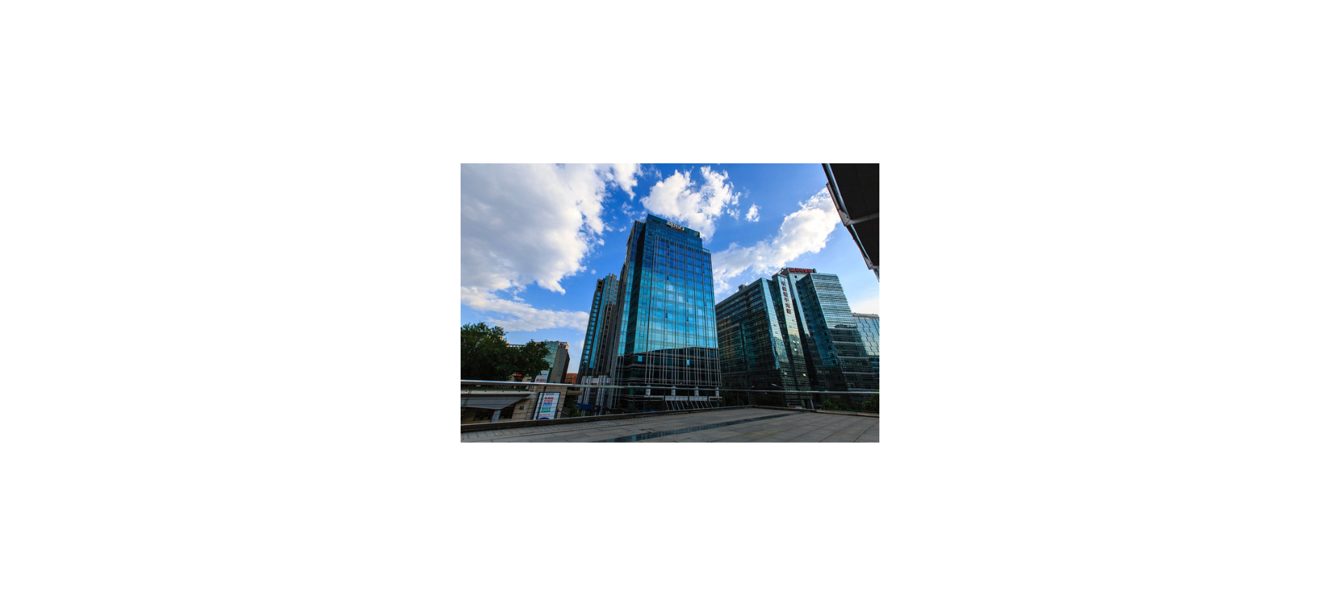
- 参照物:浏览器窗口
- 是否脱离标准流:脱离标准流,不占据自己原来的位置,相当于漂浮走了
- 标签显示模式:无论是行内元素(例如span)、块级元素(例如div),都会变成行内块元素,其中行内块元素的特点:宽高生效、不设置宽高时,宽高会被内容撑开
- 盒子宽度:设置固定定位之后,如果没有明确设置盒子宽度,盒子依靠内容撑开。
- 如果设置盒子宽度width: 100%,此时盒子会完全填满浏览器视口。
- 注意事项:当父元素应用了
transform(非 none)时,子元素的position: fixed会相对于该父元素定位,而不是相对于视口,类似于绝对定位。
1.3.2、代码示例
<!DOCTYPE html>
<html lang="en">

<head>
  <!-- 表头 -->
  <meta charset="UTF-8" />
  <meta name="viewport" content="width=device-width, initial-scale=1.0" />
  <title>你好,春天~</title>
  <style>
    img {
      width: 500px;
      position: fixed;
      top: 50%;
      left: 50%;
      /* 往x轴、y轴方向移动自身宽高的50% */
      transform: translate(-50%, -50%);
    }
  </style>
</head>

<body>
  <!-- 主体 -->
  <img src="https://k.sinaimg.cn/n/sinakd20251119s/44/w986h658/20251119/baef-a93166130f5c5c0e5a650b3f6e6ffe0a.jpg/w700d1q75cms.jpg" alt="">
</body>

</html>
1.3.3、页面效果
2、设置定位元素的层级顺序— z-index
2.1、概念
- 默认效果:按照html标签书写顺序,后来者居上
- z-index属性作用:设置定位元素的层级顺序,设置值是整数,默认值是0,值越大层级越靠前
2.2、默认效果演示
2.2.1、代码示例
<!DOCTYPE html>
<html lang="en">

<head>
  <!-- 表头 -->
  <meta charset="UTF-8" />
  <meta name="viewport" content="width=device-width, initial-scale=1.0" />
  <title>你好,春天~</title>
  <style>
    div {
      position: absolute;
      width: 200px;
      height: 200px;
    }
    .box1 {
      background-color: pink;
    }
    .box2 {
      background-color: skyblue;
      top: 100px;
      left: 100px;
    }
  </style>
</head>

<body>
  <div class="box1">box1</div>
  <div class="box2">box2</div>
</body>

</html>
2.2.2、页面效果
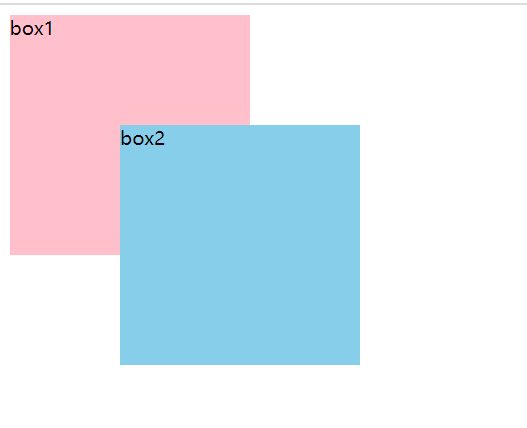
由于box2比box1的标签书写顺序更加靠后,所以在显示层面上box2压着box1
2.3、z-index使用效果演示
2.3.1、代码示例
<!DOCTYPE html>
<html lang="en">

<head>
  <!-- 表头 -->
  <meta charset="UTF-8" />
  <meta name="viewport" content="width=device-width, initial-scale=1.0" />
  <title>你好,春天~</title>
  <style>
    div {
      position: absolute;
      width: 200px;
      height: 200px;
      text-align: right;
    }
    .box1 {
      background-color: pink;
      z-index: 1;
    }
    .box2 {
      background-color: skyblue;
      top: 100px;
      left: 100px;
    }
  </style>
</head>

<body>
  <div class="box1">box1</div>
  <div class="box2">box2</div>
</body>

</html>
2.3.2、页面效果
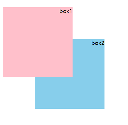
由于box1的z-index设置为1,而box2的z-index是默认值0,所以在显示层面上box1压着box2
3、CSS精灵图/CSS雪碧图
3.1、概念
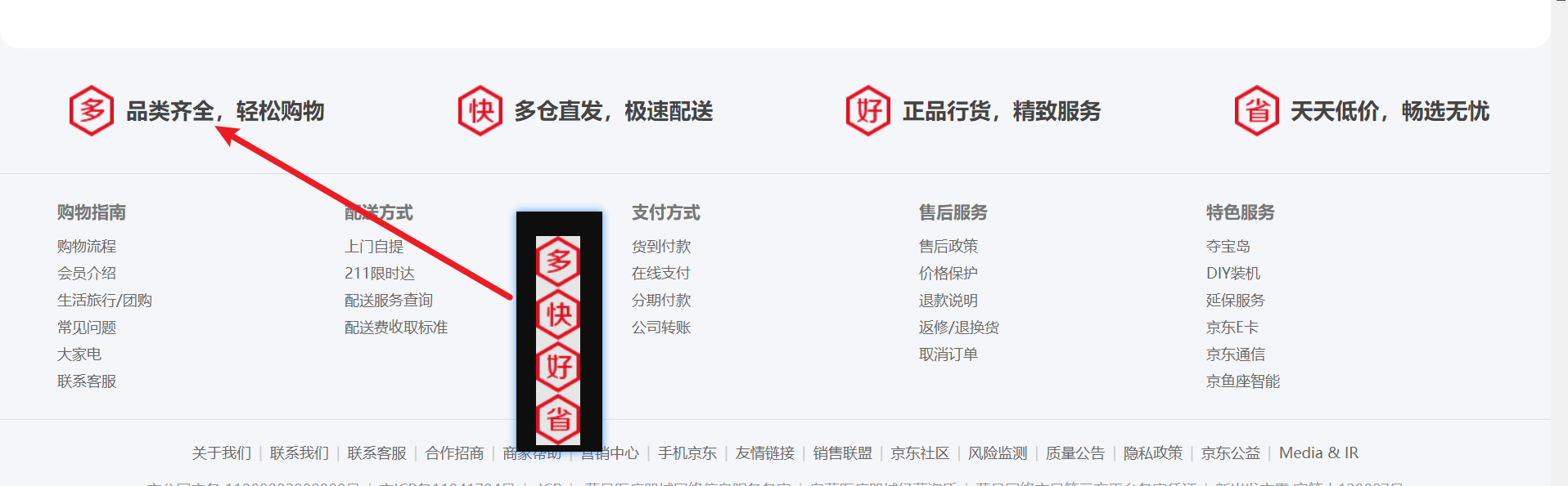
- 含义:CSS精灵图,英文是CSS Sprites,由于Sprite也有雪碧的意思,所以也叫做CSS雪碧图。将网页中的一些图标整合在一张图片中,然后通过background-position精确展示图标,这就是精灵图或者雪碧图的含义
- 优点:原来是一个图标请求一次服务器,所以请求次数还是比较多的。现在是一个图标位置在请求服务器图片之后,可以将包含多个图标的图片获取到,所以使用剩余图标的后续位置就不用请求服务器了。减少服务器请求次数,减轻服务器压力,同时也提高页面加载效果。
- 精灵图模样:
3.2、代码示例
<!DOCTYPE html>
<html lang="en">

<head>
  <!-- 表头 -->
  <meta charset="UTF-8" />
  <meta name="viewport" content="width=device-width, initial-scale=1.0" />
  <title>你好,春天~</title>
  <style>
    * {
      margin: 0;
      padding: 0;
    }

    li {
      list-style: none;
    }

    .box {
      height: 102px;
      background-color: #f5f6fa;
      margin-top: 100px;
    }

    .wrapper {
      width: 1210px;
      margin: 0 auto;
    }

    .box ul {
      display: flex;
      justify-content: space-between;
      padding: 30px;
    }

    .box li {
      position: relative;
      height: 42px;
      line-height: 42px;
      font-size: 18px;
      font-weight: 700;
      color: #444;
      /* 避免文字被图标压着 */
      text-indent: 46px;
    }

    .box li i {
      /* 设置绝对定位之后,i标签变成行内块,可以设置宽高,可以和文字在同一行显示 */
      position: absolute;
      top: 0;
      left: 0;
      width: 36px;
      height: 42px;
      background-image: url("https://misc.360buyimg.com/jdf/1.0.0/unit/service/5.0.0/i/ico_service.png");
      background-repeat: no-repeat;
    }

    .box li:nth-child(1) i {
      background-position: 0 0;
    }

    .box li:nth-child(2) i {
      background-position: 0 -43px;
    }

    .box li:nth-child(3) i {
      background-position: 0 -86px;
    }

    .box li:nth-child(4) i {
      background-position: 0 -129px;
    }
  </style>
</head>

<body>
  <div class="box">
    <div class="wrapper">
      <ul>
        <li>
          <i></i>品类齐全,轻松购物
        </li>
        <li>
          <i></i>多仓直发,极速配送
        </li>
        <li>
          <i></i>正品行货,精致服务
        </li>
        <li>
          <i></i>天天低价,畅选无忧
        </li>
      </ul>
    </div>
  </div>
</body>

</html>
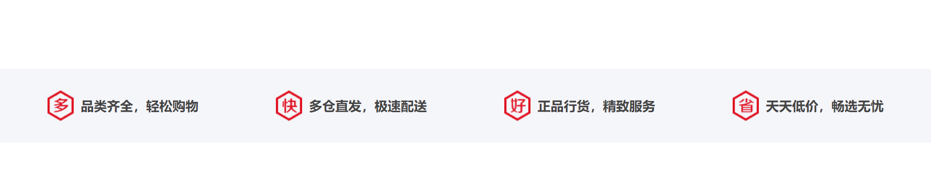
3.3、页面效果
4、字体图标
4.1、概念
- 含义:展示为图标,本质是字体
- 作用:在网页中,添加简单、颜色单一的小图标
- 优点:
- 灵活性:灵活的修改样式,例如:尺寸、颜色等
- 轻量级:体积小、渲染快、降低服务器请求次数
- 兼容性:几乎兼容所有主流浏览器
- 相关网站:https://www.iconfont.cn
4.2、使用说明
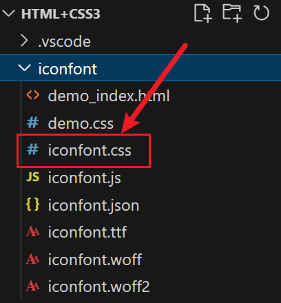
在iconfont网站中,将需要的图标添加到购物车,然后将购物车的图标添加到项目中,便于后续拓展图标
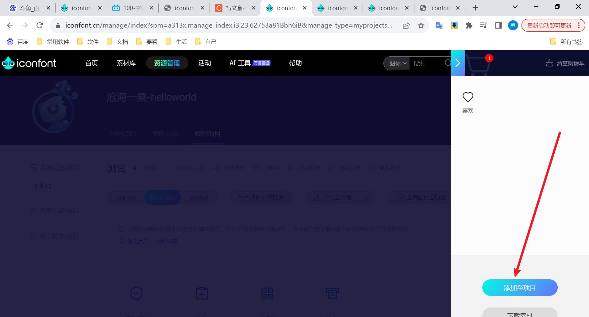
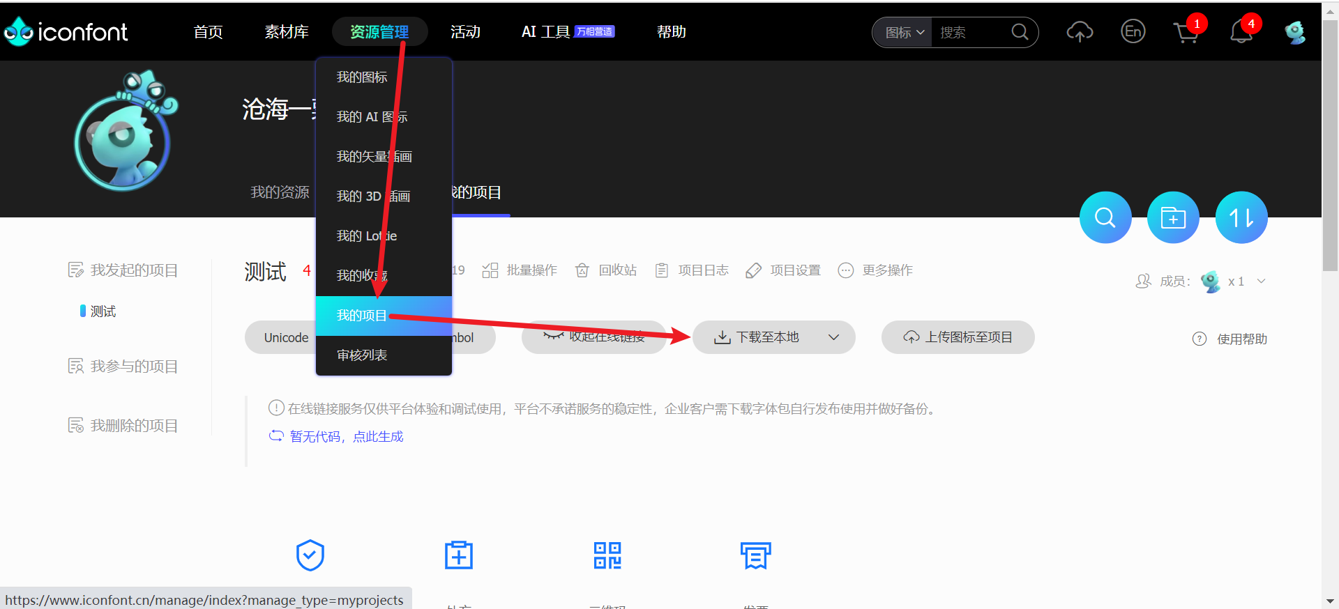
当图标选购完成后,可以在资源管理页签下点击我的项目,然后下载项目的图标库
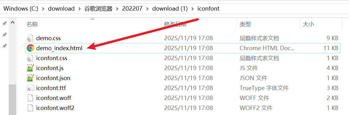
下载完成的图标库是一个压缩包,我们解压后打开demo_index.html
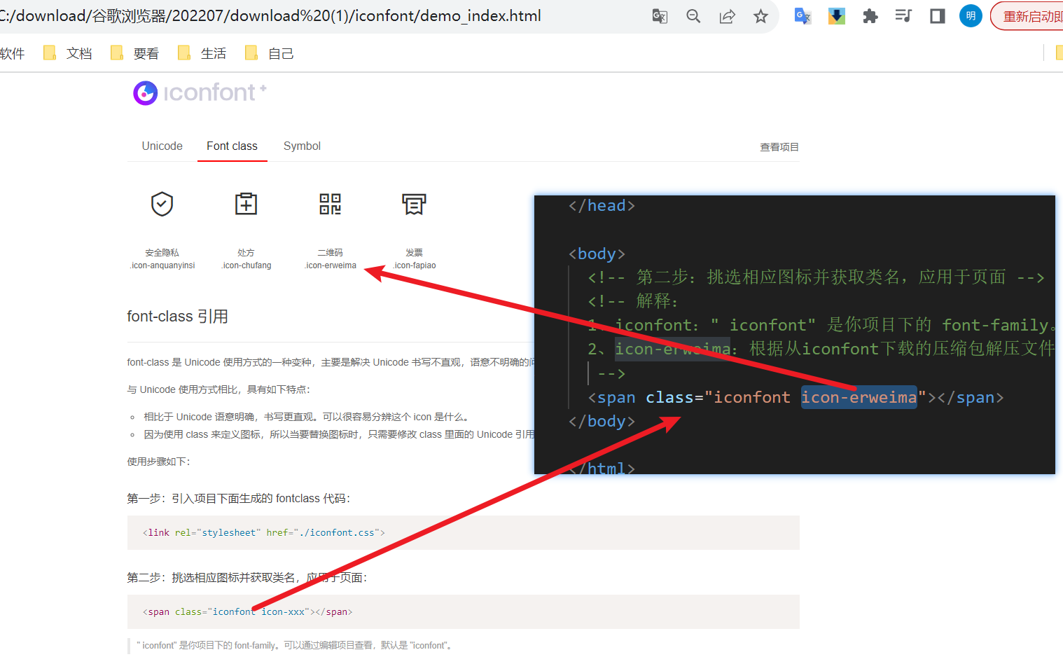
点击Font Class,就可以看到引入方式了
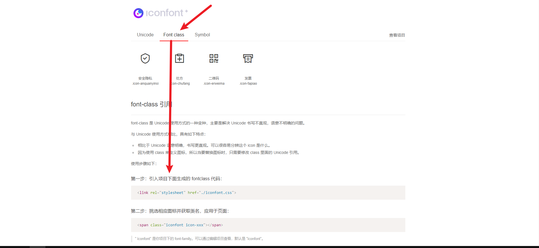
在具体使用时,可以把解压后的文件夹改名成iconfont,然后将iconfont文件夹放到项目模块中。
4.3、代码示例
<!DOCTYPE html>
<html lang="en">

<head>
  <!-- 表头 -->
  <meta charset="UTF-8" />
  <meta name="viewport" content="width=device-width, initial-scale=1.0" />
  <title>你好,春天~</title>
  <!-- 第一步:引入项目下面生成的 fontclass 代码 -->
  <link rel="stylesheet" href="./iconfont/iconfont.css">
  <style>
    .icon-erweima {
      font-size: 100px;
      color: pink;
    }
  </style>
</head>

<body>
  <!-- 第二步:挑选相应图标并获取类名,应用于页面 -->
  <!-- 解释:
  1、iconfont:" iconfont" 是你项目下的 font-family。可以通过编辑项目查看,默认是 "iconfont"。
  2、icon-erweima:根据从iconfont下载的压缩包解压文件demo_index.html,依托font-class引用说明,可以找到这个class
   -->
  <span class="iconfont icon-erweima"></span>
</body>

</html>
解释:
iconfont文件夹就是从iconfont网站中下载的解压文件夹,按照demo_index.html中的font-class引用说明就可以引入并使用了
下面在介绍一下class类的由来
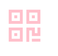
4.4、页面效果
5、垂直对齐方式 vertical-align
5.1、概念
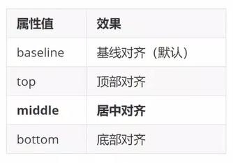
- 含义:如果父元素中包含行内元素和行内块元素,那么两者的垂直对齐方式都按照文字方式对齐,默认按照文字基线对齐
- 属性:
5.2、示例
5.2.1、基线对齐(默认)
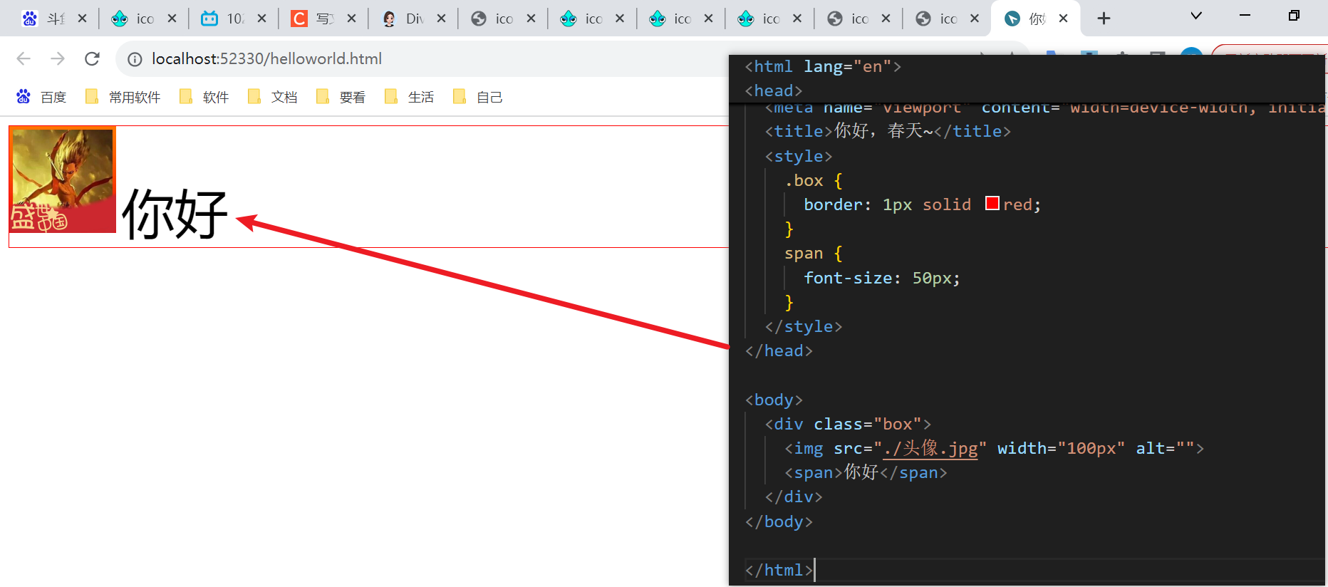
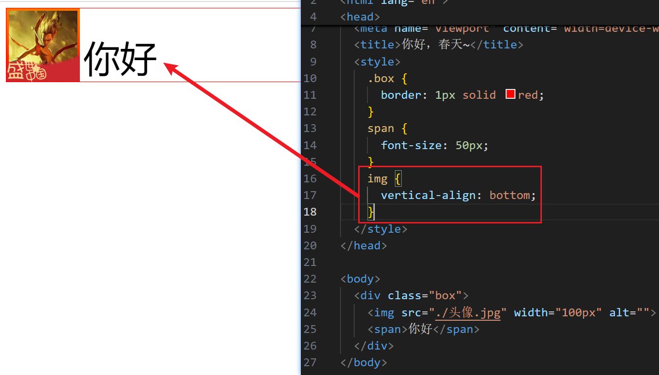
解释:默认按照基线对齐,这个基线是英文字母基线,所以部分文字内容在基线以下,所以可以看到图片下方存在空行。如果想解决这个空行问题,可以使用垂直方向底部对齐或者将图片转换成块元素
5.2.2、居中对齐
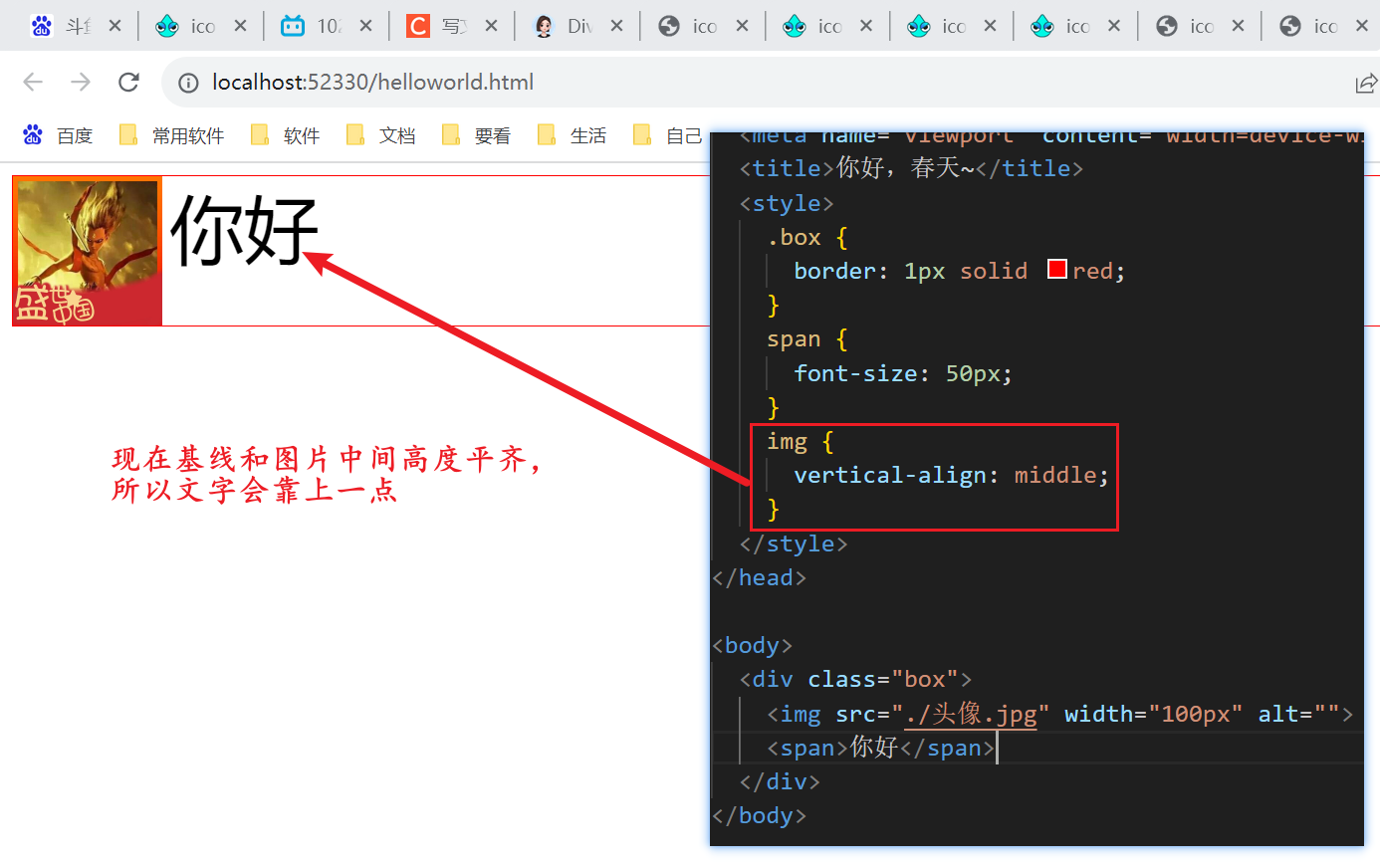
解释:虽然说是居中对齐,其实设置之后改变了基线位置,将基线位置放到了中间,此时文字依然需要根据基线对齐,所以文字是靠上的
5.2.3、顶部对齐
5.2.3、底部对齐
6、过渡-transition
6.1、概念
-
作用:可以为一个元素在不同状态之间切换的时候添加过渡效果
-
用法:
transition: <property> <duration> <timing-function> <delay>;,例如transition: all 700ms ease-in;- property:
- 含义:哪个属性要过渡
- 默认值:
all(所有能过渡的属性)
- duration:
- 含义:过渡时长,单位 s 或 ms
- 默认值:
0s(无动画,必须设置才有过渡)
- timing-function:
-
含义:速度曲线,如匀速、先慢后快等
-
默认值:
ease关键词 效果 ease默认,先快后慢,感觉自然 linear匀速 ease-in先慢后快 ease-out先快后慢 ease-in-out慢 → 快 → 慢 steps(n)分步变化,不连续,适合打字机等逐帧效果 cubic-bezier(p1, p2, p3, p4)自定义贝塞尔曲线,可实现弹跳等特殊效果,点我查看测试网站
-
- delay:
- 含义:延迟多久开始过渡
- 默认值:
0s
- property:
-
过渡设置方:
- 写在元素的基础样式上:
元素的属性变化(无论从 A→B 还是 B→A)都会有过渡。 - 只写在变化后的类上:例如
.panel.active,那么只有添加该类时有过渡,移除时直接跳变。 - 说明:因为
transition只在当前生效的CSS规则中起作用。移除类后,那些规则不再适用,所以没有过渡。
- 写在元素的基础样式上:
-
哪些属性可以过渡
- 说明:并不是所有 CSS 属性都能过渡。必须是数值/颜色/长度这种可以插值的类型。
- 常见可过渡属性:
- 颜色:color, background-color, border-color, opacity
- 尺寸:width, height, padding, margin
- 位置:left, top, transform(平移、缩放、旋转等)
- 阴影:box-shadow, text-shadow
- 边框:border-width, border-radius
- flex 相关:flex-grow, flex(你代码中就是 transition flex 属性,让宽度平滑变化)
- 不可过渡:
- display(例如 display: none → display: block),因为中间状态不存在。替代方案用 opacity + visibility。
- background-image(除非渐变,但不同图片之间不能过渡)。
- font-family。
- 固定值到 auto(例如 height: 0 → height: auto 不能平滑过渡,需用 max-height 技巧)。
-
transition简写属性的完整列表:- transition-delay:
- 含义:过渡开始前的延迟时间,单位:
s 或 ms。可以为负值(表示提前开始)。 - 默认值:
0s
- 含义:过渡开始前的延迟时间,单位:
- transition-property:
- 含义:指定要应用过渡效果的 CSS 属性名(如
width、opacity、transform,或all表示所有可过渡属性)。 - 默认值:
all
- 含义:指定要应用过渡效果的 CSS 属性名(如
- transition-duration:
- 含义:过渡动画持续的时间,单位:秒(
s)或毫秒(ms)。 - 默认值:
0s(无动画)
- 含义:过渡动画持续的时间,单位:秒(
- transition-timing-function:
- 含义:过渡动画的速度曲线(如
ease、linear、ease-in、ease-out、ease-in-out,或贝塞尔曲线cubic-bezier())。 - 默认值:
ease
- 含义:过渡动画的速度曲线(如
- transition-delay:
6.2、transition 和 animation 的区别
| 特性 | transition | animation |
|---|---|---|
| 触发方式 | 由属性变化触发(如 :hover、添加/移除类) | 自动执行,可设置循环 |
| 关键帧 | 不需要 | 需要 @keyframes 定义关键帧 |
| 状态控制 | 只有起始和结束两个状态 | 可以定义多个中间状态(百分比) |
| 循环播放 | 不能无限循环(除非反复触发) | 可以无限次(infinite) |
简单总结:
- transition:适合简单交互(悬停、点击状态变化)
- animation:适合复杂动画(载入动画、无限旋转、多阶段变化)
6.3、常见用法举例
鼠标悬停平滑放大:
.btn {
  transition: transform 0.2s ease;
}
.btn:hover {
  transform: scale(1.05);
}
多属性不同时间:
.card {
  transition: opacity 0.3s, transform 0.5s ease-out 0.1s;
}
让消失/出现有淡入淡出(不用 display):
.modal {
  opacity: 0;
  visibility: hidden;
  transition: opacity 0.3s, visibility 0s 0.3s; /* 延迟隐藏 visibility */
}
.modal.show {
  opacity: 1;
  visibility: visible;
  transition: opacity 0.3s, visibility 0s;
}
6.4、代码示例
<!DOCTYPE html>
<html lang="en">

<head>
  <!-- 表头 -->
  <meta charset="UTF-8" />
  <meta name="viewport" content="width=device-width, initial-scale=1.0" />
  <title>你好,春天~</title>
  <style>
    img {
      width: 100px;
      height: 100px;
      transition: all 0.3s;
    }
    img:hover {
      width: 200px;
      height: 200px;
    }
  </style>
</head>

<body>
  <img src="./头像.jpg" alt="">
</body>

</html>
6.5、页面效果
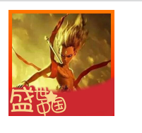
说明:将鼠标放到图片上面,图片会慢慢变大
7、透明度-opacity
7.1、概念
- 作用:设置整个元素的透明度(包括背景和内容)
- 属性名:opacity
- 属性名:0~1,其中0(完全透明,即元素不可见)、1(不透明)、
0~1之间的小数(半透明)
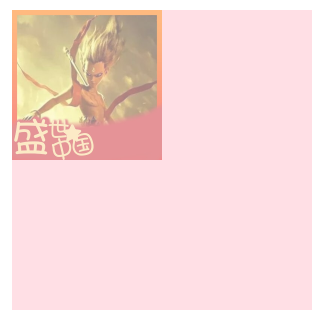
7.2、代码示例
  <!DOCTYPE html>
  <html lang="en">

  <head>
    <!-- 表头 -->
    <meta charset="UTF-8" />
    <meta name="viewport" content="width=device-width, initial-scale=1.0" />
    <title>你好,春天~</title>
    <style>
      div {
        width: 200px;
        height: 200px;
        background-color: pink;
        opacity: 0.5;
      }
      img {
        width: 100px;
        height: 100px;
      }
    </style>
  </head>

  <body>
    <div>
      <img src="./头像.jpg" alt="">
    </div>
  </body>

  </html>
7.3、页面效果
8、光标类型-cursor
8.1、概念
- 作用:当鼠标悬停在元素上时,指针显示的样式
- 属性名:cursor
- 属性值:
- default:默认值,通常是箭头
- pointer:小手效果,提示用户可以点击
- text:工字型,提示用户可以选择文字
- move:十字光标,提示用户可以移动
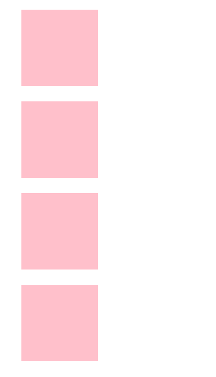
8.2、代码示例
  <!DOCTYPE html>
  <html lang="en">

  <head>
    <!-- 表头 -->
    <meta charset="UTF-8" />
    <meta name="viewport" content="width=device-width, initial-scale=1.0" />
    <title>你好,春天~</title>
    <style>
      div {
        width: 100px;
        height: 100px;
        background-color: pink;
        margin: 20px;
      }
      .pointer {
        cursor: pointer;
      }
      .text {
        cursor: text;
      }
      .move {
        cursor: move;
      }
    </style>
  </head>

  <body>
    <div class="default"></div>
    <div class="pointer"></div>
    <div class="text"></div>
    <div class="move"></div>
  </body>

  </html>
8.3、页面效果
9、平面转换-transform
9.1、概念
- 概念:改变盒子在平面内的形态(位移、旋转、缩放、倾斜)
- 作用:为元素添加动态出现过,一般与过渡transition配合使用,但是也可以单独使用
9.2、位移
9.2.1、概念
- 写法:
- transform: translate(X轴移动距离, Y轴移动距离)——沿着X轴、Y轴进行移动
- translateX(X轴移动距离)——沿着X轴进行移动
- translateY(Y轴移动距离)——沿着Y轴进行移动
- 移动距离取值:
- 取值正负:正负都可以
- 取值内容:
- 像素单位数值,比如:10px
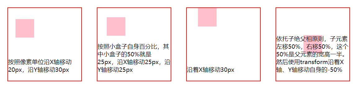
- 百分比,参照盒子自身尺寸进行百分比计算,比如:(-50%, -50%)可以向X轴、Y轴的反方向移动自身宽高的一半,结合position定位中的 top: 50% left: 50% 实现居中效果
9.2.2、效果演示1
9.2.2.1、代码示例
  <!DOCTYPE html>
  <html lang="en">

  <head>
    <!-- 表头 -->
    <meta charset="UTF-8" />
    <meta name="viewport" content="width=device-width, initial-scale=1.0" />
    <title>你好,春天~</title>
    <link rel="stylesheet" href="./iconfont/iconfont.css">
    <style>
      * {
        margin: 0;
        padding: 0;
        box-sizing: border-box;
      }
      .father {
        position: relative;
        width: 200px;
        height: 200px;
        border: 2px solid red;
        float: left;
        margin: 20px;
      }
      .father div {
        width: 50px;
        height: 50px;
        background-color: pink;
      }
      .father p {
        position: absolute;
        bottom: 20px;
        z-index: 1;
      }
      .box1 {
        transform: translate(20px, 30px);
      }
      .box2 {
        transform: translate(50%, 50%);
      }
      .box3 {
        transform: translateX(30px);
      }
      .box4 {
        position: absolute;
        left: 50%;
        top: 50%;
        transform: translate(-50%, -50%);
      }
    </style>
  </head>

  <body>
    <div class="father">
      <div class="box1"></div>
      <p>按照像素单位沿X轴移动20px,沿Y轴移动30px</p>
    </div>
    <div class="father">
      <div class="box2"></div>
      <p>按照小盒子自身百分比,其中小盒子的50%就是25px,沿X轴移动25px,沿Y轴移动25px</p>
    </div>
    <div class="father">
      <div class="box3"></div>
      <p>沿着X轴移动30px</p>
    </div>
    <div class="father">
      <div class="box4"></div>
      <p>依托子绝父相原则,子元素左移50%,右移50%,这个50%是父元素的宽高一半。然后使用transform沿着X轴、Y轴移动自身的-50%</p>
    </div>
  </body>

  </html>
9.2.2.2、页面效果
9.2.3、效果演示2
9.2.3.1、代码示例
  <!DOCTYPE html>
  <html lang="en">

  <head>
    <!-- 表头 -->
    <meta charset="UTF-8" />
    <meta name="viewport" content="width=device-width, initial-scale=1.0" />
    <title>你好,春天~</title>
    <link rel="stylesheet" href="./iconfont/iconfont.css">
    <style>
      * {
        margin: 0;
        padding: 0;
        box-sizing: border-box;
      }
      .father {
        display: flex;
        width: 1000px;
        height: 667px;
        background-color: pink;
        margin: 30px auto;
        background-image: url(https://www-file.huawei.com/admin/asset/v1/pro/view/130e752995754ab2a8a742e86885290d.jpg);
        background-repeat: no-repeat;
        background-size: 100% 100%;
        overflow: hidden;
      }
      .son1, .son2 {
        width: 500px;
        height: 667px;
        background-image: url(https://www-file.huawei.com/admin/asset/v1/pro/view/e3dd3e2b0da744eab82e6f2178ff403a.jpg);
        background-repeat: no-repeat;
        background-size: 200%;
        transition: all .5s;
      }
      .son2 {
        background-position: right 0;
      }
      .father:hover .son1 {
        transform: translateX(-100%);
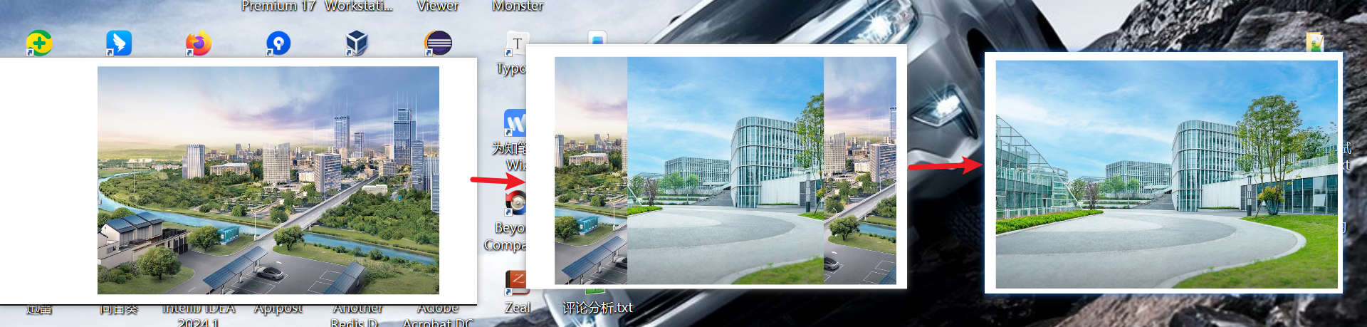
      }
      .father:hover .son2 {
        transform: translateX(100%);
      }
    </style>
  </head>

  <body>
    <div class="father">
      <div class="son1"></div>
      <div class="son2"></div>
    </div>
  </body>

  </html>
9.2.3.2、页面效果
9.3、旋转
9.3.1、概念
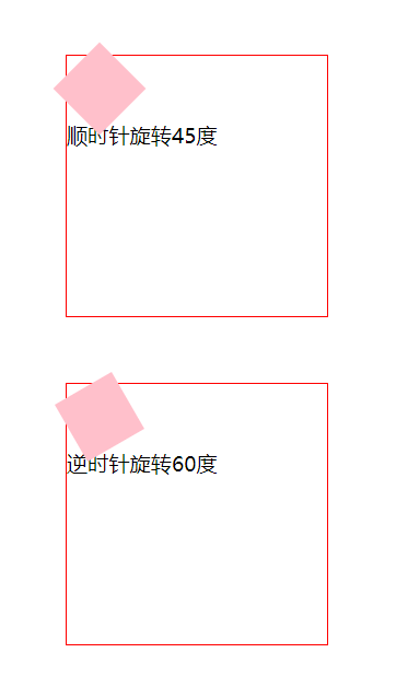
- 写法:transform: rotate(旋转角度)
- 说明:rotate() 函数就是 绕
Z 轴旋转的简写形式,效果完全等同于rotateZ()。 - 单位:deg,例如45deg代表顺时针旋转45度
- 旋转角度取值:正负都可以,正值代表顺时针旋转,负值代表逆时针旋转
- 默认旋转轴:默认沿着Z轴旋转
9.3.2、代码示例
  <!DOCTYPE html>
  <html lang="en">

  <head>
    <!-- 表头 -->
    <meta charset="UTF-8" />
    <meta name="viewport" content="width=device-width, initial-scale=1.0" />
    <title>你好,春天~</title>
    <link rel="stylesheet" href="./iconfont/iconfont.css">
    <style>
      * {
        margin: 0;
        padding: 0;
        box-sizing: border-box;
      }
      .father {
        width: 200px;
        height: 200px;
        border: 1px solid red;
        margin: 50px;
      }
      .father div {
        width: 50px;
        height: 50px;
        background-color: pink;
      }
      .son1 {
        transform: rotate(45deg);
      }
      .son2 {
        transform: rotate(60deg);
      }
    </style>
  </head>

  <body>
    <div class="father">
      <div class="son1"></div>
      <p>顺时针旋转45度</p>
    </div>
    <div class="father">
      <div class="son2"></div>
      <p>逆时针旋转60度</p>
    </div>
  </body>

  </html>
9.3.3、页面效果
9.4、缩放
9.4.1、概念
- 写法:
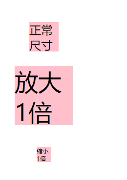
- transform: scale(缩放倍数);——通常只需要设置一个值,代表同时设置X轴和Y轴的缩放倍数
- transform: scale(X轴缩放倍数, Y轴缩放倍数);——也支持分别设置X轴和Y轴的缩放倍数
- transform: scaleX(X轴缩放倍数)
- transform: scaleY(X轴缩放倍数)
- 取值说明:取值0~1,支持小数,取值大于1代表放大,小于1代表缩小
9.4.2、代码示例
  <!DOCTYPE html>
  <html lang="en">

  <head>
    <!-- 表头 -->
    <meta charset="UTF-8" />
    <meta name="viewport" content="width=device-width, initial-scale=1.0" />
    <title>你好,春天~</title>
    <link rel="stylesheet" href="./iconfont/iconfont.css">
    <style>
      * {
        margin: 0;
        padding: 0;
        box-sizing: border-box;
      }
      div {
        width: 50px;
        height: 50px;
        background-color: pink;
        margin: 50px;
        font-size: 20px;
      }
      .box2 {
        scale: 2;
      }
      .box3 {
        scale: 0.5;
      }
    </style>
  </head>

  <body>
    <div class="box1">正常尺寸</div>
    <div class="box2">放大1倍</div>
    <div class="box3">缩小1倍</div>
  </body>

  </html>
9.4.3、页面效果
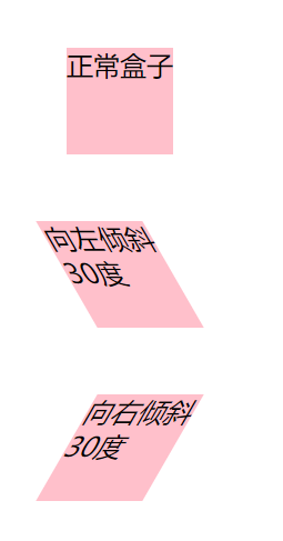
9.5、倾斜
9.5.1、概念
- 写法:transform: skew(倾斜角度)
- 单位:deg,例如30deg代表向左倾斜30度
- 倾斜角度取值:正负都可以,正值代表向左倾斜,负值代表向右倾斜
9.5.2、代码示例
  <!DOCTYPE html>
  <html lang="en">

  <head>
    <!-- 表头 -->
    <meta charset="UTF-8" />
    <meta name="viewport" content="width=device-width, initial-scale=1.0" />
    <title>你好,春天~</title>
    <link rel="stylesheet" href="./iconfont/iconfont.css">
    <style>
      * {
        margin: 0;
        padding: 0;
        box-sizing: border-box;
      }
      div {
        width: 80px;
        height: 80px;
        background-color: pink;
        margin: 50px;
        font-size: 20px;
      }
      .box2 {
        transform: skew(30deg);
      }
      .box3 {
        transform: skew(-30deg);
      }
    </style>
  </head>

  <body>
    <div class="box1">正常盒子</div>
    <div class="box2">向左倾斜30度</div>
    <div class="box3">向右倾斜30度</div>
  </body>

  </html>
9.5.3、页面效果
9.6、改变转换原点
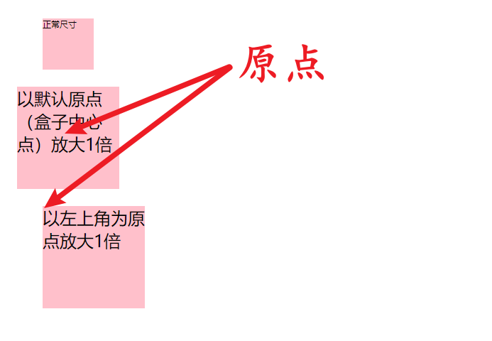
9.6.1、概念
- 默认原点:盒子中心点;上面介绍的各种平移操作,他们都是围绕着盒子中心点旋转的
- 写法:transform-origin: 水平原点位置 垂直原点位置;
- 原点位置取值:
- 方位名词:left、top、right、bottom、center
- 像素单位数值,例如50px
- 百分比,百分比是依托盒子自身的百分比得出的尺寸
9.6.2、代码示例
  <!DOCTYPE html>
  <html lang="en">

  <head>
    <!-- 表头 -->
    <meta charset="UTF-8" />
    <meta name="viewport" content="width=device-width, initial-scale=1.0" />
    <title>你好,春天~</title>
    <link rel="stylesheet" href="./iconfont/iconfont.css">
    <style>
      * {
        margin: 0;
        padding: 0;
        box-sizing: border-box;
      }
      div {
        width: 60px;
        height: 60px;
        background-color: pink;
        margin: 50px;
        font-size: 10px;
      }
      .box2 {
        scale: 2;
      }
      .box3 {
        scale: 2;
        transform-origin: left top;
      }
    </style>
  </head>

  <body>
    <div class="box1">正常尺寸</div>
    <div class="box2">以默认原点(盒子中心点)放大1倍</div>
    <div class="box3">以左上角为原点放大1倍</div>
  </body>

  </html>
9.6.3、页面效果
9.7、多重转换
9.7.1、概念
- 含义:上面介绍的这些平移方式,其实都有一个共同的属性transform。针对同一个盒子来说,使用多个transform会进行覆盖,所以需要将这些设置组合使用,这就是多重转换。
- 转换原点:如果没有设置transform-origin属性,那转换原点以第一个transform设置为准。
- 解释:在旋转过程中,原点会发生改变,这也就是为什么我们要先进行平移在进行旋转的原因,避免选择的时候盒子飘起来
- 使用说明:transform可以单独使用,更多的情况是配合transition一起使用,其中transform加在:hover选择器上,进而选中需要变化的盒子,然后transition加在需要变化的盒子上
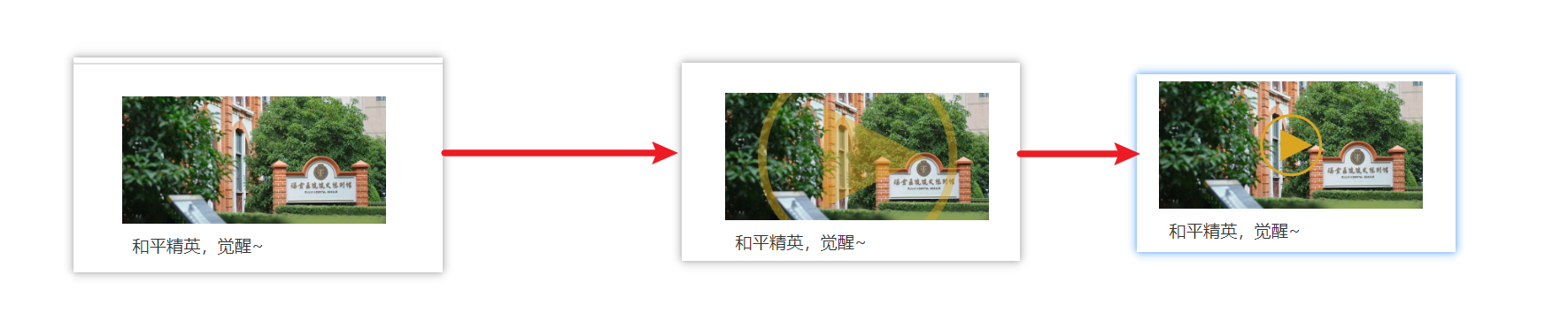
9.7.2、效果示例1
9.7.2.1、代码示例
  <!DOCTYPE html>
  <html lang="en">

  <head>
    <!-- 表头 -->
    <meta charset="UTF-8" />
    <meta name="viewport" content="width=device-width, initial-scale=1.0" />
    <title>你好,春天~</title>
    <link rel="stylesheet" href="./iconfont/iconfont.css">
    <style>
      * {
        margin: 0;
        padding: 0;
        box-sizing: border-box;
      }

      .box {
        width: 249px;
        height: 210px;
        margin: 30px auto;
      }

      .box p {
        color: #333;
        padding: 10px 10px 0 10px;
      }

      .pic {
        position: relative;
        overflow: hidden;
      }

      .pic img {
        vertical-align: middle;
        width: 100%;
      }
      .circle {
        position: absolute;
        left: 50%;
        top: 50%;
        display: flex;
        justify-content: center;
        align-items: center;
        width: 58px;
        height: 58px;
        border: 3px solid goldenrod;
        border-radius: 50%;
        transform: translate(-50%, -50%) scale(5);
        opacity: 0;
        transition: all .5s;
      }
      .triangle {
        width: 0;
        /* 宽高必须为 0 */
        height: 0;
        /* 上边框显示颜色,左右下边框透明 */
        border-left: 30px solid goldenrod;
        /* 三角形高度 = 边框宽度 */
        border-top: 15px solid transparent;
        /* 左右边框控制三角形宽度 */
        border-bottom: 15px solid transparent;
        border-right: 0 solid transparent;
        /* 底部不需要,设为 0 */
        margin-left: 10px;
      }
      .box:hover .circle {
        transform: translate(-50%, -50%) scale(1);
        opacity: 1;
      }
    </style>
  </head>

  <body>
    <div class="box">
      <div class="pic">
        <img src="https://www-file.huawei.com/admin/asset/v1/pro/view/cc1b48b6d4054764b6e7a6c265ac5df7.jpg" alt="">
        <div class="circle">
          <div class="triangle"></div>
        </div>
      </div>
      <p>和平精英,觉醒~</p>
    </div>
  </body>

  </html>
9.7.2.2、页面效果
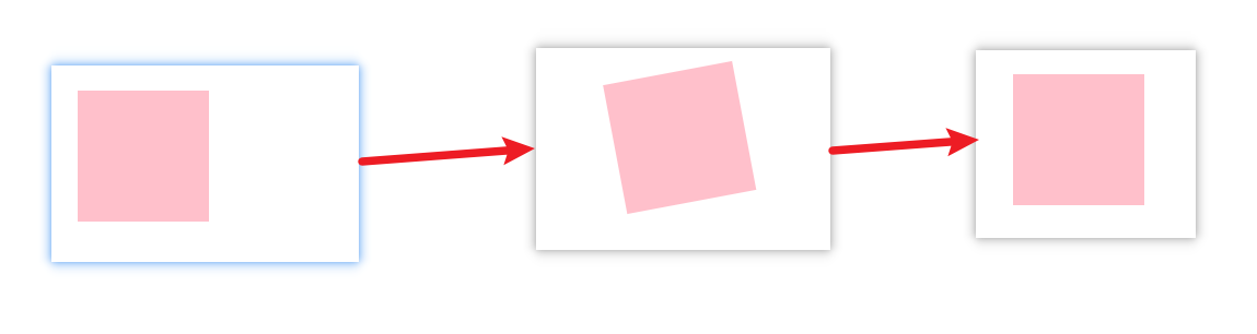
9.7.3、效果示例2
9.7.3.1、代码示例
  <!DOCTYPE html>
  <html lang="en">

  <head>
    <!-- 表头 -->
    <meta charset="UTF-8" />
    <meta name="viewport" content="width=device-width, initial-scale=1.0" />
    <title>你好,春天~</title>
    <link rel="stylesheet" href="./iconfont/iconfont.css">
    <style>
      * {
        margin: 0;
        padding: 0;
        box-sizing: border-box;
      }
      div {
        width: 100px;
        height: 100px;
        background-color: pink;
        margin: 20px;
        transition: all 1s;
      }
      div:hover {
        transform: translateX(500px) rotate(360deg);
      }
    </style>
  </head>

  <body>
    <div></div>
  </body>

  </html>
9.7.3.2、页面效果
10、渐变
10.1、线性渐变
10.1.1、概念
- 含义:渐变是多个颜色逐渐变化的效果,一般用于设置盒子背景。线性渐变代表渐变是成线性的
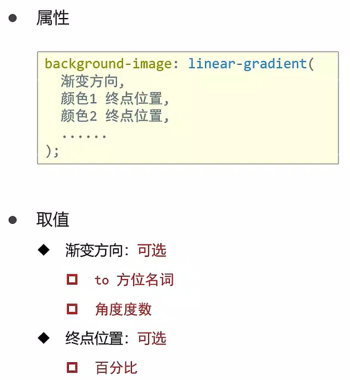
- 解释:方位名词包括 left、right、top、bottom、center
10.1.2、效果实例1
10.1.2.1、代码示例
  <!DOCTYPE html>
  <html lang="en">

  <head>
    <!-- 表头 -->
    <meta charset="UTF-8" />
    <meta name="viewport" content="width=device-width, initial-scale=1.0" />
    <title>你好,春天~</title>
    <link rel="stylesheet" href="./iconfont/iconfont.css">
    <style>
      * {
        margin: 0;
        padding: 0;
        box-sizing: border-box;
      }

      body {
        display: flex;
        justify-content: center;
        align-items: center;
        /* 元素最小高度 = 视口高度,内容过多时自动拉伸(高度 > 100vh) */
        min-height: 100vh;
        background: linear-gradient(135deg, #1a2a6c, #b21f1f, #1a2a6c);
        color: #fff;
        overflow: hidden;
      }
    </style>
  </head>

  <body>
  </body>

  </html>
10.1.2.2、页面效果

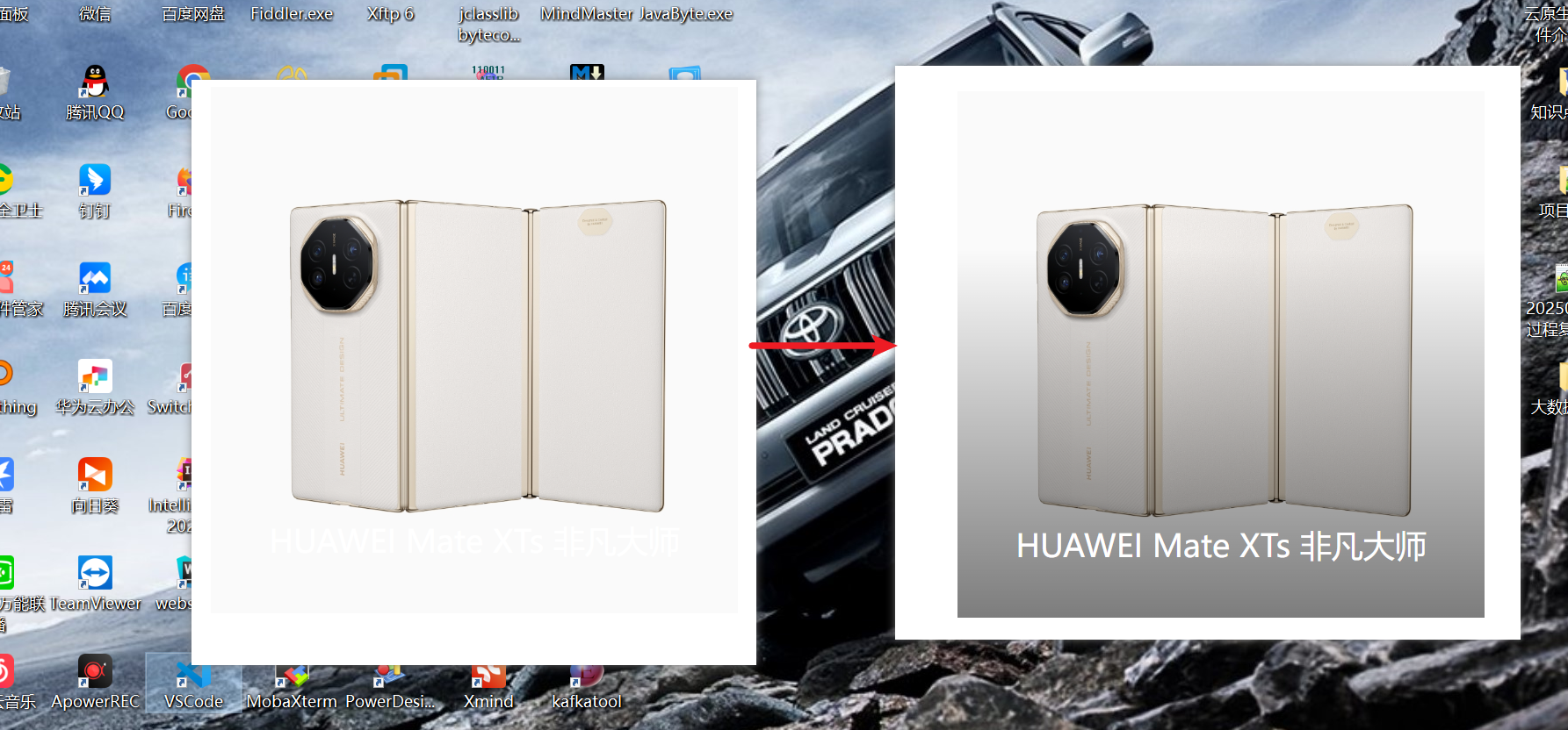
10.1.3、效果实例2
10.1.3.1、代码示例
  <!DOCTYPE html>
  <html lang="en">

  <head>
    <!-- 表头 -->
    <meta charset="UTF-8" />
    <meta name="viewport" content="width=device-width, initial-scale=1.0" />
    <title>你好,春天~</title>
    <link rel="stylesheet" href="./iconfont/iconfont.css">
    <style>
      * {
        margin: 0;
        padding: 0;
        box-sizing: border-box;
      }
      .box {
        position: relative;
        width: 500px;
        margin: 30px auto;
      }
      .box img {
        width: 100%;
        vertical-align: middle;
      }
      .box p {
        position: absolute;
        bottom: 50px;
        text-align: center;
        width: 100%;
        font-size: 30px;
        color: #fff;
        z-index: 1;
      }
      .mask {
        position: absolute;
        left: 0;
        top: 0;
        width: 100%;
        height: 100%;
        background-image: linear-gradient(
          transparent 30%,
          rgba(0, 0, 0, 0.5)
        );
        opacity: 0;
        transition: all 0.5s;
      }
      .box:hover .mask {
        opacity: 1;
      }
    </style>
  </head>

  <body>
    <div class="box">
      <img src="https://www-file.huawei.com/admin/asset/v1/pro/view/3cf424c13a19402a876e62c62db0a633.jpg" alt="">
      <p>HUAWEI Mate XTs 非凡大师</p>
      <div class="mask"></div>
    </div>
  </body>

  </html>
10.1.3.2、页面效果
10.2、径向渐变
10.2.1、概念
- 作用:给按钮添加高光效果
- 属性:
background-image: radial-gradient(
	半径 at 圆心位置,
	颜色1 终点位置,
	颜色2 终点位置,
	……
);
- 属性值:
- 半径:可以使用像素(像素可以使用1个值,也可以使用2个,1个值代表正圆,2个值代表椭圆),也可以使用单词(circle(圆形,最远到盒子边缘)、circle closest-side(最近边)、circle farthest-side(最远边)、circle closest-corner(最近角)、circle farthest-corner(最远角)、ellipse(椭圆形,最远到盒子边缘)……)
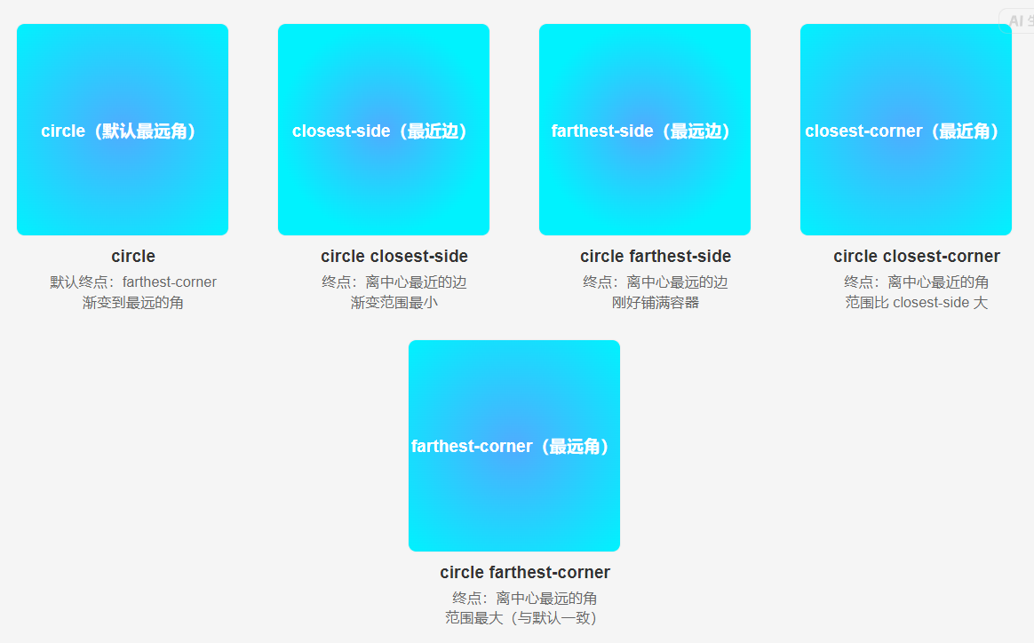
- 圆心位置:像素、百分比、方位名词(left/right/top/bottom/center),需要使用2个值,默认是center center
- 终点位置:百分比,可以省略
- 半径:可以使用像素(像素可以使用1个值,也可以使用2个,1个值代表正圆,2个值代表椭圆),也可以使用单词(circle(圆形,最远到盒子边缘)、circle closest-side(最近边)、circle farthest-side(最远边)、circle closest-corner(最近角)、circle farthest-corner(最远角)、ellipse(椭圆形,最远到盒子边缘)……)
10.2.2、效果示例1
10.2.2.1、代码示例
<!DOCTYPE html>
<html lang="zh-CN">
<head>
    <meta charset="UTF-8">
    <meta name="viewport" content="width=device-width, initial-scale=1.0">
    <title>简单好看的径向渐变</title>
    <style>
        * {
            margin: 0;
            padding: 0;
            box-sizing: border-box;
        }

        /* 径向渐变全屏背景(核心示例) */
        body {
            width: 100vw;
            height: 100vh;
            /* 核心:径向渐变(中心→边缘) */
            background: radial-gradient(
                circle at center,  /* 渐变中心(默认就是中心,可省略) */
                #4facfe,          /* 中心主色(亮) */
                #00f2fe           /* 边缘过渡色(淡) */
            );
        }

        /* 可选:添加一个卡片,演示径向渐变在容器中的效果 */
        .gradient-card {
            position: absolute;
            top: 50%;
            left: 50%;
            transform: translate(-50%, -50%);
            width: 300px;
            height: 200px;
            border-radius: 16px;
            /* 卡片内径向渐变(反向效果:中心淡→边缘深) */
            background: radial-gradient(
                circle,
                #ffffff33,  /* 中心透明淡色 */
                #ffffff00   /* 边缘透明 */
            );
            box-shadow: 0 8px 32px rgba(0, 0, 0, 0.1);
            backdrop-filter: blur(8px);
            display: flex;
            justify-content: center;
            align-items: center;
            color: #fff;
            font-size: 1.5rem;
            font-weight: 600;
        }
    </style>
</head>
<body>
    <div class="gradient-card">径向渐变效果</div>
</body>
</html>
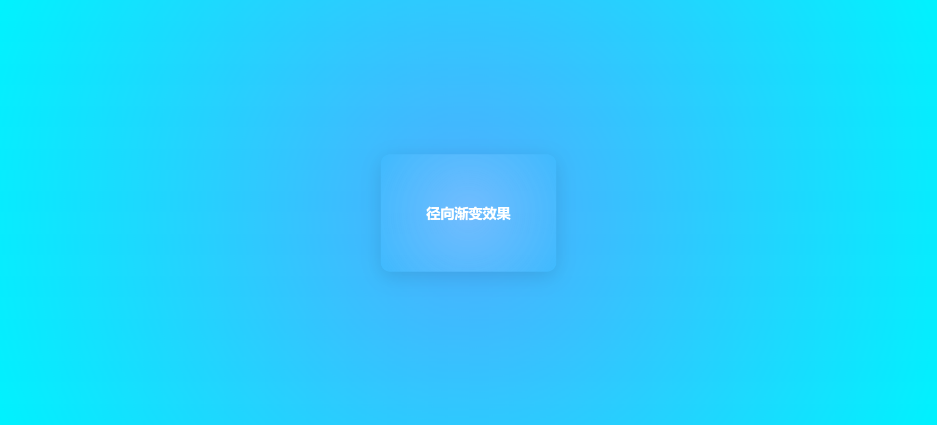
10.2.2.2、页面效果
10.2.3、效果示例2
10.2.3.1、代码示例
  <!DOCTYPE html>
  <html lang="en">

  <head>
    <!-- 表头 -->
    <meta charset="UTF-8" />
    <meta name="viewport" content="width=device-width, initial-scale=1.0" />
    <title>你好,春天~</title>
    <link rel="stylesheet" href="./iconfont/iconfont.css">
    <style>
      body {
        background-color: pink;
      }
      .box {
        width: 68px;
        height: 34px;
        border: 1px solid red;
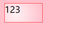
        background-image: radial-gradient(
          50px at 20px 20px,
          rgba(255, 255, 255, 0.8),
          transparent
        );
      }
    </style>
  </head>

  <body>
    <div class="box">
      123
    </div>
  </body>
  </html>
10.2.3.1、页面效果
11、空间转换-transform
11.1、概念
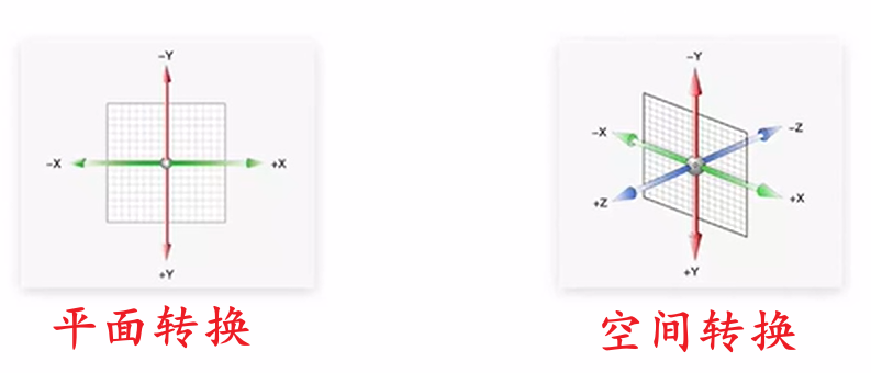
- 空间:从坐标轴角度定义来看,X、Y、Z三条坐标轴构成了一个立体空间,其中Z轴与人类视线方向相同。
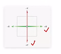
- 空间转换:也叫做3D转换,使用的属性也是transform,这点和平面转换一致。其中X轴正方向是水平向右,Y轴正方向是垂直向下,Z轴正方向是垂直平面指向面向电脑的人
11.2、平移
11.2.1、概念
- 属性:
- transform:tanslate3d(X轴移动距离, Y轴移动距离, Z轴移动距离)
- translateZ(Z轴移动距离)——沿着Z轴进行移动
- 移动距离取值:
- 取值正负:正负都可以
- 取值内容:
- 像素单位数值,比如:10px
- 百分比,参照盒子自身尺寸进行百分比计算
- 视距:
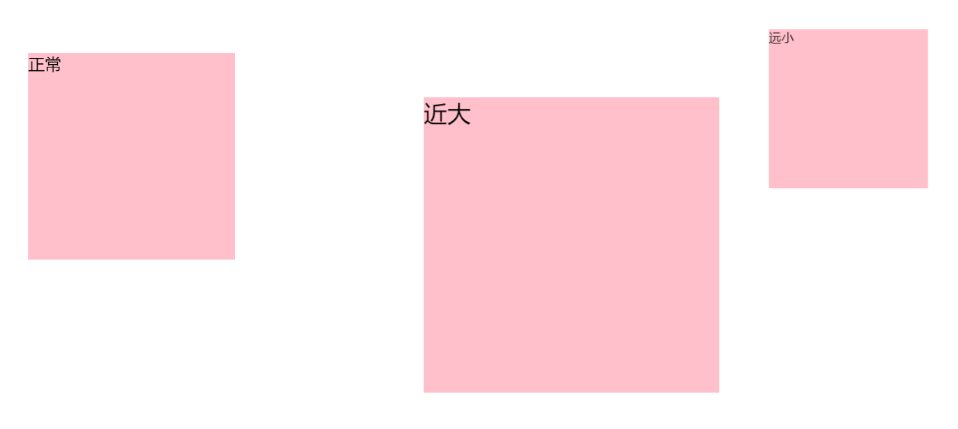
- 作用:指定了观察者和Z轴等于0的距离,需要将视距添加到直接父级元素,相当于以父级元素为参照物,当参照物到人眼的距离固定了,那么我们只需要移动子级元素的translateZ(Z轴移动距离),就可以看出子级元素近大远小的效果(近大远小指代距离人类眼睛的距离变化时的子级盒子展示的视觉效果)
- 属性:添加到直接父级元素上,取值范围800px~1200px,一般是1000px
- 写法:perspective: 视距;,例如:perspective: 1000px
11.2.2、代码示例
  <!DOCTYPE html>
  <html lang="en">

  <head>
    <!-- 表头 -->
    <meta charset="UTF-8" />
    <meta name="viewport" content="width=device-width, initial-scale=1.0" />
    <title>你好,春天~</title>
    <link rel="stylesheet" href="./iconfont/iconfont.css">
    <style>
      * {
        margin: 0;
        padding: 0;
        box-sizing: border-box;
      }
      .father {
        /* 视距,合适范围是800~1200,必须加给使用直接父级元素,这样子元素沿着Z轴移动才能看到近大远小的效果 */
        perspective: 1000px;
      }
      .son {
        width: 200px;
        height: 200px;
        background-color: pink;
        float: left;
        margin-top: 100px;
        margin-left: 200px;
      }
      .son1 {
        /* 只有给直接父级元素添加视距,才能看到沿着Z轴的移动效果 */
        transform: translateZ(300px);
      }
      .son2 {
        transform: translateZ(-300px);
      }
    </style>
  </head>

  <body>
    <div class="father">
      <div class="son">正常</div>
      <div class="son son1">近大</div>
      <div class="son son2">远小</div>
    </div>
  </body>

  </html>
11.2.3、页面效果
11.3、旋转
11.3.1、概念
- 写法:
- transform: rotate(旋转角度)
- 说明:rotate() 函数就是 绕
Z 轴旋转的简写形式,效果完全等同于rotateZ()。
- 说明:rotate() 函数就是 绕
- transform: rotateX(沿着X轴的旋转角度)
- transform: rotateY(沿着Y轴的旋转角度)
- transform: rotateZ(沿着Z轴的旋转角度)
- transform: rotate3d(x, y, z, 沿着自定义轴的旋转角度)——x、y、z取值为0~1之间的数字,用了设置自定义旋转轴的位置,基本不使用这种方式
- transform: rotate(旋转角度)
- 单位:deg,例如45deg代表顺时针旋转45度
- 旋转角度取值:正负都可以,正值代表顺时针旋转,负值代表逆时针旋转
- 确定旋转角度正负值——左手法则:根据旋转方向确定旋转角度取值的正负
- 法则内容:左手握住旋转轴,拇指指向坐标轴的正值方向,其他四个手指弯曲的方向即为旋转角度的正值方向,这样就可以确定旋转角度取正值或者负值了
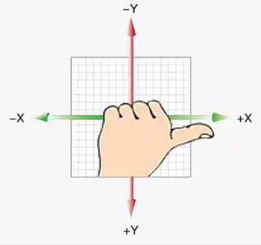
- 法则内容:左手握住旋转轴,拇指指向坐标轴的正值方向,其他四个手指弯曲的方向即为旋转角度的正值方向,这样就可以确定旋转角度取正值或者负值了
11.3.2、代码示例
  <!DOCTYPE html>
  <html lang="en">

  <head>
    <!-- 表头 -->
    <meta charset="UTF-8" />
    <meta name="viewport" content="width=device-width, initial-scale=1.0" />
    <title>你好,春天~</title>
    <link rel="stylesheet" href="./iconfont/iconfont.css">
    <style>
      * {
        margin: 0;
        padding: 0;
        box-sizing: border-box;
      }
      div {
        width: 200px;
        height: 200px;
        background-color: pink;
        float: left;
        margin: 100px;
        transition: all 1s;
      }
      .rotateX {
        transform: rotateX(60deg);
      }
      .rotateY {
        transform: rotateY(60deg);
      }
      .rotateZ {
        transform: rotateZ(60deg);
      }
    </style>
  </head>

  <body>
      <div class="rotateX">沿X轴旋转60度</div>
      <div class="rotateY">沿Y轴旋转60度</div>
      <div class="rotateZ">沿Z轴旋转60度</div>
  </body>

  </html>
11.3.3、页面效果
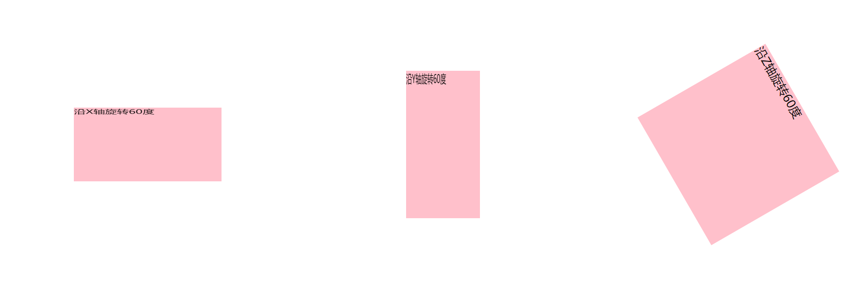
11.4、立体呈现
11.4.1、概念
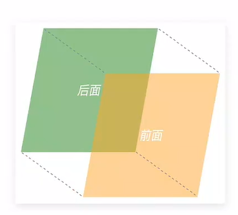
- 作用:设置元素的子元素位于3D空间,还是平面内
- 属性名:transform-style
- 被设置方:需要设置到父元素上,这样父元素就是一个立方体盒子,那么子元素就可以
- 属性值:
- flat:默认值,子元素处于平面中
- preserve-3d:子元素处于3D空间
- 呈现立体图形步骤:
- 1、在父元素中,设置立体呈现 transform-style: preserve-3d,设置相对定位 position: relative
- 2、在子元素中,设置绝对定位 position: absolute
- 3、调整子元素的位置,可以使用位移或者旋转等方式
11.4.2、效果示例1
11.4.2.1、代码示例
  <!DOCTYPE html>
  <html lang="en">

  <head>
    <!-- 表头 -->
    <meta charset="UTF-8" />
    <meta name="viewport" content="width=device-width, initial-scale=1.0" />
    <title>你好,春天~</title>
    <link rel="stylesheet" href="./iconfont/iconfont.css">
    <style>
      * {
        margin: 0;
        padding: 0;
        box-sizing: border-box;
      }

      a {
        text-decoration: none;
      }

      li {
        list-style: none;
      }
      .father {
        position: relative;
        width: 200px;
        height: 200px;
        margin: 100px auto;
        transition: all 2s;
        transform-style: preserve-3d;
      }
      .father div {
        position: absolute;
        left: 0;
        top: 0;
        width: 200px;
        height: 200px;
      }
      .front {
        background-color: orange;
        transform: translateZ(-100px);
      }
      .back {
        background-color: green;
        transform: translateZ(100px);
      }
      .father:hover {
        transform: rotateY(90deg);
      }
    </style>
  </head>

  <body>
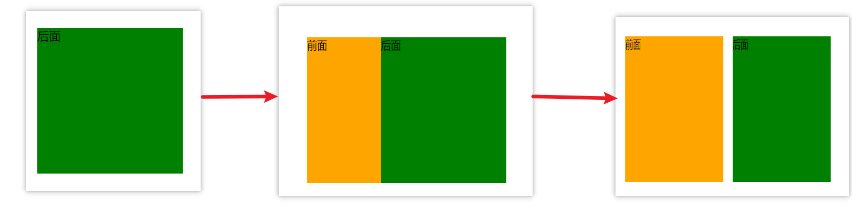
    <div class="father">
      <div class="front">前面</div>
      <div class="back">后面</div>
    </div>
  </body>
  </html>
11.4.2.2、页面效果
11.4.3、效果示例2
11.4.3.1、代码示例
  <!DOCTYPE html>
  <html lang="en">

  <head>
    <!-- 表头 -->
    <meta charset="UTF-8" />
    <meta name="viewport" content="width=device-width, initial-scale=1.0" />
    <title>你好,春天~</title>
    <link rel="stylesheet" href="./iconfont/iconfont.css">
    <style>
      * {
        margin: 0;
        padding: 0;
        box-sizing: border-box;
      }
      a {
        text-decoration: none;
      }
      li {
        list-style: none;
      }
      .father {
        position: relative;
        width: 200px;
        height: 200px;
        margin: 100px auto;
        transform-style: preserve-3d;
        transition: all 1s;
      }
      .father div {
        position: absolute;
        width: 100%;
        height: 100%;
      }
      .top {
        background-color: palegreen;
        transform: rotateX(90deg) translateZ(100px);
      }
      .front {
        background-color: goldenrod;
        transform: translateZ(100px);
      }
      .father:hover {
        transform: rotateX(-90deg);
      }
    </style>
  </head>

  <body>
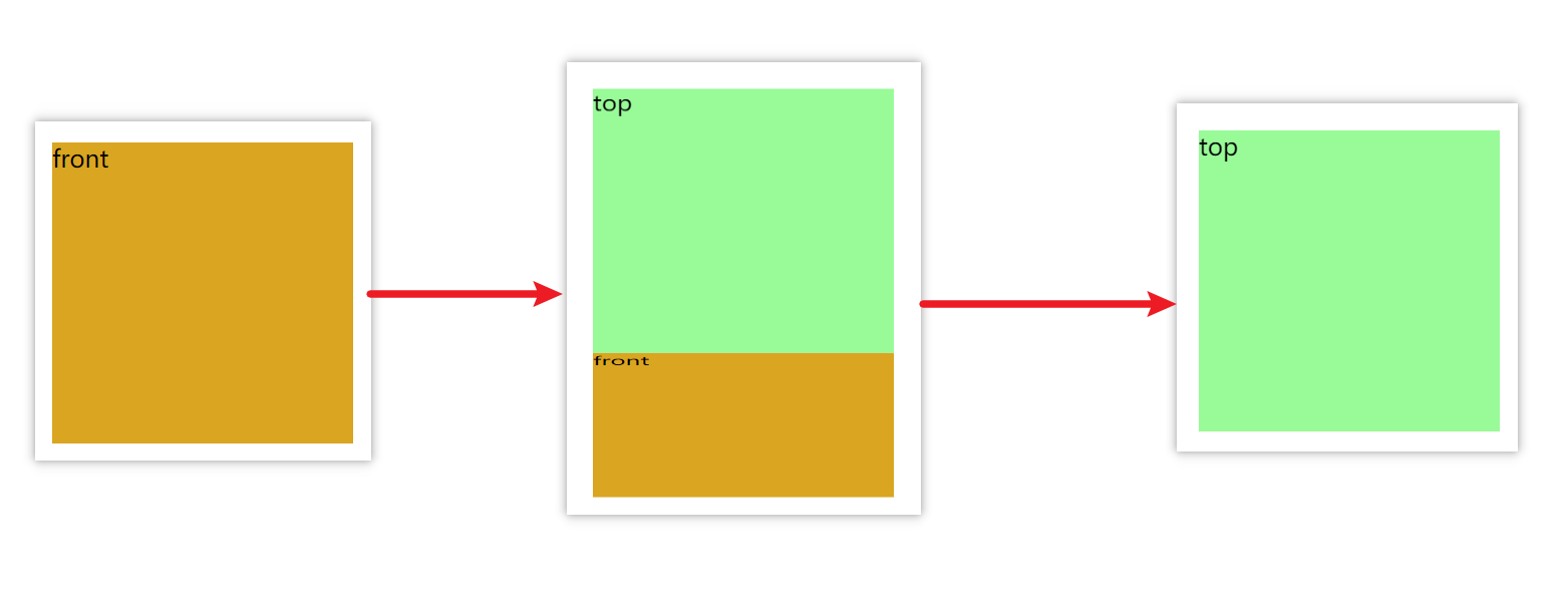
    <div class="father">
      <div class="front">front</div>
      <div class="top">top</div>
    </div>
  </body>
  </html>
11.4.2.2、页面效果
11.5、缩放
11.5.1、概念
- 写法:
- transform: scale3d(X轴缩放倍数, Y轴缩放倍数, Z轴缩放倍数)
- transform: scaleZ(X轴缩放倍数)
- 取值说明:取值0~1,支持小数,取值大于1代表放大,小于1代表缩小
- 沿着Z轴缩放效果不太好看,这里就不看了
12、动画
12.1、概念
-
含义:实现多个状态间的变化过程,并且动画过程可控,支持重复播放、设置最终画面、是否暂停等
-
动画和过渡的区别:动画可以实现多个状态间的变化过程,并且控制参数更多。而过渡只能实现2个状态件的变化过程,控制参数比较少
-
实现步骤:
- 1、定义动画
/* 写法1 */ @keyframes 动画名称 { from { CSS特效 } to { CSS特效 } } /* 写法2 */ @keyframes 动画名称 { 0% { CSS特效 } 百分比 { CSS特效 } …… 100% { CSS特效 } } - 使用动画
- 写法:animation: 动画名称 动画时长 速度曲线 延迟时间 重复次数 动画方向 执行完毕时状态
- 设值:
- 动画名称:即
@keyframes 动画名称 {……}中的动画名称 - 动画时长:动画执行时间,单位秒,例如1s
- 速度曲线:默认不是匀速的,设置linear即为匀速运动,也可以设置逐帧动画steps(帧数)(逐帧动画:动画本来是连续的过程,逐帧动画就是连续动画中的某几帧,当然这些帧也是均匀分布的)
- 延迟时间:动画执行延迟时间,即刷新页面后多长时间才会执行,单位秒,例如0.5s,可以让多个动画的执行不是同步的,造成错落有致的美感
- 重复次数:默认值是1,动画执行的次数,但是也可以设置infinite让动画循环执行
- 动画方向:默认情况下,都是从头到尾执行的,但是也可以是从头到尾在到头的执行方式,设置alternate即可
- 执行完毕时状态:默认值是第一帧backwards,也可以设置成最后一帧forwards
- 动画名称:即
- 提示:
- 动画名称和动画时长不能少
- 属性值不分先后顺序
- 如果有2个时间值,第一个时间代表动画时长,第二个时间表示延迟时间
- 1、定义动画
-
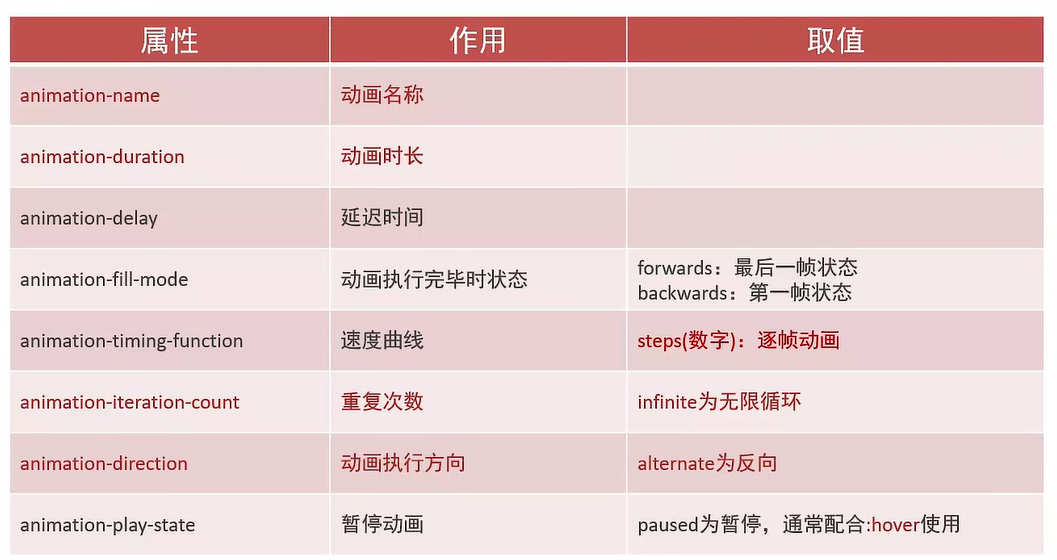
单独使用动画属性(尤其是最后一个暂停动画,我在走马灯示例中演示了用法):
-
其他信息:如果初始状态不用变化,那设置动画效果时
@keyframes{XXX}中的from和0%的CSS特效可以省略不写 -
几点感受:
- 最终状态的设置方案:
- 方案1:执行完毕时状态:默认值是第一帧backwards,也可以设置成最后一帧forwards
- 方案2:直接在
class类中设置最终状态+动画效果,当添加该类时,即添加上动画效果,并能实现最终状态的展示
- 多动画配合交替使用,解决同一名称动画无法多次重复执行问题
- 在同一函数中同时移除class类(携带动画),然后添加同名class类,这样动画不会执行,最好将两种操作错开使用
- 最终状态的设置方案:
12.2、效果示例1—体验动画
12.2.1、代码示例
  <!DOCTYPE html>
  <html lang="en">

  <head>
    <!-- 表头 -->
    <meta charset="UTF-8" />
    <meta name="viewport" content="width=device-width, initial-scale=1.0" />
    <title>你好,春天~</title>
    <link rel="stylesheet" href="./iconfont/iconfont.css">
    <style>
      .box1 {
        width: 100px;
        height: 100px;
        background-color: pink;
        margin: 100px;
        animation: testAnimation1 1s infinite alternate-reverse;
      }

      @keyframes testAnimation1 {
        from {
          transform: translate(0);
        }
        to {
          transform: translateX(100px);
        }
      }

      .box2 {
        width: 100px;
        height: 100px;
        background-color: pink;
        margin: 100px;
        animation: testAnimation2 1s infinite alternate-reverse;
      }

      @keyframes testAnimation2 {
        0% {
          transform: translate(0);
        }
        100% {
          transform: translateX(100px);
        }
      }
    </style>
  </head>

  <body>
    <div class="box1">from and to</div>
    <div class="box2">百分数</div>
  </body>
  </html>
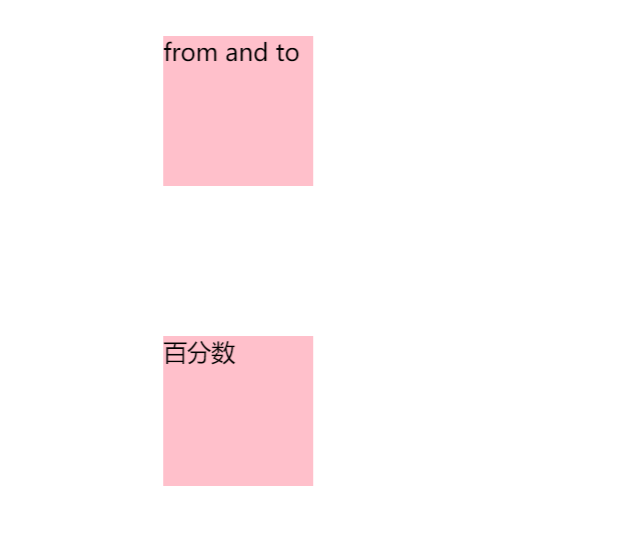
12.2.2、页面效果
这两张图片一直在那里来回晃动
12.3、效果示例2—走马灯
12.3.1、代码示例
  <!DOCTYPE html>
  <html lang="en">

  <head>
    <!-- 表头 -->
    <meta charset="UTF-8" />
    <meta name="viewport" content="width=device-width, initial-scale=1.0" />
    <title>你好,春天~</title>
    <link rel="stylesheet" href="./iconfont/iconfont.css">
    <style>
      * {
        margin: 0;
        padding: 0;
      }
      li {
        list-style: none;
      }
      div {
        width: 800px;
        height: 160px;
        margin: 50px auto;
        background-color: pink;
        overflow: hidden;
      }
      /* 将鼠标移动到div盒子上,暂停动画播放 */
      div:hover ul {
        animation-play-state: paused;
      }
      div ul {
        display: flex;
        animation: move 10s infinite linear;
      }
      div li {
        position: relative;
        width: 290px;
        height: 160px;
        overflow: hidden;
        /* 禁止 li 自动收缩(flex 默认会让子元素收缩以适应父容器,这是你之前 li 重叠的核心原因) */
        flex-shrink: 0;
      }
      div li img {
        position: absolute;
        right: 0;
        height: 100%;
      }

    @keyframes move {
      from {
        transform: translate(0);
      }
      to {
        transform: translateX(-1450px);
      }
    }
    </style>
  </head>

  <body>
    <div>
      <ul>
        <li><img src="https://img1.360buyimg.com/da/jfs/t1/314302/14/19373/93517/688211e9F5cef80d5/760d033c1af1efa1.png" alt=""></li>
        <li><img src="https://img1.360buyimg.com/da/jfs/t1/320821/34/24056/85256/689b718aFcda4ca76/08f202384ebb3d7c.png" alt=""></li>
        <li><img src="https://img1.360buyimg.com/da/jfs/t1/328440/35/2798/9644/68977e55Fb4e5d4ad/9f20034c578a64a3.png" alt=""></li>
        <li><img src="https://m.360buyimg.com/babel/jfs/t20281116/356657/11/11235/47064/691adf51F4b4f03e5/10acd1471be9b8eb.png" alt=""></li>
        <li><img src="https://m.360buyimg.com/babel/jfs/t20280325/274965/21/10397/46026/67e3802fF58536807/85fed84299cb141d.png" alt=""></li>

        <!-- 无缝动画实现思路 -->
        <li><img src="https://img1.360buyimg.com/da/jfs/t1/314302/14/19373/93517/688211e9F5cef80d5/760d033c1af1efa1.png" alt=""></li>
        <li><img src="https://img1.360buyimg.com/da/jfs/t1/320821/34/24056/85256/689b718aFcda4ca76/08f202384ebb3d7c.png" alt=""></li>
        <li><img src="https://img1.360buyimg.com/da/jfs/t1/328440/35/2798/9644/68977e55Fb4e5d4ad/9f20034c578a64a3.png" alt=""></li>
        <li><img src="https://m.360buyimg.com/babel/jfs/t20281116/356657/11/11235/47064/691adf51F4b4f03e5/10acd1471be9b8eb.png" alt=""></li>
        <li><img src="https://m.360buyimg.com/babel/jfs/t20280325/274965/21/10397/46026/67e3802fF58536807/85fed84299cb141d.png" alt=""></li>
      </ul>
    </div>
  </body>
  </html>
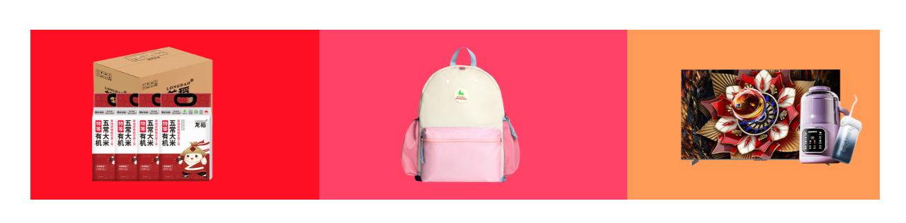
12.3.2、页面效果
一直滚动,当鼠标放到图片上时,滚动可以暂停,当鼠标离开图片时,滚动继续
12.4、效果示例3—逐帧动画(配合精灵图做逐帧动作)
12.4.1、代码示例
  <!DOCTYPE html>
  <html lang="en">

  <head>
    <!-- 表头 -->
    <meta charset="UTF-8" />
    <meta name="viewport" content="width=device-width, initial-scale=1.0" />
    <title>你好,春天~</title>
    <link rel="stylesheet" href="./iconfont/iconfont.css">
    <style>
      * {
        margin: 0;
        padding: 0;
      }
      li {
        list-style: none;
      }
      div {
        width: 110px;
        height: 110px;
        margin: 50px auto;
        background-color: pink;
        border: 1px solid red;
        overflow: hidden;
        background-image: url(https://img1.baidu.com/it/u=1066514001,2566028153&fm=253&app=120&size=w931&n=0&f=JPEG&fmt=auto?sec=1742144400&t=8afe0de96d2827021cfc6a399d33ed57);
        /* 一行总共6个表情,第一个表情是直接展示的,所以步骤数是5 */
        animation: run 1s steps(5) infinite alternate;
      }

      @keyframes run {
        from {
          background-position: 0px 0px;
        }
        to {
          /* 移动到最后的像素值,结合逐帧动画,分成5步展示 */
          background-position: -1160px 0px;
        }
      }
    </style>
  </head>

  <body>
    <div class="emoji"></div>
  </body>
  </html>
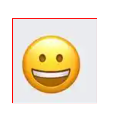
12.4.2、页面效果
这些表情一直闪动
12.5、效果示例4—多组动画共同作用
12.5.1、代码示例
  <!DOCTYPE html>
  <html lang="en">

  <head>
    <!-- 表头 -->
    <meta charset="UTF-8" />
    <meta name="viewport" content="width=device-width, initial-scale=1.0" />
    <title>你好,春天~</title>
    <link rel="stylesheet" href="./iconfont/iconfont.css">
    <style>
      * {
        margin: 0;
        padding: 0;
      }
      li {
        list-style: none;
      }
      div {
        width: 110px;
        height: 110px;
        margin-top: 100px;
        overflow: hidden;
        background-image: url(https://img1.baidu.com/it/u=1066514001,2566028153&fm=253&app=120&size=w931&n=0&f=JPEG&fmt=auto?sec=1742144400&t=8afe0de96d2827021cfc6a399d33ed57);
        animation:
          /* 一行总共6个表情,第一个表情是直接展示的,所以步骤数是5 */
          run 1s steps(5) infinite,
          /* 做逐帧动画的同时,加上移动效果 */
          move 3s infinite alternate linear;
      }

      @keyframes run {
        from {
          background-position: 0px 0px;
        }
        to {
          /* 移动到最后的像素值,结合逐帧动画,分成5步展示 */
          background-position: -1160px 0px;
        }
      }
      @keyframes move {
        from {
          transform: translate(0);
        }
        to {
          transform: translateX(500px);
        }
      }
    </style>
  </head>

  <body>
    <div class="emoji"></div>
  </body>
  </html>
12.5.2、页面效果
在表情变换时,来回晃动

12.6、效果示例5—唱吧首页弹出特效
12.6.1、代码示例
  <!DOCTYPE html>
  <html lang="en">

  <head>
    <!-- 表头 -->
    <meta charset="UTF-8" />
    <meta name="viewport" content="width=device-width, initial-scale=1.0" />
    <title>你好,春天~</title>
    <link rel="stylesheet" href="./iconfont/iconfont.css">
    <style>
      * {
        margin: 0;
        padding: 0;
      }
      li {
        list-style: none;
      }

      html {
        height: 100%;
      }

      body {
        height: 100%;
        background: linear-gradient(-45deg,#ff0040,#f22);
      }

      .pic {
        position: relative;
        width: 960px;
        height: 413px;
        margin: 0 auto;
        margin-top: 180px;
      }

      .pic img {
        position: absolute;
      }

      .pic1 {
        top: 82px;
        left: -15px;
        animation: img1 0.7s ease-out 0.5s backwards;
      }

      @keyframes img1 {
        0% {
          transform: translate3d(-2000px, 0, 0);
        }

        100% {
          transform: translate3d(0, 0, 0);
        }
      }

      .pic2 {
        bottom: 44px;
        left: 155px;
        animation: img2 0.7s ease-out 0.2s backwards;
      }

      @keyframes img2 {
        0% {
          transform: translate3d(-2000px, 0, 0);
        }

        100% {
          transform: translate3d(0, 0, 0);
        }
      }

      .pic3 {
        top: -15px;
        left: 308px;
        animation: img3 0.8s linear backwards;
      }

      @keyframes img3 {
        0% {
          transform: scale(0);
          opacity: 0;
        }

        30% {
          transform: scale(1.2);
          opacity: 1;
        }

        40% {
          transform: scale(0.85);
          opacity: 1;
        }

        50% {
          transform: scale(1.15);
          opacity: 1;
        }

        60% {
          transform: scale(0.9);
          opacity: 1;
        }

        70% {
          transform: scale(1.1);
          opacity: 1;
        }

        80% {
          transform: scale(0.95);
          opacity: 1;
        }

        90% {
          transform: scale(1.05);
          opacity: 1;
        }

        100% {
          transform: scale(1);
          opacity: 1;
        }
      }

      .pic4 {
        top: 4px;
        left: 508px;
        animation: img4 0.7s ease-out 0.2s backwards;
      }

      @keyframes img4 {
        0% {
          transform: translate3d(2000px, 0, 0);
        }

        100% {
          transform: translate3d(0, 0, 0);
        }
      }

      .pic5 {
        top: -19px;
        left: 653px;
        animation: img5 0.7s ease-out 0.5s backwards;
      }

      @keyframes img5 {
        0% {
          transform: translate3d(2000px, 0, 0);
        }

        100% {
          transform: translate3d(0, 0, 0);
        }
      }

      .logo1 {
        position: absolute;
        top: 30px;
        left: 50px;
        width: 61px;
        height: auto;
        animation: logo1 1s infinite alternate linear;
      }

      @keyframes logo1 {
        100% {
          transform: translateY(30px);
        }
      }

      .logo2 {
        position: absolute;
        top: 60px;
        left: 50%;
        transform: translateX(-50%);
        width: 61px;
        height: auto;
        animation: logo2 1s infinite alternate linear 0.3s;
      }

      @keyframes logo2 {
        100% {
          transform: translateX(-50%) translateY(30px);
        }
      }

      .logo3 {
        position: absolute;
        right: 30px;
        width: 61px;
        height: auto;
        animation: logo3 1s infinite alternate linear 0.6s;
      }

      @keyframes logo3 {
        100% {
          transform: translateY(50px);
        }
      }
    </style>
  </head>
    <div class="logo">
      <img class="logo1" src="https://res.cdn.changbaimg.com/-/bafb5d9b43c6580a/logo.png" alt="">
      <img class="logo2" src="https://res.cdn.changbaimg.com/-/bafb5d9b43c6580a/logo.png" alt="">
      <img class="logo3" src="https://res.cdn.changbaimg.com/-/bafb5d9b43c6580a/logo.png" alt="">
    </div>
    <div class="pic">
      <img class="pic1" src="https://res.cdn.changbaimg.com/-/070b854dec0d92e8/top1.png" alt="">
      <img class="pic2" src="https://res.cdn.changbaimg.com/-/5f8838dbf707ccce/top2.png" alt="">
      <img class="pic3" src="https://res.cdn.changbaimg.com/-/62e0fe93320aa0d2/top3.png" alt="">
      <img class="pic4" src="https://res.cdn.changbaimg.com/-/54daf7ad64776697/top4.png" alt="">
      <img class="pic5" src="https://res.cdn.changbaimg.com/-/affc22bc1e7c843c/top5.png" alt="">
    </div>
  <body>

  </body>
  </html>
12.6.2、页面效果
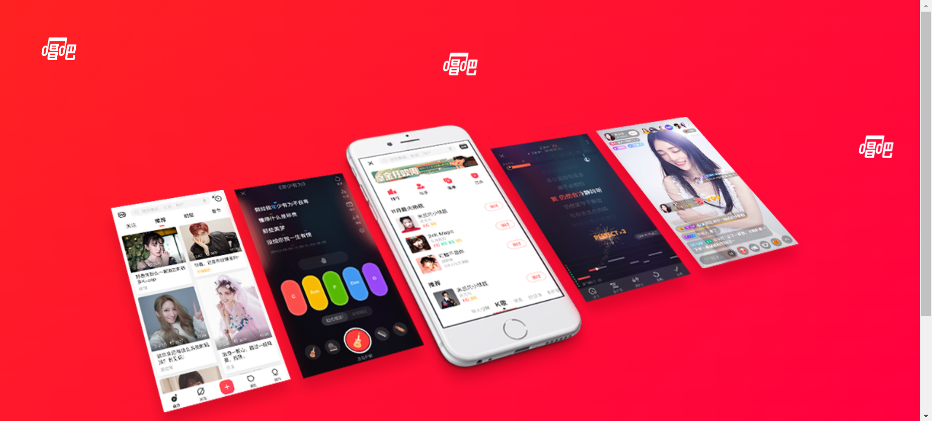
那几个唱吧的logo在一上一下不规则的晃动,这是位移和延迟共同起到的作用,然后这几张图片出现的时候带着动画效果出现的,这些动画特效是我从唱吧官网拿过来的
12.7、效果示例6—直接在class类中设置最终状态(替换【设置成最后一帧forwards】的效果)+动画效果,当添加该类时,即添加上动画效果,并能实现最终状态的展示
12.7.1、代码示例
index.html:
<!DOCTYPE html>
<html lang="en">

<head>
    <meta charset="UTF-8">
    <meta name="viewport" content="width=device-width, initial-scale=1.0">
    <title>Document</title>
    <link rel="stylesheet" href="style.css" />
</head>

<body>
    <div class="change transtion">
        <h3>过渡:</h3>
        <div class="ellipse">
            <div class="cicle"></div>
        </div>
    </div>
    <div class="change animation">
        <h3>动画:</h3>
        <div class="ellipse">
            <div class="cicle"></div>
        </div>
    </div>
    <script src="script.js"></script>
</body>

</html>
script.js:
const transtionEl = document.querySelector('.transtion .ellipse')

transtionEl.addEventListener('click', () => {
    transtionEl.classList.toggle('active')
})

const animationEl = document.querySelector('.animation .ellipse')

animationEl.addEventListener('click', () => {
    if(animationEl.classList.contains('active')) {
        animationEl.classList.remove('active')
        animationEl.classList.add('noActive')
    } else {
        animationEl.classList.add('active')
        animationEl.classList.remove('noActive')
    }
})
style.css:
* {
    margin: 0;
    padding: 0;
    box-sizing: border-box;
}

a {
    text-decoration: none;
}

li {
    list-style: none;
}

input {
    border: 0;
    background-color: transparent;
}

input:focus {
    outline: none;
}

button {
    background-color: transparent;
    border: none;
    outline: none;
}

button:focus {
    outline: none;
}

body {
    font-family: 'Open Sans', sans-serif;
    height: 100vh;
    display: flex;
    flex-direction: column;
    justify-content: center;
    align-items: center;
    background-color: #3b3b98;
    color: #fff;
}

.change {
    display: flex;
    align-items: center;
    margin-bottom: 20px;
}

.change h1 {
    margin-right: 20px;
}

.transtion .ellipse {
    width: 100px;
    height: 50px;
    background-color: #d0d0d0;
    position: relative;
    border-radius: 25px;
    -webkit-border-radius: 25px;
    -moz-border-radius: 25px;
    -ms-border-radius: 25px;
    -o-border-radius: 25px;
    cursor: pointer;
    transition: all 0.3s linear;
    -webkit-transition: all 0.3s linear;
    -moz-transition: all 0.3s linear;
    -ms-transition: all 0.3s linear;
    -o-transition: all 0.3s linear;
}

.transtion .ellipse.active {
    background-color: #8e44ad;
}

.transtion .cicle {
    position: absolute;
    left: 5px;
    top: 50%;
    transform: translateY(-50%);
    background-color: #fff;
    width: 40px;
    height: 40px;
    border-radius: 50%;
    -webkit-border-radius: 50%;
    -moz-border-radius: 50%;
    -ms-border-radius: 50%;
    -o-border-radius: 50%;
    -webkit-transform: translateY(-50%);
    -moz-transform: translateY(-50%);
    -ms-transform: translateY(-50%);
    -o-transform: translateY(-50%);
    transition: all 0.3s ease-in-out;
    -webkit-transition: all 0.3s ease-in-out;
    -moz-transition: all 0.3s ease-in-out;
    -ms-transition: all 0.3s ease-in-out;
    -o-transition: all 0.3s ease-in-out;
}

.transtion .ellipse.active .cicle {
    transform: translate(50px, -50%);
    -webkit-transform: translate(50px, -50%);
    -moz-transform: translate(50px, -50%);
    -ms-transform: translate(50px, -50%);
    -o-transform: translate(50px, -50%);
}

.animation .ellipse {
    width: 100px;
    height: 50px;
    background-color: #d0d0d0;
    position: relative;
    border-radius: 25px;
    -webkit-border-radius: 25px;
    -moz-border-radius: 25px;
    -ms-border-radius: 25px;
    -o-border-radius: 25px;
    cursor: pointer;
}

.animation .ellipse.active {
    background-color: #8e44ad;
}

.animation .cicle {
    position: absolute;
    left: 5px;
    top: 50%;
    background-color: #fff;
    width: 40px;
    height: 40px;
    border-radius: 50%;
    -webkit-border-radius: 50%;
    -moz-border-radius: 50%;
    -ms-border-radius: 50%;
    -o-border-radius: 50%;
    transform: translateY(-50%);
    -webkit-transform: translateY(-50%);
    -moz-transform: translateY(-50%);
    -ms-transform: translateY(-50%);
    -o-transform: translateY(-50%);
}

.animation .ellipse.active .cicle {
    /* 直接在`class`类中设置最终状态(替换【设置成最后一帧forwards】的效果)+动画效果,当添加该类时,即添加上动画效果,并能实现最终状态的展示 */
    transform: translate(50px, -50%);
    animation: toRight 0.3s linear;
    -webkit-animation: toRight 0.3s linear;
}

.animation .ellipse.noActive .cicle {
    animation: toLeft 0.3s linear;
    -webkit-animation: toLeft 0.3s linear;
}

/* 多动画配合交替使用,解决同一名称动画无法多次重复执行问题 */
@keyframes toRight {
    0% {
        transform: translate(0px, -50%);
        -webkit-transform: translate(0px, -50%);
        -moz-transform: translate(0px, -50%);
        -ms-transform: translate(0px, -50%);
        -o-transform: translate(0px, -50%);
    }

    50% {
        transform: translate(25px, -50%) scale(1.2);
        -webkit-transform: translate(25px, -50%) scale(1.2);
        -moz-transform: translate(25px, -50%) scale(1.2);
        -ms-transform: translate(25px, -50%) scale(1.2);
        -o-transform: translate(25px, -50%) scale(1.2);
    }

    100% {
        transform: translate(50px, -50%);
        -webkit-transform: translate(50px, -50%);
        -moz-transform: translate(50px, -50%);
        -ms-transform: translate(50px, -50%);
        -o-transform: translate(50px, -50%);
    }
}

@keyframes toLeft {
    0% {
        transform: translate(50px, -50%);
    }

    50% {
        transform: translate(25px, -50%) scale(1.2);
        -webkit-transform: translate(25px, -50%) scale(1.2);
        -moz-transform: translate(25px, -50%) scale(1.2);
        -ms-transform: translate(25px, -50%) scale(1.2);
        -o-transform: translate(25px, -50%) scale(1.2);
    }

    100% {
        transform: translate(0px, -50%);
    }
}
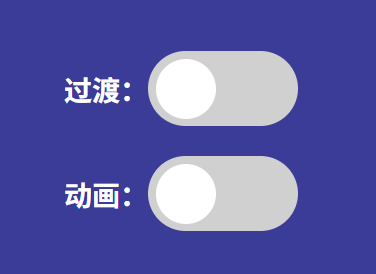
12.7.2、页面效果
12.8、效果示例7—多动画配合交替使用,解决同一名称动画无法多次重复执行问题,即使使用reverse也不行
12.8.1、案例1—代码示例
index.html:
<!DOCTYPE html>
<html lang="en">

<head>
    <meta charset="UTF-8">
    <meta name="viewport" content="width=device-width, initial-scale=1.0">
    <title>Document</title>
    <link rel="stylesheet" href="style.css" />
</head>

<body>
    <div class="change transtion">
        <h3>过渡:</h3>
        <div class="ellipse">
            <div class="cicle"></div>
        </div>
    </div>
    <div class="change animation">
        <h3>动画:</h3>
        <div class="ellipse">
            <div class="cicle"></div>
        </div>
    </div>
    <script src="script.js"></script>
</body>

</html>
script.js:
const transtionEl = document.querySelector('.transtion .ellipse')

transtionEl.addEventListener('click', () => {
    transtionEl.classList.toggle('active')
})

const animationEl = document.querySelector('.animation .ellipse')

animationEl.addEventListener('click', () => {
    if(animationEl.classList.contains('active')) {
        animationEl.classList.remove('active')
        animationEl.classList.add('noActive')
    } else {
        animationEl.classList.add('active')
        animationEl.classList.remove('noActive')
    }
})
style.css:
* {
    margin: 0;
    padding: 0;
    box-sizing: border-box;
}

a {
    text-decoration: none;
}

li {
    list-style: none;
}

input {
    border: 0;
    background-color: transparent;
}

input:focus {
    outline: none;
}

button {
    background-color: transparent;
    border: none;
    outline: none;
}

button:focus {
    outline: none;
}

body {
    font-family: 'Open Sans', sans-serif;
    height: 100vh;
    display: flex;
    flex-direction: column;
    justify-content: center;
    align-items: center;
    background-color: #3b3b98;
    color: #fff;
}

.change {
    display: flex;
    align-items: center;
    margin-bottom: 20px;
}

.change h1 {
    margin-right: 20px;
}

.transtion .ellipse {
    width: 100px;
    height: 50px;
    background-color: #d0d0d0;
    position: relative;
    border-radius: 25px;
    -webkit-border-radius: 25px;
    -moz-border-radius: 25px;
    -ms-border-radius: 25px;
    -o-border-radius: 25px;
    cursor: pointer;
    transition: all 0.3s linear;
    -webkit-transition: all 0.3s linear;
    -moz-transition: all 0.3s linear;
    -ms-transition: all 0.3s linear;
    -o-transition: all 0.3s linear;
}

.transtion .ellipse.active {
    background-color: #8e44ad;
}

.transtion .cicle {
    position: absolute;
    left: 5px;
    top: 50%;
    transform: translateY(-50%);
    background-color: #fff;
    width: 40px;
    height: 40px;
    border-radius: 50%;
    -webkit-border-radius: 50%;
    -moz-border-radius: 50%;
    -ms-border-radius: 50%;
    -o-border-radius: 50%;
    -webkit-transform: translateY(-50%);
    -moz-transform: translateY(-50%);
    -ms-transform: translateY(-50%);
    -o-transform: translateY(-50%);
    transition: all 0.3s ease-in-out;
    -webkit-transition: all 0.3s ease-in-out;
    -moz-transition: all 0.3s ease-in-out;
    -ms-transition: all 0.3s ease-in-out;
    -o-transition: all 0.3s ease-in-out;
}

.transtion .ellipse.active .cicle {
    transform: translate(50px, -50%);
    -webkit-transform: translate(50px, -50%);
    -moz-transform: translate(50px, -50%);
    -ms-transform: translate(50px, -50%);
    -o-transform: translate(50px, -50%);
}

.animation .ellipse {
    width: 100px;
    height: 50px;
    background-color: #d0d0d0;
    position: relative;
    border-radius: 25px;
    -webkit-border-radius: 25px;
    -moz-border-radius: 25px;
    -ms-border-radius: 25px;
    -o-border-radius: 25px;
    cursor: pointer;
}

.animation .ellipse.active {
    background-color: #8e44ad;
}

.animation .cicle {
    position: absolute;
    left: 5px;
    top: 50%;
    background-color: #fff;
    width: 40px;
    height: 40px;
    border-radius: 50%;
    -webkit-border-radius: 50%;
    -moz-border-radius: 50%;
    -ms-border-radius: 50%;
    -o-border-radius: 50%;
    transform: translateY(-50%);
    -webkit-transform: translateY(-50%);
    -moz-transform: translateY(-50%);
    -ms-transform: translateY(-50%);
    -o-transform: translateY(-50%);
}


/* 注意点:
        执行完毕时状态:默认值是第一帧backwards,也可以设置成最后一帧forwards
        两个不同的动画交替使用,各自的 forwards 相互覆盖,所以永远不会出现“焊死”的情况。
        forwards 本身并不是“恶魔”。 只要每次状态改变时,应用一个完全不同的动画名称,新动画的 forwards 就会干净地覆盖旧动画的冻结样式。
 */
.animation .ellipse.active .cicle {
    animation: toRight 0.3s linear forwards;
    -webkit-animation: toRight 0.3s linear forwards;
}

.animation .ellipse.noActive .cicle {
    animation: toLeft 0.3s linear forwards;
    -webkit-animation: toLeft 0.3s linear forwards;
}

/* 多动画配合交替使用,解决同一名称动画无法多次重复执行问题 */
@keyframes toRight {
    0% {
        transform: translate(0px, -50%);
        -webkit-transform: translate(0px, -50%);
        -moz-transform: translate(0px, -50%);
        -ms-transform: translate(0px, -50%);
        -o-transform: translate(0px, -50%);
    }

    50% {
        transform: translate(25px, -50%) scale(1.2);
        -webkit-transform: translate(25px, -50%) scale(1.2);
        -moz-transform: translate(25px, -50%) scale(1.2);
        -ms-transform: translate(25px, -50%) scale(1.2);
        -o-transform: translate(25px, -50%) scale(1.2);
    }

    100% {
        transform: translate(50px, -50%);
        -webkit-transform: translate(50px, -50%);
        -moz-transform: translate(50px, -50%);
        -ms-transform: translate(50px, -50%);
        -o-transform: translate(50px, -50%);
    }
}

@keyframes toLeft {
    0% {
        transform: translate(50px, -50%);
    }

    50% {
        transform: translate(25px, -50%) scale(1.2);
        -webkit-transform: translate(25px, -50%) scale(1.2);
        -moz-transform: translate(25px, -50%) scale(1.2);
        -ms-transform: translate(25px, -50%) scale(1.2);
        -o-transform: translate(25px, -50%) scale(1.2);
    }

    100% {
        transform: translate(0px, -50%);
    }
}
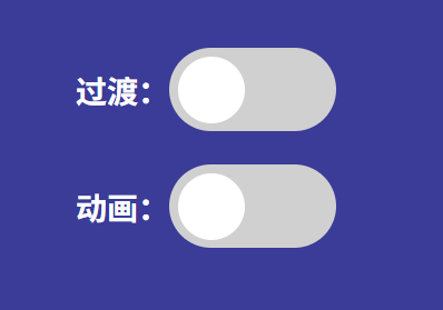
12.8.2、案例1—页面效果
12.8.3、案例2—代码示例
index.html:
<!DOCTYPE html>
<html lang="en">
  <head>
    <meta charset="UTF-8" />
    <meta name="viewport" content="width=device-width, initial-scale=1.0" />
    <link rel="stylesheet" href="style.css" />
    <title>Animated Countdown</title>
  </head>
  <body>
    <div class="counter">
      <div class="nums">
        <span class="in">3</span>
        <span>2</span>
        <span>1</span>
        <span>0</span>
      </div>
      <h4>Get Ready</h4>
    </div>

    <div class="final">
      <h1>GO</h1>
      <button id="replay">
        <span>Replay</span>
      </button>
    </div>
    <script src="script.js"></script>
  </body>
</html>
script.js:
const nums = document.querySelectorAll('.nums span')
const counter = document.querySelector('.counter')
const finalMessage = document.querySelector('.final')
const replay = document.querySelector('#replay')

runAnimation()

function resetDOM() {
  counter.classList.remove('hide')
  finalMessage.classList.remove('show')

  nums.forEach((num) => {
    num.classList.value = ''
  })

  nums[0].classList.add('in')
}

function runAnimation() {
  nums.forEach((num, idx) => {
    const nextToLast = nums.length - 1

    num.addEventListener('animationend', (e) => {
      if (e.animationName === 'goIn' && idx !== nextToLast) {
        num.classList.remove('in')
        num.classList.add('out')
      } else if (e.animationName === 'goOut' && num.nextElementSibling) {
        num.nextElementSibling.classList.add('in')
      } else {
        counter.classList.add('hide')
        finalMessage.classList.add('show')
      }
    })
  })
}

replay.addEventListener('click', () => {
  resetDOM()
  runAnimation()
})
style.css:
* {
  box-sizing: border-box;
}

body {
  font-family: 'Roboto', sans-serif;
  margin: 0;
  height: 100vh;
  overflow: hidden;
}

h4 {
  font-size: 20px;
  margin: 5px;
  text-transform: uppercase;
}

.counter {
  position: fixed;
  top: 50%;
  left: 50%;
  transform: translate(-50%, -50%);
  text-align: center;
}

.counter.hide {
  transform: translate(-50%, -50%) scale(0);
  animation: hide 0.2s ease-out;
}

@keyframes hide {
  0% {
    transform: translate(-50%, -50%) scale(1);
  }

  100% {
    transform: translate(-50%, -50%) scale(0);
  }
}

.final {
  position: fixed;
  top: 50%;
  left: 50%;
  transform: translate(-50%, -50%) scale(0);
  text-align: center;
}

.final.show {
  transform: translate(-50%, -50%) scale(1);
  animation: show 0.2s ease-out;
}

@keyframes show {
  0% {
    transform: translate(-50%, -50%) scale(0);
  }

  30% {
    transform: translate(-50%, -50%) scale(1.4);
  }

  100% {
    transform: translate(-50%, -50%) scale(1);
  }
}

.nums {
  color: #3498db;
  font-size: 50px;
  position: relative;
  overflow: hidden;
  width: 250px;
  height: 50px;
}

.nums span {
  position: absolute;
  top: 50%;
  left: 50%;
  transform: translate(-50%, -50%) rotate(120deg);
  transform-origin: bottom center;
}

.nums span.in {
  transform: translate(-50%, -50%) rotate(0deg);
  animation: goIn 0.5s ease-in-out;
}

.nums span.out {
  animation: goOut 0.5s ease-in-out;
}

@keyframes goIn {
  0% {
    transform: translate(-50%, -50%) rotate(120deg);
  }

  30% {
    transform: translate(-50%, -50%) rotate(-20deg);
  }

  60% {
    transform: translate(-50%, -50%) rotate(10deg);
  }

  100% {
    transform: translate(-50%, -50%) rotate(0deg);
  }
}

@keyframes goOut {
  0% {
    transform: translate(-50%, -50%) rotate(0deg);
  }

  60% {
    transform: translate(-50%, -50%) rotate(20deg);
  }

  100% {
    transform: translate(-50%, -50%) rotate(-120deg);
  }
}

#replay{
  background-color: #3498db;
  border-radius: 3px;
  border: none;
  color: aliceblue;
  padding: 5px;
  text-align: center;
  display: inline-block;
  cursor: pointer;
  transition: all 0.3s;
}

#replay span{
  cursor: pointer;
  display: inline-block;
  position: relative;
  transition: 0.3s;
}

#replay span:after{
  content: '\00bb';
  position: absolute;
  opacity: 0;
  top: 0;
  right: -20px;
  transition: 0.5s;
}

#replay:hover span{
  padding-right: 25px;
}

#replay:hover span:after{
  opacity: 1;
  right: 0;
}
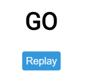
12.8.4、案例4—页面效果
12.9、效果示例8—在同一函数中同时移除class类(携带动画),然后添加同名class类,这样动画不会执行,最好将两种操作错开使用
12.9.1、代码示例——实现方案1(使用巧方法实现动画多次播放)
index.html:
<!DOCTYPE html>
<html lang="en">
  <head>
    <meta charset="UTF-8" />
    <meta name="viewport" content="width=device-width, initial-scale=1.0" />
    <link rel="stylesheet" href="style.css" />
    <title>Animated Countdown</title>
  </head>
  <body>
    <div class="counter">
      <div class="nums">
        <span class="in">3</span>
        <span>2</span>
        <span>1</span>
        <span>0</span>
      </div>
      <h4>Get Ready</h4>
    </div>

    <div class="final">
      <h1>GO</h1>
      <button id="replay">
        <span>Replay</span>
      </button>
    </div>
    <script src="script.js"></script>
  </body>
</html>
script.js:
const nums = document.querySelectorAll('.nums span')
const counter = document.querySelector('.counter')
const finalMessage = document.querySelector('.final')
const replay = document.querySelector('#replay')

runAnimation()

function resetDOM() {
  counter.classList.remove('hide')
  finalMessage.classList.remove('show')
  // 注意:在同一函数中同时移除class类(携带动画),然后添加同名class类,这样动画不会执行,最好将两种操作错开使用
  // 本次就是这么做的
  nums[0].classList.add('in')
}

function runAnimation() {
  nums.forEach((num) => {
    num.addEventListener('animationend', () => {
      // 移除动画状态,注意该步骤不能在resetDOM()中执行,原因如下:
      // 浏览器在同一个 tick 内看到:元素原本有 in → 移除 → 立即又加上 in。由于最终状态和初始状态没有变化,浏览器会优化掉这个操作,认为不需要重新运行动画(尤其是已经执行过动画的元素)。
      num.classList.remove('in')

      if (num.nextElementSibling) {
        num.nextElementSibling.classList.add('in')
      } else {

        // 移除动画状态,原因同上~
        counter.classList.add('hide')
        finalMessage.classList.add('show')
      }
    })
  })
}

replay.addEventListener('click', () => {
  resetDOM()
})
style.css:
  /* @import url('https://fonts.googleapis.com/css2?family=Roboto:wght@400;700&display=swap'); */

  * {
    box-sizing: border-box;
  }

  body {
    font-family: 'Roboto', sans-serif;
    margin: 0;
    height: 100vh;
    overflow: hidden;
  }

  h4 {
    font-size: 20px;
    margin: 5px;
    text-transform: uppercase;
  }

  .counter {
    position: fixed;
    top: 50%;
    left: 50%;
    transform: translate(-50%, -50%);
    text-align: center;
  }

  .counter.hide {
    transform: translate(-50%, -50%) scale(0);
    animation: hide 0.2s ease-out;
  }

  @keyframes hide {
    0% {
      transform: translate(-50%, -50%) scale(1);
    }

    100% {
      transform: translate(-50%, -50%) scale(0);
    }
  }

  .final {
    position: fixed;
    top: 50%;
    left: 50%;
    transform: translate(-50%, -50%) scale(0);
    text-align: center;
  }

  .final.show {
    transform: translate(-50%, -50%) scale(1);
    animation: show 0.2s ease-out;
  }

  @keyframes show {
    0% {
      transform: translate(-50%, -50%) scale(0);
    }

    30% {
      transform: translate(-50%, -50%) scale(1.4);
    }

    100% {
      transform: translate(-50%, -50%) scale(1);
    }
  }

  .nums {
    color: #3498db;
    font-size: 50px;
    position: relative;
    overflow: hidden;
    width: 250px;
    height: 50px;
  }

  .nums span {
    position: absolute;
    top: 50%;
    left: 50%;
    transform: translate(-50%, -50%) rotate(120deg);
    transform-origin: bottom center;
  }

  .nums span.in {
    animation: goIn 1s ease-in-out;
    -webkit-animation: goIn 1s ease-in-out;
  }

  @keyframes goIn {
    0% {
      transform: translate(-50%, -50%) rotate(120deg);
    }

    20% {
      transform: translate(-50%, -50%) rotate(-20deg);
    }

    30% {
      transform: translate(-50%, -50%) rotate(10deg);
    }

    50% {
      transform: translate(-50%, -50%) rotate(0deg);
    }

    80% {
      transform: translate(-50%, -50%) rotate(20deg);
    }

    100% {
      transform: translate(-50%, -50%) rotate(-120deg);
    }
  }

  #replay {
    background-color: #3498db;
    border-radius: 3px;
    border: none;
    color: aliceblue;
    padding: 5px;
    text-align: center;
    display: inline-block;
    cursor: pointer;
    transition: all 0.3s;
  }

  #replay span {
    cursor: pointer;
    display: inline-block;
    position: relative;
    transition: 0.3s;
  }

  #replay span:after {
    content: '\00bb';
    position: absolute;
    opacity: 0;
    top: 0;
    right: -20px;
    transition: 0.5s;
  }

  #replay:hover span {
    padding-right: 25px;
  }

  #replay:hover span:after {
    opacity: 1;
    right: 0;
  }
12.9.2、代码示例——实现方案2(使用笨方法实现动画多次播放)
index.html:
<!DOCTYPE html>
<html lang="en">
  <head>
    <meta charset="UTF-8" />
    <meta name="viewport" content="width=device-width, initial-scale=1.0" />
    <link rel="stylesheet" href="style.css" />
    <title>Animated Countdown</title>
  </head>
  <body>
    <div class="counter">
      <div class="nums">
        <span class="in">3</span>
        <span class="in">2</span>
        <span class="in">1</span>
        <span class="in">0</span>
      </div>
      <h4>Get Ready</h4>
    </div>

    <div class="final">
      <h1>GO</h1>
      <button id="replay">
        <span>Replay</span>
      </button>
    </div>
    <script src="script.js"></script>
  </body>
</html>
script.js:
const nums = document.querySelectorAll('.nums span')
const counter = document.querySelector('.counter')
const finalMessage = document.querySelector('.final')
const replay = document.querySelector('#replay')

runAnimation()

function resetDOM() {
  counter.classList.remove('hide')
  finalMessage.classList.remove('show')
  // 注意:在同一函数中同时移除class类(携带动画),然后添加同名class类,这样动画不会执行,最好将两种操作错开使用
  // 本次就是这么做的
  nums.forEach(num => {
    num.classList.add('in')
  })
}

function runAnimation() {
  document.querySelector('.nums span:last-child').addEventListener('animationend', () => {
    // 移除动画状态,注意该步骤不能在resetDOM()中执行,原因如下:
    // 浏览器在同一个 tick 内看到:元素原本有 in → 移除 → 立即又加上 in。由于最终状态和初始状态没有变化,浏览器会优化掉这个操作,认为不需要重新运行动画(尤其是已经执行过动画的元素)。
    nums.forEach(num => {
      num.classList.remove('in')
    })
    // 移除动画状态,原因同上~
    counter.classList.add('hide')
    finalMessage.classList.add('show')
  })
}

replay.addEventListener('click', () => {
  resetDOM()
})
style.css:
  /* @import url('https://fonts.googleapis.com/css2?family=Roboto:wght@400;700&display=swap'); */

  * {
    box-sizing: border-box;
  }

  body {
    font-family: 'Roboto', sans-serif;
    margin: 0;
    height: 100vh;
    overflow: hidden;
  }

  h4 {
    font-size: 20px;
    margin: 5px;
    text-transform: uppercase;
  }

  .counter {
    position: fixed;
    top: 50%;
    left: 50%;
    transform: translate(-50%, -50%);
    text-align: center;
  }

  .counter.hide {
    transform: translate(-50%, -50%) scale(0);
    animation: hide 0.2s ease-out;
  }

  @keyframes hide {
    0% {
      transform: translate(-50%, -50%) scale(1);
    }

    100% {
      transform: translate(-50%, -50%) scale(0);
    }
  }

  .final {
    position: fixed;
    top: 50%;
    left: 50%;
    transform: translate(-50%, -50%) scale(0);
    text-align: center;
  }

  .final.show {
    transform: translate(-50%, -50%) scale(1);
    animation: show 0.2s ease-out;
  }

  @keyframes show {
    0% {
      transform: translate(-50%, -50%) scale(0);
    }

    30% {
      transform: translate(-50%, -50%) scale(1.4);
    }

    100% {
      transform: translate(-50%, -50%) scale(1);
    }
  }

  .nums {
    color: #3498db;
    font-size: 50px;
    position: relative;
    overflow: hidden;
    width: 250px;
    height: 50px;
  }

  .nums span {
    position: absolute;
    top: 50%;
    left: 50%;
    transform: translate(-50%, -50%) rotate(120deg);
    transform-origin: bottom center;
  }

  .nums span.in {
    animation: goIn 1s ease-in-out;
  }

  .nums span:nth-child(2).in {
    animation-delay: 1s;
  }

  .nums span:nth-child(3).in {
    animation-delay: 2s;
  }

  .nums span:nth-child(4).in {
    animation-delay: 3s;
  }

  @keyframes goIn {
    0% {
      transform: translate(-50%, -50%) rotate(120deg);
    }

    20% {
      transform: translate(-50%, -50%) rotate(-20deg);
    }

    30% {
      transform: translate(-50%, -50%) rotate(10deg);
    }

    50% {
      transform: translate(-50%, -50%) rotate(0deg);
    }

    80% {
      transform: translate(-50%, -50%) rotate(20deg);
    }

    100% {
      transform: translate(-50%, -50%) rotate(-120deg);
    }
  }

  #replay {
    background-color: #3498db;
    border-radius: 3px;
    border: none;
    color: aliceblue;
    padding: 5px;
    text-align: center;
    display: inline-block;
    cursor: pointer;
    transition: all 0.3s;
  }

  #replay span {
    cursor: pointer;
    display: inline-block;
    position: relative;
    transition: 0.3s;
  }

  #replay span:after {
    content: '\00bb';
    position: absolute;
    opacity: 0;
    top: 0;
    right: -20px;
    transition: 0.5s;
  }

  #replay:hover span {
    padding-right: 25px;
  }

  #replay:hover span:after {
    opacity: 1;
    right: 0;
  }
12.9.3、页面效果
13、滤镜属性
13.1、核心定义
| 属性 | 作用对象 | 通俗理解 | 注意事项 |
|---|---|---|---|
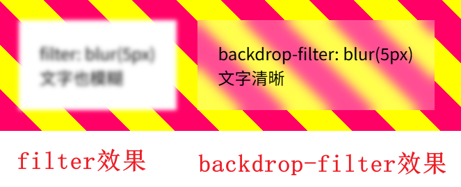
filter | 元素自身(包括内容、背景、边框、子元素) | “给自己化妆”——直接改变元素本身的视觉效果 | 无 |
backdrop-filter | 元素背后的区域(透过元素看到的一切,如父级背景、下层元素) | “给背景化妆”——透过当前元素看背后的内容被滤镜处理,但元素自身(文字、子元素)保持原样 | 背景颜色必须带有透明度,否则滤镜不起作用 |
两者语法完全相同,支持相同的滤镜函数,区别仅在于作用区域。
效果展示:
13.2、支持的滤镜函数(完整列表)
以下 10 个函数同时适用于 filter 和 backdrop-filter。
| 函数 | 效果描述 | 默认值 | 取值范围 | 示例 |
|---|---|---|---|---|
blur() | 高斯模糊。值越大越模糊。 | 0px | 长度单位(px, rem等),≥0 | blur(5px) |
brightness() | 亮度调整。0%全黑,100%原图,>100%更亮。 | 1 或 100% | 数字或百分比,≥0 | brightness(0.8) |
contrast() | 对比度调整。0%全灰,100%原图,>100%增强对比。 | 1 或 100% | 数字或百分比,≥0 | contrast(150%) |
grayscale() | 灰度转换(黑白)。0%原图,100%完全灰度。 | 0 或 0% | 数字(01)或百分比(0100%),超过100%等同100% | grayscale(70%) |
hue-rotate() | 色相旋转。0deg无变化,360deg转一圈。 | 0deg | 角度(deg, turn等),可负值 | hue-rotate(90deg) |
invert() | 颜色反转(负片)。0%无变化,100%完全反转。 | 0 或 0% | 数字(01)或百分比(0100%) | invert(80%) |
opacity() | 透明度。0%完全透明,100%不透明。 | 1 或 100% | 数字(01)或百分比(0100%) | opacity(0.5) |
saturate() | 饱和度调整。0%灰度,100%原图,>100%更鲜艳。 | 1 或 100% | 数字或百分比,≥0 | saturate(200%) |
sepia() | 棕褐色怀旧效果。0%原图,100%完全怀旧。 | 0 或 0% | 数字(01)或百分比(0100%) | sepia(60%) |
drop-shadow() | 阴影(跟随透明度)。参数:偏移X、偏移Y、模糊半径(可选)、颜色(可选)。不支持inset。 | 无 | 长度值+颜色 | drop-shadow(2px 2px 4px rgba(0,0,0,0.5)) |
url() | 引用SVG滤镜。 | 无 | url(#filter-id) | url(#blur) |
特殊值:none —— 移除了所有滤镜效果。
组合使用:空格分隔多个函数,按顺序应用。
filter: blur(2px) brightness(1.2) drop-shadow(2px 2px 4px black);
backdrop-filter: blur(8px) brightness(0.9) saturate(1.5);
13.3、filter vs backdrop-filter 详细对比
| 对比维度 | filter | backdrop-filter |
|---|---|---|
| 作用对象 | 元素自身(包括子元素、背景、边框) | 元素背后的所有内容(透过的背景/下层元素) |
| 对元素内文本/子元素影响 | 完全受影响(例如文字变模糊) | 不受影响,文字保持清晰 |
| 典型视觉效果 | 图片滤镜、灰度、模糊整个卡片、阴影 | 毛玻璃(磨砂玻璃)、背景调暗/调亮、实时背景滤镜 |
| 是否需要半透明背景配合 | 不需要(直接改变自身) | 通常需要 background-color: rgba(...) 才能看到背景变化 |
| 性能开销 | 较低,但大范围模糊仍有开销 | 相对较高(尤其是动态滚动时),因为需要实时合成背后内容 |
| 浏览器兼容性 | 现代浏览器全支持,IE 不支持 | Chrome 76+, Safari 9+, Firefox 103+;IE 及旧版 Edge 不支持 |
| 常见应用 | 图片处理、加载占位符、图标阴影、整体色调调整 | 导航栏毛玻璃、弹窗背景模糊、模态框遮罩、卡片玻璃效果 |
13.4、典型使用场景与代码示例
13.4.1、场景1:图片加载动画(filter)
代码示例:
<!DOCTYPE html>
<html lang="zh-CN">
<head>
    <meta charset="UTF-8">
    <meta name="viewport" content="width=device-width, initial-scale=1.0">
    <title>场景1:图片加载动画 - filter</title>
    <style>
        * {
            margin: 0;
            padding: 0;
            box-sizing: border-box;
        }
        body {
            background: #1a2a3a;
            display: flex;
            justify-content: center;
            align-items: center;
            min-height: 100vh;
            font-family: system-ui, sans-serif;
        }
        .card {
            background: white;
            border-radius: 24px;
            padding: 20px;
            text-align: center;
            box-shadow: 0 20px 35px rgba(0,0,0,0.2);
            width: 500px;
        }
        h3 {
            margin-bottom: 16px;
            color: #1e2a3e;
        }
        .img-wrapper {
            margin: 20px 0;
            overflow: hidden;
            border-radius: 16px;
        }
        img {
            width: 100%;
            display: block;
            filter: blur(30px);
            transition: filter 0.8s ease;
        }
        img.loaded {
            filter: blur(0);
        }
        button {
            background: #3b82f6;
            border: none;
            padding: 10px 24px;
            border-radius: 40px;
            color: white;
            font-size: 16px;
            cursor: pointer;
            margin-top: 10px;
            transition: 0.2s;
        }
        button:hover {
            background: #2563eb;
        }
        p {
            margin: 15px 0 0;
            font-size: 14px;
            color: #4b5563;
        }
    </style>
</head>
<body>
    <div class="card">
        <h3>📸 图片加载动画(filter: blur)</h3>
        <div class="img-wrapper">
            <img id="demoImg" src="https://picsum.photos/id/104/500/300" alt="示例图片">
        </div>
        <button id="loadBtn">模拟加载完成 → 变清晰</button>
        <p>初始模糊30px,点击按钮后模糊变为0,平滑过渡。</p>
    </div>
    <script>
        const img = document.getElementById('demoImg');
        const btn = document.getElementById('loadBtn');
        btn.addEventListener('click', () => {
            img.classList.add('loaded');
            btn.disabled = true;
            btn.textContent = '已加载完成';
        });
    </script>
</body>
</html>
页面效果:
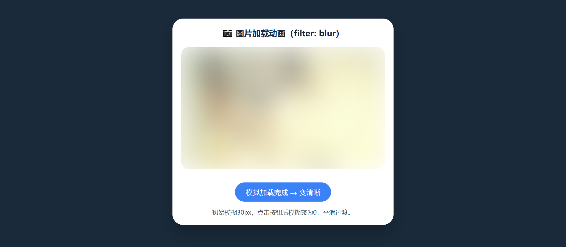
13.4.2、场景2:图片灰度/亮度 hover 效果(filter)
代码示例:
<!DOCTYPE html>
<html lang="zh-CN">
<head>
    <meta charset="UTF-8">
    <meta name="viewport" content="width=device-width, initial-scale=1.0">
    <title>场景2:图片hover滤镜 - filter</title>
    <style>
        * {
            margin: 0;
            padding: 0;
            box-sizing: border-box;
        }
        body {
            background: #0f172a;
            display: flex;
            justify-content: center;
            align-items: center;
            min-height: 100vh;
            font-family: system-ui, sans-serif;
        }
        .container {
            text-align: center;
        }
        h3 {
            color: white;
            margin-bottom: 24px;
            font-weight: 500;
        }
        .image-box {
            width: 400px;
            border-radius: 24px;
            overflow: hidden;
            box-shadow: 0 25px 40px rgba(0,0,0,0.3);
            transition: transform 0.2s;
        }
        .image-box img {
            width: 100%;
            display: block;
            transition: filter 0.4s ease;
            filter: grayscale(100%) brightness(1);
        }
        .image-box:hover img {
            filter: grayscale(0%) brightness(1.2);
        }
        .desc {
            margin-top: 24px;
            color: #cbd5e1;
            font-size: 14px;
        }
    </style>
</head>
<body>
    <div class="container">
        <h3>🎨 悬停图片:灰度 → 彩色+增亮</h3>
        <div class="image-box">
            <img src="https://picsum.photos/id/15/400/300" alt="风景">
        </div>
        <div class="desc">
            <p>默认:完全灰度 (grayscale 100%)</p>
            <p>鼠标悬停:移除灰度 + 亮度提升到 1.2 倍</p>
        </div>
    </div>
</body>
</html>
页面效果:
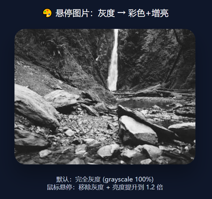
13.4.3、场景3:毛玻璃导航栏(backdrop-filter)
<!DOCTYPE html>
<html lang="zh-CN">
<head>
    <meta charset="UTF-8">
    <meta name="viewport" content="width=device-width, initial-scale=1.0">
    <title>场景3:毛玻璃导航栏 - backdrop-filter</title>
    <style>
        * {
            margin: 0;
            padding: 0;
            box-sizing: border-box;
        }
        body {
            font-family: system-ui, sans-serif;
            background: url('https://picsum.photos/id/131/1600/900') no-repeat center center/cover;
            min-height: 200vh; /* 让页面可滚动,观察毛玻璃跟随背景 */
        }
        /* 毛玻璃导航栏 */
        .navbar {
            position: fixed;
            top: 0;
            left: 0;
            width: 100%;
            background-color: rgba(255, 255, 255, 0.25);
            backdrop-filter: blur(12px);
            padding: 18px 32px;
            display: flex;
            justify-content: space-between;
            align-items: center;
            box-shadow: 0 4px 20px rgba(0,0,0,0.1);
            z-index: 1000;
        }
        .logo {
            font-size: 1.6rem;
            font-weight: bold;
            color: white;
            text-shadow: 0 1px 2px rgba(0,0,0,0.3);
        }
        .nav-links a {
            color: white;
            text-decoration: none;
            margin-left: 28px;
            font-weight: 500;
            transition: 0.2s;
            text-shadow: 0 1px 2px rgba(0,0,0,0.2);
        }
        .nav-links a:hover {
            color: #ffdd99;
        }
        .content {
            max-width: 800px;
            margin: 120px auto 40px;
            background: rgba(0,0,0,0.5);
            backdrop-filter: blur(4px);
            padding: 40px;
            border-radius: 32px;
            color: white;
            text-align: center;
        }
        h1 {
            font-size: 2.5rem;
            margin-bottom: 20px;
        }
        p {
            line-height: 1.6;
            font-size: 1.1rem;
        }
    </style>
</head>
<body>
    <nav class="navbar">
        <div class="logo">🌊 毛玻璃效果</div>
        <div class="nav-links">
            <a href="#">首页</a>
            <a href="#">探索</a>
            <a href="#">关于</a>
        </div>
    </nav>
    <div class="content">
        <h1>backdrop-filter: blur(12px)</h1>
        <p>导航栏使用了 backdrop-filter,背后的背景图片被实时模糊,但导航文字清晰可见。<br>
        滚动页面时,导航栏后的背景不断变化,模糊效果始终跟随,这就是毛玻璃(磨砂玻璃)的典型应用。</p>
    </div>
</body>
</html>
页面效果:
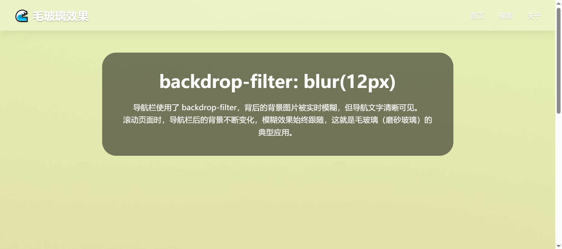
13.4.4、场景4:模态框背景模糊(backdrop-filter)
代码示例:
<!DOCTYPE html>
<html lang="zh-CN">
<head>
    <meta charset="UTF-8">
    <meta name="viewport" content="width=device-width, initial-scale=1.0">
    <title>场景4:模态框背景模糊 - backdrop-filter</title>
    <style>
        * {
            margin: 0;
            padding: 0;
            box-sizing: border-box;
        }
        body {
            font-family: system-ui, sans-serif;
            background: repeating-linear-gradient(45deg, #f43f5e, #f43f5e 40px, #facc15 40px, #facc15 80px);
            min-height: 100vh;
            display: flex;
            justify-content: center;
            align-items: center;
        }
        .open-btn {
            background: #1e293b;
            border: none;
            color: white;
            padding: 14px 32px;
            font-size: 18px;
            border-radius: 60px;
            cursor: pointer;
            font-weight: bold;
            box-shadow: 0 10px 20px rgba(0,0,0,0.2);
            transition: 0.2s;
        }
        .open-btn:hover {
            background: #0f172a;
            transform: scale(1.02);
        }
        /* 模态框遮罩 */
        .modal {
            display: none;
            position: fixed;
            top: 0;
            left: 0;
            width: 100%;
            height: 100%;
            background-color: rgba(0, 0, 0, 0.3);
            backdrop-filter: blur(8px) brightness(0.8);
            justify-content: center;
            align-items: center;
            z-index: 1000;
        }
        .modal-content {
            background: white;
            width: 380px;
            padding: 28px;
            border-radius: 32px;
            text-align: center;
            box-shadow: 0 25px 45px rgba(0,0,0,0.3);
        }
        .modal-content h2 {
            margin-bottom: 16px;
        }
        .modal-content p {
            margin-bottom: 24px;
            color: #334155;
        }
        .close-btn {
            background: #ef4444;
            border: none;
            padding: 8px 20px;
            border-radius: 40px;
            color: white;
            cursor: pointer;
            font-size: 14px;
        }
    </style>
</head>
<body>
    <button class="open-btn" id="openModalBtn">✨ 打开模态框</button>

    <div class="modal" id="myModal">
        <div class="modal-content">
            <h2>🔍 背景模糊效果</h2>
            <p>modal 的遮罩层使用了 <strong>backdrop-filter: blur(8px) brightness(0.8)</strong><br>
            背后的彩色条纹背景变得模糊且变暗,但弹窗内的文字和白色卡片保持清晰锐利。</p>
            <button class="close-btn" id="closeModalBtn">关闭</button>
        </div>
    </div>

    <script>
        const openBtn = document.getElementById('openModalBtn');
        const modal = document.getElementById('myModal');
        const closeBtn = document.getElementById('closeModalBtn');

        openBtn.addEventListener('click', () => {
            modal.style.display = 'flex';
        });
        closeBtn.addEventListener('click', () => {
            modal.style.display = 'none';
        });
        modal.addEventListener('click', (e) => {
            if (e.target === modal) modal.style.display = 'none';
        });
    </script>
</body>
</html>
页面效果:
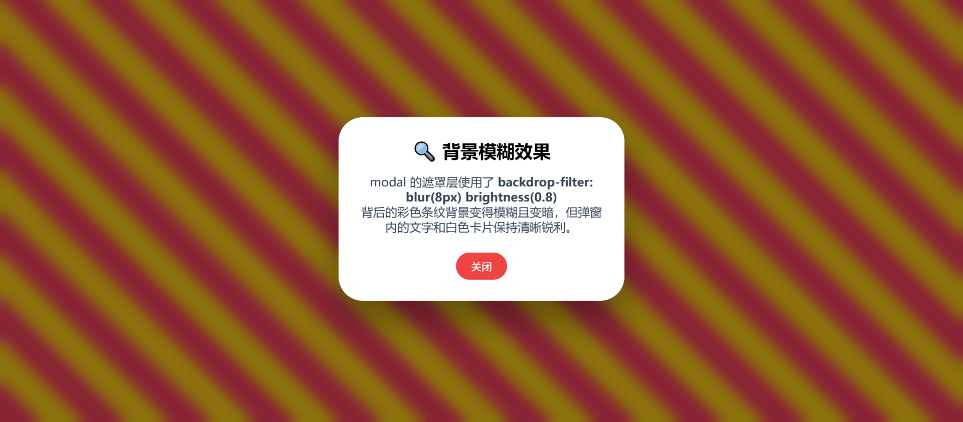
13.4.5、场景5:对比两者差异(直接可运行)
代码示例:
<!DOCTYPE html>
<html lang="zh-CN">
<head>
    <meta charset="UTF-8">
    <meta name="viewport" content="width=device-width, initial-scale=1.0">
    <title>场景5:filter vs backdrop-filter 直观对比</title>
    <style>
        * {
            margin: 0;
            padding: 0;
            box-sizing: border-box;
        }
        body {
            font-family: system-ui, sans-serif;
            background: repeating-linear-gradient(135deg, #ff8c00, #ff8c00 50px, #2ecc71 50px, #2ecc71 100px);
            min-height: 100vh;
            display: flex;
            justify-content: center;
            align-items: center;
            gap: 40px;
            flex-wrap: wrap;
            padding: 20px;
        }
        .card {
            width: 320px;
            background: rgba(255, 255, 255, 0.9);
            border-radius: 28px;
            padding: 28px;
            text-align: center;
            box-shadow: 0 20px 35px rgba(0,0,0,0.2);
            transition: all 0.2s;
        }
        .card h3 {
            margin-bottom: 16px;
            font-size: 1.6rem;
        }
        .card p {
            margin: 16px 0;
            line-height: 1.5;
            color: #2c3e50;
        }
        .filter-demo {
            filter: blur(6px);
            background: white;  /* 自身背景白色,但 blur 会使内部文字和背景都模糊 */
        }
        .backdrop-demo {
            backdrop-filter: blur(6px);
            background: rgba(255, 255, 255, 0.3);
        }
        .badge {
            display: inline-block;
            background: #1e293b;
            color: white;
            padding: 6px 14px;
            border-radius: 40px;
            font-size: 12px;
            margin-top: 12px;
        }
        .note {
            position: fixed;
            bottom: 15px;
            left: 0;
            right: 0;
            text-align: center;
            background: rgba(0,0,0,0.6);
            color: white;
            padding: 6px;
            font-size: 13px;
        }
    </style>
</head>
<body>
    <div class="card filter-demo">
        <h3>filter: blur(6px)</h3>
        <p>整个卡片(包括文字、背景、边框)都被模糊了。<br>📢 文字看不清,白色背景也模糊。</p>
        <div class="badge">作用于自身</div>
    </div>

    <div class="card backdrop-demo">
        <h3>backdrop-filter: blur(6px)</h3>
        <p>卡片背后的彩色条纹背景被模糊了,<br>✨ 但卡片内的文字和白色半透明背景依然清晰。</p>
        <div class="badge">作用于背后区域</div>
    </div>

    <div class="note">
        💡 左侧卡片:文字模糊;右侧卡片:文字清晰,背景(背后的条纹)模糊 —— 这就是两者的核心区别。
    </div>
</body>
</html>
页面效果:
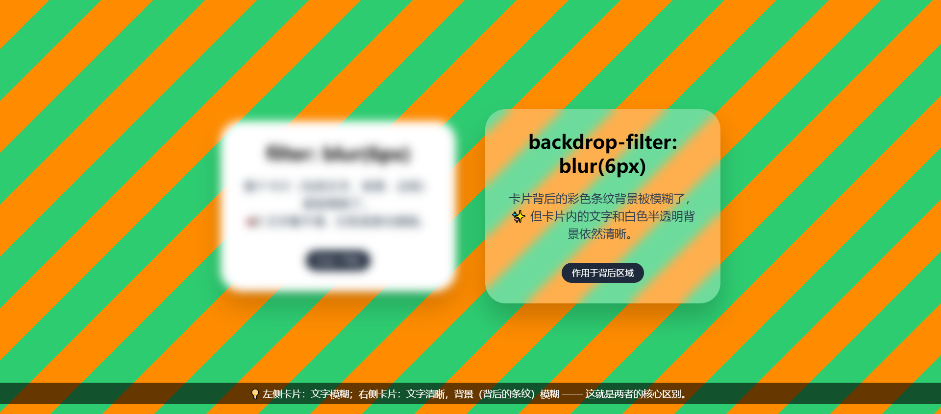
13.5、注意事项
- 性能:
backdrop-filter: blur()开销较大,避免在滚动或频繁重绘的区域使用过大的模糊半径。 - 背景配合:
backdrop-filter通常需要配合半透明背景色(background-color: rgba(…)),否则仅滤镜可能效果不明显。 - 层叠上下文:两者都会为元素创建新的层叠上下文,可能影响 z-index 排序。
drop-shadow与box-shadow区别:box-shadow投射元素边框形状的阴影。drop-shadow投射元素内容(包含透明区域)的真实阴影,适合 PNG 图标、不规则形状。
- 滤镜顺序:多个滤镜按声明的顺序依次处理。例如
filter: blur(2px) brightness(1.5)先模糊再提亮,交换顺序结果不同。 - 负值与超范围:
blur()、brightness()、contrast()、saturate()不支持负值,brightness(0)为全黑。hue-rotate()支持负值(反向旋转)。grayscale(200%)等同100%,但brightness(200%)有效。
- 兼容性处理:对于
backdrop-filter,旧浏览器可提供降级方案(如纯色背景或filter代替)。 url()滤镜:需要配合 SVG<filter>元素使用,可实现更复杂的特效(如波纹、颜色矩阵等)。
13.6、一句话记忆
filter:给自己化妆(涂脸) —— 改变自己。backdrop-filter:给背景化妆(透过玻璃看世界) —— 改变背后的风景。
两者语法相同,区别只在于是作用于自身还是背后。掌握这一点,就能灵活创造各种视觉效果。
更多推荐
 0
0 0
0- 0


 已为社区贡献5条内容

所有评论(0)