
css3超详细笔记
一、盒阴影
box-shadow用于在元素的框架上添加阴影效果。阴影的X轴偏移量、Y轴偏移量、模糊半径、扩散半径和颜色。
box-shadow:h-shadow v-shadow blur spread color inset;
h-shadow:(水平阴影)正值右,负值左。必需
v-shadow:(垂直阴影)正值下,负值上。必需
blur:模糊距离。可选,值越大,模糊面积越大,阴影就越大越淡。
spread:阴影扩展。必需,取正值时,阴影扩大;取负值时,阴影收缩。
color:颜色。可选
inset:内部阴影。可选
注:默认外部阴影(outset),不写
<!DOCTYPE html>
<html lang="en">
<head>
    <meta charset="UTF-8">
    <meta name="viewport" content="width=device-width, initial-scale=1.0">
    <title>Document</title>
    <style>
        .one {
            width: 100px;
            height: 100px;
            background-color: red;
            box-shadow: 7px -9px 3px 10px rgba(0,0,0,0.5) inset;
        }
        .two {
            width: 100px;
            height: 100px;
            background-color: red;
            /* 任意数量的阴影,以逗号分隔 */
            box-shadow: 3px 3px red, -1em 0 0.4em olive;
        }
       .three {
            width: 100px;
            height: 100px;
            background-color: red;
            /* 插页(阴影向内) | x偏移量 | y偏移量 | 阴影颜色 */
            box-shadow: inset 5em 1em gold;
        }
       .four {
            width: 100px;
            height: 100px;
            background-color: red;
            /* 插页(阴影向内) | x偏移量 | y偏移量 | 阴影颜色 */
            box-shadow: -3px 2px 1px 7px gold;
            border-radius: 30px 20px 5px 15px;
        }
    </style>
</head>

<body>
    <div class="one"></div>
    <br />
    <div class="two"></div>
    <br />
    <div class="three"></div>
    <br />
    <div class="four"></div>
</body>
</html>
二、圆角
border-radius 可以给元素的四角添加圆角效果,从而使元素看起来更加柔和和美观。
- 四个值: 第一个值为左上角,第二个值为右上角,第三个值为右下角,第四个值为左下角。(顺时针走向)
- 三个值: 第一个值为左上角, 第二个值为右上角和左下角,第三个值为右下角
- 两个值: 第一个值为左上角与右下角,第二个值为右上角与左下角(对角)
- 一个值: 四个圆角值相同
分写属性:border-top-left-radius、border-top-right-radius、border-bottom-right-radius、border-bottom-left-radius
<!DOCTYPE html>
<html lang="en">

<head>
    <meta charset="UTF-8">
    <meta name="viewport" content="width=device-width, initial-scale=1.0">
    <title>Document</title>
    <style>
        .one {
            width: 100px;
            height: 100px;
            background-color: red;
            box-shadow: 7px -9px 3px 10px rgba(0,0,0,0.5) inset;
            border-radius: 50%;
        }
        .two {
            width: 100px;
            height: 100px;
            background-color: red;
            /* 任意数量的阴影,以逗号分隔 */
            box-shadow: 3px 3px yellow, -1em 0 0.4em olive;
            border-radius: 20px 10px;
        }
       .three {
            width: 100px;
            height: 100px;
            background-color: red;
            /* 插页(阴影向内) | x偏移量 | y偏移量 | 阴影颜色 */
            box-shadow: inset 5em 1em gold;
            border-radius: 30px 20px 5px;
        }
        .four {
            width: 100px;
            height: 100px;
            background-color: red;
            /* 插页(阴影向内) | x偏移量 | y偏移量 | 阴影颜色 */
            box-shadow: -3px 2px 1px 7px gold;
            border-radius: 30px 20px 5px 15px;
        }
    </style>
</head>

<body>
    <div class="one"></div>
    <br />
    <div class="two"></div>
    <br />
    <div class="three"></div>
    <br />
    <div class="four"></div>
</body>

</html>
三、文本:
text-shadow:用于给文本添加阴影效果,可以只设置两个值(垂直和水平阴影大小),也可以是设置三个值(包括模糊值),也可以设置全部值。可以设置多个阴影效果,只需用逗号分隔每个阴影的参数。eg:
text-shadow: 2px 2px 5px rgba(0, 0, 0, 0.5), -2px -2px 5px rgba(255, 255, 255, 0.5);
text-shadow: h-offset v-offset blur color;
| 属性 | 描述 |
| h-offset | 设置文本水平方向阴影,单位可以是px、pt、cm、em等 |
| v-offest | 设置文本垂直方向阴影,单位可以是px、pt、cm、em等 |
| blur | 设置阴影的模糊效果,单位可以是px、pt、cm、em等 |
| color | 设置文本阴影的颜色,可以是颜色名、rgb、hex、hsl等形式表示的颜色 |
<!DOCTYPE html>
<html lang="en">
<head>
<meta charset="UTF-8">
<meta name="viewport" content="width=device-width, initial-scale=1.0">
<title>CSS Shadow Example</title>
<style>
  .t1{font-size:2.5em;text-shadow:2px 2px;}
  .t2{font-size:2.5em;text-shadow:2pt 2pt 0.2em;}
  .t3{font-size:2.5em;text-shadow:0.5cm 0.5cm 5px skyblue;}
</style>
</head>
<body>
    <p class='t1'>只设置垂直和水平阴影大小</p>
    <p class='t2'>设置三个值,包括模糊值</p>
    <p class='t3'>设置全部值,包括颜色</p>

</body>
</html>white-space:用于设置如何处理元素内的空白字符(在其他字符之间提供水平或垂直空间的字符,主要有:换行,空格,TAB等。)。
- normal :默认值,所有 空白 都会被替换为 一个空格 来表示,在适当位置折行来适应容器宽度
- pre:preserve: 保留、维持原样。所有的 空白 都会被保留
- nowrap:所有 空白 都会被替换为 一个空格 来表示,内容不折行(内容中有<br />标签的位置会折行)
- pre-wrap:所有 空白 都会被保留,但在适当位置会折行来适应容器宽度
- pre-line:所有 空白除换行外 都会被替换为 一个空格,但在适当位置会折行来适应容器宽度
break-spaces: 这个和pre-wrap基本相同,但是保留所有空白,每个保留的空白的地方都能因为太长而自动换行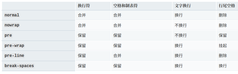
text-overflow:用于定义当文本超出其容器宽度时如何显示(文本溢出)。它通常与overflow和white-space属性结合使用,以实现预期的效果。
- clip:剪切文本,不显示省略号。
- ellipsis:显示省略号(...)来表示省略的文本。
- string:自定义省略符号,可以是任何字符串。(字符串内容将被添加在内容区域(由内容边界限制,容纳着元素的“真实”内容)中,所以会减少显示出的文本。如果空间太小以至于连字符串本身都容纳不下,那么这个字符串也会被截断。)
<!DOCTYPE html>
<html lang="en">

<head>
    <meta charset="UTF-8">
    <meta name="viewport" content="width=device-width, initial-scale=1.0">
    <title>CSS Shadow Example</title>
    <style>
        .box p{
            width: 200px;
            text-overflow: ellipsis;
            overflow: hidden;
            white-space: nowrap;
        }
    </style>
</head>

<body>

    <div class="box">
        <p>
            Lorem ipsum dolor sit amet, consectetur adipiscing elit, sed do eiusmod
            tempor incididunt ut labore et dolore magna aliqua. Ut enim ad minim veniam,
            quis nostrud exercitation ullamco laboris nisi ut aliquip ex ea commodo
            consequat. Duis aute irure dolor in reprehenderit in voluptate velit esse
            cillum dolore eu fugiat nulla pariatur. Excepteur sint occaecat cupidatat
            non proident, sunt in culpa qui officia deserunt mollit anim id est laborum.
        </p>
    </div>


</body>

</html>
四、2D转换
- transform:translate()平移:将元素沿着X轴或Y轴移动(translateX();translateY();)px
- transform:rotate()旋转:元素的旋转角度。正数角度表示顺时针旋转,负数则表示逆时针旋转。deg
- transform:scale()缩放:改变元素的尺寸。倍数缩放。scaleX()、scaleY 可以设置转换中心点缩放,默认以中心点缩放,而且不影响其他盒子。数字:大于1放大,小于1缩小。
- transform:skew()倾斜:元素的倾斜角度。沿着X轴或Y轴倾斜sckewX()、sckewY()
多个变换可以通过空格分隔
<!DOCTYPE html>
<html lang="en">
  <head>
    <meta charset="UTF-8">
    <style>
      *{
        margin: 0;
        padding: 0;
      }
      div{
        width: 100px;
        height: 100px;
        background-color: #f00;
        margin: 10px 0;
      }
      .box1{
        transform: translate(100px, 0);
      }
      .box2{
        transform: rotate(45deg);
      }
      .box3{
        transform: scale(1,0.5);
      }
      .box4{
        transform: skew(-45deg, 45deg);
      }
      .box5{
        transform: translate(300px, 0) rotate(45deg) scale(0.8, 0.8) skew(45deg);
      }
    </style>
  </head>
  <body>
    <div class="box1"></div>
    <div class="box2"></div>
    <div class="box3"></div>
    <div class="box4"></div>
    <div class="box5"></div>
  </body>
</html>
五、3D转换
近大远小、物体和面遮挡不可见
坐标系:
- x 轴:水平向右 -- 注意:x 轴右边是正值,左边是负值
- y 轴:垂直向下 -- 注意:y 轴下面是正值,上面是负值
- z 轴:垂直屏幕 -- 注意:往外边的是正值,往里面的是负值
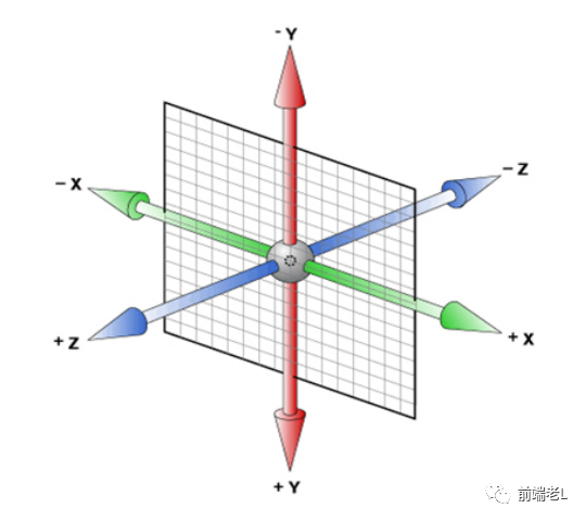
transform:translate3d(x,y,z):在 2D 移动的基础上多加了一个可以移动的方向,就是 z 轴方向
注意:x, y, z 对应的值不能省略,不需要填写用 0 进行填充,代表长度,px
transform:scale3d(x,y,z):在3D空间中调整元素大小的转换。数字,代表缩放
transform:rotate3d(x,y,z,angle):将元素围绕固定轴移动而不使其变形。运动量由指定的角度定义; 如果为正,运动将为顺时针,如果为负,则为逆时针。x,y,z:0-1之间(确定旋转点) angle:角度
<!DOCTYPE html>
<html lang="en">

<head>
    <meta charset="UTF-8">
    <style>
        * {
            margin: 0;
            padding: 0;
        }

        body {
            perspective: 500px;
        }

        div {
            width: 100px;
            height: 100px;
            background-color: #f00;
            margin: 10px 0;
        }

        .box1:hover {
            transition: all 3s;
            /* 平移 px */
            transform: translate3d(-100px, 300px, -100px);
        }

        .box2:hover {
            transition: all 3s;
            /* transform: rotateX(360deg); */
            /* transform: rotateY(360deg); */
            /* transform: rotateZ(360deg); */
            /* 旋转 0-1, 旋转点角度 */
            transform: rotate3d(0.5, 0.8, 0.2, 360deg);
        }
        .box3:hover {
            transition: all 3s;
            /* 缩放 数字代表缩放倍数 */
            transform: scale3d(1, 0.5, 1.5);
        }

        .box4 {
            transform: skew(-45deg, 45deg);
        }

        .box5:hover {
            transition: all 3s;
            /* transform: translate(300px, 0) rotate(45deg) scale(0.8, 0.8) skew(45deg); */
            transform: scale3d(1.5, 1.5, 1.5)   translate3d(300px, 0, 0) rotate3d(0, 0, 1, 45deg);
        }
    </style>
</head>

<body>
    <div class="box1"></div>
    <div class="box2"></div>
    <div class="box3"></div>
    <div class="box4"></div>
    <div class="box5"></div>

</body>

</html>transform-origin:变换原点(原点就是发生变换的轴点)。设置偏移值都是从左上角开始的;默认为:transform-origin:center center;top,bottom,center,left,right/px、em、%
transform-origin 属性,请查看这个演示。
3D变换效果需要通过设置父元素样式才能保留3d的变化效果
保留3d变换:transform-style:preserve-3d(此属性指定了嵌套元素在3D空间中的呈现方式。)/
| 值 | 描述 |
| flat | 默认值。子元素不会保留其 3D 位置。 |
| preserve-3d | 子元素将保留其 3D 位置。 |
| initial | 将此属性设置为其默认值。请参阅 initial。 |
| inherit | 从其父元素继承此属性。请参阅 inherit。 |
设置视角深度(透视):perspective:1000px(此属性定义了观察者与z=0平面的距离,即透视距离。)视距大,呈现小。透视是写在被观察元素的父盒子里的
- d:就是视距,视距就是指人的眼睛到屏幕的距离
- z:就是 z 轴,z 轴越大(正值),我们看到的物体就越大
六、动画
keyframes 用于创建动画、用于定义动画关键帧的规则。指定动画在不同时间点的状态,浏览器会自动平滑地过渡这些状态之间的变化。
使用 @keyframes 规则来定义关键帧,规定动画。
animation:所有动画属性的简写属性
「动画属性(Animation Properties)」 :
animation-name:指定动画的名称,对应@keyframes规则的名称。animation-duration:规定动画完成一个周期所花费的秒或毫秒。默认是 0。animation-timing-function:动画的速度曲线。默认是 "ease"。animation-delay:动画开始前的延迟时间(何时开始)。默认是0animation-iteration-count:动画的重复次数。默认是1/infiniteanimation-direction:动画的方向(规定动画是否在下一周期逆向地播放)。默认是 "normal"。animation-fill-mode:动画结束后的状态。animation-play-state:动画的播放状态(动画是否正在运行或暂停)。默认是 "running"。
<!DOCTYPE html>
<html lang="en">

<head>
    <meta charset="UTF-8">
    <meta name="viewport" content="width=device-width, initial-scale=1.0">
    <title>Document</title>
    <style>
        p {
            animation-duration: 3s;
            animation-name: slidein;
        }

        @keyframes slidein {
            from {
                margin-left: 100%;
                width: 300%;
            }

            to {
                margin-left: 0%;
                width: 100%;
            }
        }
    </style>
</head>
<body>
    <p>
        The Caterpillar and Alice looked at each other for some time in silence: at
        last the Caterpillar took the hookah out of its mouth, and addressed her in a
        languid, sleepy voice.
    </p>

</body>
</html>
七、过渡
从一种样式状态平滑过渡到另一种样式状态的动画效果,经常和 :hover :active 一起搭配使用。当元素的指定样式属性发生变化时,transition会自动为其添加一个过渡动画,而非立即跳变。
- transition: property duration timing-function delay;
- transition: 要过渡的属性 花费时间 运动曲线 何时开始;
property指定参与过渡动画的CSS属性。可以是单个属性名,也可以是多个属性名组成的列表。
/* 单个属性 */
.transition-element {
  transition-property: background-color;
}

/* 多个属性 */
.smooth-transition {
  transition-property: opacity, transform;
}duration定义过渡动画的持续时间,以秒(s)或毫秒(ms)为单位。- timing-function决定了过渡过程中速度的变化模式,如匀速、加速、减速等。常用的值包括:
ease(默认):开始和结束时慢,中间快。
linear:匀速过渡。
ease-in:开始时慢,然后逐渐加快。
ease-out:开始时快,然后逐渐减慢。
ease-in-out:开始和结束时慢,中间快。
cubic-bezier(n,n,n,n):自定义贝塞尔曲线。
delay设置过渡动画开始前的等待时间,同样以秒(s)或毫秒(ms)为单位。
<!DOCTYPE html>
<html lang="en">
<head>
  <meta charset="UTF-8">
  <style>
    .box {
      width: 100px;
      height: 100px;
      background-color: lightgreen;
      transition: background-color 0.3s ease, transform 0.5s cubic-bezier(0.25, 0.¼, 0.75, 0.9);
    }

    .box:hover {
      background-color: darkgreen;
      transform: scale(1.1);
      width: 200px;
    }
  </style>
</head>
<body>
  <div class="box"></div>
</body>
</html>
八、盒子大小(了解)
box-sizing用于指定盒模型的类型,即元素的总宽度是内容宽度加上内边距和边框,还是包括内容的宽度、内边距、边框和外边距的总和。
- content-box(默认值):表示元素的宽度和高度仅包括内容区域,不包括内边距、边框和外边距。也就是说,元素的宽度和高度值只是内容的大小,不包括内边距、边框和外边距。
尺寸计算公式:
width= 内容的宽度height= 内容的高度
宽度和高度的计算值都不包含内容的边框(border)和内边距(padding)。
- border-box:表示元素的宽度和高度包括内容区域、内边距和边框,但不包括外边距。也就是说,元素的宽度和高度值是包括内边距、边框和内容的总和,而不是仅仅内容的大小。
尺寸计算公式:
width= border + padding + 内容的宽度height= border + padding + 内容的高度
盒模型的大小计算方式不同,会直接影响到元素的布局和样式设计。因此,在进行 CSS 布局和样式设计时,需要根据实际需要选择合适的盒模型计算方式,并且注意元素的内边距、边框和外边距对元素的大小和位置产生的影响。
<!DOCTYPE html>
<html lang="en">

<head>
    <meta charset="UTF-8">
    <style>
        .box1 {
            box-sizing: content-box;
            width: 100px;
            height: 100px;
            padding: 10px;
            border: 1px solid black;
            margin: 10px;
            background: red;
        }

        /* 使用 border-box 计算元素的宽度和高度 */
        .box2 {
            box-sizing: border-box;
            width: 100px;
            height: 100px;
            padding: 10px;
            border: 1px solid black;
            margin: 10px;
            background: green;
        }
    </style>
</head>

<body>
    <div class="box1"></div>
    <div class="box2"></div>
</body>

</html>
九、媒体查询
https://www.yuque.com/semmering/hgmstz/psmhg7kcs450t324?singleDoc#
媒体查询允许开发者根据不同的设备特性或者屏幕条件来应用不同的样式。基于一系列的表达式,这些表达式涉及到设备的特定特征,如视口宽度、高度、设备方向(横屏或竖屏)以及分辨率等
基本语法:
@media mediatype and|not|only (mediafeature) {
CSS-Code;
}
- mediatype:媒体类型,如screen(屏幕)、print(打印)all:(所有媒体类型)、screen(屏幕设备)、speech(语音合成器)等。
- mediafeature:媒体特性,如width(宽度)、height(高度)、min-width(最小视口宽度)、max-width(最大视口宽度)、orientation(屏幕方向)(portrait或landscape)等。https://www.w3school.com.cn/css/css3_mediaqueries_ex.asp
<!DOCTYPE html>
<html>
<head>
<title>Page Title</title>
<meta charset="UTF-8">
<meta name="viewport" content="width=device-width, initial-scale=1">
<style>
* {
  box-sizing: border-box;
}

/* 设置 body 的样式 */
body {
  font-family: Arial;
  margin: 0;
}

/* 页眉/LOGO */
.header {
  padding: 60px;
  text-align: center;
  background: #1abc9c;
  color: white;
}

/* 设置顶部导航栏的样式 */
.navbar {
  display: flex;
  background-color: #333;
}

/* 设置导航栏链接的样式 */
.navbar a {
  color: white;
  padding: 14px 20px;
  text-decoration: none;
  text-align: center;
}

/* 悬停时改变颜色 */
.navbar a:hover {
  background-color: #ddd;
  color: black;
}

/* 列容器 */
.row {
  display: flex;
  flex-wrap: wrap;
}

/* 创建两个彼此相邻的不相等的列 */
/* 侧栏/左侧列 */
.side {
  flex: 30%;
  background-color: #f1f1f1;
  padding: 20px;
}

/* 主列 */
.main {
  flex: 70%;
  background-color: white;
  padding: 20px;
}

/* 伪图像,仅用于此例 */
.fakeimg {
  background-color: #aaa;
  width: 100%;
  padding: 20px;
}

/* 页脚 */
.footer {
  padding: 20px;
  text-align: center;
  background: #ddd;
}

/* 响应式布局 - 当屏幕宽度小于 700 像素时,使两列相互堆叠,而不是彼此相邻 */
@media screen and (max-width: 700px) {
  .row, .navbar {
    flex-direction: column;
  }
}
</style>
</head>
<body>

<!-- Note -->
<div style="background:yellow;padding:5px">
  <h4 style="text-align:center">请调整浏览器窗口的大小以查看响应效果。</h4>
</div>

<!-- Header -->
<div class="header">
  <h1>My Website</h1>
  <p>With a <b>flexible</b> layout.</p>
</div>

<!-- Navigation Bar -->
<div class="navbar">
  <a href="#">Link</a>
  <a href="#">Link</a>
  <a href="#">Link</a>
  <a href="#">Link</a>
</div>

<!-- The flexible grid (content) -->
<div class="row">
  <div class="side">
    <h2>About Me</h2>
    <h5>Photo of me:</h5>
    <div class="fakeimg" style="height:200px;">Image</div>
    <p>Some text about me in culpa qui officia deserunt mollit anim..</p>
    <h3>More Text</h3>
    <p>Lorem ipsum dolor sit ame.</p>
    <div class="fakeimg" style="height:60px;">Image</div><br>
    <div class="fakeimg" style="height:60px;">Image</div><br>
    <div class="fakeimg" style="height:60px;">Image</div>
  </div>
  <div class="main">
    <h2>TITLE HEADING</h2>
    <h5>Title description, Dec 7, 2017</h5>
    <div class="fakeimg" style="height:200px;">Image</div>
    <p>Some text..</p>
    <p>Sunt in culpa qui officia deserunt mollit anim id est laborum consectetur adipiscing elit, sed do eiusmod tempor incididunt ut labore et dolore magna aliqua. Ut enim ad minim veniam, quis nostrud exercitation ullamco.</p>
    <br>
    <h2>TITLE HEADING</h2>
    <h5>Title description, Sep 2, 2017</h5>
    <div class="fakeimg" style="height:200px;">Image</div>
    <p>Some text..</p>
    <p>Sunt in culpa qui officia deserunt mollit anim id est laborum consectetur adipiscing elit, sed do eiusmod tempor incididunt ut labore et dolore magna aliqua. Ut enim ad minim veniam, quis nostrud exercitation ullamco.</p>
  </div>
</div>

<!-- Footer -->
<div class="footer">
  <h2>Footer</h2>
</div>

</body>
</html>
什么是CSS媒体查询
CSS 媒体查询是一种技术,用来根据设备的特性(如屏幕大小、分辨率、方向等)应用不同的 CSS 样式。它常用于响应式设计,确保网页在各种设备上都有良好的显示效果。
媒体查询的作用
- 响应式设计:根据设备的不同,调整页面布局和样式。
- 提高用户体验:让网页在手机、平板、电脑等设备上都适配。
- 减少代码冗余:只需一套 CSS,动态适配不同设备。
媒体查询的基本语法
@media 媒体类型 (条件) {
  /* 针对满足条件的设备应用的 CSS 样式 */
  选择器 {
    属性: 值;
  }
}
常用媒体类型
all:适用于所有设备(默认)。screen:适用于屏幕显示设备。print:适用于打印设备。
注意:媒体类型用来描述设备的一般类别。除非使用 not 或 only 逻辑运算符,否则媒体类型是可选的,并且会(隐式地)应用 all 类型。
body {
	background-color: lightblue;
}
/* 屏幕宽度 >= 768px 时应用 */
@media  (min-width: 768px) {
	body {
		background-color: lightgreen;
	}
}

/* 屏幕宽度 < 760px 时应用 */
@media (max-width: 760px) {
	body {
		background-color: lightcoral;
	}
}

@media screen and (760px <=width <860px) {
	body {
		background: red;
	}
}
条件
媒体查询的条件通常基于设备特性,如宽度、高度、分辨率等:
min-width:设备宽度大于等于指定值时生效。max-width:设备宽度小于等于指定值时生效。orientation:设备方向(如portrait纵向,landscape横向)。
媒体查询-逻辑运算符
逻辑运算符(logical operator)not、and、only 和 or 可用于联合构造复杂的媒体查询,你还可以通过用逗号分隔多个媒体查询,将它们组合为一个规则。
and
用于将多个媒体查询规则组合成单条媒体查询,当每个查询规则都为真时则该条媒体查询为 true,它还用于将媒体特性与媒体类型结合在一起。
/* 屏幕宽度 >= 700px 并且 屏幕宽度 < 800px时应用 */
@media screen and (min-width: 700px) and (max-width: 800px) {
  body {
    background-color: red;
  }
}
not
用于否定媒体查询,如果不满足这个条件则返回 true,否则返回 false。如果出现在以逗号分隔的查询列表中,它将仅否定应用了该查询的特定查询。如果使用 not 运算符,则还必须指定媒体类型。
注意: 在第 3 版中,not 关键字不能用于否定单个媒体特性表达式,而只能用于否定整个媒体查询。
@media not screen {
	body {
		background-color: red;
	}
}
only
仅在整个查询匹配时才应用样式。这对于防止较老的浏览器应用所选样式很有用。当不使用 only 时,较老的浏览器会将 screen and (max-width: 500px) 简单地解释为 screen,忽略查询的其余部分,并将其样式应用于所有屏幕。如果使用 only 运算符,则还必须指定媒体类型。
@media only screen and (max-width: 760px) {
	body {
		background-color: lightcoral;
	}
}
,(逗号)
逗号用于将多个媒体查询合并为一个规则。逗号分隔列表中的每个查询都与其他查询分开处理。因此,如果列表中的任何查询为true,则整个媒体查询语句返回true。换句话说,列表的行为类似于逻辑或(or)运算符。
or
等价于 , 运算符
注意点
- 组合条件: 使用
and、not、,等逻辑运算符:
-
and:多个条件同时满足。not:条件不满足时生效。,:多个条件中只需满足一个即可。
- 优先级问题: 媒体查询的优先级依赖于条件的覆盖关系,以及 CSS 的具体选择器优先级。
- 支持性: 媒体查询在大多数现代浏览器中都受支持,但某些特性可能需要额外注意兼容性。
十、弹性布局
https://www.yuque.com/semmering/hgmstz/sa1pgkgohbgk8e36?singleDoc#Flex布局
Flex 提供了一种更加高效的方式来布局、对齐和分配容器内项目的空间,即使它们的大小是未知或者动态变化的,任何一个容器都可以指定为 Flex 布局。采用 Flex 布局的元素,称为 Flex 容器(flex container),简称"容器"。它的所有子元素自动成为容器成员,称为 Flex 项目(flex item),简称"项目"。容器默认存在两根轴:水平的主轴(main axis)和垂直的交叉轴/侧轴(cross axis)。主轴的开始位置(与边框的交叉点)叫做main start,结束位置叫做main end;交叉轴的开始位置叫做cross start,结束位置叫做cross end。
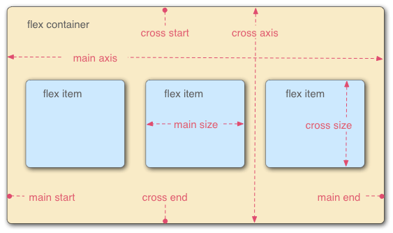
display:flex/inline-flex(行内元素)。设为 Flex 布局以后,子元素的float、clear和vertical-align属性将失效。
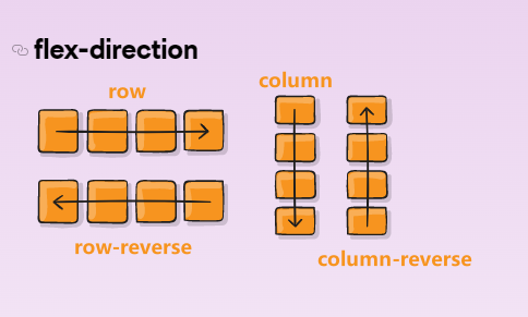
flex-direction:决定主轴的方向(即项目的排列方向)
row(默认值):主轴为水平方向,起点在左端。row-reverse:主轴为水平方向,起点在右端。column:主轴为垂直方向,起点在上沿。column-reverse:主轴为垂直方向,起点在下沿。
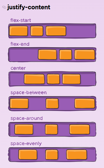
justify-content :定义了项目在主轴的对齐方式
flex-start(默认值):左对齐flex-end:右对齐center:居中space-between:两端对齐,items之间的间隔都相等。space-around:每个items两侧的间隔相等。所以,items之间的间隔比items与边框的间隔大一倍。space-evenly:每个items之间的间隔相等。
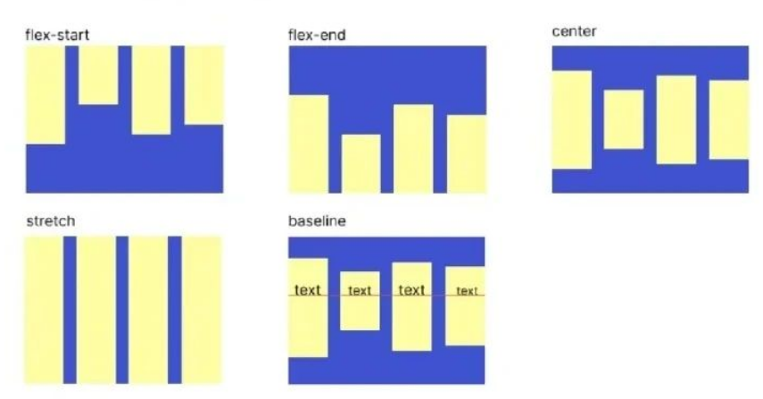
align-items:定义项目在交叉轴上如何对齐。(侧轴)
flex-start:交叉轴的起点对齐。flex-end:交叉轴的终点对齐。center:交叉轴的中点对齐。baseline: 以items里第一行文字的基线对齐。stretch(默认值):如果items未设置高度或设为auto,将占满整个容器的高度。
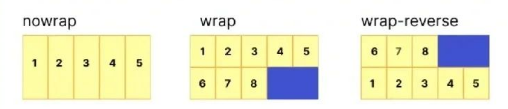
flex-wrap:定义如果一条轴线排不下,如何换行。
- nowrap:默认值,不换行
- wrap:换行,第一行在上方,正序排放
- wrap-reverse:换行,第一行在下方,倒序排放
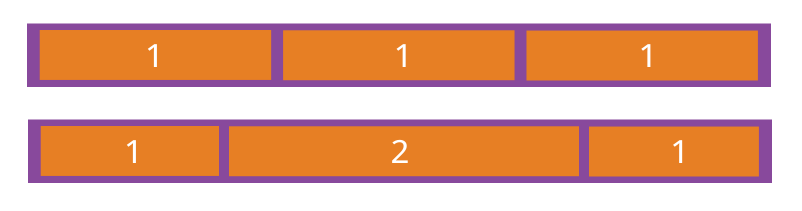
flex-grow:定义项目的放大比例,默认为0,即如果存在剩余空间,也不放大。
如果所有项目的flex-grow属性都为1,则它们将等分剩余空间(如果有的话)。如果一个项目的flex-grow属性为2,其他项目都为1,则前者占据的剩余空间将比其他项多一倍。
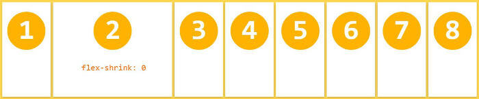
flex-shrink:定义了项目的缩小比例,默认为1,即如果空间不足,该项目将缩小。
.item {
  flex-shrink: <number>; /* default 1 */
}如果所有项目的flex-shrink属性都为1,当空间不足时,都将等比例缩小。如果一个项目的flex-shrink属性为0,其他项目都为1,则空间不足时,前者不缩小。
更多推荐
 29
29 0
0- 0


 已为社区贡献1条内容

所有评论(0)