
Grid-「容器级整体对齐」「项目级单元格内对齐」「单个项目自定义对齐」三大类
详细拆解 Grid 布局的每一种对齐方式,并且为每个对齐属性都提供独立、可运行的完整实例,按照「容器级整体对齐」「项目级单元格内对齐」「单个项目自定义对齐」三大类,逐一讲解 Grid 对齐属性,每个属性都配专属实例,帮你彻底理解 Grid 的对齐逻辑。
Grid 布局对齐核心逻辑回顾
Grid 是二维布局,对齐分为两个维度:
- 容器级对齐:控制「整个网格内容区」在 Grid 容器中的位置(针对容器留白)。
- 项目级对齐:控制「单个项目」在其所属单元格内的位置(针对单元格留白)。
核心对齐轴: inline/row轴:水平方向(也叫行轴)。block/column轴:垂直方向(也叫列轴)。
一、容器级整体对齐(控制整个网格内容区在容器中的位置)
这类属性作用于 Grid 容器,当网格内容区的总尺寸 < 容器尺寸时生效,核心是 justify-content(行轴)、align-content(列轴)、place-content(简写)。
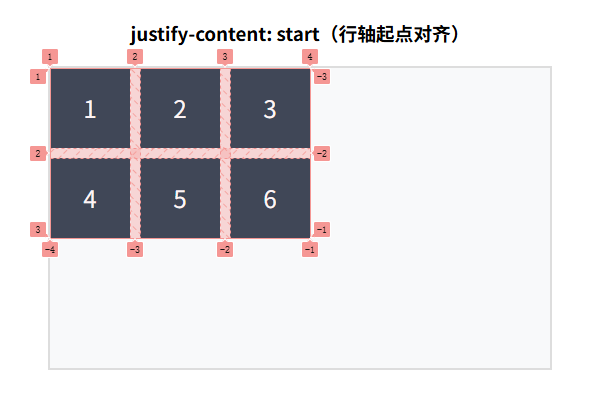
1. justify-content: start(默认值)
效果:网格内容区靠行轴(水平)起点对齐(靠左)。
<!DOCTYPE html>
<html lang="zh-CN">
<head>
    <meta charset="UTF-8">
    <title>justify-content: start</title>
    <style>
        .grid-container {
            width: 500px; /* 容器宽度远大于网格内容区 */
            height: 300px;
            border: 2px solid #ddd;
            margin: 20px auto;
            display: grid;
            /* 定义网格:3列80px,2行80px */
            grid-template-columns: 80px 80px 80px;
            grid-template-rows: 80px 80px;
            gap: 10px; /* 项目间距 */
            /* 容器级行轴对齐:起点 */
            justify-content: start;
            background: #f8f9fa;
        }
        .grid-item {
            background: #2c3e50;
            color: white;
            text-align: center;
            line-height: 80px;
            font-size: 24px;
        }
    </style>
</head>
<body>
    <h3 style="text-align: center;">justify-content: start(行轴起点对齐)</h3>
    <div class="grid-container">
        <div class="grid-item">1</div>
        <div class="grid-item">2</div>
        <div class="grid-item">3</div>
        <div class="grid-item">4</div>
        <div class="grid-item">5</div>
        <div class="grid-item">6</div>
    </div>
</body>
</html>
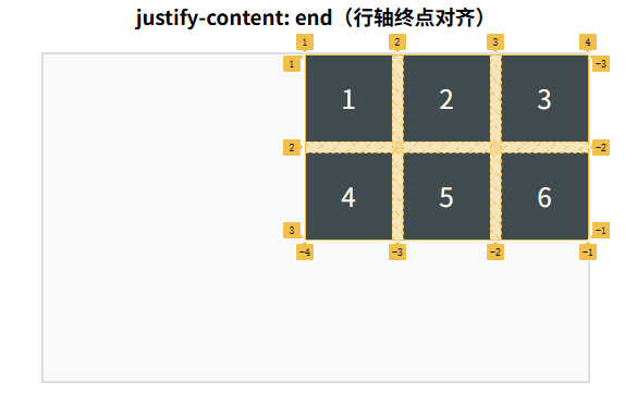
2. justify-content: end
效果:网格内容区靠行轴(水平)终点对齐(靠右)。
<!DOCTYPE html>
<html lang="zh-CN">
<head>
    <meta charset="UTF-8">
    <title>justify-content: end</title>
    <style>
        .grid-container {
            width: 500px;
            height: 300px;
            border: 2px solid #ddd;
            margin: 20px auto;
            display: grid;
            grid-template-columns: 80px 80px 80px;
            grid-template-rows: 80px 80px;
            gap: 10px;
            /* 容器级行轴对齐:终点 */
            justify-content: end;
            background: #f8f9fa;
        }
        .grid-item {
            background: #2c3e50;
            color: white;
            text-align: center;
            line-height: 80px;
            font-size: 24px;
        }
    </style>
</head>
<body>
    <h3 style="text-align: center;">justify-content: end(行轴终点对齐)</h3>
    <div class="grid-container">
        <div class="grid-item">1</div>
        <div class="grid-item">2</div>
        <div class="grid-item">3</div>
        <div class="grid-item">4</div>
        <div class="grid-item">5</div>
        <div class="grid-item">6</div>
    </div>
</body>
</html>
3. justify-content: center
效果:网格内容区在行轴(水平)居中对齐。
<!DOCTYPE html>
<html lang="zh-CN">
<head>
    <meta charset="UTF-8">
    <title>justify-content: center</title>
    <style>
        .grid-container {
            width: 500px;
            height: 300px;
            border: 2px solid #ddd;
            margin: 20px auto;
            display: grid;
            grid-template-columns: 80px 80px 80px;
            grid-template-rows: 80px 80px;
            gap: 10px;
            /* 容器级行轴对齐:居中 */
            justify-content: center;
            background: #f8f9fa;
        }
        .grid-item {
            background: #2c3e50;
            color: white;
            text-align: center;
            line-height: 80px;
            font-size: 24px;
        }
    </style>
</head>
<body>
    <h3 style="text-align: center;">justify-content: center(行轴居中对齐)</h3>
    <div class="grid-container">
        <div class="grid-item">1</div>
        <div class="grid-item">2</div>
        <div class="grid-item">3</div>
        <div class="grid-item">4</div>
        <div class="grid-item">5</div>
        <div class="grid-item">6</div>
    </div>
</body>
</html>
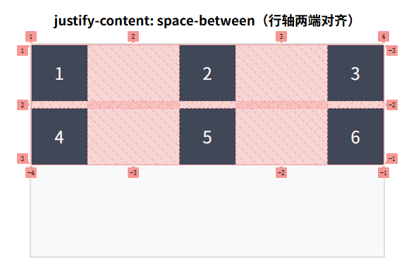
4. justify-content: space-between
效果:网格内容区行轴两端对齐,列之间间距相等,边缘无间距。
<!DOCTYPE html>
<html lang="zh-CN">
<head>
    <meta charset="UTF-8">
    <title>justify-content: space-between</title>
    <style>
        .grid-container {
            width: 500px;
            height: 300px;
            border: 2px solid #ddd;
            margin: 20px auto;
            display: grid;
            grid-template-columns: 80px 80px 80px;
            grid-template-rows: 80px 80px;
            gap: 10px;
            /* 容器级行轴对齐:两端对齐 */
            justify-content: space-between;
            background: #f8f9fa;
        }
        .grid-item {
            background: #2c3e50;
            color: white;
            text-align: center;
            line-height: 80px;
            font-size: 24px;
        }
    </style>
</head>
<body>
    <h3 style="text-align: center;">justify-content: space-between(行轴两端对齐)</h3>
    <div class="grid-container">
        <div class="grid-item">1</div>
        <div class="grid-item">2</div>
        <div class="grid-item">3</div>
        <div class="grid-item">4</div>
        <div class="grid-item">5</div>
        <div class="grid-item">6</div>
    </div>
</body>
</html>
5. justify-content: space-around
效果:网格列两侧间距相等,列间距 = 边缘间距 × 2。
<!DOCTYPE html>
<html lang="zh-CN">
<head>
    <meta charset="UTF-8">
    <title>justify-content: space-around</title>
    <style>
        .grid-container {
            width: 500px;
            height: 300px;
            border: 2px solid #ddd;
            margin: 20px auto;
            display: grid;
            grid-template-columns: 80px 80px 80px;
            grid-template-rows: 80px 80px;
            gap: 10px;
            /* 容器级行轴对齐:环绕分布 */
            justify-content: space-around;
            background: #f8f9fa;
        }
        .grid-item {
            background: #2c3e50;
            color: white;
            text-align: center;
            line-height: 80px;
            font-size: 24px;
        }
    </style>
</head>
<body>
    <h3 style="text-align: center;">justify-content: space-around(行轴环绕对齐)</h3>
    <div class="grid-container">
        <div class="grid-item">1</div>
        <div class="grid-item">2</div>
        <div class="grid-item">3</div>
        <div class="grid-item">4</div>
        <div class="grid-item">5</div>
        <div class="grid-item">6</div>
    </div>
</body>
</html>
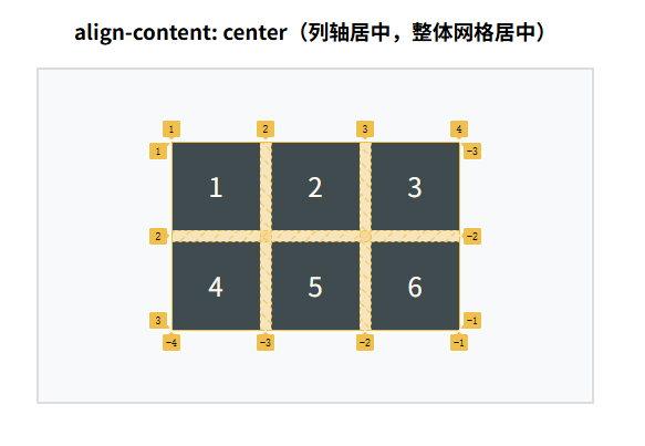
6. align-content: center(列轴居中,容器级)
效果:网格内容区在列轴(垂直)居中对齐(搭配 justify-content: center 实现整体居中)。
<!DOCTYPE html>
<html lang="zh-CN">
<head>
    <meta charset="UTF-8">
    <title>align-content: center</title>
    <style>
        .grid-container {
            width: 500px;
            height: 300px;
            border: 2px solid #ddd;
            margin: 20px auto;
            display: grid;
            grid-template-columns: 80px 80px 80px;
            grid-template-rows: 80px 80px;
            gap: 10px;
            /* 行轴+列轴都居中:整个网格内容区在容器中水平垂直居中 */
            justify-content: center;
            align-content: center;
            background: #f8f9fa;
        }
        .grid-item {
            background: #2c3e50;
            color: white;
            text-align: center;
            line-height: 80px;
            font-size: 24px;
        }
    </style>
</head>
<body>
    <h3 style="text-align: center;">align-content: center(列轴居中,整体网格居中)</h3>
    <div class="grid-container">
        <div class="grid-item">1</div>
        <div class="grid-item">2</div>
        <div class="grid-item">3</div>
        <div class="grid-item">4</div>
        <div class="grid-item">5</div>
        <div class="grid-item">6</div>
    </div>
</body>
</html>
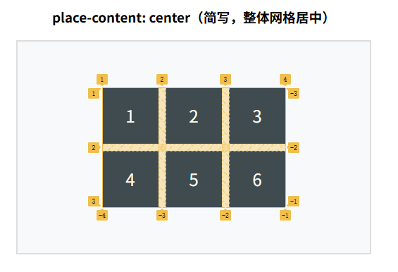
7. place-content: center(简写,同时设置行轴+列轴居中)
效果:place-content 是 justify-content + align-content 的简写,一行实现整体网格居中。
<!DOCTYPE html>
<html lang="zh-CN">
<head>
    <meta charset="UTF-8">
    <title>place-content: center</title>
    <style>
        .grid-container {
            width: 500px;
            height: 300px;
            border: 2px solid #ddd;
            margin: 20px auto;
            display: grid;
            grid-template-columns: 80px 80px 80px;
            grid-template-rows: 80px 80px;
            gap: 10px;
            /* 简写:行轴+列轴同时居中 */
            place-content: center;
            background: #f8f9fa;
        }
        .grid-item {
            background: #2c3e50;
            color: white;
            text-align: center;
            line-height: 80px;
            font-size: 24px;
        }
    </style>
</head>
<body>
    <h3 style="text-align: center;">place-content: center(简写,整体网格居中)</h3>
    <div class="grid-container">
        <div class="grid-item">1</div>
        <div class="grid-item">2</div>
        <div class="grid-item">3</div>
        <div class="grid-item">4</div>
        <div class="grid-item">5</div>
        <div class="grid-item">6</div>
    </div>
</body>
</html>
二、项目级单元格内对齐(控制项目在单元格中的位置)
这类属性作用于 Grid 容器,控制所有项目在其所属单元格内的对齐,核心是 justify-items(行轴)、align-items(列轴)、place-items(简写)。
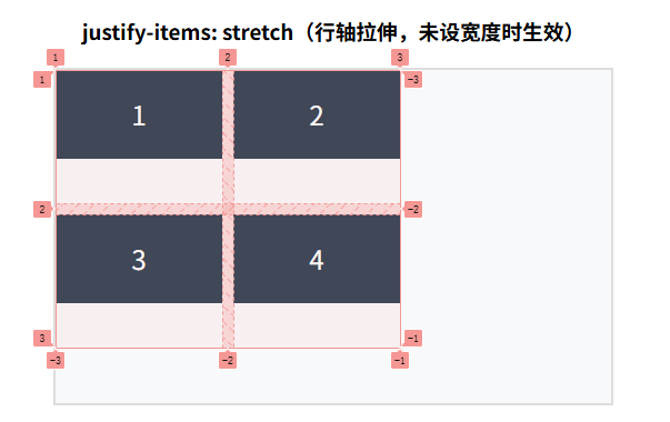
1. justify-items: stretch(默认值)
效果:项目拉伸至填满单元格的行轴宽度(未设宽度时生效)。
<!DOCTYPE html>
<html lang="zh-CN">
<head>
    <meta charset="UTF-8">
    <title>justify-items: stretch</title>
    <style>
        .grid-container {
            width: 500px;
            height: 300px;
            border: 2px solid #ddd;
            margin: 20px auto;
            display: grid;
            /* 定义单元格尺寸:每列150px,每行120px */
            grid-template-columns: 150px 150px;
            grid-template-rows: 120px 120px;
            gap: 10px;
            /* 项目级行轴对齐:拉伸(默认) */
            justify-items: stretch;
            background: #f8f9fa;
        }
        .grid-item {
            /* 故意不设宽度,看拉伸效果 */
            height: 80px;
            background: #2c3e50;
            color: white;
            text-align: center;
            line-height: 80px;
            font-size: 24px;
        }
    </style>
</head>
<body>
    <h3 style="text-align: center;">justify-items: stretch(行轴拉伸,未设宽度时生效)</h3>
    <div class="grid-container">
        <div class="grid-item">1</div>
        <div class="grid-item">2</div>
        <div class="grid-item">3</div>
        <div class="grid-item">4</div>
    </div>
</body>
</html>
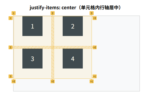
2. justify-items: center
效果:所有项目在单元格内的行轴(水平)居中对齐。
<!DOCTYPE html>
<html lang="zh-CN">
<head>
    <meta charset="UTF-8">
    <title>justify-items: center</title>
    <style>
        .grid-container {
            width: 500px;
            height: 300px;
            border: 2px solid #ddd;
            margin: 20px auto;
            display: grid;
            grid-template-columns: 150px 150px;
            grid-template-rows: 120px 120px;
            gap: 10px;
            /* 项目级行轴对齐:居中 */
            justify-items: center;
            background: #f8f9fa;
        }
        .grid-item {
            width: 80px;
            height: 80px;
            background: #2c3e50;
            color: white;
            text-align: center;
            line-height: 80px;
            font-size: 24px;
        }
    </style>
</head>
<body>
    <h3 style="text-align: center;">justify-items: center(单元格内行轴居中)</h3>
    <div class="grid-container">
        <div class="grid-item">1</div>
        <div class="grid-item">2</div>
        <div class="grid-item">3</div>
        <div class="grid-item">4</div>
    </div>
</body>
</html>
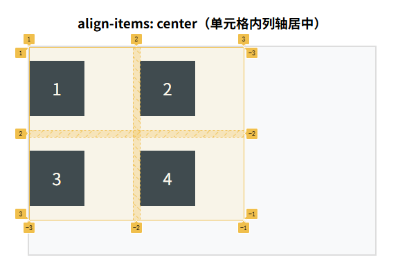
3. align-items: center
效果:所有项目在单元格内的列轴(垂直)居中对齐。
<!DOCTYPE html>
<html lang="zh-CN">
<head>
    <meta charset="UTF-8">
    <title>align-items: center</title>
    <style>
        .grid-container {
            width: 500px;
            height: 300px;
            border: 2px solid #ddd;
            margin: 20px auto;
            display: grid;
            grid-template-columns: 150px 150px;
            grid-template-rows: 120px 120px;
            gap: 10px;
            /* 项目级列轴对齐:居中 */
            align-items: center;
            background: #f8f9fa;
        }
        .grid-item {
            width: 80px;
            height: 80px;
            background: #2c3e50;
            color: white;
            text-align: center;
            line-height: 80px;
            font-size: 24px;
        }
    </style>
</head>
<body>
    <h3 style="text-align: center;">align-items: center(单元格内列轴居中)</h3>
    <div class="grid-container">
        <div class="grid-item">1</div>
        <div class="grid-item">2</div>
        <div class="grid-item">3</div>
        <div class="grid-item">4</div>
    </div>
</body>
</html>
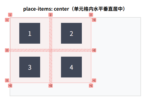
4. place-items: center(简写,单元格内水平+垂直居中)
效果:place-items 是 justify-items + align-items 的简写,一行实现所有项目在单元格内居中。
<!DOCTYPE html>
<html lang="zh-CN">
<head>
    <meta charset="UTF-8">
    <title>place-items: center</title>
    <style>
        .grid-container {
            width: 500px;
            height: 300px;
            border: 2px solid #ddd;
            margin: 20px auto;
            display: grid;
            grid-template-columns: 150px 150px;
            grid-template-rows: 120px 120px;
            gap: 10px;
            /* 简写:单元格内水平+垂直居中 */
            place-items: center;
            background: #f8f9fa;
        }
        .grid-item {
            width: 80px;
            height: 80px;
            background: #2c3e50;
            color: white;
            text-align: center;
            line-height: 80px;
            font-size: 24px;
        }
    </style>
</head>
<body>
    <h3 style="text-align: center;">place-items: center(单元格内水平垂直居中)</h3>
    <div class="grid-container">
        <div class="grid-item">1</div>
        <div class="grid-item">2</div>
        <div class="grid-item">3</div>
        <div class="grid-item">4</div>
    </div>
</body>
</html>
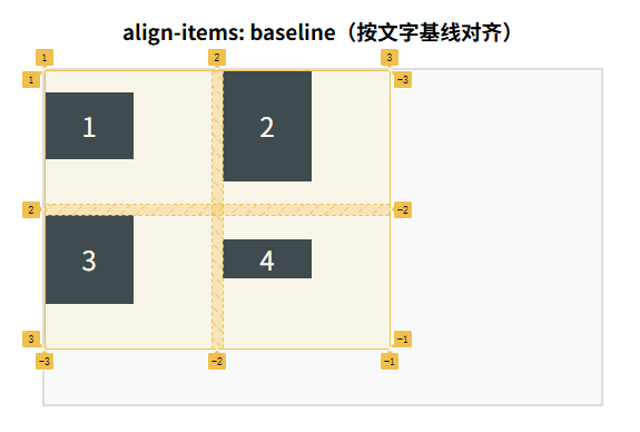
5. align-items: baseline
效果:项目按文字基线对齐(即使单元格尺寸不同,文字基线也对齐)。
<!DOCTYPE html>
<html lang="zh-CN">
<head>
    <meta charset="UTF-8">
    <title>align-items: baseline</title>
    <style>
        .grid-container {
            width: 500px;
            height: 300px;
            border: 2px solid #ddd;
            margin: 20px auto;
            display: grid;
            grid-template-columns: 150px 150px;
            grid-template-rows: 120px 120px;
            gap: 10px;
            /* 项目级列轴对齐:基线 */
            align-items: baseline;
            background: #f8f9fa;
        }
        .grid-item {
            width: 80px;
            background: #2c3e50;
            color: white;
            text-align: center;
            font-size: 24px;
        }
        .item1 { height: 60px; line-height: 60px; }
        .item2 { height: 100px; line-height: 100px; }
        .item3 { height: 80px; line-height: 80px; }
    </style>
</head>
<body>
    <h3 style="text-align: center;">align-items: baseline(按文字基线对齐)</h3>
    <div class="grid-container">
        <div class="grid-item item1">1</div>
        <div class="grid-item item2">2</div>
        <div class="grid-item item3">3</div>
        <div class="grid-item">4</div>
    </div>
</body>
</html>
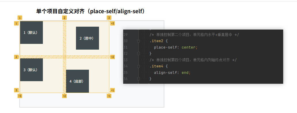
三、单个项目自定义对齐(覆盖容器的项目级对齐)
这类属性作用于 Grid 项目,单独控制某个项目在其单元格内的对齐,核心是 justify-self(行轴)、align-self(列轴)、place-self(简写)。
<!DOCTYPE html>
<html lang="zh-CN">
<head>
    <meta charset="UTF-8">
    <title>单个项目自定义对齐(justify-self/align-self)</title>
    <style>
        .grid-container {
            width: 500px;
            height: 300px;
            border: 2px solid #ddd;
            margin: 20px auto;
            display: grid;
            grid-template-columns: 150px 150px;
            grid-template-rows: 120px 120px;
            gap: 10px;
            /* 容器默认:单元格内起点对齐 */
            place-items: start;
            background: #f8f9fa;
        }
        .grid-item {
            width: 80px;
            height: 80px;
            background: #2c3e50;
            color: white;
            text-align: center;
            line-height: 80px;
            font-size: 24px;
        }
        /* 单独控制第二个项目:单元格内水平+垂直居中 */
        .item2 {
            place-self: center;
        }
        /* 单独控制第四个项目:单元格内列轴终点对齐 */
        .item4 {
            align-self: end;
        }
    </style>
</head>
<body>
    <h3 style="text-align: center;">单个项目自定义对齐(place-self/align-self)</h3>
    <div class="grid-container">
        <div class="grid-item">1(默认)</div>
        <div class="grid-item item2">2(居中)</div>
        <div class="grid-item">3(默认)</div>
        <div class="grid-item item4">4(底部)</div>
    </div>
</body>
</html>
你想了解 Grid 布局中 justify-self、align-self 和 place-self 这三个针对单个网格项的对齐属性,它们和之前讲的 justify-content/align-content 核心区别是:后者作用于整个网格轨道,而这三个只作用于单个网格项在其所属单元格内的对齐方式,我会用清晰的示例帮你掌握。
首先明确关键区别(新手最易混淆):
| 属性类别 | 作用对象 | 生效条件 |
|---|---|---|
justify-self | 单个网格项(水平方向) | 网格项尺寸 < 其所在单元格的尺寸 |
align-self | 单个网格项(垂直方向) | 网格项尺寸 < 其所在单元格的尺寸 |
place-self | 单个网格项(简写属性) | 同上 |
简单说:网格项会被分配一个「单元格」,这三个属性控制网格项在这个单元格内部的水平/垂直对齐,而非整个网格的对齐。
完整示例代码
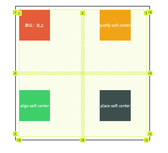
这个示例创建 2×2 的网格容器,给每个单元格设置固定尺寸,通过不同对齐属性展示单个网格项的对齐效果:
<!DOCTYPE html>
<html lang="zh-CN">
<head>
  <meta charset="UTF-8">
  <meta name="viewport" content="width=device-width, initial-scale=1.0">
  <title>Grid self 对齐属性示例</title>
  <style>
    /* 网格容器:2列2行,每个单元格宽高均为200px */
    .grid-container {
      display: grid;
      grid-template-columns: 200px 200px;
      grid-template-rows: 200px 200px;
      gap: 10px;
      width: 410px;
      margin: 20px auto;
      border: 2px solid #333;
      padding: 10px;
    }

    /* 通用网格项样式:宽高仅100px(小于单元格200px,对齐效果才生效) */
    .grid-item {
      width: 100px;
      height: 100px;
      background-color: #42b983;
      color: white;
      font-size: 18px;
      text-align: center;
      line-height: 100px;
    }

    /* 1. 默认对齐:水平左对齐(justify-self: start)、垂直上对齐(align-self: start) */
    .item1 {
      background-color: #e74c3c;
    }

    /* 2. 水平居中(justify-self: center)、垂直默认上对齐 */
    .item2 {
      justify-self: center;
      background-color: #f39c12;
    }

    /* 3. 水平默认左对齐、垂直居中(align-self: center) */
    .item3 {
      align-self: center;
      background-color: #2ecc71;
    }

    /* 4. 简写属性:水平+垂直都居中(place-self: center) */
    .item4 {
      place-self: center;
      background-color: #2c3e50;
    }
  </style>
</head>
<body>
  <div class="grid-container">
    <div class="grid-item item1">默认:左上</div>
    <div class="grid-item item2">justify-self: center</div>
    <div class="grid-item item3">align-self: center</div>
    <div class="grid-item item4">place-self: center</div>
  </div>
</body>
</html>
-
生效前提:示例中网格项宽高是 100px,而单元格宽高是 200px,单元格有多余空间,对齐属性才能体现效果;如果网格项尺寸和单元格一致,对齐属性不会有任何变化。
-
常用取值(三个属性通用):
start:水平/垂直靠单元格的起始边(左/上,默认值);center:水平/垂直居中;end:水平/垂直靠单元格的结束边(右/下);stretch:拉伸网格项填满整个单元格(如果网格项没设置宽/高,默认值是stretch)。
-
简写属性
place-self:- 语法:
place-self: <align-self> <justify-self>; - 单值写法:
place-self: center→ 等价于align-self: center+justify-self: center; - 双值写法:
place-self: end center→ 等价于align-self: end(垂直靠下) +justify-self: center(水平居中)。
- 语法:
总结
- 容器级对齐(content):控制「整个网格内容区」在容器中的位置,
place-content: center实现整体网格居中,需网格尺寸 < 容器尺寸才生效。 - 项目级对齐(items):控制「所有项目」在单元格内的位置,
place-items: center是最常用的单元格内居中方式,优先级高于容器级对齐。 - 单个项目对齐(self):
place-self可单独修改某个项目的单元格内对齐,覆盖容器的place-items设置,灵活度最高。 - 核心区分:
content管「网格整体」,items管「所有项目」,self管「单个项目」,记住这三个层级就能掌握 Grid 对齐的核心逻辑。
你可以将每个实例代码单独保存为 HTML 文件运行,直观对比不同属性的效果,也可以修改属性值(比如把 center 换成 end),快速理解 Grid 对齐的规律。
更多推荐
 12
12 0
0- 0


 已为社区贡献4条内容

所有评论(0)