
HarmonyOS6 Flex 容器完整使用文档
·
文章目录
Flex 是 HarmonyOS ArkUI 提供的弹性布局容器,基于标准 Flex 弹性盒模型设计,用于实现子组件的水平/垂直排列、自动换行、对齐、间距分配等布局能力。
它是 HarmonyOS 开发中最常用、最灵活、性能最优的布局容器,适用于绝大多数线性、流式、自适应页面布局。
一、Flex 容器核心接口
Flex(options?: {
  direction?: FlexDirection;    // 主轴方向
  wrap?: FlexWrap;              // 换行模式
  justifyContent?: FlexAlign;   // 主轴对齐
  alignItems?: ItemAlign;       // 交叉轴对齐
  alignContent?: FlexAlign;     // 多行内容对齐
})
1. direction(主轴方向)
FlexDirection.Row(默认):水平从左到右FlexDirection.Column:垂直从上到下
2. wrap(换行模式)
FlexWrap.Nowrap(默认):不换行FlexWrap.Wrap:自动换行
3. justifyContent(主轴对齐)
FlexAlign.Start:起点对齐FlexAlign.Center:居中FlexAlign.End:终点对齐FlexAlign.SpaceBetween:两端对齐FlexAlign.SpaceAround:均匀分布
4. alignItems(交叉轴对齐)
ItemAlign.Start:顶部/左侧对齐ItemAlign.Center:居中ItemAlign.End:底部/右侧对齐ItemAlign.Stretch:拉伸填充
二、完整可运行代码
@Entry
@Component
struct FlexFullExample {
  build() {
    // 最外层套 Scroll,确保页面可滑动
    Scroll() {
      Column({ space: 20 }) {
        Text("Flex 容器完整示例(可滑动版)")
          .fontSize(24)
          .fontWeight(FontWeight.Bold)
          .margin({ top: 20 });

        // 1. 默认水平排列
        Text("1. 默认 Flex(水平排列)").fontSize(16).width("100%");
        Flex() {
          Text("1").width(70).height(70).backgroundColor(Color.Red)
          Text("2").width(70).height(70).backgroundColor(Color.Green)
          Text("3").width(70).height(70).backgroundColor(Color.Blue)
        }
        .width("100%")
        .height(90)
        .backgroundColor("#f5f5f5");

        // 2. 水平方向 Row
        Text("2. 方向:水平 Row").fontSize(16).width("100%");
        Flex({ direction: FlexDirection.Row }) {
          Text("A").width(60).height(60).backgroundColor(Color.Red)
          Text("B").width(60).height(60).backgroundColor(Color.Green)
        }
        .width("100%")
        .height(80)
        .backgroundColor("#f5f5f5");

        // 3. 垂直方向 Column
        Text("3. 方向:垂直 Column").fontSize(16).width("100%");
        Flex({ direction: FlexDirection.Column }) {
          Text("A").width(60).height(60).backgroundColor(Color.Red)
          Text("B").width(60).height(60).backgroundColor(Color.Green)
        }
        .width("100%")
        .height(140)
        .backgroundColor("#f5f5f5");

        // 4. 主轴对齐 SpaceBetween
        Text("4. 主轴对齐:两端对齐").fontSize(16).width("100%");
        Flex({ justifyContent: FlexAlign.SpaceBetween }) {
          Text("1").width(60).height(60).backgroundColor(Color.Red)
          Text("2").width(60).height(60).backgroundColor(Color.Green)
        }
        .width("100%")
        .height(80)
        .backgroundColor("#f5f5f5");

        // 5. 交叉轴居中
        Text("5. 交叉轴对齐:Center").fontSize(16).width("100%");
        Flex({ alignItems: ItemAlign.Center }) {
          Text("Short").height(40).backgroundColor(Color.Red)
          Text("Long Text").height(70).backgroundColor(Color.Green)
        }
        .width("100%")
        .height(100)
        .backgroundColor("#f5f5f5");

        // 6. 自动换行
        Text("6. 自动换行 Wrap").fontSize(16).width("100%");
        Flex({ wrap: FlexWrap.Wrap }) {
          Text("Item1").width(160).height(60).backgroundColor(Color.Red).margin(5)
          Text("Item2").width(160).height(60).backgroundColor(Color.Green).margin(5)
          Text("Item3").width(160).height(60).backgroundColor(Color.Blue).margin(5)
        }
        .width("100%")
        .backgroundColor("#f5f5f5");

        // 7. 组合布局
        Text("7. 组合布局:垂直 + 居中").fontSize(16).width("100%");
        Flex({
          direction: FlexDirection.Column,
          justifyContent: FlexAlign.Center,
          alignItems: ItemAlign.Center
        }) {
          Text("Box1").width(130).height(50).backgroundColor(Color.Pink).margin(5)
          Text("Box2").width(130).height(50).backgroundColor(Color.Orange).margin(5)
        }
        .width("100%")
        .height(180)
        .backgroundColor("#f5f5f5");

        // 增加底部间距,确保滑动到底
        Text("").margin({ bottom: 40 });
      }
      .width('100%')
      .padding(15)
    }
    .width('100%')
    .height('100%')
  }
}
运行效果如图:
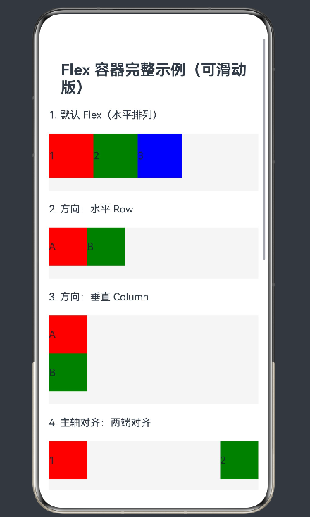
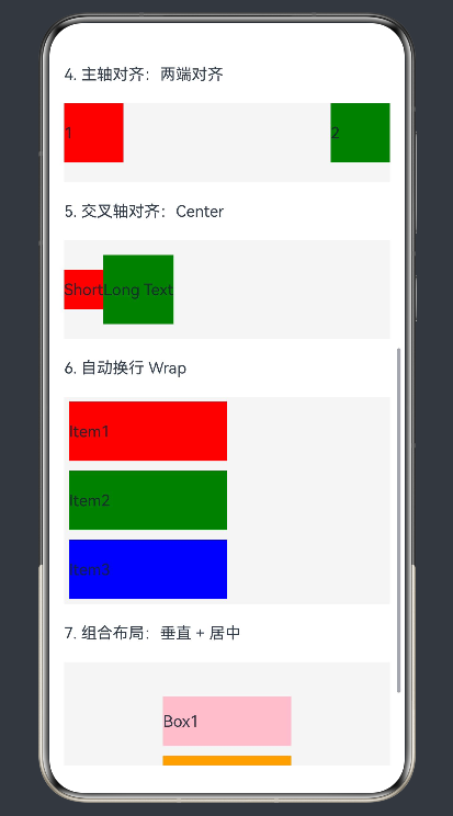
三、代码示例功能说明
1. 默认 Flex 布局
默认水平排列,子组件依次横向排布。
2. direction: Row
显式声明水平方向布局。
3. direction: Column
垂直方向布局,子组件从上到下排列。
4. justifyContent: SpaceBetween
主轴两端对齐,子组件间距自动分配。
5. alignItems: Center
子组件在交叉轴居中对齐。
6. wrap: Wrap
子组件宽度超出容器宽度时自动换行。
7. 组合布局
垂直方向 + 主轴居中 + 交叉轴居中,实现完全居中布局。
总结
- Flex 是弹性布局容器,必须包含子组件。
- 支持
direction、wrap、justifyContent、alignItems四大核心属性。 - 主轴与交叉轴相互垂直,决定布局方向。
- 长页面必须配合 Scroll 实现滑动。
- 无兼容性问题,全平台、全版本支持。
如果这篇文章对你有帮助,欢迎点赞、收藏、关注,你的支持是持续创作的动力!]
更多推荐
 54
54 0
0- 0


 已为社区贡献10条内容

所有评论(0)