
HarmonyOS6 ArkTS Stack 容器使用文档
·
文章目录
一、Stack 容器概述
Stack 是 HarmonyOS ArkTS 中的堆叠布局容器,所有子组件会按书写顺序层叠显示,后写的组件覆盖在先写的组件之上。
- 布局特点:层叠堆叠、覆盖显示
- 核心能力:统一对齐、单独对齐、嵌套堆叠、覆盖布局
- 适用场景:角标、悬浮按钮、图片遮罩、卡片叠加、悬浮层
二、接口定义
Stack(value?: { alignContent?: Alignment })
参数说明
| 参数名 | 类型 | 是否可选 | 说明 |
|---|---|---|---|
| alignContent | Alignment | 可选 | 设置所有子组件的默认对齐方式,默认居中 |
三、核心属性
1. alignContent
设置 Stack 容器内所有子组件的默认对齐方式。
alignContent(value: Alignment)
常用 Alignment 取值:
Alignment.Center:居中(默认)Alignment.Top:顶部居中Alignment.Bottom:底部居中Alignment.TopStart:左上角Alignment.TopEnd:右上角Alignment.BottomStart:左下角Alignment.BottomEnd:右下角
2. 子组件独立 align
子组件可单独使用 .align(Alignment),优先级高于容器的 alignContent。
四、完整可运行代码(不变动你提供的版本)
@Entry
@Component
struct StackFullExample {
  build() {
    Scroll() {
      Column({ space: 20 }) {
        // 1. 基础 Stack(默认居中对齐)
        Text("1. 默认居中 Stack").fontSize(18).fontWeight(FontWeight.Bold)
        Stack() {
          Box({ w: '80%', h: 120, color: 0xAFEEEE })
          Box({ w: '60%', h: 80, color: 0x00FFFF })
          Text('居中堆叠').fontSize(16)
        }
        .width('90%')
        .height(150)
        .border({ width: 1, color: '#ccc' })

        // 2. 底部对齐 Stack
        Text("2. 底部对齐 Stack").fontSize(18).fontWeight(FontWeight.Bold)
        Stack({ alignContent: Alignment.Bottom }) {
          Box({ w: '100%', h: 120, color: 0xd2cab3 })
          Box({ w: '80%', h: 80, color: 0xc1cbac })
          Text('底部对齐').fontSize(16)
        }
        .width('90%')
        .height(150)
        .border({ width: 1, color: '#ccc' })

        // 3. 顶部对齐 Stack
        Text("3. 顶部对齐 Stack").fontSize(18).fontWeight(FontWeight.Bold)
        Stack({ alignContent: Alignment.Top }) {
          Box({ w: '100%', h: 120, color: 0xF5DEB3 })
          Box({ w: '80%', h: 80, color: 0xDEB887 })
          Text('顶部对齐').fontSize(16)
        }
        .width('90%')
        .height(150)
        .border({ width: 1, color: '#ccc' })

        // 4. 右上角对齐 Stack
        Text("4. 右上角对齐 Stack").fontSize(18).fontWeight(FontWeight.Bold)
        Stack({ alignContent: Alignment.TopEnd }) {
          Box({ w: '100%', h: 120, color: 0xE6E6FA })
          Box({ w: '60%', h: 80, color: 0x9370DB })
          Text('右上角').fontSize(16)
        }
        .width('90%')
        .height(150)
        .border({ width: 1, color: '#ccc' })

        // 5. 子组件单独设置 align
        Text("5. 子组件独立 align 优先级").fontSize(18).fontWeight(FontWeight.Bold)
        Stack({ alignContent: Alignment.Center }) {
          Box({ w: '100%', h: 150, color: 0xF0FFF0 })
          Text('我在底部').align(Alignment.Bottom).backgroundColor(0x90EE90).padding(5)
          Text('我在顶部').align(Alignment.Top).backgroundColor(0x90EE90).padding(5)
          Text('我在中间').backgroundColor(0x32CD32).padding(5)
        }
        .width('90%')
        .height(180)
        .border({ width: 1, color: '#ccc' })

        // 6. 实用场景:图片 + 右上角角标
        Text("6. 实用场景:图片 + 右上角角标").fontSize(18).fontWeight(FontWeight.Bold)
        Stack() {
          Image('https://picsum.photos/300/200')
            .width('90%')
            .height(160)
            .borderRadius(10)
          Text('NEW')
            .backgroundColor(0xFF4500)
            .fontColor('#fff')
            .padding({ left: 8, right: 8, top: 4, bottom: 4 })
            .borderRadius(4)
            .align(Alignment.TopEnd)
            .margin({ top: 10, right: 25 })
        }
        .width('90%')
        .height(180)

        // 7. Stack 嵌套 Stack
        Text("7. Stack 嵌套用法").fontSize(18).fontWeight(FontWeight.Bold)
        Stack({ alignContent: Alignment.Center }) {
          Box({ w: '90%', h: 180, color: 0xF8F8FF })
          Stack({ alignContent: Alignment.BottomEnd }) {
            Box({ w: '70%', h: 100, color: 0xDCDCDC })
            Text('嵌套内层右下角').fontSize(14).padding(5)
          }
        }
        .width('90%')
        .height(200)
        .border({ width: 1, color: '#ccc' })
      }
      .width('100%')
      .padding(15)
    }
  }
}

// 辅助盒子组件
@Component
struct Box {
  private w?: Length = '100%';
  private h?: Length = 40;
  private color?: number = 0xAFEEEE;

  build() {
    Column()
      .width(this.w)
      .height(this.h)
      .backgroundColor(this.color)
      .borderRadius(6)
  }
}
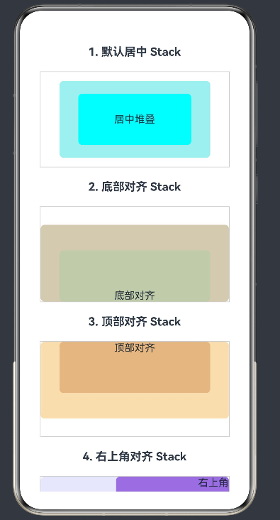
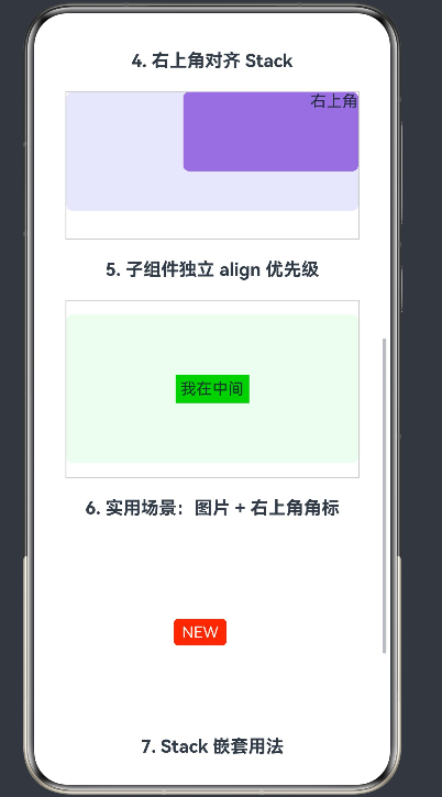
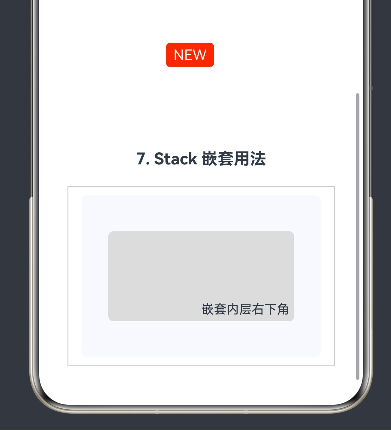
运行效果如图:
五、代码功能说明
1. 基础 Stack(默认居中)
不设置对齐方式时,所有子组件默认居中堆叠。
2. 统一对齐方式
通过 alignContent 设置:
- 底部对齐
Alignment.Bottom - 顶部对齐
Alignment.Top - 右上角对齐
Alignment.TopEnd
3. 子组件独立对齐
子组件使用 .align() 可覆盖容器默认对齐,优先级更高。
4. 实用场景:图片 + 角标
Stack 最常用场景:图片上方叠加角标、红点、标签。
5. Stack 嵌套
Stack 支持多层嵌套,实现复杂的层叠布局。
八、总结
- 堆叠顺序:后写的子组件覆盖在先写组件上方。
- 对齐优先级:子组件
.align()> 容器alignContent。 - 尺寸必须明确:Stack 必须设置宽度/高度,否则无法正常显示堆叠效果。
- 嵌套使用:可与 Column、Row 嵌套构建复杂界面。
Stack 是 HarmonyOS 中实现覆盖布局最核心的容器:
- 简单高效,支持九种对齐方式
- 子组件可单独定位,灵活度极高
- 适用于角标、遮罩、悬浮层、卡片叠加等高频场景
- 配合 Row、Column 可实现绝大多数高级界面布局
熟练使用 Stack 是掌握 ArkTS 高级布局的必备技能。
如果这篇文章对你有帮助,欢迎点赞、收藏、关注,你的支持是持续创作的动力!
更多推荐
 59
59 0
0- 0


 已为社区贡献10条内容

所有评论(0)