
QML Page 页面容器组件示例合集
目录
1. 引言
在 QML 应用开发中,Page 是一个重要的容器组件,它提供了标准化的页面结构,包括头部(header)、内容区域和底部(footer)。Page 组件特别适合构建具有统一布局风格的应用界面,能够简化页面结构的设计工作。
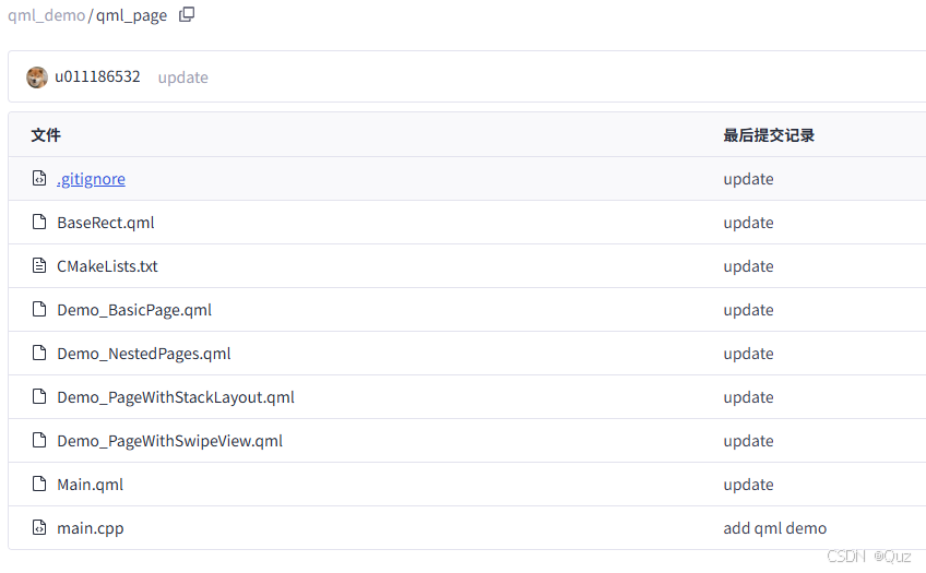
本文基于历史示例( QML 容器控件:Page)进行优化和扩展。由于代码篇幅较长,文章中只显示关键部分,完整代码见下载链接。
2. 演示效果
项目中的 Main.qml 文件使用 Flow 布局展示了四种不同的 Page 实现方案:
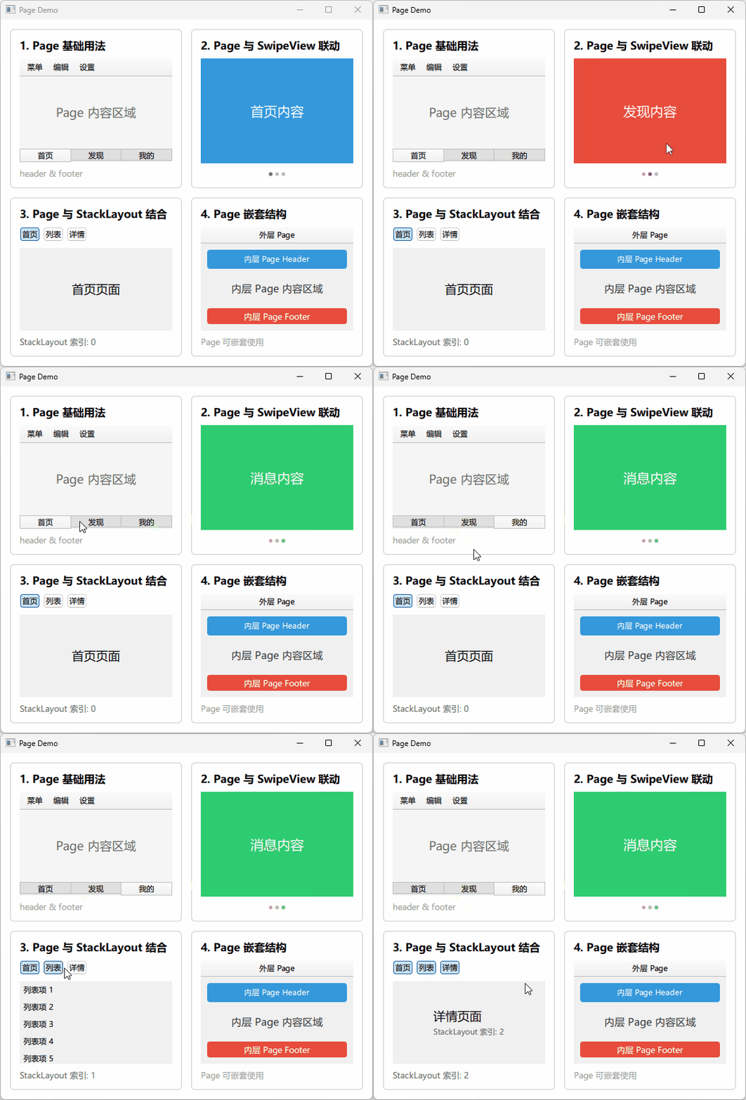
- Page 基础用法:展示 header 和 footer 的基本配置
- Page 与 SwipeView 联动:滑动切换页面,配合 PageIndicator
- Page 与 StackLayout 结合:按钮切换页面内容
- Page 嵌套结构:外层 Page 嵌套内层 Page
3. 代码说明
3.1 Page 基础用法
文件:Demo_BasicPage.qml
运行效果:
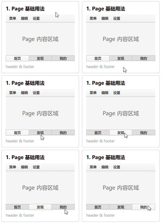
Page 基础用法展示了 header 和 footer 属性的基本配置,这是 Page 组件最核心的特性。
关键代码:
BaseRect {

    ColumnLayout {
        anchors.fill: parent
        anchors.margins: 15
        spacing: 10

        Text {
            text: "1. Page 基础用法"
            font.pointSize: 13
            font.bold: true
        }

        Page {
            Layout.fillWidth: true
            Layout.fillHeight: true

            header: ToolBar {
                RowLayout {
                    anchors.fill: parent
                    ToolButton { text: "菜单" }
                    ToolButton { text: "编辑" }
                    ToolButton { text: "设置" }
                    Item { Layout.fillWidth: true }
                }
            }

            footer: TabBar {
                TabButton { text: "首页" }
                TabButton { text: "发现" }
                TabButton { text: "我的" }
            }

            Rectangle {
                anchors.fill: parent
                color: "#f5f5f5"

                Text {
                    anchors.centerIn: parent
                    text: "Page 内容区域"
                    font.pointSize: 14
                    color: "#666"
                }
            }
        }

        Text {
            text: "header & footer"
            font.pointSize: 10
            color: "#999"
        }
    }
}
代码说明:
Page 组件提供了 header 和 footer 两个属性,用于放置顶部工具栏和底部导航栏。
要点:
header属性设置页面顶部区域,通常放置 ToolBarfooter属性设置页面底部区域,通常放置 TabBar- header 和 footer 会自动定位到 Page 的顶部和底部
- 内容区域自动填充剩余空间
- 这种结构适合标准化的应用页面布局
3.2 Page 与 SwipeView 联动
文件:Demo_PageWithSwipeView.qml
运行效果:
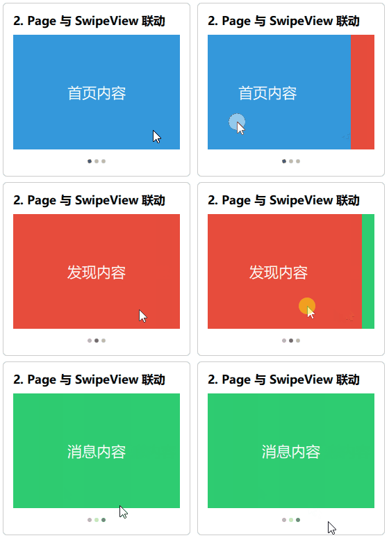
Page 与 SwipeView 联动展示了如何实现可滑动切换的页面组,每个页面都是独立的 Page 组件。
关键代码:
BaseRect {

    ColumnLayout {
        anchors.fill: parent
        anchors.margins: 15
        spacing: 10

        Text {
            text: "2. Page 与 SwipeView 联动"
            font.pointSize: 13
            font.bold: true
        }

        SwipeView {
            id: swipeView
            Layout.fillWidth: true
            Layout.fillHeight: true
            clip: true

            Page {
                title: "首页"
                Rectangle {
                    anchors.fill: parent
                    color: "#3498db"
                    Text {
                        anchors.centerIn: parent
                        text: "首页内容"
                        color: "#fff"
                        font.pointSize: 16
                    }
                }
            }

            Page {
                title: "发现"
                Rectangle {
                    anchors.fill: parent
                    color: "#e74c3c"
                    Text {
                        anchors.centerIn: parent
                        text: "发现内容"
                        color: "#fff"
                        font.pointSize: 16
                    }
                }
            }

            Page {
                title: "消息"
                Rectangle {
                    anchors.fill: parent
                    color: "#2ecc71"
                    Text {
                        anchors.centerIn: parent
                        text: "消息内容"
                        color: "#fff"
                        font.pointSize: 16
                    }
                }
            }
        }

        PageIndicator {
            count: swipeView.count
            currentIndex: swipeView.currentIndex
            Layout.alignment: Qt.AlignHCenter
        }
    }
}
代码说明:
SwipeView 作为容器,内部放置多个 Page 组件,用户可以通过滑动手势切换页面。
要点:
SwipeView支持水平滑动手势切换页面- 每个 Page 可以有独立的
title属性 PageIndicator显示当前页面位置,提升用户体验clip: true防止内容溢出边界- 这种组合适合引导页、图片浏览器、移动端主导航等场景
3.3 Page 与 StackLayout 结合
文件:Demo_PageWithStackLayout.qml
运行效果:
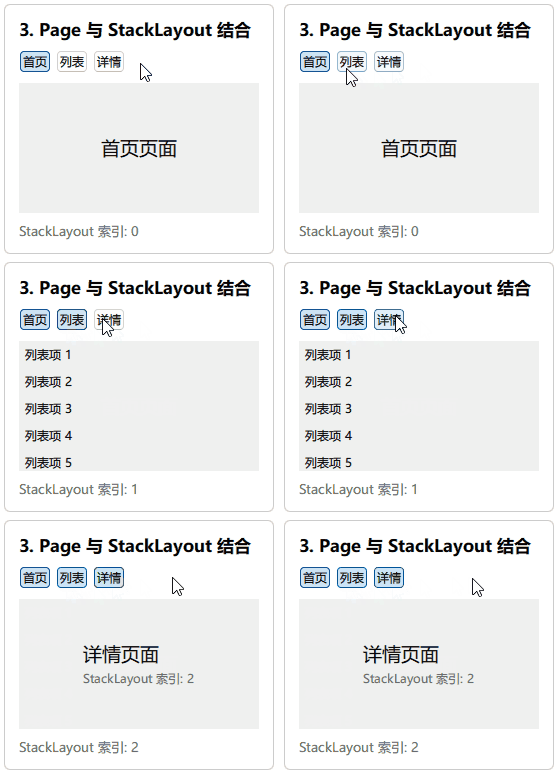
Page 与 StackLayout 结合展示了如何通过按钮切换不同的 Page 内容。
关键代码:
BaseRect {

    ColumnLayout {
        anchors.fill: parent
        anchors.margins: 15
        spacing: 10

        Text {
            text: "3. Page 与 StackLayout 结合"
            font.pointSize: 13
            font.bold: true
        }

        RowLayout {
            Layout.fillWidth: true
            spacing: 5

            Repeater {
                model: ["首页", "列表", "详情"]

                Button {
                    text: modelData
                    highlighted: stackLayout.currentIndex === index
                    onClicked: stackLayout.currentIndex = index
                }
            }
        }

        StackLayout {
            id: stackLayout
            Layout.fillWidth: true
            Layout.fillHeight: true

            Page {
                title: "首页"
                Label {
                    anchors.centerIn: parent
                    text: "首页页面"
                    font.pointSize: 14
                }
            }

            Page {
                title: "列表"
                ListView {
                    anchors.fill: parent
                    clip: true
                    model: 5
                    delegate: ItemDelegate {
                        text: "列表项 " + (index + 1)
                    }
                }
            }

            Page {
                title: "详情"
                ColumnLayout {
                    anchors.centerIn: parent
                    Label { text: "详情页面"; font.pointSize: 14 }
                    Label { text: "StackLayout 索引: " + stackLayout.currentIndex; color: "#666" }
                }
            }
        }

        Text {
            text: "StackLayout 索引: " + stackLayout.currentIndex
            font.pointSize: 10
            color: "#666"
        }
    }
}
代码说明:
StackLayout 作为容器管理多个 Page,通过索引切换显示当前页面。
要点:
StackLayout.currentIndex控制当前显示的页面- 按钮使用
highlighted属性显示选中状态 - 每个 Page 可以包含不同的内容类型(Label、ListView 等)
- StackLayout 只渲染当前页面,性能优于 SwipeView
- 这种组合适合桌面应用的标签页、设置面板等场景
3.4 Page 嵌套结构
文件:Demo_NestedPages.qml
运行效果:
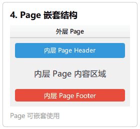
Page 嵌套结构展示了 Page 组件可以多层嵌套使用,每层 Page 可以有独立的 header 和 footer。
关键代码:
BaseRect {

    ColumnLayout {
        anchors.fill: parent
        anchors.margins: 15
        spacing: 10

        Text {
            text: "4. Page 嵌套结构"
            font.pointSize: 13
            font.bold: true
        }

        Page {
            id: outerPage
            Layout.fillWidth: true
            Layout.fillHeight: true

            header: ToolBar {
                Label {
                    text: "外层 Page"
                    anchors.centerIn: parent
                }
            }

            Page {
                id: innerPage
                anchors.fill: parent
                anchors.margins: 10

                header: Rectangle {
                    height: 30
                    color: "#3498db"
                    radius: 4

                    Text {
                        text: "内层 Page Header"
                        anchors.centerIn: parent
                        color: "#fff"
                    }
                }

                footer: Rectangle {
                    height: 25
                    color: "#e74c3c"
                    radius: 4

                    Text {
                        text: "内层 Page Footer"
                        anchors.centerIn: parent
                        color: "#fff"
                        font.pointSize: 10
                    }
                }

                Rectangle {
                    anchors.fill: parent
                    color: "#f0f0f0"
                    radius: 4

                    Text {
                        anchors.centerIn: parent
                        text: "内层 Page 内容区域"
                        font.pointSize: 12
                        color: "#333"
                    }
                }
            }
        }

        Text {
            text: "Page 可嵌套使用"
            font.pointSize: 10
            color: "#999"
        }
    }
}
代码说明:
Page 组件支持嵌套使用,外层 Page 和内层 Page 可以各自拥有独立的 header 和 footer。
要点:
- 外层 Page 的 header 作为整体顶部栏
- 内层 Page 使用
anchors定位在外层 Page 的内容区域 - 内层 Page 可以有独立的 header 和 footer
- header 和 footer 不限于 ToolBar/TabBar,可以是任意组件
- 这种结构适合复杂的应用界面,如主框架+子模块
4. 技术要点
4.1 Page 组件选择指南
根据场景选择合适的组合方式:
| 场景 | 推荐方案 | 说明 |
|---|---|---|
| 标准页面布局 | Page + header/footer | 统一的页面结构 |
| 移动端主导航 | Page + SwipeView | 支持滑动手势 |
| 桌面端标签页 | Page + StackLayout | 性能好,点击切换 |
| 复杂界面结构 | Page 嵌套 | 模块化布局 |
4.2 Page 常用属性
Page {
    title: string              // 页面标题
    header: Item               // 顶部区域
    footer: Item               // 底部区域
    contentWidth: real         // 内容宽度
    contentHeight: real        // 内容高度
}
Attached Properties:
// 在 Page 内部子组件中使用
Page.title              // 页面标题
Page.isCurrent          // 是否为当前页(SwipeView 中)
4.3 SwipeView vs StackLayout
| 特性 | SwipeView | StackLayout |
|---|---|---|
| 交互方式 | 滑动手势 | 索引切换 |
| 预加载 | 预加载相邻页 | 只渲染当前页 |
| 切换动画 | 内置滑动动画 | 无 |
| 性能 | 中等 | 最好 |
| 典型场景 | 移动端导航 | 桌面端标签页 |
4.4 Page 与其他容器对比
| 容器 | 特点 | 适用场景 |
|---|---|---|
| Page | 带 header/footer 的标准页面 | 应用主页面 |
| Rectangle | 基础矩形容器 | 简单布局 |
| Item | 无视觉元素的容器 | 逻辑分组 |
| Pane | 带内边距的容器 | 内容分组 |
5. 工程下载
下载链接:QML Page 页面容器组件示例合集
更多推荐
 7
7 0
0- 0


 已为社区贡献8条内容

所有评论(0)