
HarmonyOS ArkUI训练营入门-组件掌握系列-SideBar 侧边栏容器详解-PC版本
·
概述
侧边栏布局是桌面应用和部分移动应用中常用的界面结构,能够在屏幕侧边展示导航菜单或辅助内容。HarmonyOS ArkUI 提供的 SideBarContainer 组件功能强大,支持可拖拽的侧边栏、自定义宽度和显示控制等特性。本文将从组件基础、属性设置、交互处理、实际应用等多个维度,深入讲解 SideBarContainer 组件的使用方法。
一、SideBarContainer 组件基础
1.1 组件定义与作用
SideBarContainer 组件用于创建包含侧边栏和主内容区域的布局结构,支持侧边栏的显示、隐藏和拖拽调整。
@Entry
@Component
struct SideBarBasic {
  build() {
    SideBarContainer() {
      Column() {
        Text('侧边栏内容')
          .fontSize(16)
      }
      .backgroundColor('#F8F8F8')

      Column() {
        Text('主内容区域')
          .fontSize(16)
      }
      .backgroundColor('#FFFFFF')
    }
    .width('100%')
    .height('100%')
  }
}
1.2 构造函数结构
SideBarContainer 包含两个子组件:
- 第一个子组件:侧边栏内容
- 第二个子组件:主内容区域
1.3 基础属性
| 属性 | 类型 | 说明 | 默认值 |
|---|---|---|---|
sideBarWidth | number | 侧边栏宽度 | 200 |
controlWidth | number | 拖拽区域宽度 | 32 |
isShowSideBar | boolean | 是否显示侧边栏 | true |
showSideBarIcon | boolean | 是否显示控制图标 | true |
二、属性设置详解
2.1 侧边栏宽度
通过 sideBarWidth 属性设置侧边栏宽度:
@Entry
@Component
struct SideBarWidthDemo {
  @State sideBarWidth: number = 200;

  build() {
    Column() {
      SideBarContainer() {
        Column() {
          Text('侧边栏')
            .fontSize(16)
        }
        .width('100%')
        .backgroundColor('#F8F8F8')

        Column() {
          Text('主内容')
            .fontSize(16)
        }
        .width('100%')
        .backgroundColor('#FFFFFF')
      }
      .sideBarWidth(this.sideBarWidth)
      .width('100%')
      .height(300)

      Row() {
        Text('宽度: ' + this.sideBarWidth)
          .layoutWeight(1)
        Slider({
          value: this.sideBarWidth,
          min: 100,
          max: 300,
          step: 10
        })
          .layoutWeight(2)
          .onChange((value: number) => {
            this.sideBarWidth = value;
          })
      }
    }
  }
}
2.2 显示控制
通过 isShowSideBar 属性控制侧边栏显示:
@Entry
@Component
struct ShowSideBarDemo {
  @State isShow: boolean = true;

  build() {
    Column() {
      SideBarContainer() {
        Column() {
          Text('侧边栏内容')
            .fontSize(16)
        }
        .backgroundColor('#F8F8F8')

        Column() {
          Button('切换侧边栏')
            .onClick(() => {
              this.isShow = !this.isShow;
            })
        }
        .backgroundColor('#FFFFFF')
      }
      .isShowSideBar(this.isShow)
      .width('100%')
      .height(300)
    }
  }
}
2.3 拖拽区域宽度
通过 controlWidth 属性设置拖拽区域宽度:
@Entry
@Component
struct ControlWidthDemo {
  @State controlWidth: number = 32;

  build() {
    Column() {
      SideBarContainer() {
        Column() {
          Text('侧边栏')
            .fontSize(16)
        }
        .backgroundColor('#F8F8F8')

        Column() {
          Text('主内容')
            .fontSize(16)
        }
        .backgroundColor('#FFFFFF')
      }
      .controlWidth(this.controlWidth)
      .width('100%')
      .height(300)

      Row() {
        Text('拖拽宽度: ' + this.controlWidth)
          .layoutWeight(1)
        Slider({
          value: this.controlWidth,
          min: 20,
          max: 60,
          step: 5
        })
          .layoutWeight(2)
          .onChange((value: number) => {
            this.controlWidth = value;
          })
      }
    }
  }
}
三、事件处理
3.1 侧边栏变化事件
通过 onChange 事件监听侧边栏位置变化:
@Entry
@Component
struct OnChangeDemo {
  @State position: number = 0;

  build() {
    Column() {
      Text('侧边栏位置: ' + Math.round(this.position) + '%')
        .fontSize(14)
        .margin({ bottom: 8 })

      SideBarContainer() {
        Column() {
          Text('侧边栏')
            .fontSize(16)
        }
        .backgroundColor('#F8F8F8')

        Column() {
          Text('主内容')
            .fontSize(16)
        }
        .backgroundColor('#FFFFFF')
      }
      .onChange((value: number) => {
        this.position = value;
      })
      .width('100%')
      .height(300)
    }
  }
}
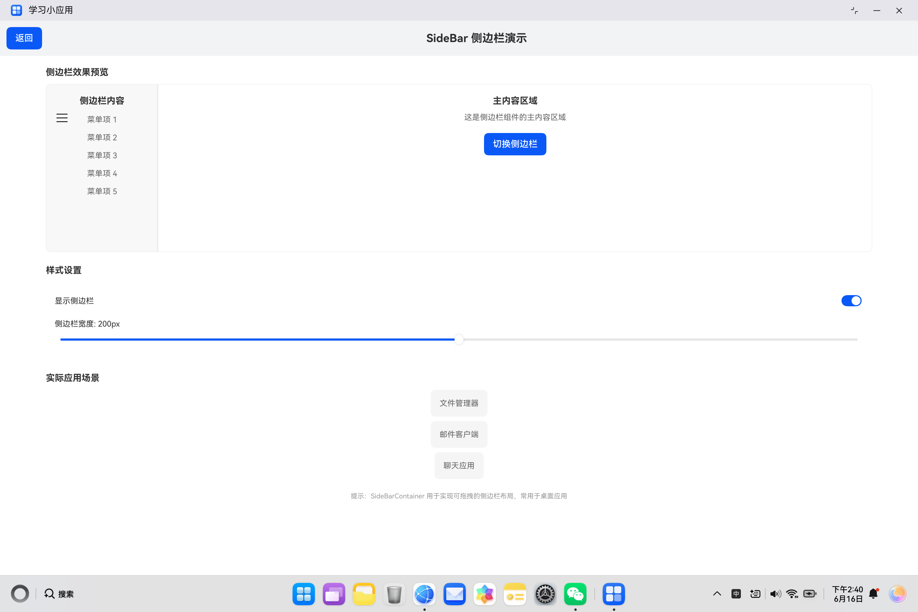
四、实际案例:侧边栏容器演示
4.1 需求分析
构建一个侧边栏容器演示页面,包含:
- 侧边栏效果预览
- 侧边栏宽度调节
- 拖拽区域宽度调节
- 显示状态切换
- 实际应用场景展示
4.2 代码实现
import { router } from '@kit.ArkUI';

@Entry
@Component
struct SideBarDemo {
  @State isShow: boolean = true;
  @State controlWidth: number = 200;
  @State sideBarWidth: number = 200;
  @State position: number = 0;

  build() {
    Column() {
      Row() {
        Button('返回')
          .onClick(() => {
            router.back();
          })
        Text('SideBar 侧边栏演示')
          .fontSize(20)
          .fontWeight(FontWeight.Bold)
          .layoutWeight(1)
          .textAlign(TextAlign.Center)
      }
      .width('100%')
      .padding(12)
      .backgroundColor('#F1F3F5')

      Column() {
        Text('侧边栏效果预览')
          .fontSize(16)
          .fontWeight(FontWeight.Bold)
          .margin({ top: 20, bottom: 12 })
          .width('90%')

        SideBarContainer() {
          Column() {
            Text('侧边栏内容')
              .fontSize(16)
              .fontWeight(FontWeight.Bold)
              .margin({ top: 20 })
            Text('菜单项 1')
              .fontSize(14)
              .fontColor('#666666')
              .margin({ top: 16 })
            Text('菜单项 2')
              .fontSize(14)
              .fontColor('#666666')
              .margin({ top: 16 })
            Text('菜单项 3')
              .fontSize(14)
              .fontColor('#666666')
              .margin({ top: 16 })
            Text('菜单项 4')
              .fontSize(14)
              .fontColor('#666666')
              .margin({ top: 16 })
            Text('菜单项 5')
              .fontSize(14)
              .fontColor('#666666')
              .margin({ top: 16 })
          }
          .width('100%')
          .backgroundColor('#F8F8F8')
          .alignItems(HorizontalAlign.Center)

          Column() {
            Text('主内容区域')
              .fontSize(16)
              .fontWeight(FontWeight.Bold)
              .margin({ top: 20 })
            Text('这是侧边栏组件的主内容区域')
              .fontSize(14)
              .fontColor('#666666')
              .margin({ top: 12 })
            Button('切换侧边栏')
              .margin({ top: 20 })
              .onClick(() => {
                this.isShow = !this.isShow;
              })
          }
          .width('100%')
          .backgroundColor('#FFFFFF')
          .alignItems(HorizontalAlign.Center)
        }
        .controlWidth(this.controlWidth)
        .sideBarWidth(this.sideBarWidth)
        .isShowSideBar(this.isShow)
        .onChange((value: number) => {
          this.position = value;
        })
        .width('90%')
        .height(300)
        .backgroundColor('#FFFFFF')
        .borderRadius(8)
        .borderWidth(1)
        .borderColor('#E5E5E5')

        Text('侧边栏位置: ' + Math.round(this.position) + '%')
          .fontSize(12)
          .fontColor('#999999')
          .margin({ top: 8 })

        Text('样式设置')
          .fontSize(16)
          .fontWeight(FontWeight.Bold)
          .margin({ top: 24, bottom: 12 })
          .width('90%')

        Column() {
          Row() {
            Text('显示侧边栏')
              .fontSize(14)
              .layoutWeight(1)
            Toggle({ type: ToggleType.Switch, isOn: this.isShow })
              .onChange((isOn: boolean) => {
                this.isShow = isOn;
              })
          }
          .width('100%')
          .margin({ bottom: 16 })

          Row() {
            Text('侧边栏宽度: ' + this.sideBarWidth + 'px')
              .fontSize(14)
              .layoutWeight(1)
          }
          Slider({
            value: this.sideBarWidth,
            min: 100,
            max: 300,
            step: 10,
            style: SliderStyle.OutSet
          })
            .width('100%')
            .onChange((value: number) => {
              this.sideBarWidth = value;
            })

          Row() {
            Text('拖拽区域宽度: ' + this.controlWidth + 'px')
              .fontSize(14)
              .layoutWeight(1)
              .margin({ top: 16 })
          }
          Slider({
            value: this.controlWidth,
            min: 50,
            max: 150,
            step: 10,
            style: SliderStyle.OutSet
          })
            .width('100%')
            .onChange((value: number) => {
              this.controlWidth = value;
            })
        }
        .width('90%')
        .backgroundColor('#FFFFFF')
        .padding(16)
        .borderRadius(8)

        Text('实际应用场景')
          .fontSize(16)
          .fontWeight(FontWeight.Bold)
          .margin({ top: 24, bottom: 12 })
          .width('90%')

        Column() {
          Text('文件管理器')
            .fontSize(14)
            .fontColor('#666666')
            .backgroundColor('#F5F5F5')
            .padding(16)
            .borderRadius(8)
          Text('邮件客户端')
            .fontSize(14)
            .fontColor('#666666')
            .backgroundColor('#F5F5F5')
            .padding(16)
            .borderRadius(8)
            .margin({ top: 8 })
          Text('聊天应用')
            .fontSize(14)
            .fontColor('#666666')
            .backgroundColor('#F5F5F5')
            .padding(16)
            .borderRadius(8)
            .margin({ top: 8 })
        }
        .width('90%')

        Text('提示:SideBarContainer 用于实现可拖拽的侧边栏布局,常用于桌面应用')
          .fontSize(12)
          .fontColor('#999999')
          .margin({ top: 24 })
          .width('90%')
          .textAlign(TextAlign.Center)
      }
      .width('100%')
      .layoutWeight(1)
    }
    .width('100%')
    .height('100%')
    .backgroundColor('#FFFFFF')
  }
}
五、SideBarContainer 使用场景总结
5.1 常见应用场景
| 场景 | 说明 |
|---|---|
| 文件管理器 | 左侧显示文件目录树 |
| 邮件客户端 | 左侧显示邮件列表 |
| 聊天应用 | 左侧显示联系人列表 |
| 设置页面 | 左侧显示设置分类 |
5.2 与其他布局对比
| 特性 | SideBarContainer | Navigation |
|---|---|---|
| 布局结构 | 侧边栏 + 主内容 | 标题栏 + 内容 |
| 拖拽支持 | 支持 | 不支持 |
| 适用场景 | 桌面应用 | 所有应用 |
六、最佳实践
6.1 使用建议
| 建议 | 说明 |
|---|---|
| 合理设置宽度 | 根据内容设置侧边栏宽度 |
| 提供切换按钮 | 方便用户控制显示 |
| 适配不同屏幕 | 考虑屏幕尺寸差异 |
6.2 常见问题
| 问题 | 解决方案 |
|---|---|
| 侧边栏不显示 | 检查 isShowSideBar 设置 |
| 拖拽不生效 | 检查 controlWidth 设置 |
| 内容不显示 | 检查子组件布局 |
七、总结
SideBarContainer 组件是实现侧边栏布局的核心组件,掌握其使用方法对于构建桌面风格应用至关重要。
核心要点:
- 第一个子组件为侧边栏内容
- 第二个子组件为主内容区域
- 使用
sideBarWidth设置侧边栏宽度 - 使用
isShowSideBar控制显示状态 - 使用
onChange监听位置变化
希望本文能帮助你更好地理解和使用 SideBarContainer 组件,构建出优秀的 HarmonyOS 应用。
参考资料:
更多推荐
 8
8 0
0- 0


 已为社区贡献1条内容

所有评论(0)