
鸿蒙Flutter Container容器组件:尺寸、颜色、装饰等属性详解
作者:高红帆(Math_teacher_fan)
仓库地址:https://gitcode.com/feng8403000/FlutterfromBeginnertoAdvancedForHarmonyOS.git
联系邮箱:372699828@qq.com
引言
在Flutter开发中,Container是最常用的布局组件之一。它是一个多功能的容器,可以控制尺寸、颜色、内边距、外边距、对齐方式等多种属性。掌握Container的使用方法,是构建精美UI界面的基础。本文将深入探讨Container的各种属性和用法。
一、Container基础用法
1.1 Container简介
Container是一个组合性的Widget,它将多个布局相关的功能整合在一起:
- 尺寸控制(width、height)
- 背景颜色(color)
- 内边距(padding)
- 外边距(margin)
- 对齐方式(alignment)
- 装饰效果(decoration)
- 变换效果(transform)
1.2 基础示例
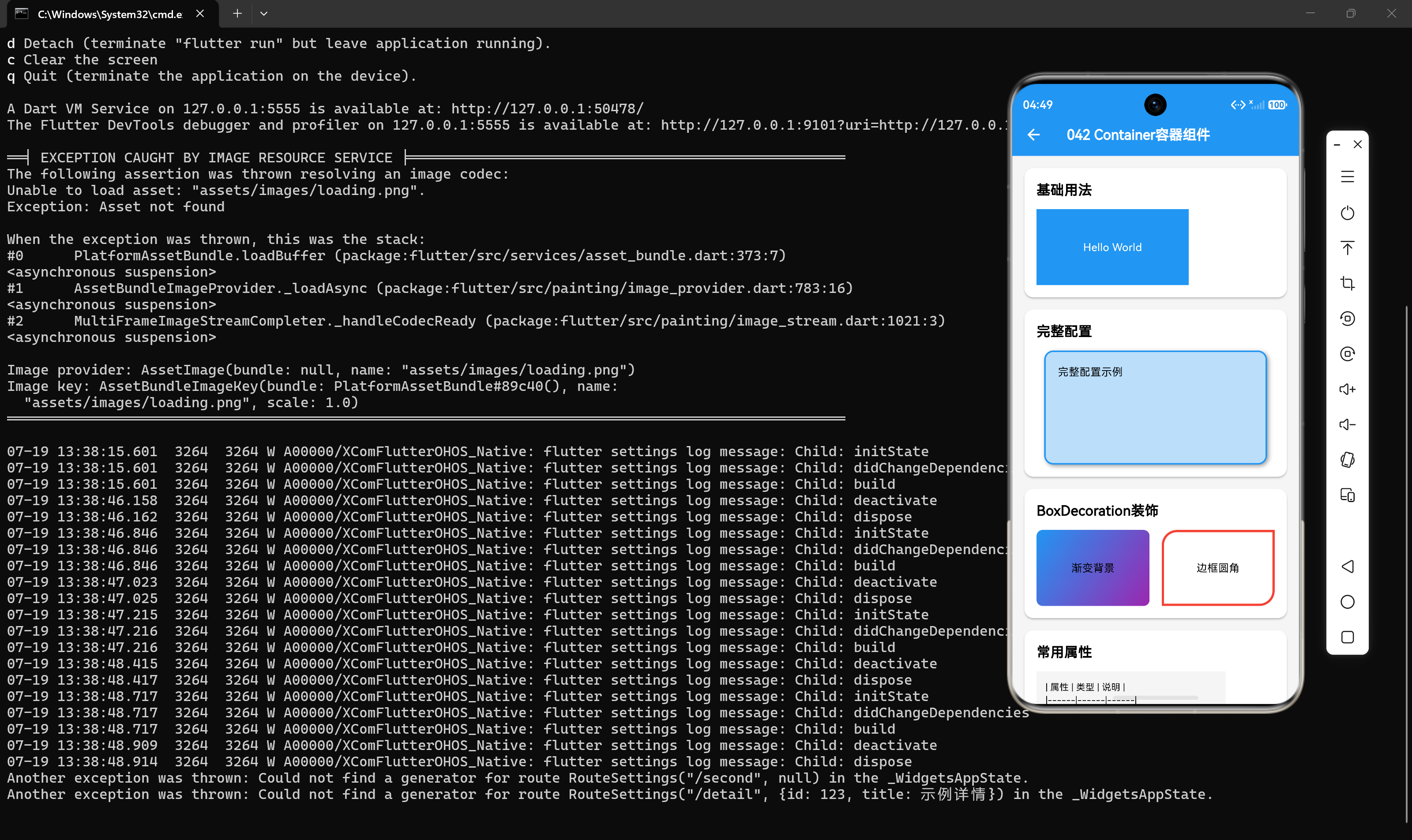
Container(
  width: 200,
  height: 100,
  color: Colors.blue,
  child: const Text("Hello World"),
);
这个简单的例子展示了Container的三个基本属性:
width:容器宽度height:容器高度color:背景颜色
二、Container完整配置
2.1 完整属性示例
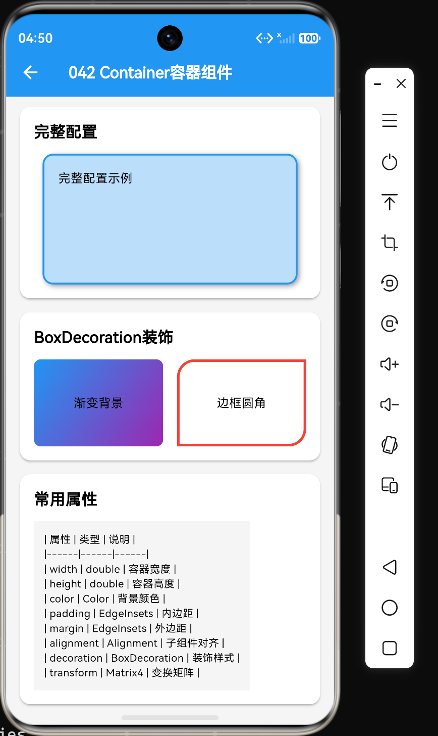
Container(
  // 尺寸属性
  width: 300,
  height: 200,

  // 颜色属性
  color: Colors.blue[100],

  // 内边距
  padding: const EdgeInsets.all(16),

  // 外边距
  margin: const EdgeInsets.symmetric(horizontal: 20),

  // 对齐方式
  alignment: Alignment.center,

  // 装饰
  decoration: BoxDecoration(
    color: Colors.blue,
    borderRadius: BorderRadius.circular(12),
    border: Border.all(color: Colors.black, width: 2),
    boxShadow: const [
      BoxShadow(
        color: Colors.grey,
        offset: Offset(2, 2),
        blurRadius: 4,
      ),
    ],
  ),

  // 变换
  transform: Matrix4.rotationZ(0.1),

  child: const Text("容器内容"),
);
2.2 属性说明
| 属性 | 类型 | 说明 |
|---|---|---|
| width | double | 容器宽度 |
| height | double | 容器高度 |
| color | Color | 背景颜色 |
| padding | EdgeInsets | 内边距 |
| margin | EdgeInsets | 外边距 |
| alignment | Alignment | 子组件对齐方式 |
| decoration | BoxDecoration | 装饰样式 |
| transform | Matrix4 | 变换矩阵 |
| child | Widget | 子组件 |
三、BoxDecoration详解
3.1 BoxDecoration概述
BoxDecoration是一个强大的装饰类,可以为容器添加各种视觉效果:
- 背景颜色(color)
- 渐变(gradient)
- 边框(border)
- 圆角(borderRadius)
- 阴影(boxShadow)
- 背景图片(image)
3.2 渐变背景
decoration: BoxDecoration(
  gradient: LinearGradient(
    begin: Alignment.topLeft,
    end: Alignment.bottomRight,
    colors: [Colors.blue, Colors.purple],
  ),
);
渐变类型:
| 类型 | 说明 |
|---|---|
| LinearGradient | 线性渐变 |
| RadialGradient | 径向渐变 |
| SweepGradient | 扇形渐变 |
3.3 圆角设置
decoration: BoxDecoration(
  borderRadius: BorderRadius.only(
    topLeft: Radius.circular(20),
    bottomRight: Radius.circular(20),
  ),
);
圆角构造方法:
| 方法 | 说明 |
|---|---|
| BorderRadius.circular(double) | 所有角相同半径 |
| BorderRadius.all(Radius) | 所有角指定半径 |
| BorderRadius.only() | 分别指定四个角 |
| BorderRadius.vertical() | 上下分别指定 |
| BorderRadius.horizontal() | 左右分别指定 |
3.4 边框设置
decoration: BoxDecoration(
  border: Border.all(
    color: Colors.red,
    width: 3,
    style: BorderStyle.solid,
  ),
);
边框样式:
| 样式 | 说明 |
|---|---|
| BorderStyle.solid | 实线 |
| BorderStyle.none | 无 |
| BorderStyle.dashed | 虚线 |
| BorderStyle.dotted | 点线 |
3.5 阴影效果
decoration: BoxDecoration(
  boxShadow: const [
    BoxShadow(
      color: Colors.grey,
      offset: Offset(2, 2),
      blurRadius: 4,
      spreadRadius: 2,
    ),
  ],
);
阴影属性:
| 属性 | 说明 |
|---|---|
| color | 阴影颜色 |
| offset | 阴影偏移 |
| blurRadius | 模糊半径 |
| spreadRadius | 扩散半径 |
3.6 背景图片
decoration: BoxDecoration(
  image: DecorationImage(
    image: NetworkImage("https://example.com/image.jpg"),
    fit: BoxFit.cover,
  ),
);
图片填充模式:
| 模式 | 说明 |
|---|---|
| BoxFit.fill | 拉伸填充 |
| BoxFit.contain | 保持比例,完整显示 |
| BoxFit.cover | 保持比例,覆盖容器 |
| BoxFit.fitWidth | 宽度适配 |
| BoxFit.fitHeight | 高度适配 |
四、padding与margin
4.1 padding内边距
padding控制内容与容器边缘之间的距离:
Container(
  padding: EdgeInsets.all(16),
  child: Text("内容"),
);
4.2 margin外边距
margin控制容器与外部元素之间的距离:
Container(
  margin: EdgeInsets.all(16),
  child: Text("内容"),
);
4.3 padding与margin的区别
| 属性 | padding | margin |
|---|---|---|
| 作用范围 | 内容与边框之间 | 容器与外部之间 |
| 背景颜色 | padding区域有背景色 | margin区域无背景色 |
| 位置关系 | 内部间距 | 外部间距 |
4.4 EdgeInsets构造方法
// 所有方向相同
EdgeInsets.all(10)

// 分别设置四个方向
EdgeInsets.fromLTRB(left, top, right, bottom)
EdgeInsets.fromLTRB(10, 20, 10, 20)

// 对称设置
EdgeInsets.symmetric(horizontal: 10, vertical: 20)

// 只设置某个方向
EdgeInsets.only(top: 10, left: 20)

// 复制并修改
EdgeInsets.all(10).copyWith(top: 20)
五、alignment对齐方式
5.1 基本对齐
Container(
  alignment: Alignment.center,
  child: Text("居中内容"),
);
5.2 对齐方向
Alignment.topLeft      Alignment.topCenter      Alignment.topRight
Alignment.centerLeft   Alignment.center        Alignment.centerRight
Alignment.bottomLeft   Alignment.bottomCenter  Alignment.bottomRight
5.3 自定义偏移
Container(
  alignment: Alignment(0.5, -0.5),
  child: Text("自定义位置"),
);
Alignment参数说明:
- x: -1.0(左) ~ 1.0(右)
- y: -1.0(上) ~ 1.0(下)
六、transform变换
6.1 基本变换
Container(
  transform: Matrix4.rotationZ(0.1),
  child: Text("旋转内容"),
);
6.2 常用变换
// 旋转
transform: Matrix4.rotationZ(0.1)
transform: Matrix4.rotationX(0.1)
transform: Matrix4.rotationY(0.1)

// 平移
transform: Matrix4.translationValues(10, 10, 0)

// 缩放
transform: Matrix4.scale(1.5)

// 组合变换
transform: Matrix4.identity()
  ..rotateZ(0.1)
  ..translate(10, 10)
七、实战示例
7.1 卡片布局
Card(
  margin: const EdgeInsets.all(16),
  child: Padding(
    padding: const EdgeInsets.all(16),
    child: Column(
      children: const [
        Text("标题", style: TextStyle(fontSize: 18, fontWeight: FontWeight.bold)),
        SizedBox(height: 8),
        Text("内容描述文字"),
      ],
    ),
  ),
);
7.2 按钮样式
Container(
  padding: const EdgeInsets.symmetric(horizontal: 24, vertical: 12),
  decoration: BoxDecoration(
    color: Colors.blue,
    borderRadius: BorderRadius.circular(8),
    boxShadow: const [
      BoxShadow(
        color: Colors.blueAccent,
        offset: Offset(0, 4),
        blurRadius: 8,
      ),
    ],
  ),
  child: const Text(
    "点击按钮",
    style: TextStyle(color: Colors.white, fontSize: 16),
  ),
);
7.3 用户头像
Container(
  width: 80,
  height: 80,
  decoration: BoxDecoration(
    color: Colors.grey[200],
    shape: BoxShape.circle,
    image: const DecorationImage(
      image: NetworkImage("https://example.com/avatar.png"),
      fit: BoxFit.cover,
    ),
  ),
);
7.4 标签样式
Container(
  padding: const EdgeInsets.symmetric(horizontal: 12, vertical: 4),
  decoration: BoxDecoration(
    color: Colors.green[100],
    borderRadius: BorderRadius.circular(20),
    border: Border.all(color: Colors.green),
  ),
  child: const Text(
    "已完成",
    style: TextStyle(color: Colors.green, fontSize: 12),
  ),
);
八、常见问题与解决方案
8.1 问题1:color与decoration不能同时使用
问题描述:同时设置color和decoration属性,编译报错。
解决方案:将color放在decoration中:
// 错误
Container(
  color: Colors.blue,
  decoration: BoxDecoration(
    borderRadius: BorderRadius.circular(8),
  ),
);

// 正确
Container(
  decoration: BoxDecoration(
    color: Colors.blue,
    borderRadius: BorderRadius.circular(8),
  ),
);
8.2 问题2:Container没有子组件时不显示
问题描述:没有设置width和height,且没有子组件时,Container不显示。
解决方案:设置尺寸或添加子组件:
// 方法1: 设置尺寸
Container(
  width: 100,
  height: 100,
  color: Colors.blue,
);

// 方法2: 添加子组件
Container(
  color: Colors.blue,
  child: Text("内容"),
);
8.3 问题3:transform影响点击区域
问题描述:使用transform旋转后,点击区域与显示区域不一致。
解决方案:使用Transform组件代替:
Transform.rotate(
  angle: 0.1,
  child: Container(
    width: 100,
    height: 100,
    color: Colors.blue,
  ),
);
8.4 问题4:圆角不生效
问题描述:设置了borderRadius但圆角不生效。
解决方案:确保没有同时使用color属性:
// 错误
Container(
  color: Colors.blue,
  decoration: BoxDecoration(
    borderRadius: BorderRadius.circular(8),
  ),
);

// 正确
Container(
  decoration: BoxDecoration(
    color: Colors.blue,
    borderRadius: BorderRadius.circular(8),
  ),
);
九、性能优化
9.1 避免不必要的Container嵌套
// 不推荐
Container(
  child: Container(
    child: Text("内容"),
  ),
);

// 推荐
Container(
  child: Text("内容"),
);
9.2 使用const构造函数
const Container(
  width: 100,
  height: 100,
  color: Colors.blue,
);
9.3 合理使用decoration
避免在频繁重建的组件中创建复杂的BoxDecoration,可以缓存或提取为常量:
final BoxDecoration _cardDecoration = BoxDecoration(
  color: Colors.white,
  borderRadius: BorderRadius.circular(8),
  boxShadow: const [
    BoxShadow(color: Colors.grey, blurRadius: 4),
  ],
);

Widget build(BuildContext context) {
  return Container(
    decoration: _cardDecoration,
    child: Text("内容"),
  );
}
十、总结
通过本文的学习,我们掌握了以下核心知识点:
- Container是一个多功能容器组件,整合了尺寸、颜色、内边距、外边距等多种属性
- BoxDecoration可以为容器添加渐变、边框、圆角、阴影等装饰效果
- padding控制内容与容器边缘的距离,margin控制容器与外部元素的距离
- alignment控制子组件在容器内的对齐方式
- transform可以对容器进行旋转、平移、缩放等变换操作
color和decoration不能同时使用,需要将color放在decoration中
掌握Container的使用方法,是构建精美Flutter界面的基础。在实际开发中,合理组合这些属性,可以创建出各种美观的UI效果。
参考资料
- Flutter官方文档:https://docs.flutter.dev/
- Container Widget:https://api.flutter.dev/flutter/widgets/Container-class.html
- BoxDecoration:https://api.flutter.dev/flutter/painting/BoxDecoration-class.html
更多推荐
 5
5 0
0- 0


 已为社区贡献4条内容

所有评论(0)