
基于HarmonyOS API 24实战解析母婴商城应用嵌套的横向 Scroll(scrollable(ScrollDirection.Horizontal))配合 Row 容器实现水平滑动效果
引言:一款面向新手父母的垂直电商应用
在移动互联网深度渗透家庭生活的今天,母婴垂直电商已经成为零售行业中一个极具潜力的细分赛道。新手父母在迎接新生命到来的过程中,面临着奶粉辅食、纸尿裤、婴儿服饰、洗护用品、玩具早教等多品类的密集采购需求,而传统的综合电商平台往往信息过载、筛选成本高,难以满足这一人群"专业、安全、高效"的购物诉求。本文将深入剖析一款基于 HarmonyOS ArkTS 声明式开发范式构建的母婴商城应用,从顶层架构到组件细节,全面解读其设计思想与工程实现。
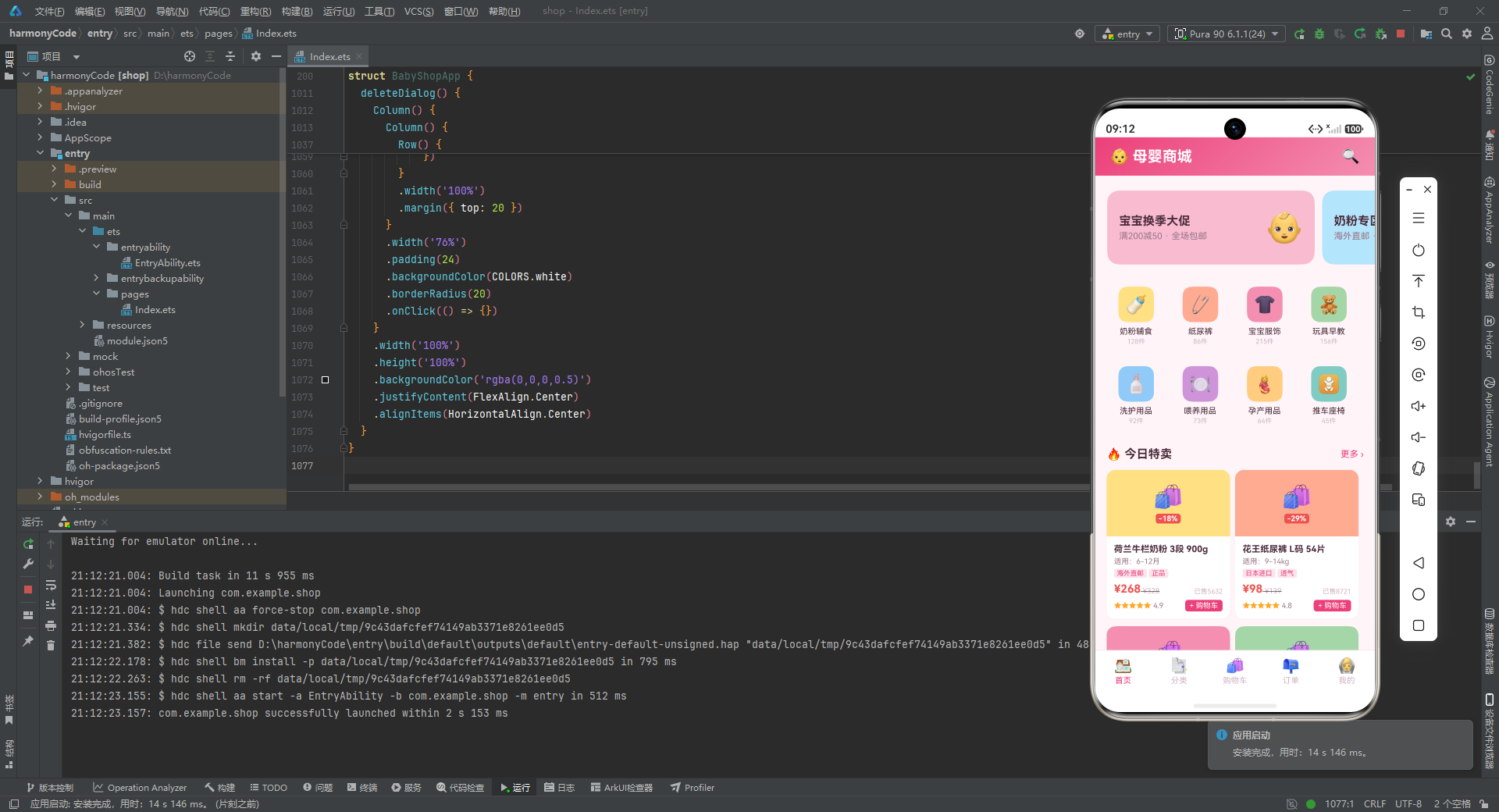
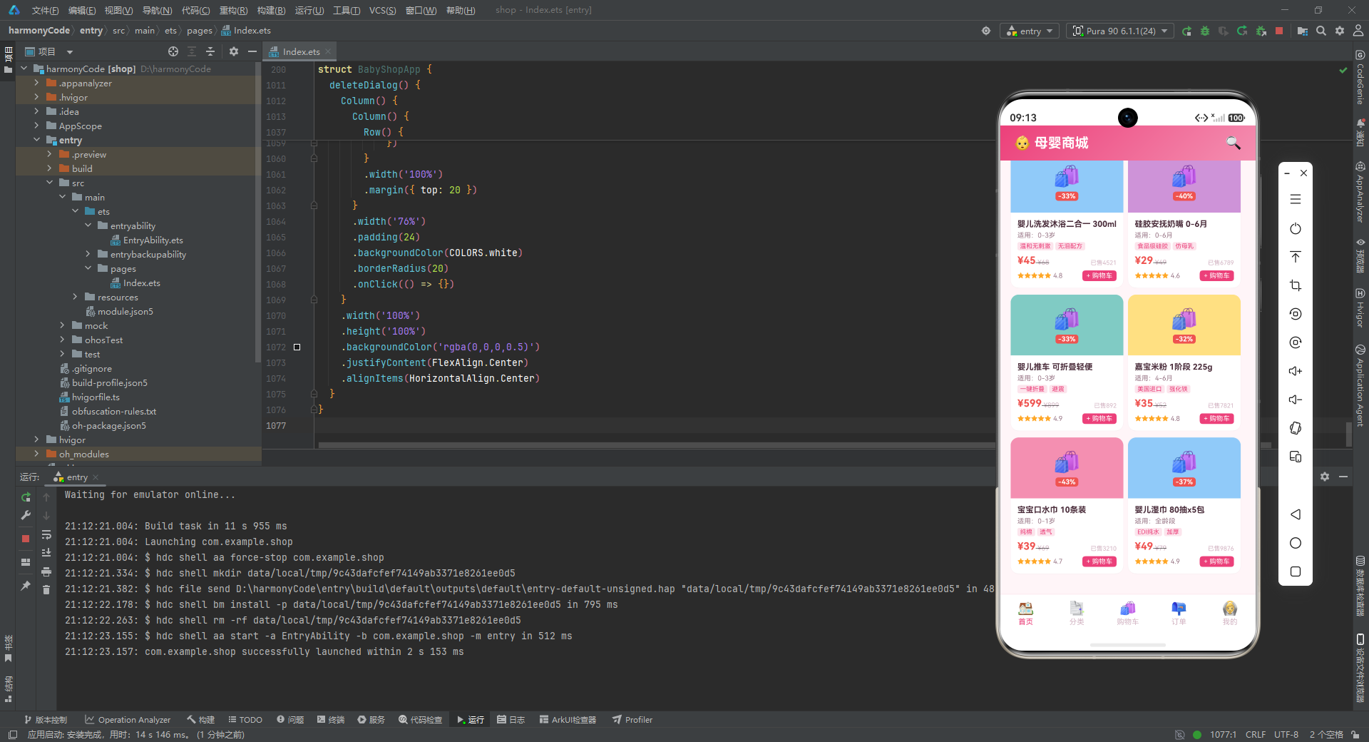
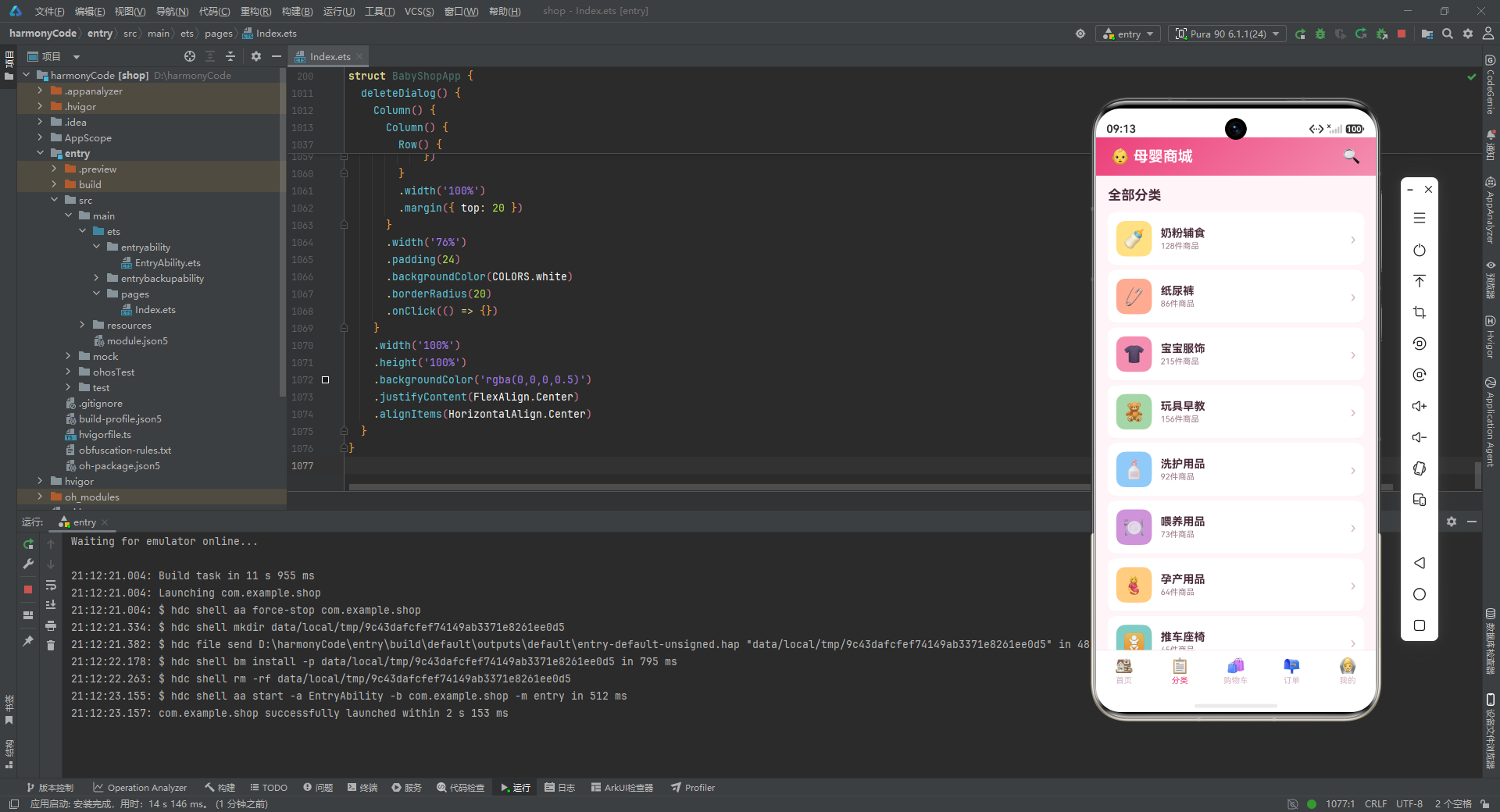
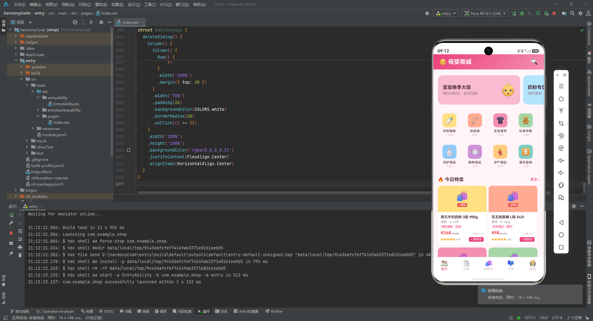
这款母婴商城应用定位为一站式母婴用品购物平台,涵盖了商品浏览、分类检索、购物车管理、订单追踪、个人中心五大核心功能模块。应用以"首页"为流量入口,通过 Banner 轮播位展示换季大促、奶粉专区、纸尿裤囤货等营销活动,引导用户进入商品瀑布流进行选购;"分类"页签以列表形式呈现奶粉辅食、纸尿裤、宝宝服饰、玩具早教、洗护用品、喂养用品、孕产用品、推车座椅八大品类,帮助用户快速定位目标商品;"购物车"页签支持商品选中状态管理与数量增减,并实时计算结算金额;"订单"页签展示已发货、待发货、已签收、已取消等多种状态的订单记录,并支持待发货订单的修改与取消操作;"我的"页签则聚合了用户档案、收货地址、收藏、优惠券、积分商城、宝宝档案、客服中心等个人服务入口。
在视觉设计理念上,这款应用采用了"婴儿粉 + 天空蓝"的双主题色方案,主色为婴儿粉 #F48FB1,强调色为天空蓝 #4FC3F7,整体色调温暖、柔和、富有亲和力,与母婴产品的天然属性高度契合。背景色采用淡粉色调 #FFF5F8,营造出温馨而不刺眼的浏览氛围;卡片背景统一使用纯白 #FFFFFF,通过细腻的阴影效果(radius: 2, color: '#0D000000', offsetY: 1)实现层次感;文本颜色细分为主要文本 #4A2C3A(深紫调)、次要文本 #9C7A8A(灰紫调)、提示文本 #D4B5C4(浅紫调)三级,确保信息层级的清晰可读。此外,应用还引入了成功绿、警告橙、危险红等功能色,分别用于订单状态标识、评分星级、价格高亮等场景,构建了一套完整的语义化色彩体系。
从技术架构角度来看,该应用采用了 HarmonyOS ArkTS 声明式 UI 开发范式,基于 @Entry、@Component、@State、@Builder 等装饰器构建单页面多 Tab 的应用结构。整个应用以一个 BabyShopApp 结构体作为入口组件,通过 @State 管理当前激活的 Tab 页签以及三个弹窗的显隐状态,利用条件渲染在 build() 函数中切换不同页签的内容,并通过 @Builder 装饰的方法将各个页签的 UI 拆分为独立的可复用单元。这种"单组件多 Builder"的架构方式在中小型应用中具有开发效率高、状态集中、调试方便的优势,同时也为后续向多组件拆分演进预留了空间。
在数据架构方面,应用采用了"接口定义 + 硬编码常量 + 纯函数计算"的三层设计。首先通过 interface 定义了 ProductMeta、CartMeta、OrderMeta、CategoryMeta、BannerMeta 等类型契约,明确了各业务实体的字段结构;然后将 Banner 列表、分类列表、商品列表、购物车列表、订单列表等业务数据以 const 常量数组的形式硬编码在文件中,便于原型阶段的快速迭代与展示;最后将折扣计算、状态颜色映射、购物车合计、星级生成等业务逻辑封装为纯函数,保证逻辑的可测试性与可复用性。这种分层设计使得数据结构、数据内容、业务逻辑三者清晰分离,体现了良好的工程素养。
在应用场景上,这款应用主要面向 0-3 岁宝宝的新手父母群体。这类用户通常具有"高频次、多品类、重品质"的购物特征:奶粉、纸尿裤等刚需品需要定期复购,服饰、玩具等非刚需品需要根据宝宝成长阶段精准匹配,而洗护用品、喂养用品则对安全性与材质有较高要求。应用通过 ageRange(适用月龄/年龄)、tags(商品标签,如"海外直邮"“正品”“A类纯棉”“食品级硅胶”)、rating(评分)等字段,为用户提供了多维度的商品筛选与决策辅助信息,有效降低了选购的认知负担。下面,我们将逐段深入分析代码实现。
一、类型定义:业务实体的契约化建模
1.1 商品元数据接口 ProductMeta
interface ProductMeta {
  id: number
  name: string
  category: string
  price: number
  originalPrice: number
  sales: number
  stock: number
  imageColor: string
  tags: string[]
  ageRange: string
  rating: number
}
ProductMeta 是整个应用中最核心的业务实体接口,它完整地描述了一件母婴商品的元数据信息。其中 id 作为唯一标识,name 是商品全称(通常包含品牌、规格、段位等信息),category 标识商品所属分类,price 与 originalPrice 分别代表当前售价与原价,二者配合可计算折扣力度。sales 字段记录累计销量,用于营造热销氛围;stock 字段记录库存数量,为后续库存预警功能预留接口。imageColor 是一个颇具巧思的设计——由于原型阶段未接入真实图片资源,这里用一个色值字符串代替商品主图背景色,既保证了视觉差异化,又避免了外部资源依赖。tags 数组承载了"海外直邮"“正品”"A类纯棉"等营销标签,ageRange 明确了适用月龄或体重范围,rating 则以浮点数形式记录商品评分。这些字段共同构成了商品卡片的完整数据支撑。
1.2 购物车与订单接口 CartMeta、OrderMeta
interface CartMeta {
  id: number
  productName: string
  price: number
  quantity: number
  imageColor: string
  selected: boolean
}

interface OrderMeta {
  id: number
  items: string
  amount: number
  status: string
  date: string
  count: number
  logistics: string
}
CartMeta 接口建模了购物车条目,其中 selected 布尔字段用于标记该条目是否被勾选参与结算,这是电商购物车"批量结算"场景的标配字段。quantity 记录购买数量,配合 price 即可计算小计金额。值得注意的是,购物车条目冗余存储了 productName 和 imageColor,而非通过 productId 关联回商品表——这种反范式设计在购物车场景下是合理的,因为它避免了每次渲染购物车时都需要遍历商品列表查找名称,同时也兼容了商品下架后购物车仍能展示历史信息的业务需求。
OrderMeta 接口则建模了订单实体,items 字段以字符串形式简要描述订单包含的商品(如"奶粉+纸尿裤"),amount 是订单总金额,status 是订单状态文本(“已发货”“待发货”“已签收”“已取消”),date 是下单日期,count 是商品总件数,logistics 是物流公司名称。这种扁平化的订单结构适合展示型场景,但在真实业务中通常会进一步拆分为订单主表与订单明细表,以支持更复杂的退换货与售后流程。
1.3 分类与轮播接口 CategoryMeta、BannerMeta
interface CategoryMeta {
  name: string
  icon: string
  color: string
  count: number
}

interface BannerMeta {
  title: string
  subtitle: string
  color: string
  icon: string
}
CategoryMeta 描述了商品分类,包含分类名称、图标(Emoji 字符)、主题色、商品数量四个字段。count 字段在分类页中会以"128件"的形式展示,帮助用户感知各品类的丰富程度。BannerMeta 描述了首页轮播位的营销活动,title 是活动主标题(如"宝宝换季大促"),subtitle 是副标题(如"满200减50 · 全场包邮"),color 是 Banner 的背景色,icon 是装饰性 Emoji。这两个接口结构简洁,但字段语义清晰,足以驱动首页的视觉呈现。
1.4 设计令牌接口 ColorPalette
interface ColorPalette {
  primary: string;
  primaryLight: string;
  primaryDark: string;
  accent: string;
  accentLight: string;
  accentDark: string;
  bg: string;
  cardBg: string;
  textPrimary: string;
  textSecondary: string;
  textHint: string;
  border: string;
  success: string;
  warning: string;
  danger: string;
  white: string;
}
ColorPalette 接口定义了一套完整的设计令牌(Design Token)类型契约。它将色彩分为六个语义分组:主色系(primary/primaryLight/primaryDark)、强调色系(accent/accentLight/accentDark)、背景色(bg/cardBg)、文本色(textPrimary/textSecondary/textHint)、功能色(success/warning/danger)以及纯白。通过接口约束,编译器能够在使用 COLORS.xxx 时提供智能提示与类型检查,避免拼写错误导致的运行时异常。这种"接口 + 常量"的设计令牌管理模式,是大型应用实现主题统一与暗黑模式适配的基础。
二、设计令牌与配置常量
2.1 全局色彩常量 COLORS
const COLORS: ColorPalette = {
  primary: '#F48FB1',
  primaryLight: '#FCE4EC',
  primaryDark: '#EC407A',
  accent: '#4FC3F7',
  accentLight: '#E1F5FE',
  accentDark: '#0288D1',
  bg: '#FFF5F8',
  cardBg: '#FFFFFF',
  textPrimary: '#4A2C3A',
  textSecondary: '#9C7A8A',
  textHint: '#D4B5C4',
  border: '#FCE4EC',
  success: '#66BB6A',
  warning: '#FFA726',
  danger: '#EF5350',
  white: '#FFFFFF'
};
COLORS 常量是整个应用的视觉基石。主色系采用 Material Design 风格的三阶色值:primary(#F48FB1)是标准的婴儿粉,用于标题栏渐变与选中态高亮;primaryLight(#FCE4EC)是极浅粉,用于标签背景与边框;primaryDark(#EC407A)是深玫红,用于强调文字与主按钮背景。强调色系以天空蓝为基调,accent(#4FC3F7)用于订单"已发货"状态,accentDark(#0288D1)可用于链接与可交互元素。背景色 #FFF5F8 是带有极淡粉调的米白色,相比纯白更能缓解长时间浏览的视觉疲劳。文本色采用紫调灰阶,比纯灰更有温度感,符合母婴场景的情感诉求。功能色中,success(#66BB6A)用于"已签收"状态,warning(#FFA726)用于"待发货"状态与星级评分,danger(#EF5350)用于价格、折扣与危险操作按钮。这套色彩体系既保证了视觉统一性,又通过语义化命名实现了"所见即所意"的代码可读性。
2.2 底部 Tab 配置 TAB_CONFIG
const TAB_CONFIG: Record<string, string> = {
  'home': '首页',
  'category': '分类',
  'cart': '购物车',
  'orders': '订单',
  'mine': '我的'
}
TAB_CONFIG 使用 Record<string, string> 类型定义了底部导航栏的配置映射,键为 Tab 的内部标识(英文),值为展示文本(中文)。这种"键值对映射 + ForEach 遍历"的方式相比逐个硬编码 Tab 项具有显著优势:新增或调整 Tab 只需修改一处配置,底部导航栏的渲染逻辑无需改动。在 bottomTabBar Builder 中,应用通过 Object.keys(TAB_CONFIG) 获取所有 Tab 键并遍历渲染,实现了配置与渲染的解耦。需要注意的是,Record 类型是 ArkTS 对 TypeScript 工具类型的支持,它等价于定义一个字符串键到字符串值的索引签名对象。
三、硬编码业务数据
3.1 Banner 轮播列表
const BANNER_LIST: BannerMeta[] = [
  { title: '宝宝换季大促', subtitle: '满200减50 · 全场包邮', color: '#F8BBD0', icon: '👶' },
  { title: '奶粉专区', subtitle: '海外直邮 · 正品保障', color: '#B3E5FC', icon: '🍼' },
  { title: '纸尿裤囤货', subtitle: '买2送1 · 限时特惠', color: '#FFE0B2', icon: '🧷' }
]
BANNER_LIST 定义了首页顶部水平轮播的三张 Banner。每张 Banner 都有独立的背景色——粉色、蓝色、橙色,形成视觉节奏感,避免单调。文案上,主标题突出活动主题,副标题强调优惠力度与保障承诺,符合电商营销文案"利益点前置"的撰写原则。Emoji 图标作为装饰元素,在不依赖图片资源的前提下增加了趣味性与识别度。在真实项目中,这些数据通常来自运营后台的 CMS 配置接口,并通过定时刷新保持活动信息的时效性。
3.2 分类列表
const CATEGORY_LIST: CategoryMeta[] = [
  { name: '奶粉辅食', icon: '🍼', color: '#FFE082', count: 128 },
  { name: '纸尿裤', icon: '🧷', color: '#FFAB91', count: 86 },
  { name: '宝宝服饰', icon: '👕', color: '#F48FB1', count: 215 },
  { name: '玩具早教', icon: '🧸', color: '#A5D6A7', count: 156 },
  { name: '洗护用品', icon: '🧴', color: '#90CAF9', count: 92 },
  { name: '喂养用品', icon: '🍽', color: '#CE93D8', count: 73 },
  { name: '孕产用品', icon: '🤰', color: '#FFCC80', count: 64 },
  { name: '推车座椅', icon: '🚼', color: '#80CBC4', count: 45 }
]
CATEGORY_LIST 定义了八大商品分类,每个分类配有独立的主题色,颜色取自 Material Design 调色板的 200 色阶,饱和度适中、明度统一,保证了网格中八个分类图标背景的和谐并存。count 字段反映了各品类的商品丰富度,从"推车座椅"的 45 件到"宝宝服饰"的 215 件,跨度较大,这也符合母婴品类中服饰 SKU 多、大件耐用品 SKU 少的实际情况。这些分类数据同时服务于首页的分类网格与分类 Tab 的列表展示,实现了"一份数据,多处复用"。
3.3 商品列表
const PRODUCT_LIST: ProductMeta[] = [
  { id: 1, name: '荷兰牛栏奶粉 3段 900g', category: '奶粉辅食', price: 268, originalPrice: 328, sales: 5632, stock: 500, imageColor: '#FFE082', tags: ['海外直邮', '正品'], ageRange: '6-12月', rating: 4.9 },
  { id: 2, name: '花王纸尿裤 L码 54片', category: '纸尿裤', price: 98, originalPrice: 139, sales: 8721, stock: 800, imageColor: '#FFAB91', tags: ['日本进口', '透气'], ageRange: '9-14kg', rating: 4.8 },
  { id: 3, name: '纯棉婴儿连体衣 0-3月', category: '宝宝服饰', price: 59, originalPrice: 89, sales: 3456, stock: 300, imageColor: '#F48FB1', tags: ['A类纯棉', '无荧光'], ageRange: '0-3月', rating: 4.9 },
  // ... 其余商品省略展示
]
PRODUCT_LIST 是首页商品瀑布流的数据源,包含十件覆盖八大分类中主要品类的商品。每件商品的命名遵循"品牌+品类+规格+适用对象"的规范,信息密度高且便于搜索。价格设计上,所有商品均设置了低于原价的当前售价,折扣力度从约 18% 到 41% 不等,营造出"全场促销"的购物氛围。tags 标签精选了最能体现商品卖点的关键词,如"海外直邮"“正品”“A类纯棉”“食品级硅胶”"EDI纯水"等,这些标签直接关系到母婴用户最关心的安全性与品质问题,是促转化的关键信息。ageRange 字段针对不同品类采用了不同的度量方式——奶粉用月龄、纸尿裤用体重、服饰用月龄、玩具用年龄——体现了对母婴品类特性的深入理解。
3.4 购物车与订单列表
const CART_LIST: CartMeta[] = [
  { id: 1, productName: '荷兰牛栏奶粉 3段 900g', price: 268, quantity: 2, imageColor: '#FFE082', selected: true },
  { id: 2, productName: '花王纸尿裤 L码 54片', price: 98, quantity: 3, imageColor: '#FFAB91', selected: true },
  { id: 3, productName: '纯棉婴儿连体衣 0-3月', price: 59, quantity: 2, imageColor: '#F48FB1', selected: false },
  { id: 4, productName: '费雪益智积木 100粒', price: 128, quantity: 1, imageColor: '#A5D6A7', selected: true },
  { id: 5, productName: '婴儿洗发沐浴二合一', price: 45, quantity: 2, imageColor: '#90CAF9', selected: false }
]

const ORDER_LIST: OrderMeta[] = [
  { id: 3001, items: '奶粉+纸尿裤', amount: 830, status: '已发货', date: '2024-04-15', count: 5, logistics: '顺丰快递' },
  { id: 3002, items: '连体衣+口水巾', amount: 157, status: '待发货', date: '2024-04-15', count: 2, logistics: '中通快递' },
  { id: 3003, items: '益智积木+湿巾', amount: 177, status: '已签收', date: '2024-04-12', count: 2, logistics: '圆通快递' },
  { id: 3004, items: '推车', amount: 599, status: '已签收', date: '2024-04-08', count: 1, logistics: '德邦物流' },
  { id: 3005, items: '米粉+奶嘴', amount: 99, status: '已取消', date: '2024-04-05', count: 2, logistics: '--' },
  { id: 3006, items: '洗护套装', amount: 134, status: '已签收', date: '2024-04-01', count: 3, logistics: '韵达快递' }
]
CART_LIST 包含五条购物车记录,其中三条 selected 为 true,两条为 false,这种混合状态正好可以演示底部结算栏的合计计算逻辑。ORDER_LIST 包含六条订单记录,覆盖了"已发货"“待发货”“已签收”“已取消"四种状态,其中"待发货"状态的订单会展示"修改"与"取消"操作按钮,触发相应的弹窗交互。物流公司字段涵盖了顺丰、中通、圆通、德邦、韵达等主流快递,体现了真实业务的多样性;已取消订单的物流字段为”–",表示无物流信息,这种边界情况的处理体现了数据建模的严谨性。
四、纯函数业务逻辑
4.1 折扣百分比计算
function getDiscountPercent(original: number, current: number): number {
  return Math.floor((1 - current / original) * 100)
}
getDiscountPercent 函数接收原价与现价两个参数,返回向下取整的折扣百分比。例如原价 328、现价 268,计算结果为 Math.floor((1 - 268/328) * 100) = Math.floor(18.29) = 18,在商品卡片上展示为"-18%"。使用 Math.floor 而非 Math.round 是电商行业的惯例——折扣力度向下取整可以避免"夸大优惠"的合规风险。这是一个无副作用的纯函数,输入相同则输出必然相同,易于单元测试与复用。
4.2 订单状态颜色映射
function getStatusColor(status: string): string {
  if (status === '已签收') {
    return COLORS.success
  }
  if (status === '已发货') {
    return COLORS.accent
  }
  if (status === '待发货') {
    return COLORS.warning
  }
  return COLORS.textHint
}
getStatusColor 函数将订单状态文本映射为语义化的颜色值:"已签收"对应成功绿,传递积极完成的信号;"已发货"对应天空蓝,传递在途进行中的信号;“待发货"对应警告橙,提示用户关注发货进度;其余状态(如"已取消”)对应浅紫灰提示色,弱化视觉权重。这种"状态-颜色"的映射规则使用户无需细读文字即可通过颜色快速感知订单进展,是信息可视化在列表场景下的典型应用。函数采用 if 语句链而非 switch 或对象映射,在状态数量较少时可读性更佳。
4.3 购物车合计与件数计算
function getSelectedCartTotal(): number {
  let total: number = 0
  for (const c of CART_LIST) {
    if (c.selected) {
      total += c.price * c.quantity
    }
  }
  return total
}

function getSelectedCartCount(): number {
  let count: number = 0
  for (const c of CART_LIST) {
    if (c.selected) {
      count += c.quantity
    }
  }
  return count
}
getSelectedCartTotal 与 getSelectedCartCount 两个函数分别计算购物车中已选中商品的总金额与总件数。二者均采用 for...of 循环遍历 CART_LIST,通过 if (c.selected) 过滤未选中条目,累加 price * quantity 或 quantity。以当前数据为例,选中的三条记录为奶粉(268×2=536)、纸尿裤(98×3=294)、积木(128×1=128),合计 958 元、6 件,因此底部结算栏会显示"合计:¥958"与"结算(6)"。这两个函数在购物车页面的底部结算栏中被调用,实现了金额与件数的实时联动。需要指出的是,由于这里遍历的是硬编码的 CART_LIST 常量而非响应式状态,因此在真实项目中应将其改造为接收数组参数的纯函数,或绑定到 @State 状态以实现响应式更新。
4.4 星级评分生成
function getRatingStars(rating: number): string {
  let stars: string = ''
  for (let i = 0; i < 5; i++) {
    if (i < rating) {
      stars += '★'
    } else {
      stars += '☆'
    }
  }
  return stars
}
getRatingStars 函数将数值评分转换为五角星字符串。它循环五次,前 rating 个位置填充实心星"★",其余位置填充空心星"☆"。例如评分 4.9 会生成"★★★★☆"(因为 i < 4.9 在 i=0,1,2,3,4 时,前四个为 true,i=4 时 4<4.9 为 true 实际生成五个实心星——这里需要注意浮点比较的细节,评分 4.9 实际会显示为五个实心星)。这个函数用最简洁的方式实现了星级可视化,避免了引入图标资源的开销。在更高保真的实现中,可以考虑支持半星显示,使用 Unicode 字符"⯨"或自定义 SVG 图标。
五、入口组件与状态管理
5.1 组件声明与状态定义
@Entry
@Component
struct BabyShopApp {
  @State currentTab: string = 'home'
  @State showAddDialog: boolean = false
  @State showEditDialog: boolean = false
  @State showDeleteDialog: boolean = false
BabyShopApp 是应用的入口组件,通过 @Entry 装饰器标记为页面入口,通过 @Component 装饰器声明为自定义组件。组件内部定义了四个 @State 状态变量:currentTab 记录当前激活的 Tab 页签标识,初始值为 'home';showAddDialog、showEditDialog、showDeleteDialog 三个布尔值分别控制加入购物车弹窗、修改订单弹窗、取消订单弹窗的显隐。@State 装饰器使得这些变量成为响应式状态——当它们的值发生变化时,ArkUI 框架会自动触发依赖这些状态的 UI 重新渲染。这种"状态驱动 UI"的声明式范式,相比传统的命令式 DOM 操作,大幅降低了状态与视图同步的心智负担。值得注意的是,三个弹窗状态相互独立,意味着理论上可以同时显示多个弹窗,但在实际交互中由于每次只触发一个,不会出现叠加情况。
5.2 build 函数:整体布局骨架
build() {
  Stack() {
    Column() {
      Row() {
        Text('👶 母婴商城')
          .fontSize(20)
          .fontWeight(FontWeight.Bold)
          .fontColor(COLORS.white)
        Column().layoutWeight(1)
        Text('🔍')
          .fontSize(20)
          .fontColor(COLORS.white)
      }
      .width('100%')
      .height(52)
      .padding({ left: 20, right: 20 })
      .linearGradient({ angle: 135, colors: [[COLORS.primaryDark, 0.0], [COLORS.primary, 1.0]] })

      Column() {
        if (this.currentTab === 'home') {
          this.homeContent()
        } else if (this.currentTab === 'category') {
          this.categoryContent()
        } else if (this.currentTab === 'cart') {
          this.cartContent()
        } else if (this.currentTab === 'orders') {
          this.ordersContent()
        } else {
          this.mineContent()
        }
      }
      .layoutWeight(1)
      .backgroundColor(COLORS.bg)

      this.bottomTabBar()
    }
    .width('100%')
    .height('100%')

    if (this.showAddDialog) {
      this.addDialog()
    }
    if (this.showEditDialog) {
      this.editDialog()
    }
    if (this.showDeleteDialog) {
      this.deleteDialog()
    }
  }
  .width('100%')
  .height('100%')
  .backgroundColor(COLORS.bg)
}
build() 函数是组件的 UI 描述入口,它构建了一个 Stack(层叠布局)作为根容器。Stack 内部分为两层:底层是一个纵向 Column,包含顶部标题栏、Tab 内容区、底部导航栏三部分;顶层是三个条件渲染的弹窗,通过 if 判断 @State 状态决定是否显示。这种"内容在下、弹窗在上"的层叠结构是移动端弹窗交互的标准模式。
顶部标题栏是一个 Row,左侧是"👶 母婴商城"标题文字,中间用一个 Column().layoutWeight(1) 占位撑开空间,右侧是搜索图标。标题栏高度 52vp,左右内边距 20vp,背景采用 135 度角的双色线性渐变,从 primaryDark(深玫红)渐变到 primary(婴儿粉),营造出柔和而有层次的视觉效果。
Tab 内容区是一个 Column,通过 if...else if 链根据 this.currentTab 的值调用对应的 @Builder 方法渲染不同页签的内容。layoutWeight(1) 使其占据标题栏与底部导航栏之间的全部剩余空间,backgroundColor(COLORS.bg) 设置淡粉背景。底部导航栏通过 this.bottomTabBar() 调用 Builder 方法渲染。整个 build 函数结构清晰,职责分明,体现了"骨架 + 内容 + 浮层"的三段式布局思想。
六、底部导航栏 Builder
6.1 bottomTabBar 实现
@Builder
bottomTabBar() {
  Row() {
    ForEach(Object.keys(TAB_CONFIG), (key: string) => {
      Column() {
        Text(this.getTabIcon(key))
          .fontSize(20)
        Text(TAB_CONFIG[key])
          .fontSize(11)
          .margin({ top: 2 })
          .fontColor(this.currentTab === key ? COLORS.primaryDark : COLORS.textHint)
      }
      .layoutWeight(1)
      .height(56)
      .justifyContent(FlexAlign.Center)
      .onClick(() => {
        this.currentTab = key
      })
    })
  }
  .width('100%')
  .height(56)
  .backgroundColor(COLORS.white)
  .border({ width: { top: 1 }, color: COLORS.border })
}
bottomTabBar Builder 负责渲染底部导航栏。它通过 ForEach(Object.keys(TAB_CONFIG), ...) 遍历 Tab 配置的所有键,为每个 Tab 渲染一个 Column,内含图标与文字两行。每个 Tab 项使用 layoutWeight(1) 等分宽度,高度 56vp,内容居中对齐。文字颜色通过三元表达式 this.currentTab === key ? COLORS.primaryDark : COLORS.textHint 实现"选中态高亮、未选中态弱化"的视觉反馈。onClick 回调将 this.currentTab 赋值为当前点击的 Tab 键,触发 @State 状态变更,进而驱动 build 函数中 Tab 内容区的条件渲染切换。底部导航栏顶部有一条 1px 的浅粉边框线,实现了与内容区的视觉分隔。这种基于 ForEach + 配置映射的导航栏实现方式,扩展性极强——新增 Tab 只需在 TAB_CONFIG 中添加一项即可。
6.2 Tab 图标映射方法
getTabIcon(key: string): string {
  if (key === 'home') {
    return this.currentTab === key ? '🏠' : '🏚'
  }
  if (key === 'category') {
    return this.currentTab === key ? '📋' : '📑'
  }
  if (key === 'cart') {
    return this.currentTab === key ? '🛒' : '🛍'
  }
  if (key === 'orders') {
    return this.currentTab === key ? '📦' : '📭'
  }
  return this.currentTab === key ? '👤' : '🙆'
}
getTabIcon 方法为每个 Tab 返回选中态与未选中态两种 Emoji 图标。例如首页选中时显示"🏠"(带烟囱的房子),未选中时显示"🏚"(废弃的房子);购物车选中时显示"🛒"(购物车),未选中时显示"🛍"(购物袋)。这种"同主题不同形态"的图标对,在视觉上既能保持一致性,又能清晰传达选中状态。方法采用 if 链逐一判断,最后用 return 兜底返回"我的"Tab 的图标。虽然这里使用 Emoji 而非矢量图标在跨平台一致性上存在风险(不同系统的 Emoji 渲染样式可能不同),但在原型阶段这种方案零资源依赖、开发效率极高。
七、首页 Tab 内容
7.1 homeContent:Banner + 分类网格 + 商品瀑布流
@Builder
homeContent() {
  Scroll() {
    Column() {
      // Banner轮播
      Scroll() {
        Row() {
          ForEach(BANNER_LIST, (banner: BannerMeta) => {
            Row() {
              Column() {
                Text(banner.title)
                  .fontSize(16)
                  .fontWeight(FontWeight.Bold)
                  .fontColor(COLORS.textPrimary)
                Text(banner.subtitle)
                  .fontSize(12)
                  .fontColor(COLORS.textSecondary)
                  .margin({ top: 4 })
              }
              .alignItems(HorizontalAlign.Start)
              .layoutWeight(1)
              Text(banner.icon)
                .fontSize(40)
            }
            .width(280)
            .height(100)
            .padding(16)
            .backgroundColor(banner.color)
            .borderRadius(16)
            .margin({ right: 10 })
            .alignItems(VerticalAlign.Center)
          })
        }
        .padding({ left: 16, right: 16 })
      }
      .scrollable(ScrollDirection.Horizontal)
      .scrollBar(BarState.Off)
      .width('100%')
      .height(116)
      .margin({ top: 12, bottom: 12 })
homeContent Builder 构建了首页的完整内容,整体包裹在一个纵向 Scroll 中以支持内容超出屏幕时的滚动。首屏区域是 Banner 横向轮播——这里巧妙地使用了一个嵌套的横向 Scroll(scrollable(ScrollDirection.Horizontal))配合 Row 容器实现水平滑动效果,并关闭了滚动条(scrollBar(BarState.Off))以保证视觉简洁。每张 Banner 是一个 280×100 的圆角卡片,左侧是标题与副标题的纵向排列,右侧是 40 号字号的装饰性 Emoji,背景色取自 Banner 数据。Banner 区域整体高度 116vp,上下各留 12vp 间距,与后续的分类网格形成节奏感。这种"横向 Scroll 模拟轮播"的方案在无需引入 Swiper 组件的前提下实现了类似效果,是轻量级实现的优选。
7.2 分类网格区域
      // 分类网格
      Flex({ wrap: FlexWrap.Wrap }) {
        ForEach(CATEGORY_LIST, (cat: CategoryMeta) => {
          Column() {
            Stack() {
              Text(cat.icon)
                .fontSize(24)
            }
            .width(48)
            .height(48)
            .borderRadius(12)
            .backgroundColor(cat.color)
            Text(cat.name)
              .fontSize(11)
              .fontColor(COLORS.textPrimary)
              .margin({ top: 6 })
            Text(cat.count + '件')
              .fontSize(9)
              .fontColor(COLORS.textHint)
              .margin({ top: 2 })
          }
          .width('23%')
          .padding({ top: 10, bottom: 10 })
          .margin({ right: '2%', bottom: 8 })
          .alignItems(HorizontalAlign.Center)
        })
      }
      .width('92%')
      .margin({ bottom: 12 })
分类网格使用 Flex({ wrap: FlexWrap.Wrap }) 实现自动换行的网格布局。每个分类项宽度设为 23%,右侧间距 2%,这样一行恰好容纳四个分类(4×23% + 3×2% = 98%,剩余 2% 作为最右侧间距),八个分类分为两行展示。每个分类项内部是一个 Column:顶部是 48×48 的圆角彩色方块包裹 Emoji 图标,中间是分类名称,底部是商品数量(“128件”)。字号从上到下递减(24、11、9),形成了清晰的视觉层级。使用百分比宽度而非固定像素,保证了在不同屏幕尺寸下的自适应布局。FlexWrap.Wrap 的换行能力使得分类数量变化时无需调整布局代码即可自动重排。
7.3 今日特卖标题与商品瀑布流
      // 热门商品
      Row() {
        Text('🔥 今日特卖')
          .fontSize(16)
          .fontWeight(FontWeight.Bold)
          .fontColor(COLORS.textPrimary)
        Column().layoutWeight(1)
        Text('更多 ›')
          .fontSize(12)
          .fontColor(COLORS.primaryDark)
      }
      .width('92%')
      .margin({ bottom: 12 })

      // 商品瀑布流(双列)
      Flex({ wrap: FlexWrap.Wrap }) {
        ForEach(PRODUCT_LIST, (product: ProductMeta) => {
          this.productCard(product)
        })
      }
      .width('92%')
    }
    .width('100%')
    .padding({ bottom: 20 })
  }
  .width('100%')
  .height('100%')
  .scrollBar(BarState.Off)
}
商品区上方是一个"🔥 今日特卖"标题行,左侧标题加粗,右侧"更多 ›"链接使用主色深色,引导用户查看更多商品。标题行宽度 92%,与上下内容保持对齐。下方的商品瀑布流同样使用 Flex({ wrap: FlexWrap.Wrap }),遍历 PRODUCT_LIST 调用 this.productCard(product) 渲染每个商品卡片。由于每个卡片宽度为 48%(在 productCard 中定义),因此自动形成双列布局。整个首页内容通过外层 Scroll 包裹,支持纵向滚动浏览全部商品,滚动条被关闭以保持界面整洁。底部 padding({ bottom: 20 }) 避免最后一个商品卡片紧贴底部导航栏。
八、商品卡片 Builder
8.1 productCard:商品信息的高密度呈现
@Builder
productCard(product: ProductMeta) {
  Column() {
    Stack() {
      Column() {
        Text('🛍')
          .fontSize(32)
        Text('-' + getDiscountPercent(product.originalPrice, product.price) + '%')
          .fontSize(10)
          .fontColor(COLORS.white)
          .fontWeight(FontWeight.Bold)
          .padding({ left: 4, right: 4, top: 1, bottom: 1 })
          .backgroundColor(COLORS.danger)
          .borderRadius(4)
          .margin({ top: 4 })
      }
    }
    .width('100%')
    .height(90)
    .backgroundColor(product.imageColor)
    .borderRadius({ topLeft: 12, topRight: 12 })
productCard 是商品瀑布流中单个商品卡片的渲染逻辑,接收一个 ProductMeta 参数。卡片整体是一个 Column,分为图片区和信息区两部分。图片区是一个 Stack,高度 90vp,背景色取自商品的 imageColor,顶部圆角 12vp。图片区内是一个 Column,居中展示"🛍"购物袋 Emoji(32 号字号)作为商品图占位,下方是红色背景的折扣标签(如"-18%"),通过 getDiscountPercent 函数实时计算。这种"色块 + Emoji + 折扣角标"的占位方案,在缺少真实图片资源时仍能传递商品的色彩个性与促销信息,是原型阶段的高效做法。
8.2 商品信息区:名称、适用范围、标签
    Column() {
      Text(product.name)
        .fontSize(12)
        .fontWeight(FontWeight.Bold)
        .fontColor(COLORS.textPrimary)
        .maxLines(2)
        .textOverflow({ overflow: TextOverflow.Ellipsis })

      Text('适用:' + product.ageRange)
        .fontSize(10)
        .fontColor(COLORS.textSecondary)
        .margin({ top: 4 })

      Row() {
        ForEach(product.tags, (tag: string) => {
          Text(tag)
            .fontSize(9)
            .padding({ left: 4, right: 4, top: 1, bottom: 1 })
            .backgroundColor(COLORS.primaryLight)
            .fontColor(COLORS.primaryDark)
            .borderRadius(3)
            .margin({ right: 3 })
        })
      }
      .margin({ top: 4 })
信息区是一个 Column,内边距 10vp。首先是商品名称,使用 maxLines(2) 限制为两行,textOverflow({ overflow: TextOverflow.Ellipsis }) 使超长文本以省略号结尾,保证卡片高度一致。其次是适用范围(“适用:6-12月”),用次要文本色弱化呈现。然后是标签行,通过 ForEach 遍历 product.tags 数组,每个标签是一个浅粉背景、深玫红文字的小圆角块,字号 9,紧凑排列。这些标签是母婴用户决策的关键信息,因此虽然字号小但通过色彩对比保证了可读性。
8.3 价格行与操作行
      Row() {
        Text('¥' + product.price)
          .fontSize(15)
          .fontWeight(FontWeight.Bold)
          .fontColor(COLORS.danger)
        Text(' ¥' + product.originalPrice)
          .fontSize(10)
          .fontColor(COLORS.textHint)
          .decoration({ type: TextDecorationType.LineThrough })
        Column().layoutWeight(1)
        Text('已售' + product.sales)
          .fontSize(9)
          .fontColor(COLORS.textHint)
      }
      .width('100%')
      .margin({ top: 6 })
      .alignItems(VerticalAlign.Bottom)

      Row() {
        Text(getRatingStars(product.rating))
          .fontSize(10)
          .fontColor(COLORS.warning)
        Text(' ' + product.rating)
          .fontSize(10)
          .fontColor(COLORS.textSecondary)
        Column().layoutWeight(1)
        Text('+ 购物车')
          .fontSize(10)
          .fontColor(COLORS.white)
          .padding({ left: 6, right: 6, top: 2, bottom: 2 })
          .backgroundColor(COLORS.primaryDark)
          .borderRadius(4)
          .onClick(() => {
            this.showAddDialog = true
          })
      }
      .width('100%')
      .margin({ top: 6 })
    }
    .padding(10)
    .alignItems(HorizontalAlign.Start)
  }
  .width('48%')
  .backgroundColor(COLORS.white)
  .borderRadius(12)
  .margin({ right: '2%', bottom: 10 })
  .shadow({ radius: 2, color: '#0D000000', offsetY: 1 })
}
价格行是一个 Row,左侧是红色的当前售价(15 号字号加粗),紧随其后是带删除线的原价(10 号字号浅色),中间用 Column().layoutWeight(1) 撑开空间,右侧是"已售5632"的销量提示。alignItems(VerticalAlign.Bottom) 使价格与原价底部对齐,视觉上更协调。操作行同样是 Row,左侧是橙色星级字符串与评分数值,右侧是"+ 购物车"按钮——一个深玫红背景、白字的小圆角块,点击后触发 this.showAddDialog = true,弹出加入购物车确认弹窗。卡片整体宽度 48%,白色背景,12vp 圆角,右侧与底部留有间距,并带有轻微阴影(radius: 2, color: '#0D000000', offsetY: 1),形成了悬浮于淡粉背景之上的卡片质感。
九、分类 Tab 内容
9.1 categoryContent:列表式分类导航
@Builder
categoryContent() {
  Scroll() {
    Column() {
      Text('全部分类')
        .fontSize(18)
        .fontWeight(FontWeight.Bold)
        .fontColor(COLORS.textPrimary)
        .margin({ top: 16, left: 16, bottom: 12 })
        .alignSelf(ItemAlign.Start)

      ForEach(CATEGORY_LIST, (cat: CategoryMeta) => {
        Row() {
          Stack() {
            Text(cat.icon)
              .fontSize(24)
          }
          .width(48)
          .height(48)
          .borderRadius(12)
          .backgroundColor(cat.color)

          Column() {
            Text(cat.name)
              .fontSize(15)
              .fontWeight(FontWeight.Bold)
              .fontColor(COLORS.textPrimary)
            Text(cat.count + '件商品')
              .fontSize(11)
              .fontColor(COLORS.textSecondary)
              .margin({ top: 2 })
          }
          .alignItems(HorizontalAlign.Start)
          .margin({ left: 12 })
          .layoutWeight(1)

          Text('›')
            .fontSize(20)
            .fontColor(COLORS.textHint)
        }
        .width('92%')
        .padding(12)
        .backgroundColor(COLORS.white)
        .borderRadius(12)
        .margin({ bottom: 6 })
        .alignItems(VerticalAlign.Center)
        .shadow({ radius: 2, color: '#0D000000', offsetY: 1 })
      })
    }
    .width('100%')
    .padding({ bottom: 20 })
  }
  .width('100%')
  .height('100%')
  .scrollBar(BarState.Off)
}
categoryContent Builder 构建了分类 Tab 的内容,与首页的分类网格不同,这里采用列表式布局展示分类。顶部是"全部分类"标题,使用 alignSelf(ItemAlign.Start) 左对齐。下方通过 ForEach 遍历 CATEGORY_LIST,每个分类项是一个 Row:左侧是 48×48 的圆角彩色图标方块,中间是分类名称与商品数量的纵向排列(layoutWeight(1) 占据剩余空间),右侧是"›"箭头指示符,暗示可点击进入分类详情。每个分类项是白色卡片,12vp 圆角,带轻微阴影,项间距 6vp。这种列表式分类导航相比网格布局,能展示更丰富的辅助信息(如商品数量),且更适合单手操作场景下的纵向滑动浏览。两种布局方式(首页网格 + 分类页列表)复用同一份数据源,为用户提供了不同的浏览路径选择。
十、购物车 Tab 内容
10.1 cartContent:商品列表与底部结算栏
@Builder
cartContent() {
  Column() {
    Scroll() {
      Column() {
        ForEach(CART_LIST, (cart: CartMeta) => {
          Row() {
            Stack() {
              Text(cart.selected ? '✓' : '')
                .fontSize(16)
                .fontColor(COLORS.white)
                .fontWeight(FontWeight.Bold)
            }
            .width(24)
            .height(24)
            .borderRadius(12)
            .backgroundColor(cart.selected ? COLORS.primaryDark : COLORS.border)

            Stack() {
              Text('🛍')
                .fontSize(24)
            }
            .width(56)
            .height(56)
            .borderRadius(10)
            .backgroundColor(cart.imageColor)
            .margin({ left: 10 })

            Column() {
              Text(cart.productName)
                .fontSize(13)
                .fontWeight(FontWeight.Bold)
                .fontColor(COLORS.textPrimary)
                .maxLines(2)
                .textOverflow({ overflow: TextOverflow.Ellipsis })
              Row() {
                Text('¥' + cart.price)
                  .fontSize(15)
                  .fontWeight(FontWeight.Bold)
                  .fontColor(COLORS.danger)
                Column().layoutWeight(1)
                Text('- ' + cart.quantity + ' +')
                  .fontSize(13)
                  .fontColor(COLORS.textPrimary)
              }
              .width('100%')
              .margin({ top: 6 })
              .alignItems(VerticalAlign.Bottom)
            }
            .layoutWeight(1)
            .margin({ left: 10 })
            .alignItems(HorizontalAlign.Start)
          }
          .width('92%')
          .padding(12)
          .backgroundColor(COLORS.white)
          .borderRadius(12)
          .margin({ bottom: 6 })
          .alignItems(VerticalAlign.Center)
          .shadow({ radius: 2, color: '#0D000000', offsetY: 1 })
        })
      }
      .width('100%')
      .padding({ top: 16, bottom: 80 })
    }
    .width('100%')
    .layoutWeight(1)
    .scrollBar(BarState.Off)
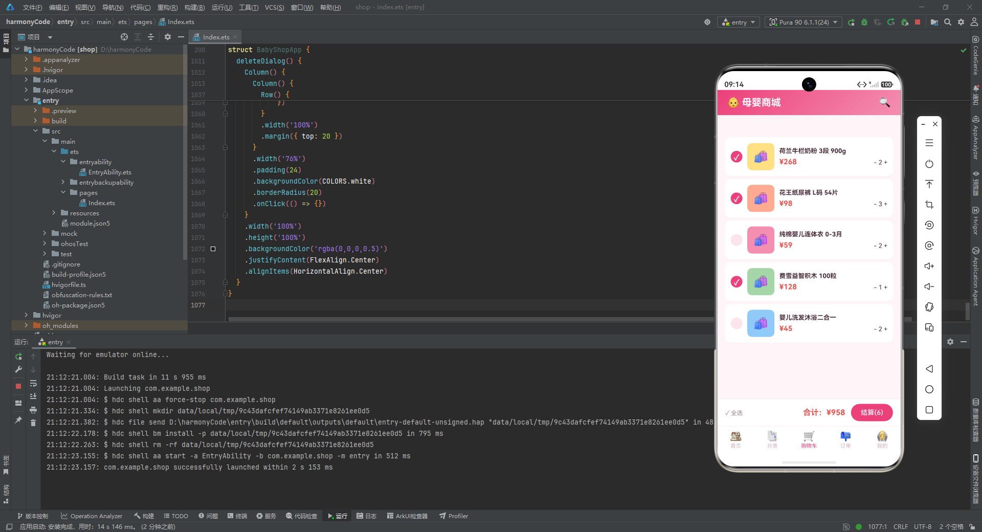
cartContent Builder 构建了购物车 Tab,整体是一个 Column,分为上方的商品列表 Scroll 与下方的底部结算栏。商品列表通过 ForEach 遍历 CART_LIST,每个购物车条目是一个 Row:左侧是 24×24 的圆形勾选框,选中时显示"✓"且背景为深玫红,未选中时背景为浅粉边框色;接着是 56×56 的圆角商品图占位方块;右侧是商品名称(最多两行)、价格(红色加粗)与数量调节器("- 2 +"格式)。数量调节器以文本形式呈现,虽然未绑定实际的增减逻辑,但视觉上清晰地表达了可交互意图。列表底部留有 80vp 的内边距,避免最后一个条目被结算栏遮挡。
10.2 底部结算栏
    // 底部结算栏
    Row() {
      Text('✓ 全选')
        .fontSize(12)
        .fontColor(COLORS.textSecondary)
      Column().layoutWeight(1)
      Text('合计:¥' + getSelectedCartTotal())
        .fontSize(16)
        .fontWeight(FontWeight.Bold)
        .fontColor(COLORS.danger)
      Button('结算(' + getSelectedCartCount() + ')')
        .fontSize(14)
        .fontColor(COLORS.white)
        .backgroundColor(COLORS.primaryDark)
        .borderRadius(20)
        .height(36)
        .padding({ left: 20, right: 20 })
        .margin({ left: 12 })
    }
    .width('100%')
    .height(56)
    .padding({ left: 16, right: 16 })
    .backgroundColor(COLORS.white)
    .border({ width: { top: 1 }, color: COLORS.border })
    .alignItems(VerticalAlign.Center)
  }
  .width('100%')
  .height('100%')
}
底部结算栏是一个固定在购物车页面底部的 Row,高度 56vp,白色背景,顶部有 1px 浅粉边框线。左侧是"✓ 全选"文字,中间用 layoutWeight(1) 撑开,右侧是"合计:¥958"的金额显示(调用 getSelectedCartTotal() 实时计算)与"结算(6)"按钮(调用 getSelectedCartCount() 实时计算件数)。结算按钮使用深玫红背景、白字、20vp 圆角的胶囊形样式,高度 36vp,左右内边距 20vp,视觉上突出且易于点击。结算栏与商品列表通过 Column 的 layoutWeight(1) 协作实现了"列表可滚动、结算栏固定"的经典电商布局。这种固定底部操作栏的模式在移动端电商应用中几乎成为标准,因为它保证了用户在任何滚动位置都能快速发起结算。
十一、订单 Tab 内容
11.1 ordersContent:订单卡片列表
@Builder
ordersContent() {
  Scroll() {
    Column() {
      Text('我的订单')
        .fontSize(18)
        .fontWeight(FontWeight.Bold)
        .fontColor(COLORS.textPrimary)
        .margin({ top: 16, left: 16, bottom: 12 })
        .alignSelf(ItemAlign.Start)

      ForEach(ORDER_LIST, (order: OrderMeta) => {
        Column() {
          Row() {
            Text('订单 #' + order.id)
              .fontSize(12)
              .fontColor(COLORS.textHint)
            Column().layoutWeight(1)
            Text(order.status)
              .fontSize(12)
              .fontColor(getStatusColor(order.status))
              .fontWeight(FontWeight.Bold)
          }
          .width('100%')

          Divider().color(COLORS.border).margin({ top: 8, bottom: 8 })
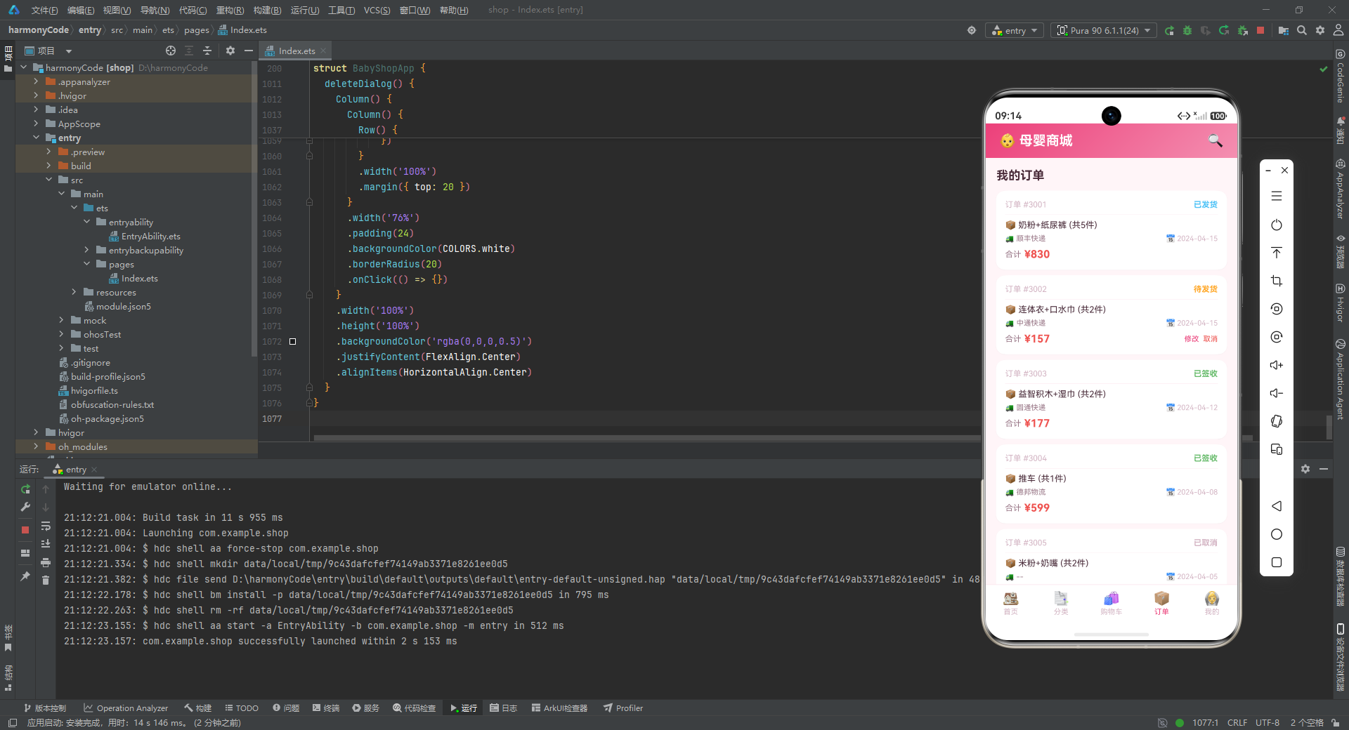
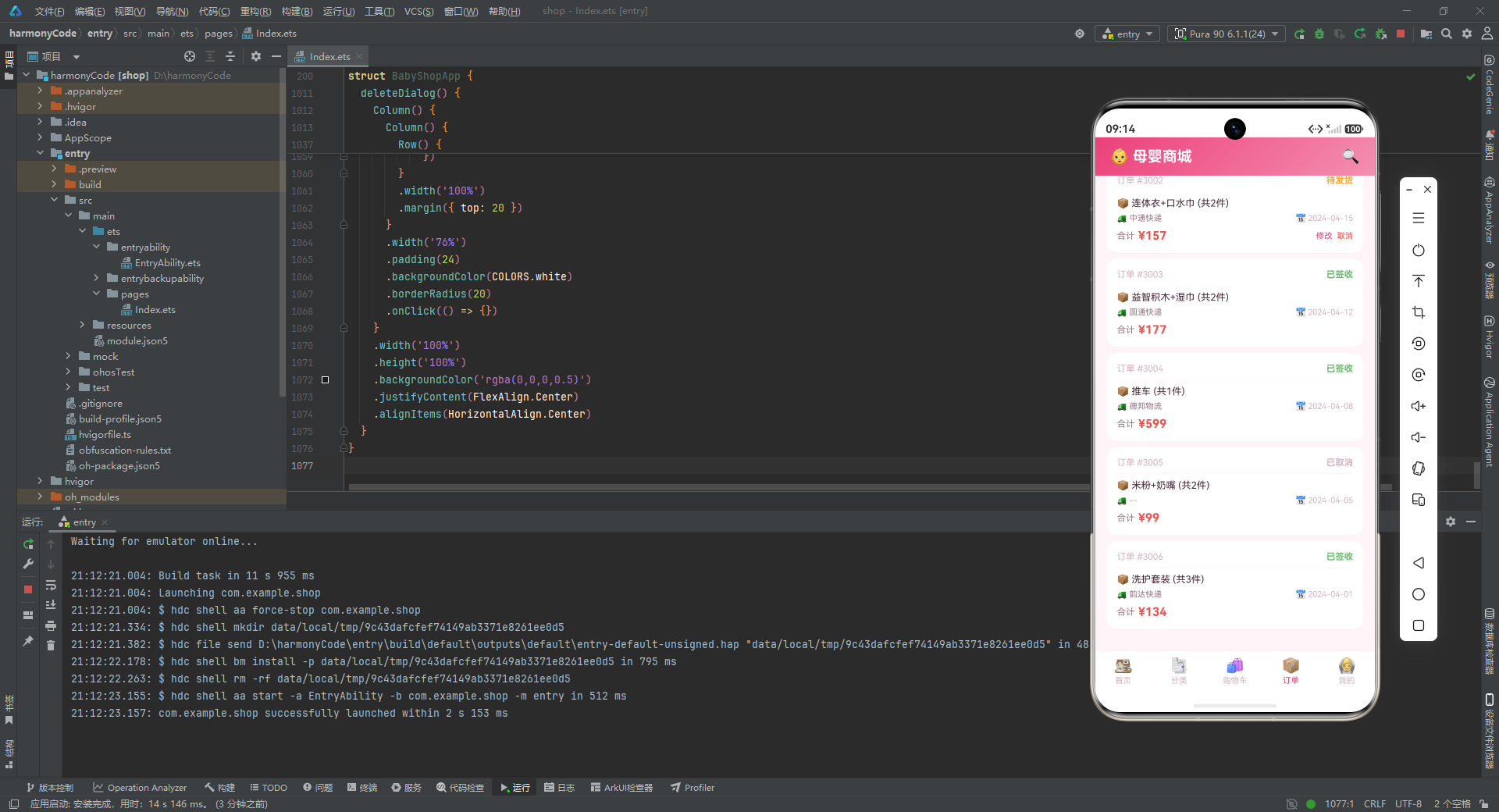
ordersContent Builder 构建了订单 Tab,顶部是"我的订单"标题,下方通过 ForEach 遍历 ORDER_LIST 渲染订单卡片。每个订单卡片是一个 Column,顶部是一个 Row,左侧是"订单 #3001"的订单编号(浅色弱化),右侧是订单状态文字,颜色通过 getStatusColor 函数动态映射——"已签收"为绿色、"已发货"为蓝色、"待发货"为橙色、"已取消"为浅紫灰。状态文字加粗显示,确保用户一眼即可识别。订单编号与状态之间用 layoutWeight(1) 隔开,形成左右分布。标题行下方是一条浅粉分隔线(Divider),上下各留 8vp 间距,将订单头部与商品信息区视觉分离。
11.2 订单商品与物流信息
          Row() {
            Text('📦 ' + order.items + ' (共' + order.count + '件)')
              .fontSize(13)
              .fontColor(COLORS.textPrimary)
              .layoutWeight(1)
          }
          .width('100%')

          Row() {
            Text('🚚 ' + order.logistics)
              .fontSize(11)
              .fontColor(COLORS.textSecondary)
            Column().layoutWeight(1)
            Text('📅 ' + order.date)
              .fontSize(11)
              .fontColor(COLORS.textHint)
          }
          .width('100%')
          .margin({ top: 6 })
商品信息行展示"📦 奶粉+纸尿裤 (共5件)"的概要描述,用包裹 Emoji 增加视觉辨识度,字号 13,主文本色。物流信息行左侧是"🚚 顺丰快递"的物流公司,右侧是"📅 2024-04-15"的下单日期,字号 11,分别使用次要与提示文本色弱化呈现。这两行信息通过 Emoji 前缀实现了"图标 + 文字"的轻量化信息展示,无需引入图标资源即可传达丰富的语义。物流与日期分列左右,信息密度高且布局平衡。
11.3 订单金额与操作按钮
          Row() {
            Text('合计')
              .fontSize(12)
              .fontColor(COLORS.textSecondary)
            Text(' ¥' + order.amount)
              .fontSize(16)
              .fontWeight(FontWeight.Bold)
              .fontColor(COLORS.danger)
            Column().layoutWeight(1)
            if (order.status === '待发货') {
              Text('修改')
                .fontSize(11)
                .fontColor(COLORS.primaryDark)
                .onClick(() => {
                  this.showEditDialog = true
                })
              Text('  取消')
                .fontSize(11)
                .fontColor(COLORS.danger)
                .onClick(() => {
                  this.showDeleteDialog = true
                })
            }
          }
          .width('100%')
          .margin({ top: 8 })
        }
        .width('92%')
        .padding(14)
        .backgroundColor(COLORS.white)
        .borderRadius(14)
        .margin({ bottom: 8 })
        .shadow({ radius: 2, color: '#0D000000', offsetY: 1 })
      })
    }
    .width('100%')
    .padding({ bottom: 20 })
  }
  .width('100%')
  .height('100%')
  .scrollBar(BarState.Off)
}
订单卡片底部是金额与操作行。左侧是"合计 ¥830"的金额显示,"合计"二字用次要色弱化,金额数值用红色加粗 16 号字号突出。右侧通过 if (order.status === '待发货') 条件渲染,仅当订单状态为"待发货"时才显示"修改"与"取消"两个操作按钮——"修改"触发 showEditDialog 弹窗,"取消"触发 showDeleteDialog 弹窗。这种基于状态的差异化操作展示,体现了"按需呈现"的交互设计原则:已发货订单无法修改(物流已发出),已签收订单无需操作,已取消订单已是终态,只有待发货订单才需要提供修改与取消入口。订单卡片整体是白色圆角卡片,14vp 内边距,8vp 项间距,带轻微阴影。
十二、我的 Tab 内容
12.1 mineContent:用户档案与服务入口
@Builder
mineContent() {
  Scroll() {
    Column() {
      Row() {
        Stack() {
          Text('👶')
            .fontSize(32)
        }
        .width(60)
        .height(60)
        .borderRadius(30)
        .backgroundColor(COLORS.primaryLight)

        Column() {
          Text('宝妈用户')
            .fontSize(18)
            .fontWeight(FontWeight.Bold)
            .fontColor(COLORS.textPrimary)
          Text('宝宝 8个月 · VIP会员')
            .fontSize(12)
            .fontColor(COLORS.textSecondary)
            .margin({ top: 4 })
          Text('积分 1280 · 优惠券 5张')
            .fontSize(12)
            .fontColor(COLORS.primaryDark)
            .margin({ top: 2 })
        }
        .margin({ left: 16 })
        .alignItems(HorizontalAlign.Start)
        .layoutWeight(1)
      }
      .width('92%')
      .padding(16)
      .backgroundColor(COLORS.white)
      .borderRadius(16)
      .margin({ top: 16, bottom: 16 })
      .alignItems(VerticalAlign.Center)
      .shadow({ radius: 4, color: '#0D000000', offsetY: 2 })
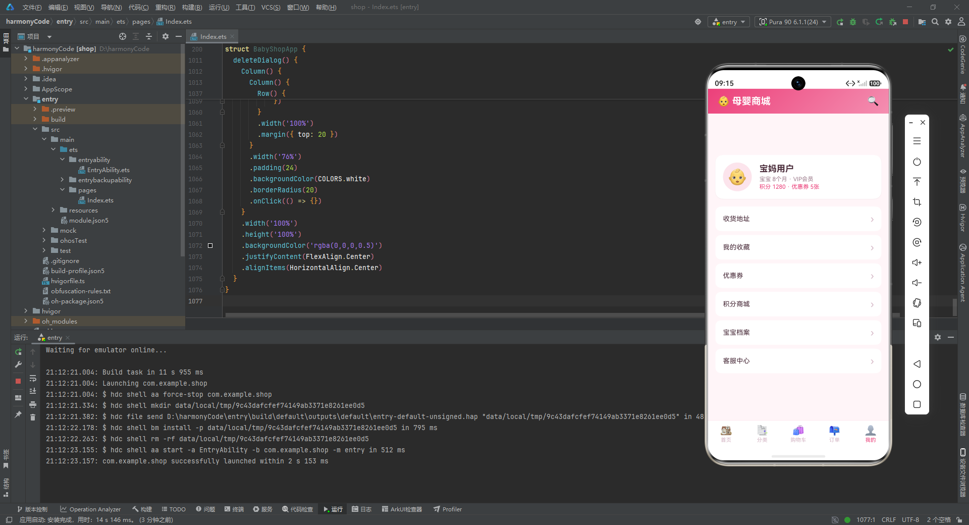
mineContent Builder 构建了"我的"个人中心页面。顶部是用户档案卡片,左侧是 60×60 的圆形头像(浅粉背景 + “👶” Emoji),右侧是用户信息纵向排列:昵称"宝妈用户"(18 号加粗)、宝宝月龄与会员等级(“宝宝 8个月 · VIP会员”,次要色)、积分与优惠券(“积分 1280 · 优惠券 5张”,主色深色)。档案卡片使用 16vp 圆角、4vp 阴影半径(比商品卡片的 2vp 更深),突出了个人信息的主体地位。卡片内的文本层级通过字号(18/12/12)、字重(Bold/Regular/Regular)、颜色(主色/次要色/深玫红)三个维度的差异化,构建了清晰的信息优先级。
12.2 服务入口列表
      ForEach(['收货地址', '我的收藏', '优惠券', '积分商城', '宝宝档案', '客服中心'], (item: string) => {
        Row() {
          Text(item)
            .fontSize(14)
            .fontColor(COLORS.textPrimary)
          Column().layoutWeight(1)
          Text('›')
            .fontSize(20)
            .fontColor(COLORS.textHint)
        }
        .width('92%')
        .padding({ left: 16, right: 16, top: 14, bottom: 14 })
        .backgroundColor(COLORS.white)
        .borderRadius(12)
        .margin({ bottom: 8 })
        .alignItems(VerticalAlign.Center)
      })
    }
    .width('100%')
    .padding({ bottom: 20 })
  }
  .width('100%')
  .height('100%')
  .scrollBar(BarState.Off)
}
用户档案下方是六个服务入口的列表,通过 ForEach 遍历字符串数组直接渲染——这种"数据即视图"的方式在纯展示型列表中非常高效。每个入口项是一个 Row:左侧是服务名称(14 号字号,主文本色),右侧是"›"箭头指示符(20 号字号,提示色)。项与项之间以 8vp 间距分隔,每项是独立的白色圆角卡片,而非共用一个卡片容器——这种"卡片化列表"风格相比传统分组列表更具现代感与呼吸感。六个入口涵盖了地址管理、收藏、优惠、积分、宝宝信息、客服等母婴用户的高频服务需求,其中"宝宝档案"是母婴场景的特色入口,可用于记录宝宝的成长数据以获得个性化推荐。
十三、弹窗组件
13.1 addDialog:加入购物车确认弹窗
@Builder
addDialog() {
  Column() {
    Column() {
      Text('加入购物车')
        .fontSize(18)
        .fontWeight(FontWeight.Bold)
        .fontColor(COLORS.textPrimary)

      Row() {
        Text('商品名称')
          .fontSize(13)
          .fontColor(COLORS.textSecondary)
        Column().layoutWeight(1)
        Text('花王纸尿裤 L码')
          .fontSize(13)
          .fontColor(COLORS.textPrimary)
          .fontWeight(FontWeight.Bold)
      }
      .width('100%')
      .padding({ top: 12, bottom: 12 })
      .border({ width: { bottom: 1 }, color: COLORS.border })

      Row() {
        Text('商品单价')
          .fontSize(13)
          .fontColor(COLORS.textSecondary)
        Column().layoutWeight(1)
        Text('¥98')
          .fontSize(13)
          .fontColor(COLORS.danger)
          .fontWeight(FontWeight.Bold)
      }
      .width('100%')
      .padding({ top: 12, bottom: 12 })
      .border({ width: { bottom: 1 }, color: COLORS.border })

      Row() {
        Text('购买数量')
          .fontSize(13)
          .fontColor(COLORS.textSecondary)
        Column().layoutWeight(1)
        Text('3 包')
          .fontSize(13)
          .fontColor(COLORS.textPrimary)
      }
      .width('100%')
      .padding({ top: 12, bottom: 12 })
      .border({ width: { bottom: 1 }, color: COLORS.border })

      Row() {
        Text('合计金额')
          .fontSize(13)
          .fontColor(COLORS.textSecondary)
        Column().layoutWeight(1)
        Text('¥294')
          .fontSize(16)
          .fontColor(COLORS.danger)
          .fontWeight(FontWeight.Bold)
      }
      .width('100%')
      .padding({ top: 12, bottom: 12 })

      Row() {
        Button('取消')
          .fontSize(14)
          .fontColor(COLORS.textSecondary)
          .backgroundColor(COLORS.white)
          .border({ width: 1, color: COLORS.border })
          .borderRadius(10)
          .height(40)
          .layoutWeight(1)
          .onClick(() => {
            this.showAddDialog = false
          })
        Button('加入购物车')
          .fontSize(14)
          .fontColor(COLORS.white)
          .backgroundColor(COLORS.primaryDark)
          .borderRadius(10)
          .height(40)
          .layoutWeight(1)
          .margin({ left: 12 })
          .onClick(() => {
            this.showAddDialog = false
          })
      }
      .width('100%')
      .margin({ top: 16 })
    }
    .width('80%')
    .padding(20)
    .backgroundColor(COLORS.white)
    .borderRadius(20)
    .onClick(() => {})
  }
  .width('100%')
  .height('100%')
  .backgroundColor('rgba(0,0,0,0.5)')
  .justifyContent(FlexAlign.Center)
  .alignItems(HorizontalAlign.Center)
}
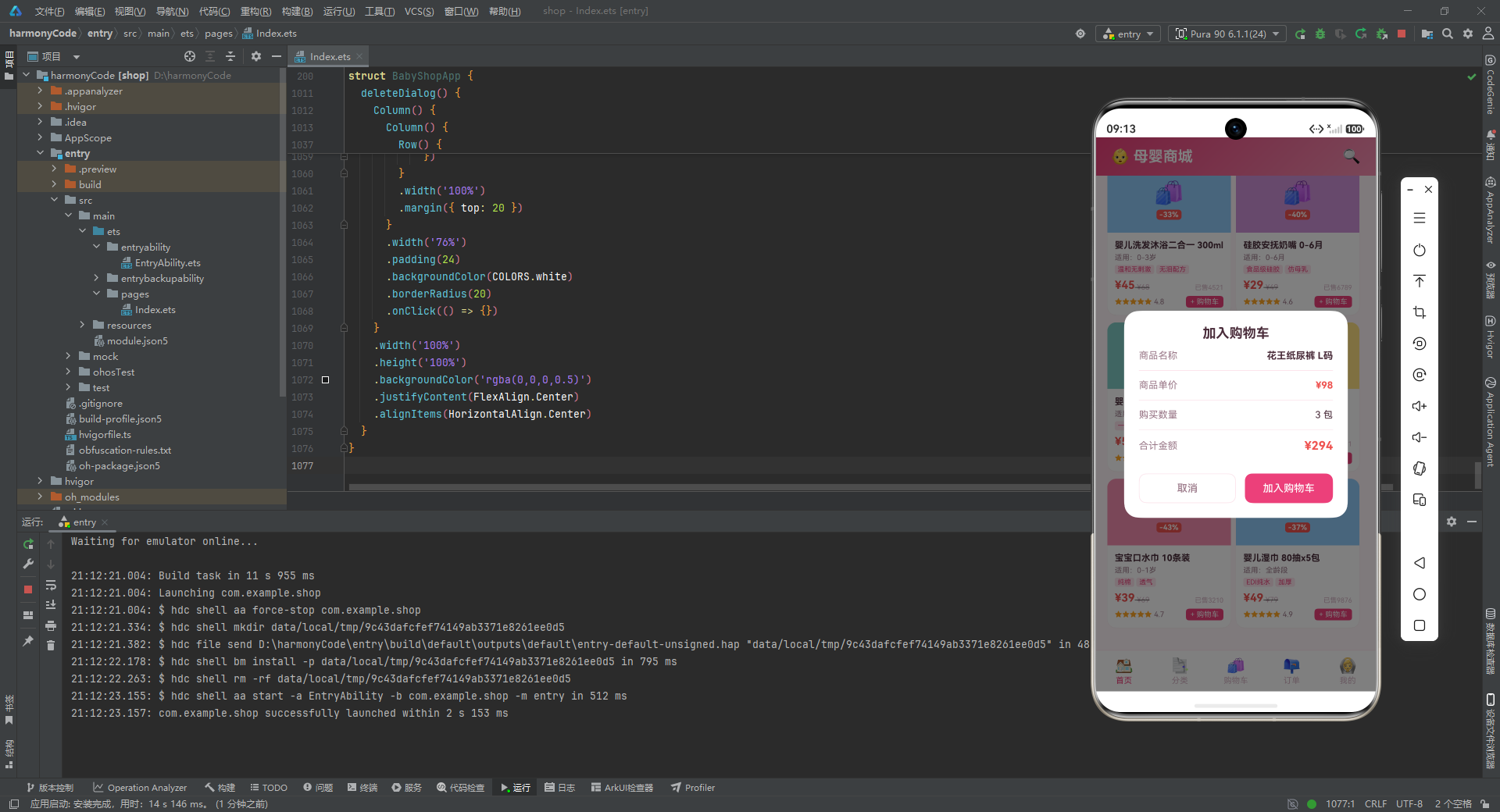
addDialog Builder 构建了加入购物车的确认弹窗。弹窗的最外层是一个全屏 Column,背景色为半透明黑色(rgba(0,0,0,0.5))作为遮罩层,通过 justifyContent(FlexAlign.Center) 与 alignItems(HorizontalAlign.Center) 将弹窗内容居中显示。弹窗主体是一个宽度 80%、白色背景、20vp 圆角的 Column,内含标题"加入购物车"与四行信息行——商品名称、商品单价、购买数量、合计金额,每行之间用浅粉底边框分隔。合计金额行使用 16 号字号红色加粗,视觉权重最高,引导用户关注最终支付金额。底部是"取消"与"加入购物车"两个按钮,各占一半宽度(layoutWeight(1)),取消按钮为白底带边框的次按钮样式,加入购物车按钮为深玫红底白字的主按钮样式,两个按钮的 onClick 回调都将 showAddDialog 设为 false 以关闭弹窗。内层 Column 上的 onClick(() => {}) 是一个空操作,其作用是阻止点击弹窗内部时事件冒泡到遮罩层,避免误关闭——这是一种常见的事件拦截技巧。
13.2 editDialog:修改订单弹窗
@Builder
editDialog() {
  Column() {
    Column() {
      Text('修改订单')
        .fontSize(18)
        .fontWeight(FontWeight.Bold)
        .fontColor(COLORS.textPrimary)
        .margin({ bottom: 16 })

      Row() {
        Text('订单编号')
          .fontSize(13)
          .fontColor(COLORS.textSecondary)
        Column().layoutWeight(1)
        Text('#3002')
          .fontSize(13)
          .fontColor(COLORS.textPrimary)
          .fontWeight(FontWeight.Bold)
      }
      .width('100%')
      .padding({ top: 10, bottom: 10 })
      .border({ width: { bottom: 1 }, color: COLORS.border })

      Row() {
        Text('商品内容')
          .fontSize(13)
          .fontColor(COLORS.textSecondary)
        Column().layoutWeight(1)
        Text('连体衣+口水巾')
          .fontSize(13)
          .fontColor(COLORS.textPrimary)
      }
      .width('100%')
      .padding({ top: 10, bottom: 10 })
      .border({ width: { bottom: 1 }, color: COLORS.border })

      Row() {
        Text('收货地址')
          .fontSize(13)
          .fontColor(COLORS.textSecondary)
        Column().layoutWeight(1)
        Text('上海市浦东新区...')
          .fontSize(12)
          .fontColor(COLORS.textPrimary)
      }
      .width('100%')
      .padding({ top: 10, bottom: 10 })

      Row() {
        Button('取消')
          .fontSize(14)
          .fontColor(COLORS.textSecondary)
          .backgroundColor(COLORS.white)
          .border({ width: 1, color: COLORS.border })
          .borderRadius(10)
          .height(40)
          .layoutWeight(1)
          .onClick(() => {
            this.showEditDialog = false
          })
        Button('保存')
          .fontSize(14)
          .fontColor(COLORS.white)
          .backgroundColor(COLORS.primaryDark)
          .borderRadius(10)
          .height(40)
          .layoutWeight(1)
          .margin({ left: 12 })
          .onClick(() => {
            this.showEditDialog = false
          })
      }
      .width('100%')
      .margin({ top: 16 })
    }
    .width('80%')
    .padding(20)
    .backgroundColor(COLORS.white)
    .borderRadius(20)
    .onClick(() => {})
  }
  .width('100%')
  .height('100%')
  .backgroundColor('rgba(0,0,0,0.5)')
  .justifyContent(FlexAlign.Center)
  .alignItems(HorizontalAlign.Center)
}
editDialog Builder 构建了修改订单的弹窗,结构与加入购物车弹窗高度一致,但信息字段不同。弹窗展示订单编号(“#3002”)、商品内容(“连体衣+口水巾”)、收货地址(“上海市浦东新区…”)三项信息,其中收货地址以省略号结尾,暗示地址较长且可编辑。底部是"取消"与"保存"按钮,分别关闭弹窗与模拟保存操作。在真实业务中,"保存"按钮的回调应当先校验地址等字段的合法性,再调用后端接口更新订单,最后根据接口结果决定关闭弹窗或提示错误。这里为了原型演示,两个按钮都直接关闭弹窗。该弹窗的复用性体现在其布局结构与 addDialog 几乎相同——如果后续重构,可以抽取一个通用的"表单弹窗"Builder,通过参数传入标题、字段列表与按钮配置。
13.3 deleteDialog:取消订单确认弹窗
@Builder
deleteDialog() {
  Column() {
    Column() {
      Stack() {
        Text('⚠')
          .fontSize(40)
          .fontColor(COLORS.danger)
      }
      .width(64)
      .height(64)
      .borderRadius(32)
      .backgroundColor('#FFEBEE')
      .margin({ bottom: 16 })

      Text('取消订单确认')
        .fontSize(18)
        .fontWeight(FontWeight.Bold)
        .fontColor(COLORS.textPrimary)

      Text('确定要取消此订单吗?取消后款项将在3-5个工作日内退回原支付账户。')
        .fontSize(13)
        .fontColor(COLORS.textSecondary)
        .textAlign(TextAlign.Center)
        .lineHeight(20)
        .margin({ top: 12 })

      Row() {
        Button('再想想')
          .fontSize(14)
          .fontColor(COLORS.textSecondary)
          .backgroundColor(COLORS.white)
          .border({ width: 1, color: COLORS.border })
          .borderRadius(10)
          .height(40)
          .layoutWeight(1)
          .onClick(() => {
            this.showDeleteDialog = false
          })
        Button('确认取消')
          .fontSize(14)
          .fontColor(COLORS.white)
          .backgroundColor(COLORS.danger)
          .borderRadius(10)
          .height(40)
          .layoutWeight(1)
          .margin({ left: 12 })
          .onClick(() => {
            this.showDeleteDialog = false
          })
      }
      .width('100%')
      .margin({ top: 20 })
    }
    .width('76%')
    .padding(24)
    .backgroundColor(COLORS.white)
    .borderRadius(20)
    .onClick(() => {})
  }
  .width('100%')
  .height('100%')
  .backgroundColor('rgba(0,0,0,0.5)')
  .justifyContent(FlexAlign.Center)
  .alignItems(HorizontalAlign.Center)
}
deleteDialog Builder 构建了取消订单的确认弹窗,与前两个弹窗的表单式布局不同,这里采用了"警示型"布局。弹窗顶部是一个 64×64 的圆形红色警告图标(浅红背景 #FFEBEE + 红色"⚠"符号),强烈警示用户此操作的严肃性。下方是"取消订单确认"标题与一段说明文字——“确定要取消此订单吗?取消后款项将在3-5个工作日内退回原支付账户。”,说明文字居中对齐,行高 20vp,确保多行文本的可读性。这段文案既明确了操作的不可逆性,又告知了退款时效,降低了用户的决策焦虑。底部是"再想想"与"确认取消"两个按钮——"再想想"是温和的取消措辞,使用次按钮样式;"确认取消"使用红色(COLORS.danger)背景的主按钮样式,色彩上的红色警示与操作的危险性相呼应。弹窗宽度 76%(比前两个弹窗的 80% 略窄),内边距 24vp,视觉上更紧凑聚焦。三个弹窗共同构成了应用的交互闭环:商品卡片触发加入购物车弹窗,待发货订单触发修改与取消弹窗。
十四、模块与组件特点对比
下表对应用中的各个功能模块与组件进行了多维度的横向对比,以便于理解各自的设计定位与技术特征。
| 模块/组件 | 核心职责 | 布局容器 | 数据来源 | 交互复杂度 | 视觉重点 | 状态依赖 | 可复用性 |
|---|---|---|---|---|---|---|---|
| 顶部标题栏 | 品牌标识与搜索入口 | Row + 渐变背景 | 静态文本 | 低(仅搜索图标) | 渐变色品牌色 | 无 | 高 |
| Banner 轮播 | 营销活动展示 | 横向 Scroll + Row | BANNER_LIST | 中(横向滑动) | 多色卡片节奏感 | 无 | 中 |
| 分类网格(首页) | 快速品类导航 | Flex Wrap | CATEGORY_LIST | 低(点击跳转) | 彩色图标方块 | 无 | 高 |
| 商品瀑布流 | 商品浏览与加购 | Flex Wrap + productCard | PRODUCT_LIST | 高(加购弹窗) | 折扣角标与价格 | showAddDialog | 高 |
| 分类列表(分类页) | 品类详情导航 | Scroll + Row 列表 | CATEGORY_LIST | 低(点击跳转) | 列表项箭头引导 | 无 | 中 |
| 购物车列表 | 商品选择与数量管理 | Scroll + Row 列表 | CART_LIST | 高(选择与结算) | 勾选状态与结算栏 | selected 字段 | 中 |
| 底部结算栏 | 金额合计与结算入口 | Row 固定底部 | CART_LIST 计算 | 中(结算按钮) | 红色金额与主色按钮 | 选中商品数据 | 低 |
| 订单列表 | 订单状态追踪与操作 | Scroll + Column 卡片 | ORDER_LIST | 高(修改与取消) | 状态色与条件按钮 | showEdit/DeleteDialog | 中 |
| 个人中心 | 用户档案与服务入口 | Scroll + Row 列表 | 静态文本数组 | 低(点击跳转) | 头像卡片与列表项 | 无 | 中 |
| 加入购物车弹窗 | 加购确认 | Stack 遮罩 + Column | 静态文本 | 中(确认/取消) | 金额高亮 | showAddDialog | 高(可抽象) |
| 修改订单弹窗 | 订单信息编辑 | Stack 遮罩 + Column | 静态文本 | 中(保存/取消) | 表单分隔线 | showEditDialog | 高(可抽象) |
| 取消订单弹窗 | 危险操作确认 | Stack 遮罩 + Column | 静态文本 | 中(确认/取消) | 红色警示图标 | showDeleteDialog | 高(可抽象) |
| 底部导航栏 | Tab 页签切换 | Row + ForEach | TAB_CONFIG | 中(切换页签) | 选中态图标与文字 | currentTab | 高 |
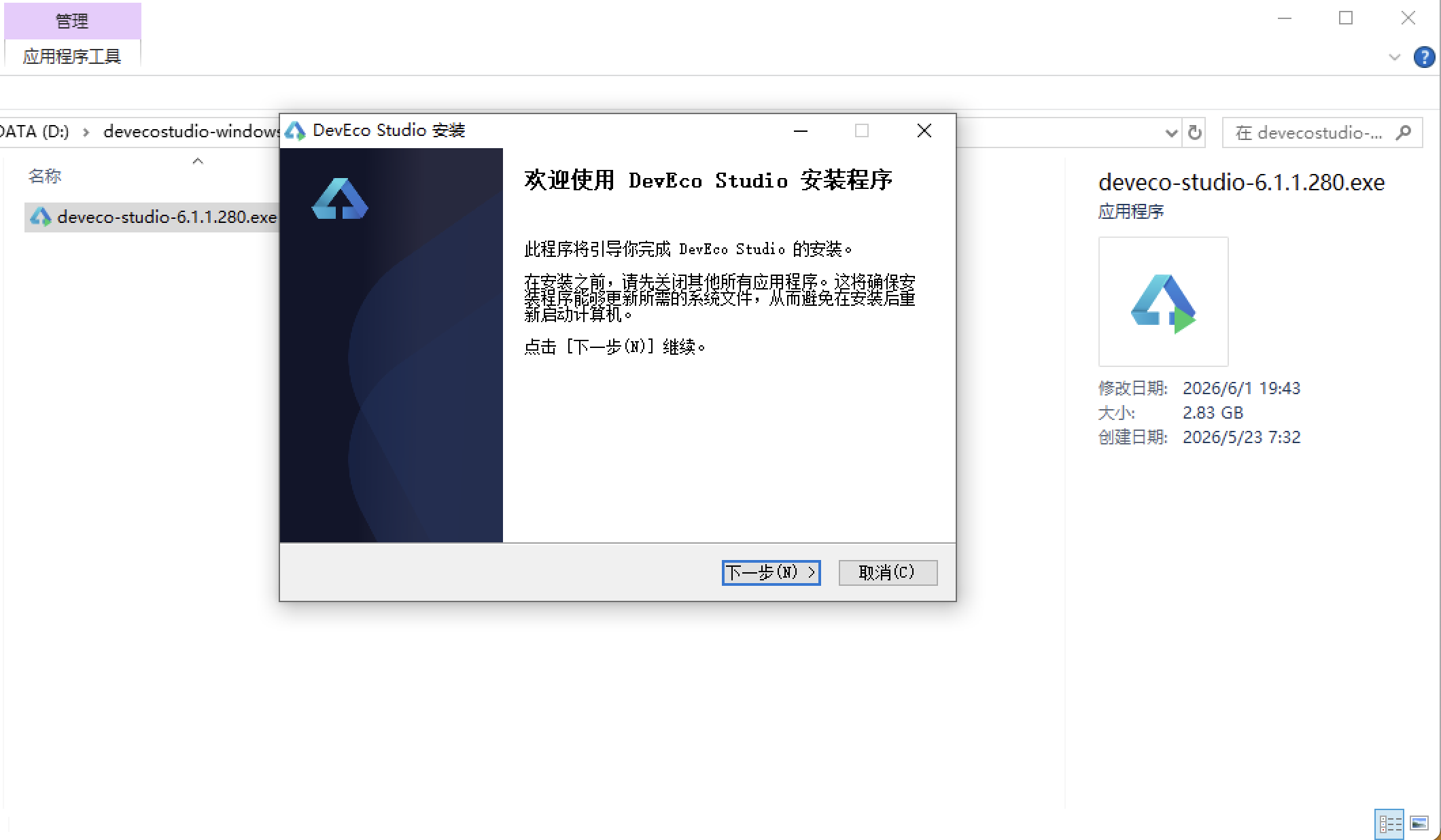
安装DevEco Studio程序
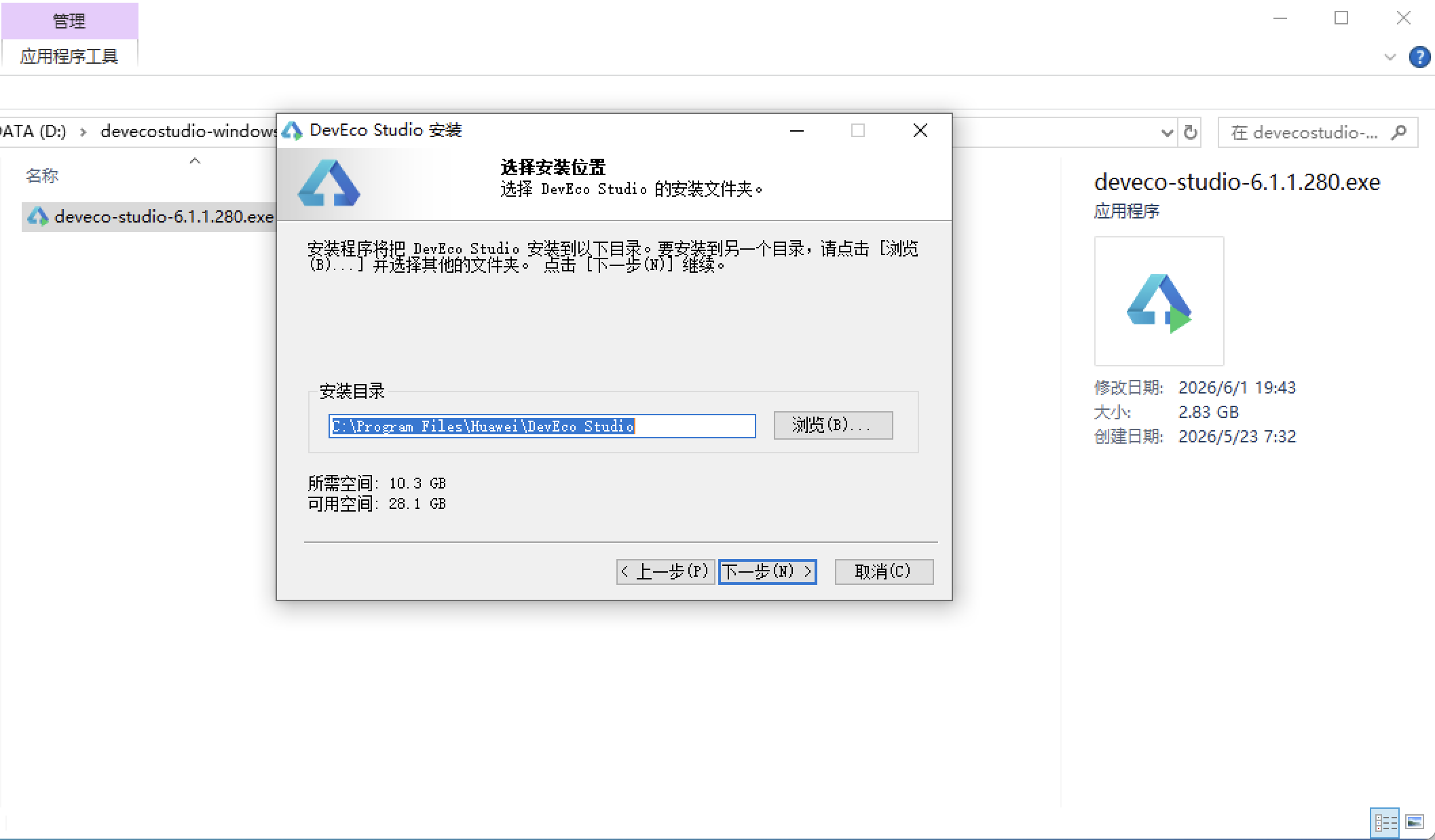
选择目标安装目录:
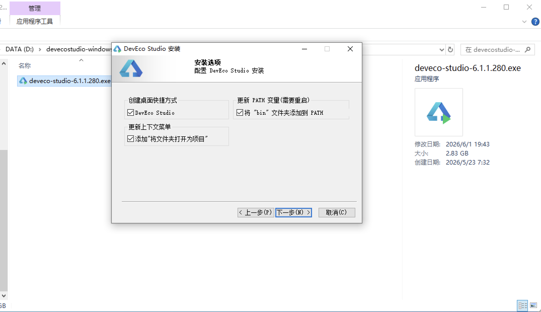
设置环境变量,但是需要重启一下:
新建一个空白模板:
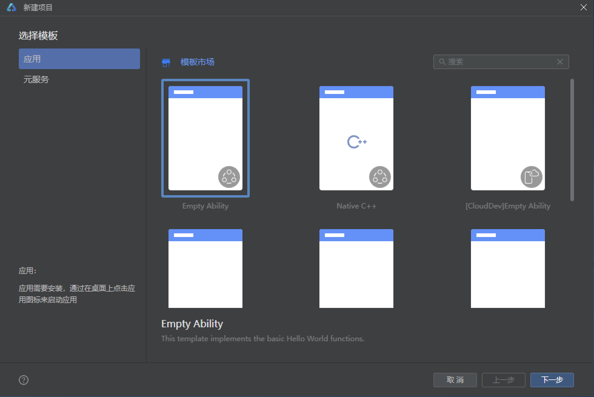
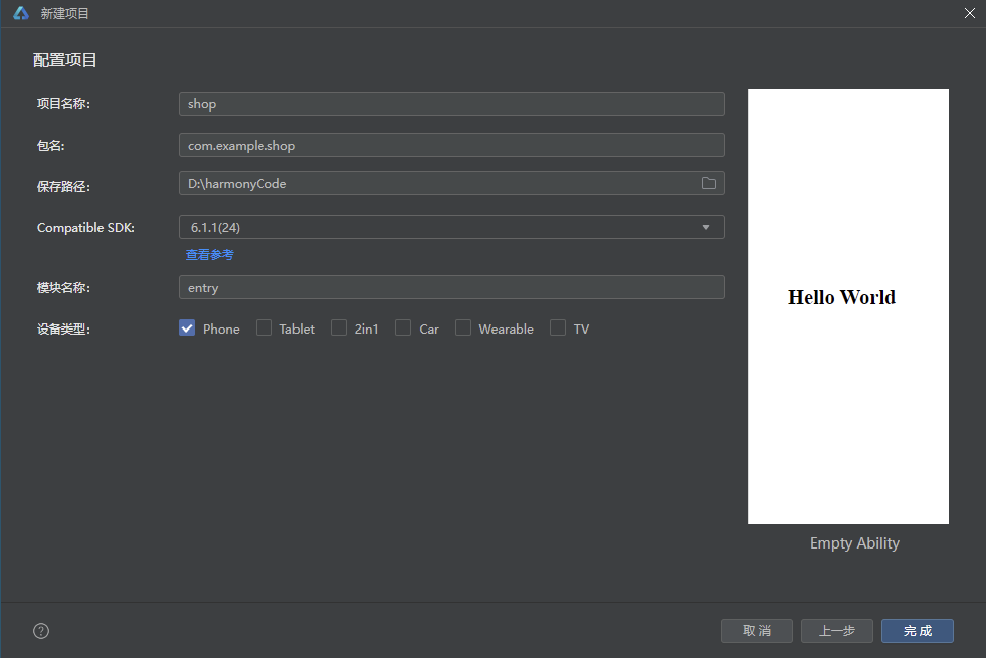
设置API为24的模板项目:
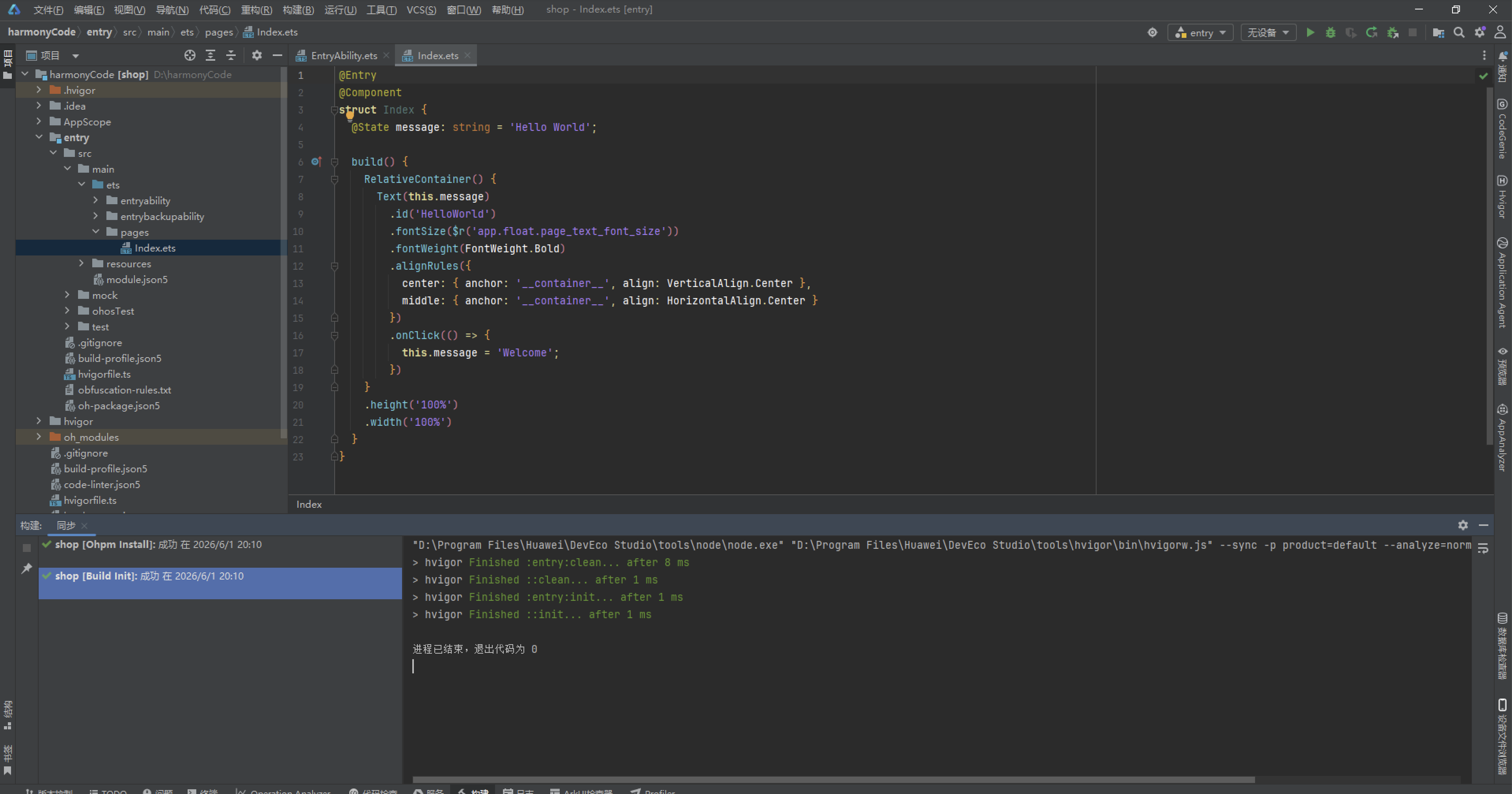
初始化项目,自动下载相关依赖:
完整代码:
// 250.ets - 母婴商城APP
// 主题色:婴儿粉 #F48FB1 + 天空蓝 #4FC3F7
// 布局:Banner轮播 + 分类网格 + 商品瀑布流 + 购物车列表 + 订单追踪
// ==================== 类型定义 ====================
interface ProductMeta {
id: number
name: string
category: string
price: number
originalPrice: number
sales: number
stock: number
imageColor: string
tags: string[]
ageRange: string
rating: number
}
interface CartMeta {
id: number
productName: string
price: number
quantity: number
imageColor: string
selected: boolean
}
interface OrderMeta {
id: number
items: string
amount: number
status: string
date: string
count: number
logistics: string
}
interface CategoryMeta {
name: string
icon: string
color: string
count: number
}
interface BannerMeta {
title: string
subtitle: string
color: string
icon: string
}
// ==================== 设计令牌 ====================
interface ColorPalette {
primary: string;
primaryLight: string;
primaryDark: string;
accent: string;
accentLight: string;
accentDark: string;
bg: string;
cardBg: string;
textPrimary: string;
textSecondary: string;
textHint: string;
border: string;
success: string;
warning: string;
danger: string;
white: string;
}
const COLORS: ColorPalette = {
primary: '#F48FB1',
primaryLight: '#FCE4EC',
primaryDark: '#EC407A',
accent: '#4FC3F7',
accentLight: '#E1F5FE',
accentDark: '#0288D1',
bg: '#FFF5F8',
cardBg: '#FFFFFF',
textPrimary: '#4A2C3A',
textSecondary: '#9C7A8A',
textHint: '#D4B5C4',
border: '#FCE4EC',
success: '#66BB6A',
warning: '#FFA726',
danger: '#EF5350',
white: '#FFFFFF'
};
const TAB_CONFIG: Record<string, string> = {
'home': '首页',
'category': '分类',
'cart': '购物车',
'orders': '订单',
'mine': '我的'
}
// ==================== 硬编码数据 ====================
const BANNER_LIST: BannerMeta[] = [
{ title: '宝宝换季大促', subtitle: '满200减50 · 全场包邮', color: '#F8BBD0', icon: '👶' },
{ title: '奶粉专区', subtitle: '海外直邮 · 正品保障', color: '#B3E5FC', icon: '🍼' },
{ title: '纸尿裤囤货', subtitle: '买2送1 · 限时特惠', color: '#FFE0B2', icon: '🧷' }
]
const CATEGORY_LIST: CategoryMeta[] = [
{ name: '奶粉辅食', icon: '🍼', color: '#FFE082', count: 128 },
{ name: '纸尿裤', icon: '🧷', color: '#FFAB91', count: 86 },
{ name: '宝宝服饰', icon: '👕', color: '#F48FB1', count: 215 },
{ name: '玩具早教', icon: '🧸', color: '#A5D6A7', count: 156 },
{ name: '洗护用品', icon: '🧴', color: '#90CAF9', count: 92 },
{ name: '喂养用品', icon: '🍽', color: '#CE93D8', count: 73 },
{ name: '孕产用品', icon: '🤰', color: '#FFCC80', count: 64 },
{ name: '推车座椅', icon: '🚼', color: '#80CBC4', count: 45 }
]
const PRODUCT_LIST: ProductMeta[] = [
{ id: 1, name: '荷兰牛栏奶粉 3段 900g', category: '奶粉辅食', price: 268, originalPrice: 328, sales: 5632, stock: 500, imageColor: '#FFE082', tags: ['海外直邮', '正品'], ageRange: '6-12月', rating: 4.9 },
{ id: 2, name: '花王纸尿裤 L码 54片', category: '纸尿裤', price: 98, originalPrice: 139, sales: 8721, stock: 800, imageColor: '#FFAB91', tags: ['日本进口', '透气'], ageRange: '9-14kg', rating: 4.8 },
{ id: 3, name: '纯棉婴儿连体衣 0-3月', category: '宝宝服饰', price: 59, originalPrice: 89, sales: 3456, stock: 300, imageColor: '#F48FB1', tags: ['A类纯棉', '无荧光'], ageRange: '0-3月', rating: 4.9 },
{ id: 4, name: '费雪益智积木 100粒', category: '玩具早教', price: 128, originalPrice: 199, sales: 2187, stock: 200, imageColor: '#A5D6A7', tags: ['益智', '环保材质'], ageRange: '1-3岁', rating: 4.7 },
{ id: 5, name: '婴儿洗发沐浴二合一 300ml', category: '洗护用品', price: 45, originalPrice: 68, sales: 4521, stock: 600, imageColor: '#90CAF9', tags: ['温和无刺激', '无泪配方'], ageRange: '0-3岁', rating: 4.8 },
{ id: 6, name: '硅胶安抚奶嘴 0-6月', category: '喂养用品', price: 29, originalPrice: 49, sales: 6789, stock: 1000, imageColor: '#CE93D8', tags: ['食品级硅胶', '仿母乳'], ageRange: '0-6月', rating: 4.6 },
{ id: 7, name: '婴儿推车 可折叠轻便', category: '推车座椅', price: 599, originalPrice: 899, sales: 892, stock: 80, imageColor: '#80CBC4', tags: ['一键折叠', '避震'], ageRange: '0-3岁', rating: 4.9 },
{ id: 8, name: '嘉宝米粉 1阶段 225g', category: '奶粉辅食', price: 35, originalPrice: 52, sales: 7821, stock: 700, imageColor: '#FFE082', tags: ['美国进口', '强化铁'], ageRange: '4-6月', rating: 4.8 },
{ id: 9, name: '宝宝口水巾 10条装', category: '宝宝服饰', price: 39, originalPrice: 69, sales: 3210, stock: 400, imageColor: '#F48FB1', tags: ['纯棉', '透气'], ageRange: '0-1岁', rating: 4.7 },
{ id: 10, name: '婴儿湿巾 80抽x5包', category: '洗护用品', price: 49, originalPrice: 79, sales: 9876, stock: 900, imageColor: '#90CAF9', tags: ['EDI纯水', '加厚'], ageRange: '全龄段', rating: 4.9 }
]
const CART_LIST: CartMeta[] = [
{ id: 1, productName: '荷兰牛栏奶粉 3段 900g', price: 268, quantity: 2, imageColor: '#FFE082', selected: true },
{ id: 2, productName: '花王纸尿裤 L码 54片', price: 98, quantity: 3, imageColor: '#FFAB91', selected: true },
{ id: 3, productName: '纯棉婴儿连体衣 0-3月', price: 59, quantity: 2, imageColor: '#F48FB1', selected: false },
{ id: 4, productName: '费雪益智积木 100粒', price: 128, quantity: 1, imageColor: '#A5D6A7', selected: true },
{ id: 5, productName: '婴儿洗发沐浴二合一', price: 45, quantity: 2, imageColor: '#90CAF9', selected: false }
]
const ORDER_LIST: OrderMeta[] = [
{ id: 3001, items: '奶粉+纸尿裤', amount: 830, status: '已发货', date: '2024-04-15', count: 5, logistics: '顺丰快递' },
{ id: 3002, items: '连体衣+口水巾', amount: 157, status: '待发货', date: '2024-04-15', count: 2, logistics: '中通快递' },
{ id: 3003, items: '益智积木+湿巾', amount: 177, status: '已签收', date: '2024-04-12', count: 2, logistics: '圆通快递' },
{ id: 3004, items: '推车', amount: 599, status: '已签收', date: '2024-04-08', count: 1, logistics: '德邦物流' },
{ id: 3005, items: '米粉+奶嘴', amount: 99, status: '已取消', date: '2024-04-05', count: 2, logistics: '--' },
{ id: 3006, items: '洗护套装', amount: 134, status: '已签收', date: '2024-04-01', count: 3, logistics: '韵达快递' }
]
function getDiscountPercent(original: number, current: number): number {
return Math.floor((1 - current / original) * 100)
}
function getStatusColor(status: string): string {
if (status === '已签收') {
return COLORS.success
}
if (status === '已发货') {
return COLORS.accent
}
if (status === '待发货') {
return COLORS.warning
}
return COLORS.textHint
}
function getSelectedCartTotal(): number {
let total: number = 0
for (const c of CART_LIST) {
if (c.selected) {
total += c.price * c.quantity
}
}
return total
}
function getSelectedCartCount(): number {
let count: number = 0
for (const c of CART_LIST) {
if (c.selected) {
count += c.quantity
}
}
return count
}
function getRatingStars(rating: number): string {
let stars: string = ''
for (let i = 0; i < 5; i++) {
if (i < rating) {
stars += '★'
} else {
stars += '☆'
}
}
return stars
}
// ==================== 入口组件 ====================
@Entry
@Component
struct BabyShopApp {
@State currentTab: string = 'home'
@State showAddDialog: boolean = false
@State showEditDialog: boolean = false
@State showDeleteDialog: boolean = false
build() {
Stack() {
Column() {
Row() {
Text('👶 母婴商城')
.fontSize(20)
.fontWeight(FontWeight.Bold)
.fontColor(COLORS.white)
Column().layoutWeight(1)
Text('🔍')
.fontSize(20)
.fontColor(COLORS.white)
}
.width('100%')
.height(52)
.padding({ left: 20, right: 20 })
.linearGradient({ angle: 135, colors: [[COLORS.primaryDark, 0.0], [COLORS.primary, 1.0]] })
Column() {
if (this.currentTab === 'home') {
this.homeContent()
} else if (this.currentTab === 'category') {
this.categoryContent()
} else if (this.currentTab === 'cart') {
this.cartContent()
} else if (this.currentTab === 'orders') {
this.ordersContent()
} else {
this.mineContent()
}
}
.layoutWeight(1)
.backgroundColor(COLORS.bg)
this.bottomTabBar()
}
.width('100%')
.height('100%')
if (this.showAddDialog) {
this.addDialog()
}
if (this.showEditDialog) {
this.editDialog()
}
if (this.showDeleteDialog) {
this.deleteDialog()
}
}
.width('100%')
.height('100%')
.backgroundColor(COLORS.bg)
}
@Builder
bottomTabBar() {
Row() {
ForEach(Object.keys(TAB_CONFIG), (key: string) => {
Column() {
Text(this.getTabIcon(key))
.fontSize(20)
Text(TAB_CONFIG[key])
.fontSize(11)
.margin({ top: 2 })
.fontColor(this.currentTab === key ? COLORS.primaryDark : COLORS.textHint)
}
.layoutWeight(1)
.height(56)
.justifyContent(FlexAlign.Center)
.onClick(() => {
this.currentTab = key
})
})
}
.width('100%')
.height(56)
.backgroundColor(COLORS.white)
.border({ width: { top: 1 }, color: COLORS.border })
}
getTabIcon(key: string): string {
if (key === 'home') {
return this.currentTab === key ? '🏠' : '🏚'
}
if (key === 'category') {
return this.currentTab === key ? '📋' : '📑'
}
if (key === 'cart') {
return this.currentTab === key ? '🛒' : '🛍'
}
if (key === 'orders') {
return this.currentTab === key ? '📦' : '📭'
}
return this.currentTab === key ? '👤' : '🙆'
}
// ========== 首页Tab ==========
@Builder
homeContent() {
Scroll() {
Column() {
// Banner轮播
Scroll() {
Row() {
ForEach(BANNER_LIST, (banner: BannerMeta) => {
Row() {
Column() {
Text(banner.title)
.fontSize(16)
.fontWeight(FontWeight.Bold)
.fontColor(COLORS.textPrimary)
Text(banner.subtitle)
.fontSize(12)
.fontColor(COLORS.textSecondary)
.margin({ top: 4 })
}
.alignItems(HorizontalAlign.Start)
.layoutWeight(1)
Text(banner.icon)
.fontSize(40)
}
.width(280)
.height(100)
.padding(16)
.backgroundColor(banner.color)
.borderRadius(16)
.margin({ right: 10 })
.alignItems(VerticalAlign.Center)
})
}
.padding({ left: 16, right: 16 })
}
.scrollable(ScrollDirection.Horizontal)
.scrollBar(BarState.Off)
.width('100%')
.height(116)
.margin({ top: 12, bottom: 12 })
// 分类网格
Flex({ wrap: FlexWrap.Wrap }) {
ForEach(CATEGORY_LIST, (cat: CategoryMeta) => {
Column() {
Stack() {
Text(cat.icon)
.fontSize(24)
}
.width(48)
.height(48)
.borderRadius(12)
.backgroundColor(cat.color)
Text(cat.name)
.fontSize(11)
.fontColor(COLORS.textPrimary)
.margin({ top: 6 })
Text(cat.count + '件')
.fontSize(9)
.fontColor(COLORS.textHint)
.margin({ top: 2 })
}
.width('23%')
.padding({ top: 10, bottom: 10 })
.margin({ right: '2%', bottom: 8 })
.alignItems(HorizontalAlign.Center)
})
}
.width('92%')
.margin({ bottom: 12 })
// 热门商品
Row() {
Text('🔥 今日特卖')
.fontSize(16)
.fontWeight(FontWeight.Bold)
.fontColor(COLORS.textPrimary)
Column().layoutWeight(1)
Text('更多 ›')
.fontSize(12)
.fontColor(COLORS.primaryDark)
}
.width('92%')
.margin({ bottom: 12 })
// 商品瀑布流(双列)
Flex({ wrap: FlexWrap.Wrap }) {
ForEach(PRODUCT_LIST, (product: ProductMeta) => {
this.productCard(product)
})
}
.width('92%')
}
.width('100%')
.padding({ bottom: 20 })
}
.width('100%')
.height('100%')
.scrollBar(BarState.Off)
}
@Builder
productCard(product: ProductMeta) {
Column() {
Stack() {
Column() {
Text('🛍')
.fontSize(32)
Text('-' + getDiscountPercent(product.originalPrice, product.price) + '%')
.fontSize(10)
.fontColor(COLORS.white)
.fontWeight(FontWeight.Bold)
.padding({ left: 4, right: 4, top: 1, bottom: 1 })
.backgroundColor(COLORS.danger)
.borderRadius(4)
.margin({ top: 4 })
}
}
.width('100%')
.height(90)
.backgroundColor(product.imageColor)
.borderRadius({ topLeft: 12, topRight: 12 })
Column() {
Text(product.name)
.fontSize(12)
.fontWeight(FontWeight.Bold)
.fontColor(COLORS.textPrimary)
.maxLines(2)
.textOverflow({ overflow: TextOverflow.Ellipsis })
Text('适用:' + product.ageRange)
.fontSize(10)
.fontColor(COLORS.textSecondary)
.margin({ top: 4 })
Row() {
ForEach(product.tags, (tag: string) => {
Text(tag)
.fontSize(9)
.padding({ left: 4, right: 4, top: 1, bottom: 1 })
.backgroundColor(COLORS.primaryLight)
.fontColor(COLORS.primaryDark)
.borderRadius(3)
.margin({ right: 3 })
})
}
.margin({ top: 4 })
Row() {
Text('¥' + product.price)
.fontSize(15)
.fontWeight(FontWeight.Bold)
.fontColor(COLORS.danger)
Text(' ¥' + product.originalPrice)
.fontSize(10)
.fontColor(COLORS.textHint)
.decoration({ type: TextDecorationType.LineThrough })
Column().layoutWeight(1)
Text('已售' + product.sales)
.fontSize(9)
.fontColor(COLORS.textHint)
}
.width('100%')
.margin({ top: 6 })
.alignItems(VerticalAlign.Bottom)
Row() {
Text(getRatingStars(product.rating))
.fontSize(10)
.fontColor(COLORS.warning)
Text(' ' + product.rating)
.fontSize(10)
.fontColor(COLORS.textSecondary)
Column().layoutWeight(1)
Text('+ 购物车')
.fontSize(10)
.fontColor(COLORS.white)
.padding({ left: 6, right: 6, top: 2, bottom: 2 })
.backgroundColor(COLORS.primaryDark)
.borderRadius(4)
.onClick(() => {
this.showAddDialog = true
})
}
.width('100%')
.margin({ top: 6 })
}
.padding(10)
.alignItems(HorizontalAlign.Start)
}
.width('48%')
.backgroundColor(COLORS.white)
.borderRadius(12)
.margin({ right: '2%', bottom: 10 })
.shadow({ radius: 2, color: '#0D000000', offsetY: 1 })
}
// ========== 分类Tab ==========
@Builder
categoryContent() {
Scroll() {
Column() {
Text('全部分类')
.fontSize(18)
.fontWeight(FontWeight.Bold)
.fontColor(COLORS.textPrimary)
.margin({ top: 16, left: 16, bottom: 12 })
.alignSelf(ItemAlign.Start)
ForEach(CATEGORY_LIST, (cat: CategoryMeta) => {
Row() {
Stack() {
Text(cat.icon)
.fontSize(24)
}
.width(48)
.height(48)
.borderRadius(12)
.backgroundColor(cat.color)
Column() {
Text(cat.name)
.fontSize(15)
.fontWeight(FontWeight.Bold)
.fontColor(COLORS.textPrimary)
Text(cat.count + '件商品')
.fontSize(11)
.fontColor(COLORS.textSecondary)
.margin({ top: 2 })
}
.alignItems(HorizontalAlign.Start)
.margin({ left: 12 })
.layoutWeight(1)
Text('›')
.fontSize(20)
.fontColor(COLORS.textHint)
}
.width('92%')
.padding(12)
.backgroundColor(COLORS.white)
.borderRadius(12)
.margin({ bottom: 6 })
.alignItems(VerticalAlign.Center)
.shadow({ radius: 2, color: '#0D000000', offsetY: 1 })
})
}
.width('100%')
.padding({ bottom: 20 })
}
.width('100%')
.height('100%')
.scrollBar(BarState.Off)
}
// ========== 购物车Tab ==========
@Builder
cartContent() {
Column() {
Scroll() {
Column() {
ForEach(CART_LIST, (cart: CartMeta) => {
Row() {
Stack() {
Text(cart.selected ? '✓' : '')
.fontSize(16)
.fontColor(COLORS.white)
.fontWeight(FontWeight.Bold)
}
.width(24)
.height(24)
.borderRadius(12)
.backgroundColor(cart.selected ? COLORS.primaryDark : COLORS.border)
Stack() {
Text('🛍')
.fontSize(24)
}
.width(56)
.height(56)
.borderRadius(10)
.backgroundColor(cart.imageColor)
.margin({ left: 10 })
Column() {
Text(cart.productName)
.fontSize(13)
.fontWeight(FontWeight.Bold)
.fontColor(COLORS.textPrimary)
.maxLines(2)
.textOverflow({ overflow: TextOverflow.Ellipsis })
Row() {
Text('¥' + cart.price)
.fontSize(15)
.fontWeight(FontWeight.Bold)
.fontColor(COLORS.danger)
Column().layoutWeight(1)
Text('- ' + cart.quantity + ' +')
.fontSize(13)
.fontColor(COLORS.textPrimary)
}
.width('100%')
.margin({ top: 6 })
.alignItems(VerticalAlign.Bottom)
}
.layoutWeight(1)
.margin({ left: 10 })
.alignItems(HorizontalAlign.Start)
}
.width('92%')
.padding(12)
.backgroundColor(COLORS.white)
.borderRadius(12)
.margin({ bottom: 6 })
.alignItems(VerticalAlign.Center)
.shadow({ radius: 2, color: '#0D000000', offsetY: 1 })
})
}
.width('100%')
.padding({ top: 16, bottom: 80 })
}
.width('100%')
.layoutWeight(1)
.scrollBar(BarState.Off)
// 底部结算栏
Row() {
Text('✓ 全选')
.fontSize(12)
.fontColor(COLORS.textSecondary)
Column().layoutWeight(1)
Text('合计:¥' + getSelectedCartTotal())
.fontSize(16)
.fontWeight(FontWeight.Bold)
.fontColor(COLORS.danger)
Button('结算(' + getSelectedCartCount() + ')')
.fontSize(14)
.fontColor(COLORS.white)
.backgroundColor(COLORS.primaryDark)
.borderRadius(20)
.height(36)
.padding({ left: 20, right: 20 })
.margin({ left: 12 })
}
.width('100%')
.height(56)
.padding({ left: 16, right: 16 })
.backgroundColor(COLORS.white)
.border({ width: { top: 1 }, color: COLORS.border })
.alignItems(VerticalAlign.Center)
}
.width('100%')
.height('100%')
}
// ========== 订单Tab ==========
@Builder
ordersContent() {
Scroll() {
Column() {
Text('我的订单')
.fontSize(18)
.fontWeight(FontWeight.Bold)
.fontColor(COLORS.textPrimary)
.margin({ top: 16, left: 16, bottom: 12 })
.alignSelf(ItemAlign.Start)
ForEach(ORDER_LIST, (order: OrderMeta) => {
Column() {
Row() {
Text('订单 #' + order.id)
.fontSize(12)
.fontColor(COLORS.textHint)
Column().layoutWeight(1)
Text(order.status)
.fontSize(12)
.fontColor(getStatusColor(order.status))
.fontWeight(FontWeight.Bold)
}
.width('100%')
Divider().color(COLORS.border).margin({ top: 8, bottom: 8 })
Row() {
Text('📦 ' + order.items + ' (共' + order.count + '件)')
.fontSize(13)
.fontColor(COLORS.textPrimary)
.layoutWeight(1)
}
.width('100%')
Row() {
Text('🚚 ' + order.logistics)
.fontSize(11)
.fontColor(COLORS.textSecondary)
Column().layoutWeight(1)
Text('📅 ' + order.date)
.fontSize(11)
.fontColor(COLORS.textHint)
}
.width('100%')
.margin({ top: 6 })
Row() {
Text('合计')
.fontSize(12)
.fontColor(COLORS.textSecondary)
Text(' ¥' + order.amount)
.fontSize(16)
.fontWeight(FontWeight.Bold)
.fontColor(COLORS.danger)
Column().layoutWeight(1)
if (order.status === '待发货') {
Text('修改')
.fontSize(11)
.fontColor(COLORS.primaryDark)
.onClick(() => {
this.showEditDialog = true
})
Text(' 取消')
.fontSize(11)
.fontColor(COLORS.danger)
.onClick(() => {
this.showDeleteDialog = true
})
}
}
.width('100%')
.margin({ top: 8 })
}
.width('92%')
.padding(14)
.backgroundColor(COLORS.white)
.borderRadius(14)
.margin({ bottom: 8 })
.shadow({ radius: 2, color: '#0D000000', offsetY: 1 })
})
}
.width('100%')
.padding({ bottom: 20 })
}
.width('100%')
.height('100%')
.scrollBar(BarState.Off)
}
// ========== 我的Tab ==========
@Builder
mineContent() {
Scroll() {
Column() {
Row() {
Stack() {
Text('👶')
.fontSize(32)
}
.width(60)
.height(60)
.borderRadius(30)
.backgroundColor(COLORS.primaryLight)
Column() {
Text('宝妈用户')
.fontSize(18)
.fontWeight(FontWeight.Bold)
.fontColor(COLORS.textPrimary)
Text('宝宝 8个月 · VIP会员')
.fontSize(12)
.fontColor(COLORS.textSecondary)
.margin({ top: 4 })
Text('积分 1280 · 优惠券 5张')
.fontSize(12)
.fontColor(COLORS.primaryDark)
.margin({ top: 2 })
}
.margin({ left: 16 })
.alignItems(HorizontalAlign.Start)
.layoutWeight(1)
}
.width('92%')
.padding(16)
.backgroundColor(COLORS.white)
.borderRadius(16)
.margin({ top: 16, bottom: 16 })
.alignItems(VerticalAlign.Center)
.shadow({ radius: 4, color: '#0D000000', offsetY: 2 })
ForEach(['收货地址', '我的收藏', '优惠券', '积分商城', '宝宝档案', '客服中心'], (item: string) => {
Row() {
Text(item)
.fontSize(14)
.fontColor(COLORS.textPrimary)
Column().layoutWeight(1)
Text('›')
.fontSize(20)
.fontColor(COLORS.textHint)
}
.width('92%')
.padding({ left: 16, right: 16, top: 14, bottom: 14 })
.backgroundColor(COLORS.white)
.borderRadius(12)
.margin({ bottom: 8 })
.alignItems(VerticalAlign.Center)
})
}
.width('100%')
.padding({ bottom: 20 })
}
.width('100%')
.height('100%')
.scrollBar(BarState.Off)
}
// ==================== 弹窗 ====================
@Builder
addDialog() {
Column() {
Column() {
Text('加入购物车')
.fontSize(18)
.fontWeight(FontWeight.Bold)
.fontColor(COLORS.textPrimary)
Row() {
Text('商品名称')
.fontSize(13)
.fontColor(COLORS.textSecondary)
Column().layoutWeight(1)
Text('花王纸尿裤 L码')
.fontSize(13)
.fontColor(COLORS.textPrimary)
.fontWeight(FontWeight.Bold)
}
.width('100%')
.padding({ top: 12, bottom: 12 })
.border({ width: { bottom: 1 }, color: COLORS.border })
Row() {
Text('商品单价')
.fontSize(13)
.fontColor(COLORS.textSecondary)
Column().layoutWeight(1)
Text('¥98')
.fontSize(13)
.fontColor(COLORS.danger)
.fontWeight(FontWeight.Bold)
}
.width('100%')
.padding({ top: 12, bottom: 12 })
.border({ width: { bottom: 1 }, color: COLORS.border })
Row() {
Text('购买数量')
.fontSize(13)
.fontColor(COLORS.textSecondary)
Column().layoutWeight(1)
Text('3 包')
.fontSize(13)
.fontColor(COLORS.textPrimary)
}
.width('100%')
.padding({ top: 12, bottom: 12 })
.border({ width: { bottom: 1 }, color: COLORS.border })
Row() {
Text('合计金额')
.fontSize(13)
.fontColor(COLORS.textSecondary)
Column().layoutWeight(1)
Text('¥294')
.fontSize(16)
.fontColor(COLORS.danger)
.fontWeight(FontWeight.Bold)
}
.width('100%')
.padding({ top: 12, bottom: 12 })
Row() {
Button('取消')
.fontSize(14)
.fontColor(COLORS.textSecondary)
.backgroundColor(COLORS.white)
.border({ width: 1, color: COLORS.border })
.borderRadius(10)
.height(40)
.layoutWeight(1)
.onClick(() => {
this.showAddDialog = false
})
Button('加入购物车')
.fontSize(14)
.fontColor(COLORS.white)
.backgroundColor(COLORS.primaryDark)
.borderRadius(10)
.height(40)
.layoutWeight(1)
.margin({ left: 12 })
.onClick(() => {
this.showAddDialog = false
})
}
.width('100%')
.margin({ top: 16 })
}
.width('80%')
.padding(20)
.backgroundColor(COLORS.white)
.borderRadius(20)
.onClick(() => {})
}
.width('100%')
.height('100%')
.backgroundColor('rgba(0,0,0,0.5)')
.justifyContent(FlexAlign.Center)
.alignItems(HorizontalAlign.Center)
}
@Builder
editDialog() {
Column() {
Column() {
Text('修改订单')
.fontSize(18)
.fontWeight(FontWeight.Bold)
.fontColor(COLORS.textPrimary)
.margin({ bottom: 16 })
Row() {
Text('订单编号')
.fontSize(13)
.fontColor(COLORS.textSecondary)
Column().layoutWeight(1)
Text('#3002')
.fontSize(13)
.fontColor(COLORS.textPrimary)
.fontWeight(FontWeight.Bold)
}
.width('100%')
.padding({ top: 10, bottom: 10 })
.border({ width: { bottom: 1 }, color: COLORS.border })
Row() {
Text('商品内容')
.fontSize(13)
.fontColor(COLORS.textSecondary)
Column().layoutWeight(1)
Text('连体衣+口水巾')
.fontSize(13)
.fontColor(COLORS.textPrimary)
}
.width('100%')
.padding({ top: 10, bottom: 10 })
.border({ width: { bottom: 1 }, color: COLORS.border })
Row() {
Text('收货地址')
.fontSize(13)
.fontColor(COLORS.textSecondary)
Column().layoutWeight(1)
Text('上海市浦东新区...')
.fontSize(12)
.fontColor(COLORS.textPrimary)
}
.width('100%')
.padding({ top: 10, bottom: 10 })
Row() {
Button('取消')
.fontSize(14)
.fontColor(COLORS.textSecondary)
.backgroundColor(COLORS.white)
.border({ width: 1, color: COLORS.border })
.borderRadius(10)
.height(40)
.layoutWeight(1)
.onClick(() => {
this.showEditDialog = false
})
Button('保存')
.fontSize(14)
.fontColor(COLORS.white)
.backgroundColor(COLORS.primaryDark)
.borderRadius(10)
.height(40)
.layoutWeight(1)
.margin({ left: 12 })
.onClick(() => {
this.showEditDialog = false
})
}
.width('100%')
.margin({ top: 16 })
}
.width('80%')
.padding(20)
.backgroundColor(COLORS.white)
.borderRadius(20)
.onClick(() => {})
}
.width('100%')
.height('100%')
.backgroundColor('rgba(0,0,0,0.5)')
.justifyContent(FlexAlign.Center)
.alignItems(HorizontalAlign.Center)
}
@Builder
deleteDialog() {
Column() {
Column() {
Stack() {
Text('⚠')
.fontSize(40)
.fontColor(COLORS.danger)
}
.width(64)
.height(64)
.borderRadius(32)
.backgroundColor('#FFEBEE')
.margin({ bottom: 16 })
Text('取消订单确认')
.fontSize(18)
.fontWeight(FontWeight.Bold)
.fontColor(COLORS.textPrimary)
Text('确定要取消此订单吗?取消后款项将在3-5个工作日内退回原支付账户。')
.fontSize(13)
.fontColor(COLORS.textSecondary)
.textAlign(TextAlign.Center)
.lineHeight(20)
.margin({ top: 12 })
Row() {
Button('再想想')
.fontSize(14)
.fontColor(COLORS.textSecondary)
.backgroundColor(COLORS.white)
.border({ width: 1, color: COLORS.border })
.borderRadius(10)
.height(40)
.layoutWeight(1)
.onClick(() => {
this.showDeleteDialog = false
})
Button('确认取消')
.fontSize(14)
.fontColor(COLORS.white)
.backgroundColor(COLORS.danger)
.borderRadius(10)
.height(40)
.layoutWeight(1)
.margin({ left: 12 })
.onClick(() => {
this.showDeleteDialog = false
})
}
.width('100%')
.margin({ top: 20 })
}
.width('76%')
.padding(24)
.backgroundColor(COLORS.white)
.borderRadius(20)
.onClick(() => {})
}
.width('100%')
.height('100%')
.backgroundColor('rgba(0,0,0,0.5)')
.justifyContent(FlexAlign.Center)
.alignItems(HorizontalAlign.Center)
}
}
十五、总结与技术反思
15.1 技术要点回顾
纵观整个母婴商城应用的实现,我们可以提炼出若干值得借鉴的技术要点。首先是声明式 UI 范式的深度运用——通过 @Entry、@Component、@State、@Builder 四个核心装饰器,应用构建了一个状态驱动、Builder 分治的组件架构,build 函数仅负责骨架组装,具体内容下沉到各个 @Builder 方法,实现了关注点分离。其次是设计令牌体系的建立——ColorPalette 接口与 COLORS 常量构成了应用的视觉契约,所有颜色引用均通过语义化键名访问,杜绝了魔法字符串,为主题统一与未来暗黑模式适配奠定了基础。再次是数据建模的严谨性——五个 interface 明确界定了业务实体的字段结构,配合 Record 类型的配置映射与硬编码常量数组,形成了"类型-数据-配置"的三层数据架构。最后是纯函数的合理运用——折扣计算、状态颜色映射、购物车合计、星级生成等业务逻辑均封装为无副作用的纯函数,既保证了可测试性,又避免了 UI 层的逻辑污染。
15.2 设计思想剖析
在设计思想层面,这款应用体现了"原型优先、数据驱动、体验细腻"三大原则。"原型优先"体现在广泛使用 Emoji 字符与色块代替图片资源,在不引入外部依赖的前提下快速构建了可交互的高保真原型,这种做法在需求验证阶段具有极高的效率优势。"数据驱动"体现在 UI 渲染高度依赖数据遍历——ForEach 配合常量数组驱动了 Banner、分类、商品、购物车、订单、服务入口等几乎所有列表区域的渲染,新增数据项即可自动扩展 UI,无需修改布局代码。"体验细腻"体现在诸多细节处理上:商品名称的 maxLines(2) + 省略号保证了卡片高度一致;价格行的 alignItems(VerticalAlign.Bottom) 使现价与原价底部对齐;弹窗内层的空 onClick 阻止了事件冒泡;订单状态的条件按钮实现了"按需呈现"的操作引导;折扣百分比的 Math.floor 向下取整规避了合规风险——这些细节共同塑造了成熟、专业的产品质感。
15.3 可改进方向
尽管应用整体完成度较高,但仍存在若干可改进方向。其一,状态管理的响应式改造——当前购物车合计与件数计算依赖硬编码的 CART_LIST 常量,无法响应用户的选择与数量变更操作,应将购物车数据升级为 @State 或 @Observed/@ObjectLink 响应式状态,使合计金额与结算按钮件数实时联动。其二,组件的进一步拆分——当前所有 Builder 集中在 BabyShopApp 一个结构体中,随着功能增长会导致文件膨胀,应将商品卡片、订单卡片、弹窗等抽取为独立的 @Component 自定义组件,通过 @Prop/@Link/@Provide/@Consume 管理跨组件状态。其三,导航架构的升级——当前 Tab 切换通过 if...else 条件渲染实现,每次切换都会重建组件、丢失滚动位置,应考虑使用 Navigation 组件或 Tabs 容器实现真正的页面级导航与状态保留。其四,真实资源的接入——Emoji 与色块应替换为真实的商品图片、矢量图标与品牌字体,并引入图片加载库实现懒加载与缓存。其五,无障碍与性能优化——应为交互元素补充 accessibilityText 等无障碍属性,为长列表引入 LazyForEach 实现按需加载,避免大数据量下的渲染性能瓶颈。
15.4 工程价值与展望
从"单组件多 Builder"到"多组件 + 状态管理"再到"Navigation 导航 + 分布式数据"的升级路线是平滑可行的,前期的类型定义、设计令牌、纯函数等基础设施可以无缝复用。应用所展示的"声明式 UI + 数据驱动 + 设计令牌"三位一体的开发模式,正是 HarmonyOS ArkTS 推荐的最佳实践,对于希望入门鸿蒙原生开发的工程师具有很好的参考价值。展望未来,随着鸿蒙生态的成熟与分布式能力的释放,这类垂直电商应用还可以进一步接入 HarmonyOS 的服务卡片、原子化服务、跨设备协同等特性,例如在智能手表上展示订单物流进度、在智慧屏上浏览商品大图、在车机上语音加购——这些场景都将得益于 ArkTS 统一的开发范式与鸿蒙的全场景分布式能力。希望本文的逐行解析能够帮助读者深入理解 HarmonyOS ArkTS 的开发模式,并在自己的项目中灵活运用这些设计思想与技术技巧。
更多推荐
 5
5 0
0- 0


 已为社区贡献13条内容

所有评论(0)