
组件样式继承与覆盖——从不可见容器到策略模式的深度工程化实践
文章目录

每日一句正能量
这个世界没有白费的努力,也没有白来的成功。
你可能暂时看不到回报,但努力不会消失,它会以某种方式沉淀下来。不要幻想捷径,所有的得到都要付出对等的代价。
岁月不败真功,星光不负赶路人。 愿你带着这份沉静的力量,在自己的时区里,从容地重复,坚定地积累。
一、引言:组件样式继承的工程化痛点
在 HarmonyOS 应用开发中,自定义组件是实现 UI 复用和模块化设计的核心手段。然而,随着组件层级加深、业务场景复杂化,一个看似简单的问题往往让开发者陷入困惑:给自定义组件设置的 width 和 backgroundColor,为什么没有直接作用于组件内部的 Button 或 Text?
这个困惑的根源在于 ArkUI 的渲染机制——当为自定义组件设置通用样式时,系统实际上是在组件外部套了一个开发者不可见的容器组件,样式作用于这个容器而非组件内部元素。理解这一机制,是掌握组件样式继承与覆盖的前提。
本文将基于 HarmonyOS 6(API 23),从不可见容器的底层机制出发,系统讲解样式覆盖优先级、父子组件状态传递、@BuilderParam 注入、AttributeModifier 动态覆盖,以及策略模式在组件样式体系中的工程化实践。
二、核心机制:不可见容器与样式继承
2.1 不可见容器机制
ArkUI 给自定义组件设置样式时,相当于给组件套了一个不可见的容器组件,而这些样式是设置在容器组件上的,而非直接设置给组件内部的元素。通过渲染结果可以清楚地看到,背景颜色并没有直接生效在内部元素上,而是生效在内部元素所处的不可见容器上。
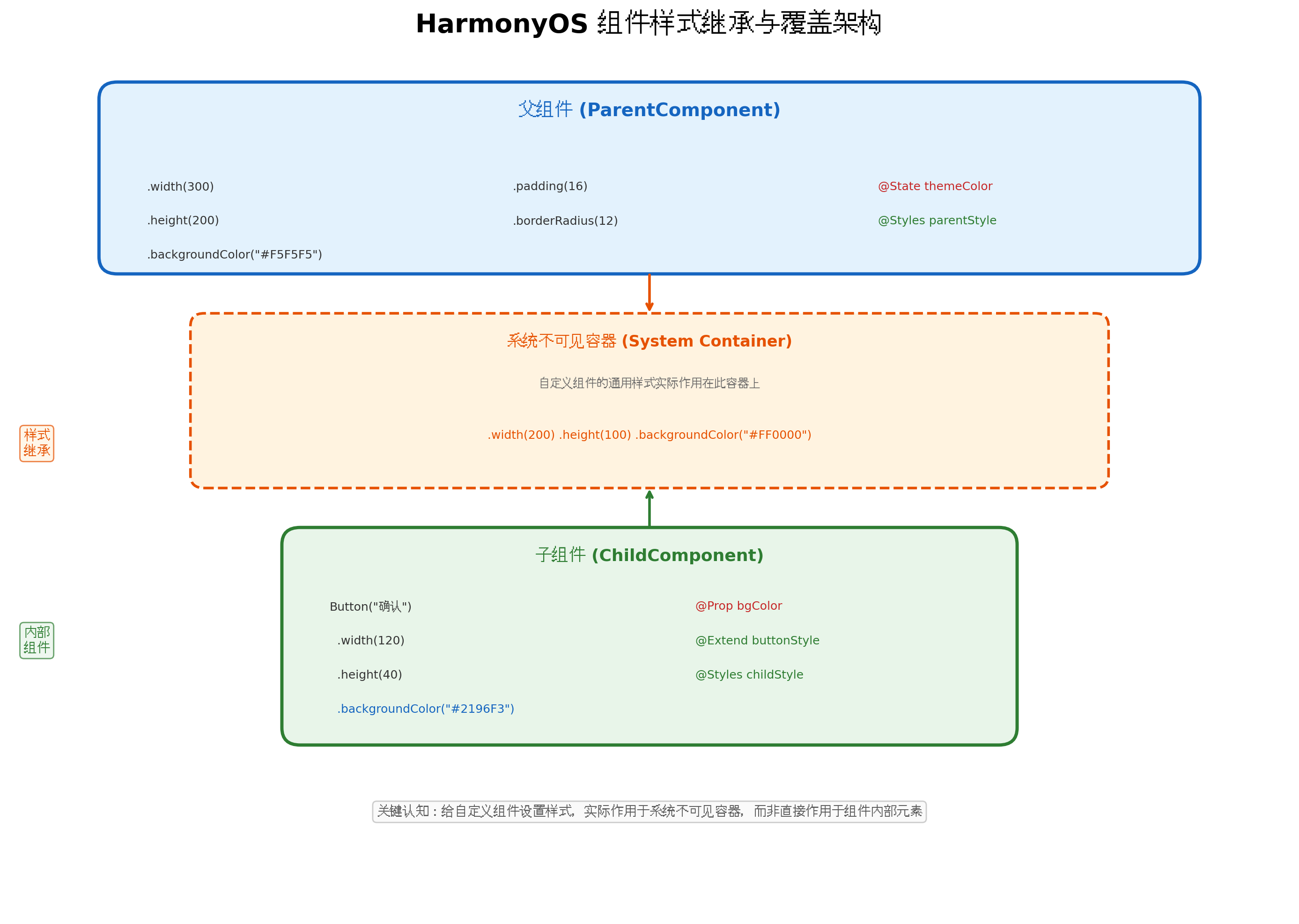
图1:HarmonyOS 组件样式继承与覆盖架构
如上图所示,整个样式传递链路分为三层:
- 父组件层:通过
.width(300).padding(16)等链式调用设置样式 - 不可见容器层:系统自动创建的容器,实际承载父组件传入的通用样式
- 子组件内部层:组件自身
build()中定义的元素,拥有独立的样式作用域
这一机制的核心影响是:通用样式(width、height、padding、backgroundColor 等)作用于不可见容器,而子组件内部元素的样式由子组件自身控制。这意味着父组件无法直接"穿透"修改子组件内部的字体大小或按钮颜色,必须通过状态传递或参数注入实现。
2.2 实验验证
@Component
struct MyComponent {
  build() {
    Button('Hello')
      .fontSize(20)
  }
}

@Entry
@Component
struct ParentPage {
  build() {
    Row() {
      MyComponent()
        .width(200)
        .height(300)
        .backgroundColor(Color.Red)
    }
  }
}
运行结果:红色背景并不会直接覆盖在 Button 上,而是出现在 Button 所在的不可见容器中。Button 保持自身默认样式,仅被容器约束了布局范围。
三、样式覆盖优先级金字塔
在 HarmonyOS 中,当多种样式机制同时作用于一个组件时,遵循明确的优先级规则。理解这个优先级体系,是避免样式冲突的关键。
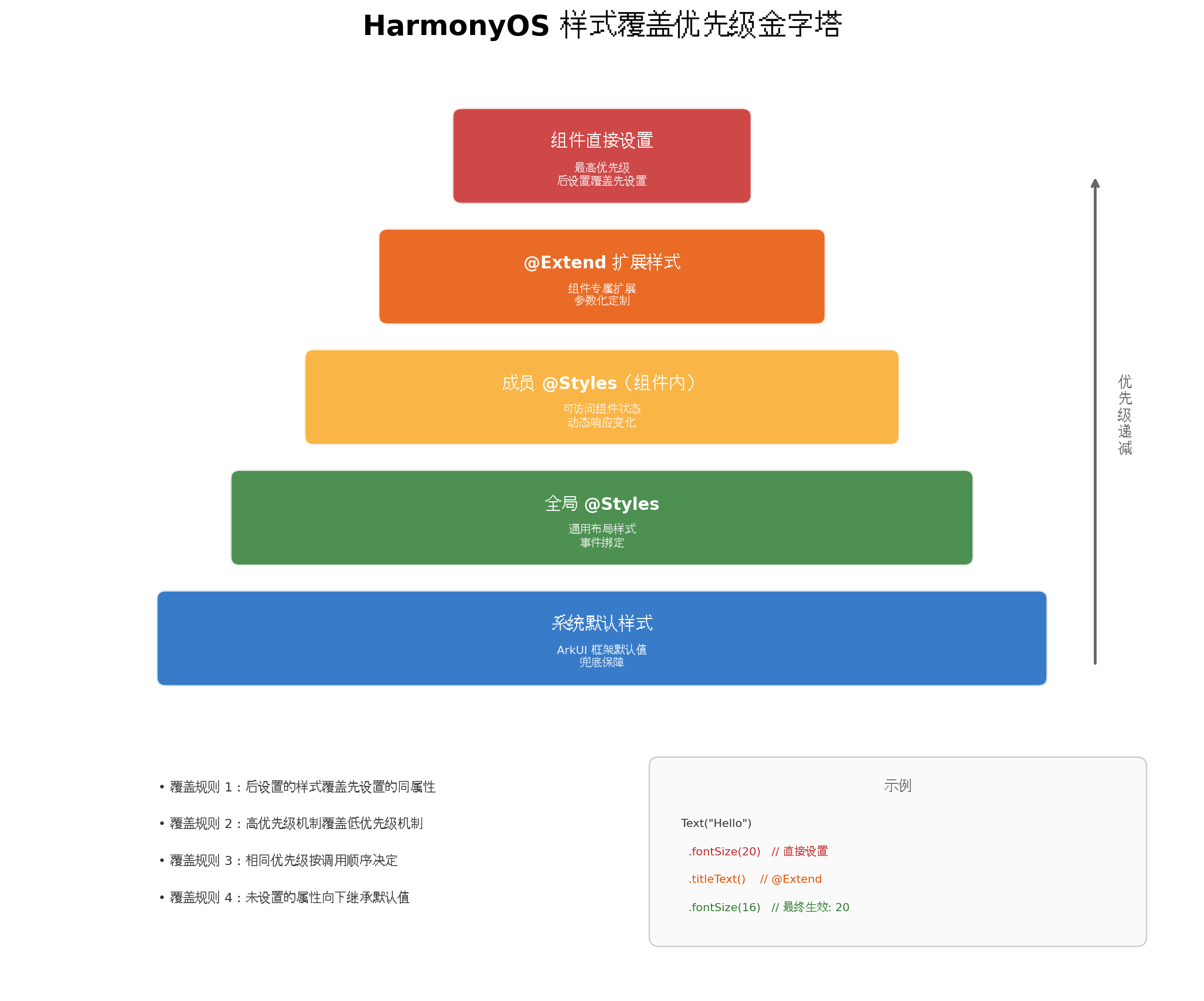
图2:HarmonyOS 样式覆盖优先级金字塔
3.1 优先级层级(从高到低)
| 优先级 | 机制 | 特性 |
|---|---|---|
| 1 | 组件直接设置 | .fontSize(20) 等链式调用,后设置覆盖先设置 |
| 2 | @Extend 扩展样式 | 组件专属扩展,支持参数化 |
| 3 | 成员 @Styles | 组件内定义,可访问状态变量 |
| 4 | 全局 @Styles | 通用布局样式,跨组件复用 |
| 5 | 系统默认样式 | ArkUI 框架默认值 |
3.2 覆盖规则
规则一:后设置的样式覆盖先设置的同属性
Text('Hello')
  .fontSize(16)   // 先设置
  .fontSize(20)   // 后设置,最终生效 20
规则二:高优先级机制覆盖低优先级机制
@Extend(Text) function titleText() {
  .fontSize(18)
  .fontColor('#333333')
}

Text('标题')
  .titleText()      // @Extend 设置 fontSize: 18
  .fontSize(24)     // 直接设置覆盖,最终生效 24
规则三:相同优先级按调用顺序决定
@Styles function styleA() { .width(100) }
@Styles function styleB() { .width(200) }

Column()
  .styleA()   // 先调用,width = 100
  .styleB()   // 后调用,width = 200(最终生效)
规则四:未设置的属性向下继承默认值
@Extend(Text) function titleText() {
  .fontSize(20)
  // 未设置 fontColor,继承系统默认
}

Text('标题')
  .titleText()           // fontSize = 20
  .fontColor('#FF0000')  // 单独设置 fontColor
四、父子组件状态传递与样式覆盖
4.1 @Prop:单向状态传递实现样式注入
@Prop 装饰器建立父子组件间的单向同步关系,父组件修改状态会同步到子组件,但子组件的修改不会回传父组件。这是实现样式继承最基础的方式。
// components/AppCard.ets
@Component
export struct AppCard {
  @Prop title: string = '';
  @Prop desc: string = '';
  @Prop bgColor: ResourceColor = $r('app.color.surface_card');
  @Prop borderColor: ResourceColor = $r('app.color.border_default');
  @Prop showShadow: boolean = true;

  build() {
    Column({ space: 8 }) {
      Text(this.title)
        .fontSize(18)
        .fontWeight(FontWeight.Bold)
        .fontColor($r('app.color.text_primary'))

      Text(this.desc)
        .fontSize(14)
        .fontColor($r('app.color.text_secondary'))
        .maxLines(2)
        .textOverflow({ overflow: TextOverflow.Ellipsis })
    }
    .width('90%')
    .padding(16)
    .backgroundColor(this.bgColor)
    .borderRadius(12)
    .border({
      width: 1,
      color: this.borderColor
    })
    .shadow(this.showShadow ? {
      radius: 8,
      color: 'rgba(0,0,0,0.06)',
      offsetX: 0,
      offsetY: 2
    } : undefined)
  }
}
// pages/Index.ets
import { AppCard } from '../components/AppCard';

@Entry
@Component
struct Index {
  @State themeColor: string = '#2196F3';

  build() {
    Column({ space: 16 }) {
      // 默认样式
      AppCard({
        title: '默认卡片',
        desc: '使用默认背景色和边框色'
      })

      // 覆盖背景色(警告场景)
      AppCard({
        title: '警告卡片',
        desc: '操作可能存在风险',
        bgColor: '#FFF3E0',
        borderColor: '#FF9800'
      })

      // 覆盖背景色(成功场景)
      AppCard({
        title: '成功卡片',
        desc: '操作已完成',
        bgColor: '#E8F5E9',
        borderColor: '#4CAF50'
      })

      // 无阴影的简洁卡片
      AppCard({
        title: '简洁卡片',
        desc: '无阴影的扁平风格',
        showShadow: false
      })
    }
    .width('100%')
    .padding(20)
  }
}
4.2 @Link:双向状态同步实现动态样式
当需要父子组件双向同步样式状态时,使用 @Link 装饰器:
// components/ThemeAwareButton.ets
@Component
export struct ThemeAwareButton {
  @Link isActive: boolean;
  label: string = '按钮';
  onClick?: () => void;

  @Styles activeStyle() {
    .backgroundColor('#1565C0')
    .scale({ x: 0.96, y: 0.96 })
  }

  @Styles inactiveStyle() {
    .backgroundColor('#2196F3')
    .scale({ x: 1, y: 1 })
  }

  build() {
    Button(this.label)
      .width('80%')
      .height(48)
      .fontSize(16)
      .fontColor(Color.White)
      .borderRadius(24)
      .stateStyles({
        normal: this.isActive ? this.activeStyle : this.inactiveStyle
      })
      .onClick(() => {
        this.isActive = !this.isActive;
        this.onClick?.();
      })
  }
}
// 父组件中使用
@Entry
@Component
struct ParentPage {
  @State buttonActive: boolean = false;

  build() {
    Column() {
      ThemeAwareButton({
        isActive: this.buttonActive,
        label: '切换状态',
        onClick: () => {
          console.info(`当前状态: ${this.buttonActive}`);
        }
      })
    }
  }
}
五、@BuilderParam:UI 结构注入实现深度覆盖
当需要让父组件完全控制子组件的部分 UI 结构时,@BuilderParam 是最强大的工具。它允许父组件向子组件注入自定义的 UI 构建函数,实现"插槽"(Slot)机制。
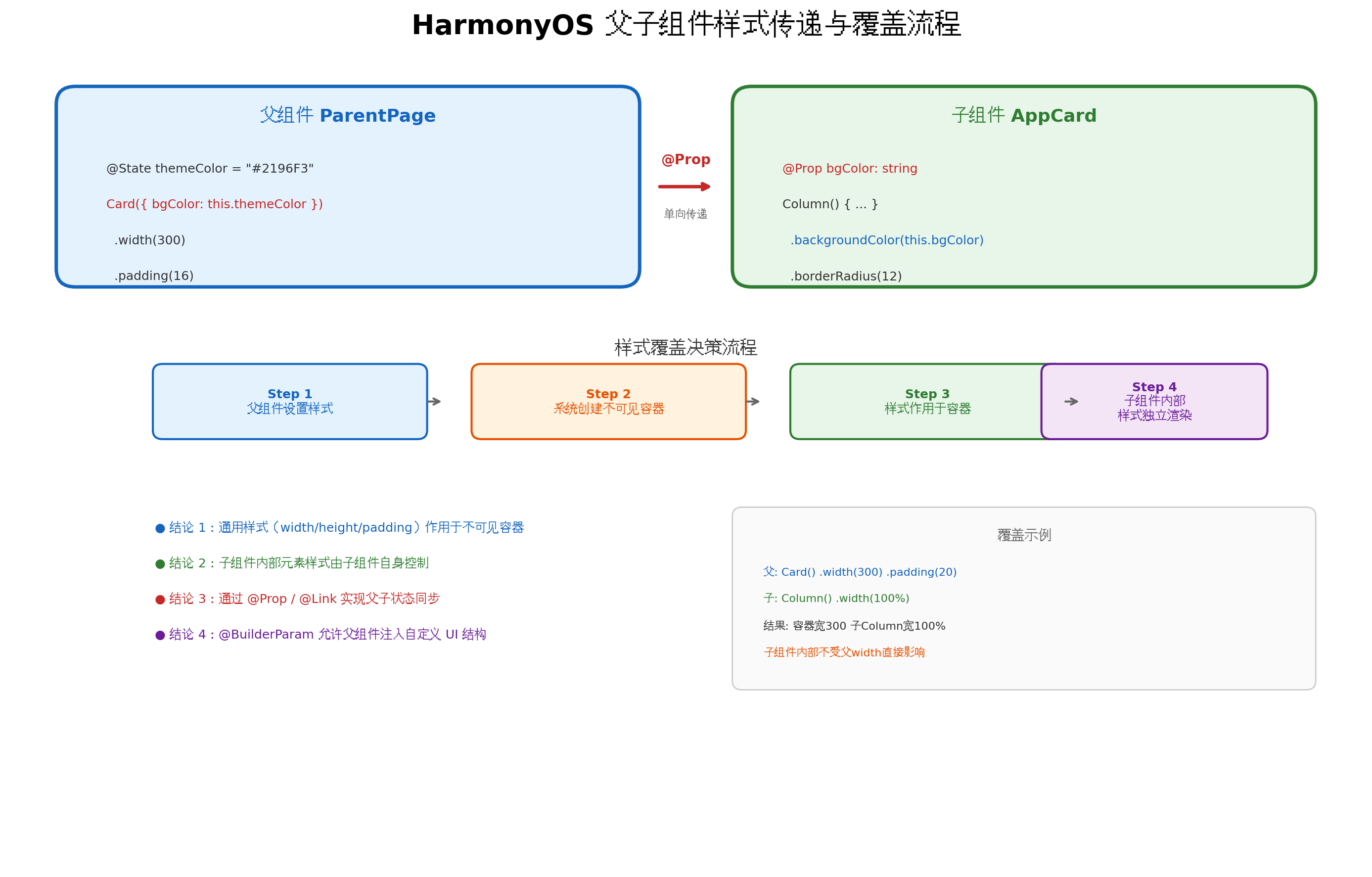
图3:HarmonyOS 父子组件样式传递与覆盖流程
5.1 基础用法
// components/CardWithSlot.ets
@Component
export struct CardWithSlot {
  @Prop title: string = '';
  @BuilderParam contentBuilder: () => void = this.defaultContent;
  @BuilderParam actionBuilder: () => void = this.defaultAction;

  @Builder
  defaultContent() {
    Text('默认内容')
      .fontSize(14)
      .fontColor($r('app.color.text_secondary'))
  }

  @Builder
  defaultAction() {
    Button('确认')
      .primaryButton()
  }

  build() {
    Column({ space: 12 }) {
      Text(this.title)
        .fontSize(18)
        .fontWeight(FontWeight.Bold)
        .fontColor($r('app.color.text_primary'))

      // 内容插槽
      this.contentBuilder()

      // 操作插槽
      this.actionBuilder()
    }
    .width('90%')
    .padding(16)
    .backgroundColor($r('app.color.surface_card'))
    .borderRadius(12)
    .shadow({
      radius: 8,
      color: 'rgba(0,0,0,0.06)',
      offsetX: 0,
      offsetY: 2
    })
  }
}
5.2 父组件注入自定义内容
// pages/SlotDemoPage.ets
import { CardWithSlot } from '../components/CardWithSlot';

@Entry
@Component
struct SlotDemoPage {
  @Builder
  customContent() {
    Column({ space: 8 }) {
      Image($r('app.media.avatar'))
        .width(60)
        .height(60)
        .borderRadius(30)
      Text('用户头像')
        .fontSize(14)
        .fontColor($r('app.color.text_secondary'))
    }
  }

  @Builder
  customActions() {
    Row({ space: 12 }) {
      Button('编辑')
        .secondaryButton()
      Button('删除')
        .dangerButton()
    }
  }

  build() {
    Column({ space: 20 }) {
      // 使用默认插槽
      CardWithSlot({ title: '默认卡片' })

      // 注入自定义内容
      CardWithSlot({ title: '用户信息' }) {
        this.customContent()
      }

      // 同时注入内容和操作
      CardWithSlot({
        title: '操作卡片',
        contentBuilder: this.customContent,
        actionBuilder: this.customActions
      })
    }
    .width('100%')
    .padding(20)
  }
}
5.3 尾随闭包语法
HarmonyOS 6 支持更简洁的尾随闭包语法:
CardWithSlot({ title: '尾随闭包示例' }) {
  // 自动映射到第一个 @BuilderParam
  Column() {
    Text('通过尾随闭包注入的内容')
      .fontSize(14)
    Image($r('app.media.banner'))
      .width('100%')
      .height(120)
      .borderRadius(8)
  }
}
六、AttributeModifier:运行时的动态样式覆盖
AttributeModifier 不仅支持跨文件复用,更强大的能力在于运行时动态修改样式属性。当 AttributeModifier 对象的属性值变化时,组件对应属性也会同步更新。
// styles/modifiers/CardModifier.ets
import { AttributeModifier, CommonAttribute } from '@kit.ArkUI';

export class DynamicCardModifier implements AttributeModifier<CommonAttribute> {
  private bgColor: ResourceColor = '#FFFFFF';
  private borderColor: ResourceColor = '#E0E0E0';
  private scaleValue: number = 1.0;

  setColors(bg: ResourceColor, border: ResourceColor): DynamicCardModifier {
    this.bgColor = bg;
    this.borderColor = border;
    return this;
  }

  setScale(scale: number): DynamicCardModifier {
    this.scaleValue = scale;
    return this;
  }

  applyNormalAttribute(instance: CommonAttribute): void {
    instance
      .width('90%')
      .padding(16)
      .backgroundColor(this.bgColor)
      .borderRadius(12)
      .border({ width: 1, color: this.borderColor })
      .scale({ x: this.scaleValue, y: this.scaleValue })
      .shadow({
        radius: 8,
        color: 'rgba(0,0,0,0.06)',
        offsetX: 0,
        offsetY: 2
      });
  }
}
// pages/DynamicStylePage.ets
import { DynamicCardModifier } from '../styles/modifiers/CardModifier';

@Entry
@Component
struct DynamicStylePage {
  @State cardModifier: DynamicCardModifier = new DynamicCardModifier()
    .setColors('#FFFFFF', '#E0E0E0');

  @State currentType: string = 'default';

  private styleMap: Map<string, [ResourceColor, ResourceColor]> = new Map([
    ['default', ['#FFFFFF', '#E0E0E0']],
    ['warning', ['#FFF3E0', '#FF9800']],
    ['danger', ['#FFEBEE', '#F44336']],
    ['success', ['#E8F5E9', '#4CAF50']]
  ]);

  build() {
    Column({ space: 20 }) {
      Column() {
        Text('动态样式卡片')
          .fontSize(18)
          .fontWeight(FontWeight.Bold)
        Text('点击按钮切换卡片样式')
          .fontSize(14)
          .fontColor($r('app.color.text_secondary'))
      }
      .attributeModifier(this.cardModifier)

      Row({ space: 12 }) {
        ForEach(['default', 'warning', 'danger', 'success'], (type: string) => {
          Button(type)
            .width(80)
            .height(36)
            .fontSize(12)
            .onClick(() => {
              this.currentType = type;
              const colors = this.styleMap.get(type);
              if (colors) {
                this.cardModifier = new DynamicCardModifier()
                  .setColors(colors[0], colors[1]);
              }
            })
        })
      }

      Text(`当前类型: ${this.currentType}`)
        .fontSize(14)
        .fontColor($r('app.color.text_secondary'))
    }
    .width('100%')
    .padding(20)
  }
}
关键特性:多次通过 attributeModifier 设置属性时,生效的属性为所有属性的并集,相同属性按照设置顺序生效。这意味着可以增量更新样式,而无需重新定义所有属性。
七、实战案例:自定义卡片组件的样式继承体系
基于上述机制,我们构建一个完整的卡片组件样式继承体系。
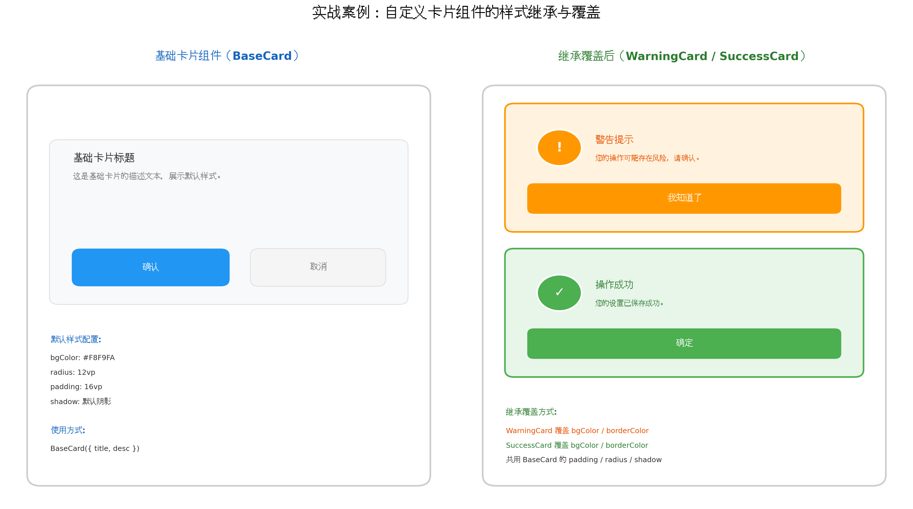
图4:实战案例:自定义卡片组件的样式继承与覆盖
7.1 基础卡片组件
// components/BaseCard.ets
@Component
export struct BaseCard {
  @Prop title: string = '';
  @Prop desc: string = '';
  @Prop bgColor: ResourceColor = $r('app.color.surface_card');
  @Prop borderColor: ResourceColor = $r('app.color.border_default');
  @Prop icon?: Resource;
  @BuilderParam actionBuilder?: () => void;

  @Builder
  defaultAction() {
    Button('确认')
      .primaryButton()
  }

  build() {
    Column({ space: 12 }) {
      Row({ space: 12 }) {
        if (this.icon) {
          Image(this.icon)
            .width(40)
            .height(40)
            .borderRadius(20)
        }

        Column({ space: 4 }) {
          Text(this.title)
            .fontSize(16)
            .fontWeight(FontWeight.Bold)
            .fontColor($r('app.color.text_primary'))

          Text(this.desc)
            .fontSize(13)
            .fontColor($r('app.color.text_secondary'))
            .maxLines(2)
            .textOverflow({ overflow: TextOverflow.Ellipsis })
        }
        .layoutWeight(1)
        .alignItems(HorizontalAlign.Start)
      }
      .width('100%')

      // 操作区域
      if (this.actionBuilder) {
        this.actionBuilder();
      } else {
        this.defaultAction();
      }
    }
    .width('90%')
    .padding(16)
    .backgroundColor(this.bgColor)
    .borderRadius(12)
    .border({ width: 1, color: this.borderColor })
    .shadow({
      radius: 8,
      color: 'rgba(0,0,0,0.06)',
      offsetX: 0,
      offsetY: 2
    })
  }
}
7.2 继承覆盖:警告卡片
// components/WarningCard.ets
import { BaseCard } from './BaseCard';

@Component
export struct WarningCard {
  @Prop title: string = '警告';
  @Prop desc: string = '';
  @Prop onConfirm?: () => void;

  @Builder
  warningAction() {
    Button('我知道了')
      .width('100%')
      .height(40)
      .backgroundColor('#FF9800')
      .fontColor(Color.White)
      .borderRadius(20)
      .onClick(() => {
        this.onConfirm?.();
      })
  }

  build() {
    BaseCard({
      title: this.title,
      desc: this.desc,
      bgColor: '#FFF3E0',
      borderColor: '#FF9800',
      icon: $r('app.media.ic_warning'),
      actionBuilder: this.warningAction
    })
  }
}
7.3 继承覆盖:成功卡片
// components/SuccessCard.ets
import { BaseCard } from './BaseCard';

@Component
export struct SuccessCard {
  @Prop title: string = '成功';
  @Prop desc: string = '';
  @Prop onConfirm?: () => void;

  @Builder
  successAction() {
    Button('确定')
      .width('100%')
      .height(40)
      .backgroundColor('#4CAF50')
      .fontColor(Color.White)
      .borderRadius(20)
      .onClick(() => {
        this.onConfirm?.();
      })
  }

  build() {
    BaseCard({
      title: this.title,
      desc: this.desc,
      bgColor: '#E8F5E9',
      borderColor: '#4CAF50',
      icon: $r('app.media.ic_success'),
      actionBuilder: this.successAction
    })
  }
}
7.4 页面统一使用
// pages/CardDemoPage.ets
import { BaseCard } from '../components/BaseCard';
import { WarningCard } from '../components/WarningCard';
import { SuccessCard } from '../components/SuccessCard';

@Entry
@Component
struct CardDemoPage {
  build() {
    Column({ space: 16 }) {
      BaseCard({
        title: '基础卡片',
        desc: '使用默认样式配置'
      })

      WarningCard({
        title: '网络异常',
        desc: '当前网络连接不稳定,请检查网络设置',
        onConfirm: () => {
          console.info('用户已知晓警告');
        }
      })

      SuccessCard({
        title: '保存成功',
        desc: '您的个人资料已更新成功',
        onConfirm: () => {
          console.info('用户确认成功');
        }
      })
    }
    .width('100%')
    .padding(20)
    .backgroundColor($r('app.color.surface_background'))
  }
}
八、设计模式:策略模式实现动态样式覆盖
对于需要运行时动态切换多种样式方案的场景,策略模式(Strategy Pattern)是最优雅的设计方案。
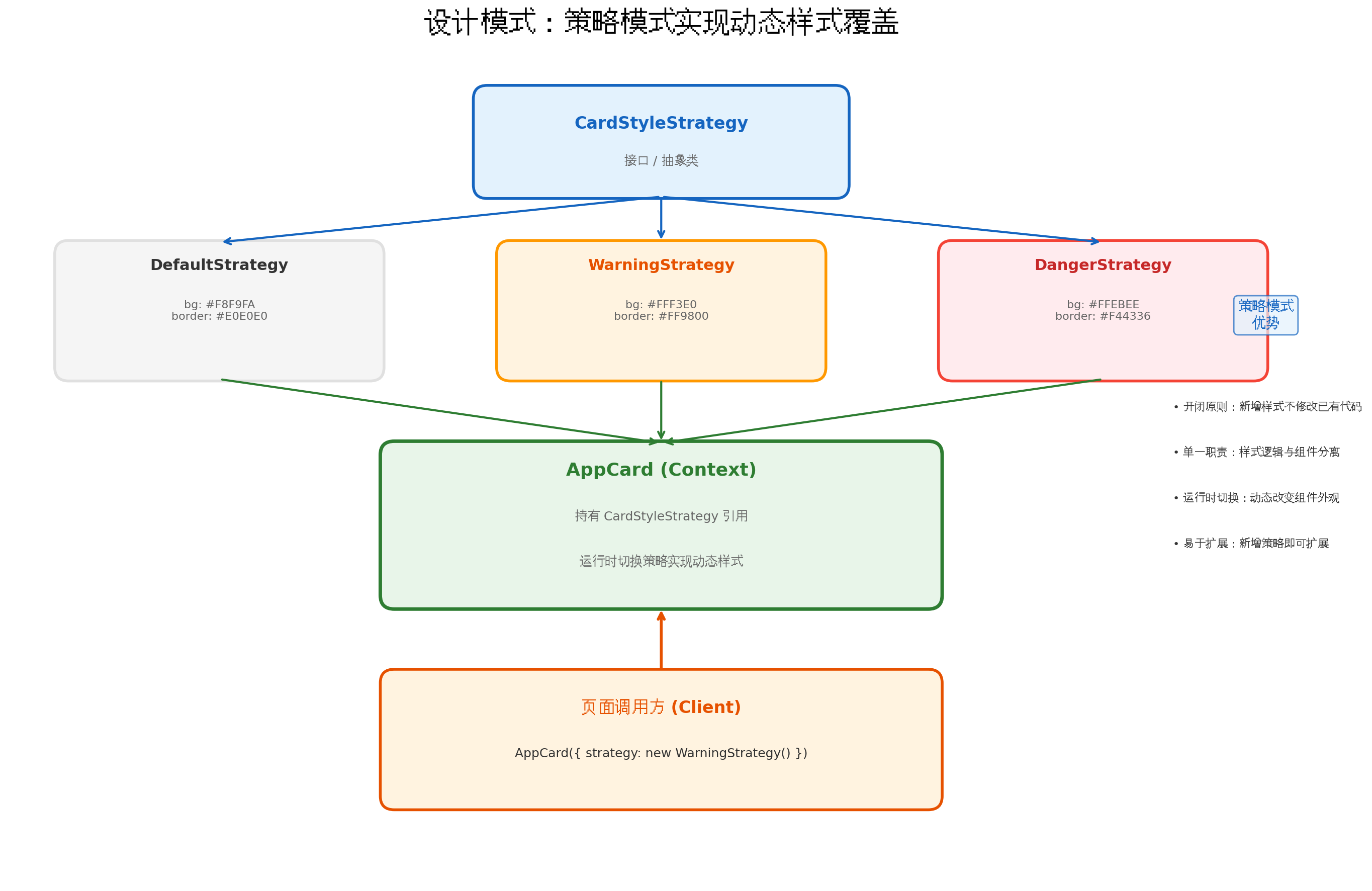
图5:设计模式:策略模式实现动态样式覆盖
8.1 策略接口定义
// styles/strategy/CardStyleStrategy.ets
export interface CardStyleStrategy {
  getBgColor(): ResourceColor;
  getBorderColor(): ResourceColor;
  getTitleColor(): ResourceColor;
  getDescColor(): ResourceColor;
  getButtonBgColor(): ResourceColor;
  getButtonTextColor(): ResourceColor;
  getIcon(): Resource;
}
8.2 具体策略实现
// styles/strategy/DefaultStrategy.ets
import { CardStyleStrategy } from './CardStyleStrategy';

export class DefaultStrategy implements CardStyleStrategy {
  getBgColor(): ResourceColor { return '#F8F9FA'; }
  getBorderColor(): ResourceColor { return '#E0E0E0'; }
  getTitleColor(): ResourceColor { return '#212121'; }
  getDescColor(): ResourceColor { return '#757575'; }
  getButtonBgColor(): ResourceColor { return '#2196F3'; }
  getButtonTextColor(): ResourceColor { return '#FFFFFF'; }
  getIcon(): Resource { return $r('app.media.ic_info'); }
}

// styles/strategy/WarningStrategy.ets
export class WarningStrategy implements CardStyleStrategy {
  getBgColor(): ResourceColor { return '#FFF3E0'; }
  getBorderColor(): ResourceColor { return '#FF9800'; }
  getTitleColor(): ResourceColor { return '#E65100'; }
  getDescColor(): ResourceColor { return '#E65100'; }
  getButtonBgColor(): ResourceColor { return '#FF9800'; }
  getButtonTextColor(): ResourceColor { return '#FFFFFF'; }
  getIcon(): Resource { return $r('app.media.ic_warning'); }
}

// styles/strategy/DangerStrategy.ets
export class DangerStrategy implements CardStyleStrategy {
  getBgColor(): ResourceColor { return '#FFEBEE'; }
  getBorderColor(): ResourceColor { return '#F44336'; }
  getTitleColor(): ResourceColor { return '#C62828'; }
  getDescColor(): ResourceColor { return '#C62828'; }
  getButtonBgColor(): ResourceColor { return '#F44336'; }
  getButtonTextColor(): ResourceColor { return '#FFFFFF'; }
  getIcon(): Resource { return $r('app.media.ic_error'); }
}
8.3 上下文组件
// components/StrategyCard.ets
import { CardStyleStrategy } from '../styles/strategy/CardStyleStrategy';

@Component
export struct StrategyCard {
  @Prop title: string = '';
  @Prop desc: string = '';
  @Prop strategy: CardStyleStrategy = new DefaultStrategy();
  @Prop onAction?: () => void;

  build() {
    Column({ space: 12 }) {
      Row({ space: 12 }) {
        Image(this.strategy.getIcon())
          .width(40)
          .height(40)
          .borderRadius(20)

        Column({ space: 4 }) {
          Text(this.title)
            .fontSize(16)
            .fontWeight(FontWeight.Bold)
            .fontColor(this.strategy.getTitleColor())

          Text(this.desc)
            .fontSize(13)
            .fontColor(this.strategy.getDescColor())
        }
        .layoutWeight(1)
        .alignItems(HorizontalAlign.Start)
      }
      .width('100%')

      Button('确认')
        .width('100%')
        .height(40)
        .backgroundColor(this.strategy.getButtonBgColor())
        .fontColor(this.strategy.getButtonTextColor())
        .borderRadius(20)
        .onClick(() => {
          this.onAction?.();
        })
    }
    .width('90%')
    .padding(16)
    .backgroundColor(this.strategy.getBgColor())
    .borderRadius(12)
    .border({ width: 1, color: this.strategy.getBorderColor() })
    .shadow({
      radius: 8,
      color: 'rgba(0,0,0,0.06)',
      offsetX: 0,
      offsetY: 2
    })
  }
}
8.4 页面使用
// pages/StrategyDemoPage.ets
import { StrategyCard } from '../components/StrategyCard';
import { DefaultStrategy, WarningStrategy, DangerStrategy } from '../styles/strategy';

@Entry
@Component
struct StrategyDemoPage {
  @State currentStrategy: CardStyleStrategy = new DefaultStrategy();
  @State strategyName: string = 'default';

  private strategies: Map<string, CardStyleStrategy> = new Map([
    ['default', new DefaultStrategy()],
    ['warning', new WarningStrategy()],
    ['danger', new DangerStrategy()]
  ]);

  build() {
    Column({ space: 20 }) {
      StrategyCard({
        title: '策略模式卡片',
        desc: `当前策略: ${this.strategyName}`,
        strategy: this.currentStrategy,
        onAction: () => {
          console.info('策略卡片操作触发');
        }
      })

      Row({ space: 12 }) {
        ForEach(['default', 'warning', 'danger'], (name: string) => {
          Button(name)
            .width(100)
            .height(36)
            .fontSize(12)
            .onClick(() => {
              this.strategyName = name;
              const strategy = this.strategies.get(name);
              if (strategy) {
                this.currentStrategy = strategy;
              }
            })
        })
      }
    }
    .width('100%')
    .padding(20)
  }
}
8.5 策略模式的优势
- 开闭原则:新增样式方案只需添加新的策略类,无需修改已有代码
- 单一职责:样式逻辑与组件渲染逻辑分离,各自独立演进
- 运行时切换:根据业务状态动态切换策略,实现灵活的样式覆盖
- 易于测试:每个策略类可独立单元测试,保证样式一致性
九、性能优化与最佳实践
9.1 避免深层嵌套继承
组件嵌套建议不超过 5 层。过深的嵌套会导致样式计算复杂度增加,影响渲染性能。
// ✅ 推荐:扁平化结构
Column() {
  Header()
  Content()
  Footer()
}

// ❌ 不推荐:过深层级
Column() {
  Column() {
    Column() {
      Column() {
        Text('深层嵌套')
      }
    }
  }
}
9.2 状态粒度控制
样式相关的状态变量应尽可能精简,避免不必要的刷新:
// ✅ 推荐:使用对象封装相关样式
@State cardStyle: CardStyle = {
  bgColor: '#FFFFFF',
  borderColor: '#E0E0E0'
};

// ❌ 不推荐:分散的独立状态
@State bgColor: string = '#FFFFFF';
@State borderColor: string = '#E0E0E0';
@State shadowRadius: number = 8;
9.3 样式预计算
对于复杂的样式计算,在 aboutToAppear 中预计算,避免在 build() 中重复执行:
@Component
struct OptimizedCard {
  @Prop type: string = 'default';
  private computedStyle: CardStyle = { bgColor: '#FFFFFF', borderColor: '#E0E0E0' };

  aboutToAppear() {
    // 预计算样式,避免 build 中重复计算
    this.computedStyle = this.calculateStyle(this.type);
  }

  private calculateStyle(type: string): CardStyle {
    switch (type) {
      case 'warning': return { bgColor: '#FFF3E0', borderColor: '#FF9800' };
      case 'danger': return { bgColor: '#FFEBEE', borderColor: '#F44336' };
      default: return { bgColor: '#FFFFFF', borderColor: '#E0E0E0' };
    }
  }

  build() {
    Column() {
      // 使用预计算的样式
      Text('优化卡片')
    }
    .backgroundColor(this.computedStyle.bgColor)
    .border({ color: this.computedStyle.borderColor })
  }
}
9.4 与主题系统联动
组件样式继承体系应与主题变量系统深度结合:
// 在策略中使用主题资源
class ThemeAwareStrategy implements CardStyleStrategy {
  getBgColor(): ResourceColor {
    return $r('sys.color.background_secondary');  // 跟随系统主题
  }

  getTitleColor(): ResourceColor {
    return $r('sys.color.font_primary');
  }
}
十、总结
本文从 HarmonyOS 6(API 23)的不可见容器机制出发,系统性地讲解了组件样式继承与覆盖的完整技术体系。通过 不可见容器的底层认知、样式覆盖优先级金字塔、@Prop/@Link 状态传递、@BuilderParam UI 注入、AttributeModifier 动态覆盖,以及 策略模式的工程化实践,我们构建了一套从基础原理到高级设计的完整解决方案。
关键要点回顾:
- 不可见容器是理解样式继承的核心:自定义组件的通用样式作用于系统容器,而非内部元素
- 样式覆盖遵循明确的优先级:直接设置 > @Extend > 成员 @Styles > 全局 @Styles > 系统默认
- @Prop 实现单向样式注入:父组件通过参数向子组件传递样式配置
- @BuilderParam 实现 UI 插槽:父组件可完全控制子组件的部分 UI 结构
- AttributeModifier 支持运行时动态覆盖:属性值变化自动同步到组件
- 策略模式实现优雅的样式扩展:新增样式方案不修改已有代码,遵循开闭原则
- 组件嵌套不超过 5 层:避免过深嵌套带来的性能损耗
组件样式继承与覆盖的本质,是在"复用"与"定制"之间寻找平衡。通过合理的架构设计,我们可以让基础组件提供 80% 的通用能力,同时通过参数、插槽、策略等机制,让调用方自由覆盖剩余的 20%。这种"约定优于配置,配置优于硬编码"的工程化思维,正是 HarmonyOS 开发者构建高质量组件库的关键。
转载自:https://blog.csdn.net/u014727709/article/details/163481847
欢迎 👍点赞✍评论⭐收藏,欢迎指正
更多推荐
 5
5 0
0- 0


 已为社区贡献108条内容

所有评论(0)