vue.js前端开发,利用echarts组件实现动态数据展示
使用echarts组件,每10秒请求一次数据,并用折线图和柱状图动态展示数据,效果如图所示具体代码如下<template><el-row class="warp"><el-col :span="24" class="warp-breadcrum"><el-breadcrumb separator="/">...
·
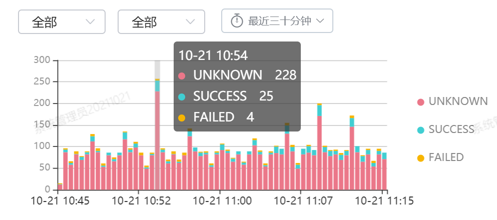
使用echarts组件,每10秒请求一次数据,并用折线图和柱状图动态展示数据,效果如图所示

具体代码如下
<template>
	<el-row class="warp">
		<el-col :span="24" class="warp-breadcrum">
			<el-breadcrumb separator="/">
				<el-breadcrumb-item :to="{ path: '/' }"><b>首页</b></el-breadcrumb-item>
			</el-breadcrumb>
		</el-col>

		<el-col :span="24" class="warp-main">
			<section class="chart-container">
				<el-row>

					<el-col :span="12">
						<div id="chartColumn" style="width:100%; height:400px;"></div>
					</el-col>
					<el-col :span="12">
						<div id="chartBar" style="width:100%; height:400px;"></div>
					</el-col>
					<el-col :span="12">
						<div id="chartLine" style="width:100%; height:400px;"></div>
					</el-col>
					<el-col :span="12">
						<div id="chartPie" style="width:100%; height:400px;"></div>
					</el-col>
					<el-col :span="24">
						<a href="http://echarts.baidu.com/examples.html" target="_blank" style="float: right;">more>></a>
					</el-col>
				</el-row>
			</section>

		</el-col>
	</el-row>
</template>
<style>
	.time {
		font-size: 13px;
		color: #999;
	}

	.bottom {
		margin-top: 13px;
		line-height: 12px;
	}

	.image {
		width: 100%;
		display: block;
	}

	.clearfix:before,
	.clearfix:after {
		display: table;
		content: "";
	}

	.clearfix:after {
		clear: both
	}

	.chart-container {
		width: 100%;
	}

	.chart-container .el-col {
		padding: 30px 20px;
	}
</style>

<script>
	import echarts from 'echarts'
	import axios from 'axios'
	export default {
		data() {
			return {
				currentDate: new Date(),
				chartColumn: null,
				chartBar: null,
				chartLine: null,
				chartPie: null,
				datas: [],
				count: 0,
				names: []
			};
		},
		mounted: function() {
			var _this = this;
			//基于准备好的dom,初始化echarts实例
			this.chartColumn = echarts.init(document.getElementById('chartColumn'));
			this.chartBar = echarts.init(document.getElementById('chartBar'));
			this.chartLine = echarts.init(document.getElementById('chartLine'));
			this.chartPie = echarts.init(document.getElementById('chartPie'));
			//循环执行
			this.fun();
			window.setInterval(() => {
				setTimeout(this.fun(), 0)
			}, 10000)

		},
		methods: {
			fun: function() {
				axios.all([
					axios.get('/stub_status'),
					axios.get('/upstream_check')
				]).then(axios.spread((statusResp, checkResp) => {
					// 上面两个请求都完成后,才执行这个回调方法
					let time = Date.parse(new Date());
					let count = statusResp.data.active;
					if(count > this.count) {
						this.count = count;
					}
					this.datas.unshift([time, count]);
					this.chartLine.setOption({
						title: {
							text: 'Line Chart'
						},
						tooltip: {
							trigger: 'axis'
						},
						grid: {
							left: '3%',
							right: '7%',
							bottom: '3%',
							containLabel: true
						},
						xAxis: {
							type: 'time',
							name: "时间",
							boundaryGap: false
						},
						yAxis: {
							type: 'value',
							name: "次数",
							max: this.count
						},
						series: [{
							name: '次数',
							type: 'line',
							data: this.datas
						}]
					})

					let servers = checkResp.data.servers.server;
					//let names = [];
					let totalnum = [];
					let extnum = [];
					let normalnum = [];

					for(let i = 0; i < servers.length; i++) {
						let name = servers[i].upstream;
						if(this.names.indexOf(name) == -1) {
							this.names.unshift(servers[i].upstream);
						}
					}
					for(let i = 0; i < this.names.length; i++) {
						totalnum.push(0);
						extnum.push(0);
						normalnum.push(0);
					}
					for(let i = 0; i < servers.length; i++) {
						let name = servers[i].upstream;
						let index = this.names.indexOf(name);
						totalnum[index] += 1;
						if("up" == servers[i].status) {
							normalnum[index] += 1;
						} else {
							extnum[index] += 1;
						}
					}
					this.chartBar.setOption({
						title: {
							text: 'Bar Chart',
							subtext: '数据来自网络'
						},
						tooltip: {
							trigger: 'axis',
							axisPointer: {
								type: 'shadow'
							}
						},
						legend: {
							data: ['总数', '正常', '异常']
						},
						grid: {
							left: '3%',
							right: '4%',
							bottom: '3%',
							containLabel: true
						},
						/*xAxis: {
							type: 'value',
							boundaryGap: [0, 0.01]
						},
						yAxis: {
							type: 'category',
							data: names
						},*/
						yAxis: {
							type: 'value',
							boundaryGap: [0, 0.01]
						},
						xAxis: {
							type: 'category',
							data: this.names
						},
						series: [{
								name: '总数',
								type: 'bar',
								data: totalnum
							},
							{
								name: '正常',
								type: 'bar',
								data: normalnum
							},
							{
								name: '异常',
								type: 'bar',
								data: extnum
							}
						]
					});
				}));
			}
		}
	}
</script>
文末分享一些技术学习视频资料:https://pan.baidu.com/s/13dbR69NLIEyP1tQyRTl4xw

前往低代码交流专区
更多推荐
 1
1 0
0- 0


 已为社区贡献8条内容

所有评论(0)