
微信小程序入门-弹性模型
不闲扯直接上代码页面的wxml文件,一个view容器中包含三个子容器abc接下来就是wxss文件 /* pages/module/module.wxss */.flex-wrap{display: -webkit-flex;flex-direction: column;height: 1000rpx;}.flex-wrap vi
·
不闲扯直接上代码
页面的wxml文件,一个view容器中包含三个子容器
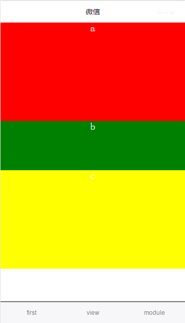
<view class="flex-wrap">
<view class="a">a</view>
<view class="b">b</view>
<view class="c">c</view>
</view>
/* pages/module/module.wxss */
.flex-wrap{
    display: -webkit-flex;
    flex-direction: column;
    height: 1000rpx;
}

.flex-wrap view{
    text-align: center;
    font-size: 40rpx;
    color: white;
}
.a{
    background-color: red;
    flex: 2;
}
.b{
    background-color: green;
    flex: 1;
}
.c{
     background-color: yellow;
     flex: 2;
}
显示效果如下:
注意: display: -webkit-flex;说明使用弹性模式, 在微信中默认的排列方式水平。flex-direction: column更改排列方式垂直。在该模型下,不声明父容器宽高,默认占满均分。可以通过设置父容器的宽度或高度和子容器的flex的值实现按比例分配空间。弹性模式最大的好处就是适应性强。

权威|前沿|技术|干货|国内首个API全生命周期开发者社区
更多推荐
 0
0 0
0- 0


 已为社区贡献1条内容

所有评论(0)